kip - Pick. Keep. Kip!
Ariha A
Kip
A grocery app/store that saves time & makes grocery shopping fast and fun.
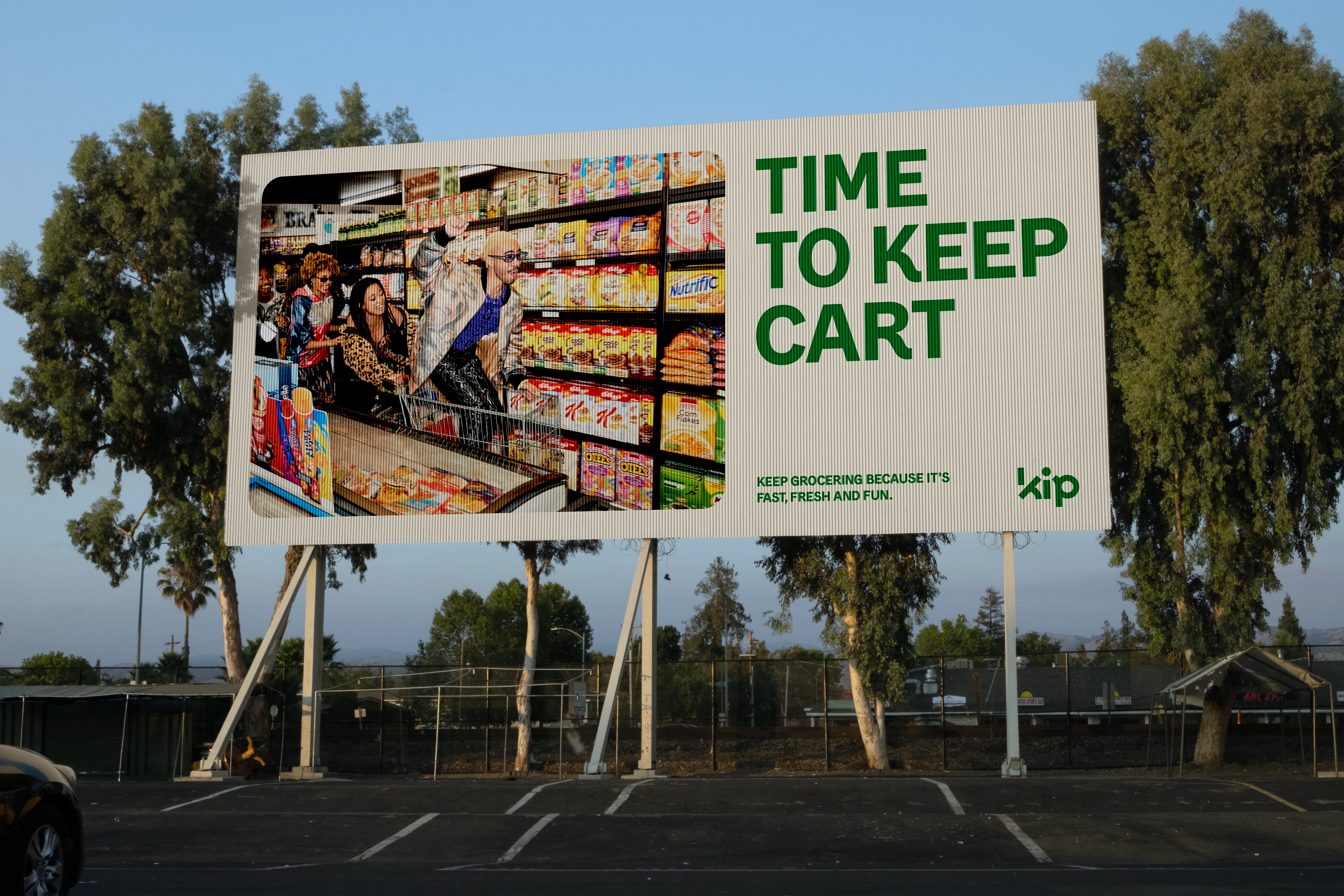
Billboard
Logo
A wordmark logo carefully designed with angles and shapes to define brand's tone of voice. It is fun, modern, and youthful. Letter "i" and the diagonal line in letter "k" represent the clock's hands. The idea was to create something that plays with the concept of time with and element of fun. All the letters are designed from scratch and are completely customized. The concept of clock's hands is used as a brand pattern.

Brand Pattern and Tagline
The taglines "Time to keep cart" and "Pick. Keep. Kip!" are strategically created to support brand's tone of voice. Both signifies the importance of time saving in a realm of shopping both online and in store.

Brand Tone of Voice
The colors and brand primary typeface for headlines and body copy compliments the brand logo and the approach.
Social Media posts
Character Illustration and Brand Text
Brand Tagline and Tone of Voice
Like this project
Posted Nov 12, 2024
Time to keep cart. Brand identity and strategy for a grocery app/store that aims to revolutionise the grocery shopping by making it fast, fun and smart.