AI Note - Webflow SaaS Design Development
Live Website: https://note-taking.webflow.io/
Case Study: https://halodesign.webflow.io/project/ai-note
About
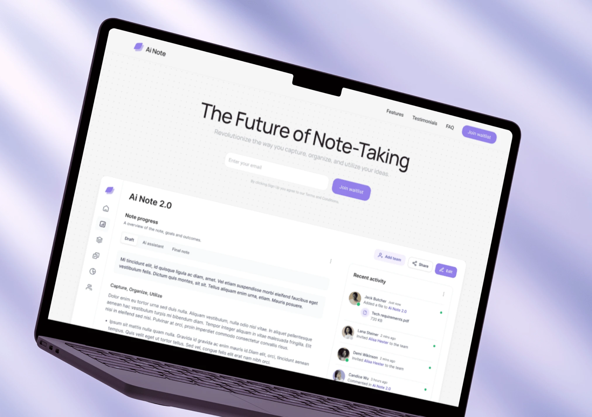
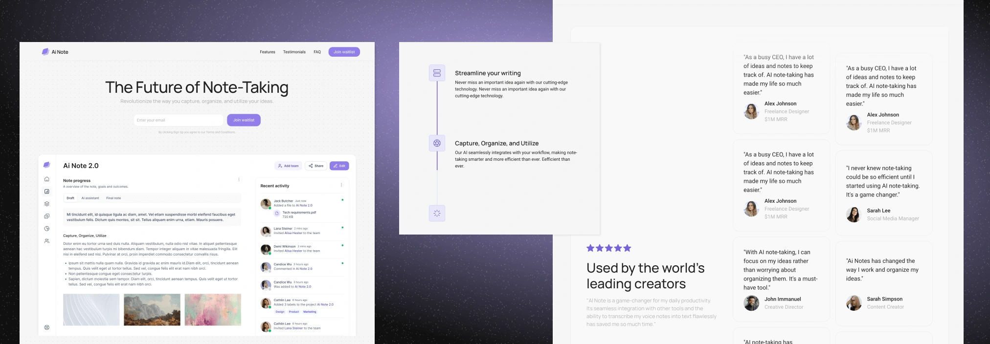
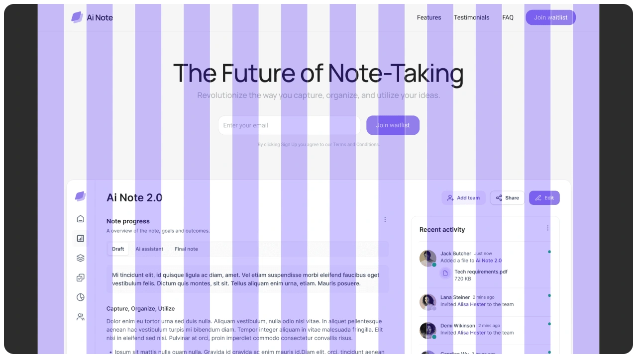
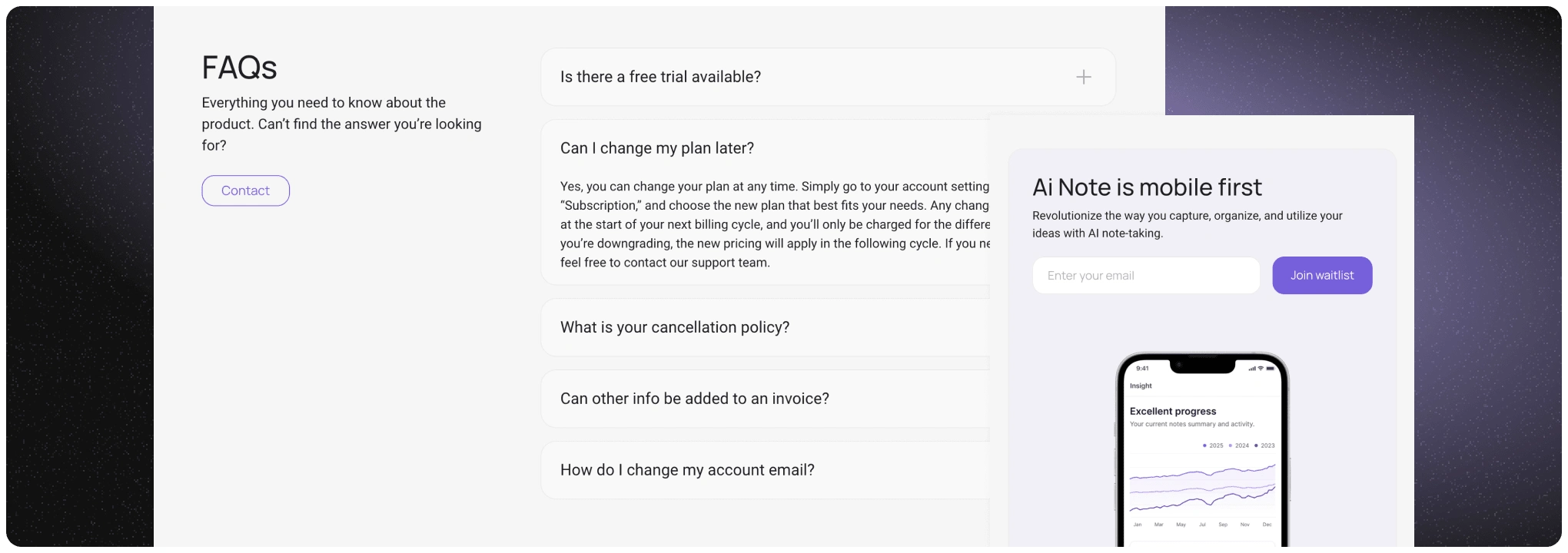
AI Note is a minimalist Webflow template designed as a single landing page specifically for SaaS companies aiming to promote their products and convert visitors into users. Built with a focus on driving conversions, this template integrates a clear call-to-action, encouraging users to join a waitlist.
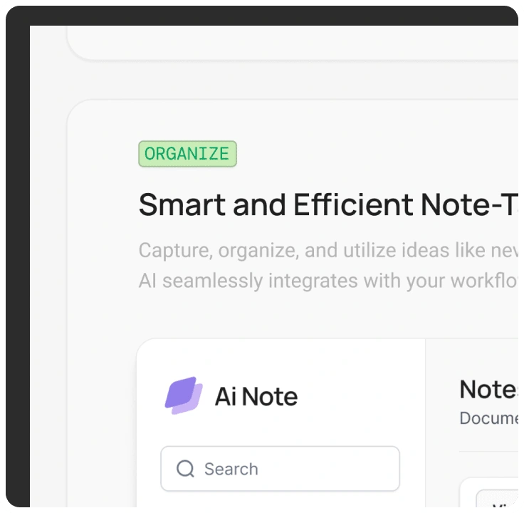
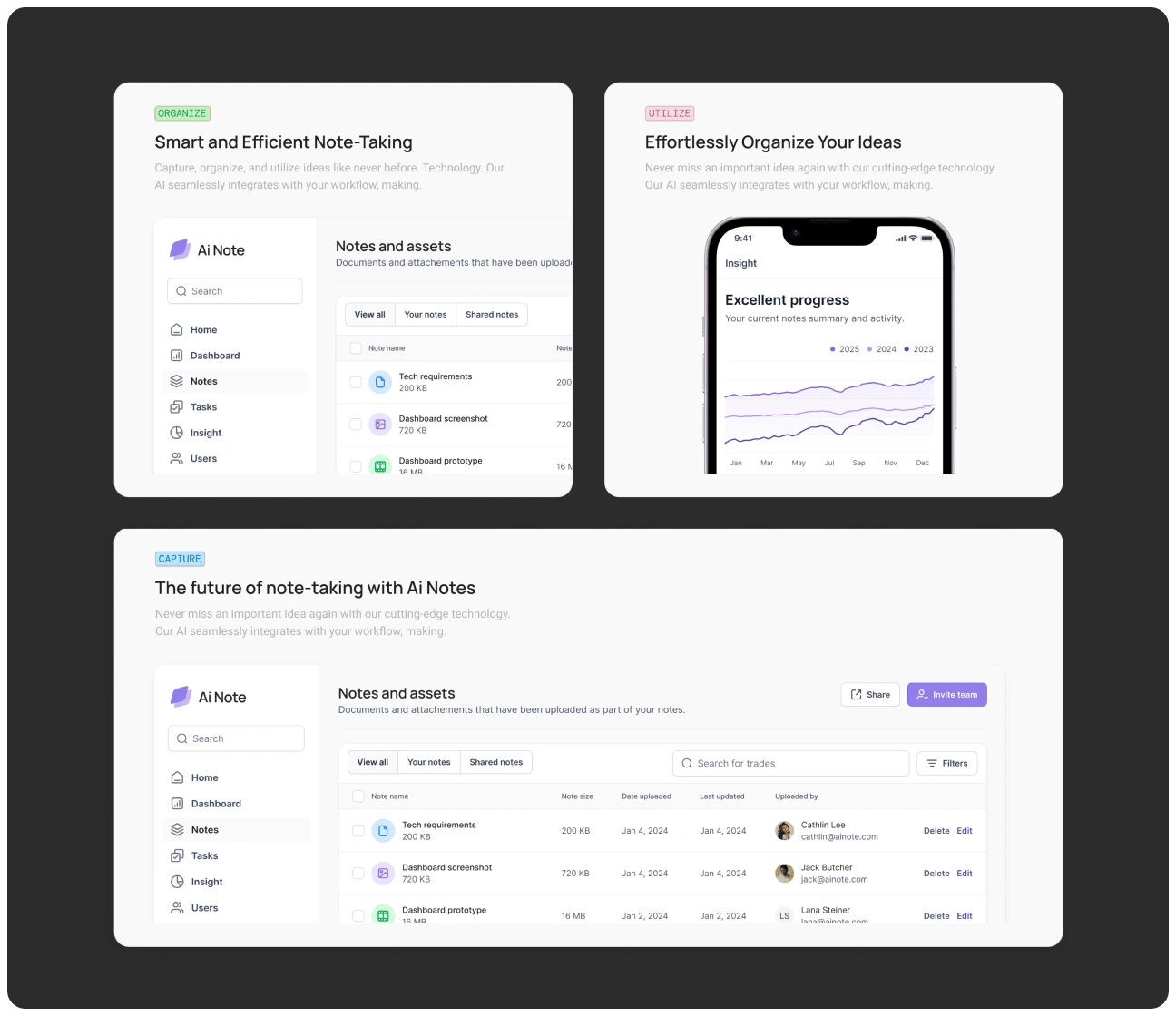
The visual direction is driven by a modern, bento-card style layout, giving the page a clean, well-organized structure that seamlessly guides the user’s attention. The simplicity of the template ensures that potential customers remain focused on the product and its key benefits without distraction.
Featuring smooth animations and a structured design, AI Note leverages its minimalist aesthetic to create a professional and engaging experience for users.
The template can be easily replaced by SaaS founders to suit their own product and messaging. Whether used by startups or established tech companies, AI Note allows SaaS companies to present their product effectively while maintaining a strong focus on conversion.
We're available for new projects. We try to accommodate 3 open slots every quarter. Let’s schedule a time to bring your idea to life.
Goals
The goal of the AI Note project was to create a highly optimized Webflow landing page template that prioritizes conversion through a clean and modern design.
We aimed to deliver a flexible solution that SaaS companies can easily customize to showcase their product, drive interest, and encourage users to join a waitlist.
The main challenge was ensuring that the template provided all necessary elements for conversion while maintaining a minimalist aesthetic that doesn’t overwhelm the user. We focused on creating a structure that allows SaaS companies to personalize the template without needing extensive design or coding knowledge, ensuring that it is accessible for a broad range of users.
Insight
During the development of AI Note, we realized the effectiveness of focusing on one clear objective—conversion. By stripping away unnecessary elements and emphasizing the waitlist call-to-action, the page achieves a streamlined user experience that naturally leads visitors to take action.
Early feedback from users indicated that the minimalist design not only provided clarity but also reinforced the professionalism of the product being promoted. The bento-card layout also proved to be highly adaptable, allowing users to quickly swap in their own content without disrupting the overall flow or design.
Moreover, the simple yet modern aesthetic made AI Note suitable for a wide range of SaaS products, from AI tools to productivity apps. The template’s flexibility and ease of use were highly praised, reinforcing the idea that less is more when it comes to promoting products online.
The clean, conversion-focused layout offers SaaS founders an ideal platform to showcase their product and drive engagement.
Like this project
Posted Sep 23, 2024
AI Note is a minimalist Webflow template designed as a single landing page specifically for SaaS companies aiming to promote their products and convert visitors
Likes
0
Views
21


