✨ Conceptual App Design for freelance marketplace - Contra


Overview 🔎
I am a fan of Contra and its mission. I took onto their product in the early stages itself. It not only offers 0% Commission freelancing platform but also a community of extremely talented designers.
The only thing missing was a Mobile app
It's a Conceptual Passion project I took as a Product Designer. They already have a website in place and a very beautiful one indeed (Kudos to the Product team on that 👏).
I wanted every page to reflect the Premium vibrant vibe that is in Contra's Brand.
Problem & Solution 🤝
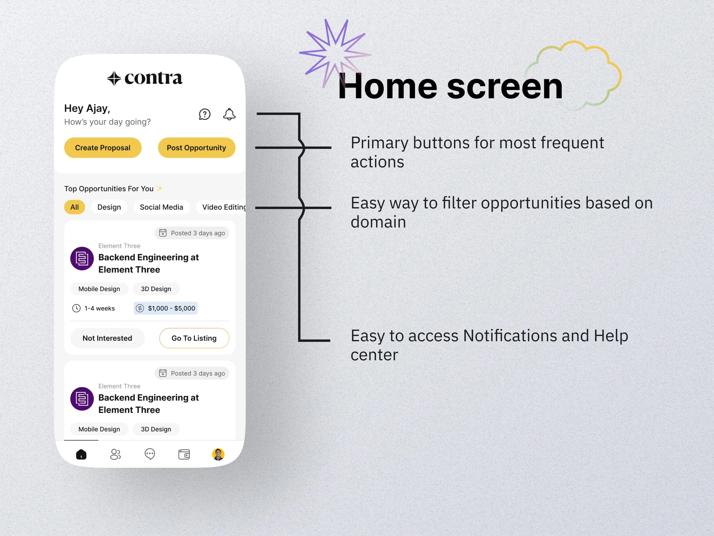
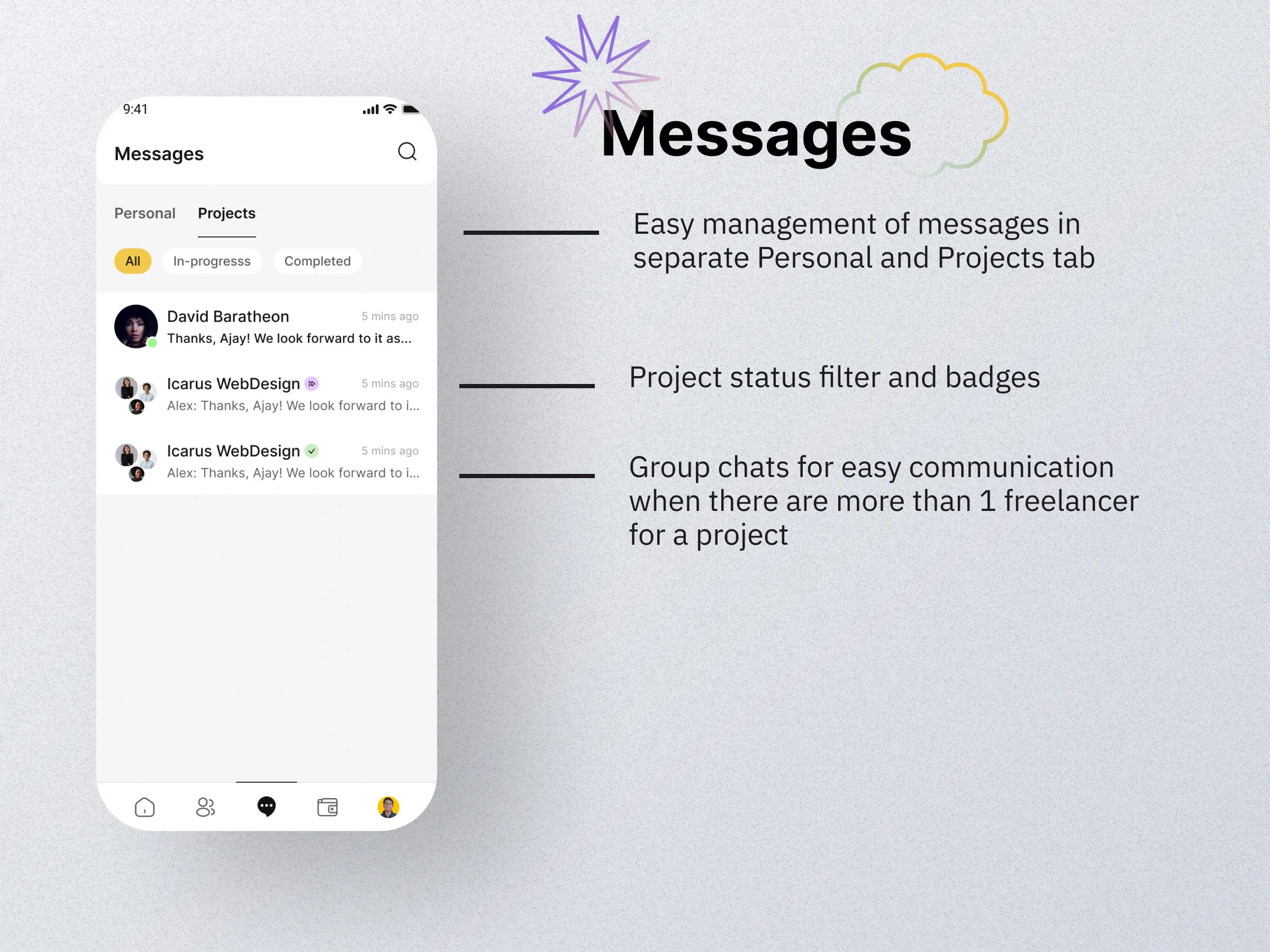
I had been a part of their community for quite some time then and severely wanted an app. It was kinda hard to open a website all the time to check up on your projects or opportunities. Also, the notifications got lost sometimes.
Goals/Requirements:
The primary goal was to come up with a conceptual design for the app that not only caters to existing features but also the features that users are requesting for.
NOTE: Contra already has a beautiful brand style guide, so I didn't try to revamp it. The design was mainly focused on Information Architecture and understanding the problems users were facing.
Process 🛣
Identifying the problems
Not having a mobile app is not a problem. It's the cons that it brings with it.
More friction for repititive users to access the product
No notifications for me to keep track of the opportunities that I have applied to or existing client communications
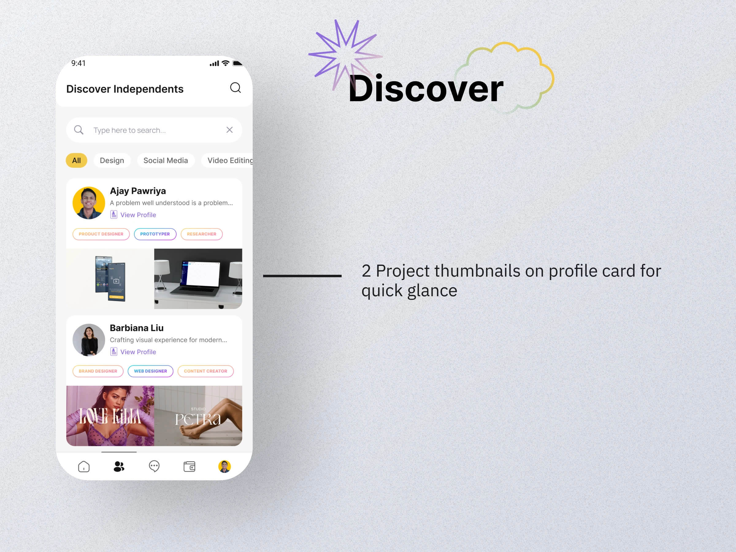
An easy way to share my contra profile
A prominent easy to access help & support feature
There's so much to do. So much to add. I needed a strategy for the placement of features in the app.
Comes into picture, "Information Architecture brainstorming". To back this up, I tried to look at what features are the mot important ones and which ones are complimentary. I also did a small survey to just to validate the statement from others
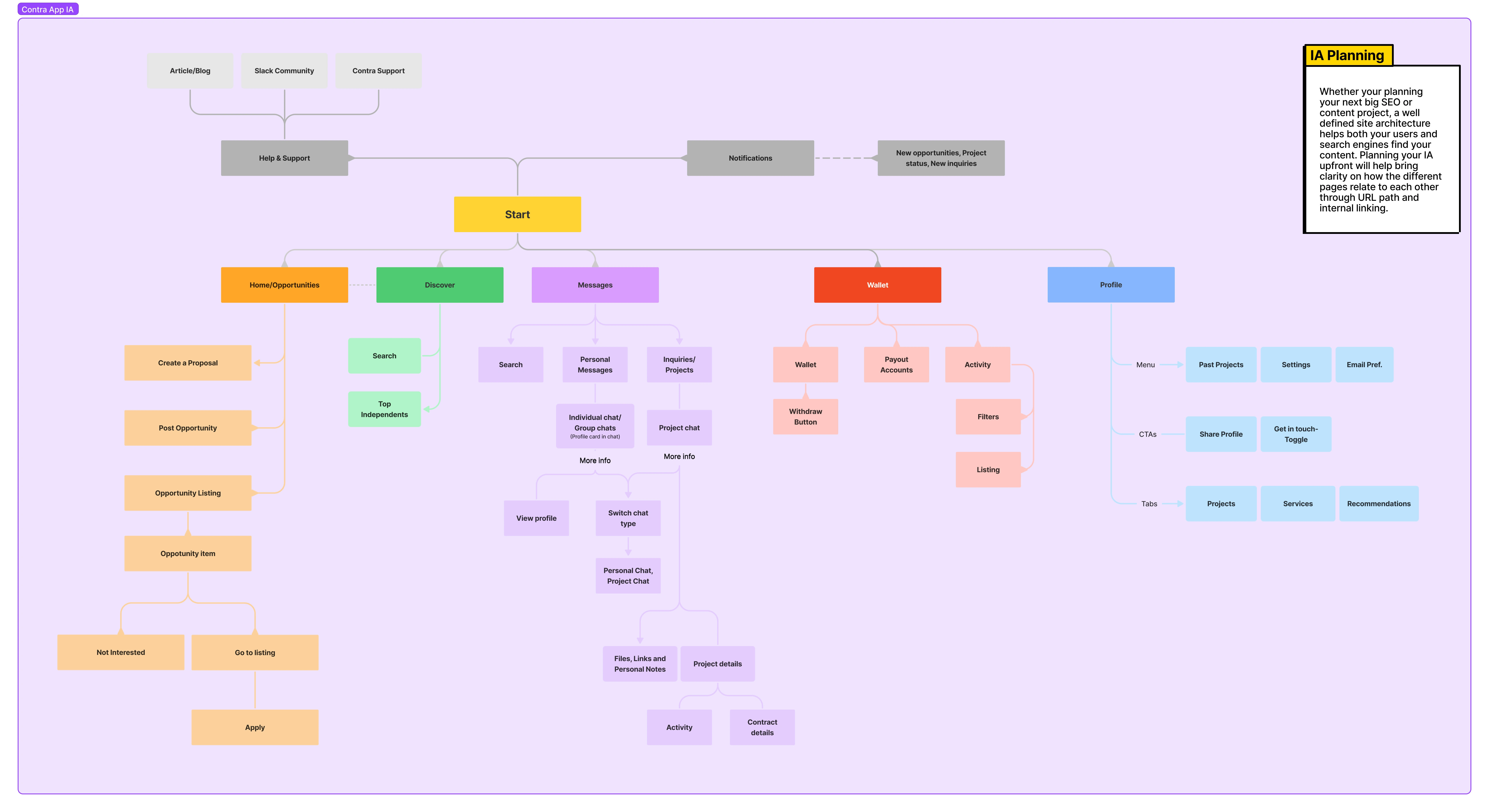
Wireframes
Now, that I had a good structure for the app, I went to do some wireframes for it.
Paper sketches
To have more creative ideas and not be limited by tools. I first did rough sketches on paper to help me brainstorm and get few obvious ideas out of my head.
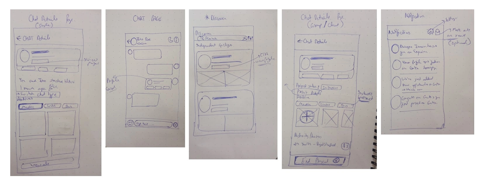
Rough paper sketches
Digital Wireframes
Whimsical is my tool of choice for digital wireframing. Having my wireframes in a digital format gives me an understanding of visual estate that I have to work in.
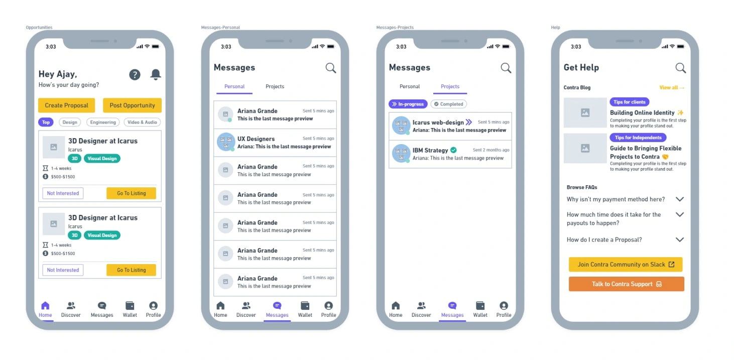
Digital Whimsical wireframes
Design system (Rudimentary)
Wireframes gave me a good enough idea of what elements are repeating and can be made into components while doing high-fidelity designing.
Components like:
Buttons
Tabs
Navbar
Chips etc
The magic is in the details. I always ensure that once I start designing high-fidelity, I always keep making components and styles for the same.
A lot of designers have this misconception that the Design systems building has a proper start and an end. I happen to oppose that view. You just start building the design system and from there on, you keep on adding and removing from it.
As it should be.
Your Design system is supposed to grow with your product. Neither before it, nor after it.
So here's the rudimentary design system components and styles that I built to help me design faster.
Components
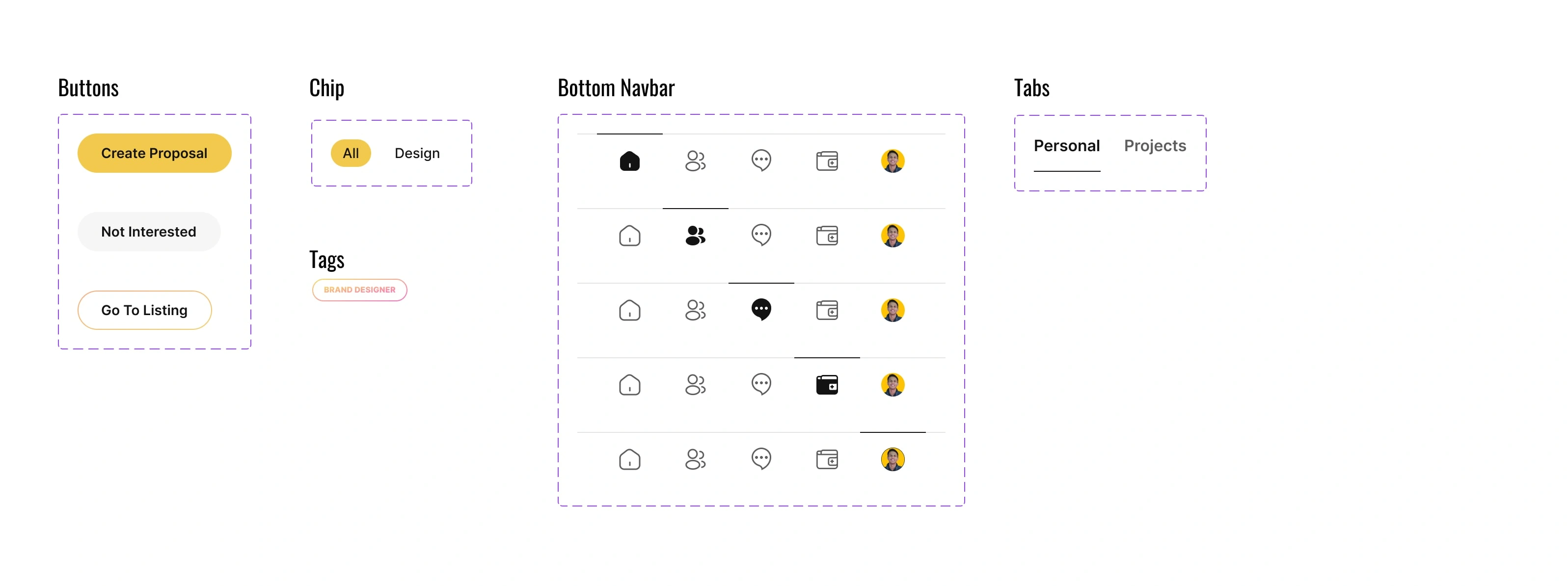
Rudimentary design system components
Icons
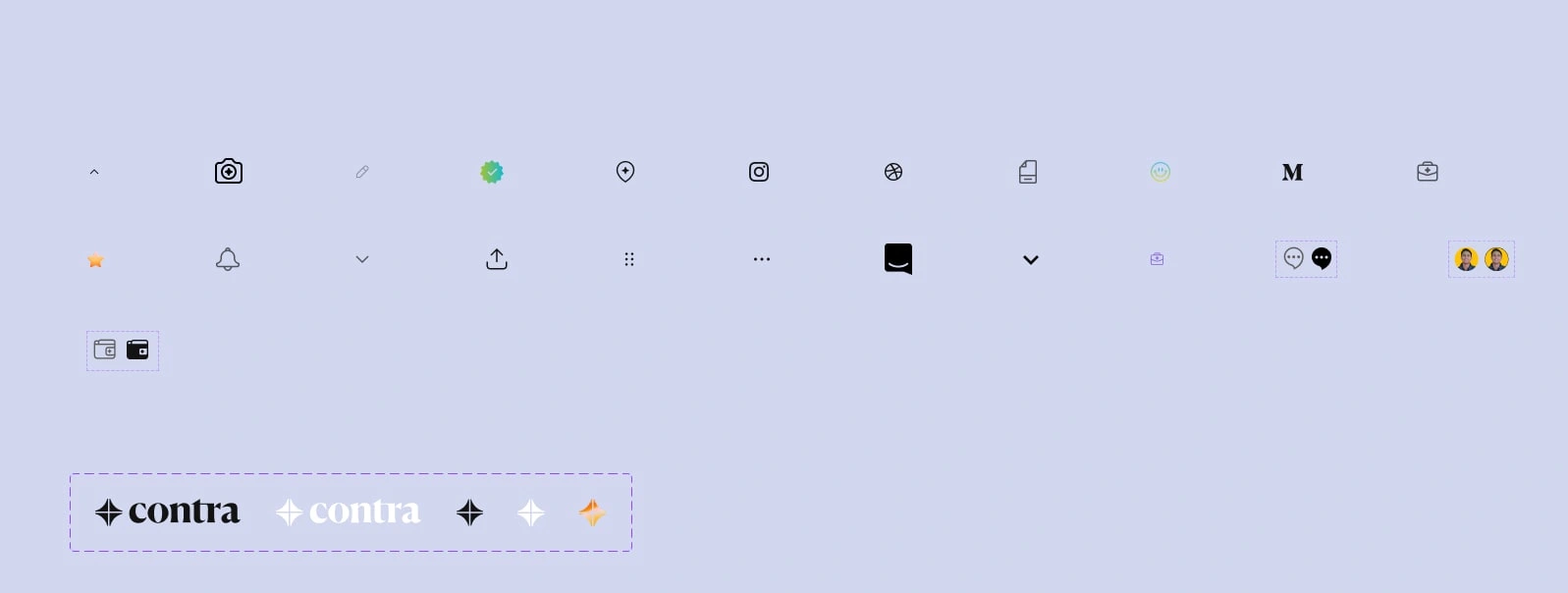
All the icons were imported form Contra's official website
Final High-fidelity designs
Now to the final deal. The high-fidelity designs.
My main motive was to bring the Premium vibrant vibe in the app as they have it on their website.
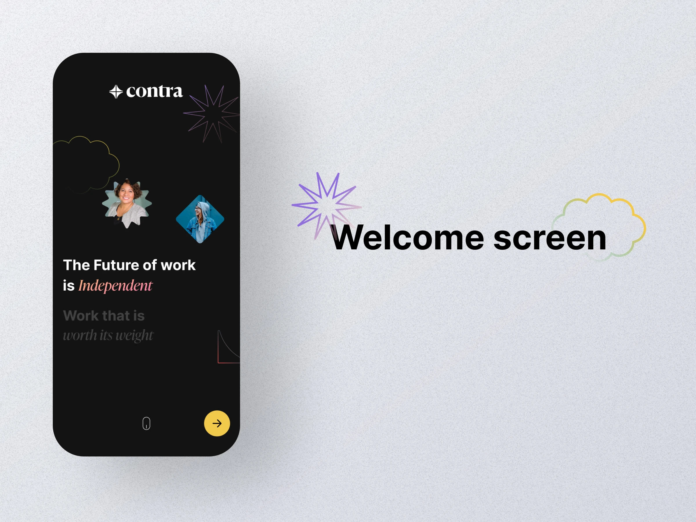
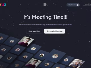
Welcome screen had enough estate for me to go creative and try out new things.
I see Contra having a brand that feels alive. I like to think one major factor is the motion they add in it.
So, I designed a welcome screen that ot only feels premium but also has scope for animation.
The shapes can move in to the viewport and the vertical parallax scroll would feel incredibly soft and smooth.
Conclusion and next steps
Overall it was a fun side project to work on. I designed the product in a way that it leaves a lot of room for motion design.
In future, more customizations can be made based on the new features that Contra might release.
Like this project
0
Posted Dec 20, 2023
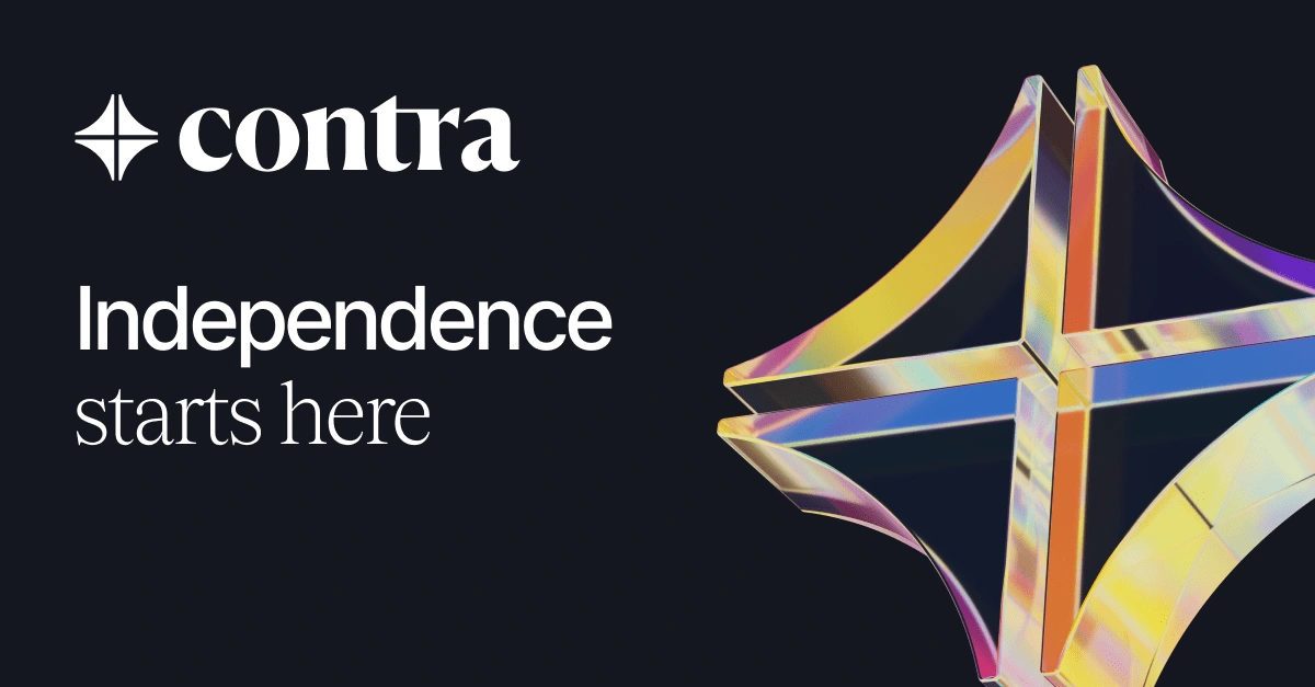
The Independent-first community & commission-free hiring platform shaping the future of work ✨


🧭 Redefining how user navigates at Addelink - IA Revamp
SAAS Landing Page Design - VAYUZ Technologies
Apple Music app - Figma
⏳ A Compilation of all my designs I obsess over