🧭 Redefining how user navigates at Addelink - IA Revamp


Redefined the website's Information Architecture(IA) and Designed a navigation interface for the same.
Overview 🌎
The ERP software needed a revamp for the Information Architecture as the business was expanding and new modules were being added. The current design didn't support displaying all of those modules to the users effectively.
Problem Statement🧩
This is a problem statement
Revamp Information Architecture - How might we make it easier for users to find all the modules in the ERP software effectively and quickly?
Customization for End users- How might we make the ERP interface personalized to the customers being licensed to?
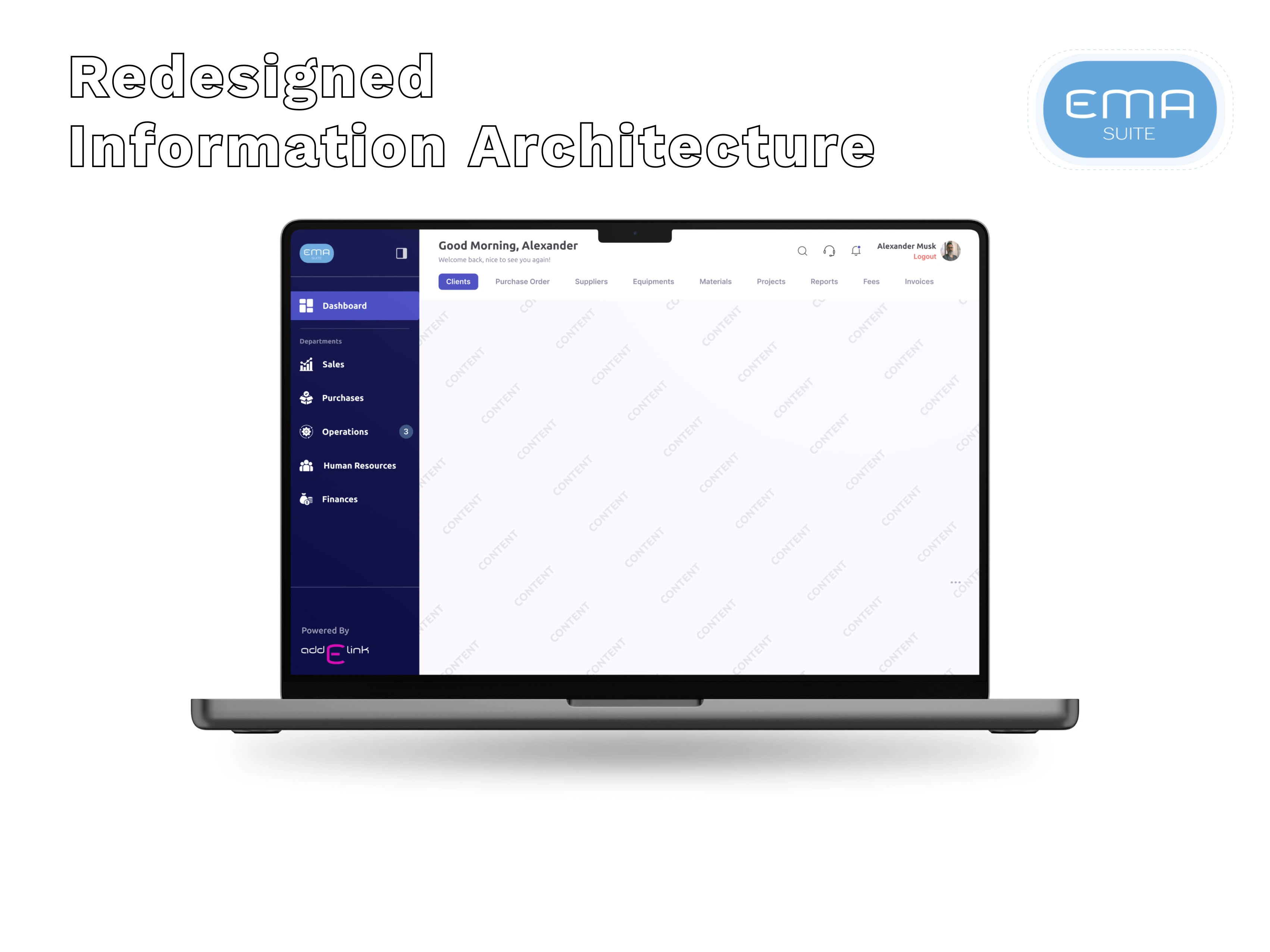
Solution #1 - Revamp Information Architecture🗺️
The first step to redefining the Information Architecture of the software was to categorize all the given modules around a central theme.
The central theme could be around:-
Department-wise - All the available modules be categorized under one major Department and then get listed under that.
Module-usage - Whichever module is most frequently used by users gets shown on the top
Alphabetical order - Modules be listed in alphabetical order.
Decision time
I decided to go with Department-wise as it made more sense than the other options for the given industry type. In the future, there's a good possibility of new modules being added. Adding those under the Department's section can be easily scalable.
Solution #2 - Customization for End users🖌️
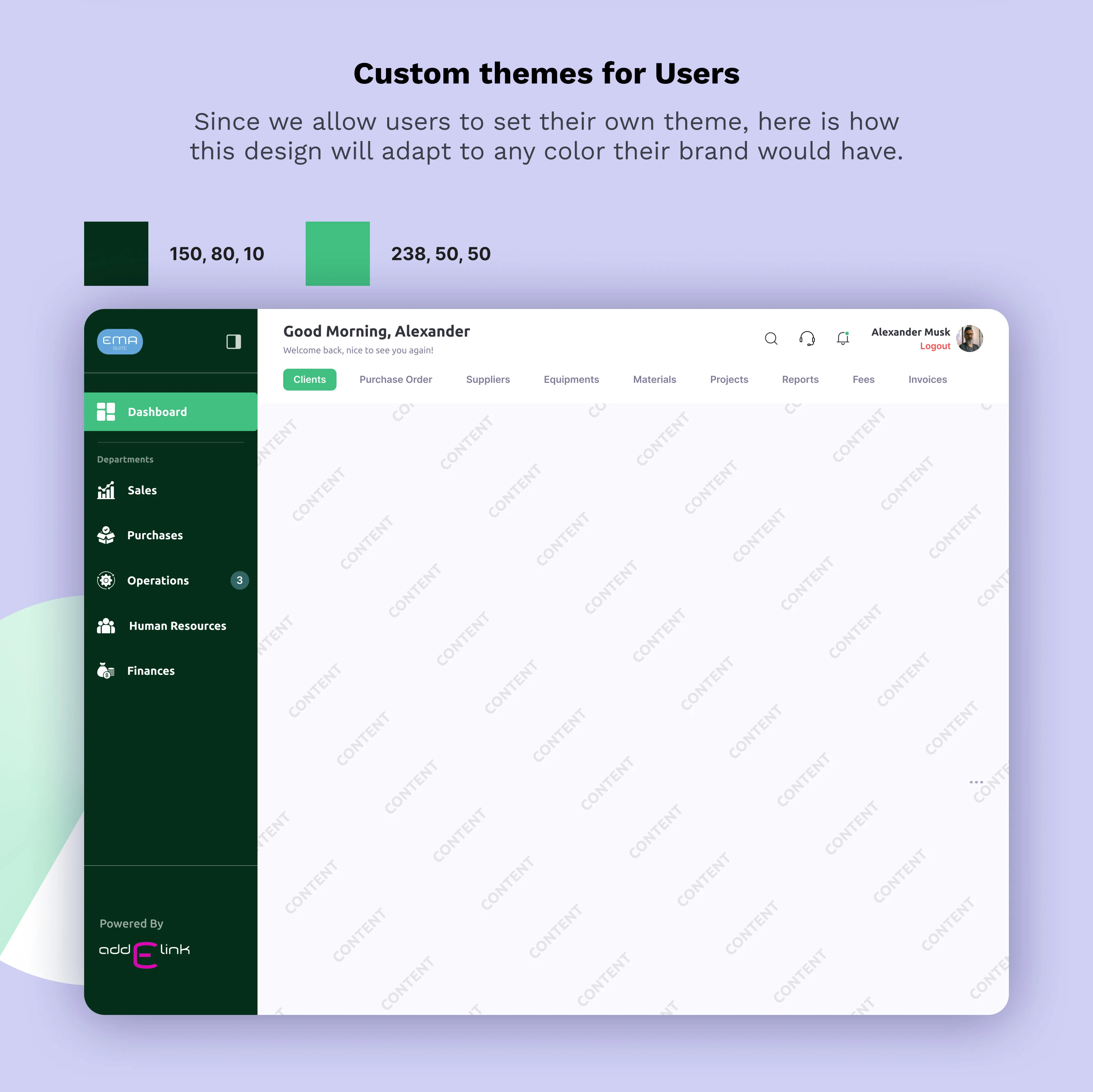
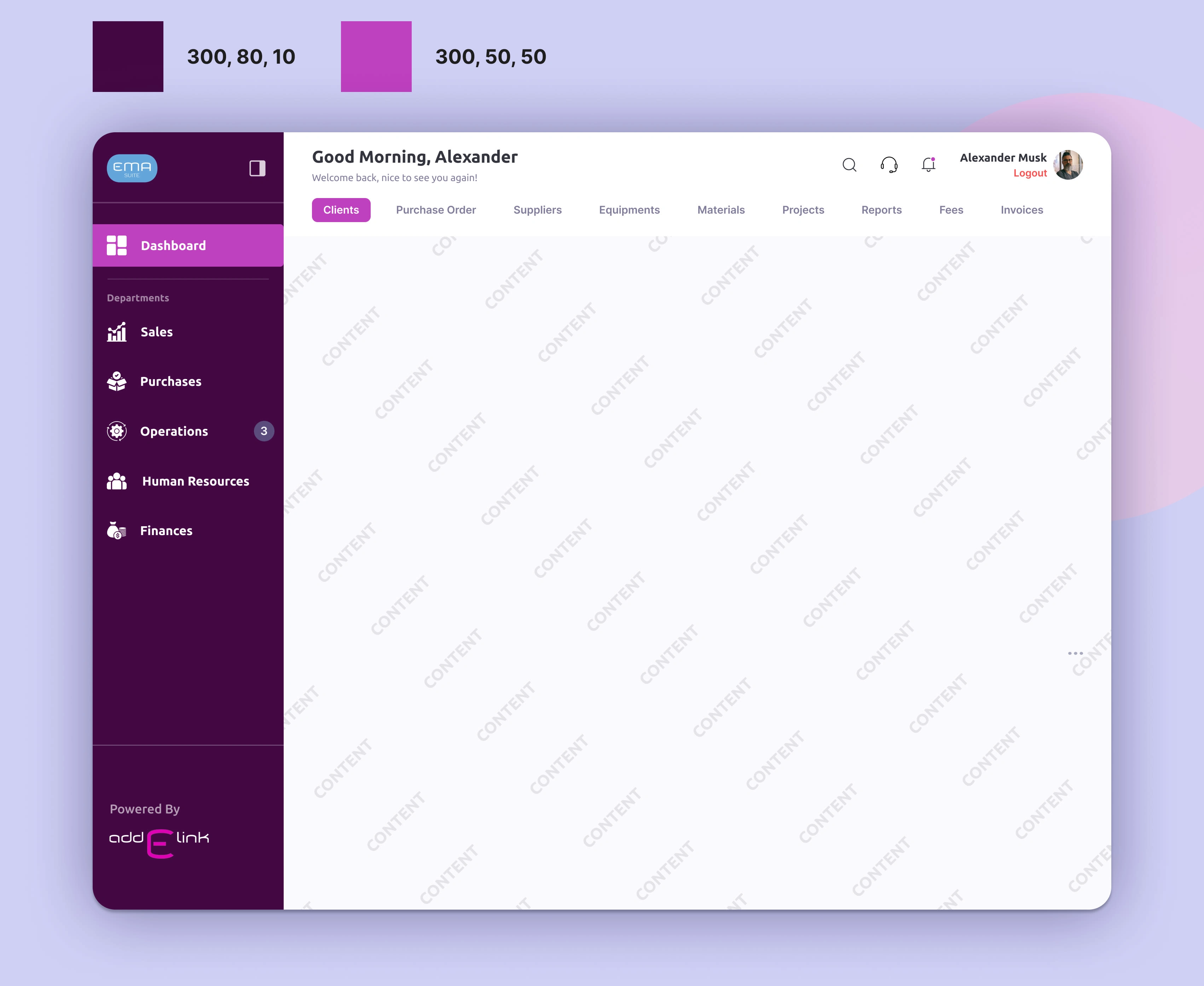
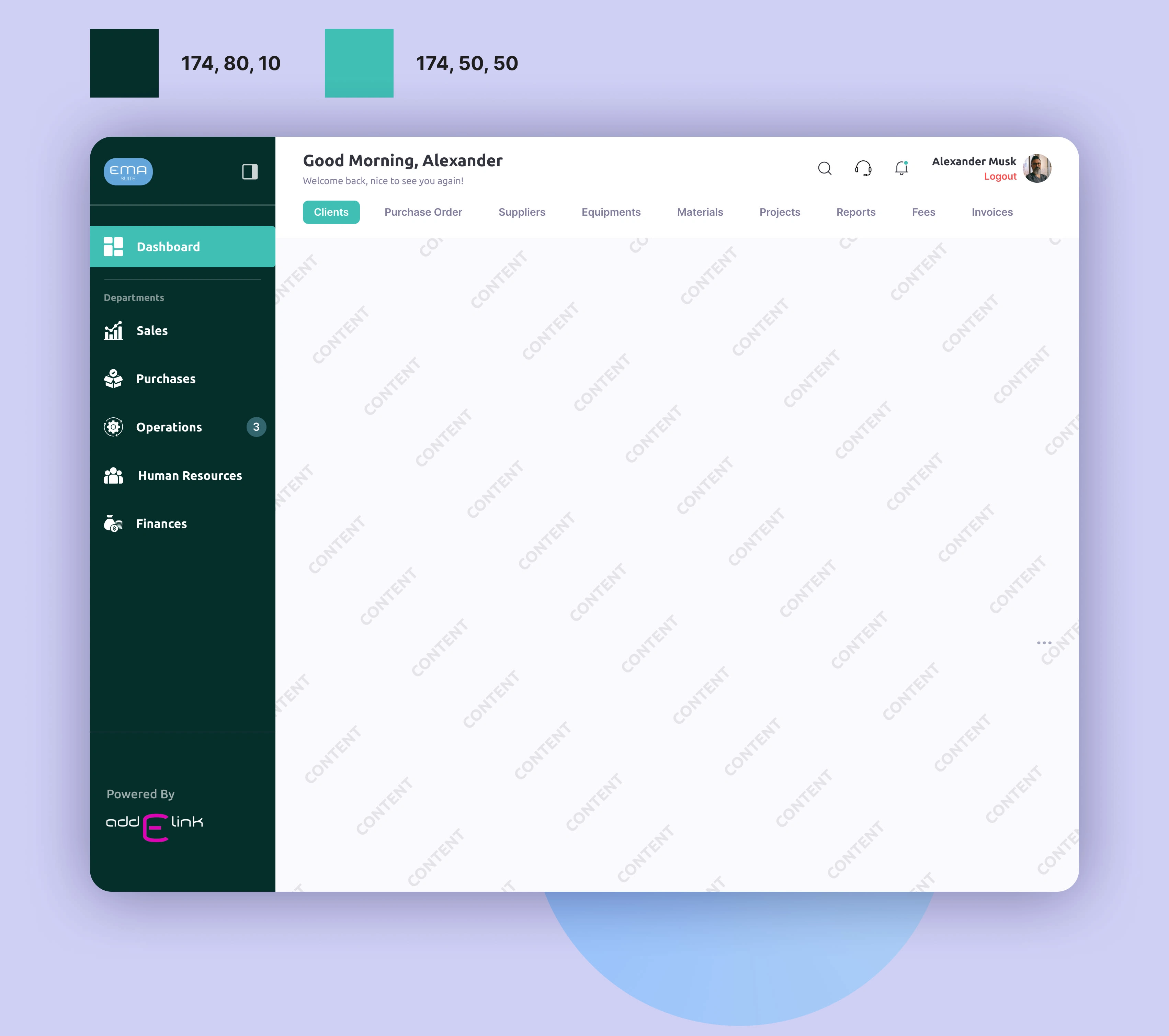
Since the end ERP product has to be sold to the businesses, we wanted to allow them to personalize the UI of the software as per their brands. Allowing them to feel more at home and familiar with our software.
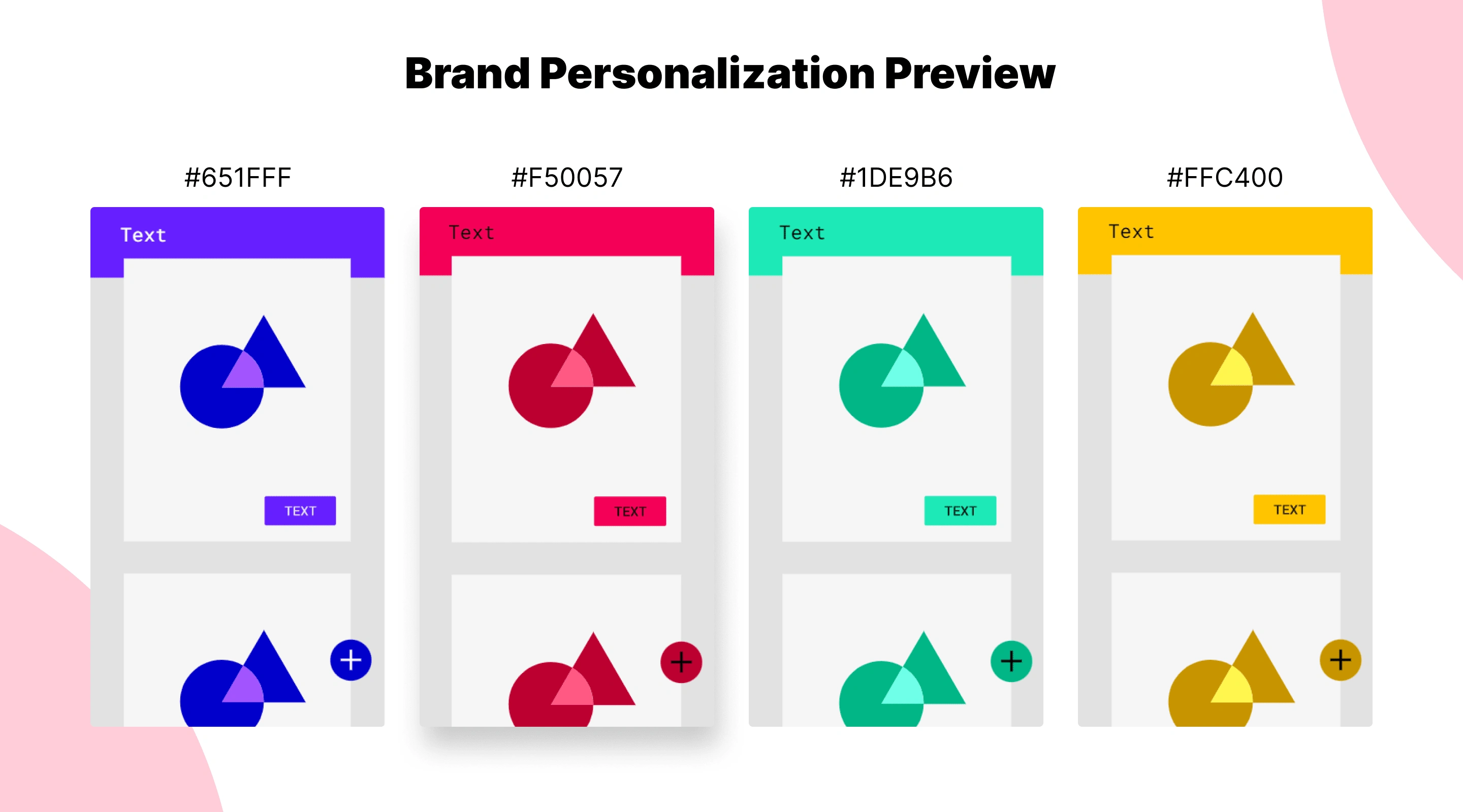
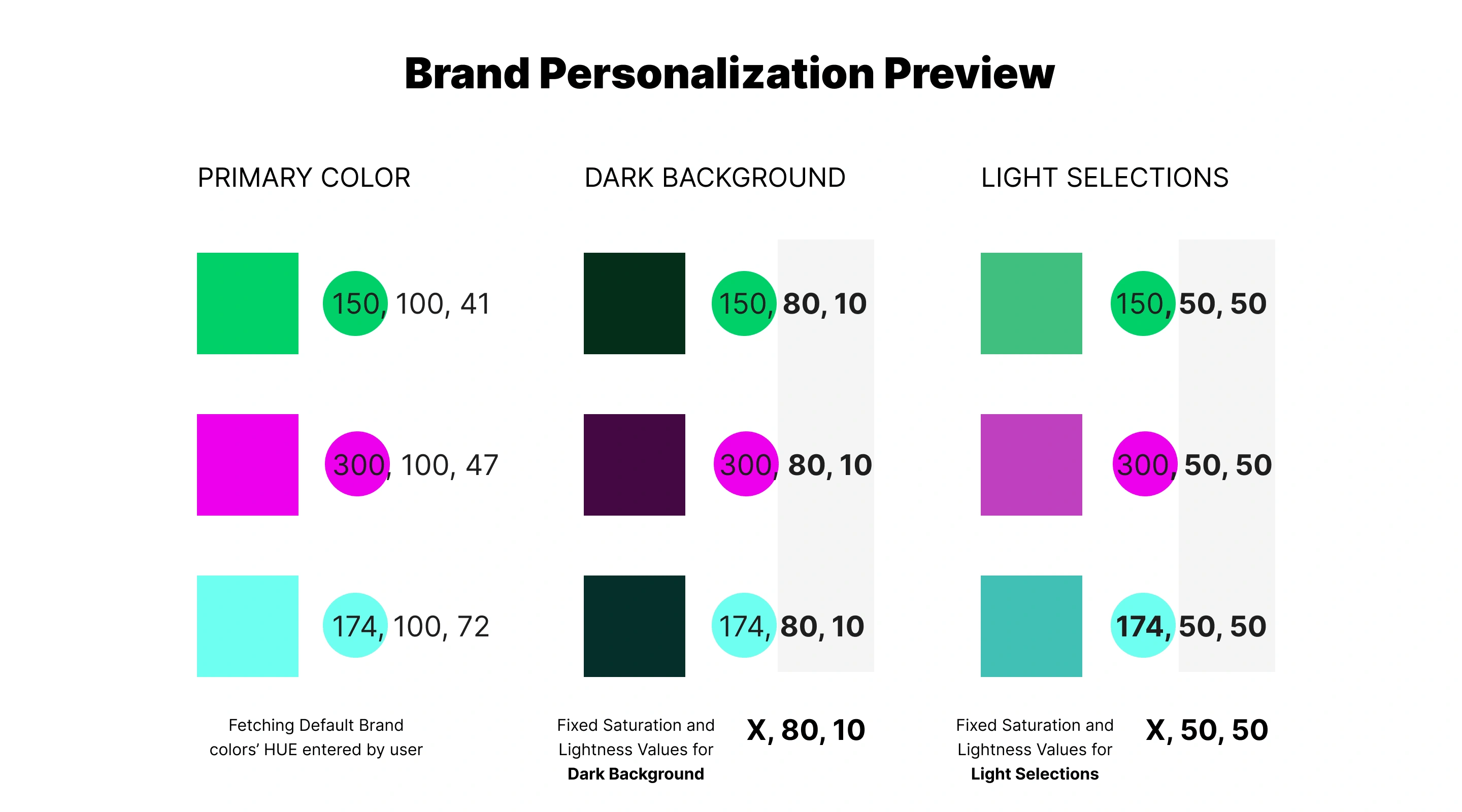
HSL color format as the solution
But the question remains the same. How do we make it so that system can automatically generate a color palette from the given Primary color of a Brand? A palette that is versatile and easy to adapt throughout the interface.
After some research, I remembered about other color formats that are available apart from HEX codes. There are multiple ways color can be identified by a system. It can be HEX code, an HSL parameter, an HSB parameter, RGB values, and CSS values.
And for our use case HSL parameter made the most sense. A priamry Hue(color) can be entered by the user and by changing the Saturation and Lightness values, the system can easily come up with a palette that is versatile throughout the UI.

Coming up with Default Saturation and Lightness Values
Now was the hard part. I had to test multiple times to come up with a combination of Saturation and Lightness values that could easily adapt to any user interface.
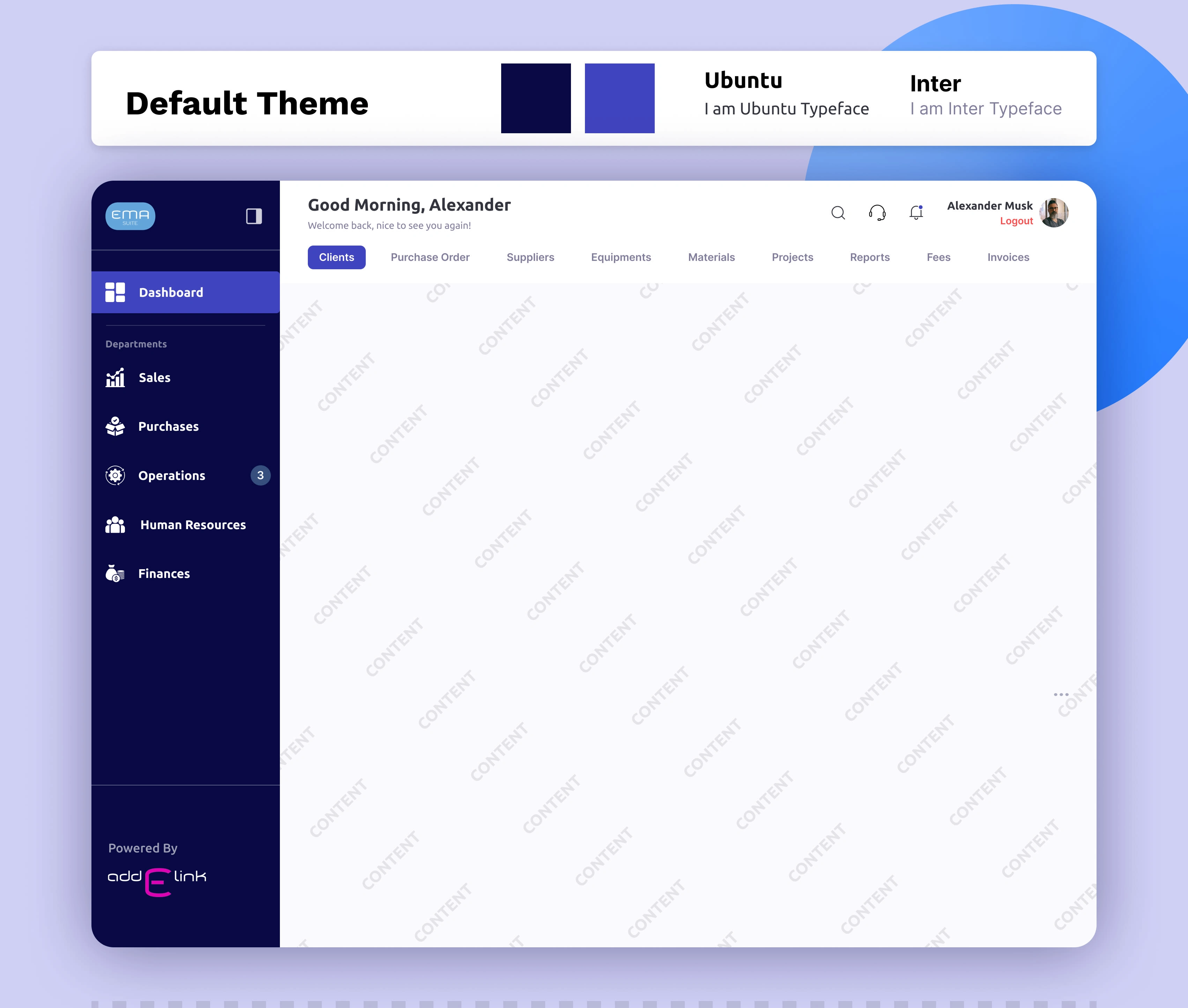
Final Solution - High Fidelity Design🎨
Conclusion/ Learning 📑
It was an all-new experience for me to solve a problem where the UI has to be customizable as per Individual Brand. This was very challenging as any Brand could have any color as its primary hue and getting a color palette out of it would be very difficult, especially for the Development part.
I did some mistakes finalizing the Information Architecture process could have been more quick and effective but it was learning after all. And an amazing project for sure.
Like this project
1
Posted May 7, 2024
Redefined the website's Information Architecture(IA) and Designed a navigation interface for the same.
Likes
1
Views
221


SAAS Landing Page Design - VAYUZ Technologies
Apple Music app - Figma

⏳ A Compilation of all my designs I obsess over
💨 Optimizing UX flow for India's first Property rental app