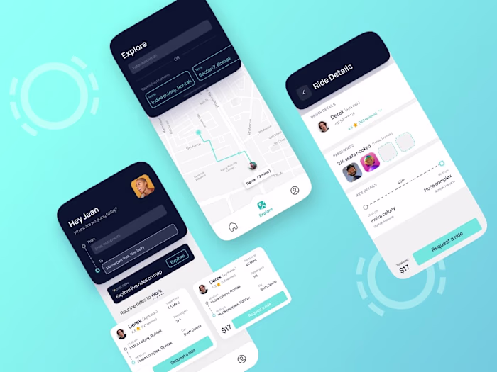
💨 Optimizing UX flow for India's first Property rental app
Ajay Pawriya
UX optimization Flow - Colive App
Colive is India's first rental solution for property owners, which includes a powerful property & inventory management suite, a single dashboard to manage tenants, payments, eKYC & much more.
Problem Statement
The information architecture of the app is very poor as the required information is not where an average user would look for. On top of that, the information architecture is very skewed towards one end.
Constraints
For this project, I am only taking Information architecture revamp as my task. Visual revamp is not in the scope of this project.
Existing Architecture
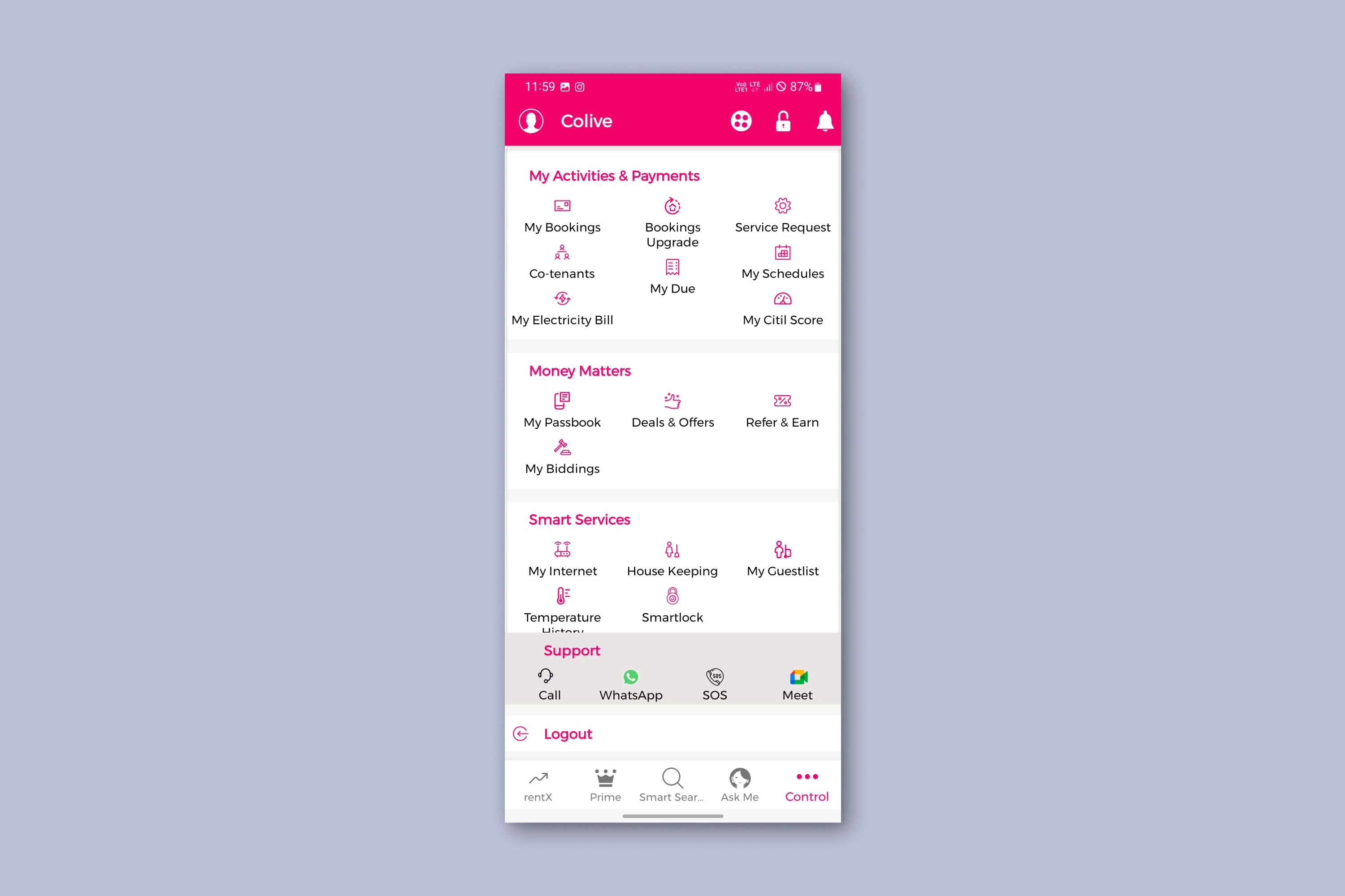
As obviously visible from the below graphic, most of the commonly used features are put in a single tab only, i.e. Control.
Furthermore, there is again a deep root going in the Service Request flow.
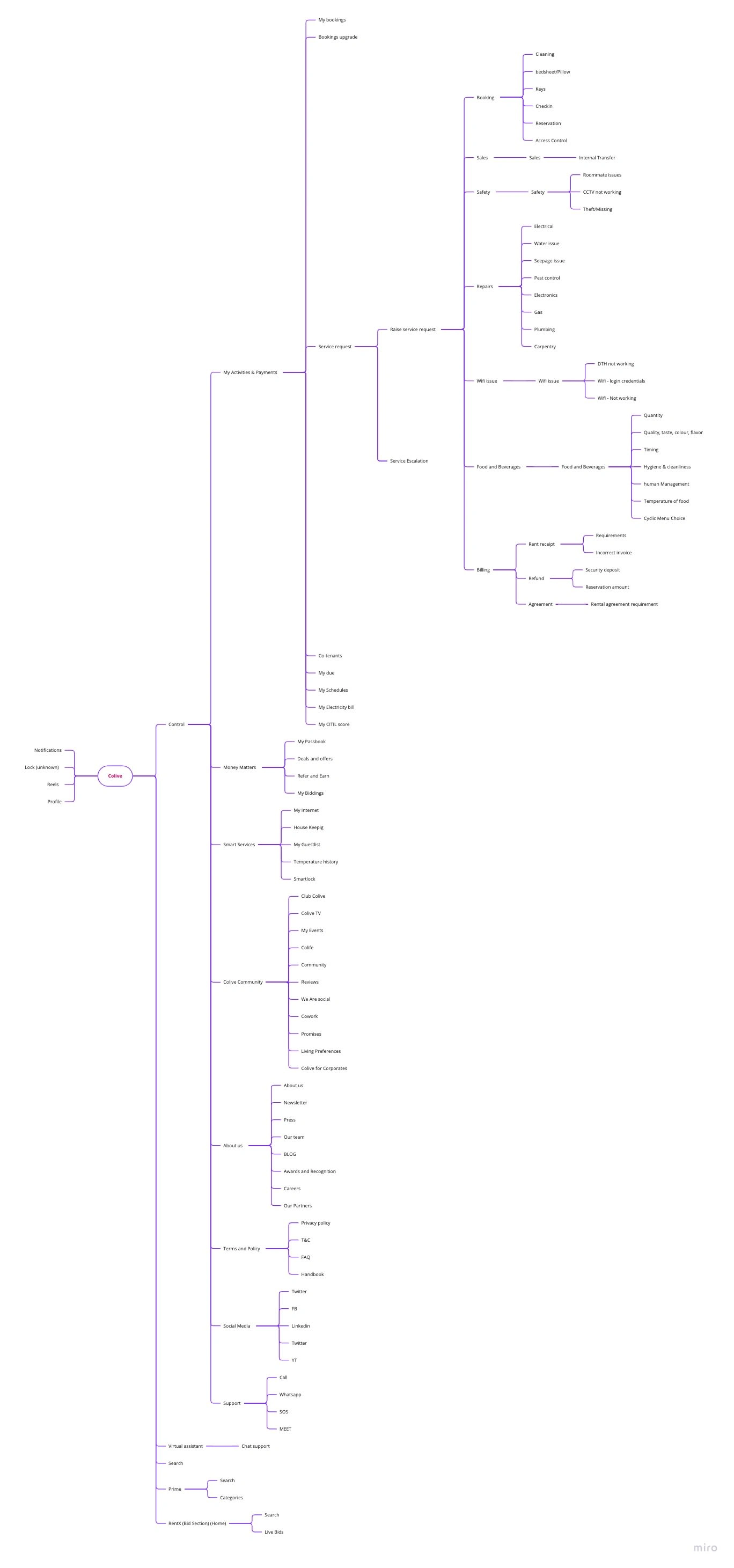
Miro Board link : https://miro.com/app/board/uXjVP_99_vM=/?share_link_id=555108883458
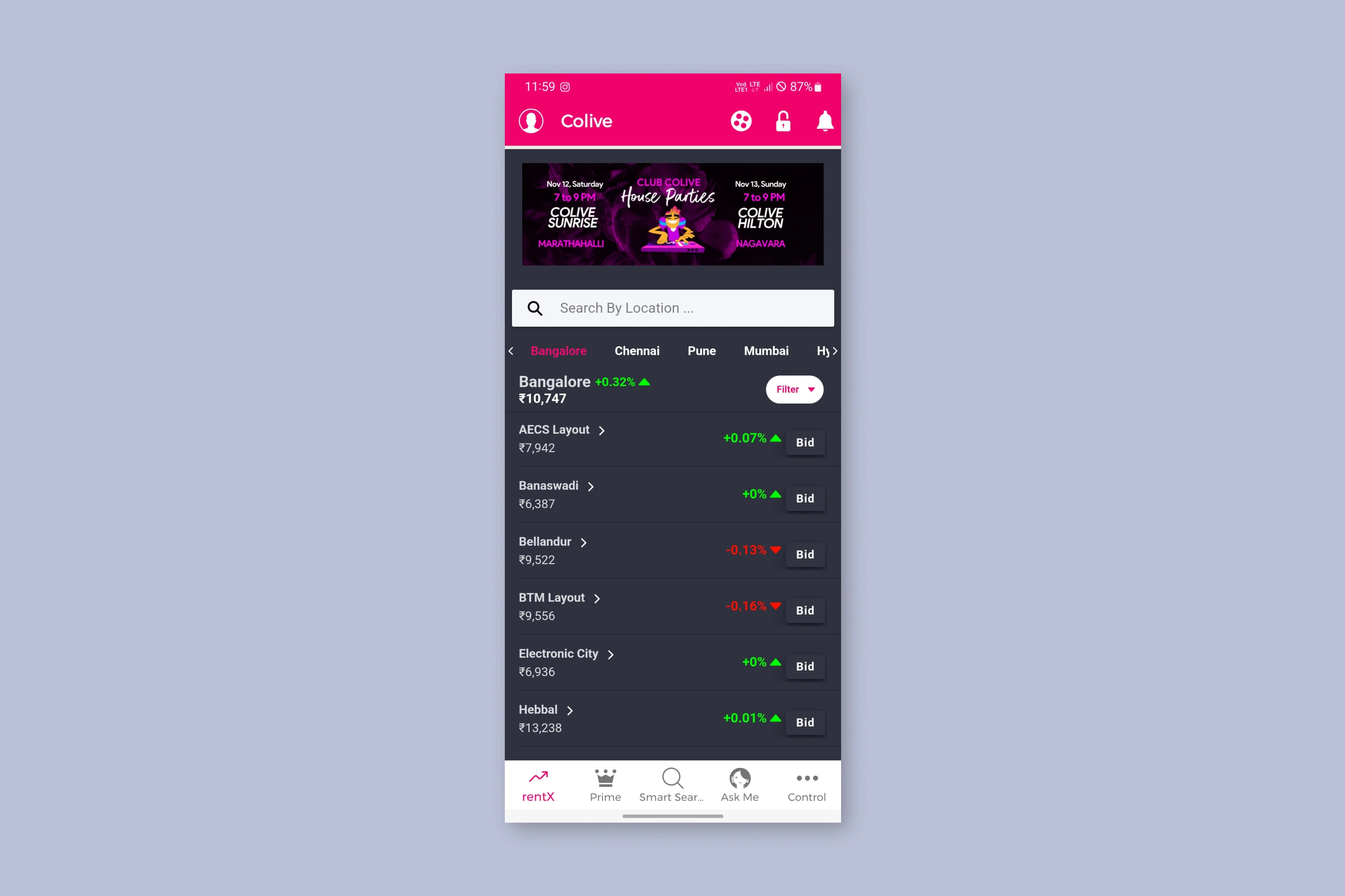
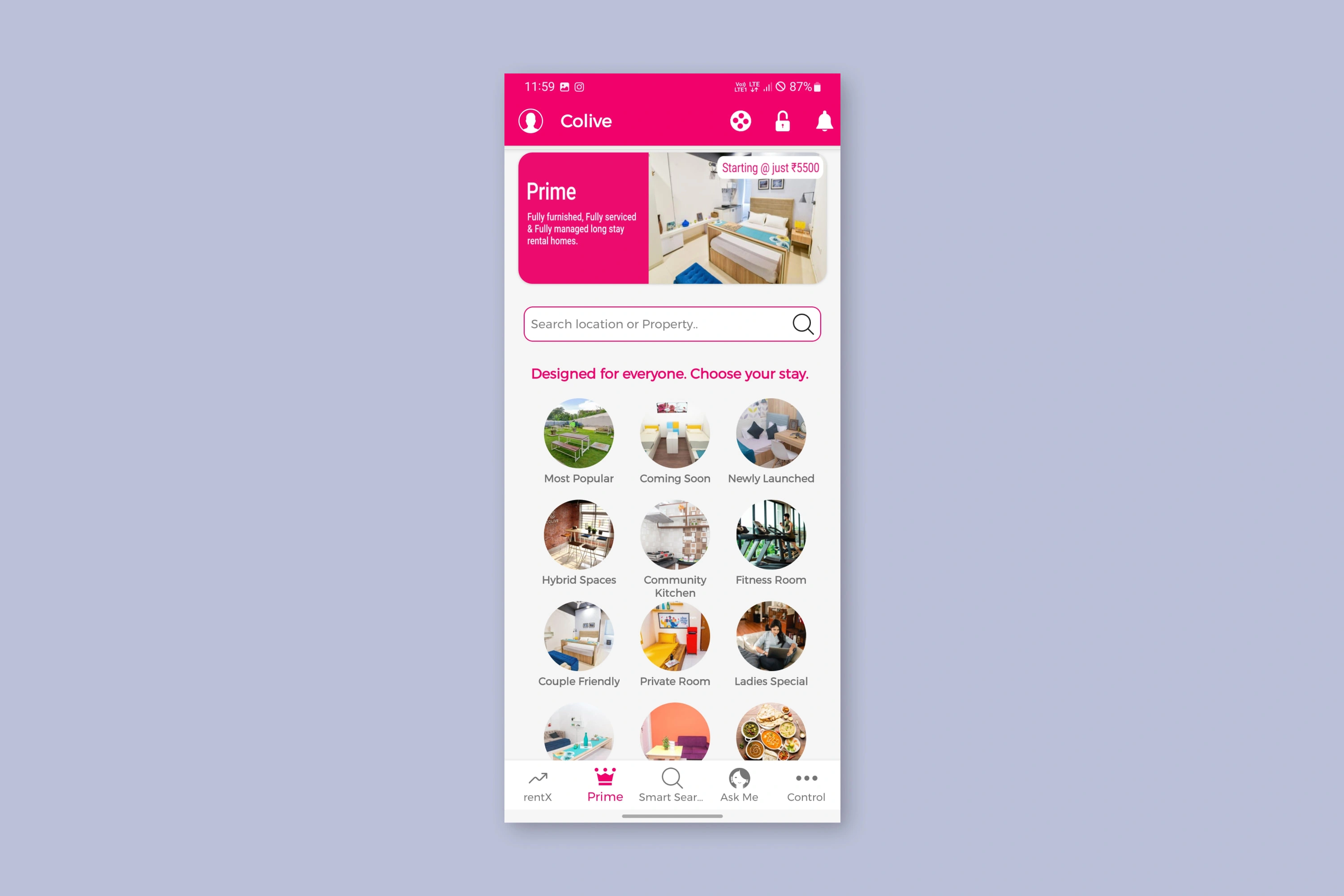
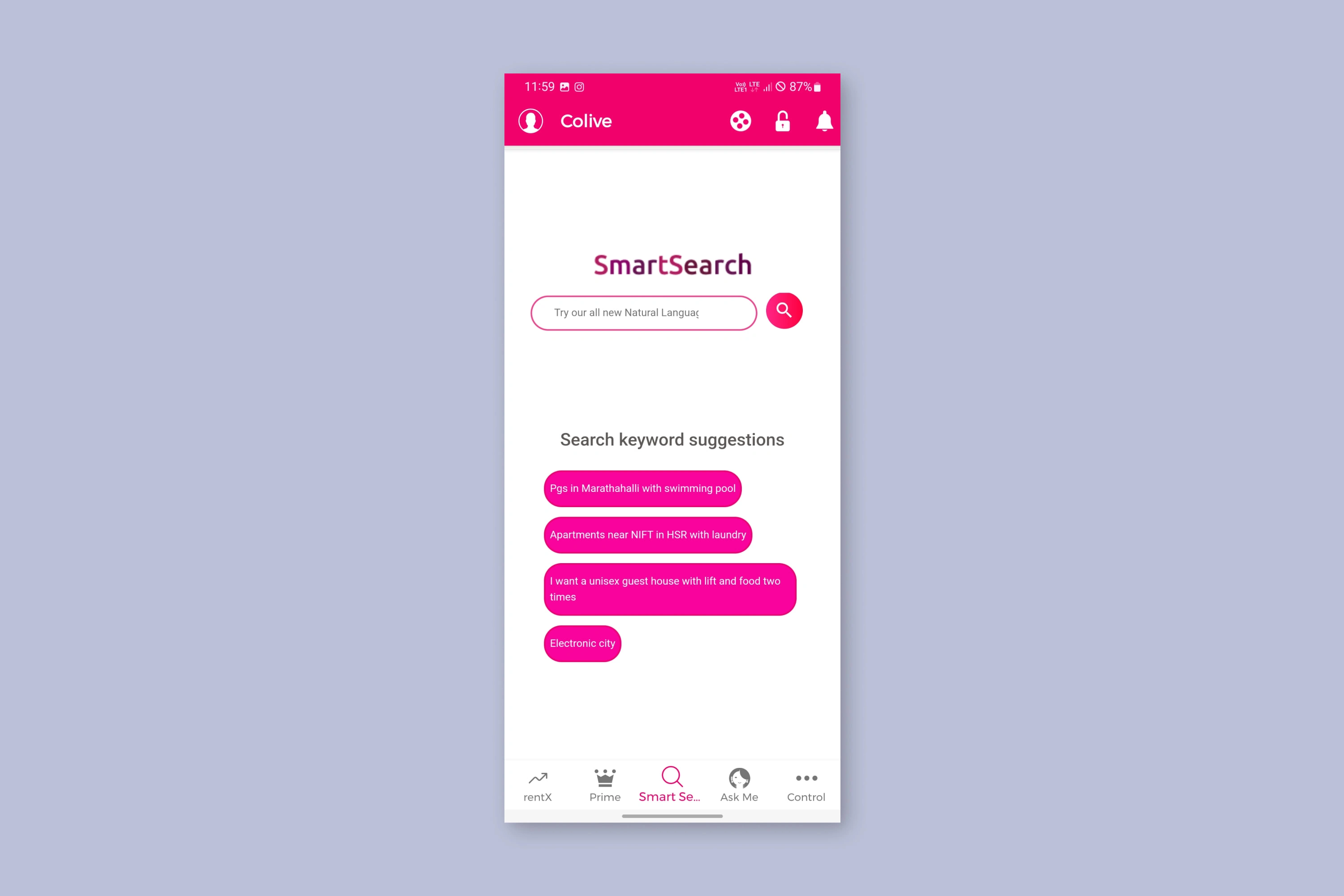
Current App Design
RentX (Home)
Prime
Smart Search
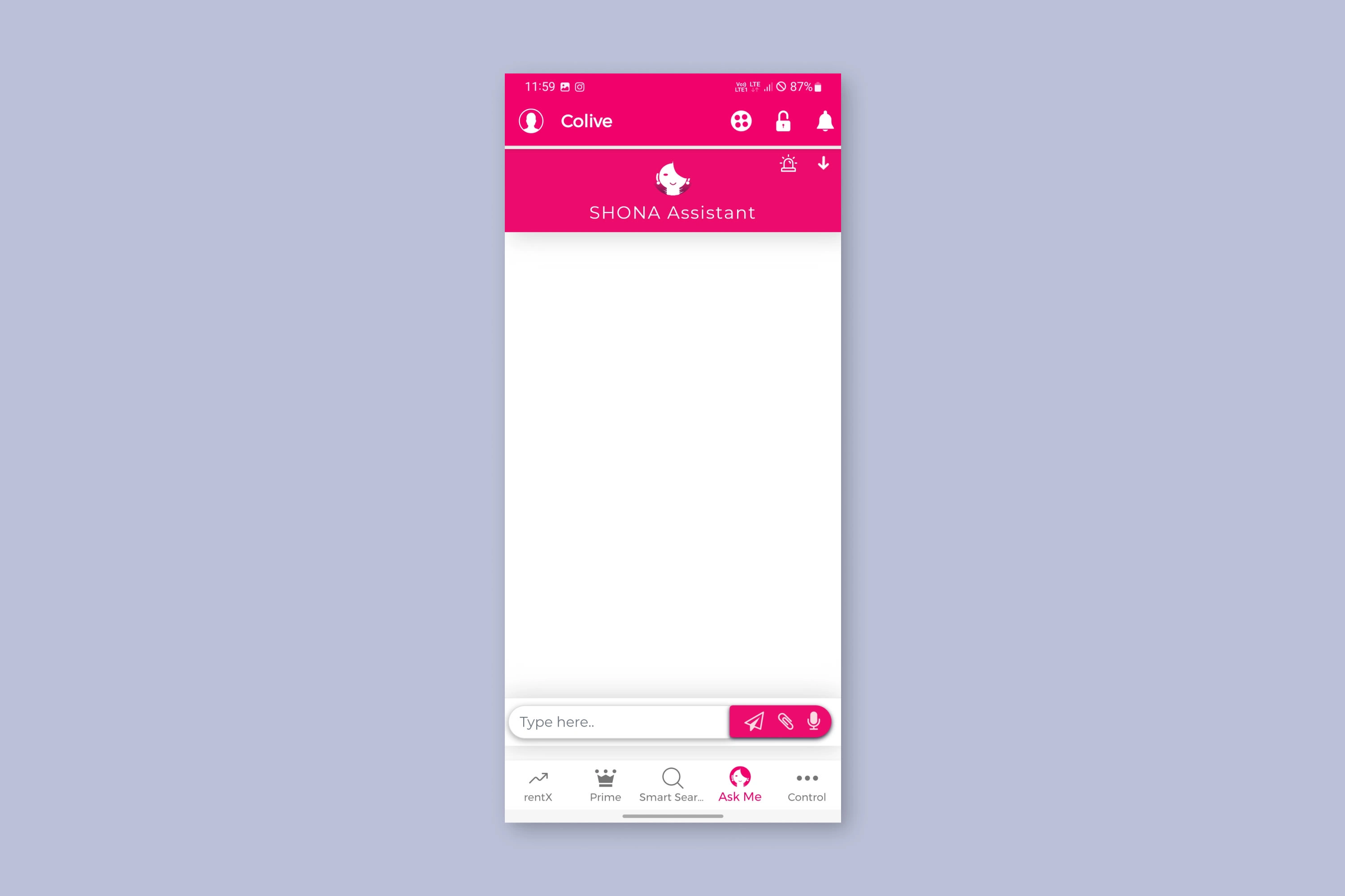
Ask Shona (Virtual support)
Control
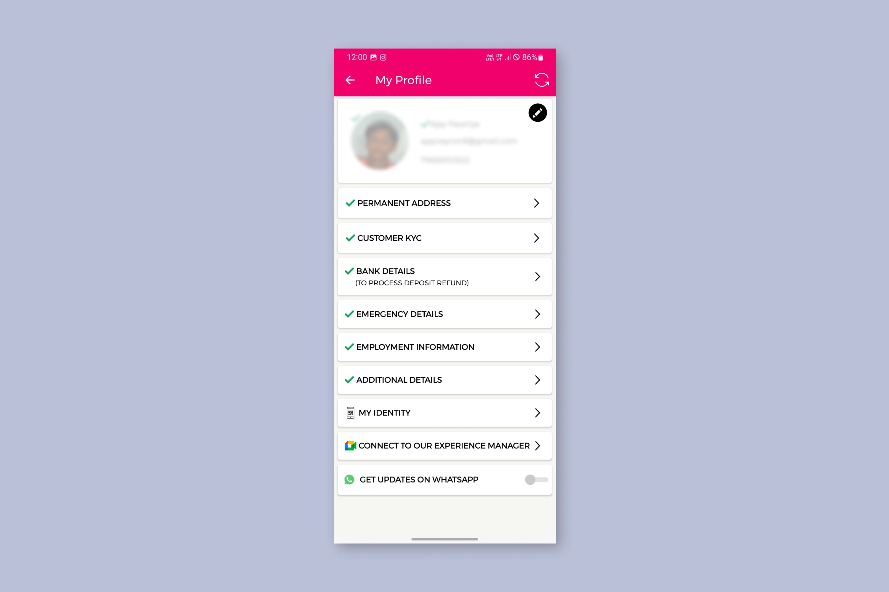
Profile
Observation
Among all the problems that I found in the product, here are few of them that I will be fixing in this case study.
Unnecessary Allocation of Bottom tabs space
Reorganizing Items in the architecture
Removing unecessary/non-working features
Bottom Tabs
At the moment, the app currently hosts 5 bottom tabs. Which are RentX(Home), Prime, Smart Search, Ask me, Control.
Being a Rental property search app, it is expected of the app to have Search bar and listings directly on the Homepage itself.
Hence, no need to have a separate Smart Search tab and Prime tab.
Reorganizing Items in Architecture
From the existing Information Architecture, it is quite clear that a good number of items are placed in categories they don't belong in.
For example: My dues and my Electricity Bill in My Activities and Payments. Whereas it makes more sense in Money Matters and Smart Services respectively.
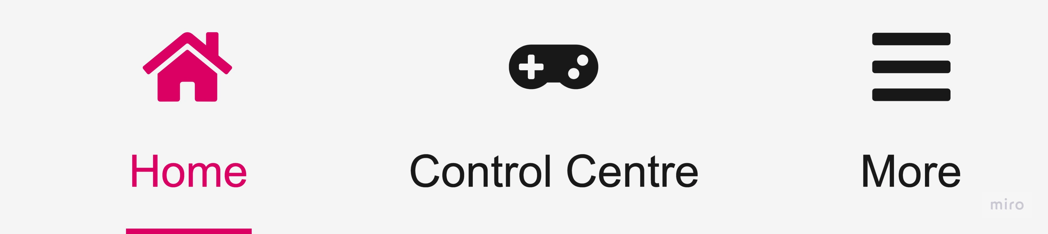
New Information Architecture
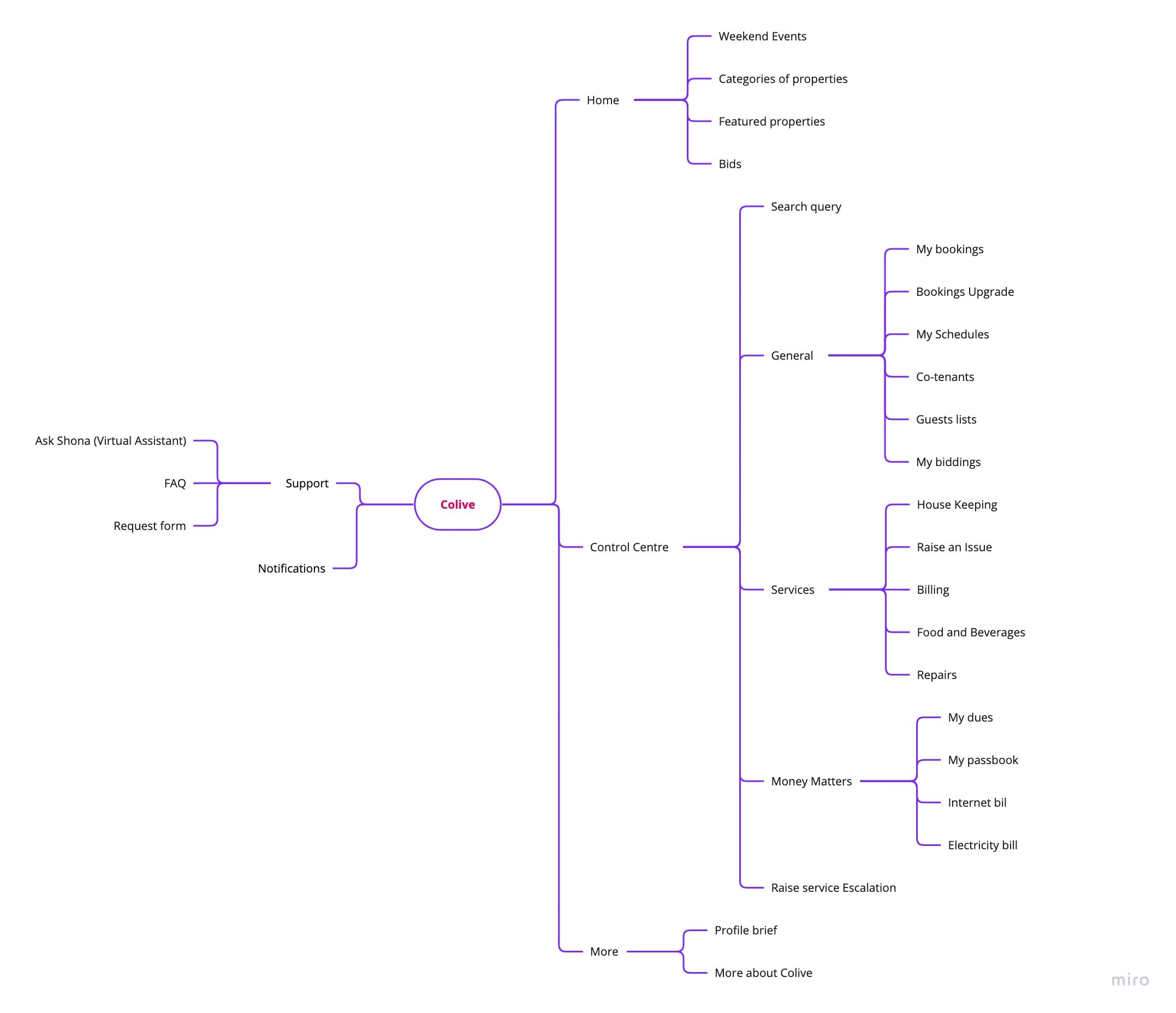
Very Straight and simple. Three tabs on the bottom that caters to Tenants and the owners both in a simple manner.
Removing unnecessary/non-working Features
I decided to remove/hide the features that were either not working or not making sense in the app.
Non-working features:
Lock icon
Smart lock
Temperature History
Google meet call
Unnecessary features:
Reels: Makes more sense to be on the Social media pages.
Colive Community: Better suited for Website about us page and Social media pages.
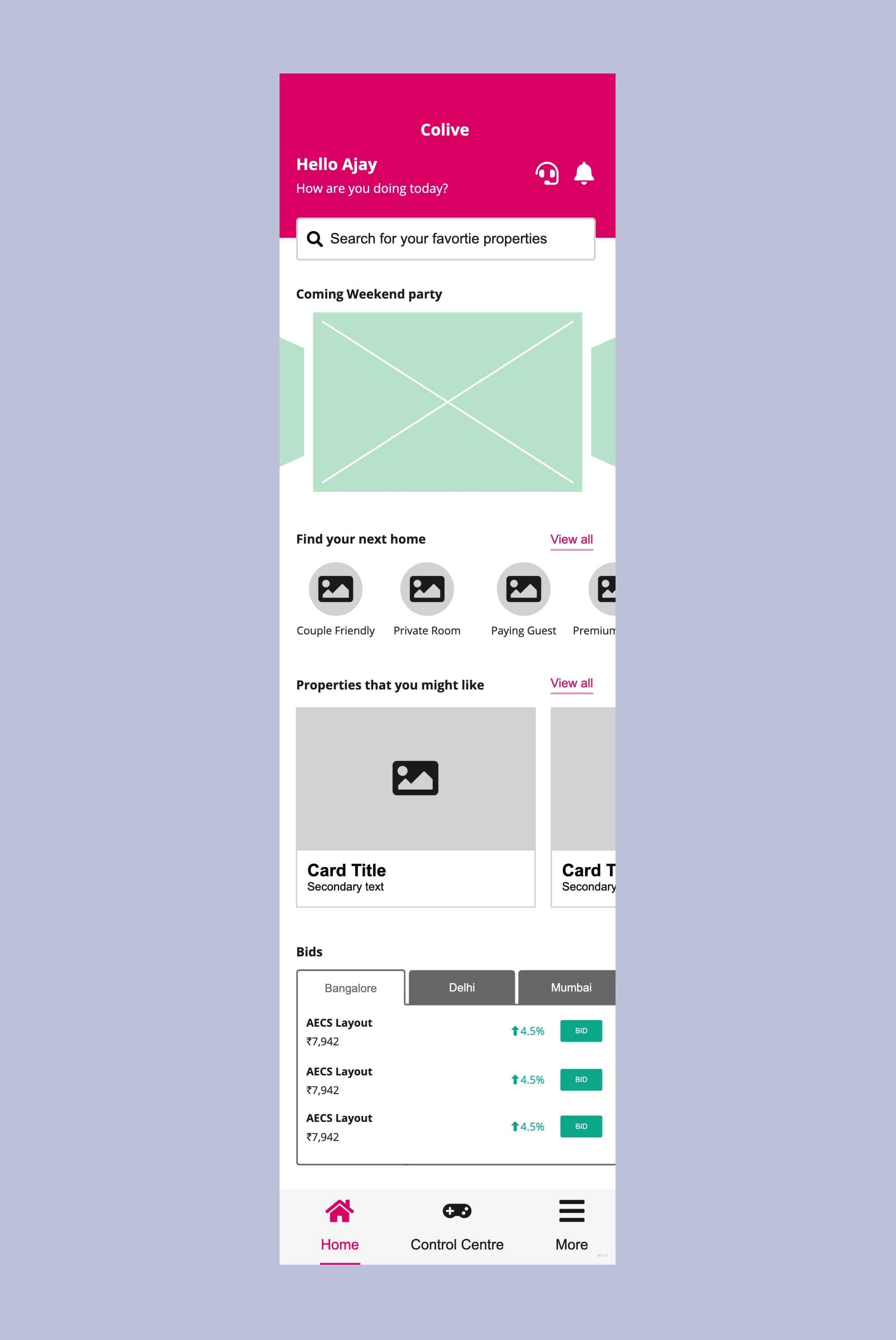
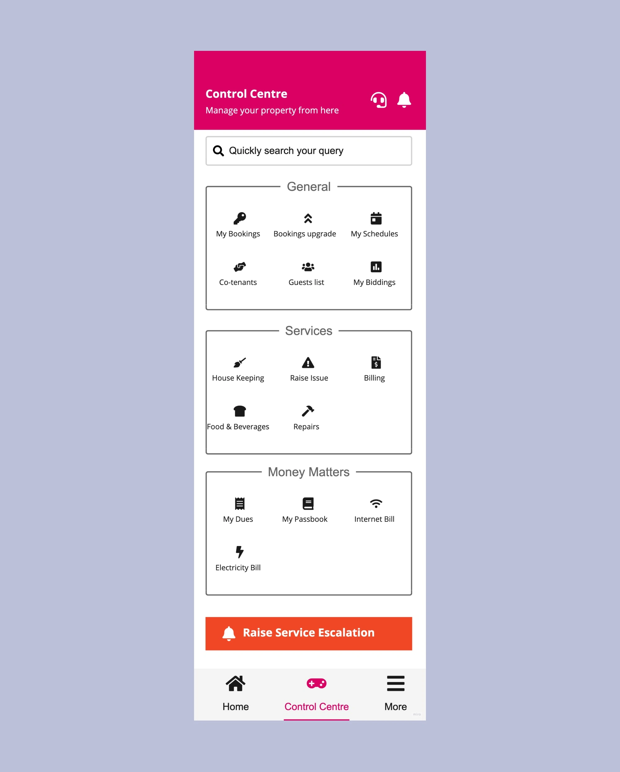
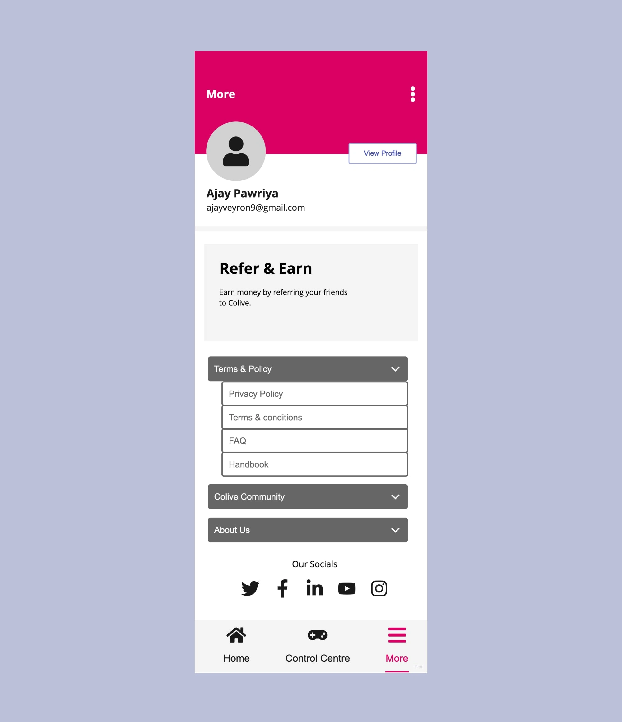
Final Wireframes
Homepage
Control Center
More
Conclusions
Since, I am super user of Colive app, I get to face these issues every now and then. All this made me take this as a project and define a solution for this.
In future, I might even do a Visual revamp as well of the app.
Thanks for your time.
Like this project
Posted May 7, 2024
Colive is India's first rental solution for property owners, which includes a powerful property & inventory management suite, a single dashboard to manage tenan
Likes
0
Views
301