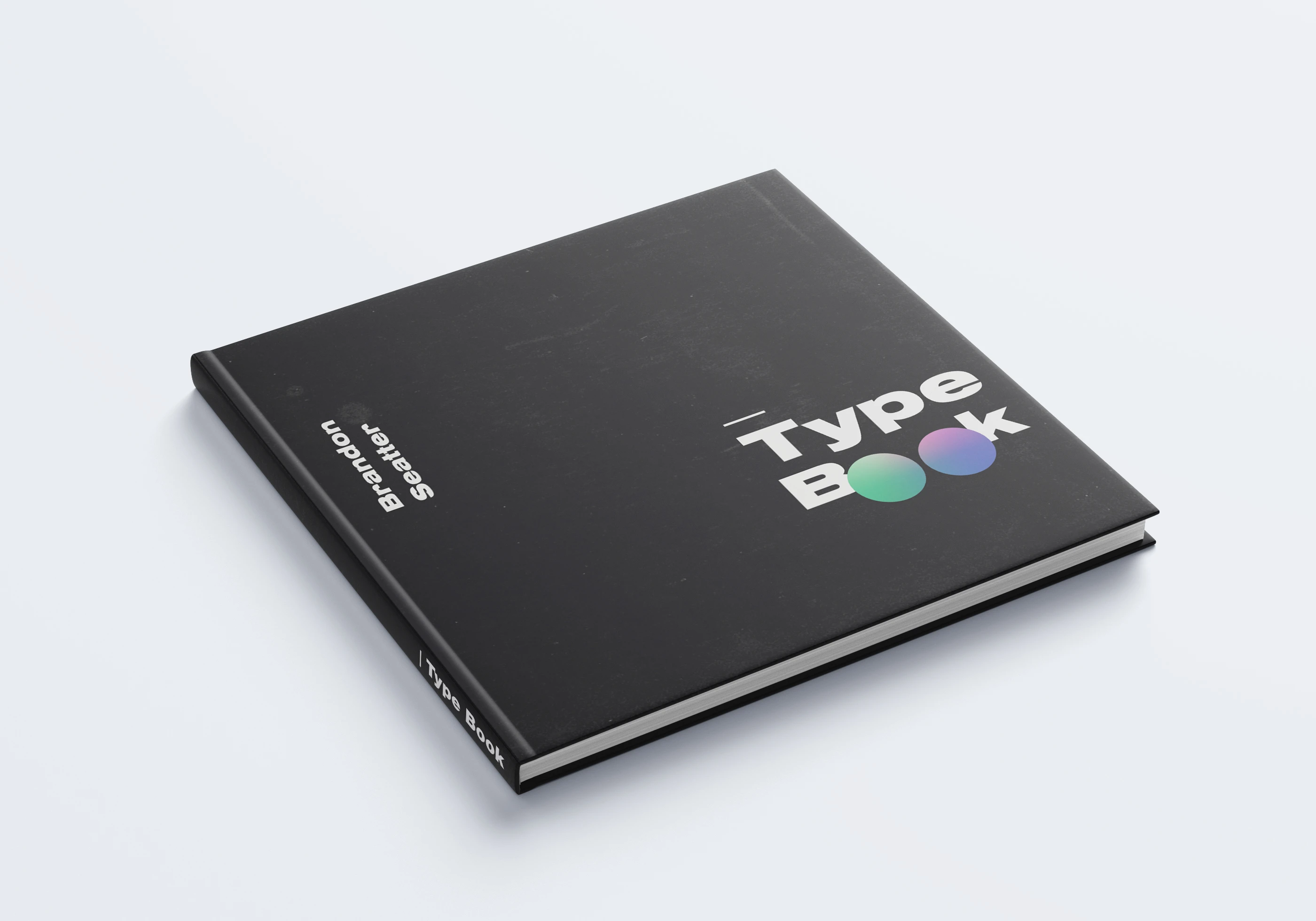
A Guide to Type
Brandon Seatter
This project was a practice in the utilization of typographic principles and a way to demonstrate my editorial abilities. 🤓
The Book touches on:
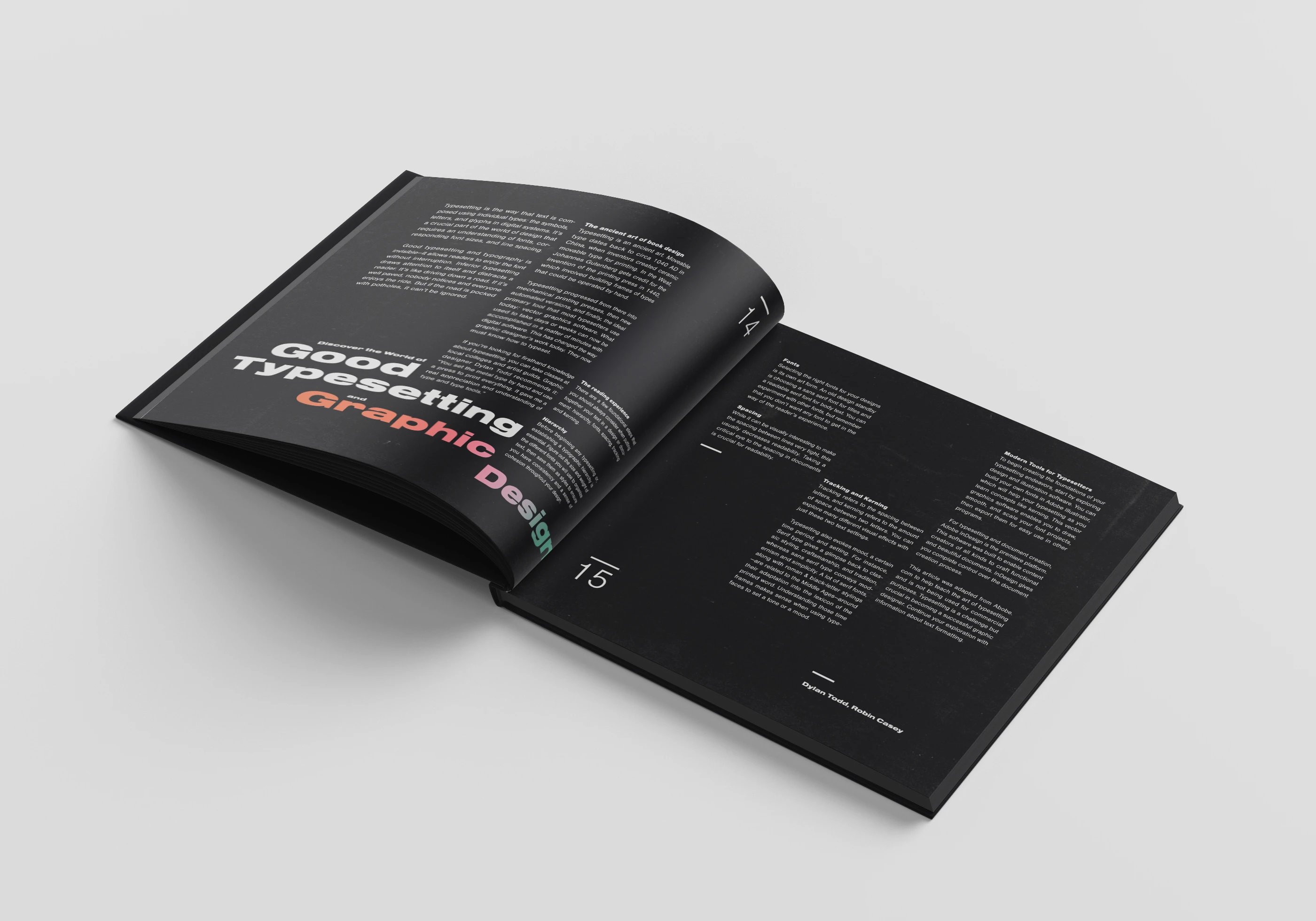
A guide to good typesetting in Design ✅
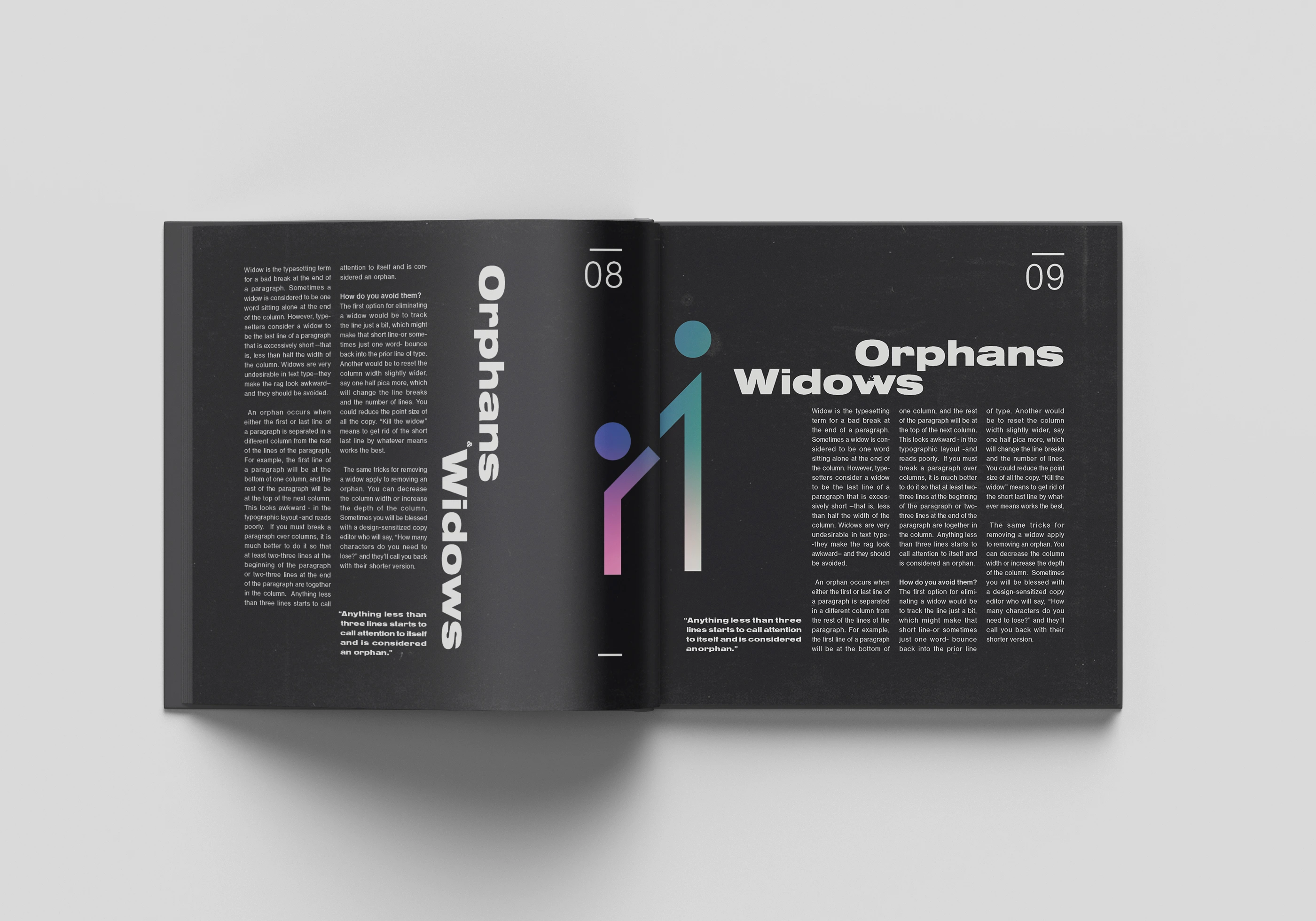
Orphans and Widows ✅
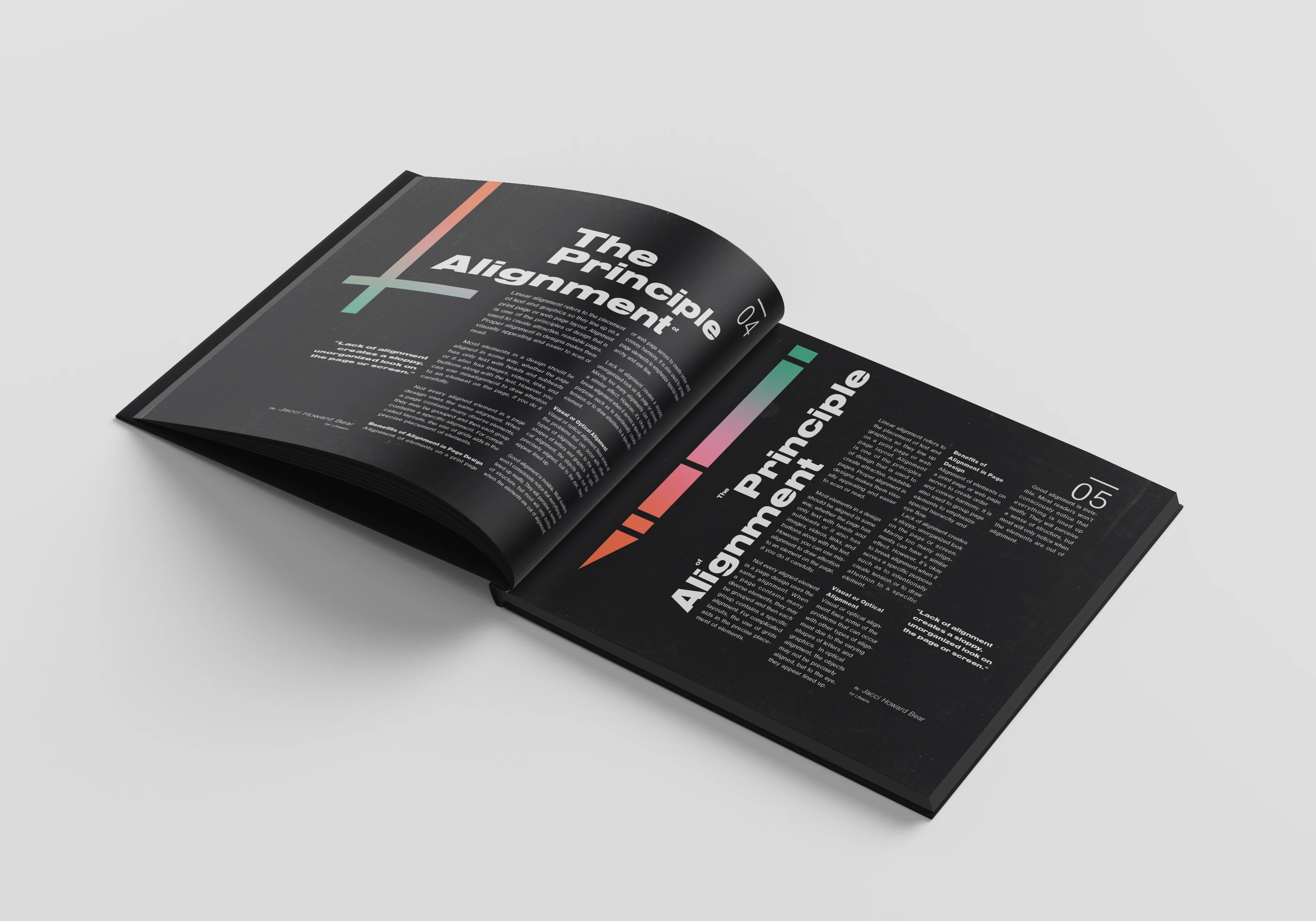
The Principle of Alignment ✅
I found this an opportunity to explore my interest in Swiss Typographic Design, and adapt it/make it my own 💪
😌
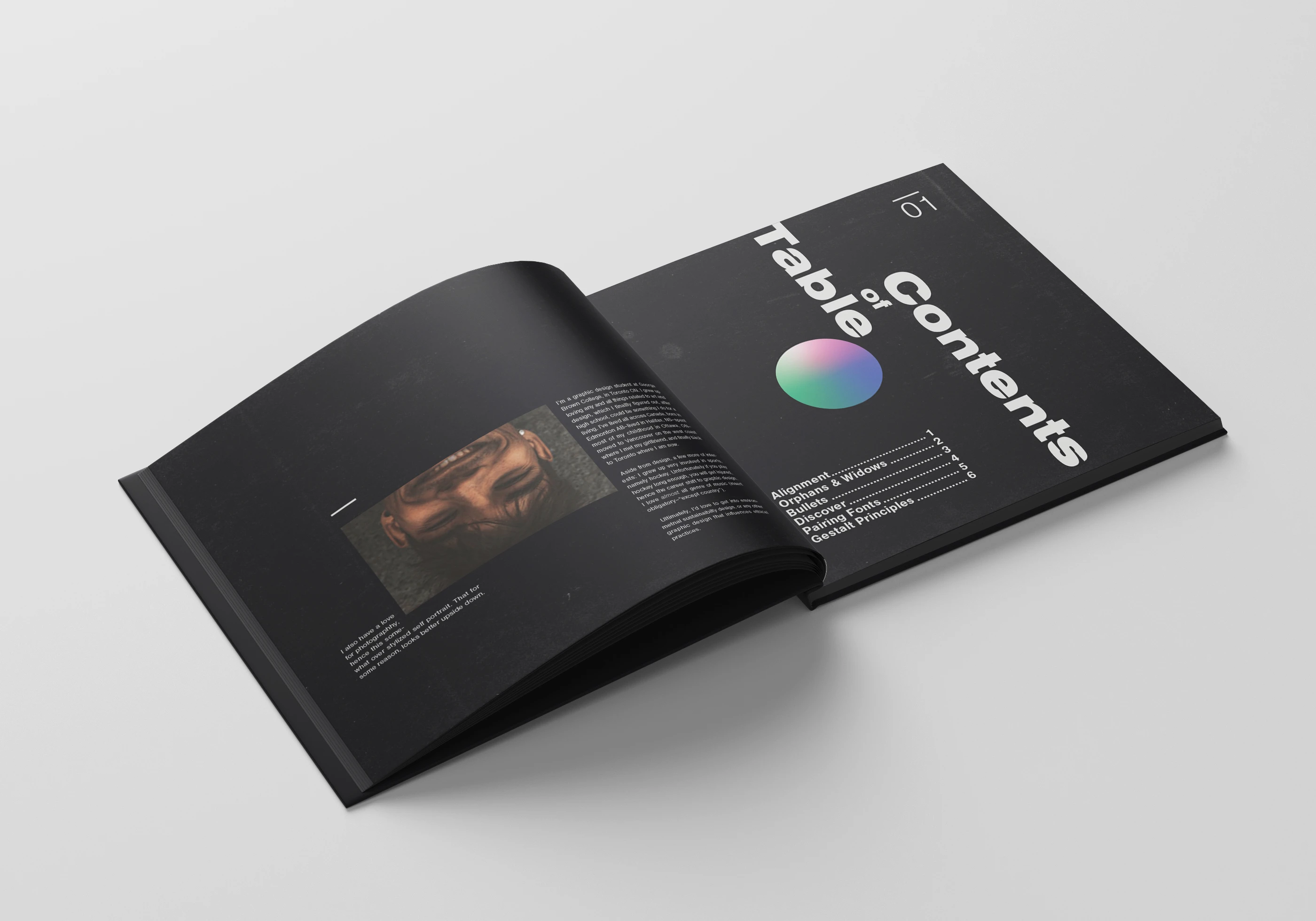
The reversed colour palette (white on black) is rarely used, especially in print, because it can be challenging on the reader’s eye. Pure white text prints as negative space as which can lead to the surround black ink to bleed into the letters and make the text appear thinner. To counteract this, the text is ever so slightly a light grey, which tells the printer to fill the area with ink. 🤓
⚫️⚪️
I wanted to have fun 🎉 with the layout, uniform evenly spaced columns can be useful at certain times, but can also get monotonous and boring. So I chose to stagger and vary the text column placement and size while still following a consistent flow 🌊, so the reader can follow.
⚫️⚪️
👉 If you like what you see, let's work together! Don't be shy, get in touch here
Like this project
Posted Apr 22, 2021
Likes
0
Views
43
Clients
George Brown College