Case study: Nespresso — What more?!
Fig.1 - What more?!
Redesigning the iOS App
I love coffee.
Coffee is the thing takes makes me get out of bed by the morning, it is what makes me more focused and it’s the perfect conclusion to any breakfast, lunch, snack, dinner, or any other meal that I might not have mentioned.
I’ve been a Nespresso client for years now and while I can’t live without the coffee, unfortunately, I cannot say the same thing about Nespresso mobile app.
Who doesn’t remember their famous ads featuring George Clooney and with special guests like Jack Black, Matt Damon, Danny DeVito, and Andy Garcia? Their ads are funny, simple, and iconic. So why can’t the app provide me with an amusing experience, consistent with the Nespresso brand?
iOS App
Research
So I’ve started by researching other mobile application that allows me to make an order and receive it at home. Due to the category of Nespresso app, apps like Amazon, Nike, and Uber Eats were my main reference.
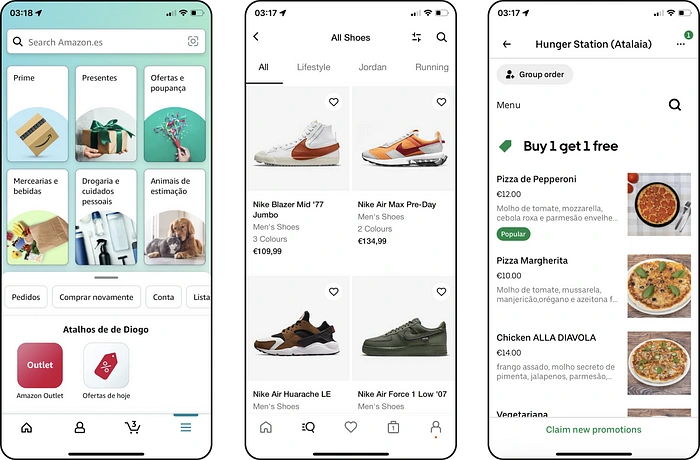
Fig.2 - Amazon, Nike, and Uber Eats iOS Apps
These references highlighted one of the biggest problems Nespresso mobile app has: a lack of visual experience. When compared to the previous examples, Nespresso has an old-fashion interface — it lacks dynamic and amusement, which makes my experience boring.
By conducting a heuristic evaluation on the app, I was able to connect the previous topic that we talked about and correlate it with this first issue:
Aesthetic and minimalist design: There’s a huge amount of content that stops the white space from breathing. Even the content that has some white space gives the impression that could still give more space and manage the area more freely.

Fig.3 - An example of lack of white space
The look and feel that I’ve found on the app raises some questions: In some screens, we have buttons that have bold labels, but we can also find screens that show buttons with regular labels. We can see lists of coffee that change drastically from one screen to the other. Due to these situations, I found the second issue:
Consistency and standards: Consistency is something that was not taken into consideration by Nespresso. We are able to find a lot of inconsistencies in things like buttons, lists, labels, etc. Once again, we can also make the comparison between the Nespresso brand, with George Clooney, Jack Black, etc., and Nespresso mobile app.
In general, there’s not a lot of margins to make mistakes, but unfortunately, I did manage to make a mistake. I decided to make an order and buy a couple of coffee sleeves. I’ve made my selection, I chose the payment type, and then I needed to choose a time to have the order delivered. Here are my choices:
a) Pick up Point;
b) Standard Delivery;
c) My Time and Day;
d) Boutique Pick up.
So, usually, I select option b) Standard Delivery, that way I’ll have the order on the next workday until 8 PM. But at the time I was making the purchase I was completely out of coffee, and then I’ve noticed option c) My Time and Day — It was like an Aha! moment! I actually believed that I was going to get away with it… boy, was I wrong. Apparently, there was an internal problem with the option at the time, so the order was not placed to be delivered on the next day — How did this end, you may be asking? I had to wait two days to receive my order!
Which brings us to the third issue, that we can still see in the previous example:
Error Prevention: There are slips and there are mistakes. Slips are unconscious errors caused by inattention, mistakes are conscious errors based on a mismatch between the user’s mental model and the design. Unfortunately, I’ve faced this problem at the worst possible time — while doing the checkout.
Ideation
Having concluded the investigation about visual references and existing issues now’s the time to actually start ideating the solution.
We started to have a clear idea about the last mentioned topics, but now we need to actually make them. We started creating some screens for the mobile app and making everything consistent.
The User Interface
So, based on our previous analysis, I wanted to create solutions for the three topics that I’ve mentioned previously: Aesthetic and minimalist design, Consistency and standards, and Error Prevention.
I’ve decided to start with one of the main screens of the app: the Shop!
The Shop
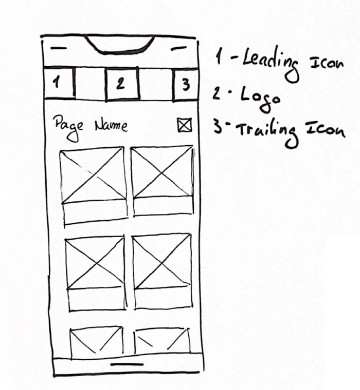
Fig.4 - Wireframe of the shop
I wanted a more dynamic screen, something that could immediately give me a clear idea of how good and different these coffees are from the competitors.
When thinking of the shop, I’ve faced a new challenge: Nespresso does not sell only coffee capsules — they do allow you to buy coffee machines and accessories as well. So this is something to have in consideration, on how could I allow you to acquire all of these categories in an easy and practical way.
Another challenge that I’ve faced is the content needed for each of these item cards. In general, they are quite consistent: name, quantity, and in the case is necessary, the “NEW” label. But there was still something missing — the coffee intensity.
We figured out the challenges, so now let’s talk about each solution.
Different categories
As we’ve read previously, we need to consider that the app will be selling more than just coffee, and we need to consider machines and accessories.
I wanted to create simple navigation, that would allow the user to:
a) Easily understand in which screen he is, in order to protect him from committing mistakes;
b) Keep focused on what is important for the user: being able to add items to the Shopping Bag.
So I’ve decided to create a horizontal menu that allows the user to navigate easily between the different categories, without losing the perception of space and what he’s made so far.
Having concluded this challenge, now it’s time to tackle the second challenge. The structure of the item card.
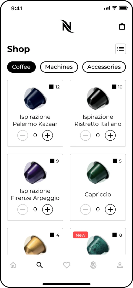
Fig.5 - Final version of the shop
Item Card
We need to establish a structure that allows us to present the ideas in a clear and consistent way. This is the content to consider:
a) Name of the item — This seems quite simple, but we need to consider that it might exist some items that may require more space in order to see the complete name. “Capriccio” is the perfect case scenario, but what would happen when we see “Ispirazione Palermo Kazaar”?;
b) Add to Shopping Bag — We need to allow the user to add as many items as he possibly can to the Shopping Bag. I wanted this experience to be subtle so that the only thing that you have to do, click on “-” or “+” to adjust the number of items that you desire;
c) “NEW” label — It’s important to show users when there are new additions to the store;
d) Intensity — Last but not least, the topic that created the need to mention the challenge inside the Item Cards. This challenge is about the Intensity of the coffee, which is exclusive to the Coffee section — no matter how important it is to know the intensity of the coffee, it’s also important to have a consistent interface. For that reason I’ve decided to add in the top right corner the information about the intensity of the coffee — we can still prioritize this information, without compromising the consistency and the simplicity of the interface.
The Profile
Having concluded the Shop and the challenges, the next screen to cover is the Profile.
I wanted to have a Profile page that could be similar to the Nike App — a subtle profile, that allows you to edit, check orders, and types of payment in a subtle and practical way.
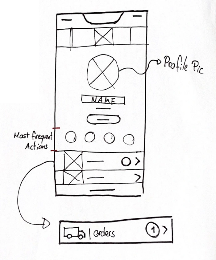
Fig.6 - Wireframe of the Profile
Initially, I was trying to have a section called “Most Frequent Actions”, so that the user can access it as soon as he entered the profile and the list below would contain not-so-used topics.
The reason I’ve decided not to go with this solution is that I questioned myself:
“How likely is it for me to go to the profile, and have a “more frequent actions?”
I mean, you can go to the profile for several reasons but the profile should be pretty straightforward and simple. I meant well when I started ideating the “Most Frequent Actions”, but then I realized that having this would probably mean that I was overcomplicating things for the user.
Since I’m not using the “Most Frequent Actions”, I’ve focused my attention in how to organize the categories.
Again, Nike App was a huge reference in order to create the solution for this problem.

Fig.7 Final version of the profile
As I finished the Profile, I ended up thinking about a topic that we’ve discussed at the beginning of this case study: What’s Nespresso's statement? What do they stand for? What are their standards? And then I realized that I’ve completely forgotten something that Nespresso (well, Néstle in general actually, but you get what I mean) cares a lot about: Sustainability.
Sustainability
Has I’ve mentioned, Nespresso cares a lot about Sustainability — it’s all around if we watch closely. By accessing their website, we can access the page of a specific coffee and we get to know whatever might be relevant about the coffee, and one of the highlighted topics is “How do we make these coffee beans?”
The brand makes a huge effort to have an impact on this subject and even when their clients refuse to go along, Nespresso still has the stamina to keep fighting and showing us how important this topic really is for the planet and for their products.
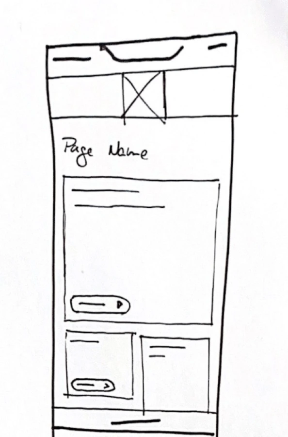
Fig.8 - Wireframe of the Sustainability page
Despite this, there’s still some lack of information about this in the app — personally speaking, I would like to see the app creating content that can trigger me into getting to know more about Sustainability. This awareness that Nespresso is passing us is really important, we should be aware and do more for our planet.
And that’s the reason why I added the Sustainability screen to this redesigned app. For this screen, I wanted to make something really different from the rest of the app, without compromising the consistency that we’ve applied so far.
I wanted to make this a really enjoyable visual experience so that even if you don’t care a lot about Sustainability, you’ll still get to the page and interact with the content. One of my favorite apps is Pinterest — I love the masonry layout and all the images and colors that the app provides me, but I also love how dynamic the layout is due to different image heights.
Last but not the least, I wanted this to be like a National Geographic documentary session about nature — nature has such beautiful colors and I wanted to highlight these colors the maximum I could.
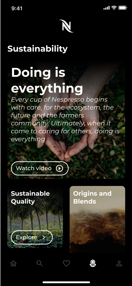
Fig.9 - Final version of the Sustainability page
For that reason, I’ve decided to make the screen exclusively black — that way I broke the users' routine and I’m able to have their attention for such an important topic, by providing interesting content, like articles and videos.
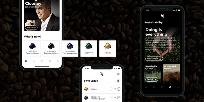
Fig.10 - Cover image with interfaces
The end
If you’ve read this chapter, thank you very much for the attention — I do hope that you have enjoyed it.
Aside from the three interfaces that we’ve been talking about, more interfaces were made in order to be able to create a prototype. In case you’re interested in getting to know more interfaces, keep an eye on Dribbble.
Like this project
Posted Oct 12, 2023
Coffee is the thing that makes me get out of bed in the morning. I wish I could say the same about the app.
Likes
0
Views
11


