Michu Werefa
Rufael Anteneh
Michu Werefa (ምቹ ወረፋ)
Transforming Chaos into Comfort
Michu Werefa (ምቹ ወረፋ) is a game-changing app designed to tackle the frustrations of customer queues and waiting lists for businesses of all sizes. From government offices buried in paperwork to bustling nail salons managing endless appointments, Michu Werefa eliminates the chaos by keeping customers informed, simplifying bureaucratic processes, and sending timely reminders. It’s the ultimate solution for businesses looking to turn scheduling headaches into stress-free experiences.
Animated Logo
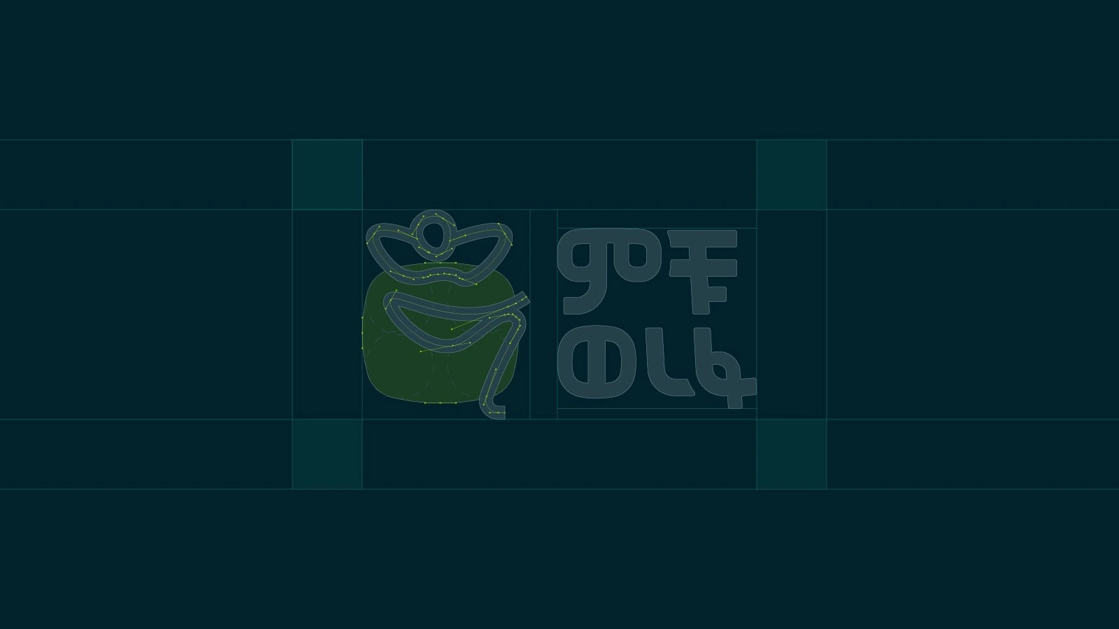
Logo Construction
The Comfortable Wait: Crafting the Logo
The logo concept was inspired by the idea of relaxation and peace of mind—knowing that all your worries are taken care of. The name ምቹ ወረፋ, which translates to “comfortable wait,” was central to the brand’s identity and the initial plan was to create a logotype only that will be the sole representation of the brand. However, after numerous iterations and brainstorming sessions, something still felt missing… then it hit me the logo needed a great icon and through experimentation, we arrived at a clear, iconic logo: a human figure leaning back with arms relaxed behind their head and feet crossed—a universal pose that instantly communicates ease and comfort. By combining a clear, legible logotype with a unique and recognizable icon that evokes comfort, we achieved the best of both worlds.
Key highlights of the Logo:
Clarity and Simplicity: The minimalist design ensures the logo is instantly recognizable and versatile across various applications across digital and print media.
Universal Appeal: The relaxed pose resonates with everyone, conveying the app’s promise of a stress-free experience.
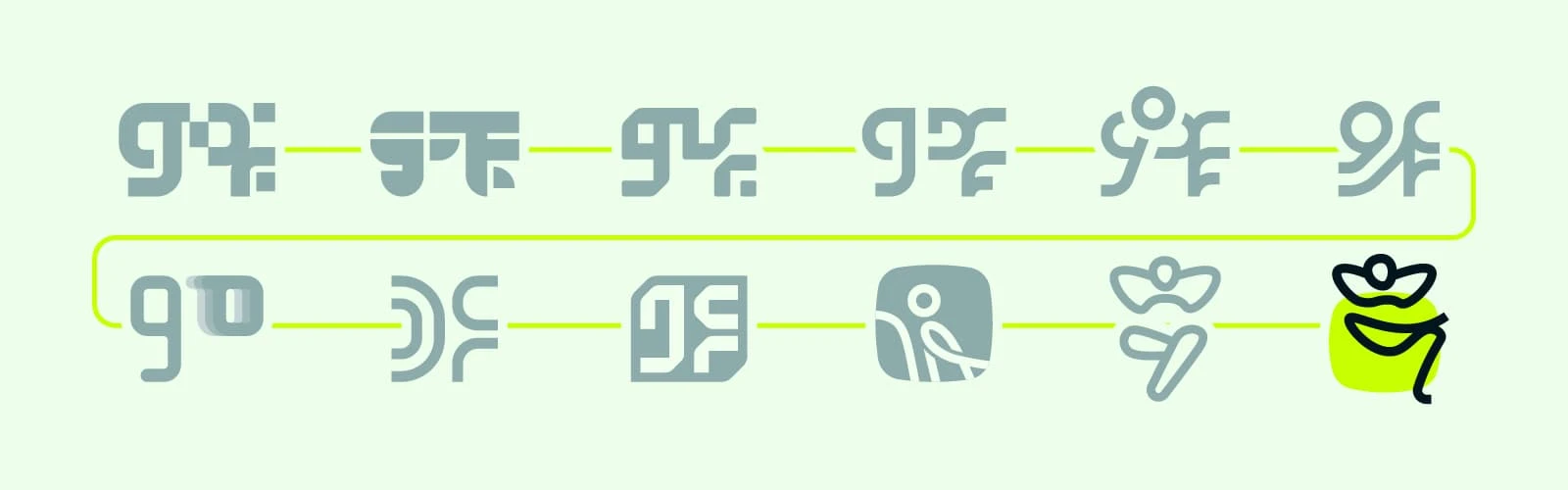
Iterative process

Logo Concept
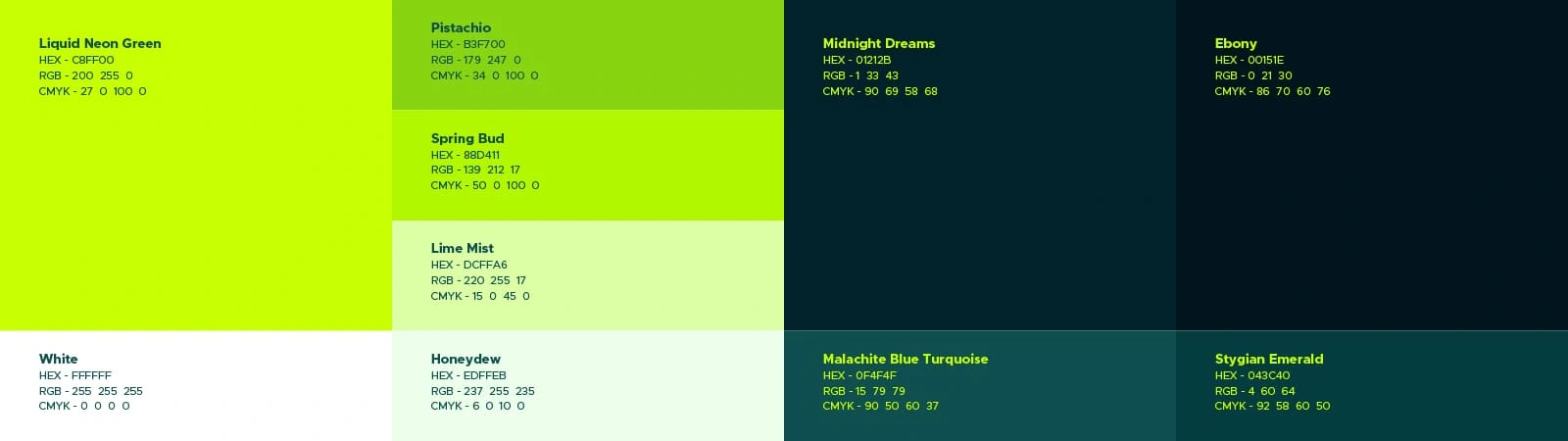
Color Pallet
Neon Green: A Color That Pops
Color played a significant role in the brand’s identity. The client had a strong vision for neon green, their favorite color. Beyond its personal significance, neon green is bright, eye-catching, and perfect for grabbing attention at expos, offices, and businesses where Michu Werefa is implemented. Paired with the logo, it creates a striking visual identity that stands out in any setting.
Color Palette Enhancements:
Neon Green: Vibrant and attention-grabbing, it reflects the app’s energy and innovation.
Contrasting Neutrals: To balance the vibrant neon green and evoke a sense of calm, we introduced subtle, cool tones of dark green, dark turquoise, and hints of lime.
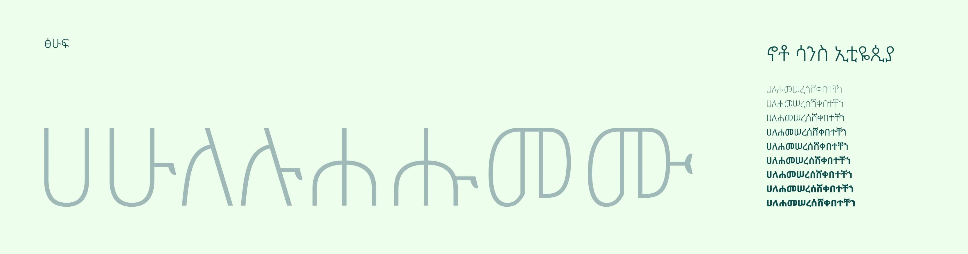
Amharic Typography
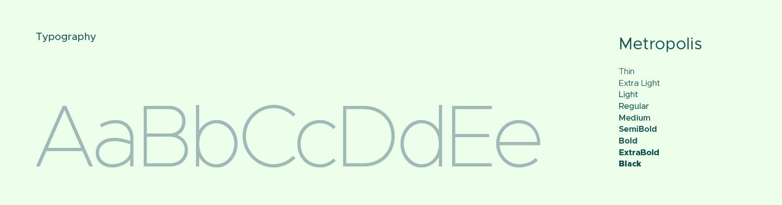
English Typography
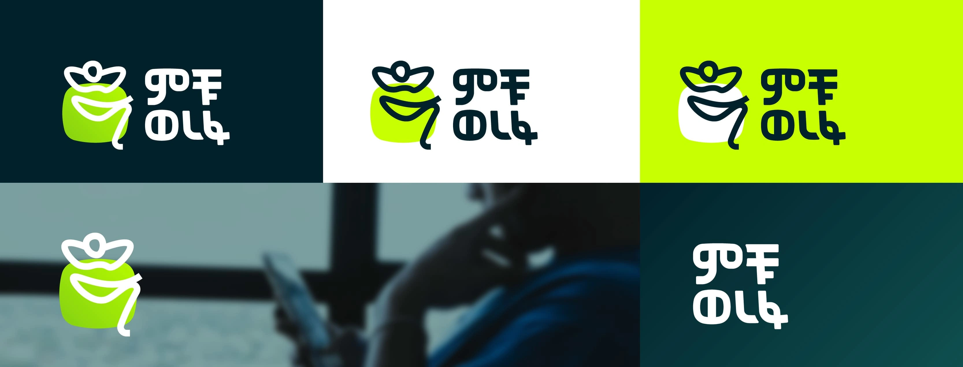
Logo Variations
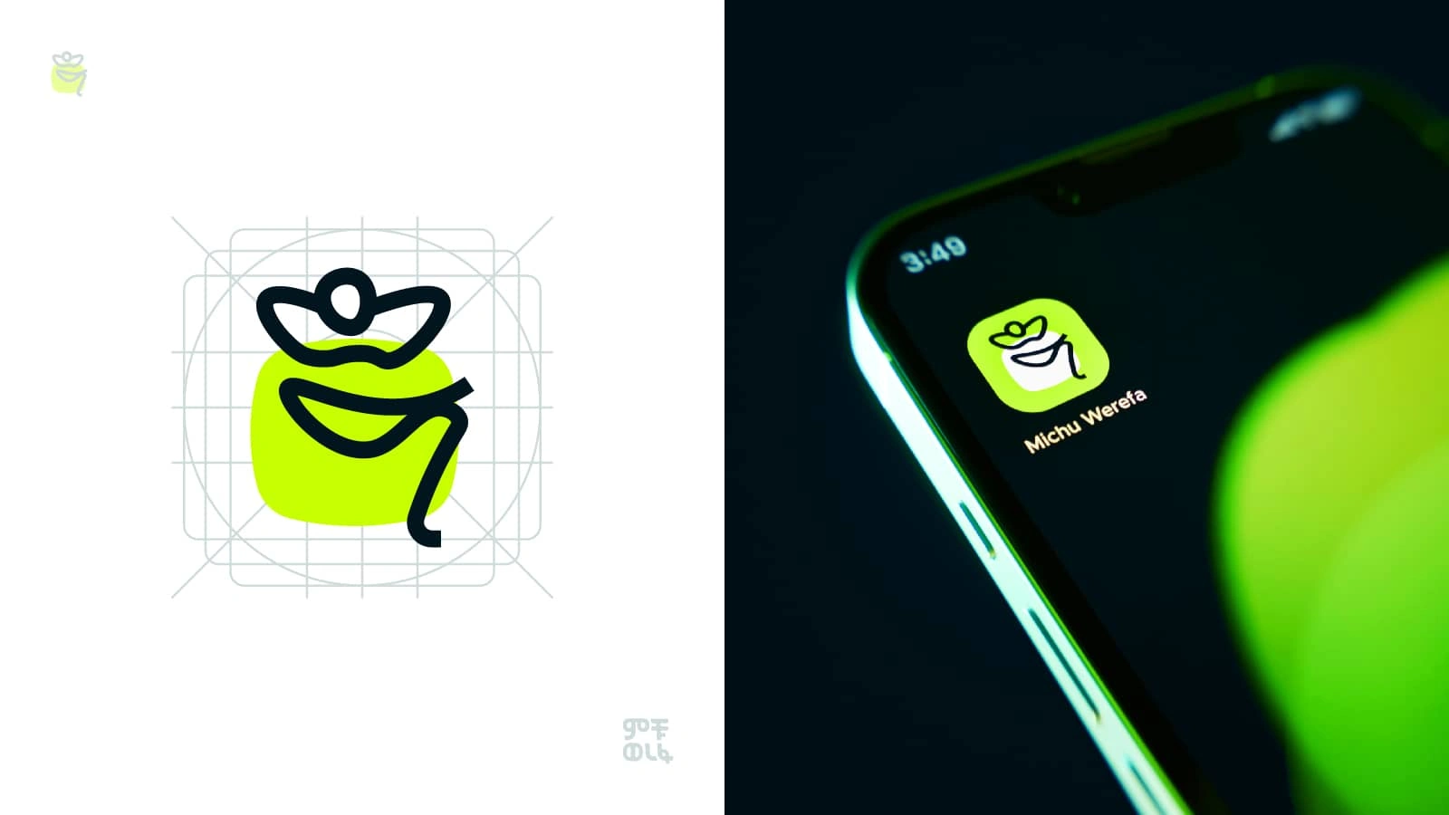
App Icon
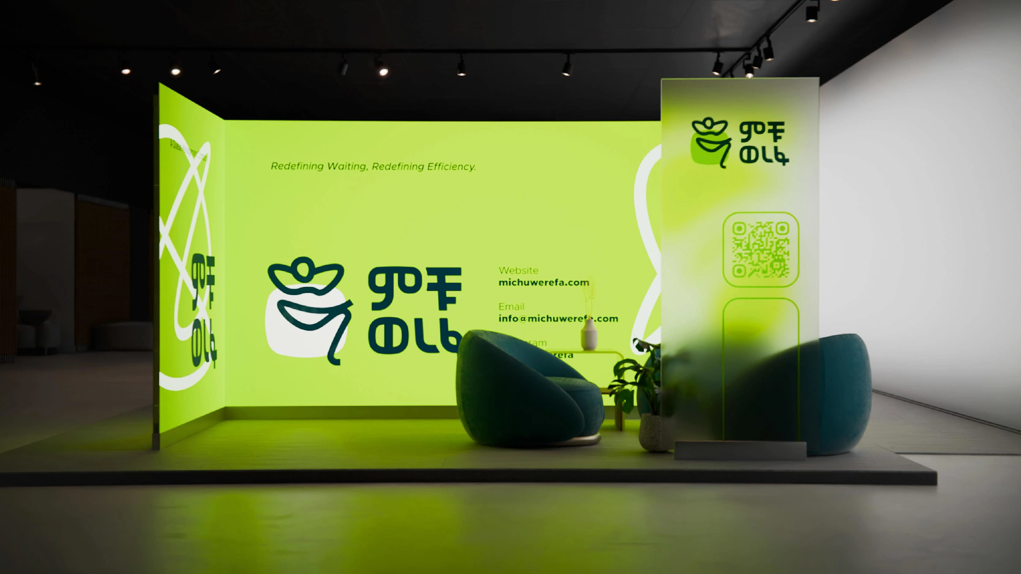
Expo
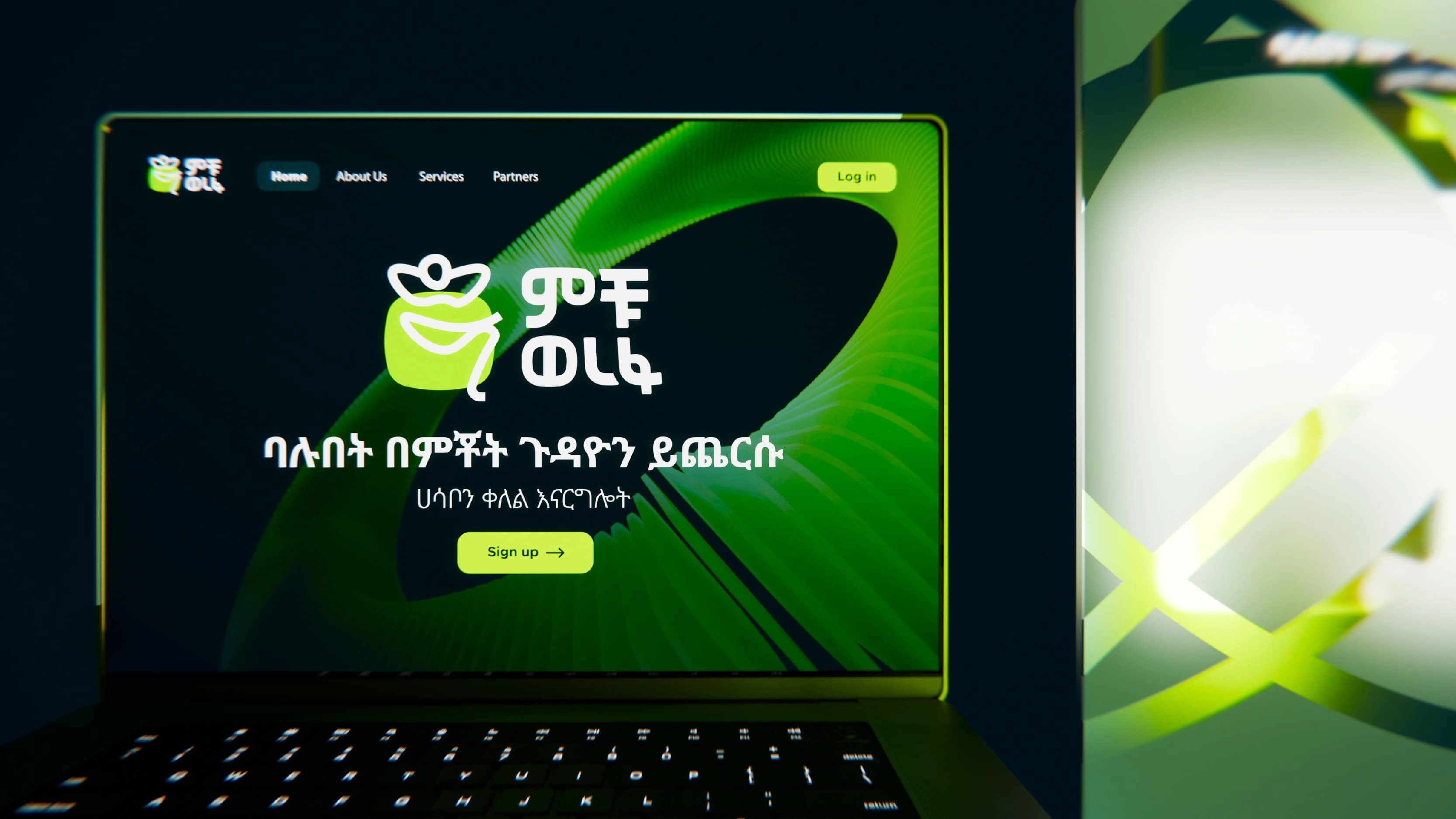
Website
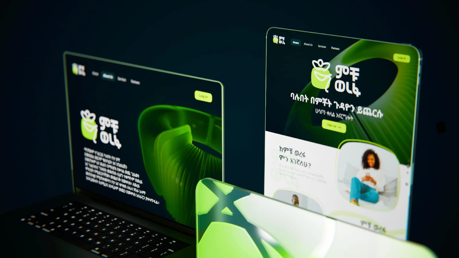
Website on different devises
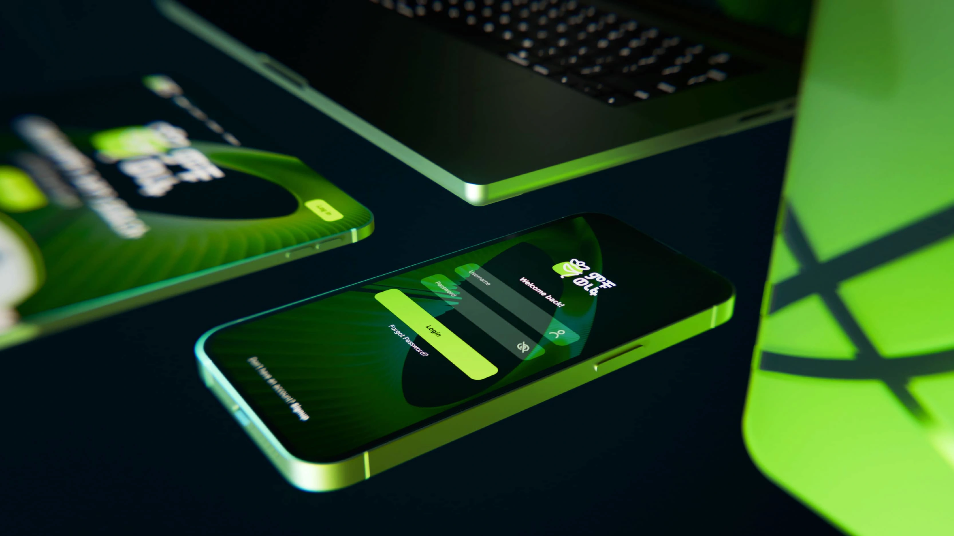
Login
Graphic Elements
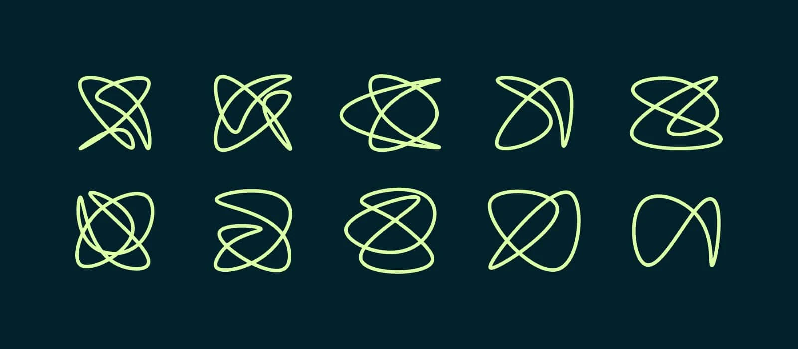
Visual Storytelling: Chaos vs. Calm
To further emphasize the app’s value, we incorporated graphic elements depicting bureaucratic chaos—knots, paperwork, and endless back-and-forth exchanges and travel from one department to another. These visuals contrast sharply with the clean, minimalist lines of the Michu Werefa logo, highlighting the app’s ability to transform clunky, chaotic processes into seamless, stress-free experiences.
Design Elements:
Bureaucratic Chaos: Illustrations of tangled paperwork and knots symbolize the frustration of traditional scheduling.
Minimalist Logo: The clean, relaxed figure represents the simplicity and ease Michu Werefa brings to the process.
Striking Dichotomy: The contrast between chaos and calm visually underscores the app’s transformative power.
Animated Graphic Elements
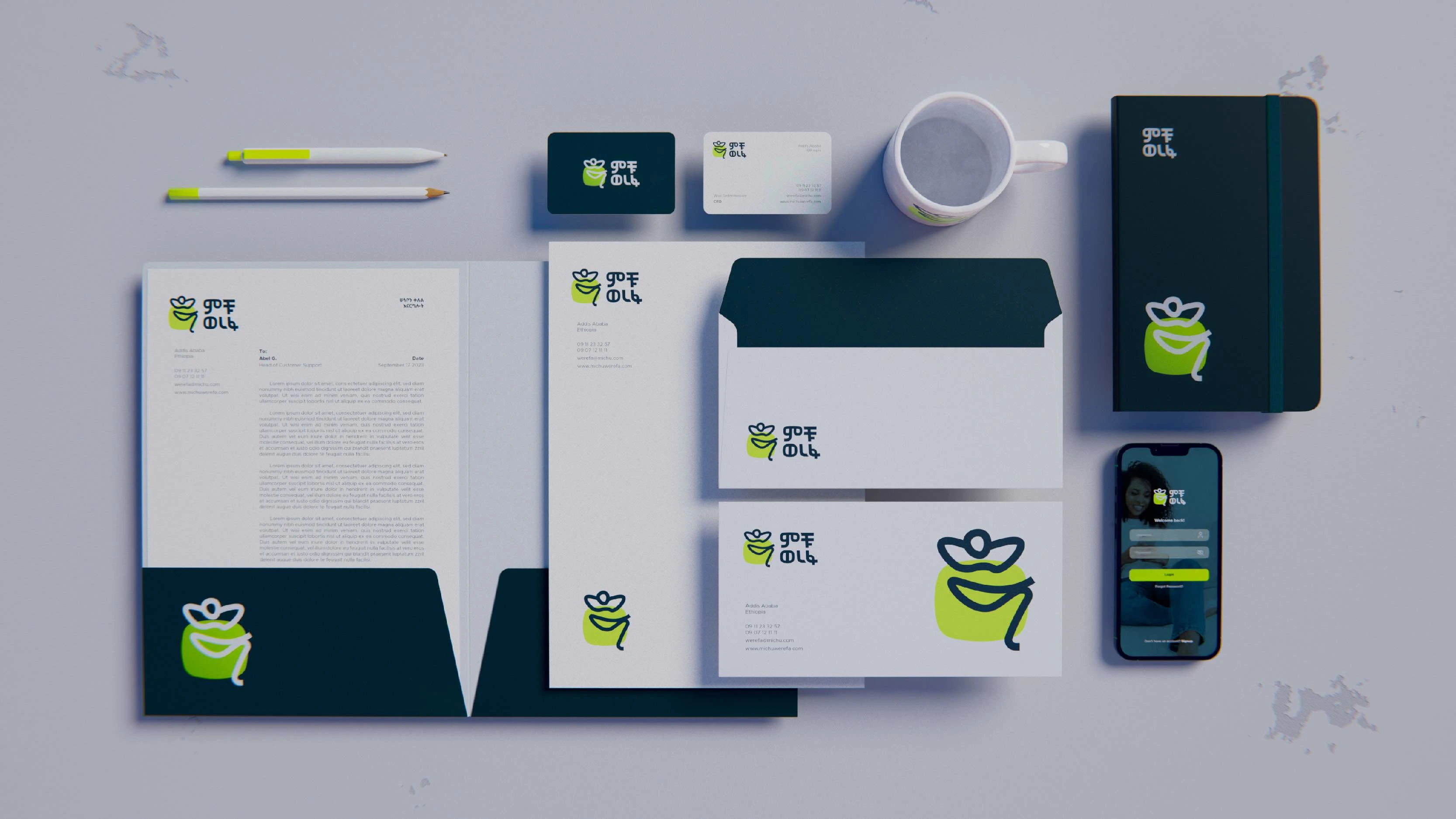
Stationary
Stationary
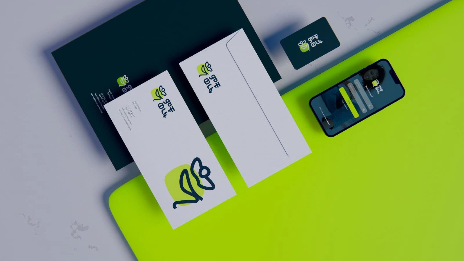
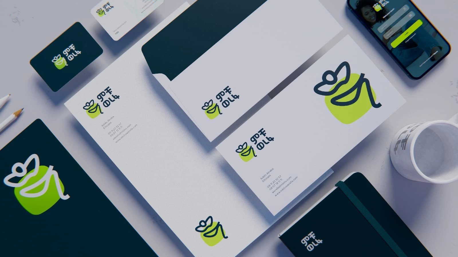
Envelopes and App Login
Seeing the Brand Identity in action
After finalizing the logo and visual elements, we tested the brand identity across various applications to ensure functionality and consistency. This included creating stationary, business cards, website mockups, icons, different screen sizes and promotional materials for expos and offices.

Design Outcome
In the end, the new brand identity emerged as a perfect blend of flexibility, functionality, and consistency, seamlessly adapting to every format and application. The client’s excitement was palpable—seeing their vision come to life in a way that not only thrilled them but also powerfully communicated Michu Werefa’s mission and values.
Key Takeaways
Symbolism Matters: The relaxed figure in the logo perfectly captures the app’s promise of comfort and ease.
Color as a Differentiator: Neon green not only reflects the client’s vision but also ensures the brand stands out in a competitive market.
Visual Contrast: The dichotomy between chaos and calm effectively communicates the app’s transformative impact.
Stress Testing for Success: Implementing the identity across various formats confirmed its functionality and versatility.
It was a rewarding journey, one that reminded us how thoughtful design can transform ideas into impactful, real-world solutions. Together, we created more than just a brand; we crafted an experience that promises comfort, clarity, and calm in the midst of chaos.
Like this project
Posted Mar 19, 2025
For the Michu Werefa app we created more than just a brand; we crafted an experience that promises comfort, clarity, and calm in the midst of chaos.
Likes
0
Views
22
Timeline
Jul 11, 2024 - Nov 21, 2024