A fresh marketing site for a marketing agency.

John Hansen


Redesigning the Yelu Marketing brand and website with clarity, energy, and room to grow.
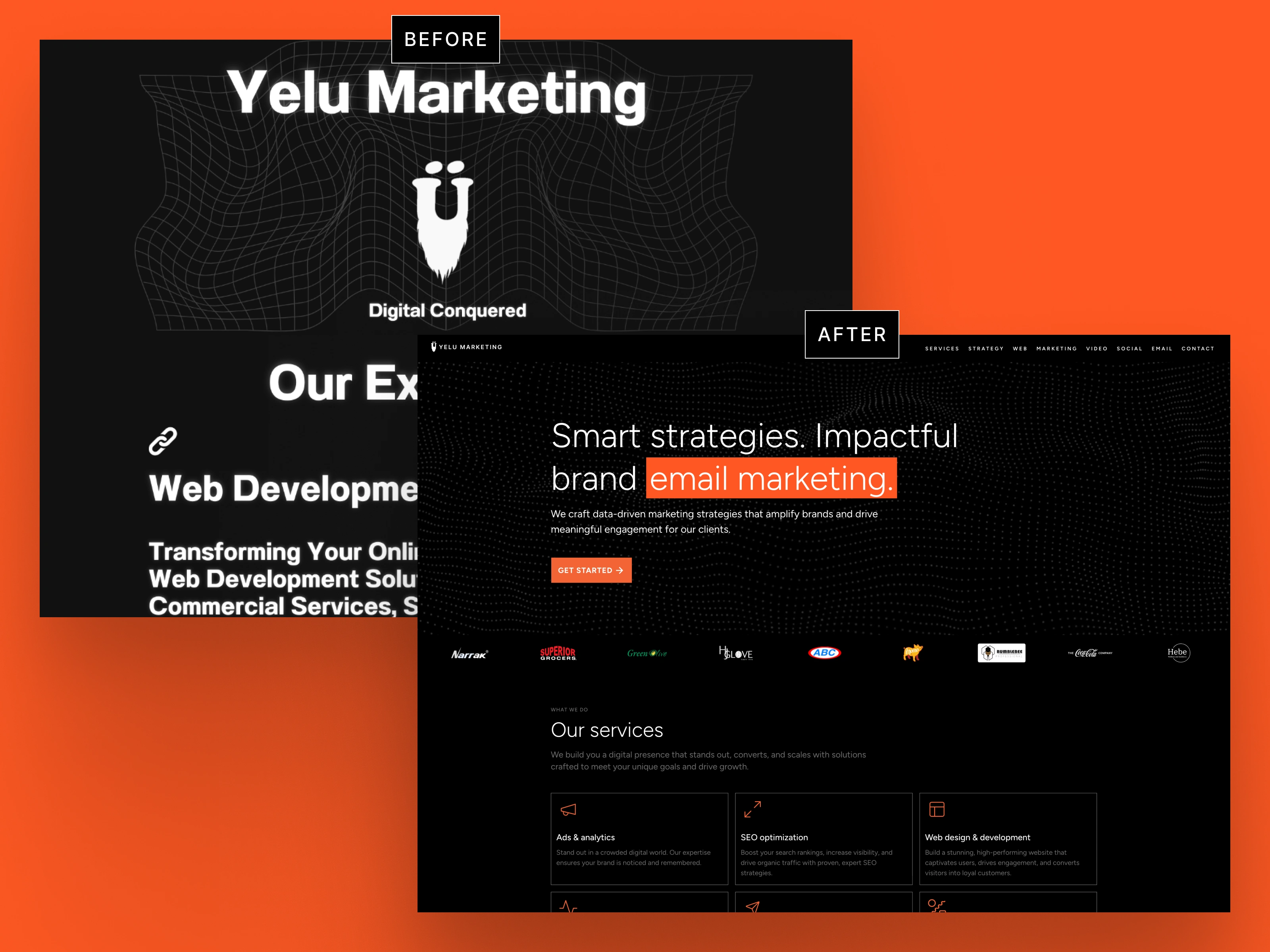
I redesigned and built Yelu Marketing a website they could start conversations with. Moving fast, they had started with a quick and passable site that conveyed services and showed work, but it needed work.
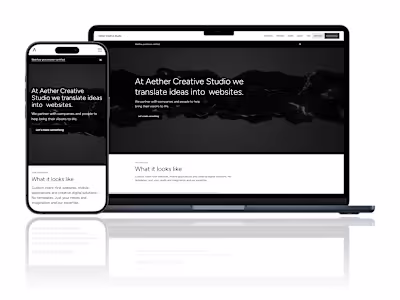
I took the somewhat confusing and ambiguously branded site to a tightened and polished experience with room to grow. Using a shock of orange against an onyx environment sparkled with white typography, the content speaks to SEO (AEO) and conveys a slickness expected of a marketing agency. I crafted it with Client-First so it's approachable and easy to understand — perfect if they want to go the next level with interactions and more content. It's the baseline, the foundation.
From a Quick Start to a Clear Direction
Yelu Marketing launched with a simple, functional site—good enough to share services, but not strong enough to start real conversations. The branding felt unclear, the structure was loose, and the experience didn’t reflect the agency’s energy or expertise. This project began by identifying what worked, what didn’t, and what the site could become with the right design foundation.
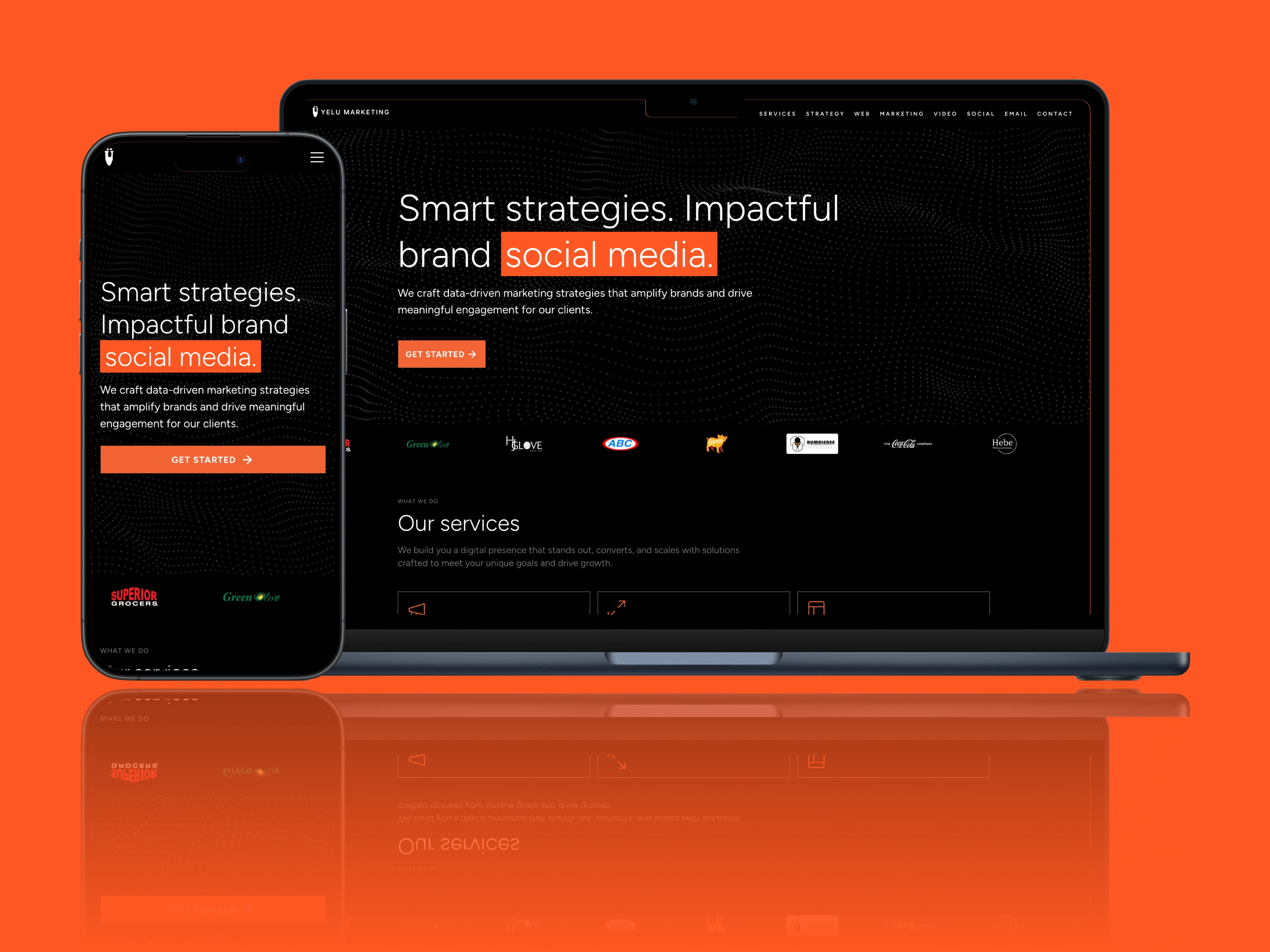
A crisp value proposition and call-to-action combo motif.
A Bold, Polished Identity Built to Speak
The redesign established a sharper, more confident brand voice through a high-contrast visual system: a vivid shock of orange set against an onyx backdrop, balanced with crisp white typography. This created a sleek, marketing-ready presence that instantly communicates credibility. Every layout, component, and interaction was crafted using Client-First, making the site intuitive, scalable, and easy for Yelu to grow into—whether adding more content, refining messaging, or introducing animations.
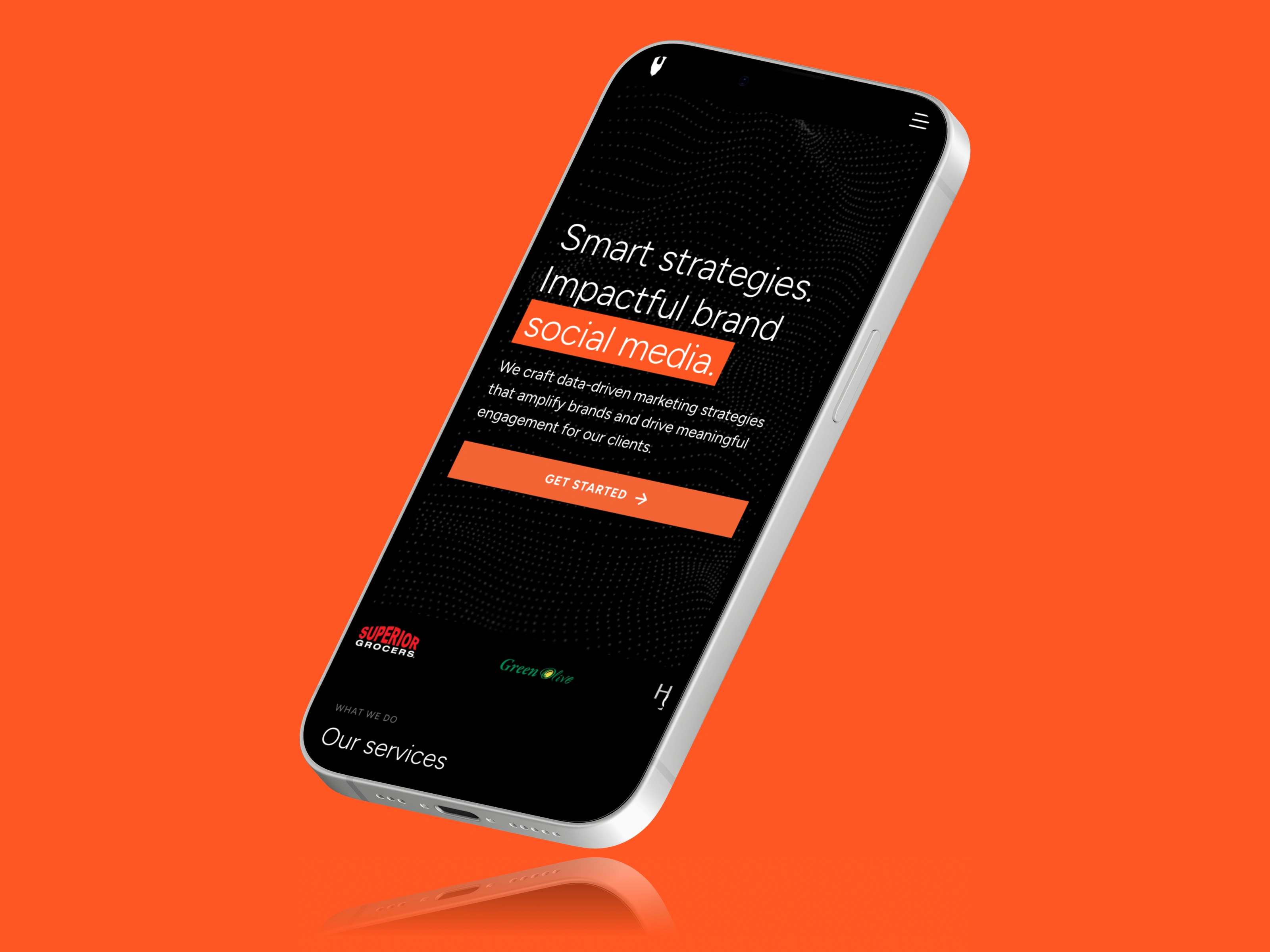
Optimized especially for phones.
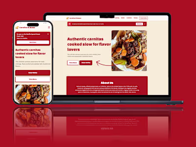
A Clear Showcase of Services and Expertise
With the new structure in place, the services section received special attention. Each offering is presented clearly, framed with concise copy and purposeful hierarchy to help visitors quickly understand what Yelu does best. The layout works seamlessly across devices—highlighted through the mobile and desktop visuals—ensuring the experience feels just as strong on a phone as it does on a full screen. The result is a foundation that supports Yelu’s ambitions and leaves room for what comes next.
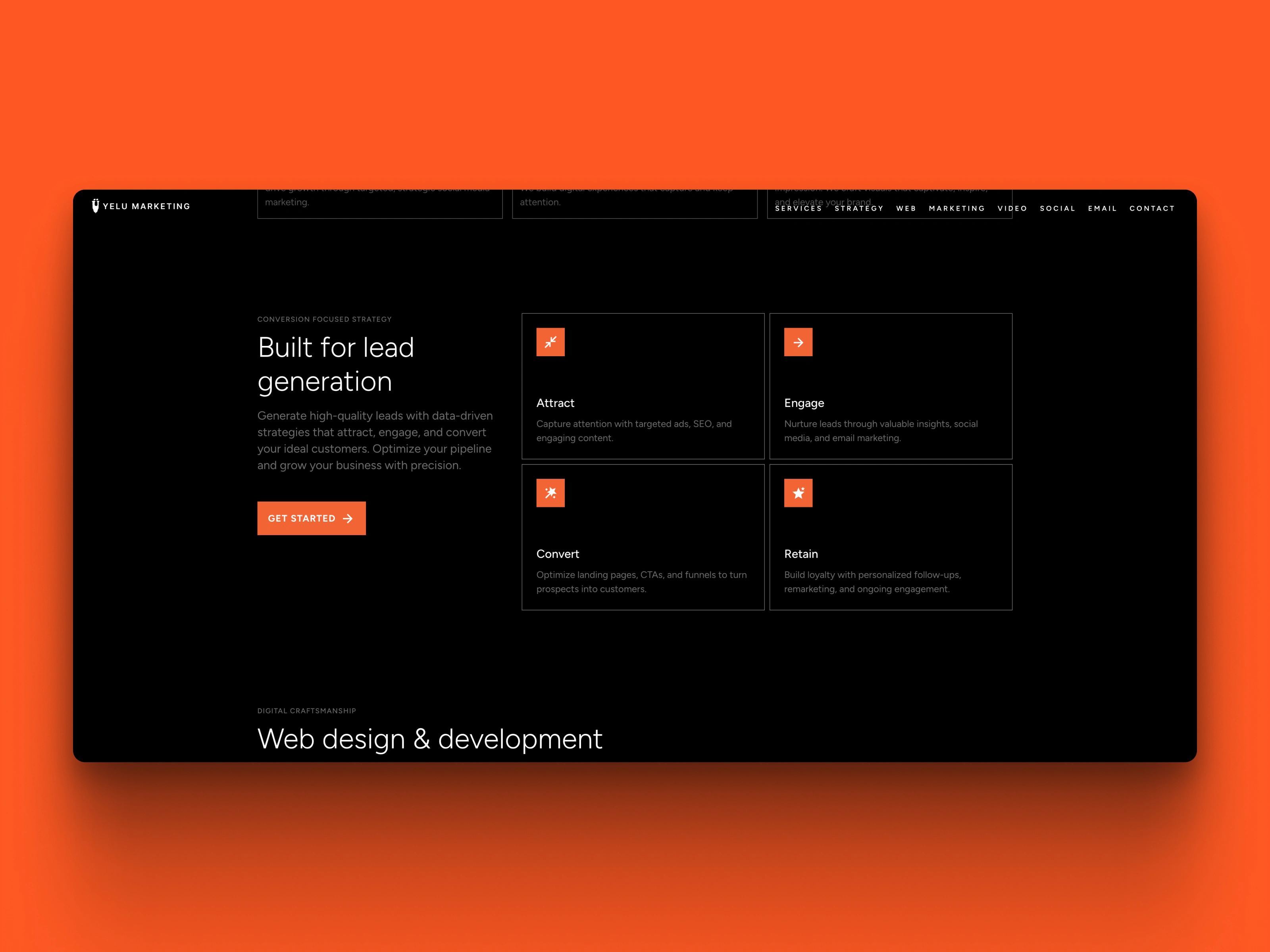
Clear value propositions.
SEO (AEO/GEO) Optimized
With LLMs.txt carefully crafted and provided coupled with JSDON-LD schema, the site is positioned to be an early saturation point to permeate and start carving out its area of effect.

I personally designed and crafted the site. This is just the beginning for Yelu Marketing.
Helping people and companies became a branded experience they're proud to share is what I love to do.
Yelu Marketing is one of many of the SMBs I've had the pleasure of helping take to their next level. I don't need much - just your intent, ideas and any assets you have and we can work build something.
It could be a brand definition like Yelu Marketing paired with a foundational and quietly powerful website or a completely custom app idea, I thrive on solving the problem of turning an idea into a shared experience.
Like this project
Posted Dec 2, 2025
A Webflow website and brand definition to help position Yelu Marketing as a strong potential marketing and design partner for SMB clients.
Likes
0
Views
0