Trueframe: A Website Built to Turn Proof Into Pipeline

Benjamin C


The live website in motion, from the playing hero video to the moving content wall and page scroll.
A website built around the buying decision
Trueframe needed a website that could explain the offer and let visitors see the work behind it. The available material included content examples, client testimonials, and different ways to work together. I brought those pieces into one responsive website for founders considering a content partner.
My role covered the page structure, visual design, and production build. I shaped the experience around a practical journey: understand the offer, inspect relevant work, compare the ways to start, and reach a fit-call booking flow.
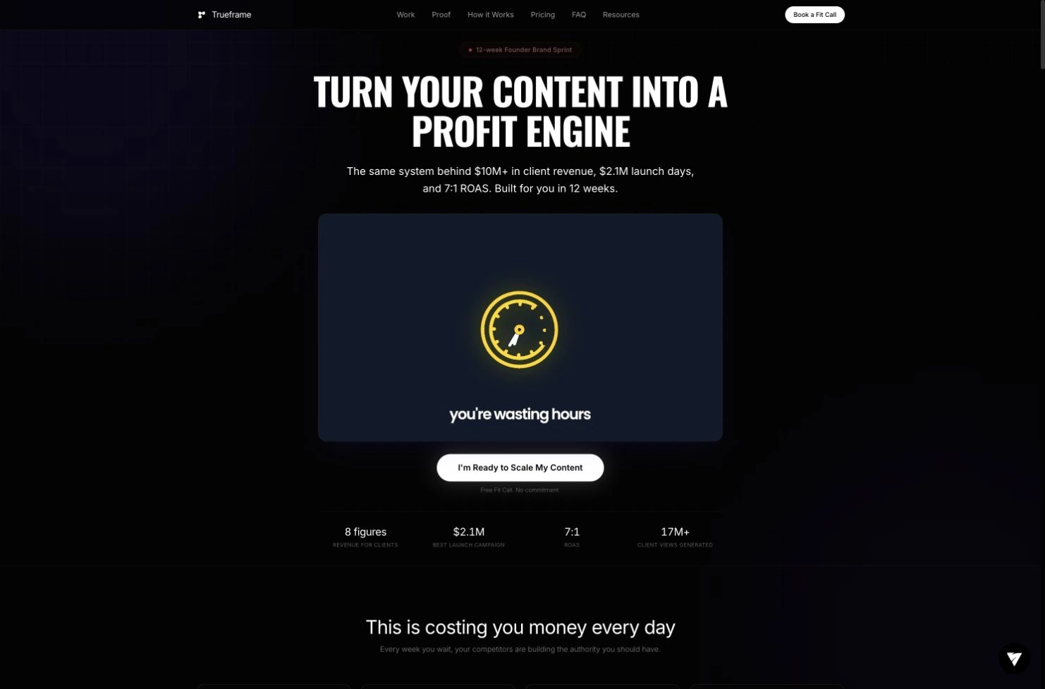
The live homepage leads with the core offer, a video introduction and a direct booking action.
Giving the homepage a clear sequence
I treated the homepage as a series of questions a prospective client might need answered. The hero establishes the main promise and introduces the offer through video. The following sections explain the problem, show work, add client context, and describe how the engagement operates.
Process, pricing, FAQs, and resources give visitors more detail as they move down the page. The booking path appears throughout that journey, including the final section. This structure lets someone move quickly when they are ready, while giving a more cautious reader enough material to keep exploring.
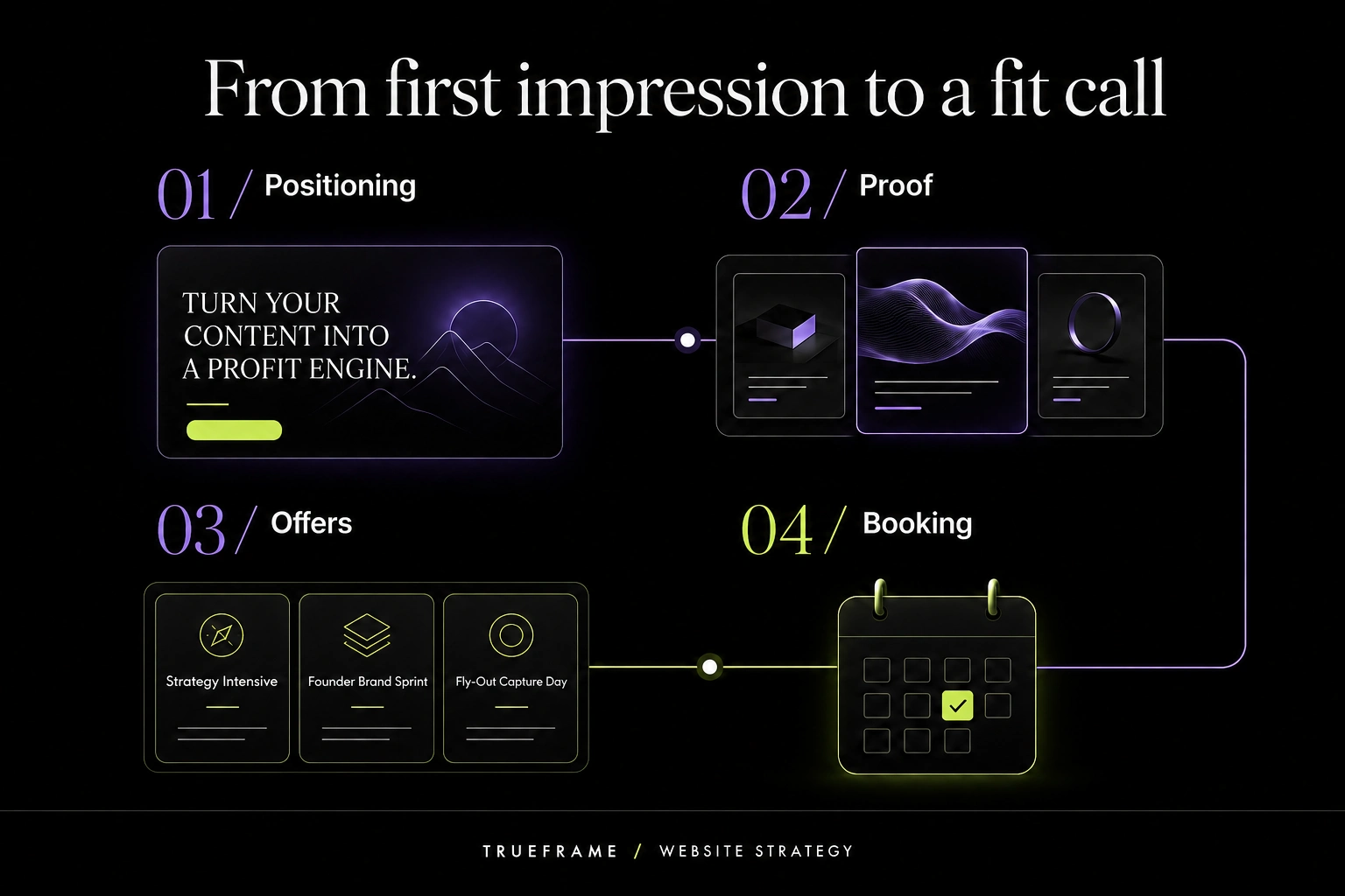
Conceptual page strategy: connect positioning, proof, offers and booking in one visitor journey.
Making the work visible
The proof system uses several formats because a single testimonial cannot show the whole service. The content wall presents actual creative output. Public channel cards connect examples to the accounts behind them. Video testimonials let visitors hear clients describe their experience, while written reviews are easy to scan.
I gave those formats distinct spaces within the same visual system. A founder can watch an example, read a review, or compare several pieces of work without needing to leave the main story. The design puts the material on the page where it can support the offer directly.
Designing for a video-led brand
The visual direction uses a dark foundation, high-contrast type, rounded media frames, and purple accents. Large headings establish the main ideas, while smaller supporting text leaves space for the videos and proof cards.
Movement is part of the actual website. The hero contains a playing video, the page includes animated counters and interactive elements, and media gives the work its own pace. I built the layout to accommodate that activity while keeping the main message and call to action easy to find. The experience is designed to be seen in motion, with text providing the structure around it.
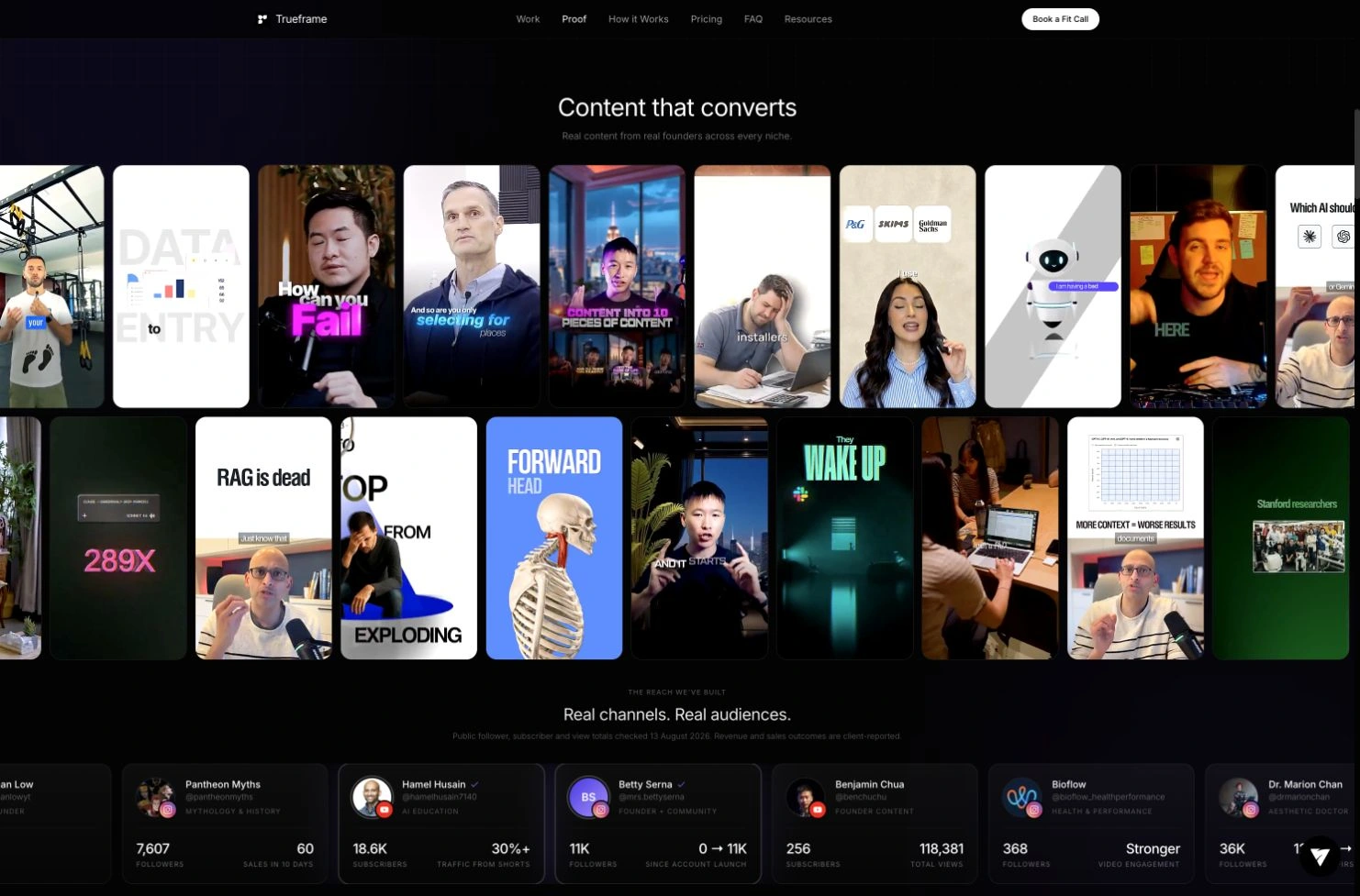
The content wall brings actual video work into the page, giving visitors a direct view of the output.
Connecting proof to a next step
The offer section presents distinct ways to begin, with cards that make their scope easier to compare. Process details and FAQs sit within the same journey, so the practical questions are close to the point where a visitor considers taking action.
I connected the calls to action to an iClosed booking flow and added a sticky call button for mobile visitors. That keeps the next step available even on a long page. The aim of these choices was to reduce the effort required to move from browsing the work to starting a conversation.
Building the production website
I built the site with Next.js and TypeScript and deployed it on Vercel. The component structure separates the hero, work showcase, reviews, process, offers, and booking areas, making it possible to update individual sections as the business changes.
The implementation includes responsive desktop and mobile layouts and event tracking across Fathom, GA4, and Meta. For this portfolio presentation, I also explored a proof-card sweep in a separate Replit interaction study. That study followed the production website and helped explore how to present its work visually.
What shipped
The delivered website brings positioning, creative examples, testimonials, offers, and booking into one public experience. Visitors can understand what Trueframe does and inspect the work before choosing a next step.
The finished scope includes the responsive homepage, reusable section system, video and review presentation, offer comparison, and connected fit-call path. The case study demonstrates the design and implementation of that journey, with the live site serving as the completed output.
Like this project
Posted Sep 7, 2026
Designed and built Trueframe’s responsive website around client work, testimonials, offers, and a clear call-booking path.
Likes
2
Views
13
Timeline
Apr 7, 2026 - Ongoing
Clients
Trueframe