Basia's Blossoms
Say Hello to BASIA'S BLOSSOMS;
INDUSTRY
FLORAL PRESERVATION
PROJECT DELIVERABLES
Brand Strategy
Brand Identity Design
Web Design
Business Card Design
Alternative Primary Wordmark + Tagline
BRAND SUMMARY
SUBHEADING
Basia is a biomedical engineer with a passion for preserving memories! From a dedication to science and a love for tactile creativity, came a thriving and fulfilling business making beautiful and lasting keepsakes from flowers. She believes that everyone deserves to have a tangible reminder of the moments that matter most.
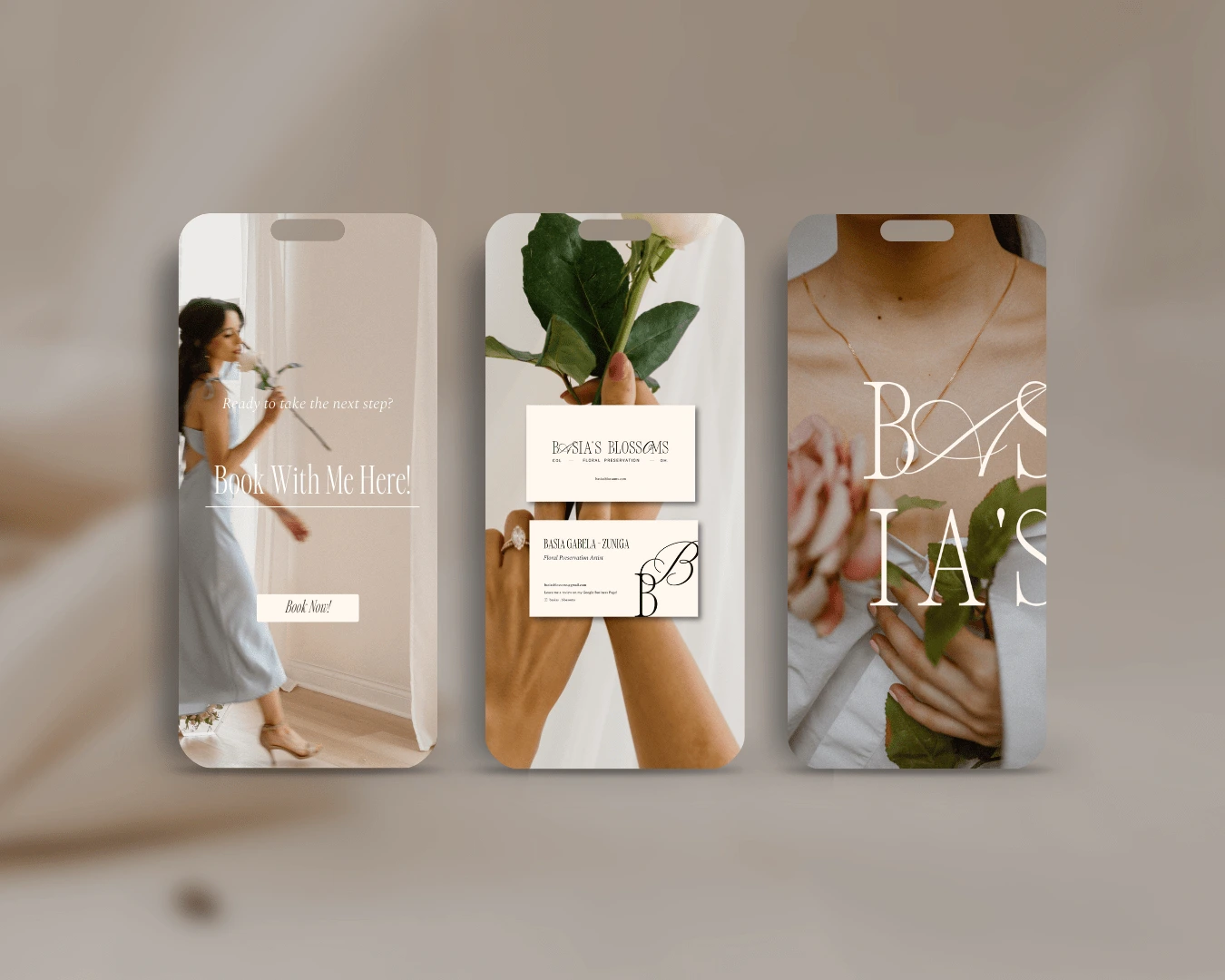
Branding Applications
Primary Lettermark + Tagline
BRAND ETHOS:
Sleek / Modern
Luxurious
Breathtaking
Romantic
Inspired
Soft / Chic
REBRAND EFFECT
Basia's new visual identity finally meets her brand's core because we crafted it using her unique personality: soft, chic, modern, romantic and inspired. Her logo suite was built to mirror the visual effect that her products have: sleek, polished and luxurious assets that give off elegant movement, even in their stillness.
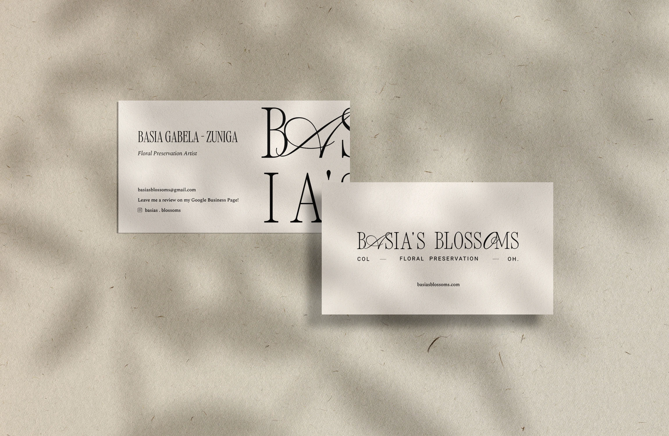
Business Card Design
WEBSITE DESIGN
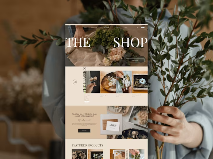
We wanted the web design to lull you into a dreamy, nostalgic state of mind - much like her timeless products are meant to do. So, I took a slight minimalist approach to the layout design - I wanted the pages to feel easy to explore/engage with and not overwhelm the user. I made sure there was always enough whitespace on the page, so that the photo displays of her work were the spotlight, while the buttons, text, visual movement and brand assets felt like natural accents. This approach to the design allowed me to prioritize user experience, while ensuring her new brand identity was well balanced and dispersed across the site!
Website Design Preview
Like this project
Posted Oct 13, 2023
Brand Identity, Web Design, and Collateral Design for Basia's Blossoms, a floral preservation artist transforming cherished flowers into stunning keepsakes.
