🧠 Case Study: Cognito – The Mind Company
Leslie Isah
🧠 Case Study: Cognito – The Mind Company
Client: Cognito
Industry: Mental Health & Cognitive Innovation
Scope: Brand Identity Design, Typography, Visual Direction
Timeline: 2 weeks
🗂️ Background
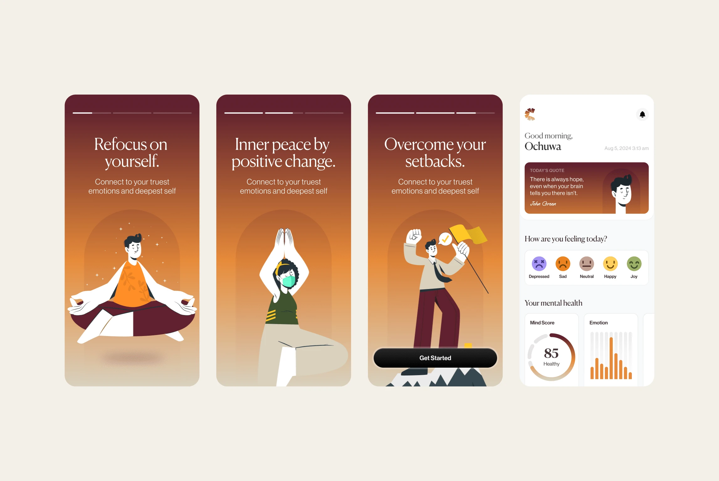
Cognito is a modern mental health and cognitive tech company focused on enhancing how people think, feel, and live. The brand blends neuroscience, psychology, and mindfulness practices into products designed to unlock mental clarity, resilience, and personal growth.
As a new entrant in the space, Cognito needed a bold and meaningful visual identity that would position them as a trusted innovator in the realm of mind-first technologies.
🎯 The Brief
Create a brand identity that captures the essence of cognition — depth, intelligence, clarity, and inner exploration — while standing out in a space often dominated by clinical, generic visuals. The identity should feel modern, conceptual, and human, avoiding clichés (e.g., brain icons, puzzle pieces).
Key Words: Smart, Calm, Conceptual, Layered, Human
Target Audience: Young professionals, wellness-conscious individuals, tech-savvy learners, and mental health advocates.
💡 Strategy & Concept
The name Cognito, derived from the Latin cognoscere (“to know”), provided a philosophical anchor for the visual language. Our goal was to create a typographic identity that felt intelligent and introspective — one that didn’t shout, but invited thought.
We embraced the concept of layered thinking — the idea that cognition is not linear, but a deep interplay of thought, emotion, and memory. This became the foundation for both visual motifs and type decisions.
✏️ Design Execution
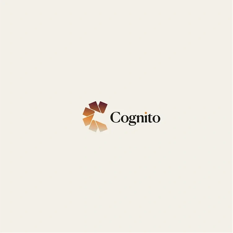
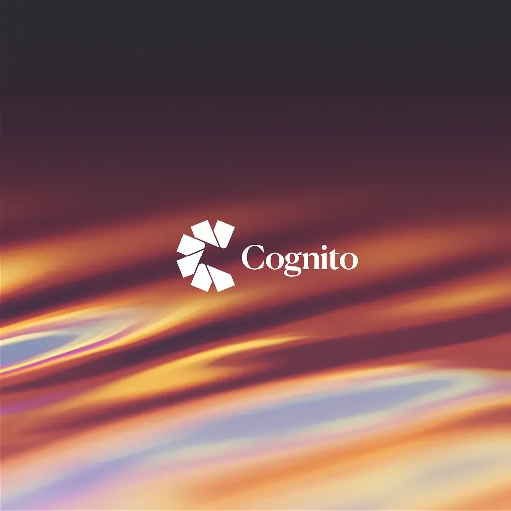
1. Logomark (Symbol)
The symbol is a circular, pinwheel-like shape made up of six abstract, folded shapes.
These shapes resemble overlapping paper folds or fragments—each with a distinct direction and rotation, creating a sense of motion, depth, and cognition.
The positioning forms a subtle spiral, evoking mental expansion, unfolding thoughts, or a radiating idea.
Visually, the symbol suggests layered thinking and complex mental processes—a great metaphor for a mind-centric or cognitive brand.
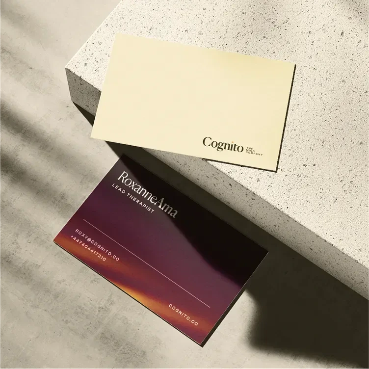
2. Wordmark (Typography)
The word “Cognito” is set in a classic serif typeface, giving it an elegant, intellectual presence.
Notably, the dot on the "i" is replaced with a small golden-orange circle, echoing the warm tones from the logomark and adding a spark of uniqueness or insight (like a lightbulb moment).
3. Color Palette
The color palette is warm, earthy, and rich—evoking a grounded, human-centered feel:
Deep Burgundy / Maroon - Used in the top shapes of the logomark; conveys depth, thoughtfulness, and seriousness.
Golden Ochre / Warm Yellow - Found in the lower shapes and the dot on the "i"; suggests clarity, optimism, and insight.
The goal was to evoke a sense of clarity without sterility.
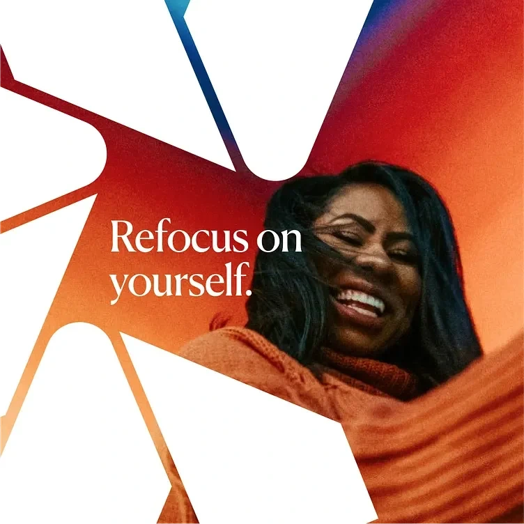
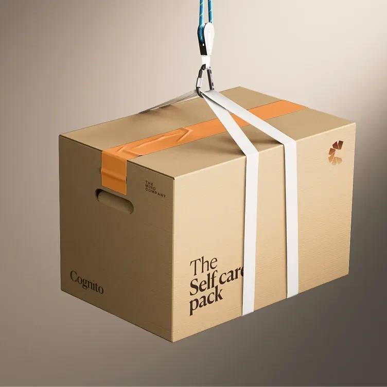
4. Visual System
The extended brand system includes subtle overlays, layering effects, and abstract patterns derived from the curves of the logotype. These elements can be used in editorial, packaging, or digital interfaces to reinforce the brand’s intellectual depth.
📈 Outcome
The final identity gives Cognito a confident, conceptual, and calm presence — aligning seamlessly with their mission to reshape how people approach mental wellness and cognitive growth. The brand feels both grounded and elevated, setting the stage for future product innovation and community engagement.

🧩 Reflection
This project underscored the importance of aligning design elements with conceptual underpinnings. By delving into the essence of cognition and translating it into visual form, the identity not only captures attention but also invites contemplation and engagement.
Like this project
Posted Mar 26, 2025
Crafted a calm, conceptual identity for Cognito that symbolizes layered thinking, insight, and clarity—praised for its elegance, depth, and versatility.
Likes
6
Views
57