Built with Framer
Hyper 5G: Visual Identity & Website for a Telco Startup
Leslie Isah
🚀 Hyper 5G — Creating the Visual Identity & Website for a European Telco Startup
Role: Lead Designer (Brand + Product)
Timeline: 4 Weeks
Tools: Figma, Framer, Illustrator
Deliverables: Visual Identity, Marketing Website, UI Kit
🌐 Overview
Hyper5G is a forward-thinking telecommunications startup entering the European market, with initial rollout across Germany and the Netherlands. Their mission? To redefine how people experience mobile internet — bringing lightning-fast 5G speeds to modern users through simple, flexible, and transparent plans.
They came to me with a clean slate — no branding, no website, no visual system — just a big vision. I was brought in to craft their entire digital presence from the ground up, including a distinctive brand identity and a Framer-built marketing website that speaks directly to their tech-savvy audience.
🎯 Project Goals
Develop a visually bold brand system that stands out in a saturated telco space
Design a modern, conversion-optimized landing page to support product launch
Emphasize speed, freedom, and simplicity in both design and user experience
Build the full site in Framer for fast deployment and flexibility
🧠 Strategy & Direction
I started with a mini brand discovery sprint — clarifying their tone of voice, competitive positioning, and user profiles. Hyper5G wasn’t trying to be another traditional telco. They wanted to feel fast, independent, and unconstrained — no contracts, no fine print, just freedom.
From there, I translated that into a kinetic, motion-inspired visual system — everything from the logo to the layout reinforced the feeling of momentum.
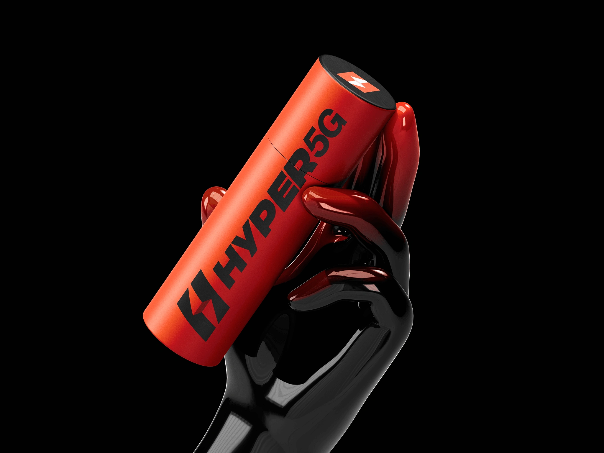
🎨 Visual Identity
The identity had to signal performance, energy, and reliability — while still feeling clean and accessible.
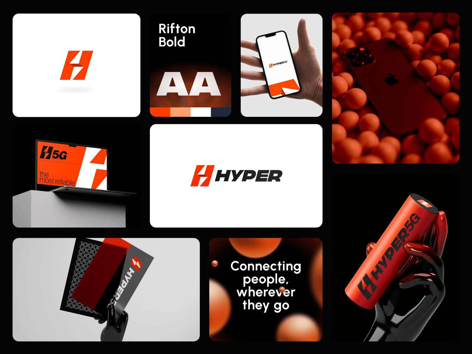
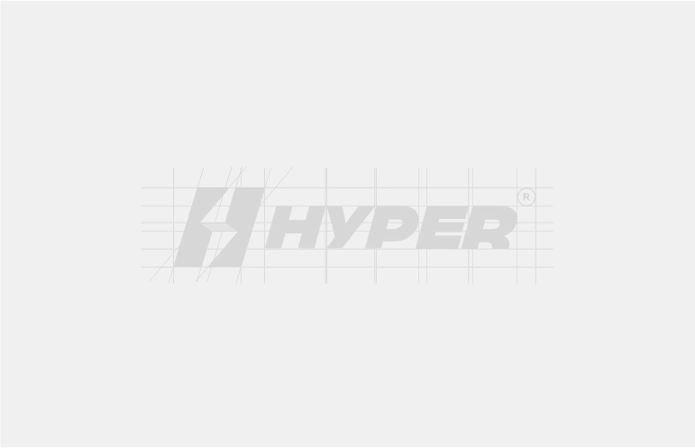
Logo Design
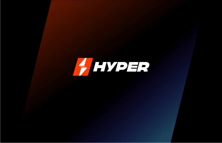
The final logo features a bold, minimal mark that balances power with simplicity.
On the left: a striking geometric symbol formed by two mirrored red-orange angles, creating a stylized "H". This shape evokes speed, signal, and motion — perfectly aligning with the brand’s 5G core.
On the right: the word “HYPER” in strong, italicized uppercase sans-serif lettering. The italic treatment enhances the sense of momentum, while the clean, modern typeface supports clarity and trust.
The vibrant red-orange used in the symbol adds urgency and confidence, helping Hyper5G stand out in a landscape often dominated by blue-toned, conservative telco brands.
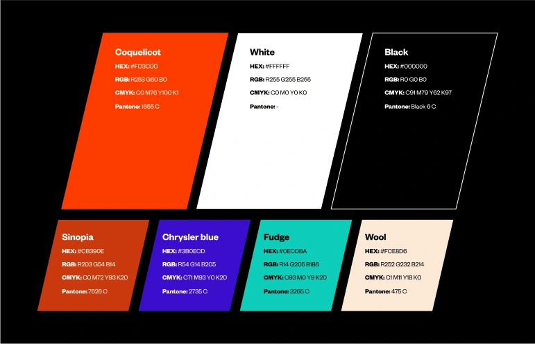
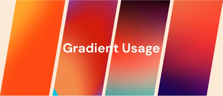
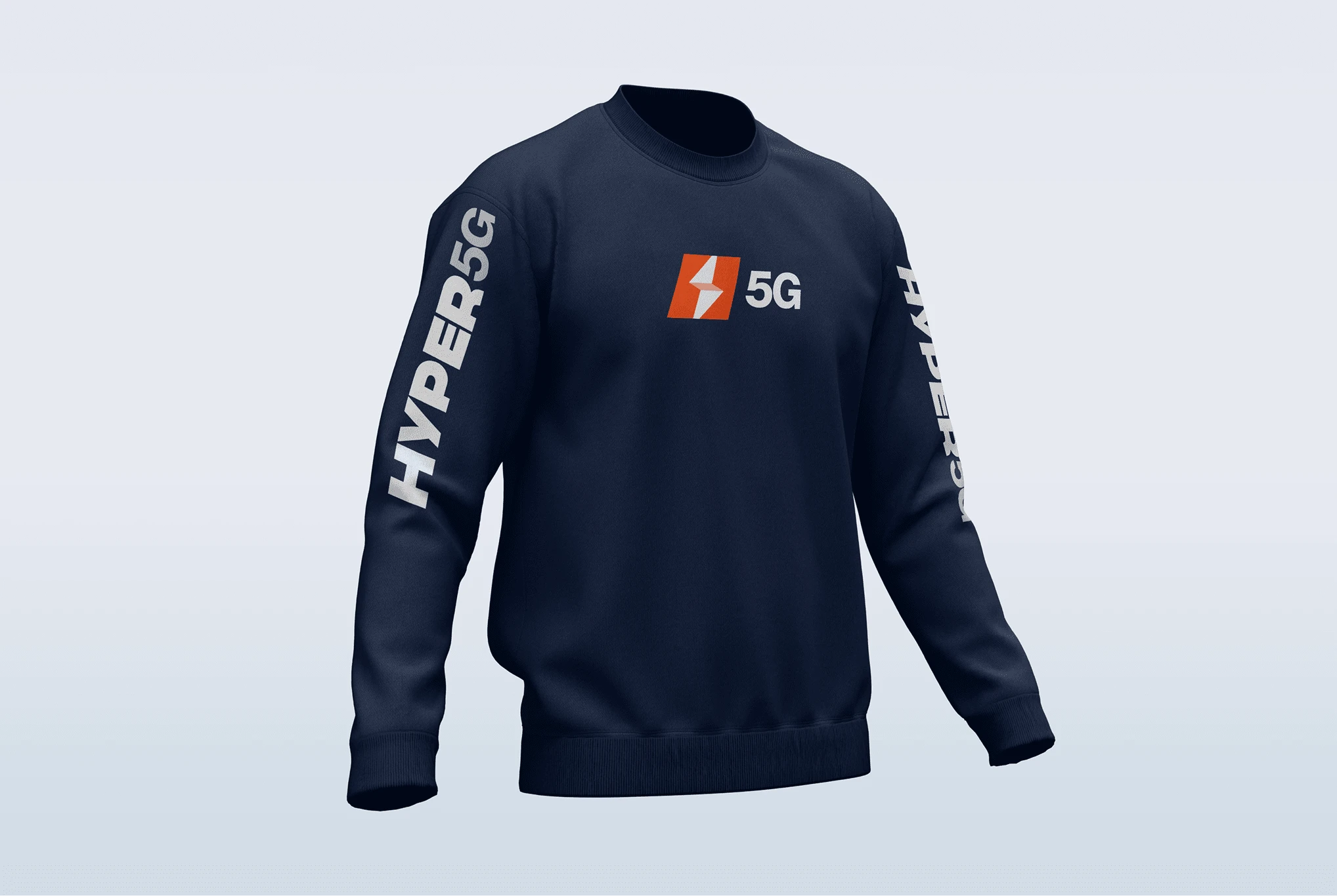
Brand System
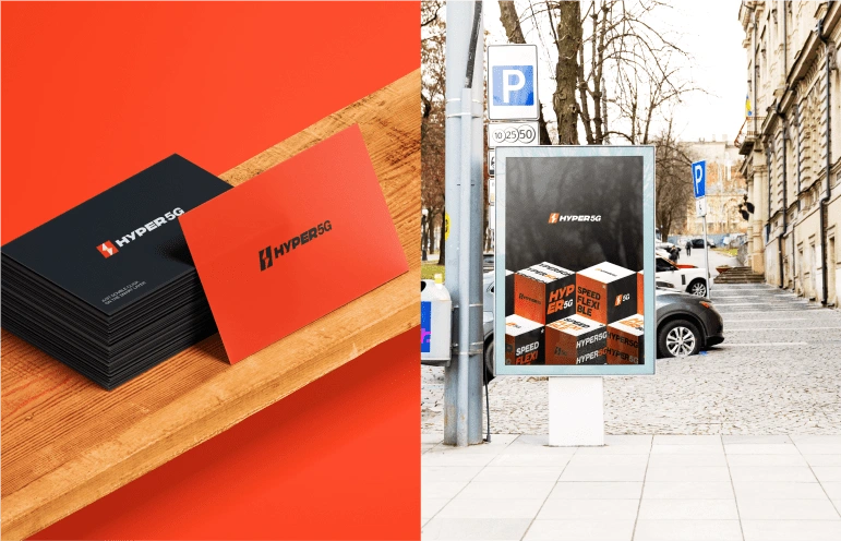
Developed a modular, scalable identity system for use across web, print, and social
Built out a bold but clean color palette with strong contrasts and tech-forward tones
Chose typography that balances tech modernity with readability at every size
Delivered a full brand kit including usage rules, logo lockups, icon system, and a scalable UI design kit
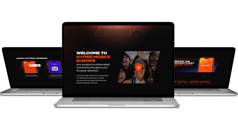
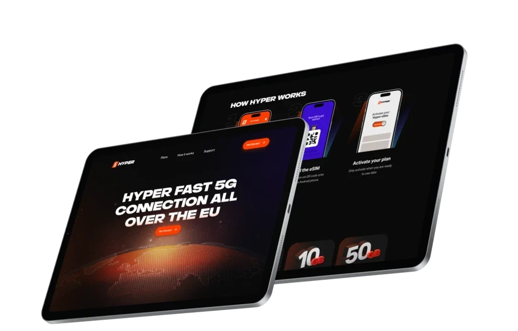
💻 Website Design & Build
Designed a mobile-first layout with clear hierarchy and crisp visual flow
Created a frictionless pricing section that makes decision-making easy and intuitive
Used motion, hover states, and scroll-triggered elements to reinforce the brand’s kinetic vibe
Developed the final site in Framer, allowing for seamless animations and easy CMS updates for future rollouts
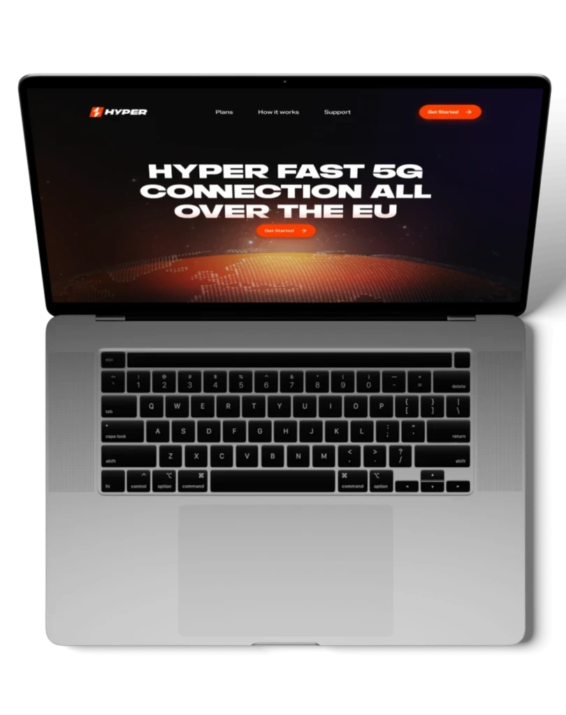
🌍 Results
Hyper5G launched their MVP site on-time, ready for go-to-market across Europe
The visual identity has helped position them as a premium, no-BS alternative to legacy carriers
The site has served as a conversion touchpoint for early users and beta testers in Germany and the Netherlands
The design system supports scalable marketing and onboarding across future territories
💬 Client Feedback
“We couldn’t have asked for a better launch. Leslie understood the vision and turned it into something better than we imagined. People love the brand — and the website just works.”
— Hyper 5G Co-founder
🧠 Reflections
This was one of those dream projects — zero legacy clutter, just a fresh vision and room to build something meaningful. From early sketches to fully deployed Framer pages, I got to shape how people see, feel, and experience the Hyper5G brand. Proud of how clean and intentional this one turned out.
Like this project
Posted Mar 24, 2025
Designed a bold brand and website for Hyper5G, helping them launch across Europe with a fast, modern identity and a conversion-focused digital presence.
Likes
2
Views
35
Timeline
Mar 1, 2024 - Ongoing