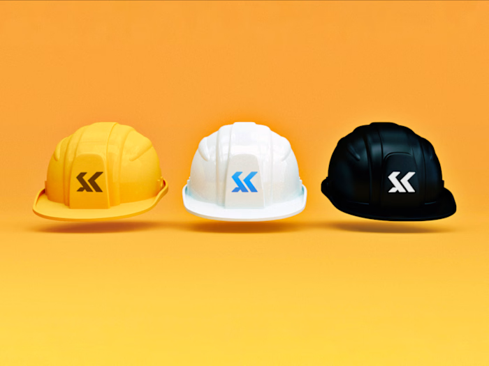
SK Icon — Schwartz Kristoffel Brand Identity Redesign

Tomiwa Neustack


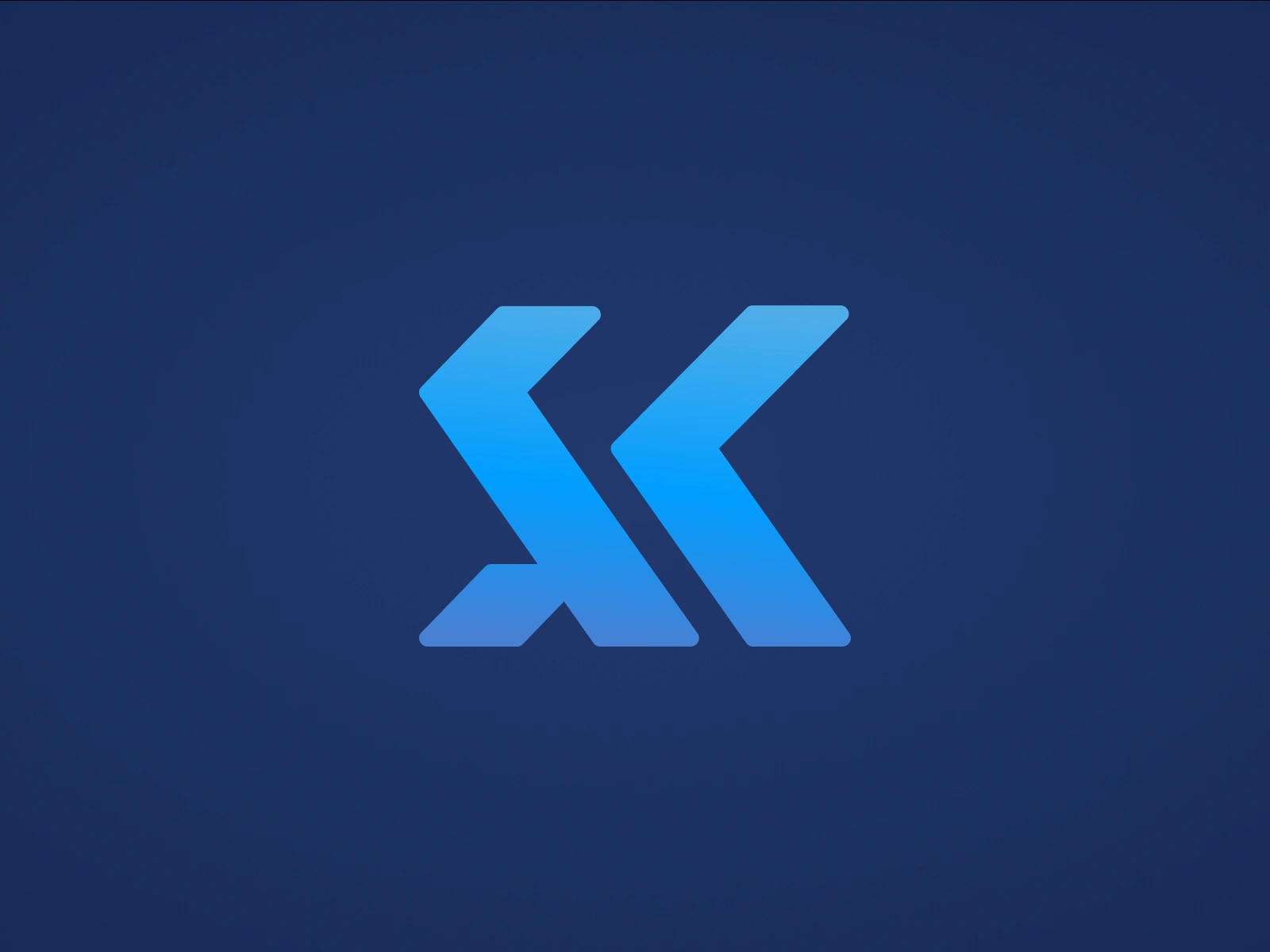
Modernized their S + K Icon Mark
Ensuring precise geometric proportions befitting a construction brand.
—
Schwartz Kristoffel Engineering Service Limited has been a major player in the Civil Engineering and Construction sector in Nigeria for 3 decades.
They wanted a rebrand that balanced the characteristics of an experienced, institutional business with a modern outlook while still retaining the brand’s core essence.
The goal was to design a brand identity that would; balance the characteristics of an experienced business with a modern look; retain the brand’s core essence and values, and represent the brand’s vision for the future.
Safe to say they absolutely loved the outcome of the redesign.
Like this project
Posted Oct 17, 2026
Modernized their S + K Icon Mark Ensuring precise geometric proportions befitting a construction brand. — Schwartz Kristoffel Engineering Service Limited has been a major player in the Civil Engineering and Construction sector in Nigeria for 3 decades. They wanted a rebrand that balanced the characteristics of an experienced, institutional business with a modern outlook while still retaining the brand’s core essence. The goal was to design a brand identity that would; balance the characteristics of an experienced business with a modern look; retain the brand’s core essence and values, and represent the brand’s vision for the future. Safe to say they absolutely loved the outcome of the redesign.