Yoko
Marco Oliveira
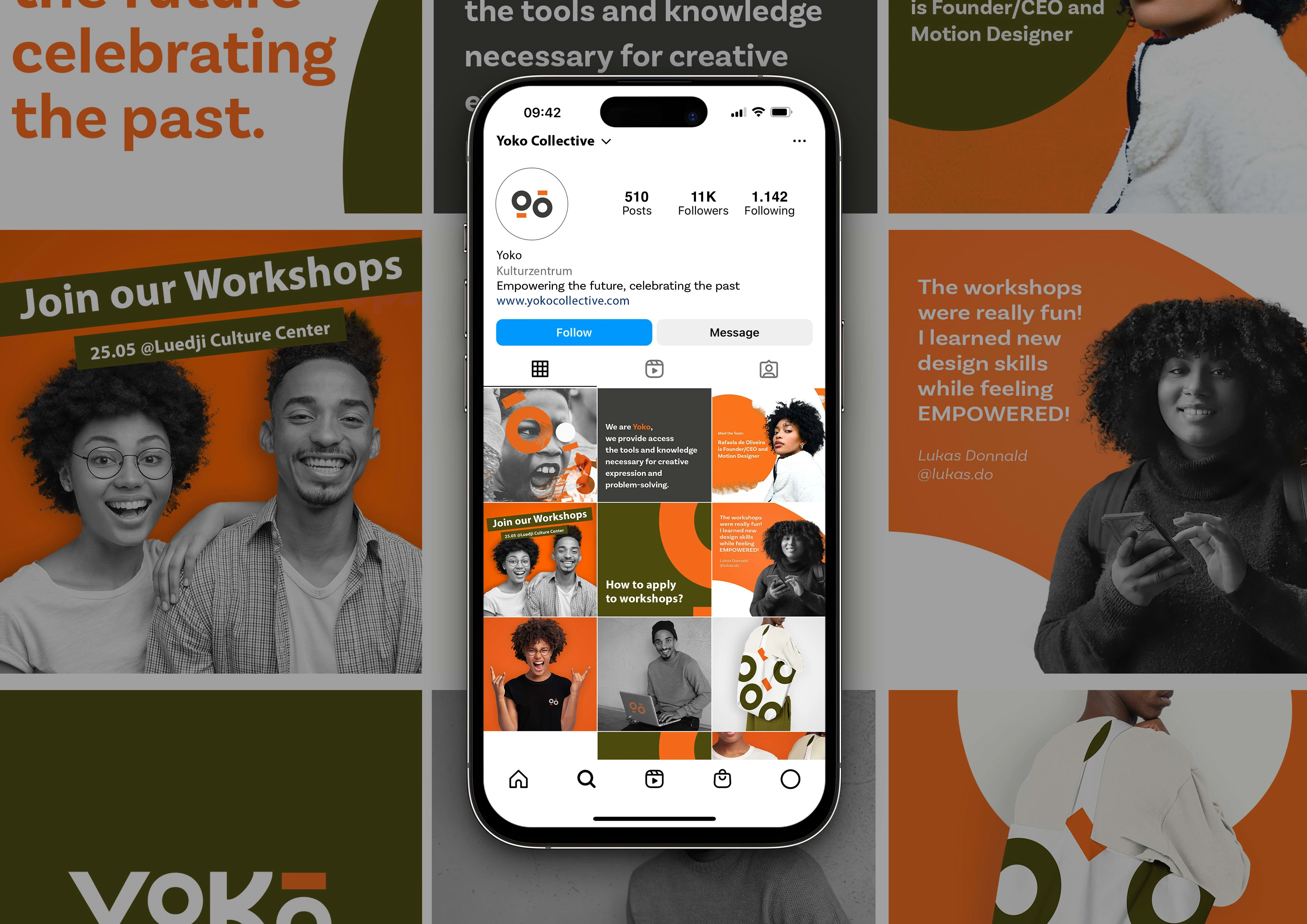
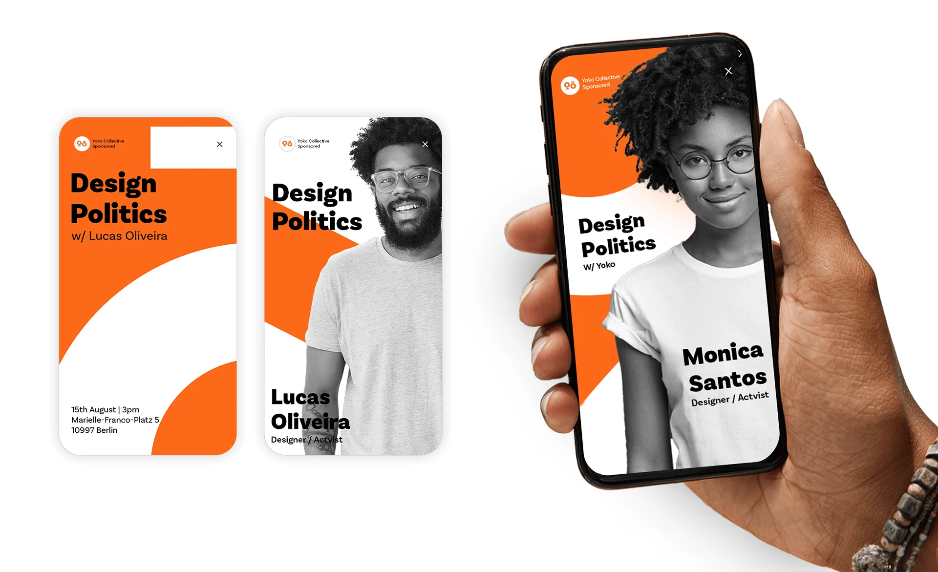
Yoko Collective embodies a diverse, inclusive community embracing Afro-futurism and multiple disciplines. It's a space dedicated to empowering People of Color through education and creativity. Creativity is at our core, fostering an environment where self-expression and empowerment thrive.
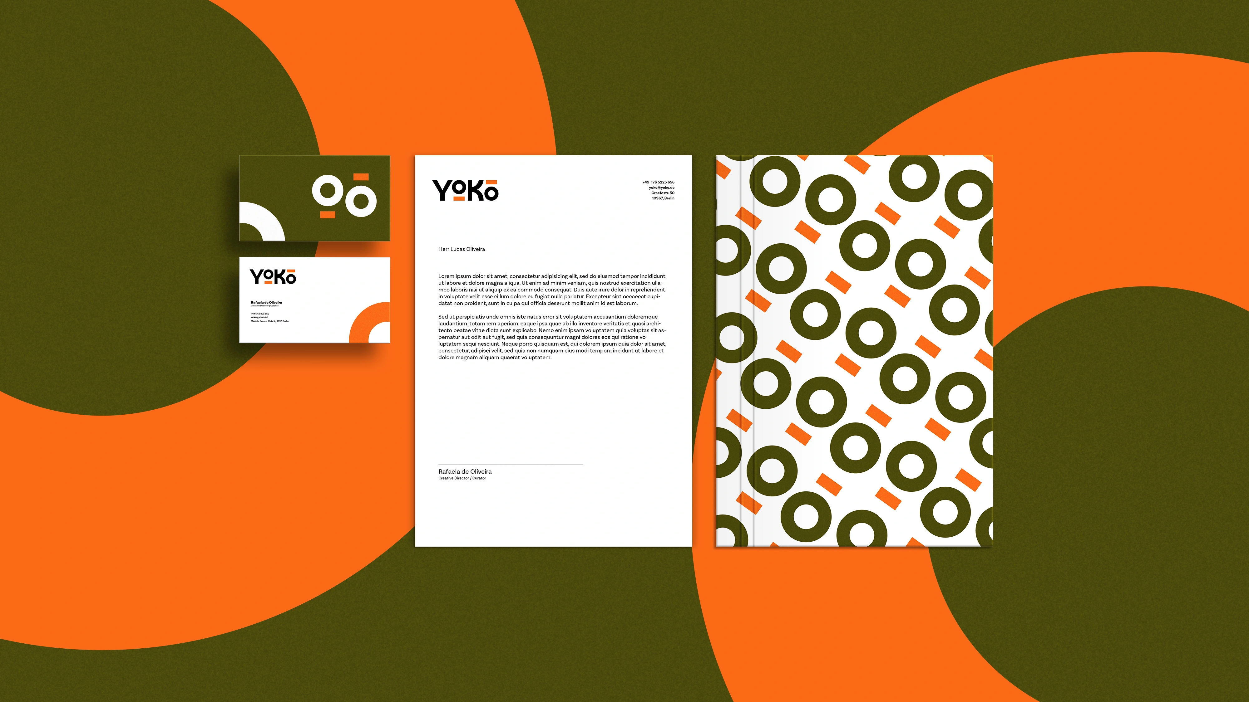
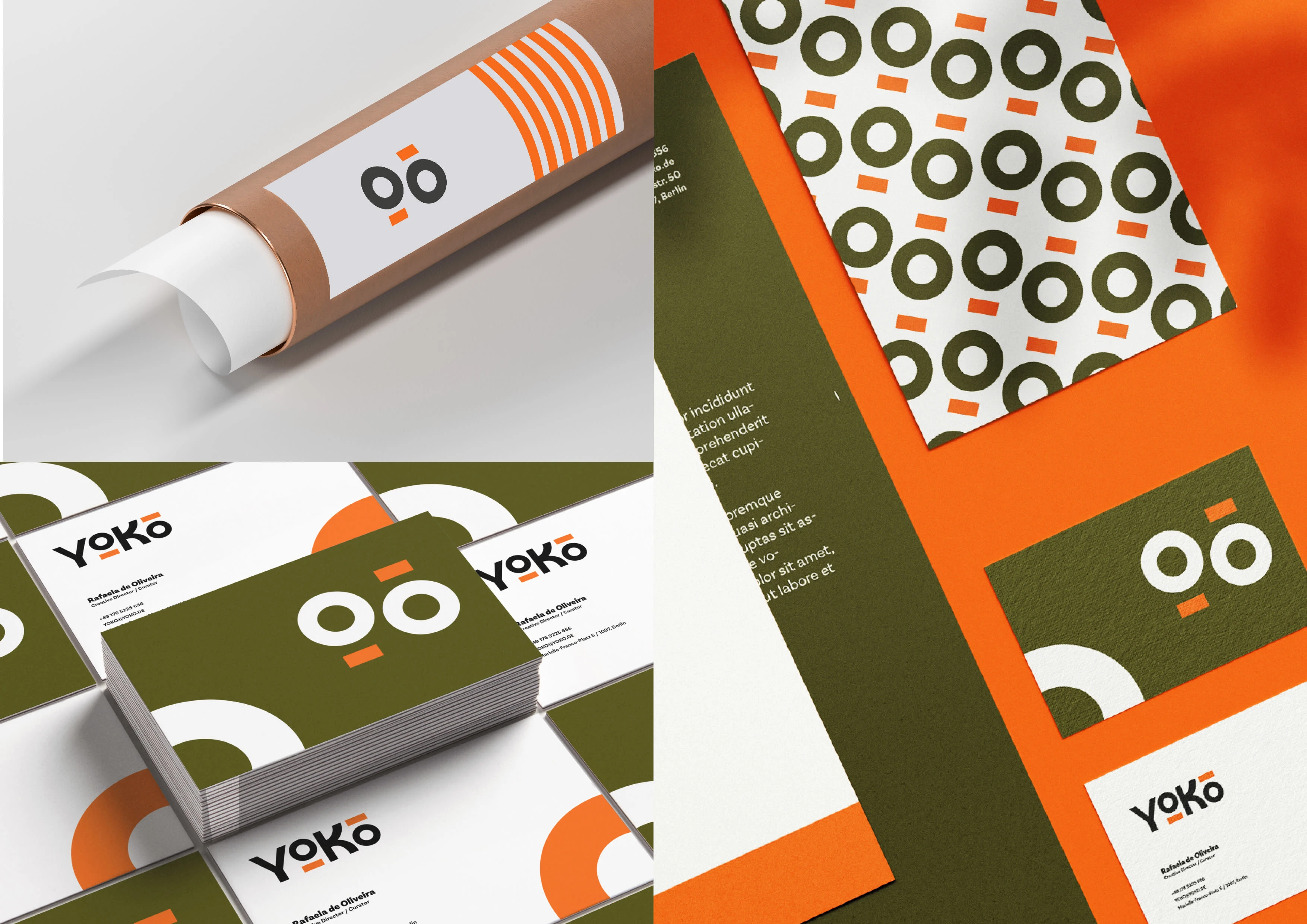
The choice of orange and green hues wasn't arbitrary. Orange signifies enthusiasm and creativity, reflecting the vibrant spirit of Yoko Collective. Green represents balance and growth, symbolizing the commitment to nurturing a space where People of Color can flourish creatively and harmoniously. The logo captures the collective's essence – it represents connections and progress, echoing our inclusive and forward-thinking approach. It's a visual symbol of our collective identity, reflecting our values and guiding our journey toward empowerment and unity.
Like this project
Posted Jan 25, 2024
Yoko Collective embodies a diverse, inclusive community embracing Afro-futurism and multiple disciplines.