Bsounds Logo
Sabine Pierre
About Bsounds
Bsounds is a reliable and innovative business that strives to provide crystal-clear sound solutions to event professionals and performers.
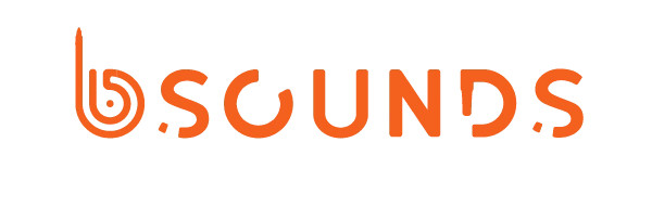
About the logo
The logomark creatively combines a 1/4 cable wire that subtly transforms into the "B of Bsounds.


The “D” of the Bsounds also combines a 1/4 cable wire. The O forme the shape of mixer knob.
Concept
Symbolic Meaning:
Cable wire represents connectivity and technical infrastructure
Mixer knob suggests precision and professional sound manipulation
Integrated design communicates seamless, holistic audio solutions
Key Design Elements:
Primary color: Deep blue | dark (representing trust and professionalism)
Secondary color: Vibrant orange (signaling energy and innovation)
Minimalist design that's easily recognizable
Emotional Connection:
Build trust through professional, clean design
Communicates technical competence
Feels modern and approchable
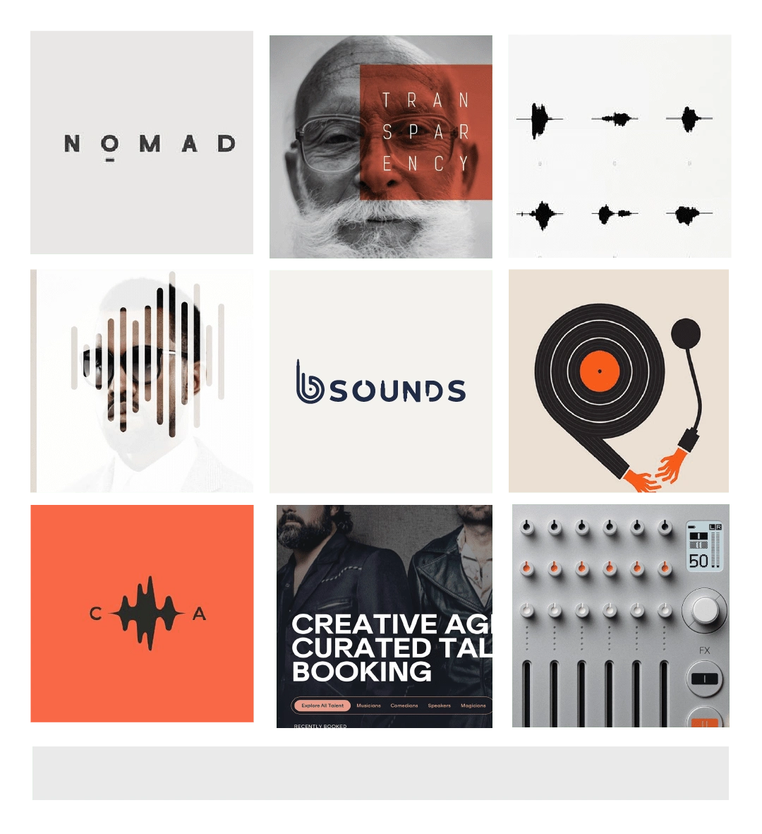
The Mood board
Here is the logo showcased with the initial mood board reflecting the visual inspiration, knobs, wires, waveforms, typography, and colours that influences the final results.

Like this project
Posted Nov 27, 2024
I redesigned Bsounds' logo to reflect their sound engineering expertise, delivering a modern, professional identity with high-resolution files and a style guide
Likes
0
Views
11