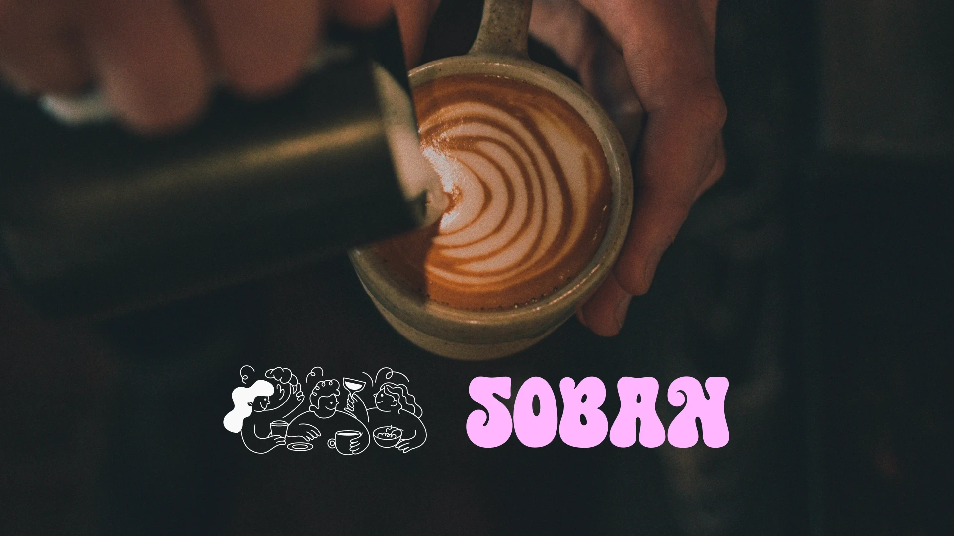
Soban Cafe / Rebrand
Anika Aggarwal
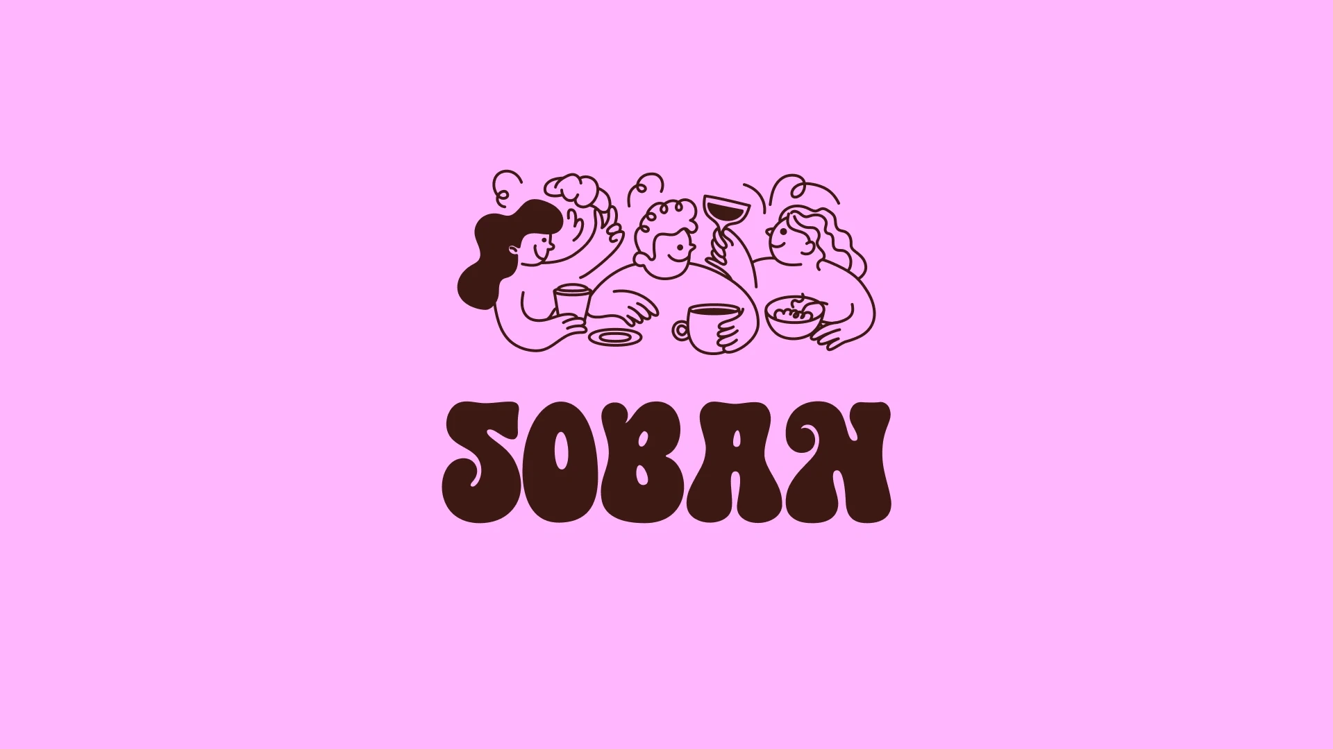
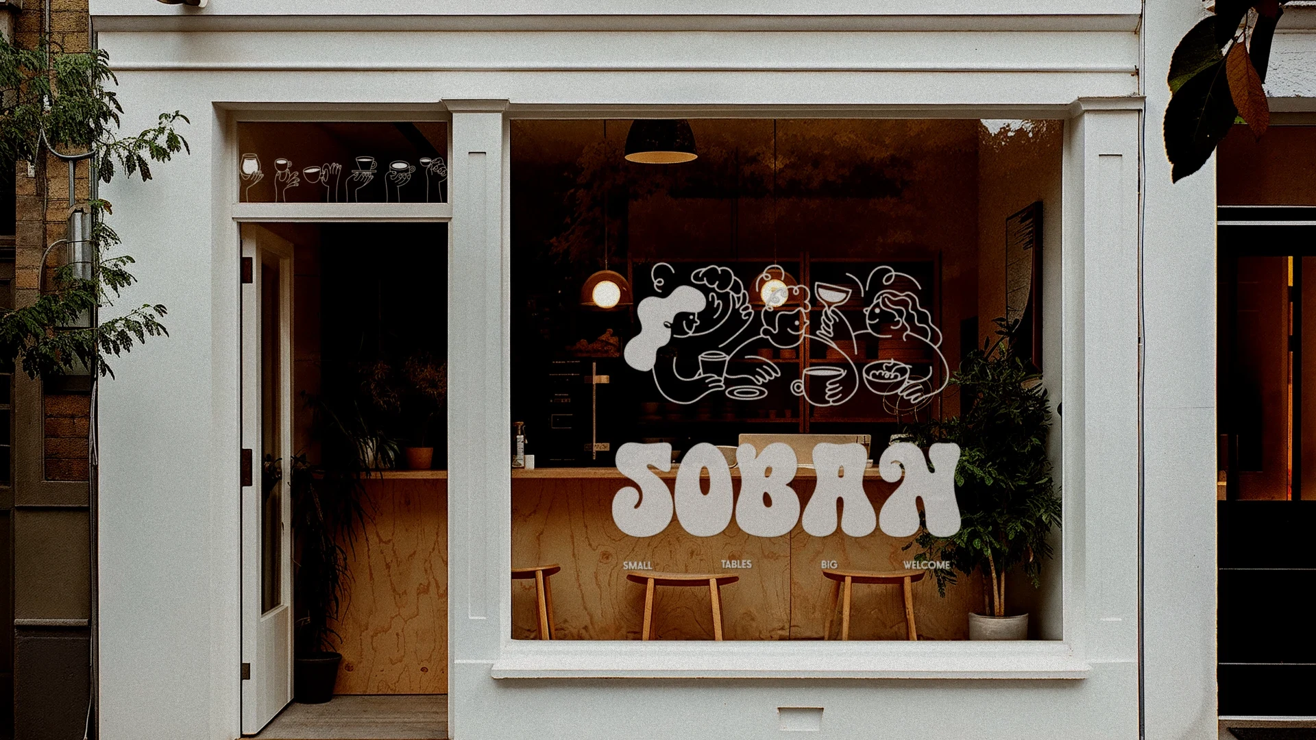
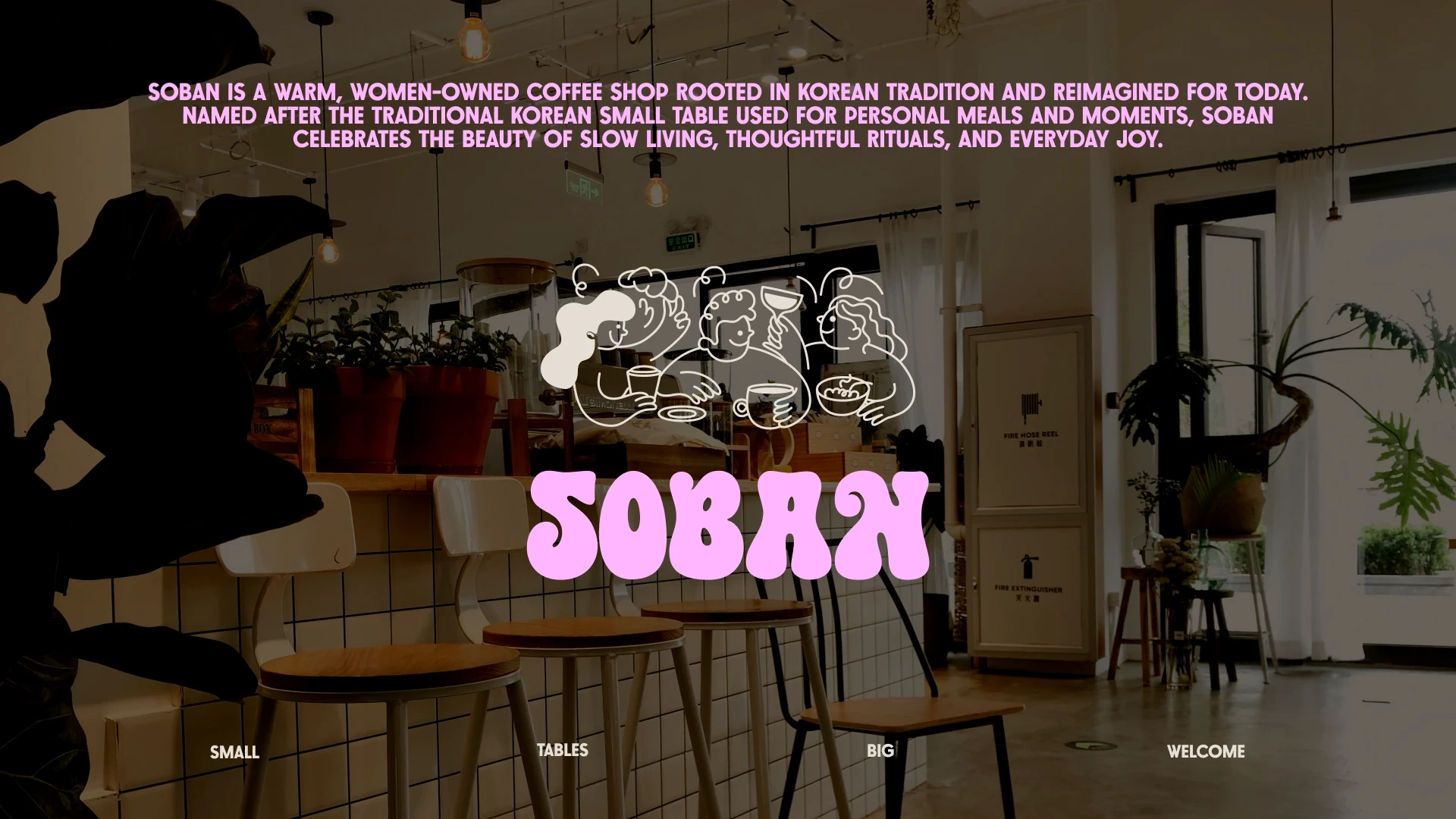
Soban Rebrand
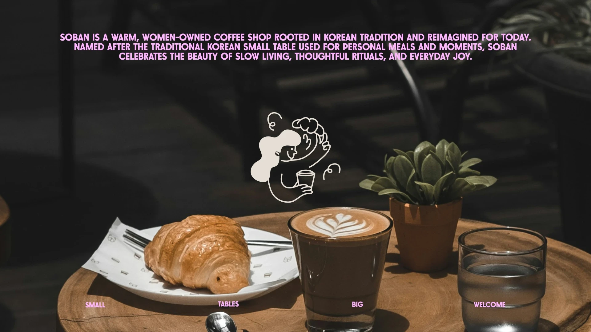
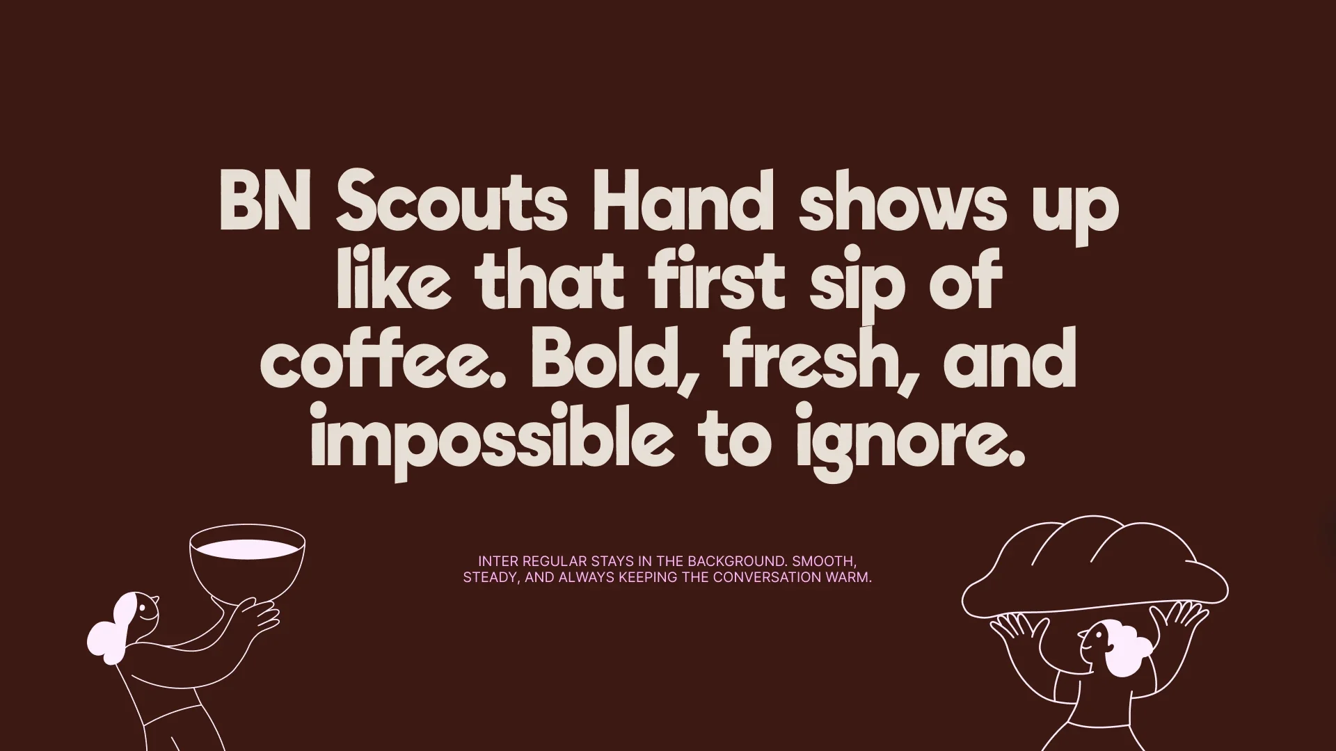
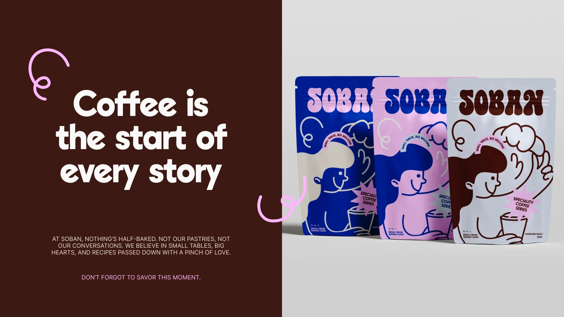
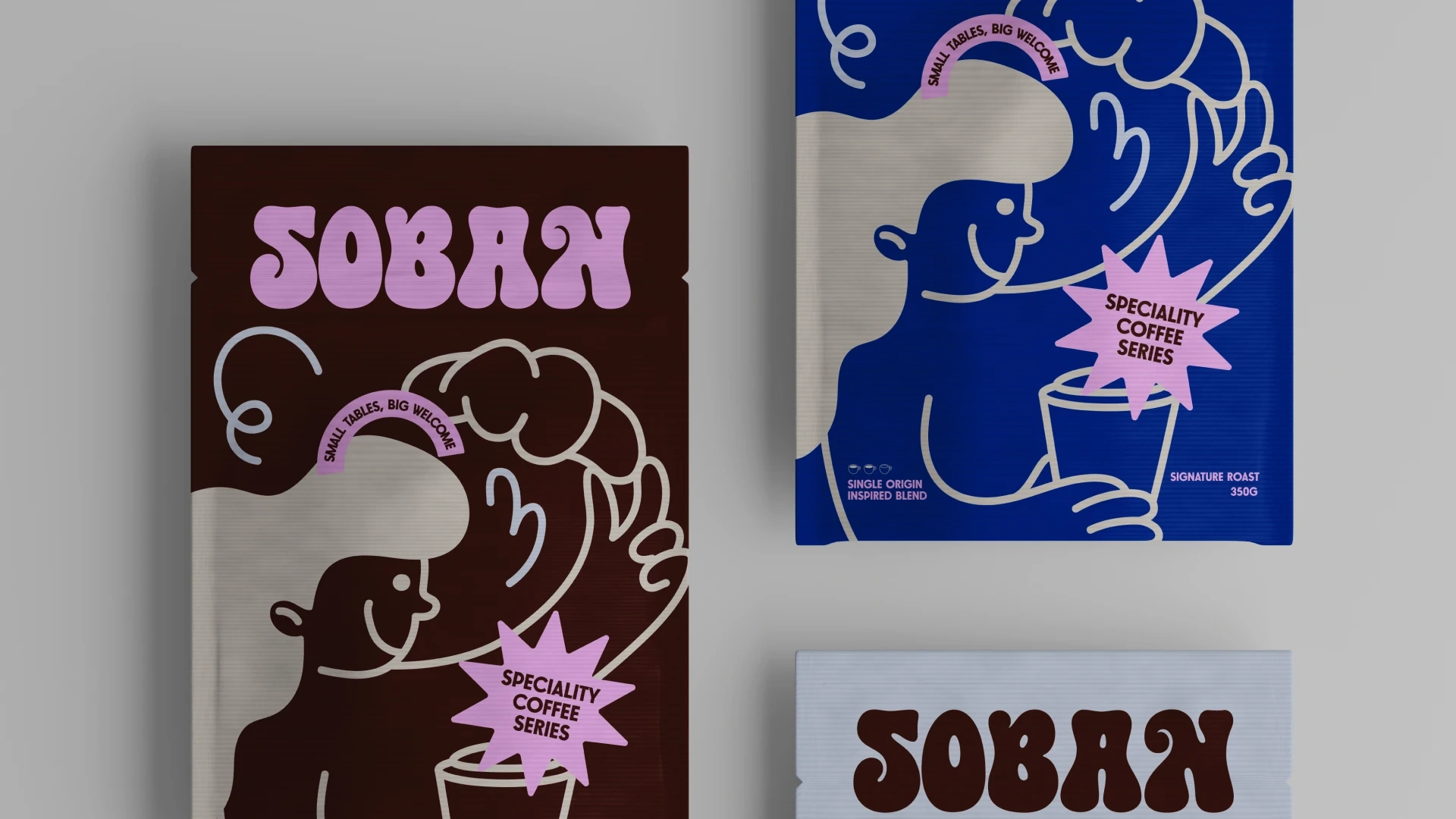
Soban is a warm, women-owned coffee shop rooted in Korean tradition and reimagined for today. Named after the traditional Korean small table used for personal meals and moments, Soban celebrates the beauty of slow living, thoughtful rituals, and everyday joy. The tagline, “Small tables, big welcome”, sums up the heart of Soban — a place where you’re always invited to sit down, slow down, and feel at home.
The brand strategy shaped Soban into more than just a coffee shop. It positioned the café as a space for genuine connection, focusing on thoughtful details, from the way the food is made to the way stories are shared. By using playful words, a cozy visual style, and a clear voice, the rebrand helped Soban stand out and feel familiar at the same time — turning each visit into something worth remembering.
Project Scope
– Brand Discovery & Strategy
– Logo & Identity System
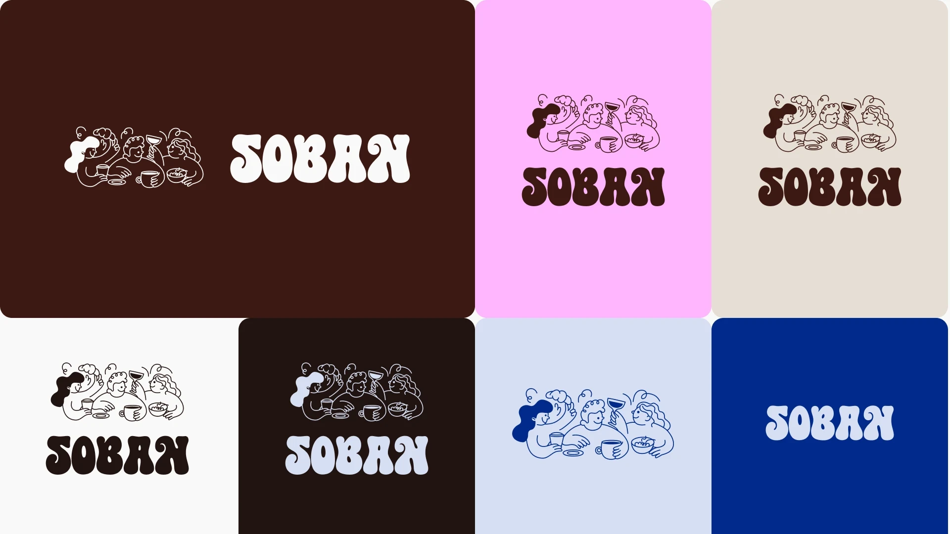
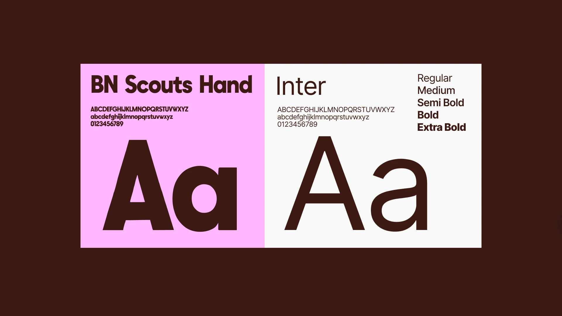
– Typography & Color
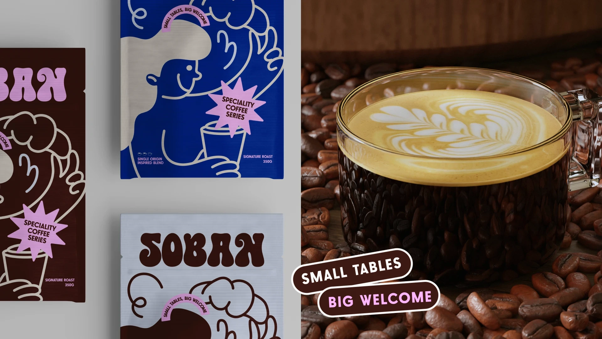
– Packaging & Brand Language
– Social Media Templates
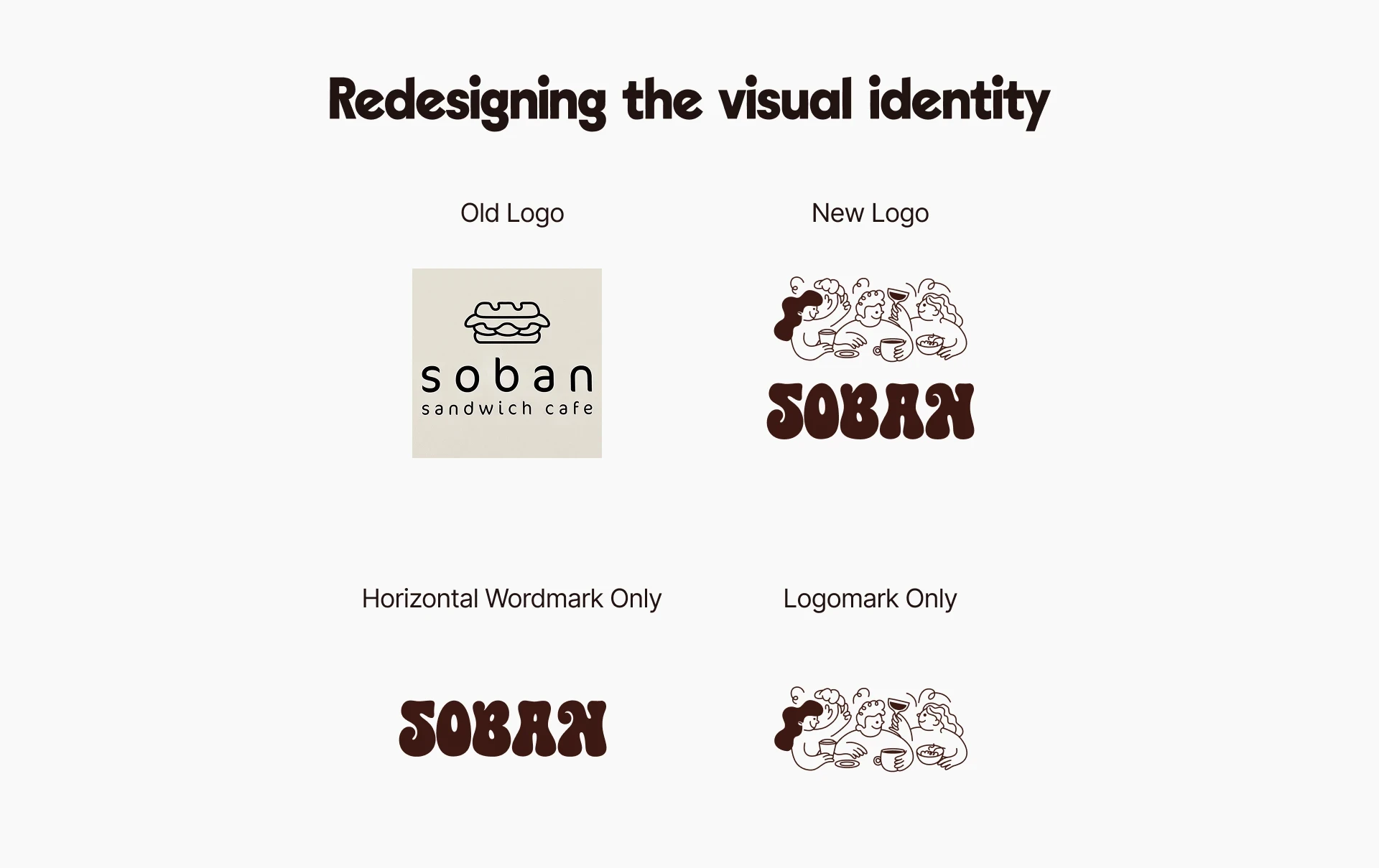
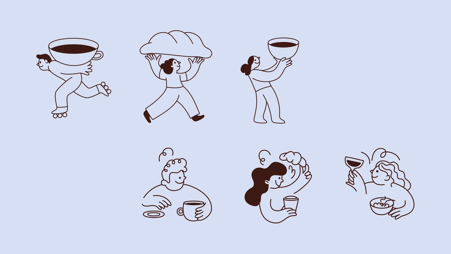
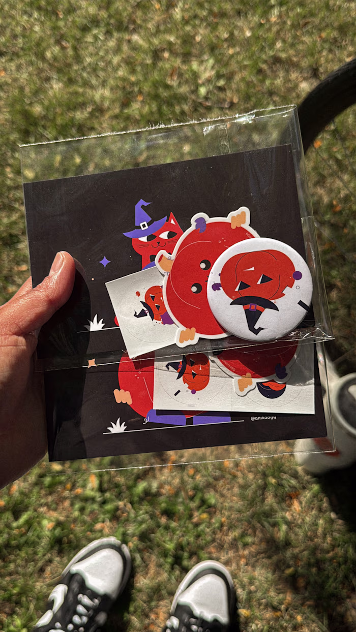
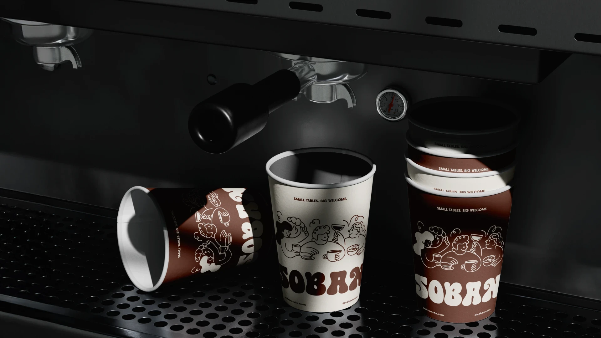
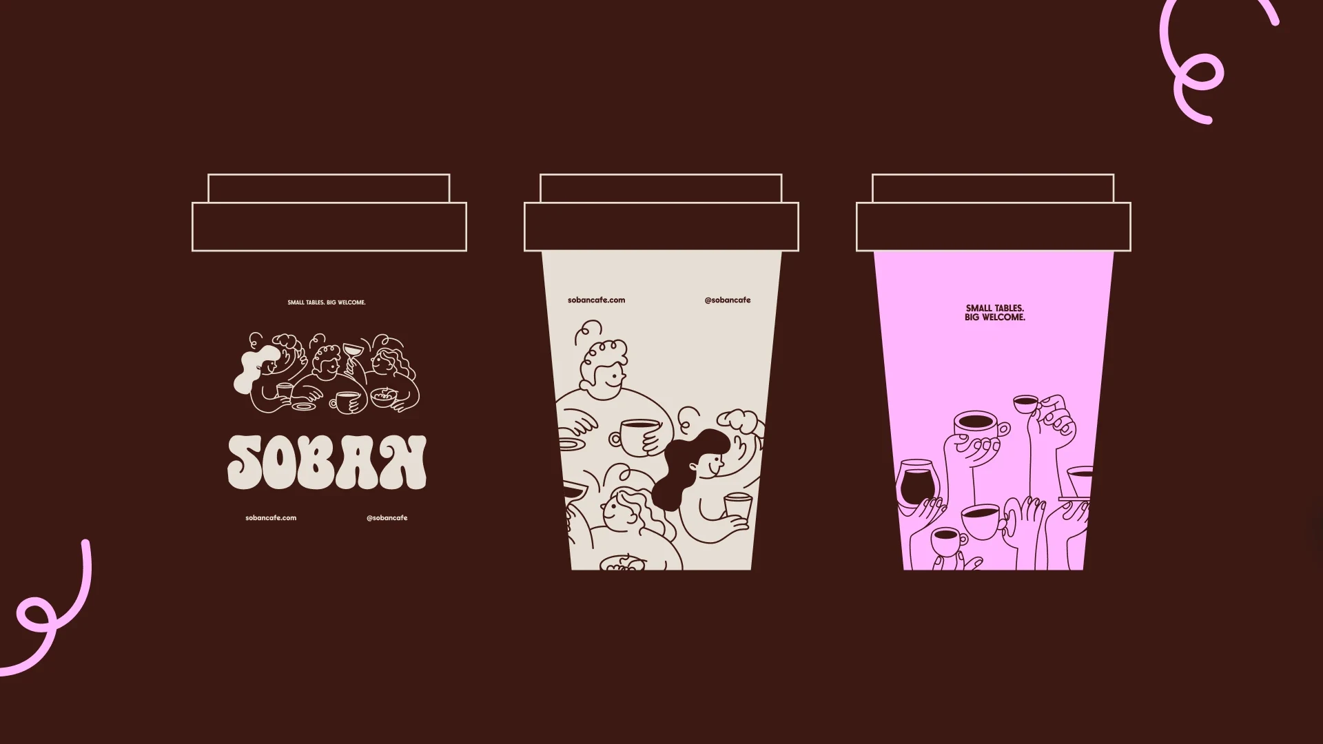
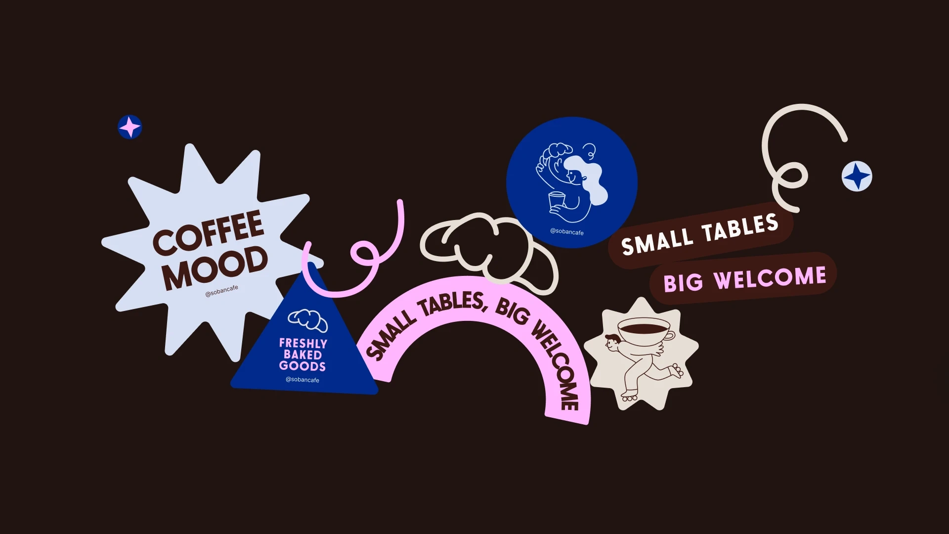
The illustration style was all about adding a human touch.
We kept it simple and playful — a way to tell stories visually without feeling too polished.
This section shows how illustration supports the brand’s personal, handmade feel.
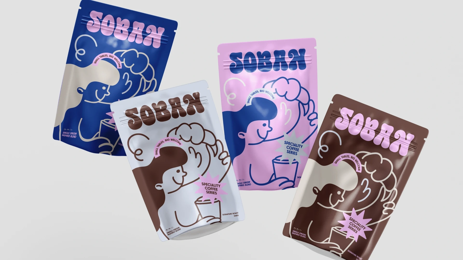
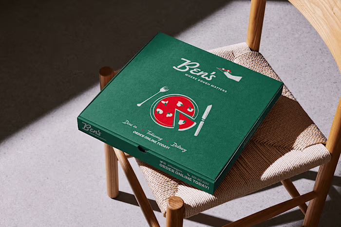
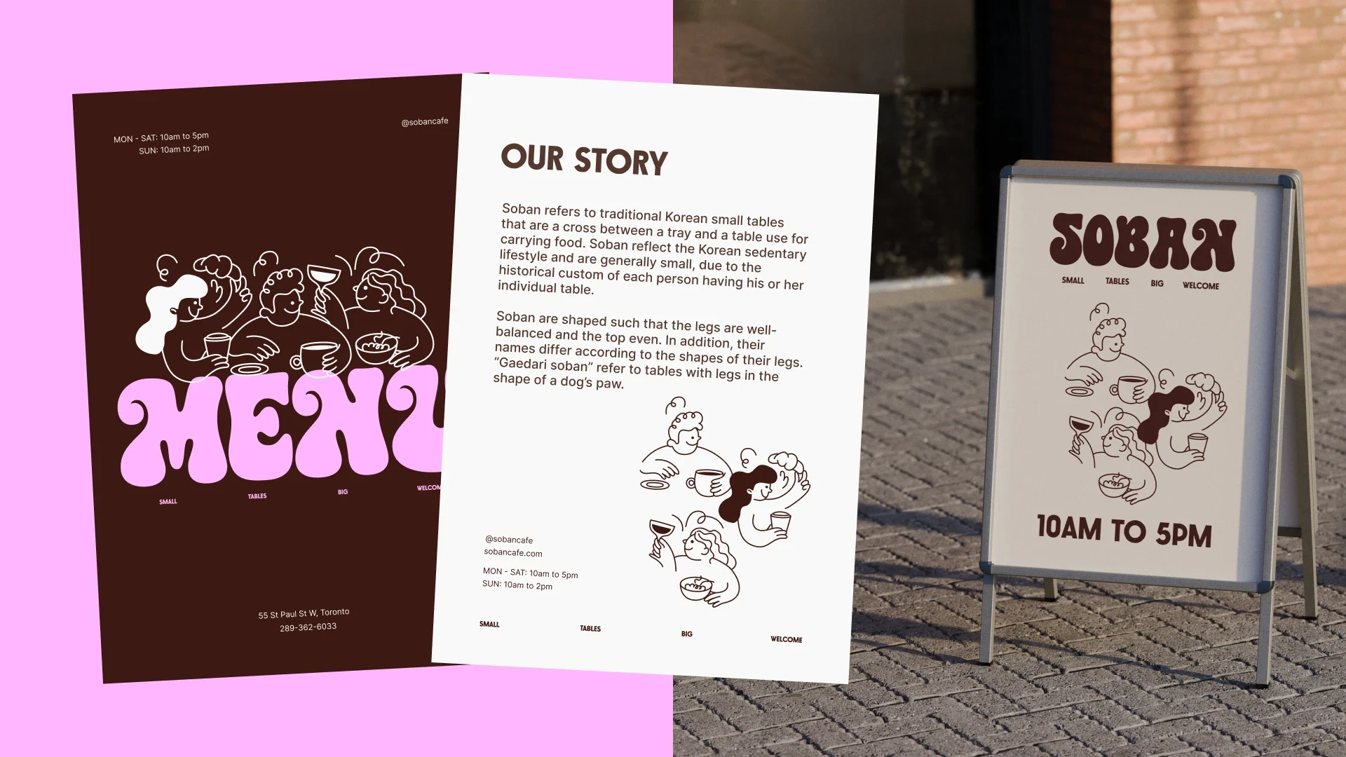
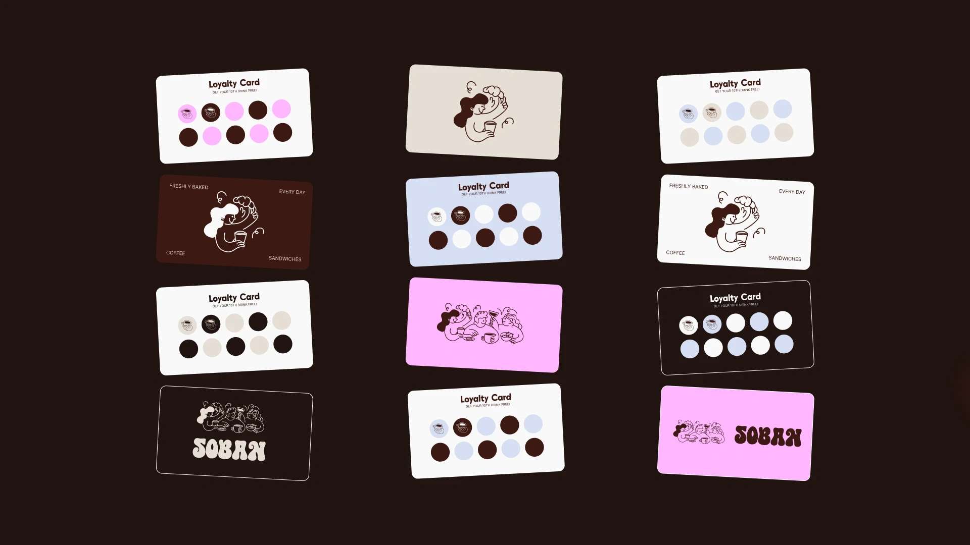
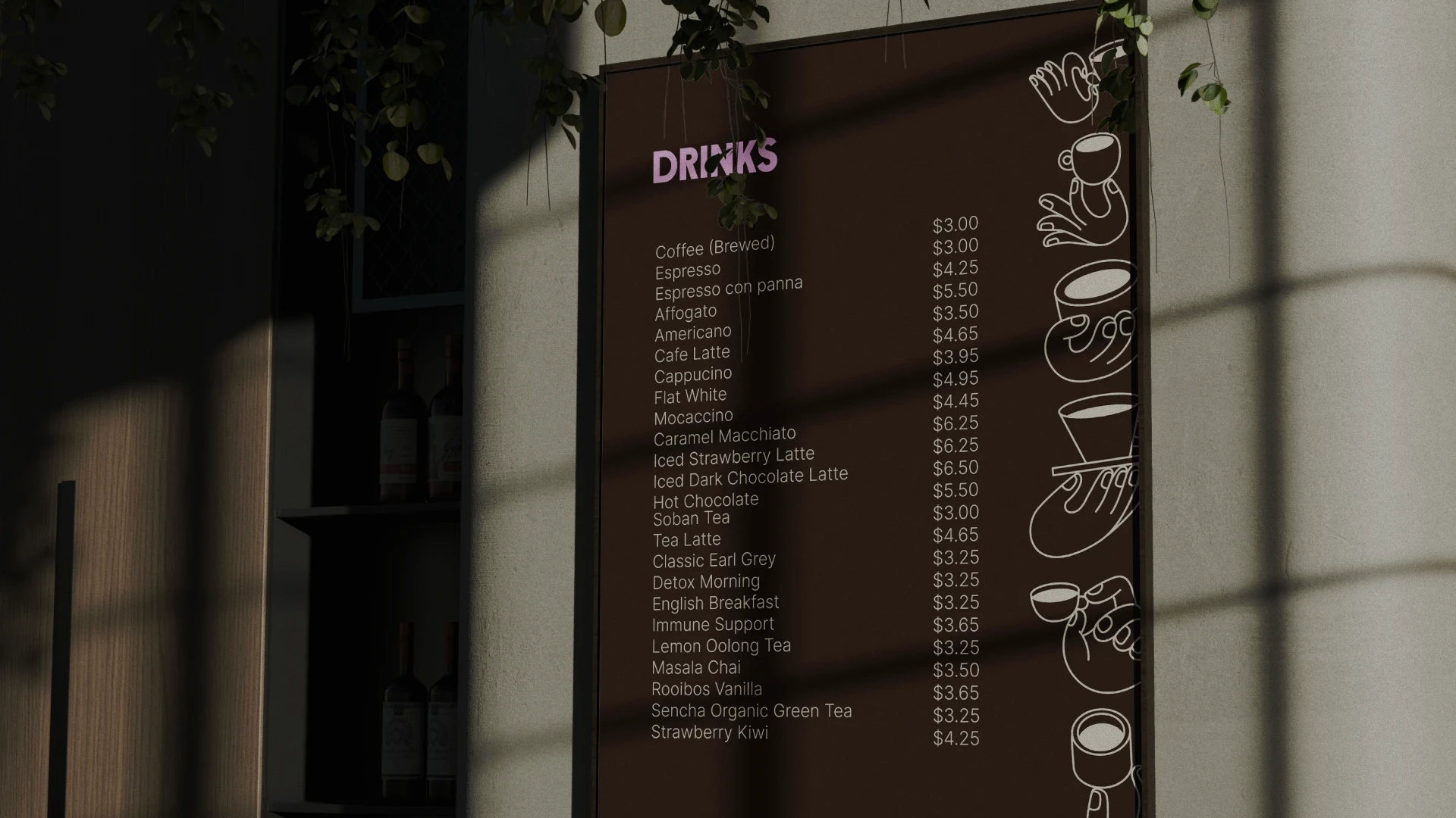
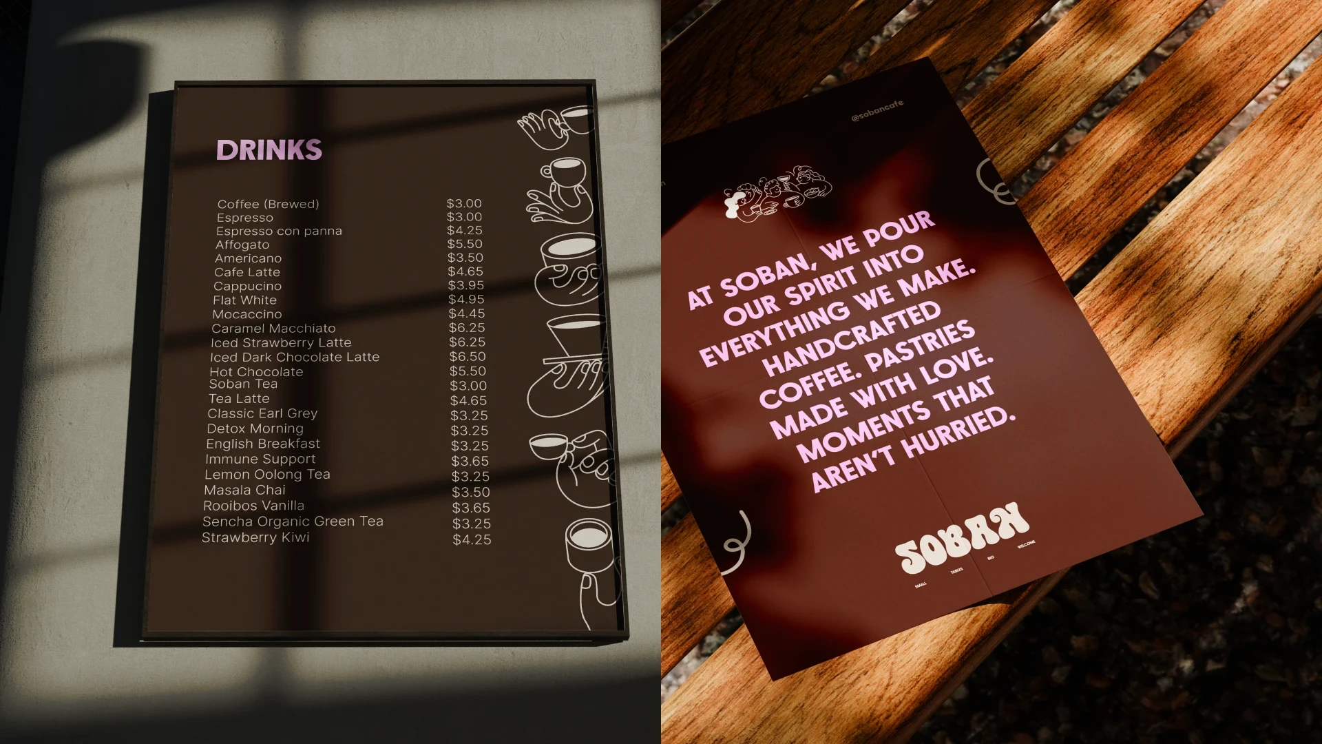
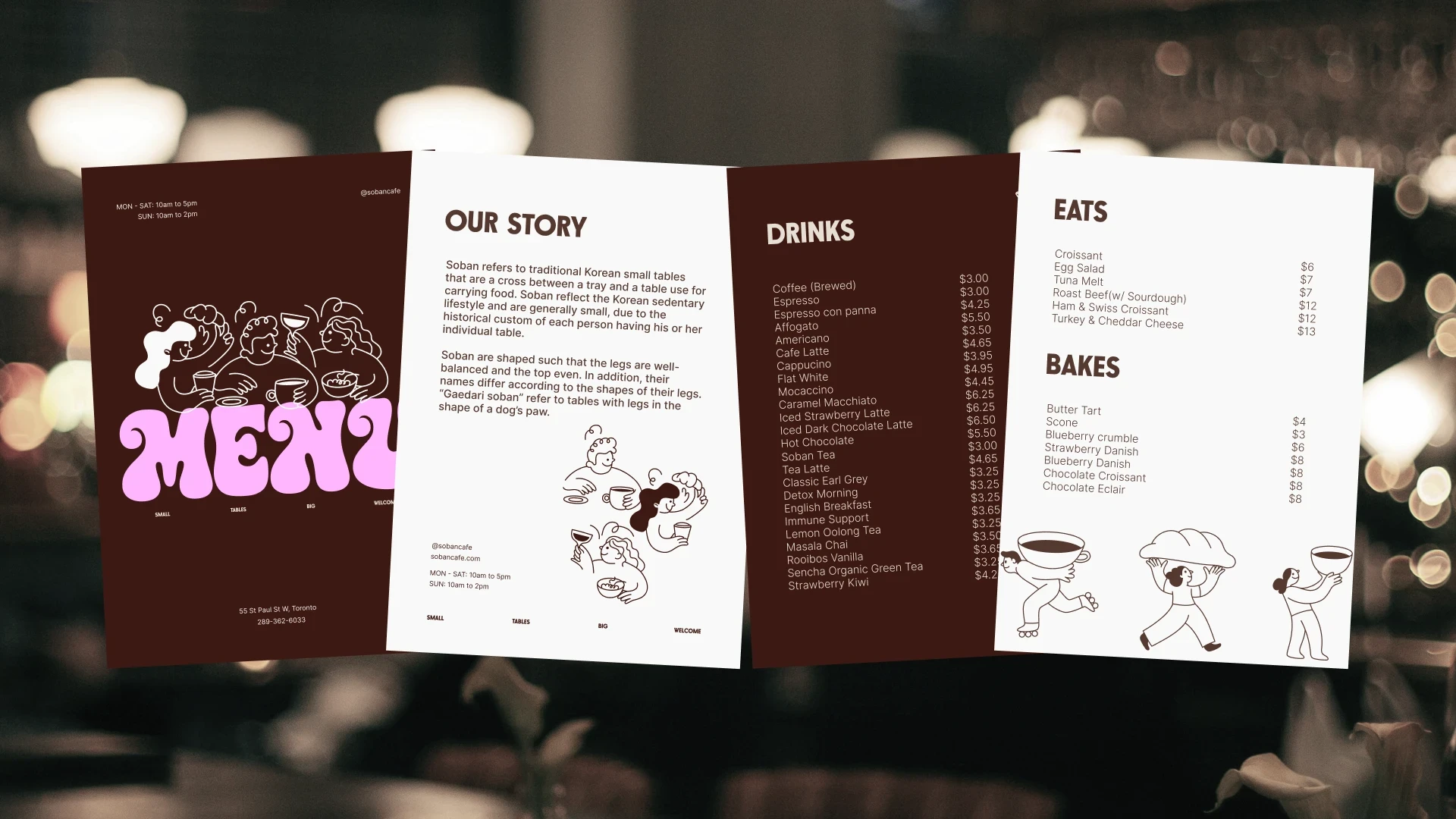
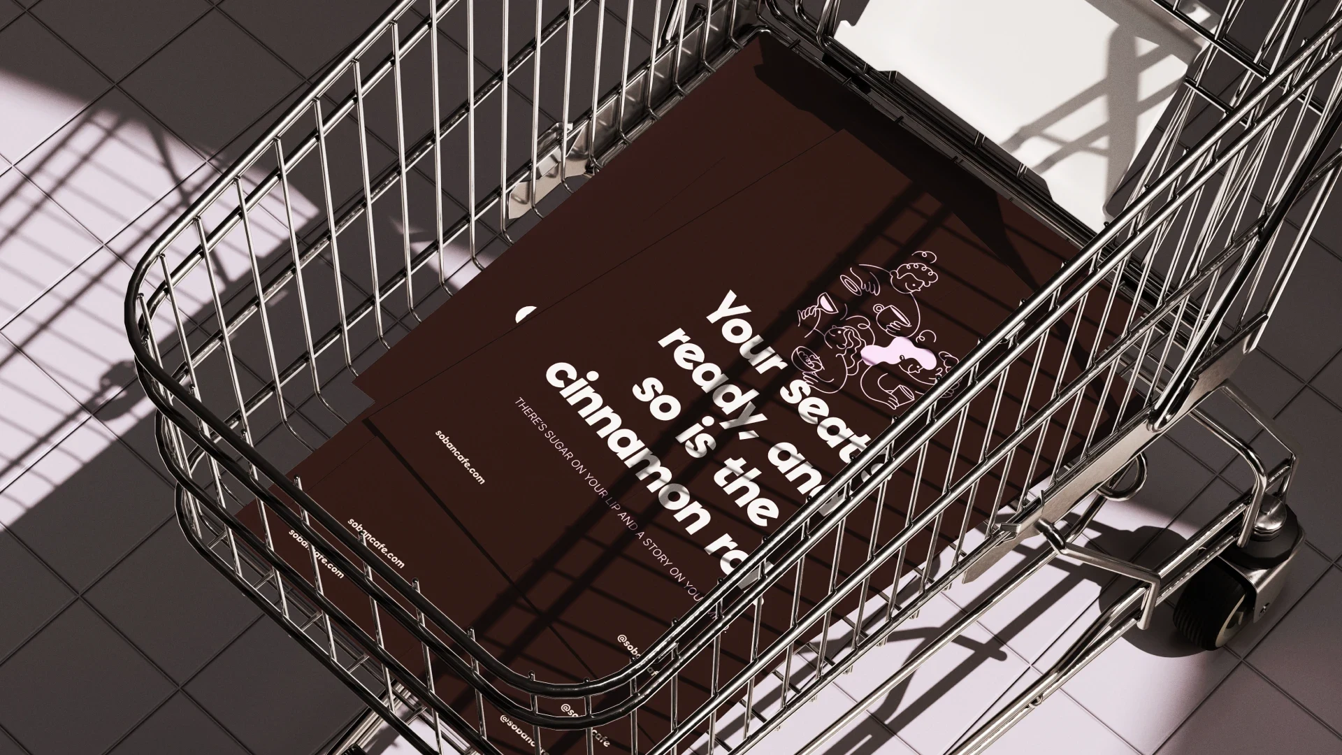
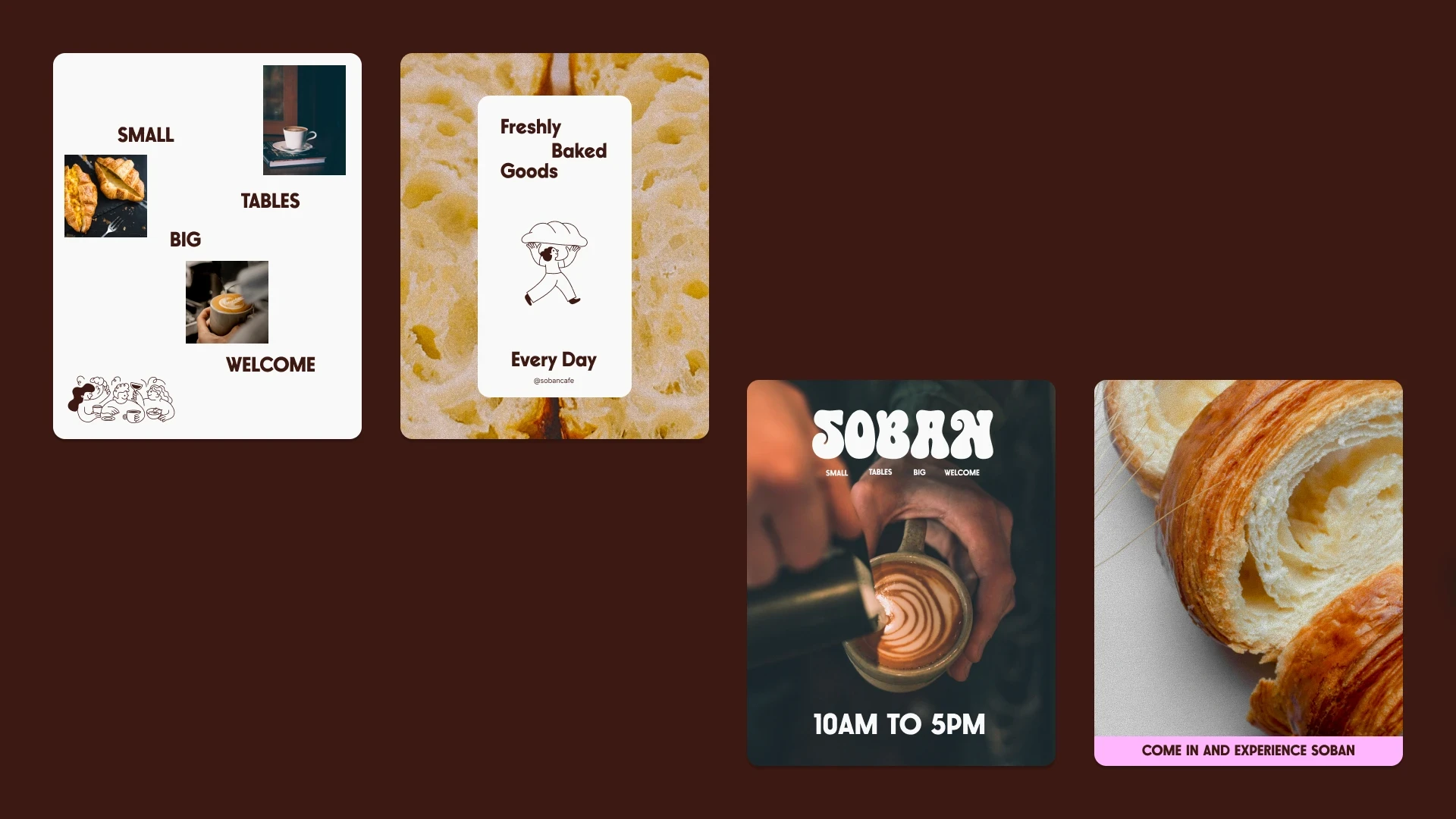
We treated every customer touchpoint like an extension of the café experience. The packaging, menus, and takeaways were all designed to feel thoughtful, not just branded — a little reminder of Soban you could carry with you.
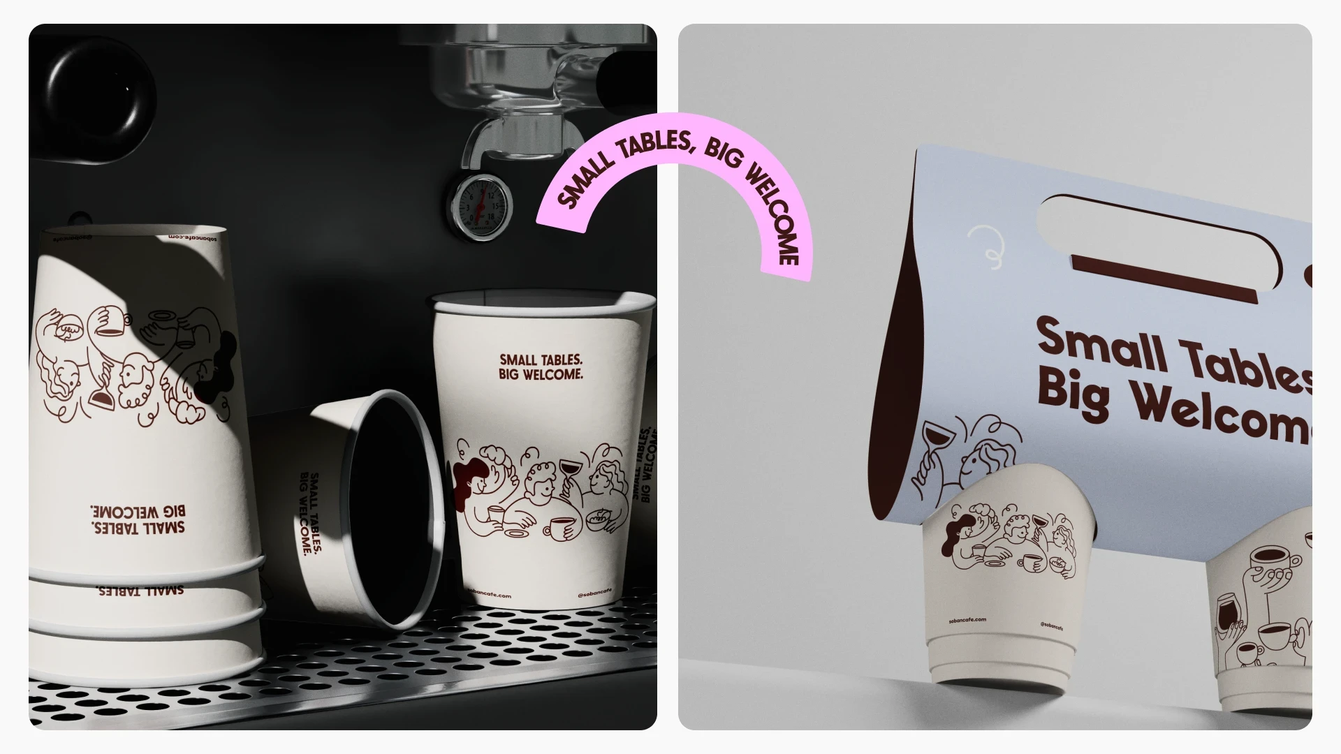
Designing the experience wasn’t just about visuals. We focused on how every interaction feels — from the first glance to the last sip.
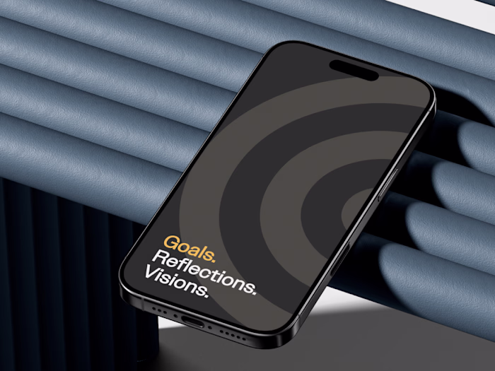
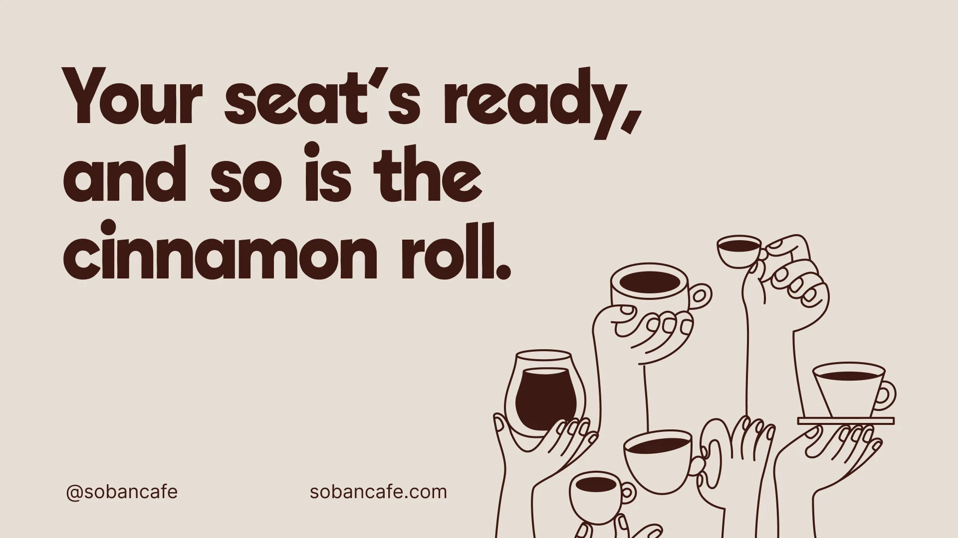
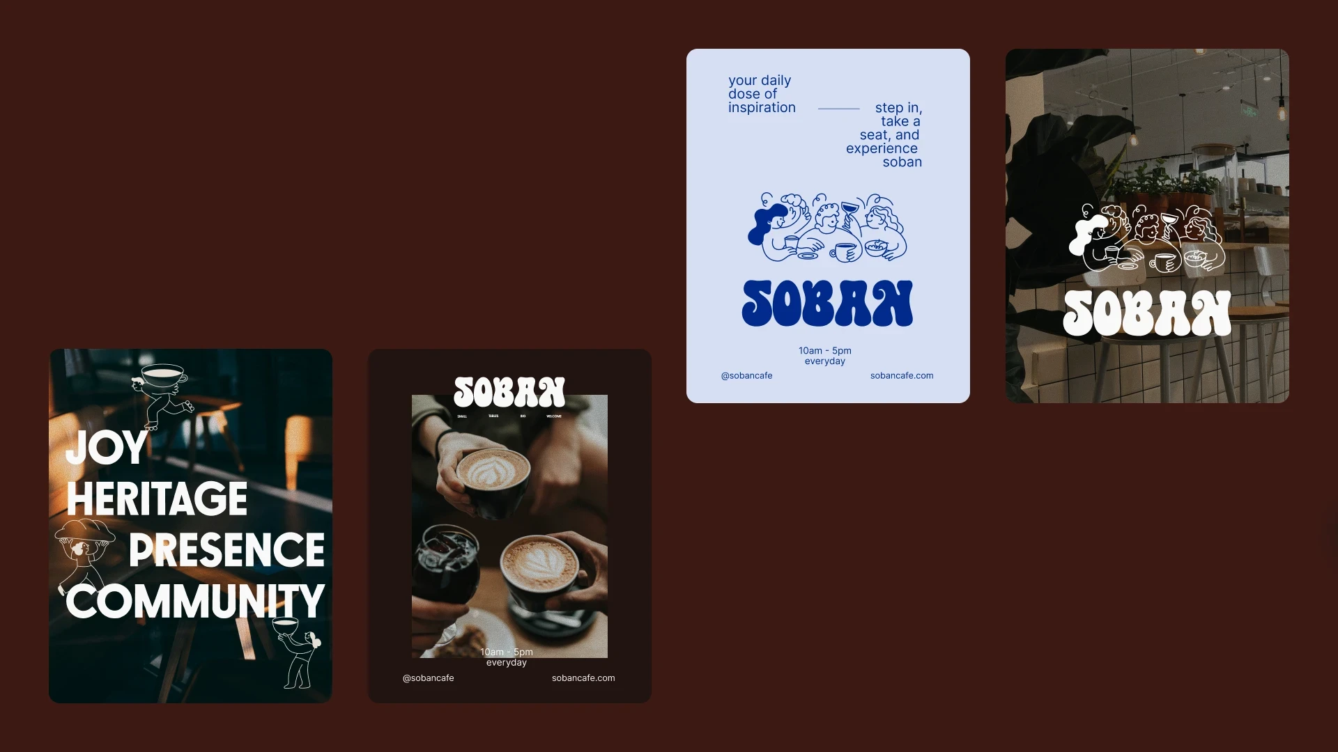
We designed social media and community moments as real extensions of the brand.
It was about keeping the conversation going and staying true to the Soban spirit online.
This section looks at how our creative approach helped build an authentic community presence.
At its core, Soban’s brand is built on connection — between people, stories, and a shared love for honest food and good company. We designed every piece with that in mind, making sure the visual identity, touchpoints, and experiences all spoke the same language.
The goal wasn’t just to build a brand, but to shape a place people want to return to.
Like this project
Posted Oct 10, 2025
Rebranded Soban Cafe branding to make it approachable and playful, while being intentional and crafted.