Seeper® — Evolving a Brand with Almost 30 Years of History

Alex Aperios


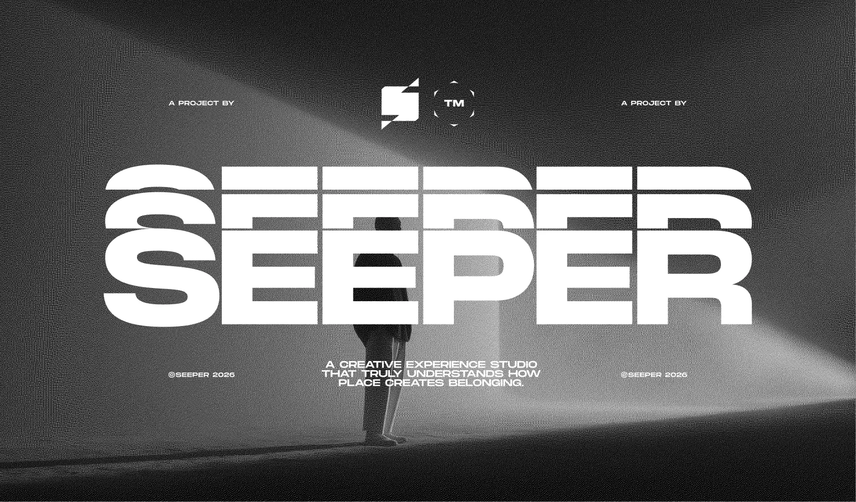
Seeper Studios: An identity that reflects the studio they had become.
Deliverables:
[ 01 ] Logo Design
[ 02 ] Visual Identity
[ 03 ] Social & Graphic Language
[ 04 ] Web Design
[ 04 ] AI Art Direction
Industry:
Immersive Experiences
Client:
Seeper Studios
Almost three decades of immersive experiences. A portfolio of extraordinary work. Seeper needed a brand that reflected the creativity, scale and sophistication of the company behind it.
We evolved their identity and created a flexible visual system to help them communicate that ambition, while preserving the personality and history that made them distinctive.
A change people noticed.
Following the launch, the Seeper team reported a significant shift in how the studio was perceived. Their exhibition stand attracted unsolicited praise, and the identity is now being extended across presentations, case studies, motion and new business pitches.
The business had evolved. The brand needed to catch up.
Founded in 1998, Seeper brings together storytelling, technology and immersive experiences to create cultural destinations, visitor attractions and brand worlds.
Their work had continued to push boundaries, but their identity no longer communicated the studio’s full creative capability.
With almost 30 years of history came recognition, credibility and a strong attachment to the existing brand. The challenge was to carry that value forward while giving people a clearer picture of who Seeper had become.
Working closely with Lauren and Chris, we explored the studio’s positioning, ambitions and how they wanted to be perceived. Those conversations gave us a foundation for an identity that could honour their history and support their next chapter.
Making “Spatial Storytellers” something you could feel.
Seeper’s work combines light, sound, movement and human interaction. Communicating that through a visual identity meant looking beyond what an experience looks like to what it leaves people feeling.
Curiosity. Connection. The sense of stepping into another world.
Their positioning as Spatial Storytellers became the starting point for a visual language built around space, perspective and emotion.
We explored two directions: one expressive and fluid, the other more structured and editorial. The final identity brought the emotional quality of the first together with the clarity and storytelling of the second.
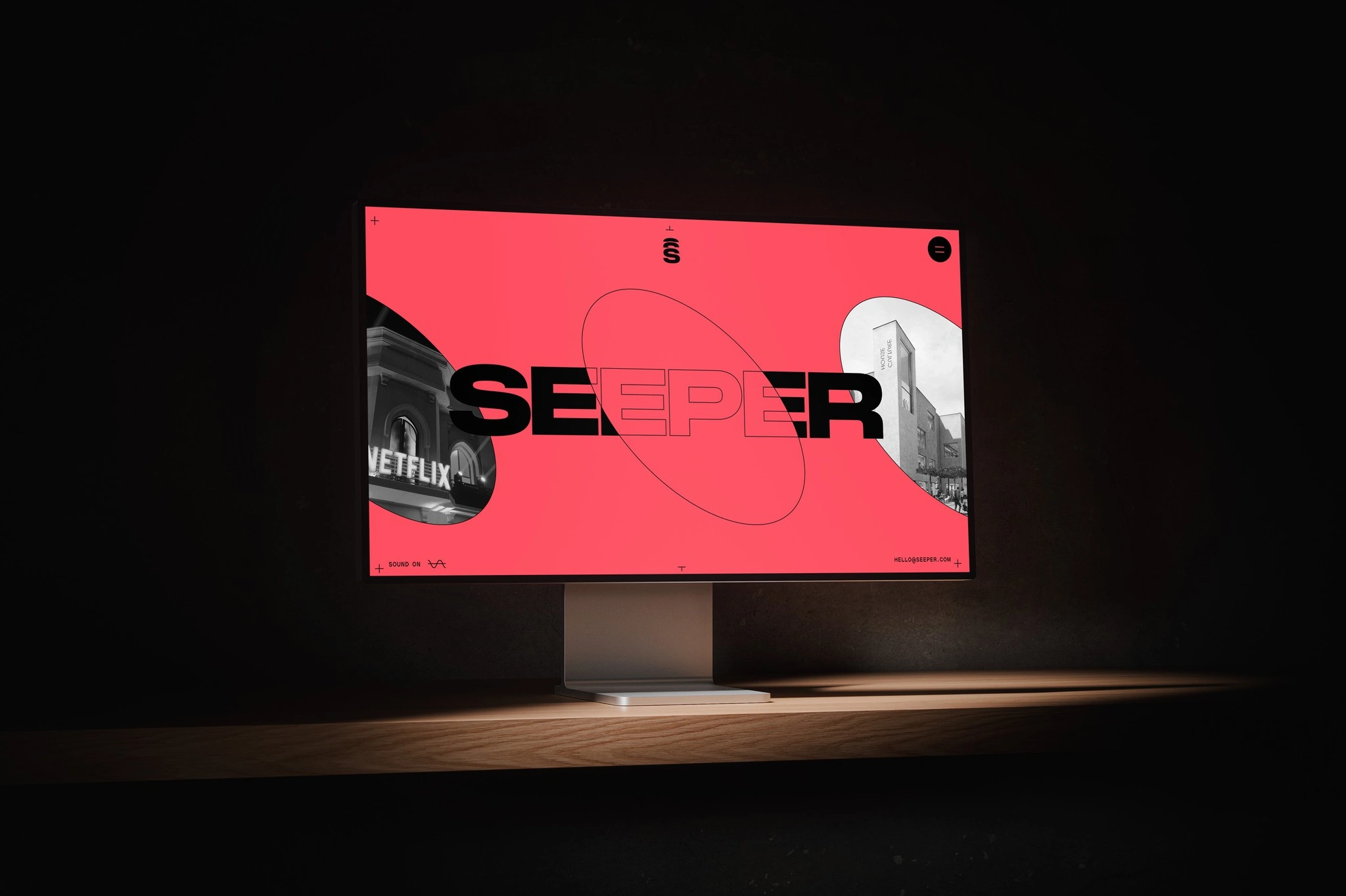
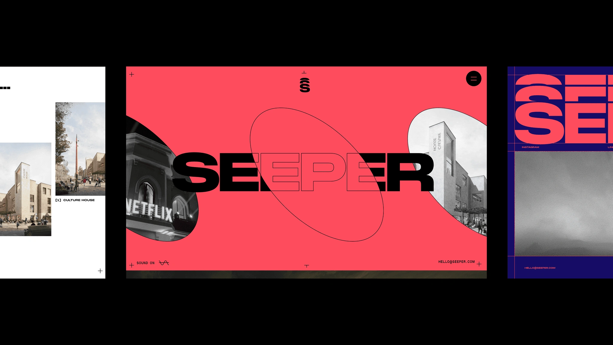
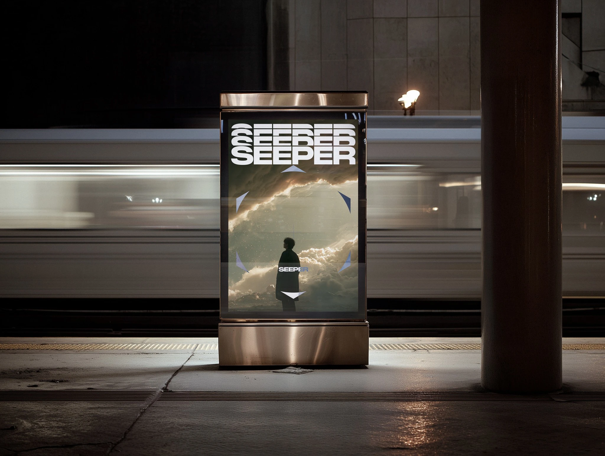
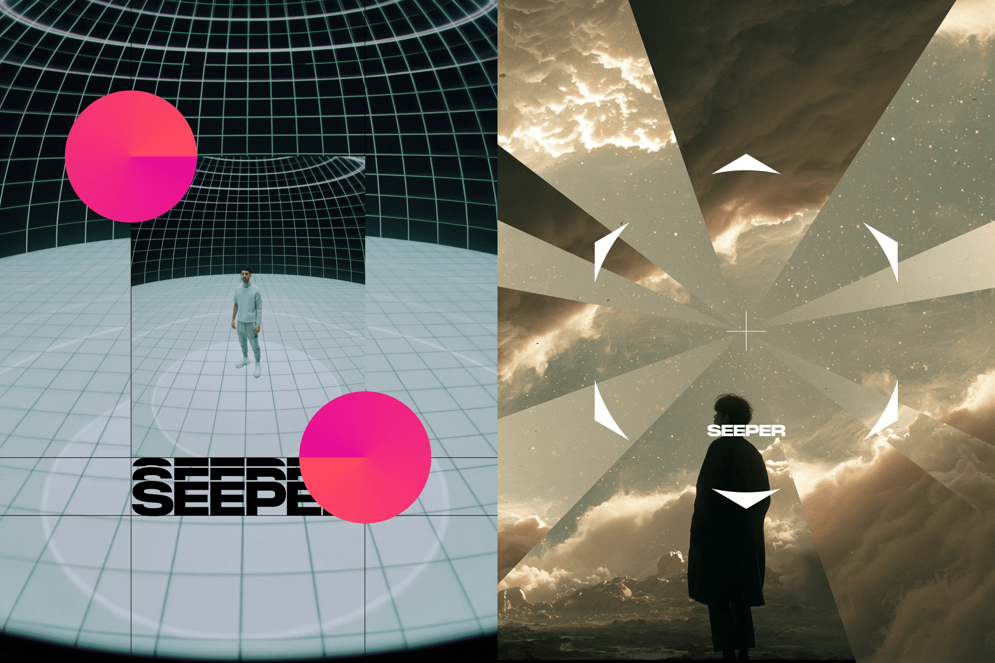
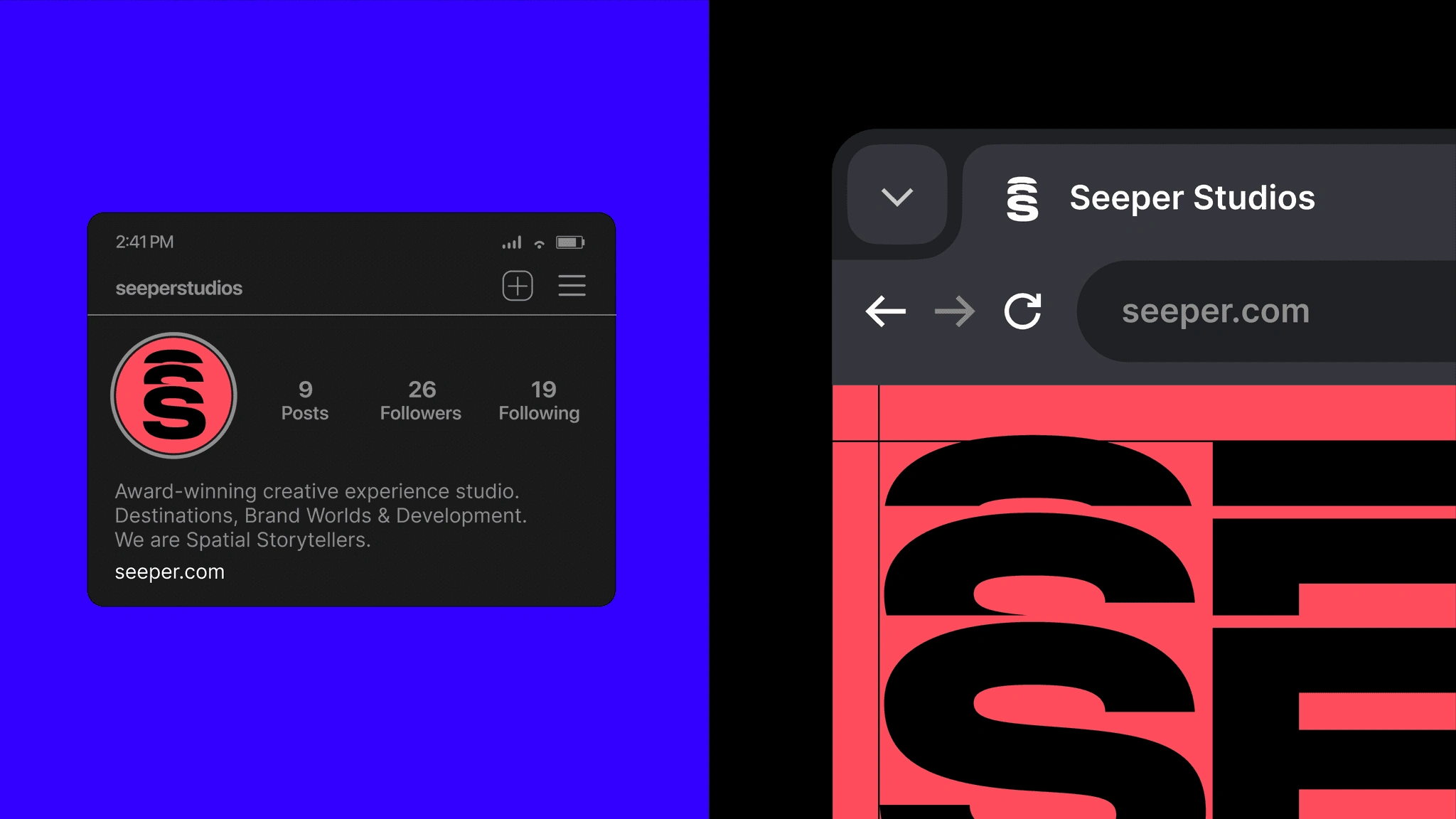
Bold enough to stand out. Flexible enough to make space.
Seeper needed an identity that could introduce the studio with confidence, then step back and let its projects take the lead.
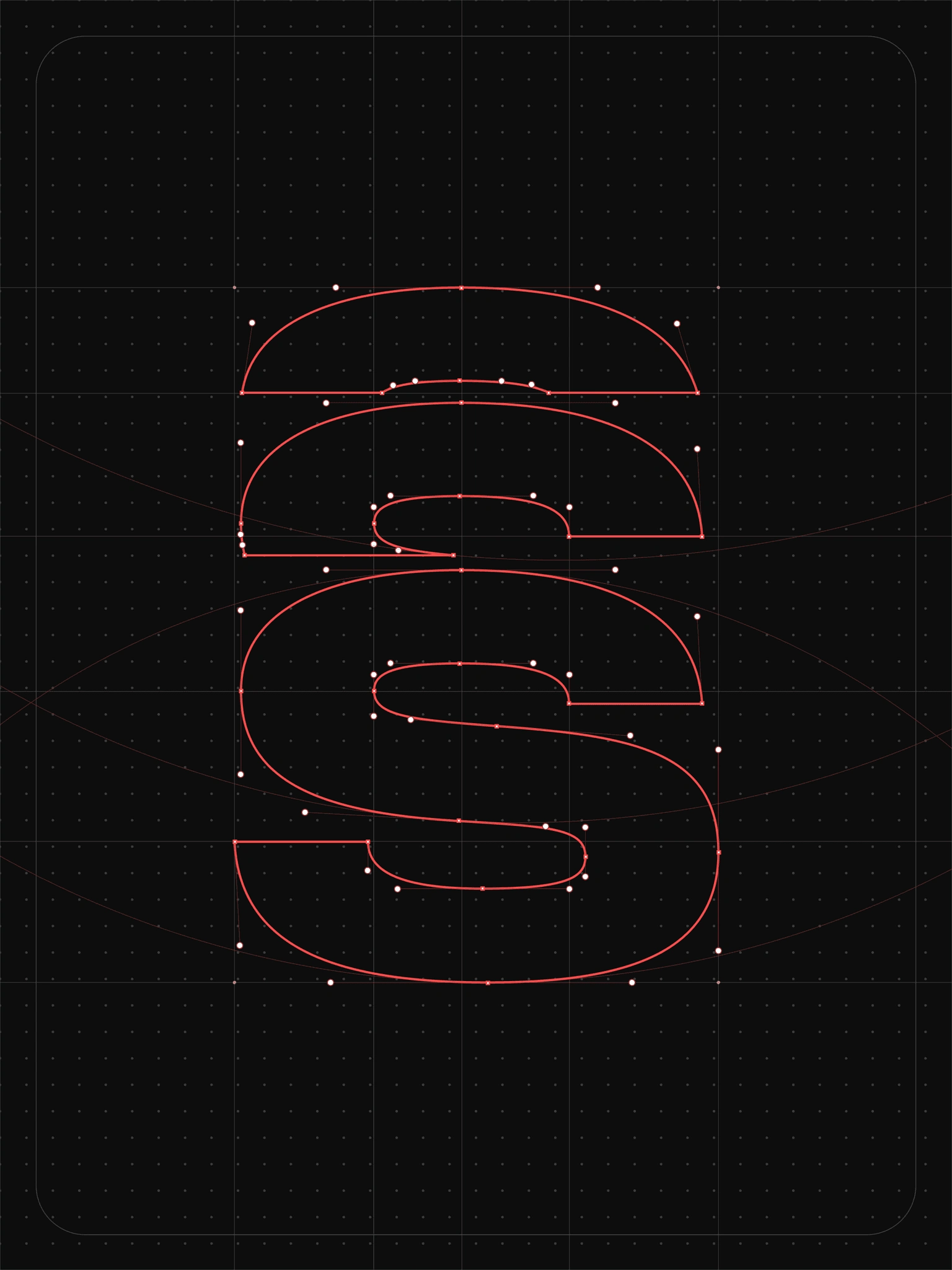
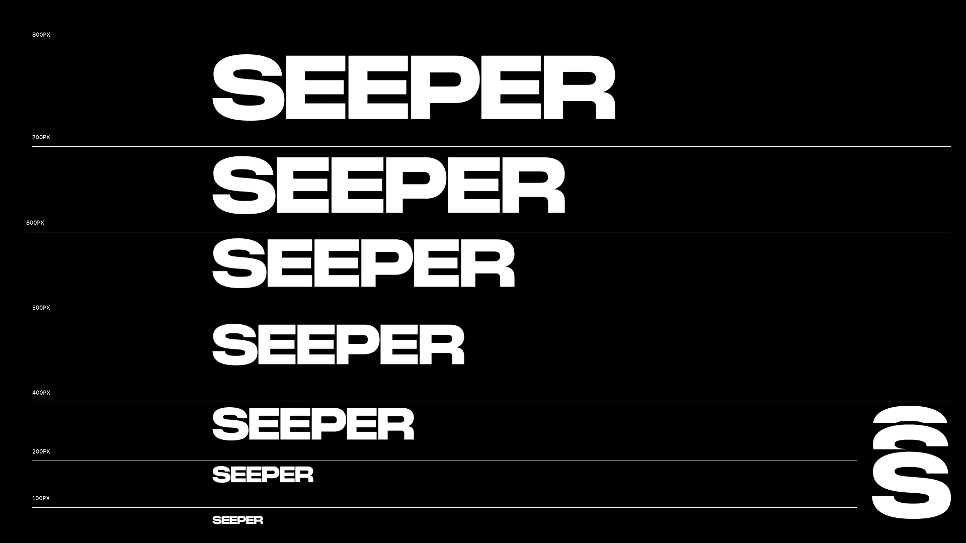
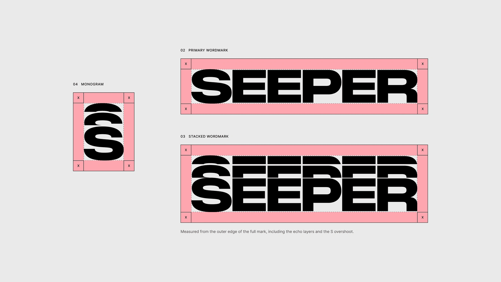
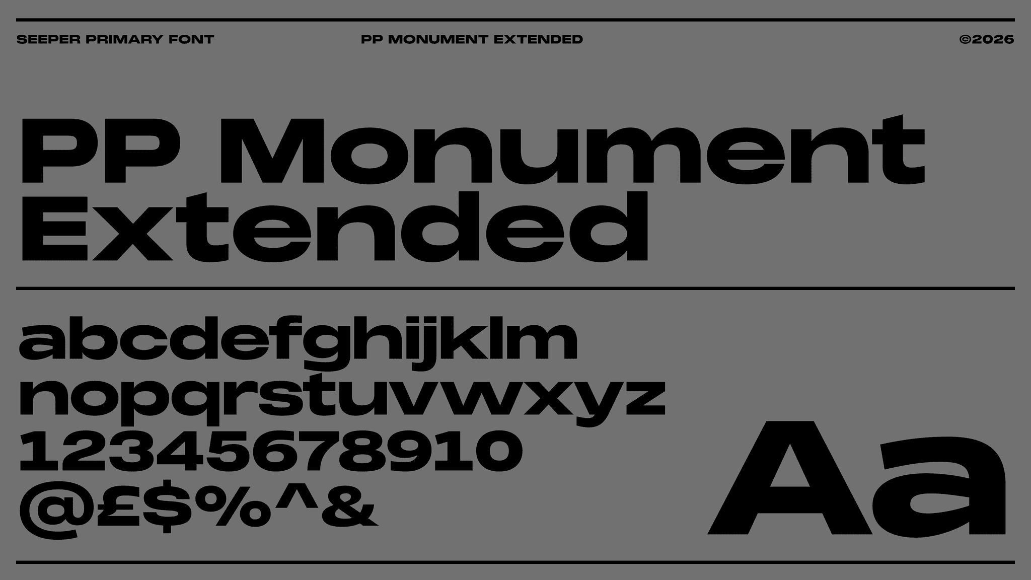
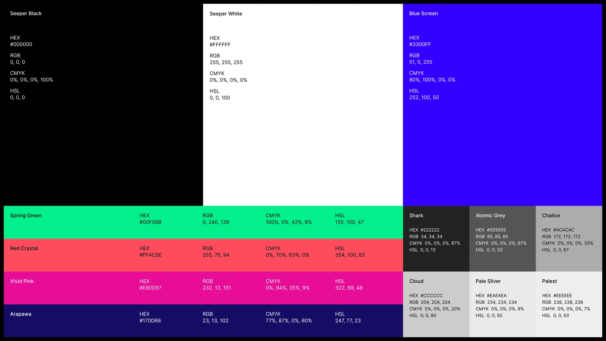
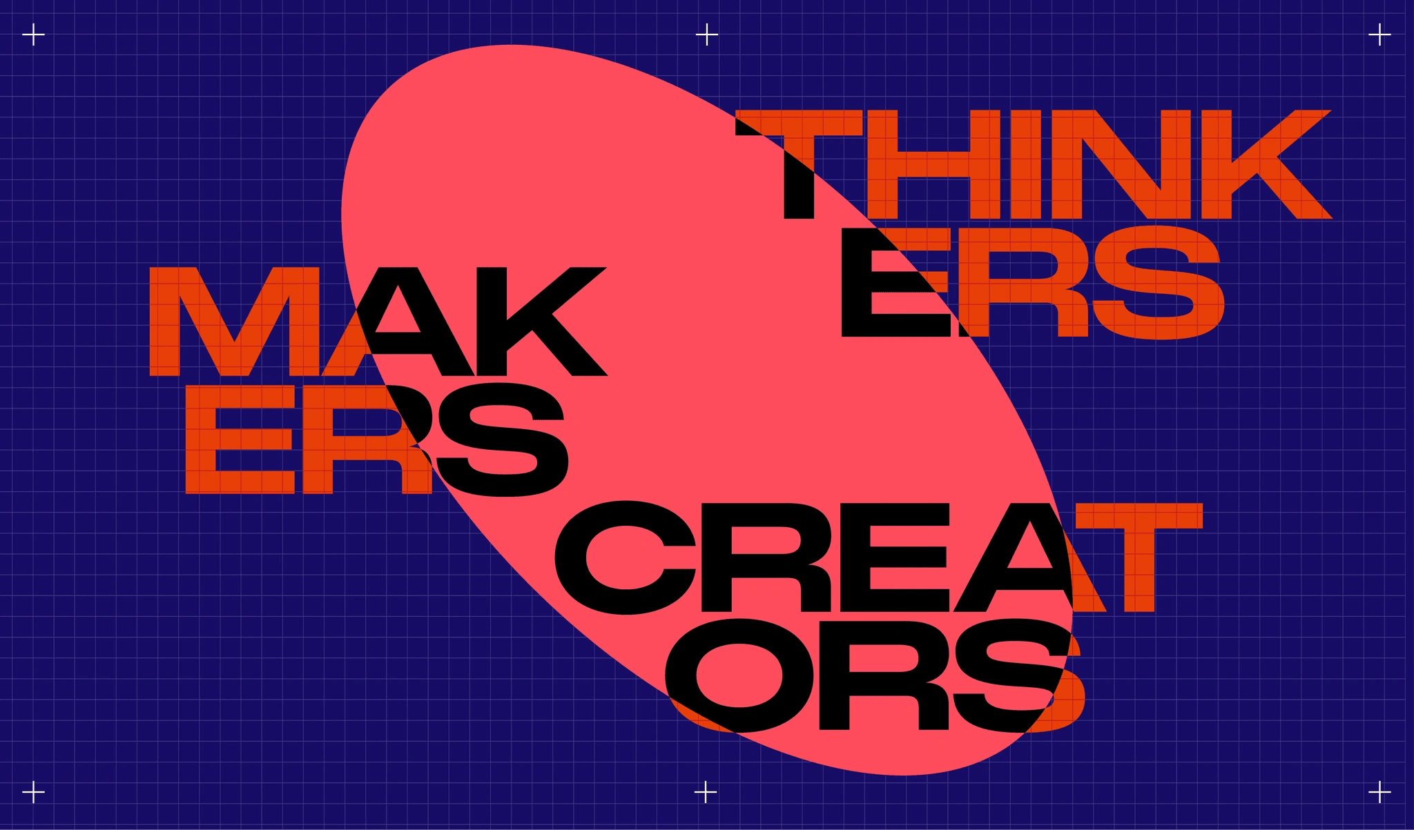
A light logo refresh, bold typography, a distinctive colour palette and spatial graphic devices gave the team that range.
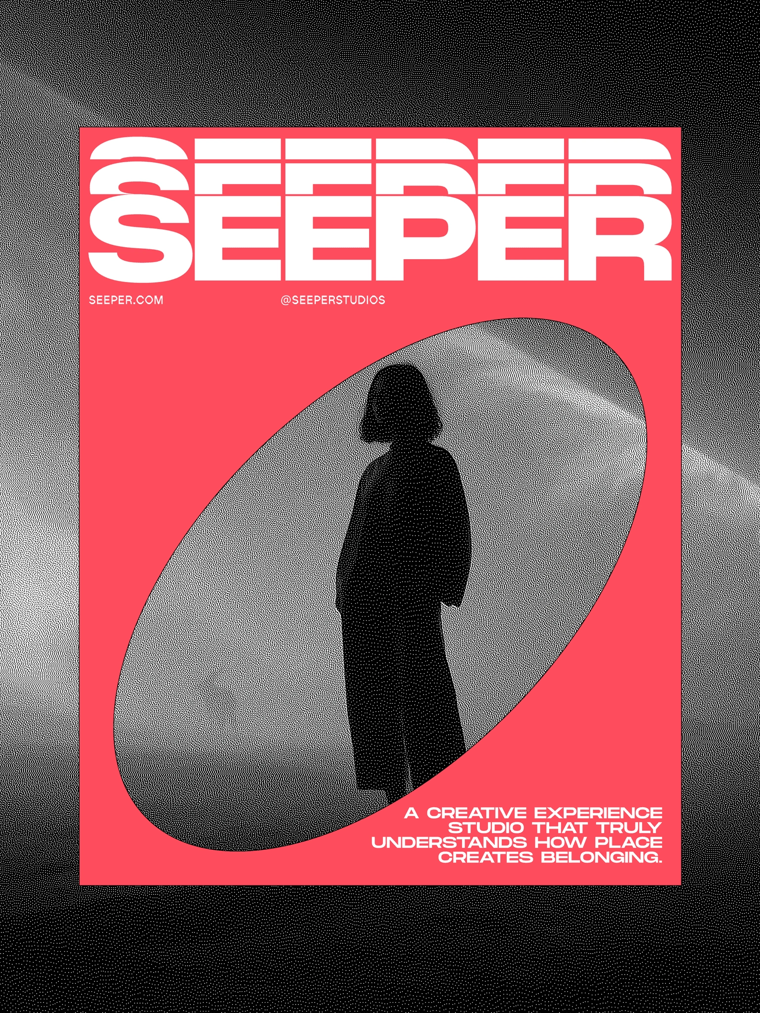
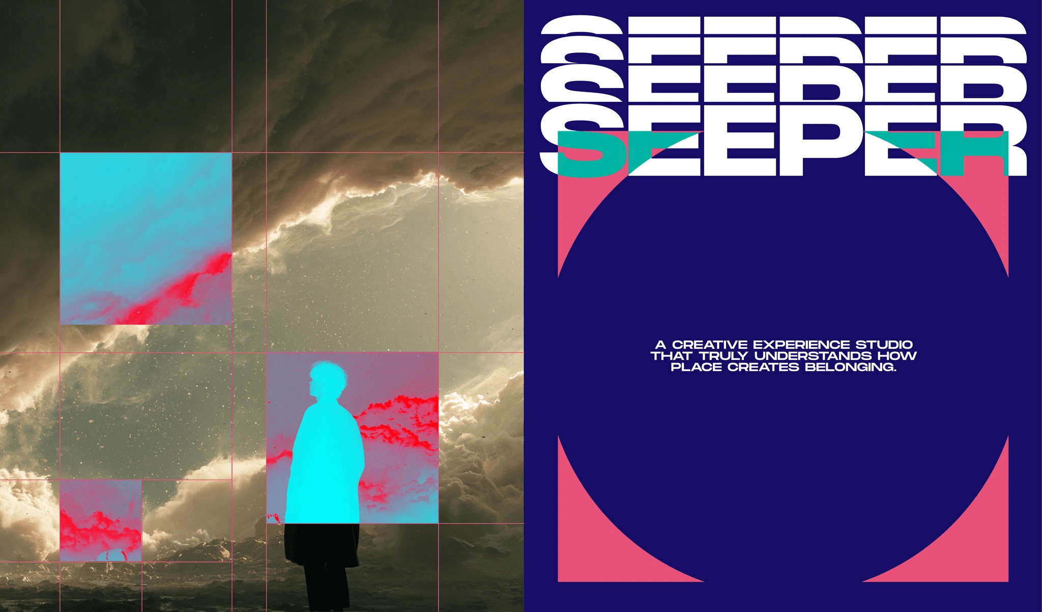
Circles, framing devices and geometric forms introduce perspective and movement across layouts. They create a recognisable visual language while allowing each project to retain its own character.
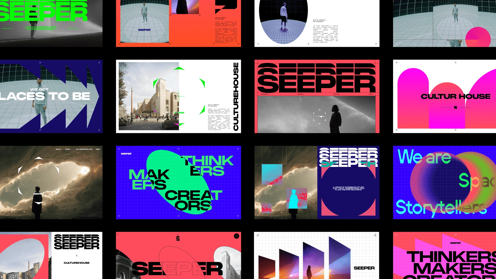
We tested the system against real applications, from presentations and social content to website layouts. The result gives Seeper the flexibility to move between expressive brand communications and more restrained project storytelling.
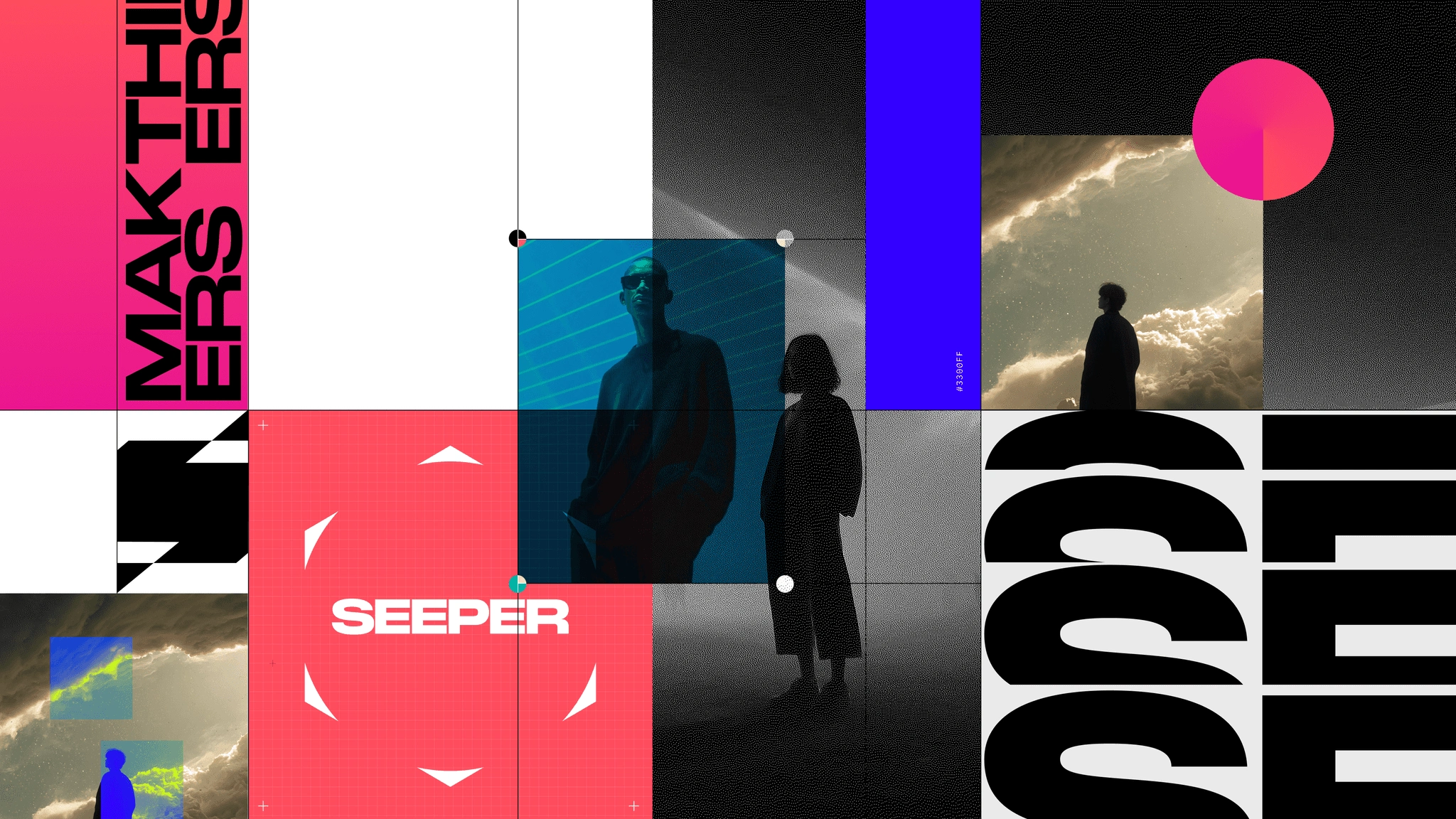
Showing how an experience feels.
Alongside the identity, we developed an art direction that explores the relationship between people and extraordinary spaces.
Using carefully directed AI-generated imagery, we combined human figures with unexpected landscapes, light and scale to evoke wonder and discovery.
These images create a world around the brand, complementing the documentation of Seeper’s actual projects.
Creative guidance and image-generation prompts give the team a way to continue developing that world with a consistent visual direction.
A system the team could take forward.
The identity needed to work in the hands of Seeper’s own team.
Brand assets, editable presentation templates, guidelines and image-generation prompts gave them the tools to create new material confidently. The graphic language was also designed to extend into motion.
Since launch, the team has begun adapting and expanding the system across case studies, presentations, motion assets and new business pitches.
Seeing that ownership has been one of the most rewarding parts of the project: a brand the team feels proud to use and has the freedom to keep developing.
Has your business outgrown its brand?
When your business has moved forward, your identity and website should help people see it.
We help established companies bring their brand into line with the quality, ambition and scale of their business.
–––––––––––––––––––––––––––––––––––––––––––
“The transformation has been incredible. We’ve gone from being seen as a dated studio to a serious creative force in the industry. The response to our new identity has been overwhelmingly positive, with people telling us we had the best stand they’d seen. The work has completely changed how people perceive Seeper.”
Ria, Marketing + PR Director — Seeper Studios
Like this project
Posted Nov 4, 2026
Evolving Seeper’s brand to reflect almost 30 years of immersive creativity, with a refreshed identity, expressive art direction and a flexible brand system.