Rylo Brand Refresh Project

Alex Aperios


RYLO BRAND REFRESH
Deliverables:
[ 1 ] Logo Design
[ 2 ] Visual Identity
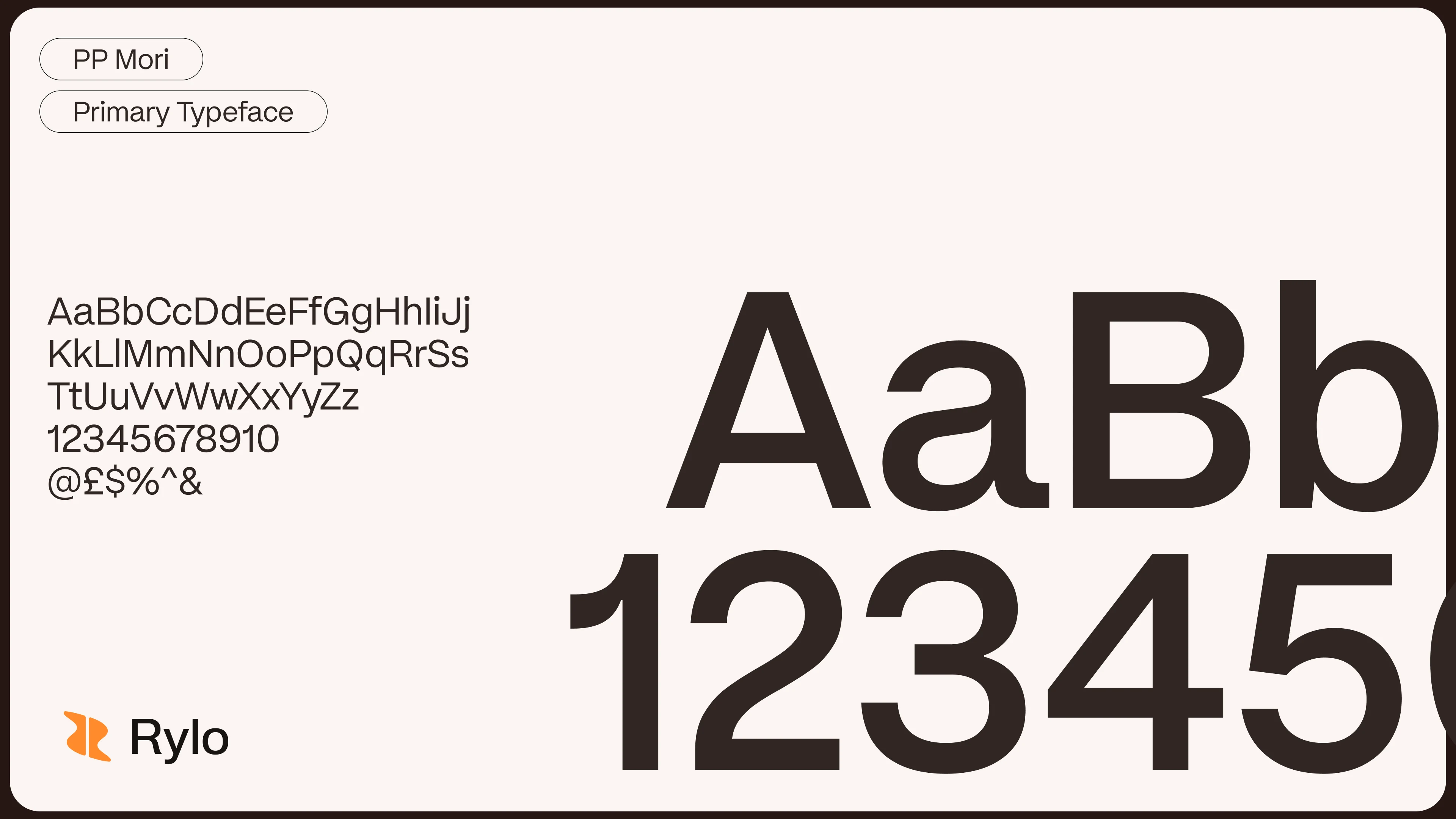
[ 3 ] Type System
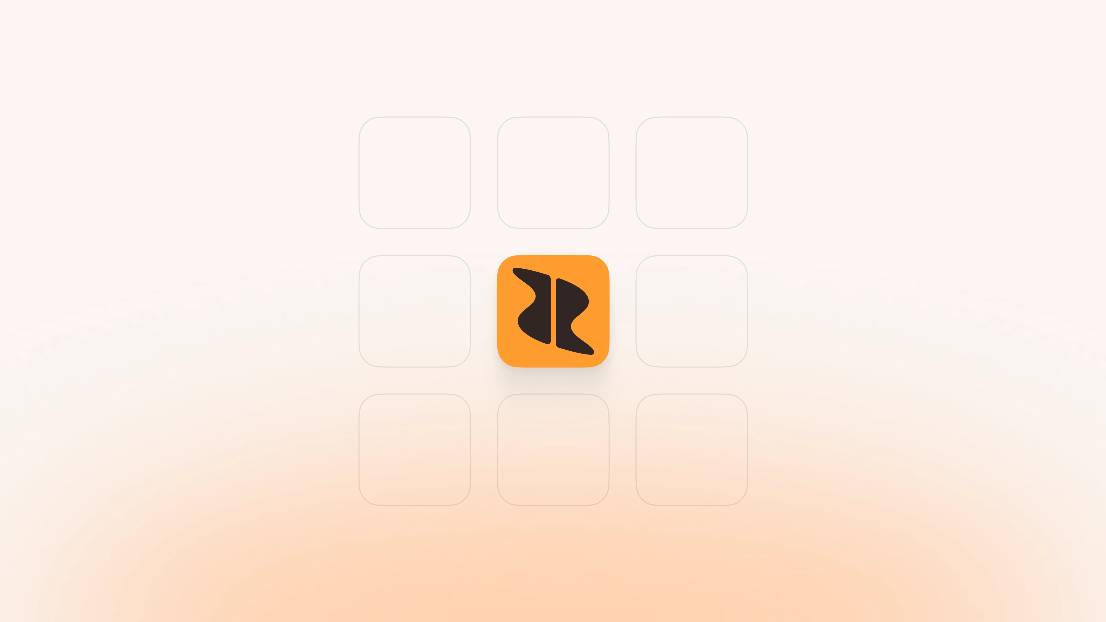
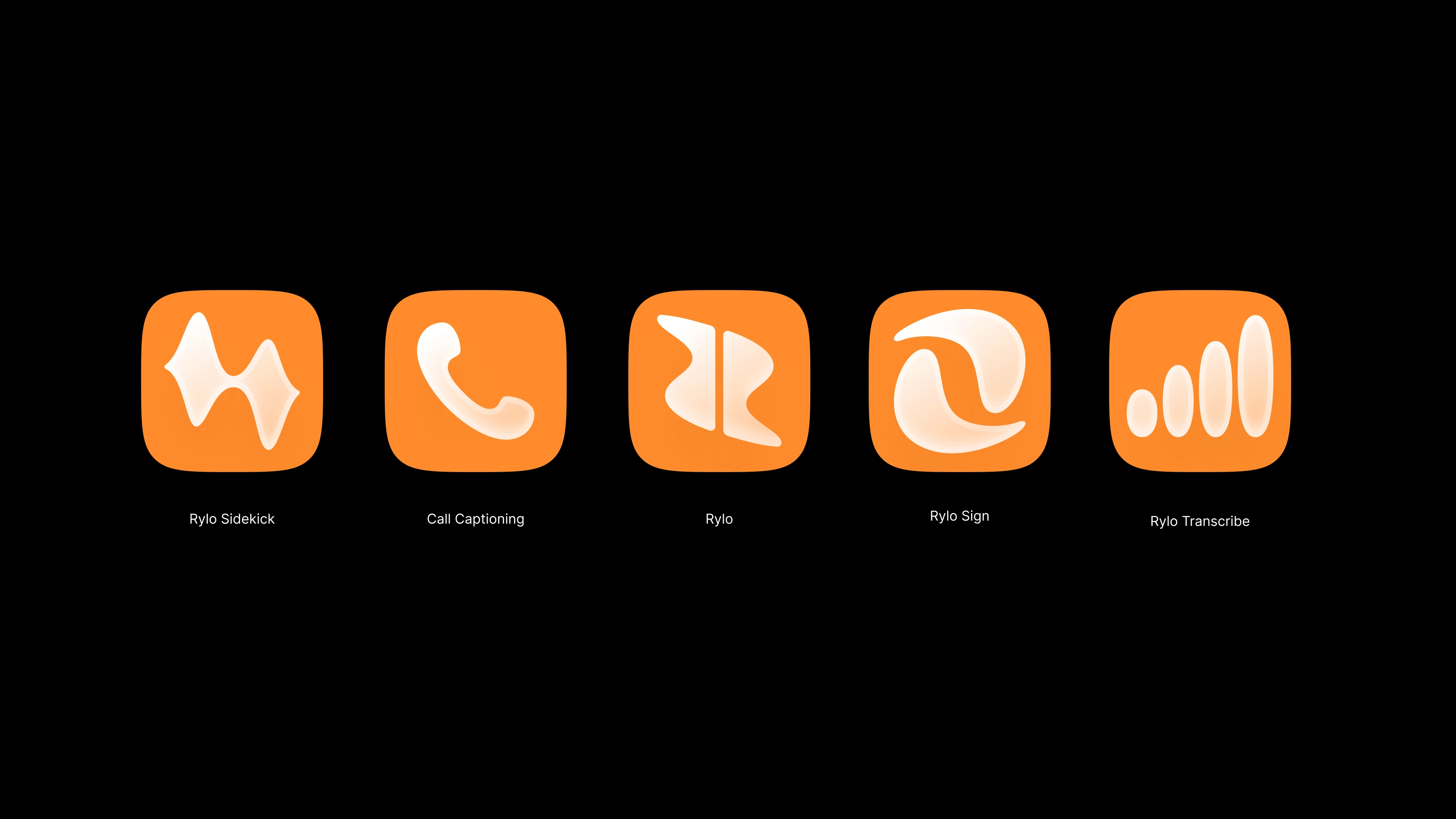
[ 4 ] Icons
Industry:
Communications / AI
Intro:
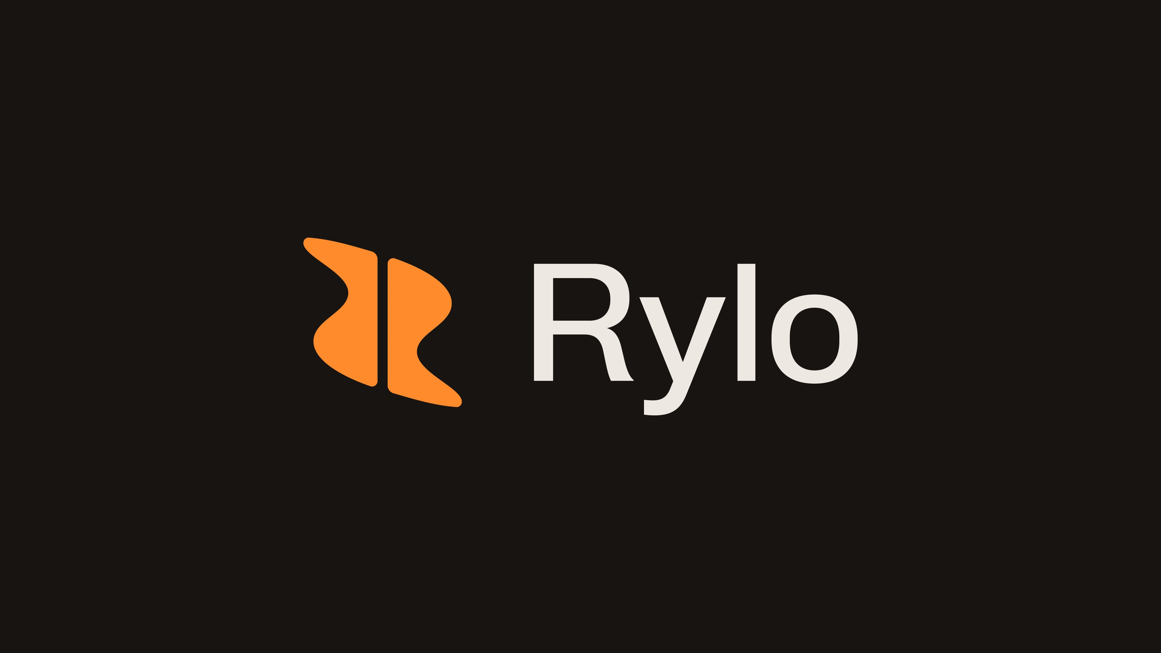
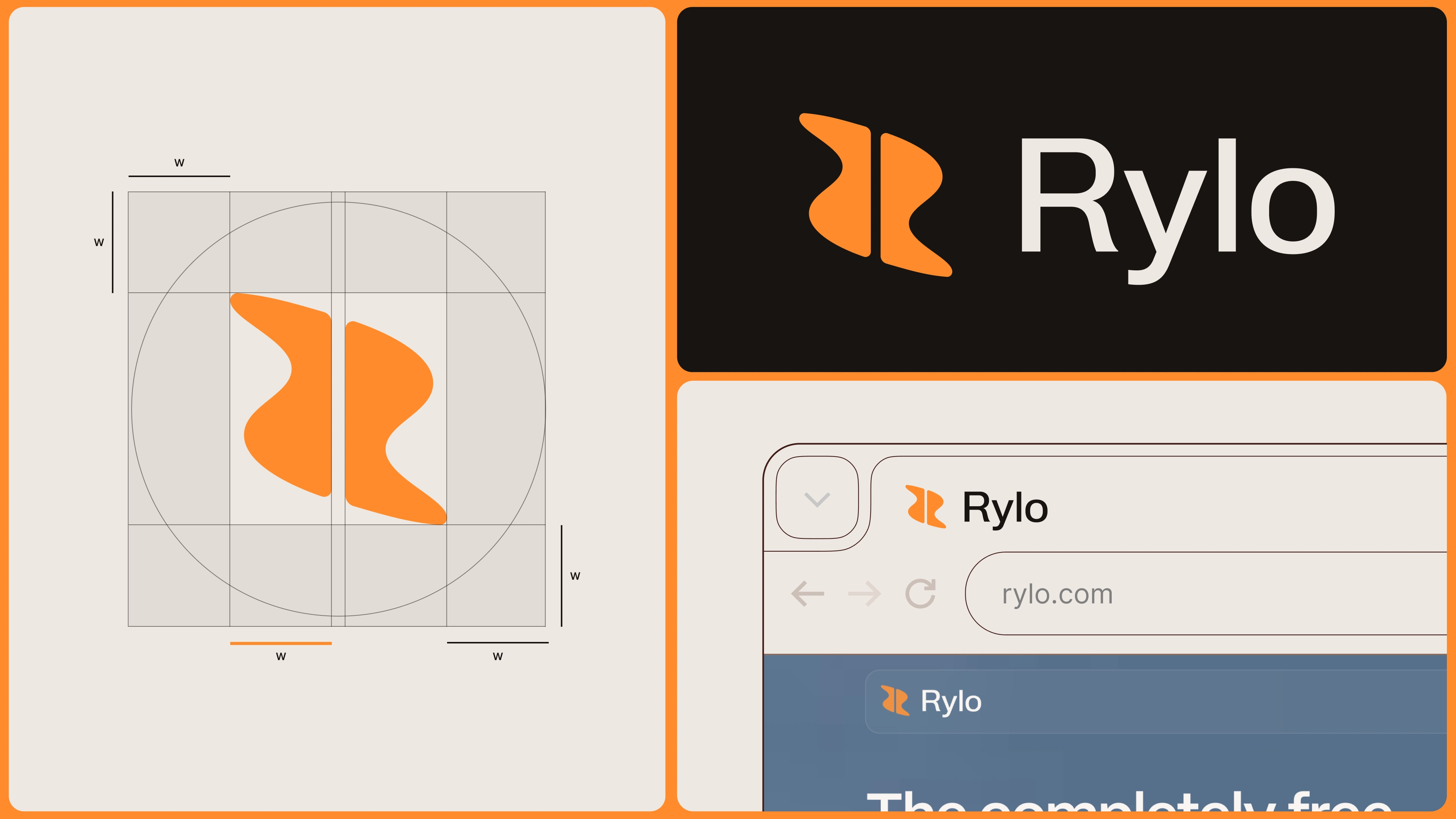
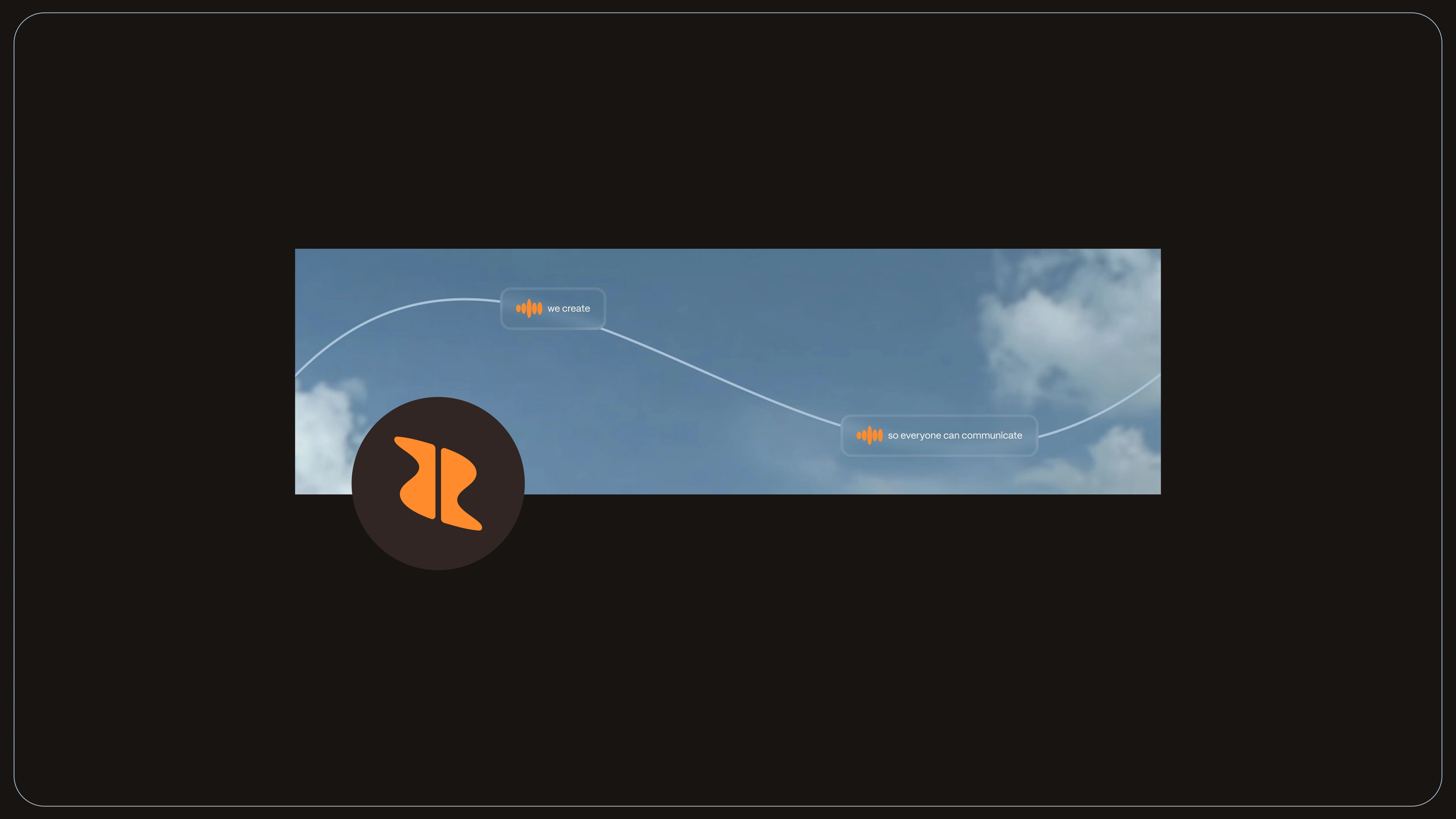
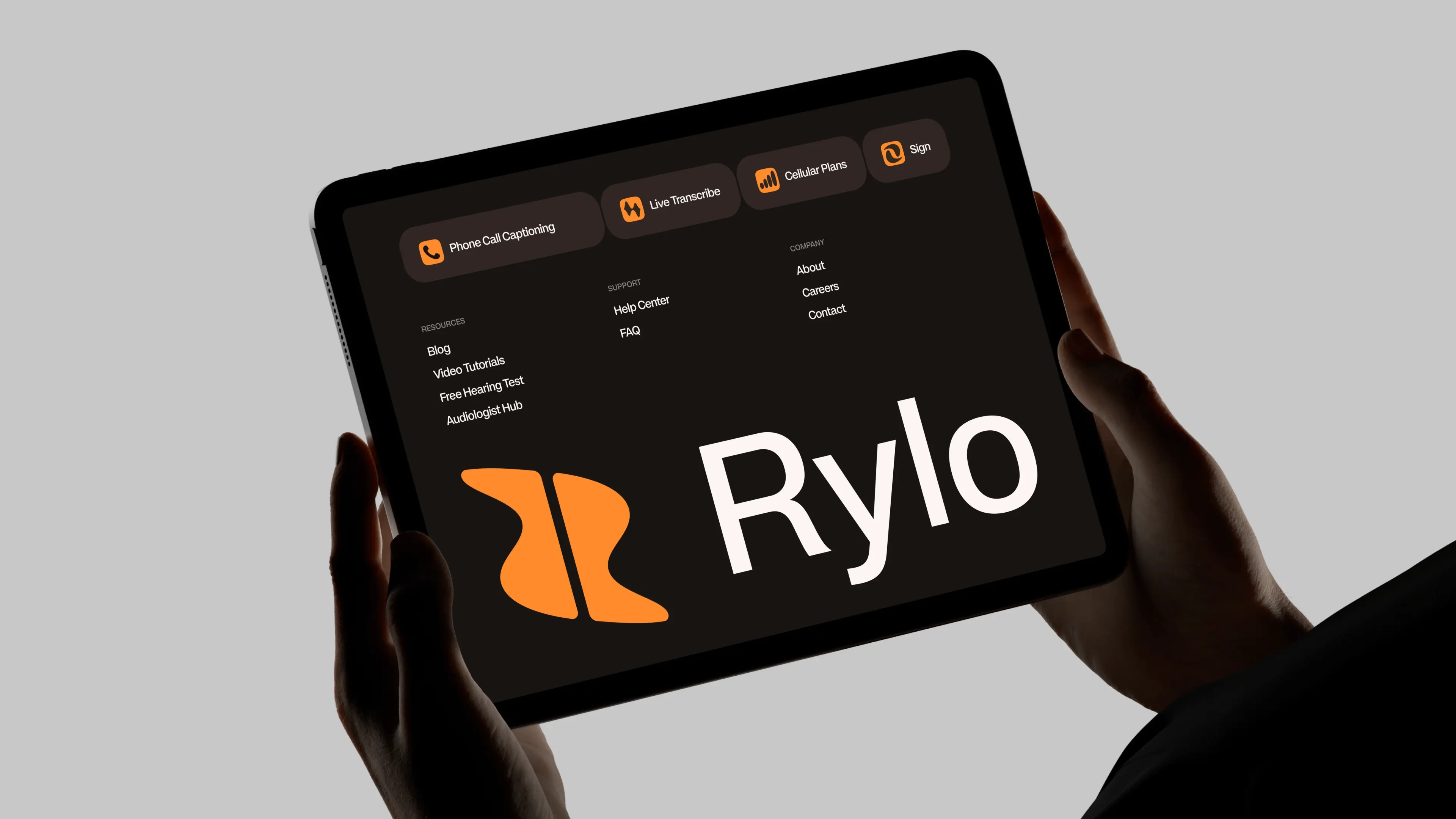
We rebuilt Rylo’s identity around its core purpose: communication. The new mark combines a letterform, audio waveform and two opposing shapes, creating the foundation for a distinctive visual system spanning typography, colour, icons, graphic language and motion.
Created in collaboration with Kinetic Studio.
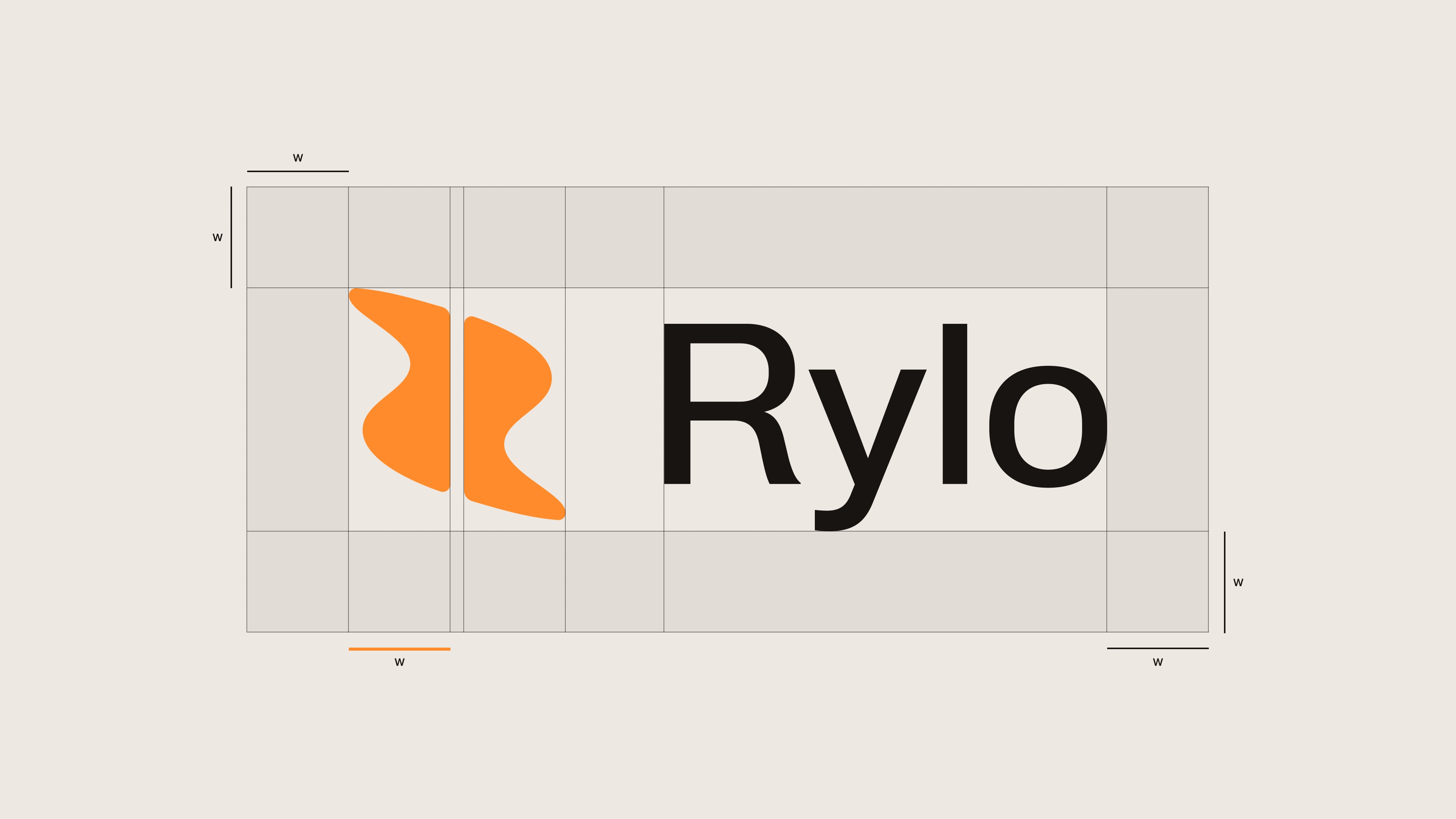
LOGO GRID
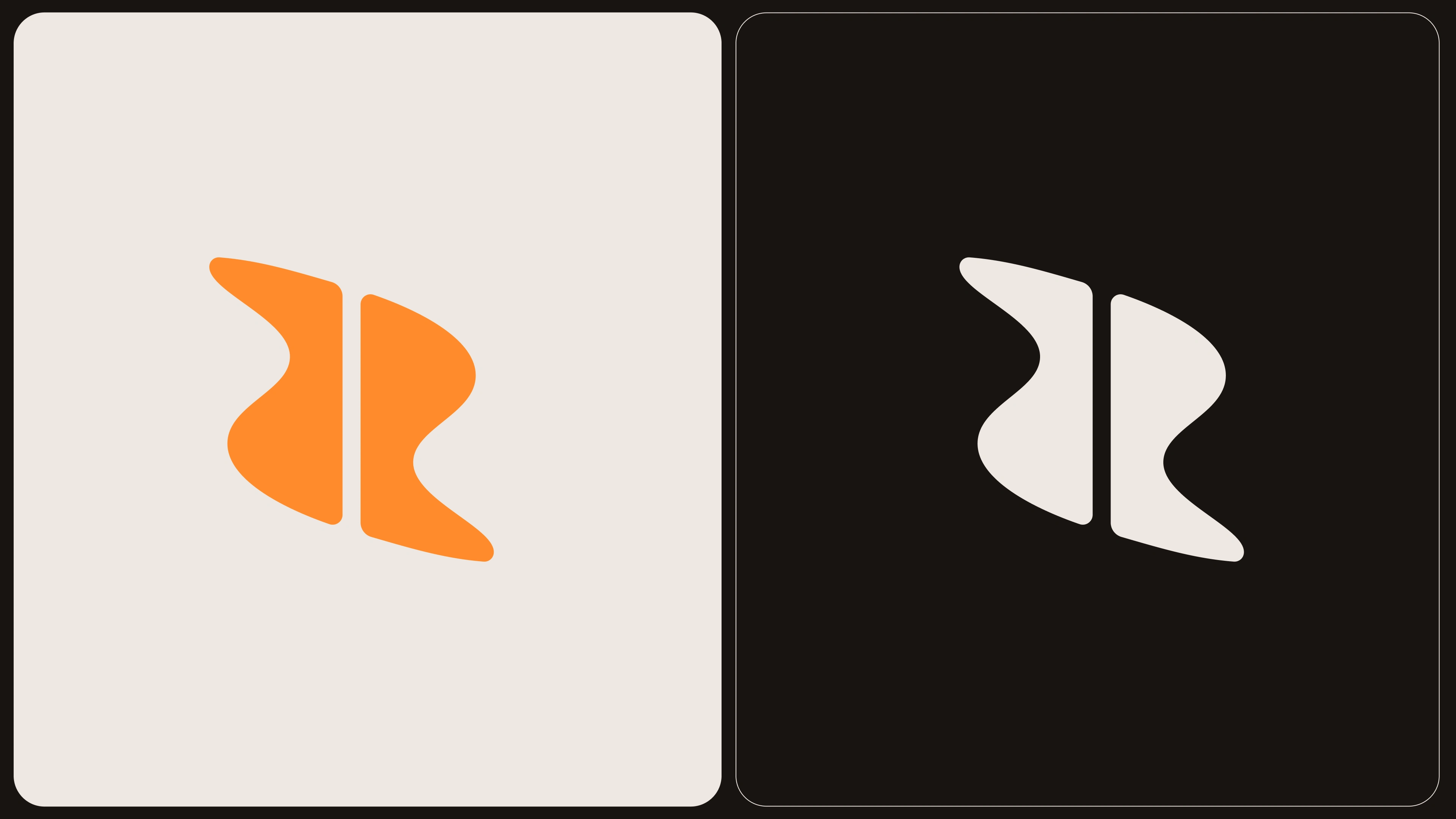
THE LOGOMARK
Rylo came to us with the foundations of an identity, but in their words, it was “lacking a strong brand feeling.”
They had a logo, typography, colours and gradients, but not enough of a visual language to make the brand feel distinctive or memorable. The system worked in isolated examples, but became difficult to apply across the product, social, presentations and everyday marketing.
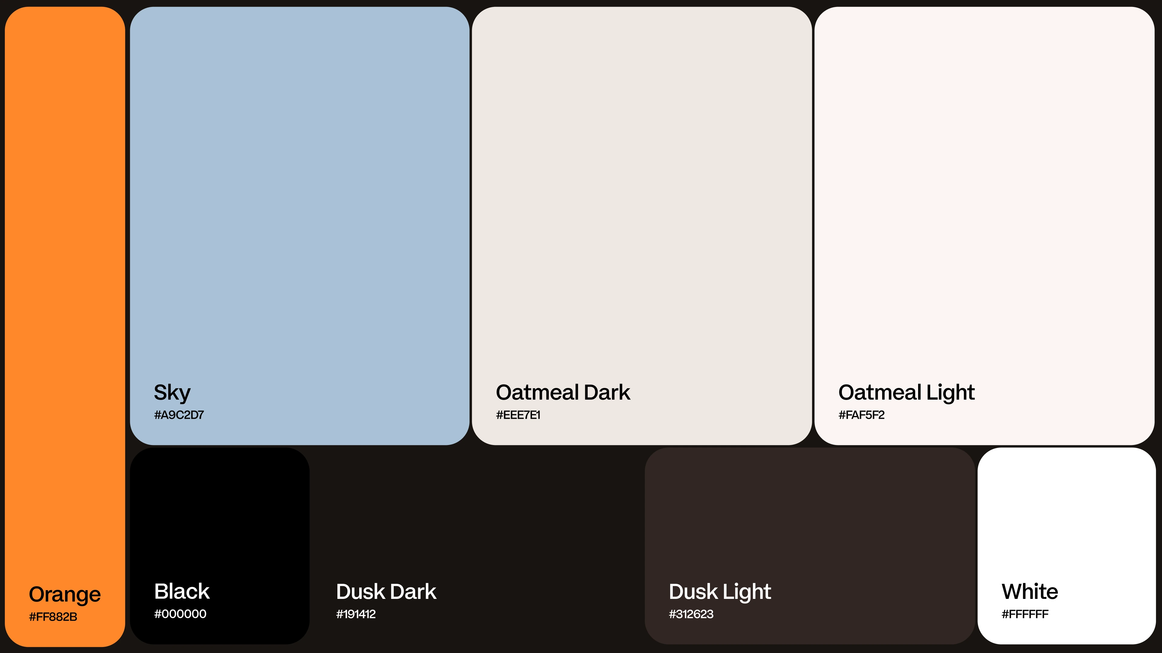
Typography wasn't translating well beyond the website, the colour palette was difficult to use consistently, and there were very few supporting assets — no real icon system, secondary colours, graphic language or visual devices to bring everything together.
The brief wasn't to simply redesign what they had. It was to give Rylo a brand they could actually build with: a richer, more flexible identity with enough personality to become recognisable wherever it showed up.
Results
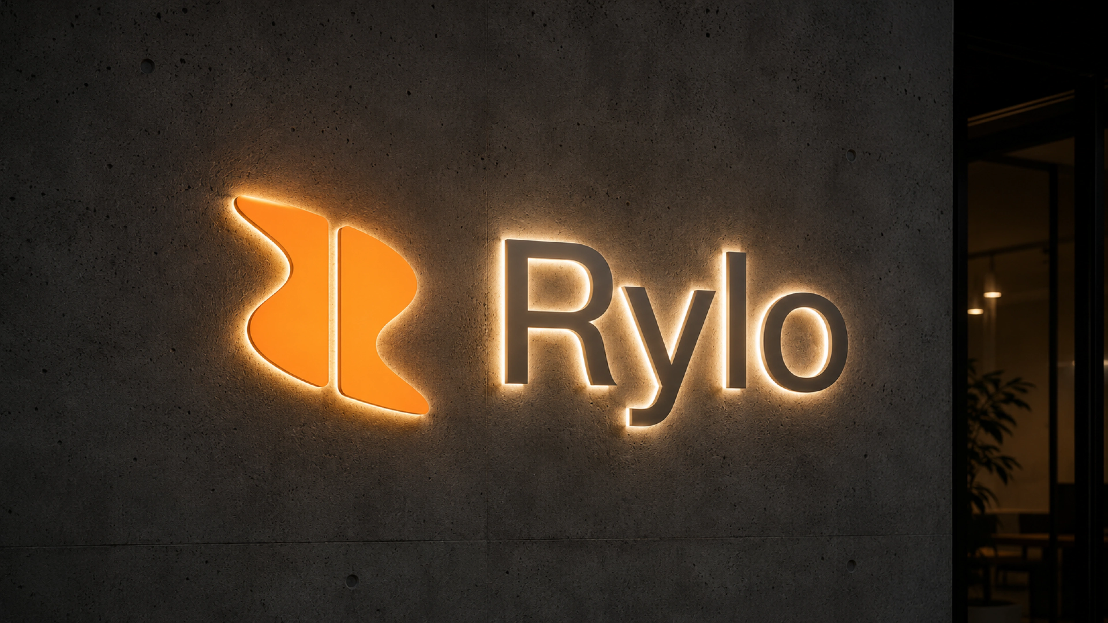
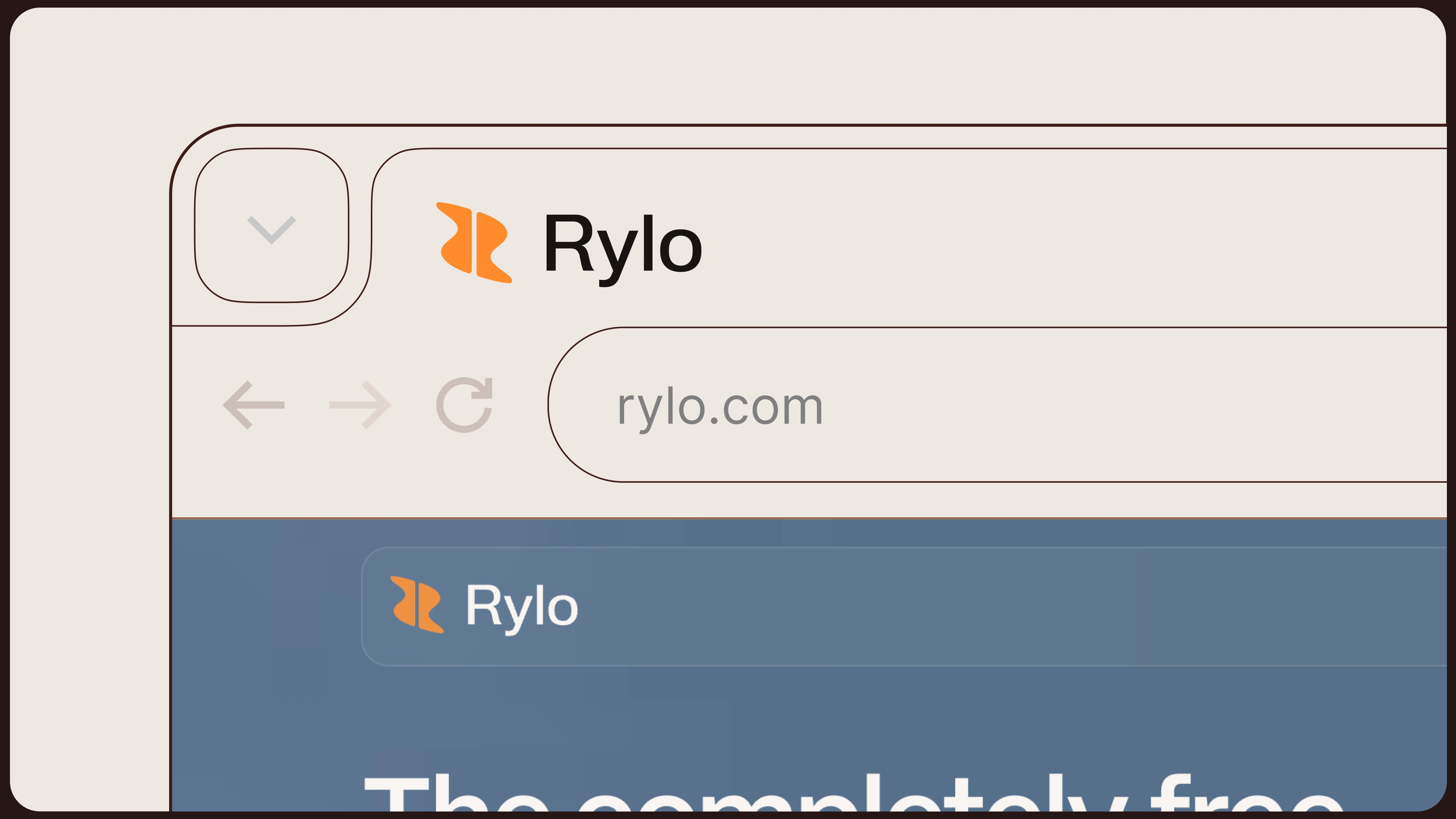
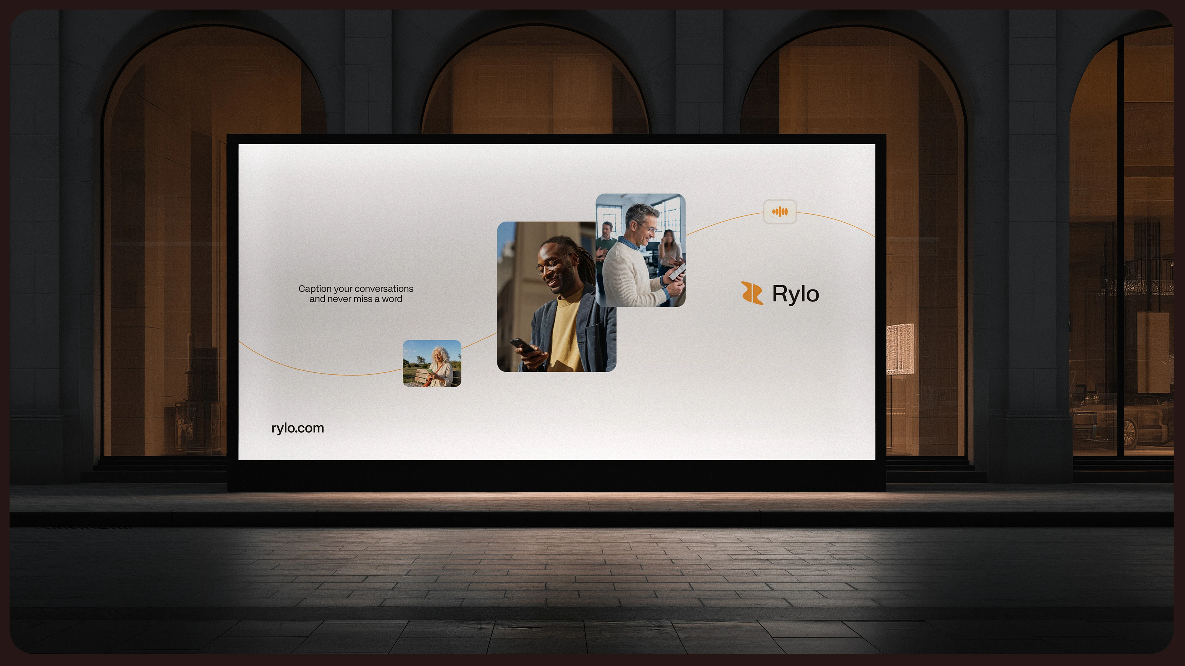
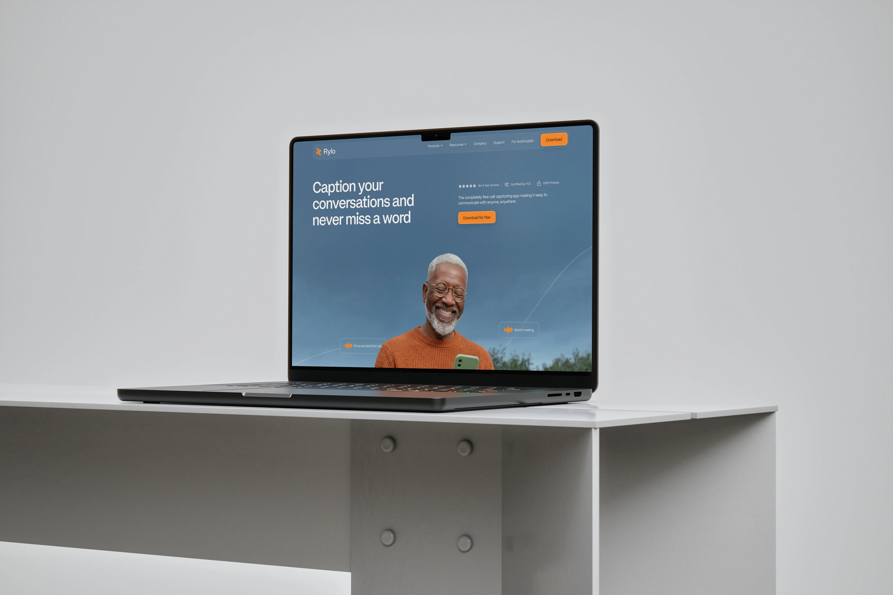
Rylo now has a distinctive brand system that feels consistent wherever it shows up. From product and digital through to social, campaigns and content, the identity gives the team a recognisable visual language without everything needing to look the same
The logo, colour, typography, graphic shapes and wave language work together to make Rylo feel unmistakably Rylo, something that’s particularly visible across their social presence
The new identity also arrived at a significant moment for the business. Rylo launched as the evolution of Nagish alongside $85 million in new funding, bringing total funding to more than $100 million, as the company expands from call captioning into a broader AI-powered communication platform.
Like this project
Posted Sep 16, 2026
Revamped Rylo's brand with a new visual identity and logo design.
Likes
0
Views
13
Clients
Rylo