NovaMind AI – Light & Dark SaaS Landing Page
Olufemi Tofunmi
Project Overview
NovaMind AI is a concept for an AI-powered productivity platform that helps users brainstorm ideas, summarize long documents, and plan their daily tasks.
For this project, I designed a marketing landing page in both light and dark mode, focusing on:
Clear product value in the hero section
Simple, readable feature hierarchy
Flexible pricing cards for individuals and teams
The goal was to create a clean SaaS layout that could be used in a real product or as a strong portfolio piece.
Objective & Problem
Many AI tools feel powerful but confusing when you first land on the website. New visitors often don’t immediately understand:
1. What the AI actually does
2. How it fits into their daily workflow
3. Whether it is built for individuals or teams
Objective
Design a landing page that quickly explains NovaMind AI, shows how it helps with everyday work, and guides users toward starting a free trial.
Key Goals
1. Communicate the core value in one clear sentence
2. Highlight how NovaMind AI supports ideas, summaries, and planning
3. Present a simple pricing structure for Free, Pro, and Team plans
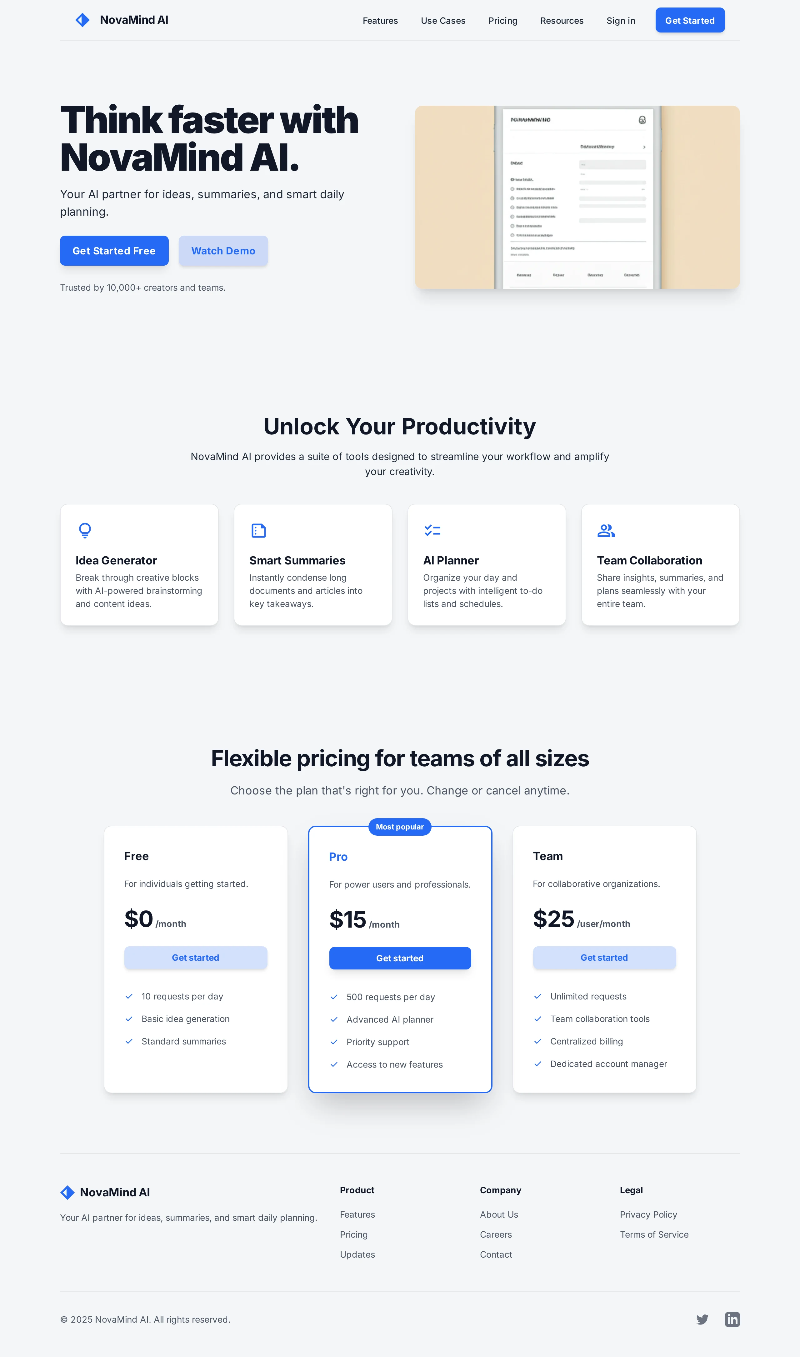
Hero Section – Light Mode
The hero section is built around a bold, straightforward headline:
“Think faster with NovaMind AI.”
On the left side, the hero focuses on clarity and trust:
Main headline and short supporting text presenting NovaMind AI as a partner for ideas, summaries, and smart daily planning
Two clear CTAs: “Get Started Free” as the primary action and “Watch Demo” as the secondary action
A trust indicator: “Trusted by 10,000+ creators and teams”
On the right side, a device mockup hints at the product’s interface, reinforcing that NovaMind AI is a real, usable tool and not just a concept.
Stylistically, the light hero uses a soft gray background, white surfaces, and a bright blue accent color for CTAs. Generous whitespace keeps the layout calm, approachable, and professional.
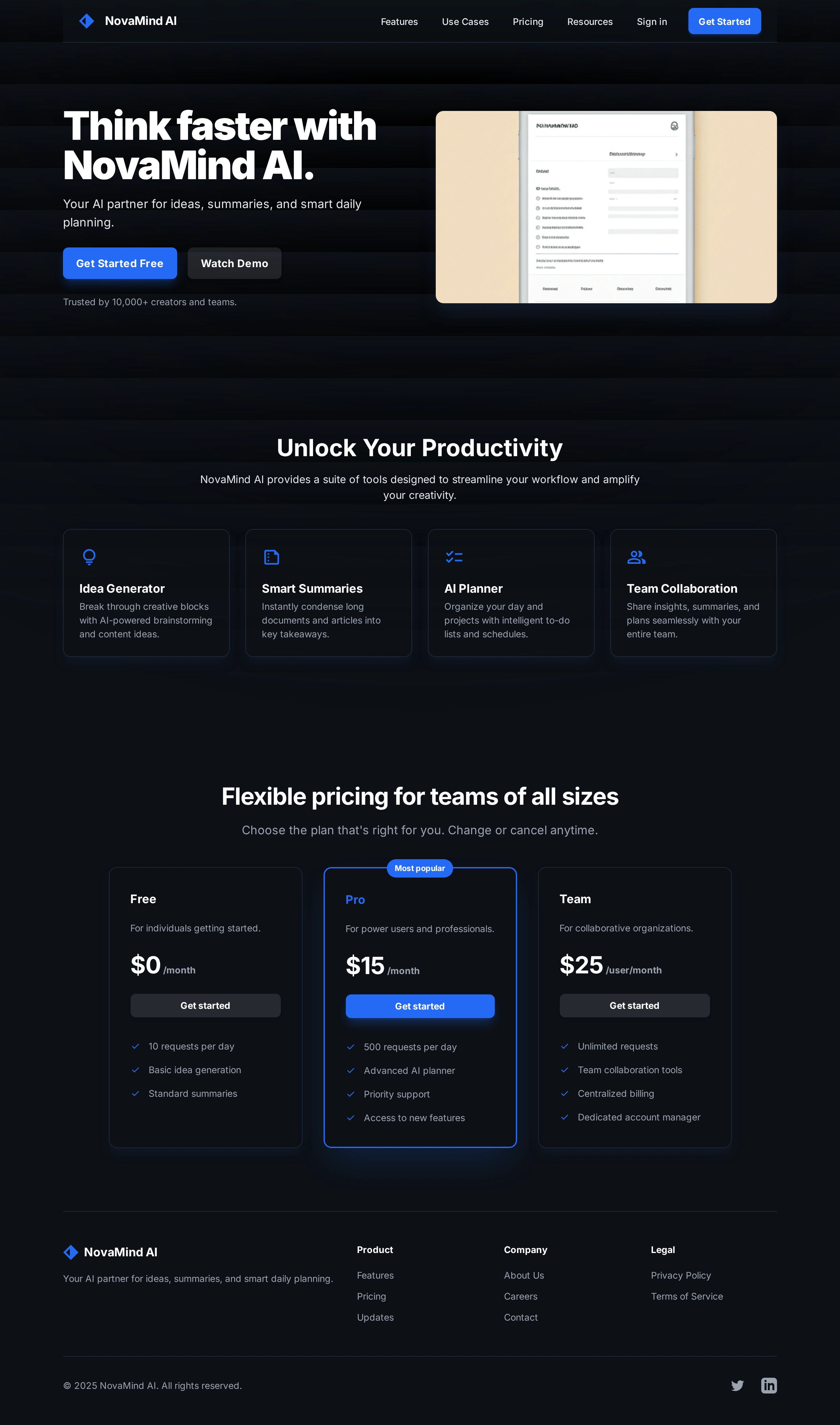
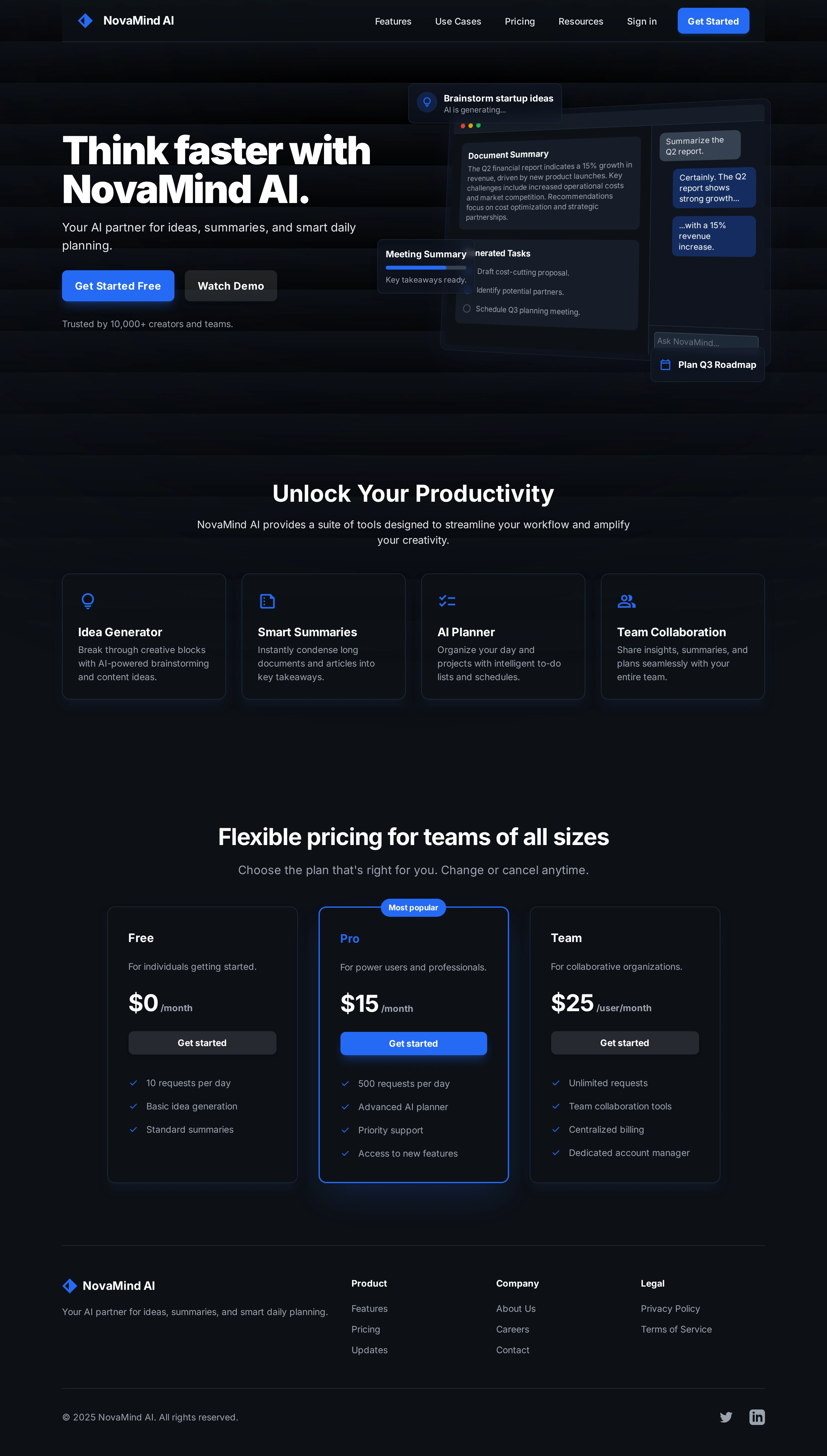
Hero Section – Dark Mode Exploration
To give the concept more depth and realism, I created a dark mode variation of the hero.
Why dark mode?
Many modern SaaS and AI tools support dark themes for comfort and focus
A dark interface instantly conveys a more premium, “pro” feeling
In the dark hero:
The background shifts to deep navy and black tones with subtle gradients
UI cards use minimal outlines and soft glows to separate layers
The same blue accent color is preserved to maintain brand consistency
The structure remains identical to the light version so that switching between themes doesn’t require users to re-learn the layout. The change is about mood and contrast, not functionality.
Features Section
Below the hero, the features section explains what NovaMind AI actually does through four cards:
1. Idea Generator – Break through creative blocks with AI-powered brainstorming and content ideas.
2. Smart Summaries – Instantly condense long documents and articles into key takeaways.
3. AI Planner – Organize your day and projects with intelligent to-do lists and schedules.
4. Team Collaboration – Share insights, summaries, and plans seamlessly with your entire team.
Each card contains a simple icon, title, and short description. The cards are equally sized and aligned in a grid to create a balanced, scannable layout. On smaller screens, this grid can stack vertically, keeping the information easy to read.
Pricing Section
The pricing section is designed to cover both individual users and organizations:
Free – For individuals getting started with basic usage
Pro – Highlighted as the “Most popular” plan for power users and professionals
Team – For collaborative organizations that need more scale
Each card clearly shows:
Monthly price
Short description of who the plan is for
A bullet list of key features and limits
A “Get started” button to reduce friction and make the next step obvious
The Pro plan is visually emphasized using a badge and a slightly stronger highlight, subtly guiding users toward the best value option without overwhelming them.
Layout & Visual Language
Typography
The typography relies on a modern sans-serif typeface, with strong, bold headings and clean body text. Attention is given to line height and spacing to keep paragraphs readable and sections visually separated. The hierarchy is straightforward: large hero heading, medium section titles, and a consistent style for descriptions.
Color Palette
Light mode uses a soft light gray background, white cards, and a vibrant blue accent for CTAs and key elements
Dark mode uses deep navy and black tones, subtle gradients, and the same blue accent for consistency
This dual palette allows NovaMind AI to feel flexible and modern while still recognizable across both themes.
Components
The layout is built from reusable UI components that could easily become part of a design system:
A top navigation bar with logo, section links, and a “Get Started” button
Hero layout with primary and secondary CTAs
Feature cards in a grid structure
Three-column pricing cards with consistent button styling
A footer that includes product, company, and legal links plus simple social icons
These components create a foundation that could scale into additional pages and in-app screens.
Responsive Considerations (Concept)
Although the case study focuses on desktop visuals, the layout is planned with responsiveness in mind:
The two-column hero can convert into a stacked layout on tablet and mobile, with text first and the mockup following
Feature and pricing grids adapt from multi-column layouts on desktop to single-column stacks on smaller screens
Buttons and interactive elements are designed large enough to work as comfortable tap targets on mobile devices
This ensures that the design would translate smoothly into real responsive breakpoints during development.
Conclusion & Next Steps
This NovaMind AI landing page project helped me practice:
Structuring a full SaaS marketing page from hero to pricing
Exploring light and dark themes while maintaining a single brand identity
Communicating product value using clear copy, layout hierarchy, and simple UI components
Next directions I’d like to explore for NovaMind AI:
Designing the main application dashboard that combines chat, document summaries, and task management
Creating a dedicated mobile experience to show how the product scales across devices
Building an onboarding flow that guides new users through their first AI-generated ideas, summaries, and plans
NovaMind AI is a concept, but the design approach, components, and structure are ready to be extended into a fully functional product.

Like this project
Posted May 28, 2026