FoodExpress – Food Delivery Landing Page (Case Study)
Olufemi Tofunmi
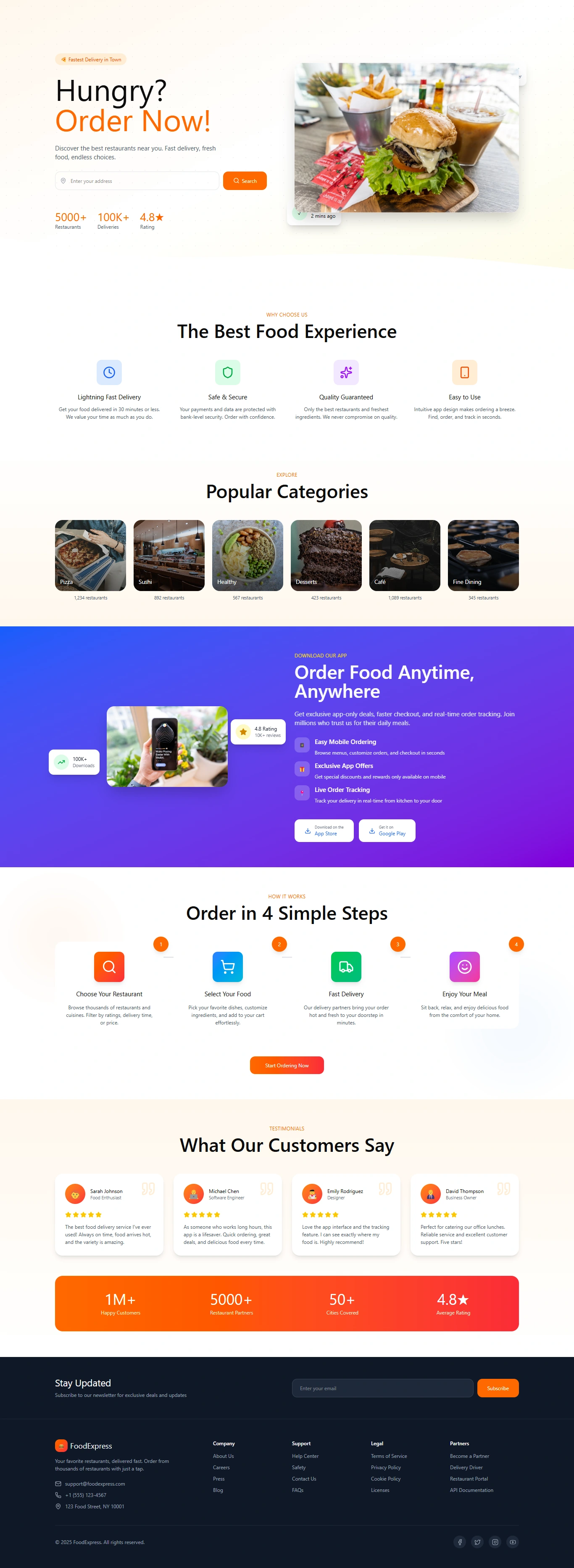
🍔 FoodExpress – Food Delivery Landing Page (Case Study)
Overview
FoodExpress is a modern and intuitive landing page designed for a food delivery platform.
The goal was to create a friendly, appetizing, and conversion-focused interface that helps users quickly find restaurants, explore categories, and place orders with ease.
🎯 Project Goals
The landing page was designed to:
Introduce the platform clearly and instantly Showcase food categories in a visually appealing way Highlight trust metrics (reviews, users, ratings) Encourage users to download the mobile app Present the ordering process in simple, actionable steps Improve user engagement and conversion rates 🔍 Research & Discovery User Research Insights
Food delivery users expect:
Speed (quick checkout, fast loading) Trust (ratings, testimonials) Clarity (simple steps, clean layout) High-quality food visuals Competitive Analysis
I studied apps like UberEats, DoorDash, and Bolt Food.
Key takeaways:
Hero section must immediately build hunger appeal Categories should be scannable Color accents should guide attention (orange works well for food) Testimonials with photos boost trust 🖥 Design Strategy 1. Visual Style
The overall aesthetic is:
Bright Clean Friendly Food-focused
Colorful gradients and warm tones were used to stimulate appetite and excitement.
2. Typography Bold headings to create strong visual hierarchy Soft, readable body text for clarity Text spacing optimized for easy scanning 3. Layout Flow
The page is structured to guide users naturally:
Hero Section — “Hungry? Order Now!”
Engaging headline Search bar for restaurants Hero image featuring fresh food
Key Benefits
Lightning-fast delivery Safe & secure Quality guarantee Easy to use
Popular Categories
BBQ, Sushi, Healthy, Desserts, Cakes, Fine Dining Cards with real images for instant appetite appeal
Mobile App Promotion
Gradient background for contrast Highlighted features like order tracking and app-only deals
Step-by-Step Ordering Process
4 simple illustrated steps Encourages new users to try the platform
Testimonials
Real customer photos 5-star ratings Social proof to build trust
Trust Metrics
1M+ happy customers 5000+ restaurants 50+ cities 4.8★ average rating
Footer Section
Navigation links Newsletter subscription Company info and social media
🎨 Color Palette Color Usage
#FF914D Accent color for CTAs and key highlights
#FF5A2D Gradient + emphasis
#2D2E45 Footer background
#FFFFFF Clean base background Blue/Purple Gradient Mobile app promotion section
The warm orange accents make the design feel appetizing, while gradients add a modern feel.
📱 Responsive Design
The layout adapts across:
Mobile – vertical stacking, larger tap targets Tablet – balanced spacing, larger images Desktop – full-width hero, multi-column sections
All UI elements were optimized for accessibility and readability.
🛠 Tools Used
Figma — UI Design, Auto-layout, Components
Illustrator — Icon refinement
Unsplash / Pexels — Food imagery
💡 Challenges & Solutions
Challenge 1: Keeping the design clean despite many sections
Solution: Used soft spacing, modular cards, and a consistent grid.
Challenge 2: Making the page visually appetizing
Solution: High-quality food photos + warm accent tones.
Challenge 3: Increasing conversion
Solution: Strong CTAs, trust metrics, testimonials, and simplified ordering steps.
📈 Final Result
The final landing page is:
✔ Clean
✔ Modern
✔ Appetite-driven
✔ Easy to navigate
✔ Optimized for high conversion
It successfully communicates trust, convenience, and a delightful food experience from start to finish.
🙌 Thank You for Viewing
Your feedback and appreciation on Behance are always welcome.
Open to collaborations and UI/UX projects!
Like this project
Posted May 28, 2026