A recent SaaS UI project

Mufeed Ghanem


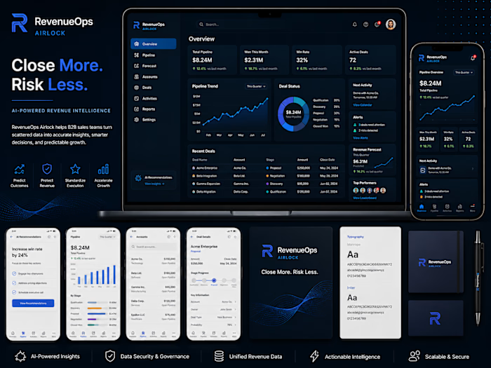
A recent SaaS UI project focused on turning complex revenue data into a clearer, more actionable product experience.
For RevenueOps Airlock, I designed a cohesive visual system across dashboard, web, and mobile interfaces—balancing data density with strong hierarchy, reusable components, and a clean modern aesthetic.
The goal was simple: make critical revenue insights easier to scan, understand, and act on.
Tools: Figma • Adobe Illustrator • Adobe Photoshop
When designing data-heavy SaaS products, what matters most to you first—clarity, speed, or visual hierarchy?
Like this project
Posted Aug 10, 2026
A recent SaaS UI project focused on turning complex revenue data into a clearer, more actionable product experience. For RevenueOps Airlock, I designed a coh...