"Aurora Skincare – A Symbol of Natural Beauty & Elegance" 🌿✨
Harsh Pilke
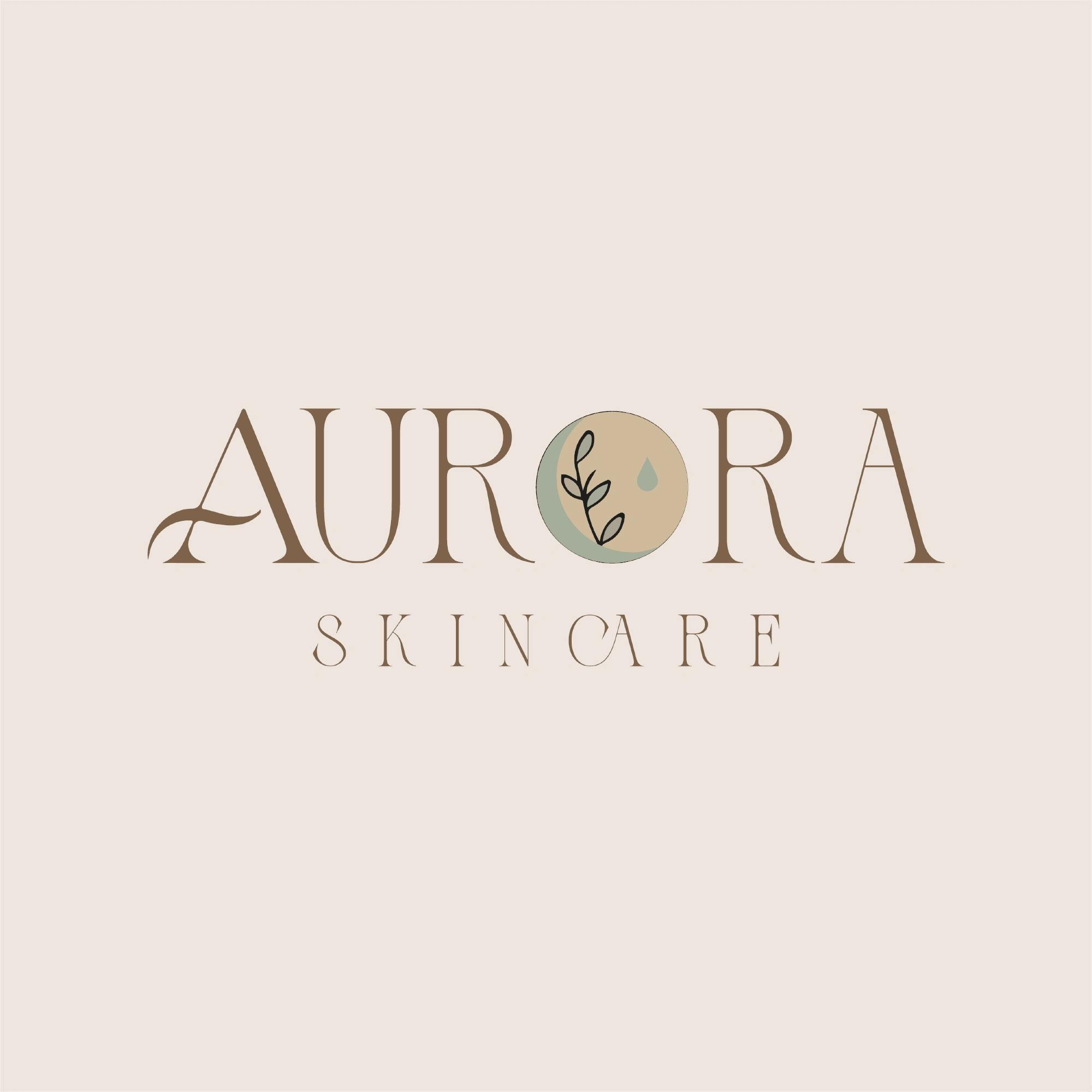
1. Typography & Style
The word "AURORA" is designed with an elegant, serif font that conveys luxury and sophistication.
Subtle curves in the letters add a natural, organic feel, reinforcing the brand’s skincare focus.
The word "SKINCARE" is in a delicate, spaced-out font, maintaining a refined and minimalist aesthetic.
2. Color Palette
Earthy Brown: Symbolizes warmth, nature, and organic ingredients.
Muted Beige & Soft Green: Represent purity, tranquility, and natural skincare elements.
Light Background: Enhances readability and creates a soft, soothing look.
3. Unique Logo Element
The "O" in "AURORA" is replaced with a circular icon containing:
A delicate plant illustration, symbolizing growth, nature, and botanical ingredients.
A droplet, representing hydration, skincare, and nourishment.
A two-tone background, adding depth and balance to the composition.
4. Overall Branding Message
The Aurora Skincare logo embodies natural beauty, elegance, and wellness, making it perfect for a premium skincare or beauty brand.
The soft color tones and organic elements create a soothing and inviting aesthetic, appealing to customers who value self-care and natural ingredients.
Would you like any refinements or alternate versions of this design? 🌿
Like this project
Posted Mar 25, 2025
The Aurora Skincare logo embodies elegance, purity, and nature. With its soft earthy tones and delicate typography
Likes
0
Views
0
Timeline
Mar 20, 2025 - Mar 21, 2025