Logo design for Apex Fitness
Harsh Pilke
1. Typography & Style
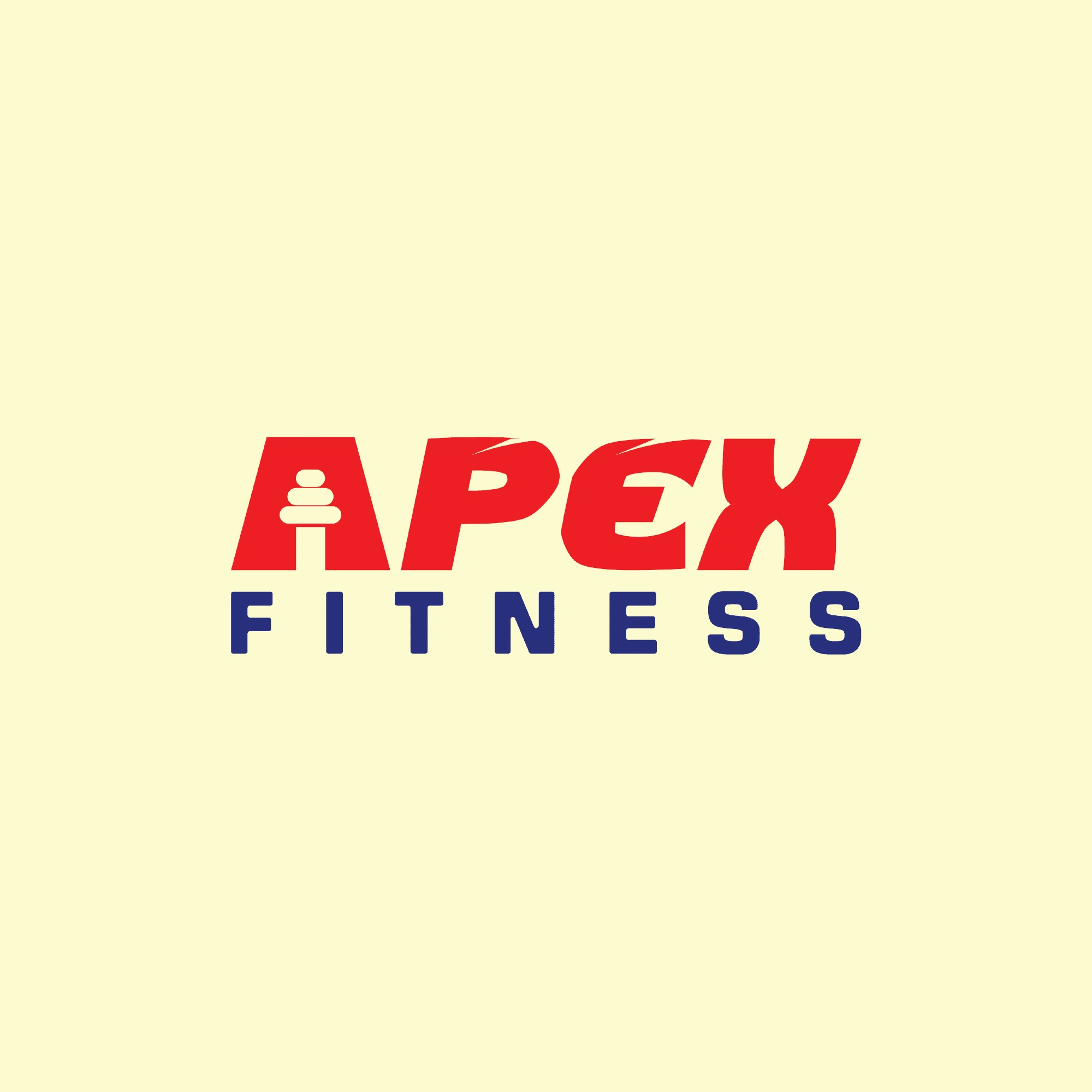
The word "APEX" is in bold, uppercase letters, giving it a strong and energetic look.
The letters have a slanted, dynamic style, conveying movement and speed, which aligns with a fitness brand’s active nature.
The word "FITNESS" is in a clean, sans-serif font with evenly spaced letters, enhancing readability.
2. Color Scheme
Red (APEX): Represents energy, passion, and strength, which are essential qualities in fitness and training.
Dark Blue (FITNESS): Adds a professional, stable, and trustworthy feel to balance the vibrancy of red.
Light Yellow Background: A neutral tone that allows the bold colors to stand out.
3. Unique Logo Element
The letter "A" in "APEX" is creatively designed to resemble a barbell with weights.
This icon visually reinforces the fitness theme and makes the logo easily recognizable.
4. Overall Branding Message
The Apex Fitness logo conveys strength, energy, and movement, making it a perfect fit for a gym, personal training business, or fitness brand.
The combination of a bold, modern font with fitness-inspired design elements ensures the brand stands out and remains memorable.
Like this project
Posted Mar 25, 2025
The Apex Fitness logo embodies strength, energy, and movement. With bold red typography symbolizing power and passion
Likes
0
Views
0
Timeline
Mar 22, 2025 - Mar 23, 2025