Allorés Real Estate Website Redesign

Salihu Abdullahi


Allorés: Designing a Real Estate Website Around How People Actually Shop for Homes
The idea
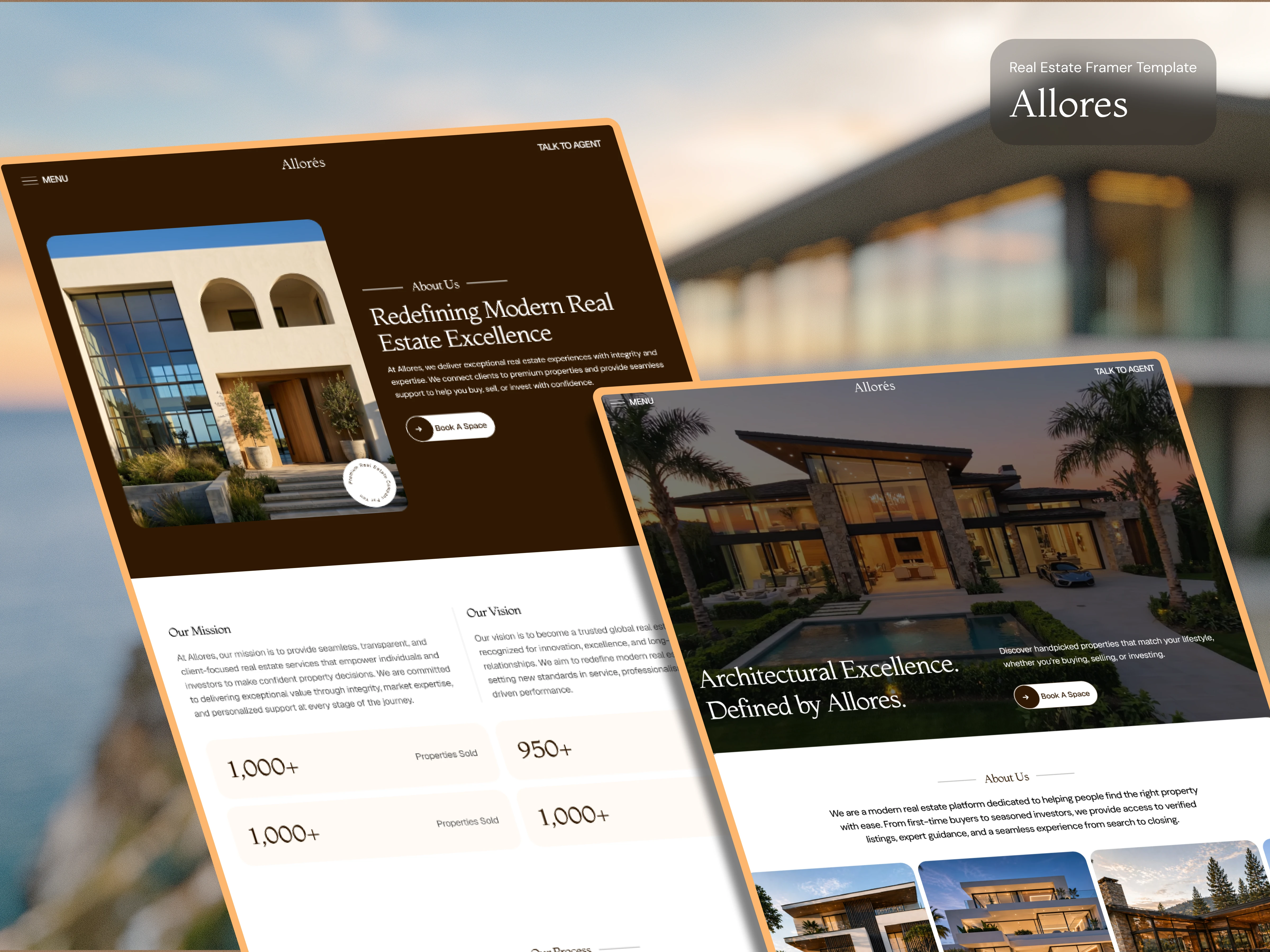
Think about how someone looks for a home online. They don’t read an “About Us” page first. They look at photos, check the price, wonder whether the place is worth a visit, and only then think about talking to someone. I designed Allorés in that order, so the site follows the visitor’s thinking.
Following a buyer through the site
1. Arriving
The home page opens with one large photo and one line: “Homes for the way you live.” No sliders, no pop-ups. The menu and a “Talk to Agent” link sit at the top, so a person who already knows what they want can skip straight to someone who can help.
2. Browsing
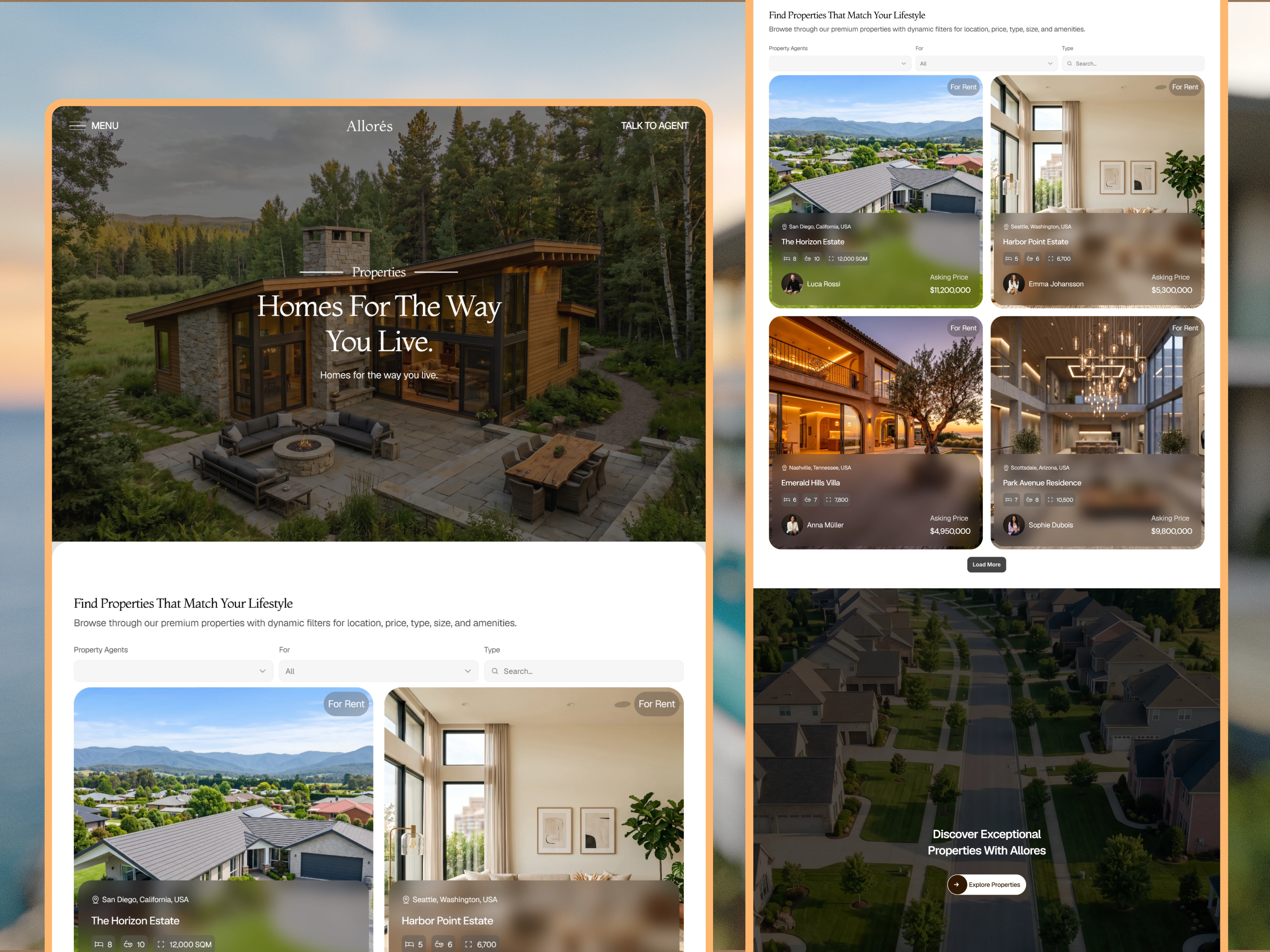
Listing cards carry what people check first: location, bedrooms, bathrooms, size, price, and the agent’s face and name. Three filters (agent, rent or sale, and search) sit above the cards. I kept them to three on purpose, because a long filter bar makes a page feel like homework. A Load More button keeps the page short.
3. Deciding
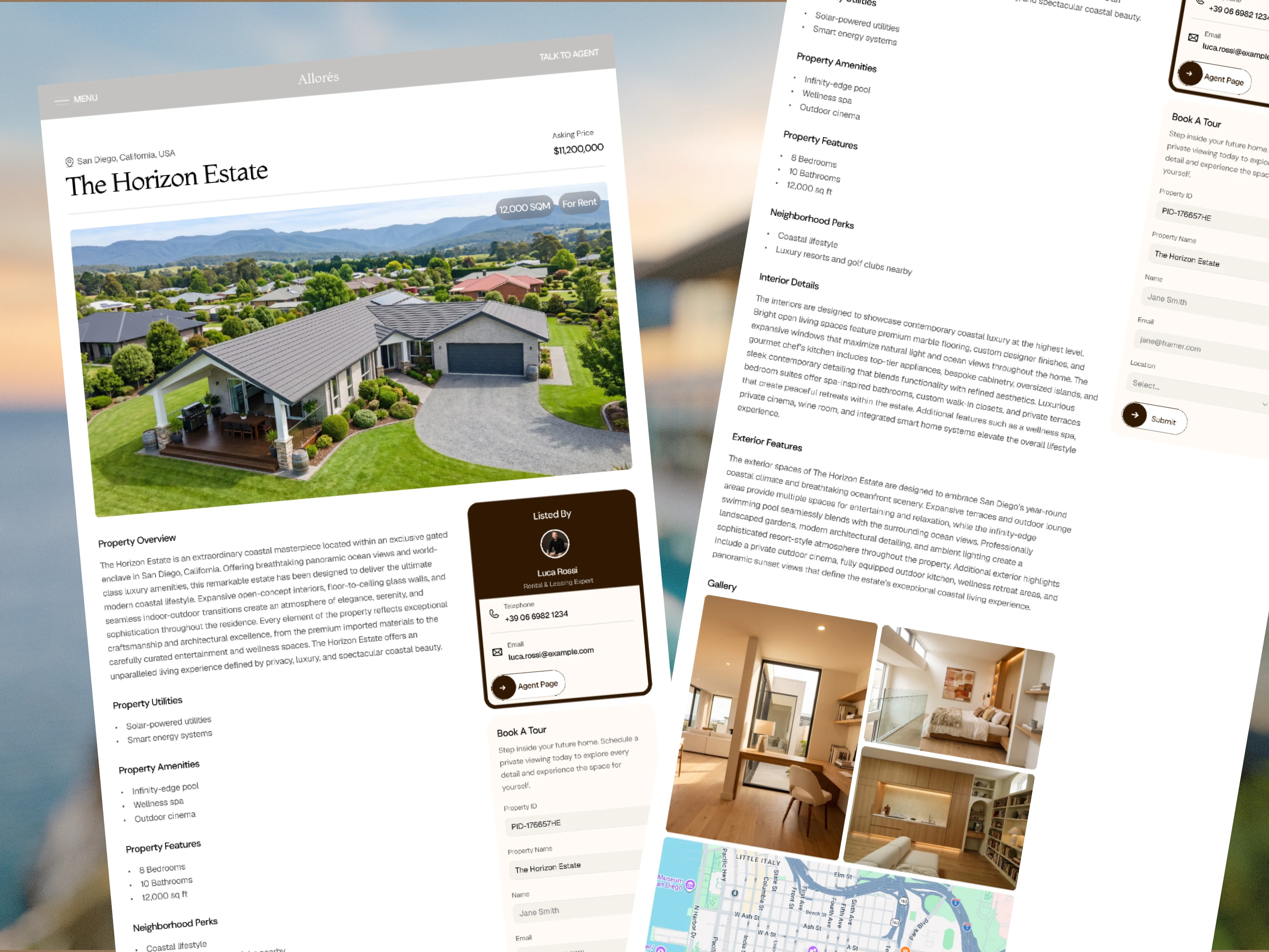
The property page is where most of the work went. The price and location sit at the top. Under the main photo come the overview, amenities, features, interior and exterior notes, a gallery, and a map, in that order, from “what is this place” to “where is it.” Details that would otherwise turn into one long block of text are broken into short lists.
4. Reaching out
A “Listed By” card sits beside the listing, with the agent’s photo, role, phone, and email. Below it is a Book a Tour form that already knows which property you’re looking at, so the visitor only adds their name, email, and location. The step from “I like this” to “I’d like to see it” takes about a minute.
5. Checking the agency is real
Visitors who aren’t convinced yet can look at the About page (mission, vision, numbers), the agent profiles, testimonials, and an FAQ. Those sections are placed after the listings, so they back up the decision and don’t get in its way.
Small decisions that mattered
Colour. Dark brown, cream, and a soft orange accent. It feels warm and a bit upmarket without looking like a bank.
Type. A serif for headlines gives the brand some personality. Everything else is a plain, easy-to-read sans.
Content structure. Properties, agents, and blog posts are set up as content collections, so an agency can add a new listing or agent without touching the layout.
Where it stands
Allorés is a finished template with a home page, about, properties, property details, agents, blog, FAQ, and contact pages, all built to work on mobile as well as desktop. [Add anything real: sales, downloads, client feedback.]
What I’d test next
Whether visitors use the filters or just scroll the cards.
How many people start the tour form and leave before finishing.
Whether adding price and bedroom filters helps or only clutters the page.
Like this project
Posted Oct 12, 2026
Redesigned Allorés to match user habits in searching for real estate online.
Likes
0
Views
1
Timeline
Aug 3, 2026 - Aug 28, 2026