Case Study Danny Studio Wedding Photography Template Redesign.

Lam Hoang

Danny Studio — redesigning a wedding template so the work leads.
Role: Design & build (Framer) · madebyMal
Danny Studio is a wedding photography template built in Framer. Its audience is photographers and studios who book on the strength of their images people whose site has one job: make a couple feel the photos and reach out.
Challenge
The first version looked good and still fell flat. It opened strong a three-column grid that flowed into a masonry as you scrolled, building real momentum. Then two structural problems undercut it:
The gallery was finite. The images ran out and the page dropped into a Story section an interruption exactly where the feeling peaked.
The gallery images weren't clickable. Plenty of photos, but they led nowhere. Beautiful decoration, not a way in.
The result: a site that looked premium but felt forgettable, and whose best asset — the work didn't lead anywhere.
Approach
One rule drove the redesign: the work leads. Keep what built emotion, remove what broke it, and give that emotion somewhere to go.
Key decisions
1. Homepage is an infinite, clickable gallery.
The gallery never dead-ends now, and every cover opens its album. The images went from decoration to the primary navigation.
Why: photos that look openable but aren't break the user's expectation (affordance) and on a photographer's site the images are the strongest value signal, so they should carry the entry (information scent).
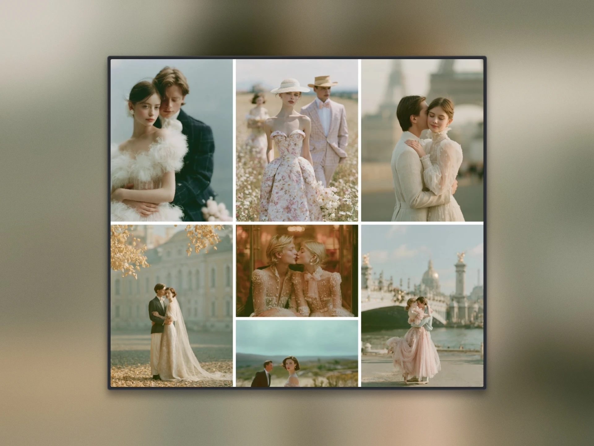
The homepage is the gallery: an infinite, clickable grid of album covers. Every image opens its story, so the work leads instead of a hero.
2. The story moved to where it lands, not interrupts.
Instead of a Story block cutting the homepage scroll, the narrative lives on the About page and at the end of each album after the photos have already made you feel something.
Why: people judge an experience by its peak and its end (peak-end rule), so the story and the ask belong at the emotional high, not mid-flow.
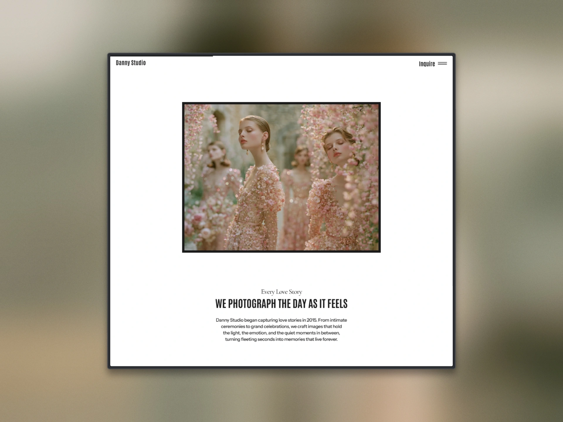
The story didn't disappear it moved here, after the photos have already made you feel something.
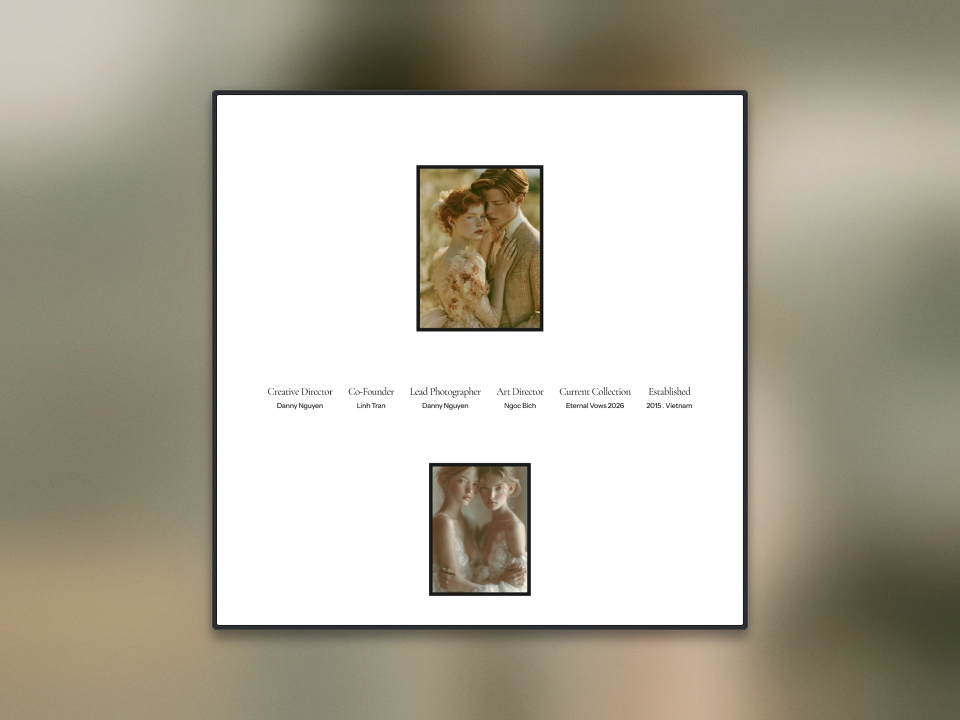
A spare About — real roles and studio details that reassure without competing with the photos.
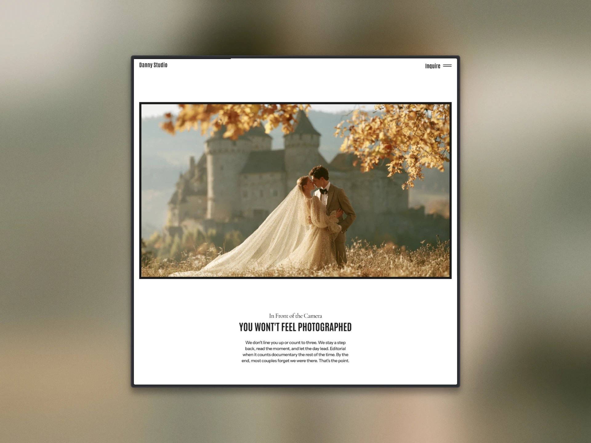
Approach, placed where it lands — after the photos have earned attention, not mid-scroll.
3. The CTA sits at the emotional peak.
A single, quiet CTA at the end of each album and in the closing band — asked once the work has earned it, never loud.
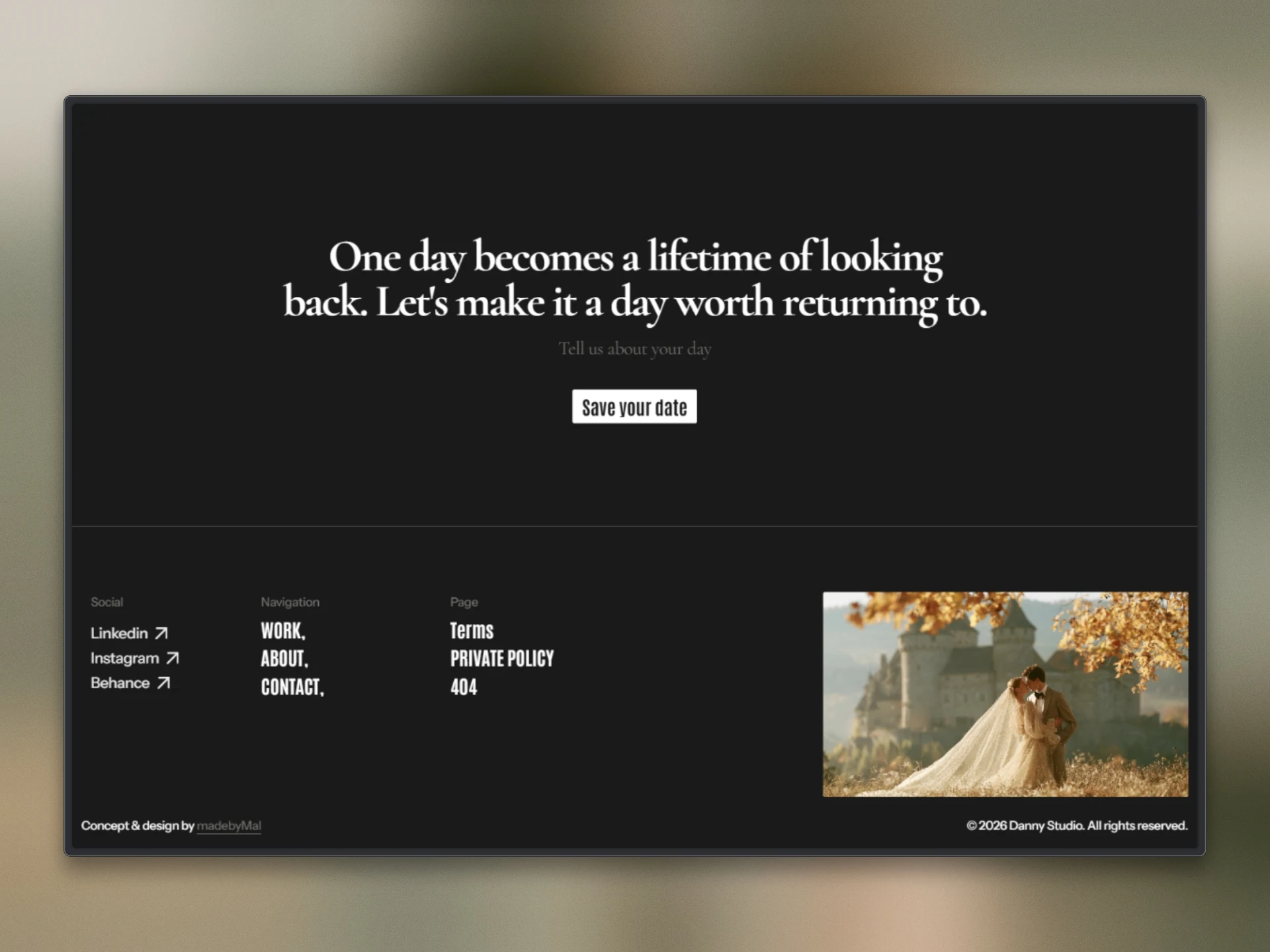
The closing band — the ask lands once, gently, at the very end.
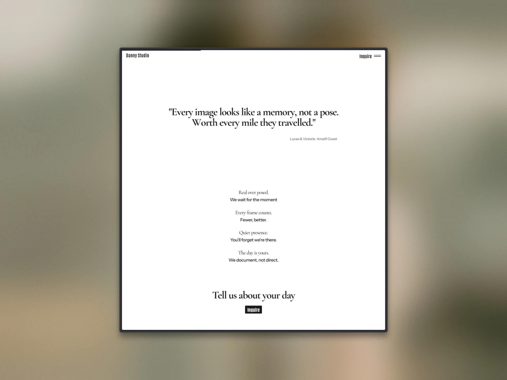
A couple's words, then a single soft CTA at the emotional peak — asked after the work has earned it.
4. Navigation lives in the header + overlay, by design.
Because the homepage scrolls infinitely, it never reaches a footer so a sticky header and a full-screen menu carry everything the homepage deliberately drops (Work, About, Contact).
Why: infinite scroll removes the footer as a navigation anchor, so wayfinding has to move into persistent navigation (information architecture / user flow).
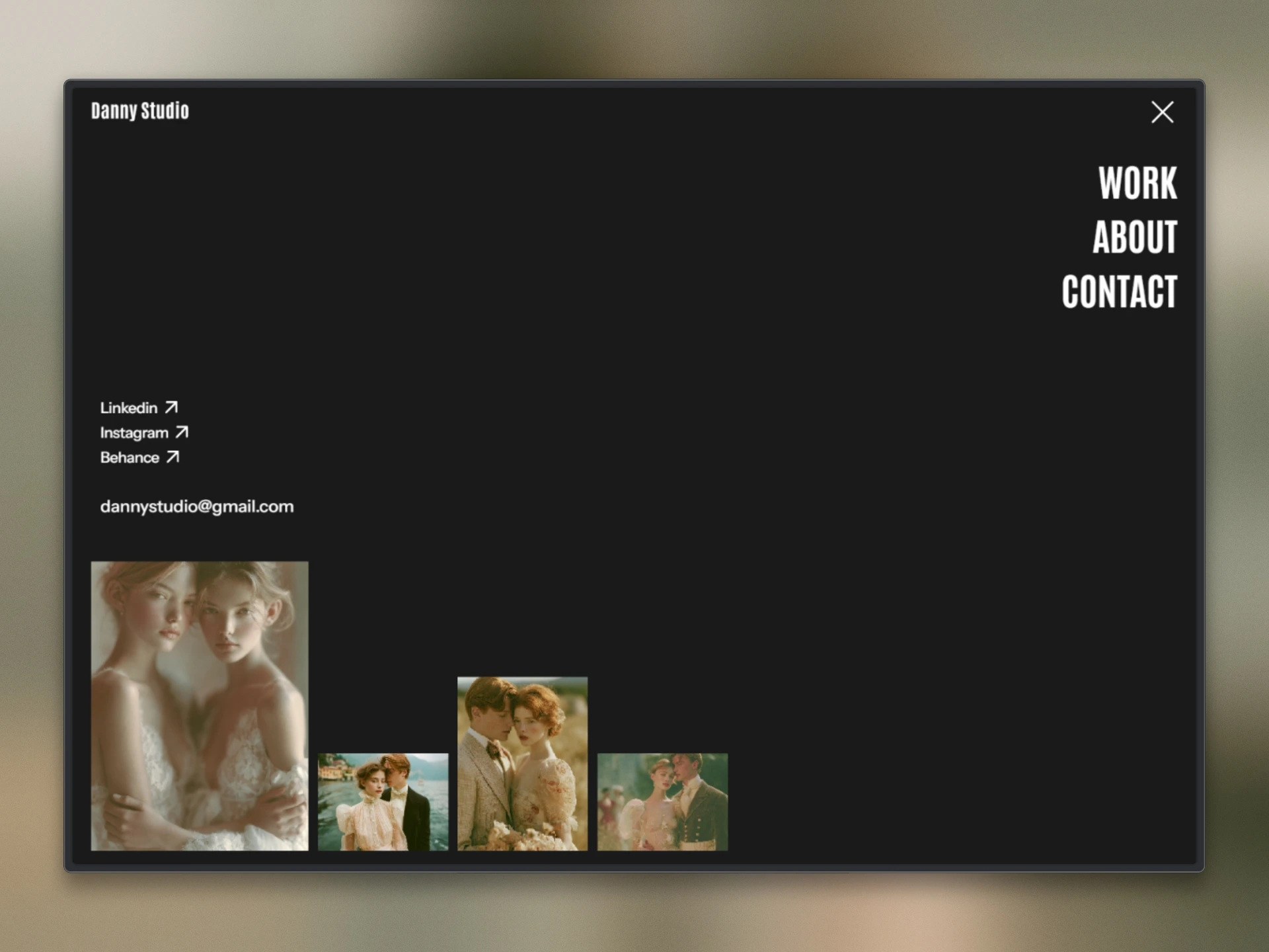
A full-screen menu carries the whole map Work, About, Contact one tap away.
5. An inquiry form built for weddings.
Couple names, wedding date, venue, role, message only fields a wedding inquiry needs, plus a clear "we reply within 48 hours."
Why: every extra field costs completions, so the form asks only what's relevant and sets expectations up front (cognitive load).
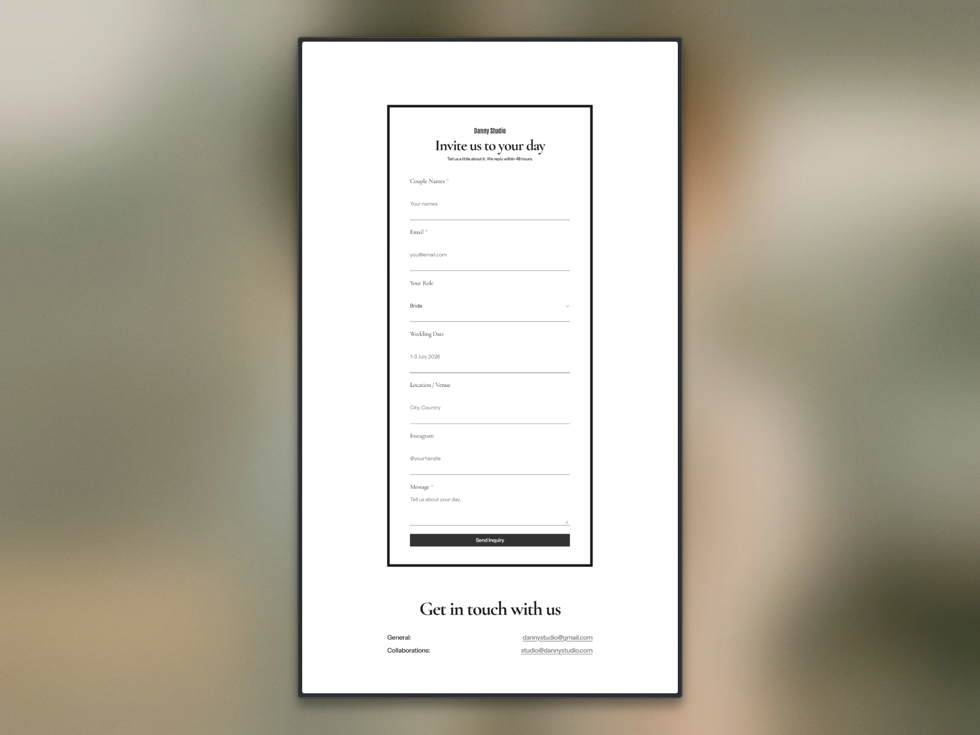
An inquiry form built for weddings.
Tradeoff considered
Keeping the hero and story on the homepage was the safe, familiar choice most wedding sites do it. I dropped it because it interrupted the one thing the page did well: build momentum through the photos. The judgment call was to protect the flow over convention.
Result
Before → after: a finite, decorative gallery that interrupted itself became an infinite, clickable gallery that carries the whole journey, the story went from a mid-scroll interruption to a payoff at the peak.
The redesign (v2) is now live on the Framer Marketplace.
Like this project
Posted Aug 1, 2026
Redesigned Danny Studio's photography site for better engagement and navigation.
Likes
1
Views
3