Personal Financial Advisor Website for Youth Financial Literacy
Introduction
This project represents the creation of a dynamic and educational personal website for a financial advisor specializing in youth financial literacy. The design emphasizes clarity and engagement, combining clean, modern aesthetics with custom animations and unique layouts. Utilizing vector graphics, the site captivates young audiences while delivering crucial financial guidance.
A content management system (CMS) ensures effortless updates, while its responsive design guarantees a seamless user experience across all devices. This project exemplifies a commitment to promoting good financial habits among young people, leveraging technology and design expertise to make financial literacy accessible and engaging.
Hero
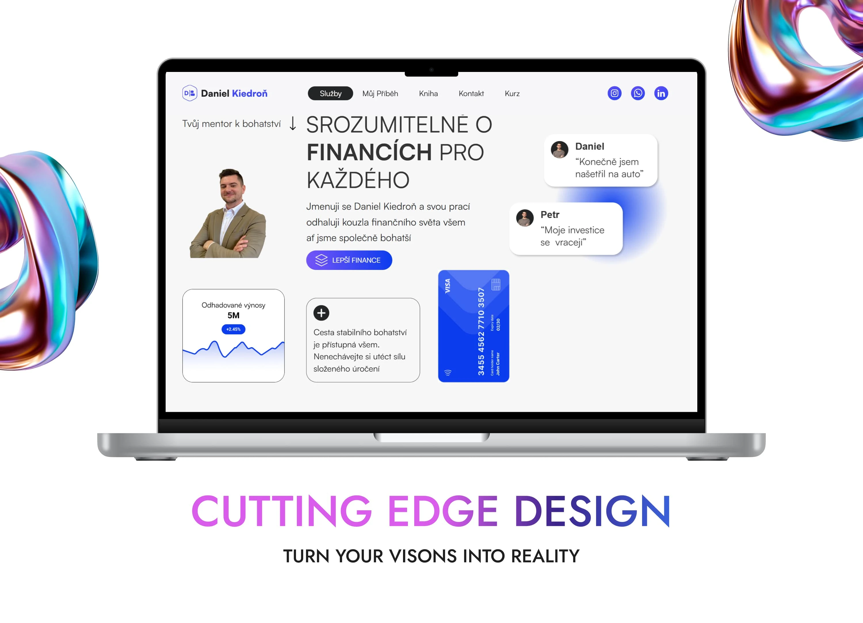
Strengths of the Design:
Bold Typography: The prominent, large font (“Clear Financial Advice for Everyone”) immediately grabs attention and communicates the core message clearly.
Personalization: Featuring the financial advisor’s photo builds trust and establishes a personal connection with the audience.
Call-to-Action (CTA): The "Better Finances" button stands out with a strong contrast, encouraging user engagement.
Visual Elements: Supporting graphics, such as the chart and the payment card, add a professional touch and make the content visually engaging.
Social Proof: Testimonials from users ("Daniel: I finally saved up for a car") provide credibility and demonstrate real-life success stories.
Simple Navigation: The clean and intuitive top menu (Services, My Story, Book...) ensures easy exploration of the website.
Responsiveness: The laptop-based mockup suggests that the design is optimized for various devices, enhancing accessibility.
Practical Impact:
This section effectively combines aesthetics, functionality, and messaging to make a strong first impression. The primary objective is to capture the visitor's attention and encourage action, whether clicking the CTA or exploring more of the site.
Career Timeline
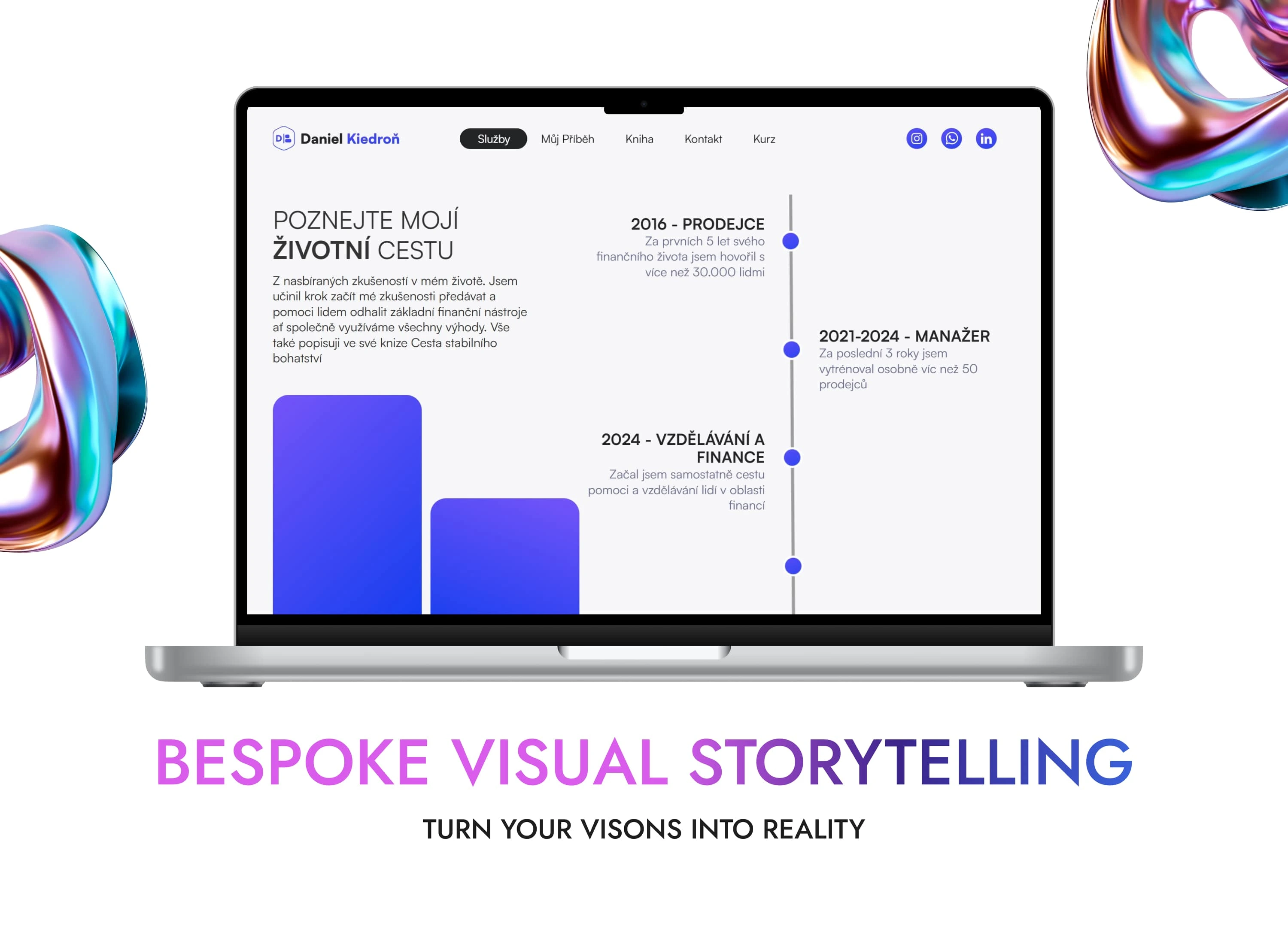
Strengths of the Design:
Clear Narrative Structure: The timeline format provides an easy-to-follow overview of the client's career milestones, helping visitors understand their expertise and growth over time.
Modern Visual Style: The combination of dots, connecting lines, and gradient bars ensures the section is visually appealing while maintaining professionalism.
Balanced Text and Graphics: The integration of concise text alongside visual elements like bar graphs creates an engaging layout that avoids overwhelming the user.
Progressive Storytelling: By highlighting key achievements (e.g., 2016 - Sales, 2021–2024 - Manager, 2024 - Finance Education), the design builds credibility and showcases growth.
Accessible Language: The text is straightforward and approachable, making it relatable for a broad audience, especially younger users unfamiliar with complex financial terminology.
Cohesive Design with Branding: The colors and fonts align with the overall website theme, reinforcing the brand's identity.
Practical Impact:
This section effectively communicates the client’s professional journey and expertise. It not only builds trust by showcasing their experience but also inspires younger audiences by presenting a relatable success story. The use of a timeline ensures chronological clarity while maintaining user engagement.
Book Presentation
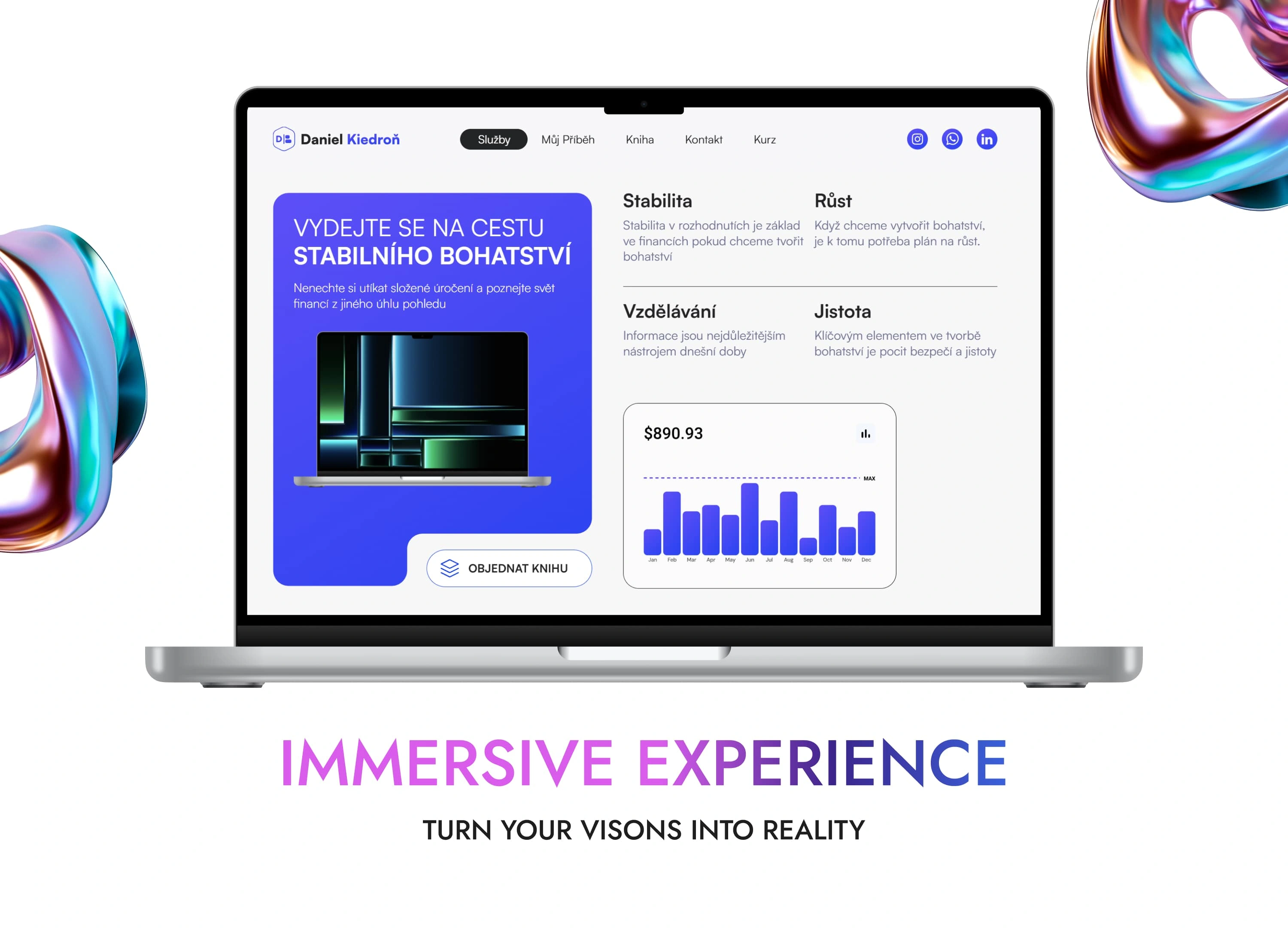
Strengths of the Design:
Focused Messaging: The headline ("Embark on the Journey to Stable Wealth") is inspirational and encourages exploration of financial knowledge through the book. It directly appeals to the target audience.
Strong Call-to-Action (CTA): The “Order Book” button is prominently displayed and immediately actionable, simplifying the process for interested users.
Engaging Visuals: The laptop image and gradient background add a modern and sleek aesthetic, making the section visually compelling.
Key Benefits Highlighted: Dividing the information into clear pillars (Stability, Growth, Education, Security) helps users quickly understand the core takeaways and value of the book.
Data Visualization: Including the bar chart adds a touch of practicality, symbolizing financial literacy and analytical thinking, which resonates with the book's theme.
Brand Consistency: The blue and white color scheme aligns with the overall branding, ensuring a cohesive look throughout the website.
Practical Impact:
This section not only markets the book effectively but also builds credibility by outlining the tangible benefits it offers. The clean layout and structured information make it easy for users to absorb key details and take action.
Contact Section
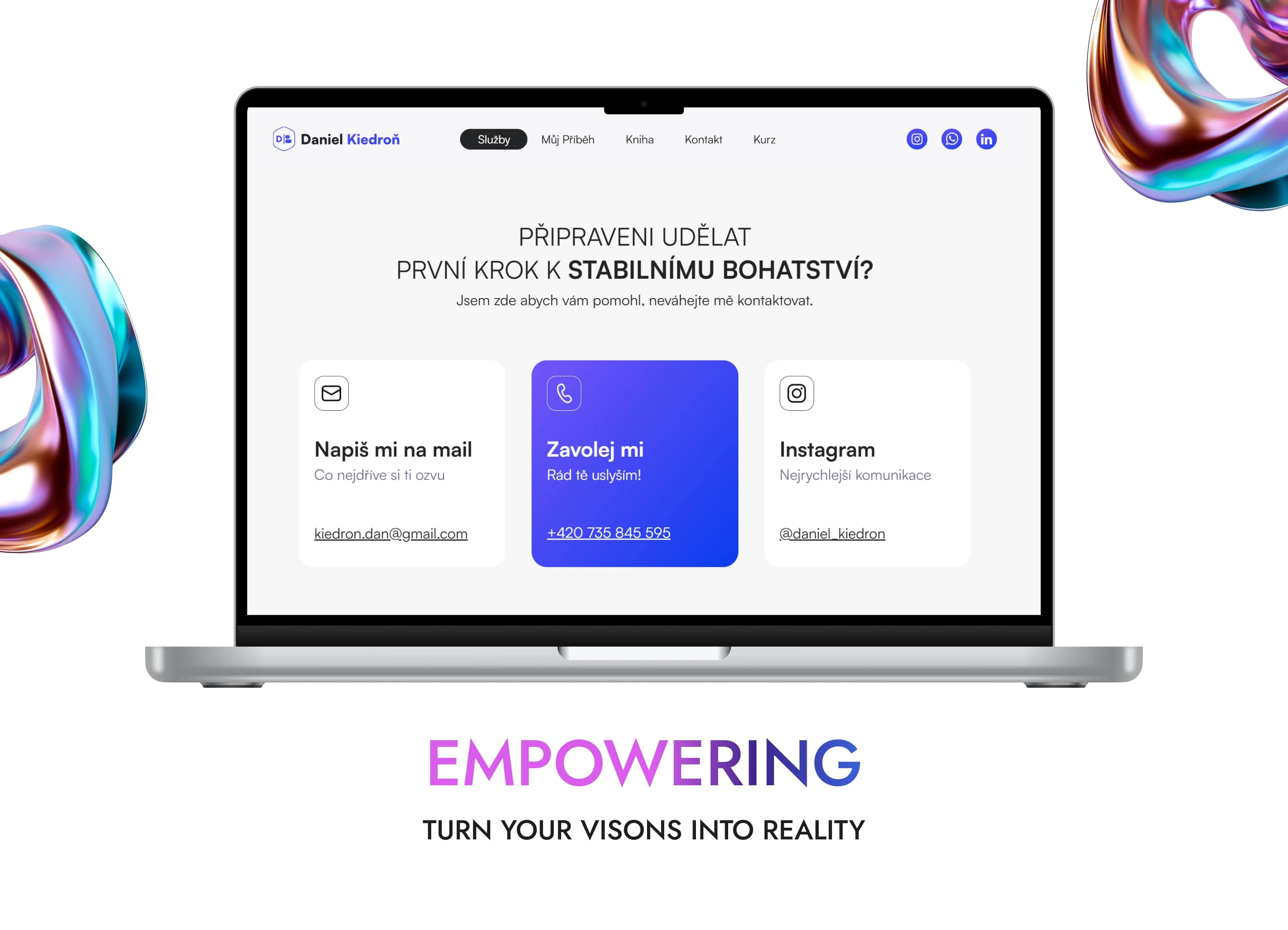
Strengths of the Design:
Clear Call-to-Action (CTA): The headline ("Ready to Take the First Step Towards Stable Wealth?") directly invites users to engage, providing a sense of empowerment and action.
Easy Communication Options:
Email: Offers a simple way for users to initiate contact, giving a formal channel for communication.
Phone: Highlighted prominently in the center with a vibrant blue background, making it stand out for users who prefer direct and immediate interaction.
Instagram: Recognizes the importance of social media, appealing to younger audiences or those who favor informal communication.
Balanced Layout: The equal-sized cards ensure the design is clean and easy to navigate, avoiding information overload.
Brand Consistency: The purple and white theme ties in with other sections of the website, reinforcing visual coherence.
Impression and Impact of the Project
The Daniel Kiedroň website leaves a strong and lasting impression, effectively achieving its purpose of building a credible and approachable personal brand. Here are the key points regarding its impression and potential impact:
1. Professionalism and Trustworthiness
The modern and clean design immediately conveys professionalism. The biography and clear timeline reinforce Daniel's expertise, making him relatable and trustworthy. Visitors are likely to feel they are engaging with an experienced professional who understands their financial needs.
2. Emotional Connection and Inspiration
The site goes beyond just offering services—it tells a story. Daniel's personal and professional journey is presented in a way that resonates with users. This humanizes the brand and inspires visitors to take control of their financial futures, increasing their motivation to engage with the content.
3. Accessibility and Usability
The site’s user-friendly navigation ensures a smooth experience for visitors, allowing them to access information effortlessly. Clear contact options and calls to action further simplify the process of reaching out or taking the next steps, such as ordering the book or booking consultations.
4. Appeal to Target Audience
The focus on financial stability, education, and personal growth strongly appeals to younger audiences and professionals. The integration of visual elements, such as graphs and statistics, adds credibility and makes complex financial topics easier to grasp.
5. Long-Term Impact
The website has the potential to:
Increase Daniel Kiedroň’s visibility and reputation as a financial educator.
Drive meaningful engagement through personal storytelling and practical solutions.
Inspire financial confidence and action among visitors, leading to positive societal and personal outcomes.
Conclusion
The website is not just a digital presentation—it’s an impactful platform that leaves visitors feeling inspired, informed, and empowered to take the first step toward financial stability. Its polished design, relatable content, and clear focus on value make it an excellent tool for building Daniel Kiedroň’s personal brand and achieving long-term success in financial education.
Like this project
Posted Dec 6, 2024
A modern website focused on financial expertise, personal growth, and services designed to inspire and empower individuals to achieve financial stability.
Likes
0
Views
11

