CoralCare: Elevating Beauty with a Unique Digital Experience
Project Introduction
CoralCare is an innovative web project that seamlessly combines luxury aesthetics with sustainability through a design inspired by the beauty of the ocean. Every element of the website, from custom animations to its unique layout, has been thoughtfully crafted to reflect the brand’s identity. Utilizing a soothing color palette of deep blues, aquas, and seafoam greens, the site encapsulates the essence of the marine world.
Built on the Webflow platform with custom code enhancements, CoralCare merges creativity with advanced technology to deliver a modern, engaging user experience. Interactive graphics not only reinforce the oceanic theme but also ensure clarity and user-friendliness. CoralCare invites visitors to explore a website where beauty meets eco-consciousness in perfect harmony.
Overview of the Hero Section
Visual Impact:
The section immediately grabs attention with its clean, modern layout and balanced use of color. The soothing blue tones of the water background tie into the sustainability and ocean theme, creating an emotional connection with the audience.
The vibrant orange callout ("TRY ME") and product highlight break the color monotony, drawing the viewer’s eye directly to the product.
Typography:
The bold, capitalized "BEAUTY OF THE NATURE" headline emphasizes the brand's theme and aligns well with the luxurious yet eco-conscious messaging.
Supporting text uses clean, legible fonts for a modern and professional feel. The layout ensures it’s easy to scan.
Imagery:
The bubble effect and the submerged bottle evoke a strong connection to the ocean, sustainability, and purity. The imagery subtly communicates the brand's focus on natural, clean products.
The cream jar adds context to the product offering and is a focal point for immediate user interest.
Interactivity Potential:
The “TRY ME” label suggests an interactive element, such as a hover effect, link, or animation, encouraging user engagement.
Integrating this with a demo or feature could enhance usability.
Navigation & Call-to-Action (CTA):
The navigation menu at the top is minimalistic and strategically placed, ensuring it does not overshadow the hero content.
The “Get 20% OFF…” banner serves as a secondary incentive, prompting action without disrupting the visual flow.
Strengths:
Balanced Design: Effective use of contrast and color balance enhances readability and appeal.
Brand Connection: The ocean theme is consistent and reinforced through both imagery and colors.
Engagement Features: The "TRY ME" graphic teases interactivity, enticing users to explore.
Overview of the Product Categories Section
Headline and Visual Theme:
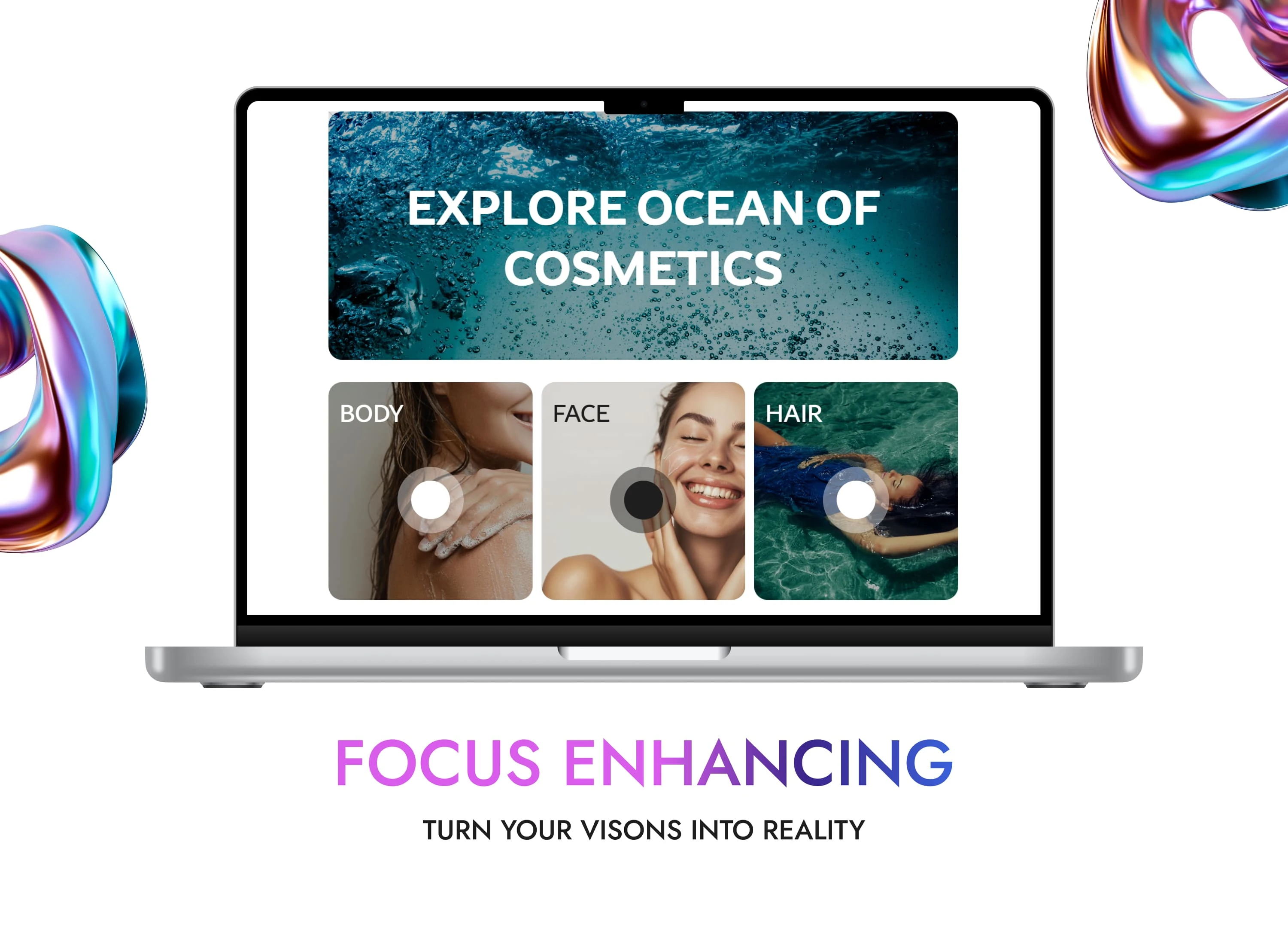
The section opens with a bold, centered headline, "EXPLORE OCEAN OF COSMETICS," set against a dynamic underwater image. This creates a seamless continuation of the oceanic theme, reinforcing the brand identity.
The background image of bubbles rising in water adds movement and energy, while maintaining the clean, luxurious aesthetic.
Category Layout:
The three product categories – "BODY," "FACE," and "HAIR" – are displayed in a clear, grid-like layout, making navigation intuitive for users.
Each category is represented with vibrant, high-quality imagery that is emotionally appealing. For example:
"BODY": A focus on self-care and indulgence.
"FACE": Emphasis on freshness and radiance.
"HAIR": A lifestyle approach, showing beauty in harmony with water.
Interactive Design:
The circular interactive elements overlaid on the images add a modern touch. These could represent clickable buttons or hover effects, encouraging user interaction.
This element makes the design more engaging and provides an opportunity to direct users deeper into specific product lines.
Typography:
The use of bold, uppercase text for categories ensures clarity and hierarchy, allowing users to quickly identify sections of interest.
Subtle contrast in font size and weight between the headline and category names ensures readability and maintains visual balance.
Strengths of the Section:
Engaging Visuals: The underwater background and vivid images immediately draw the viewer’s eye while staying cohesive with the overall theme.
Simple Navigation: The clean, grid-style layout ensures that the categories are well-organized and easy to explore.
Interactive Focus: The circular design elements hint at an engaging and modern user experience.
Consistency: The design aligns with the branding established in the hero section, providing a seamless transition.
Overview of the Product Gallery Section
Headline and Subcategories:
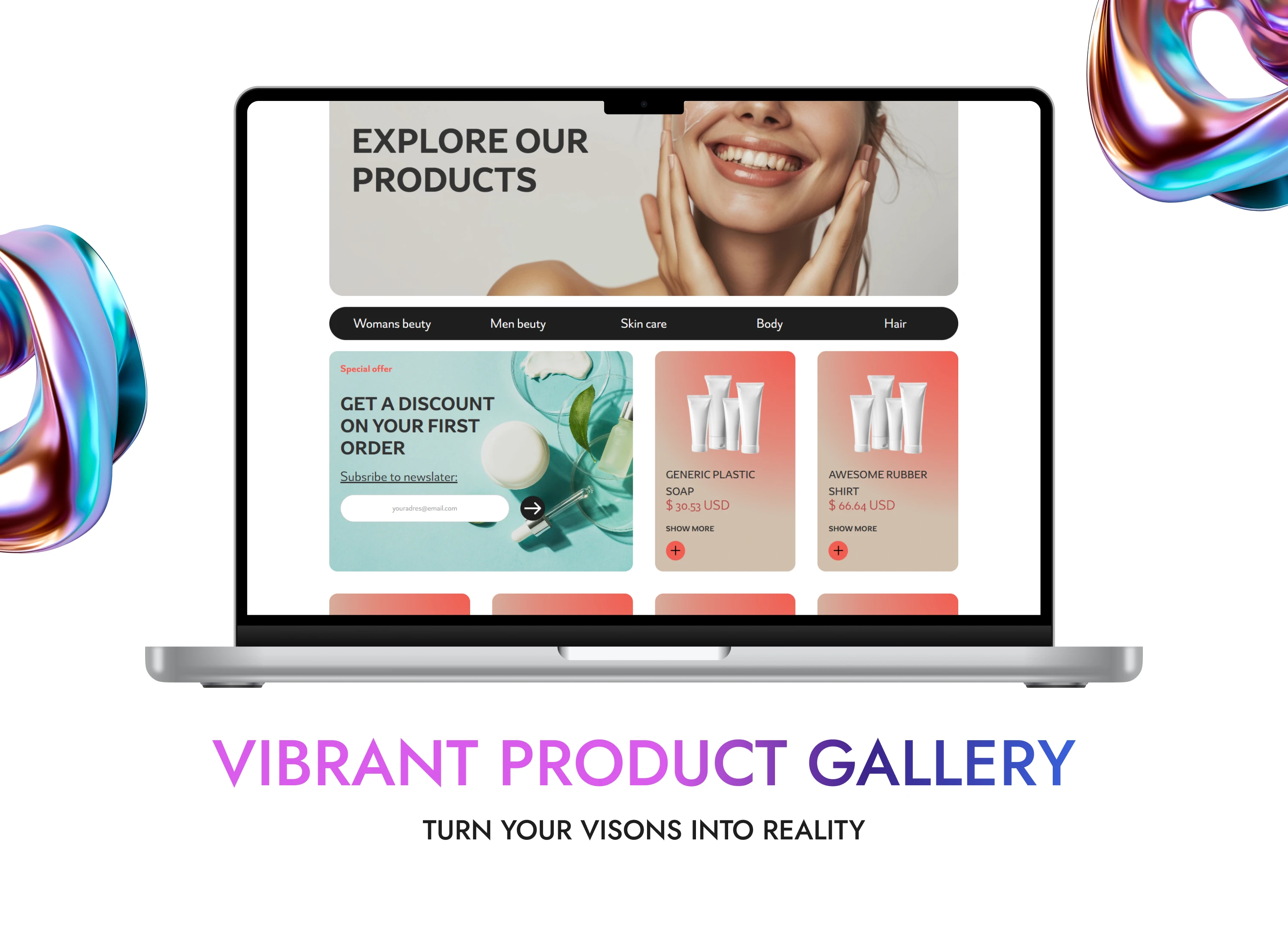
The section begins with a clear, bold headline: "EXPLORE OUR PRODUCTS," ensuring users immediately understand the purpose of this section.
Below the headline, a navigation bar with subcategories (e.g., "Women's Beauty," "Men's Beauty," "Skincare," "Body," "Hair") is prominently placed, enabling users to filter products intuitively. The design emphasizes usability, guiding users to specific interests.
Visual Organization:
Product Cards:
Each product is showcased in a clean card format with ample white space, ensuring no overcrowding.
The gradient backgrounds of the product cards add vibrancy and a modern touch, aligning with the luxury and eco-friendly branding.
Product details, such as name, price, and a “SHOW MORE” link, are neatly displayed. This minimalistic design keeps the focus on the products.
Special Offer Section:
The special offer block is visually distinct with a softer color palette (aqua tones) and a rounded subscribe form. This draws attention while maintaining harmony with the overall design.
The inclusion of a discount incentive ("Get a Discount on Your First Order") is an effective way to encourage user interaction and conversions.
Imagery:
The use of smiling faces and high-quality product imagery in the background creates a positive, relatable connection with users.
Images of the products are generic placeholders but still visually balanced within the layout.
Call-to-Action (CTA):
The section incorporates multiple CTAs:
The navigation bar acts as a category-based CTA, funneling users into specific product types.
The “SHOW MORE” button for individual products hints at deeper pages or pop-ups for detailed descriptions.
The newsletter subscription form introduces a sales funnel opportunity while tying into promotions.
Strengths of the Section:
User-Friendly Design:
Subcategory navigation and well-structured product cards make this section easy to browse.
Visual Appeal:
A clean, professional aesthetic, boosted by modern gradients and high-quality images, aligns well with the brand’s luxury positioning.
Conversion-Focused Features:
The discount offer and subscription form actively engage users, encouraging participation and purchases.
Overview of the Product Display Section
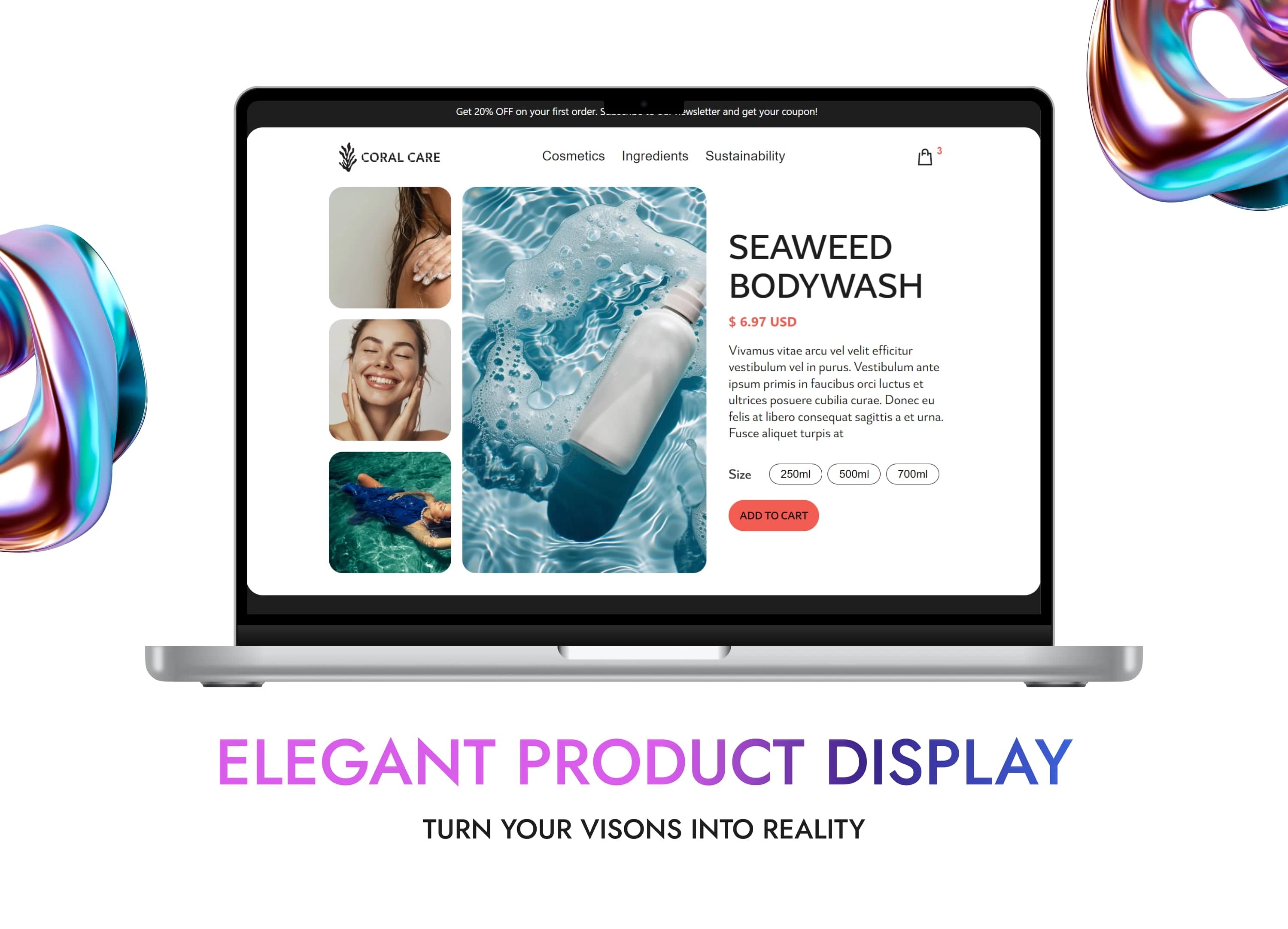
Headline and Navigation:
The section begins with a bold and clear headline: "SEAWEED BODYWASH," ensuring that the product name is immediately apparent and prominent to the user.
The navigation at the top includes broader categories such as "Cosmetics," "Ingredients," and "Sustainability," guiding users toward different areas of interest within the brand's offerings. This structure enhances browsing clarity and usability.
Visual Organization:
Product Display:
The layout is minimalistic yet elegant, ensuring that the product is the central focus. Ample white space keeps the display uncluttered.
The product imagery is vibrant and immersive, featuring a bottle of body wash submerged in clear water, reinforcing the natural and refreshing theme.
Accompanying visuals include smiling, relaxed individuals, creating a relatable and aspirational vibe for users.
Key product information such as price ($6.97 USD) and size options (250ml, 500ml, 700ml) is displayed cleanly alongside the product image, making it easy to identify purchasing details.
The “ADD TO CART” button is bold, with a red accent to draw attention and encourage immediate action.
Supporting Imagery:
On the left, a vertical collage of images showcases:
Hands applying lotion or product.
A close-up of a smiling face.
A lifestyle image of someone enjoying water, enhancing the emotional connection to the product’s benefits (refreshment and self-care).
Call-to-Action (CTA):
Multiple CTAs are seamlessly integrated:
Product size selection: Users can easily choose between different sizes.
The “ADD TO CART” button ensures straightforward purchasing actions.
Navigation bar links at the top act as indirect CTAs, funneling users to additional product categories or brand information.
Imagery and Design Aesthetics:
High-resolution images paired with aqua-toned backgrounds evoke a sense of purity, eco-friendliness, and luxury.
The consistent use of modern typography and clean lines aligns with the brand’s premium positioning.
The soft rounded edges of buttons and forms maintain a user-friendly and approachable design language.
Conclusion of the CoralCare Web Project
The CoralCare website is a testament to the seamless blend of creativity, innovation, and user-centric design. From its visually stunning hero section to its intuitive product galleries, every detail reflects the brand's mission of luxury and sustainability. Through thoughtful design and advanced technology, this project showcases how aesthetic appeal and functionality can coexist harmoniously.
Visual Excellence:
The use of ocean-inspired visuals and a calming color palette not only captivates the audience but also aligns perfectly with the brand's eco-conscious identity. Custom animations and interactive elements further enhance the user experience, making the site immersive and engaging.
User-Centric Navigation:
Clear layouts, well-defined categories, and intuitive navigation ensure that users can explore products effortlessly. Whether browsing the hero section or diving into specific product categories, the experience remains smooth and enjoyable.
Conversion-Driven Design:
The integration of CTAs, such as the newsletter subscription form with a discount incentive, demonstrates a focus on driving conversions. These features create an effective funnel, encouraging user interaction and purchase behavior.
Technical Expertise:
Built with Webflow and enriched by custom code, the CoralCare website exemplifies technical proficiency. It combines creative storytelling with cutting-edge web development, resulting in a robust and scalable platform.
Eco-Conscious Messaging:
The consistent marine theme, subtle yet impactful, reminds users of the brand's commitment to sustainability. This is a crucial element that reinforces trust and aligns with the target audience's values.
Reflections and Skills Highlighted:
This project highlights several key skills, including:
Design Expertise: Crafting visually appealing and on-brand elements, such as cohesive color schemes and dynamic layouts.
User Experience Design: Prioritizing ease of navigation and engagement to create an intuitive and enjoyable user journey.
Web Development Mastery: Leveraging modern platforms and custom coding to achieve responsive, high-performing results.
Strategic Thinking: Balancing aesthetics and functionality to meet business goals, from brand storytelling to conversion optimization.
Final Statement:
The CoralCare website is more than just a digital storefront—it is an immersive experience that bridges luxury, sustainability, and cutting-edge web design. This project demonstrates my ability to combine creative vision, technical execution, and user-focused design to deliver a platform that not only represents a brand but elevates it. CoralCare stands as a benchmark for high-quality web projects, making an impact both visually and functionally.
Like this project
Posted Dec 6, 2024
CoralCare: A luxurious, eco-conscious website blending ocean-inspired design, seamless navigation, and advanced Webflow tech for an engaging user experience.
Likes
0
Views
11

