PGI Brand Identity Redesign
Sophie Rautenbach
Protection Group International (PGI) is a cybersecurity and intelligence consultancy working across corporate, government, and humanitarian sectors. Operating in high-trust environments, clarity and discretion are critical. Following internal strategy work, the existing identity felt generic and overly corporate, lacking cohesion and failing to reflect the ingenuity, authority, and quiet confidence of the team.
What came before: The existing identity was dated, inconsistent, and visually underpowered. Gold accents and generic typography gave it an off-the-shelf finance feel, while clichéd stock imagery did little to build trust. There was no clear hierarchy, no real system, and no sign of the human intelligence behind the work. A brand built for generic safety, not strategic clarity.
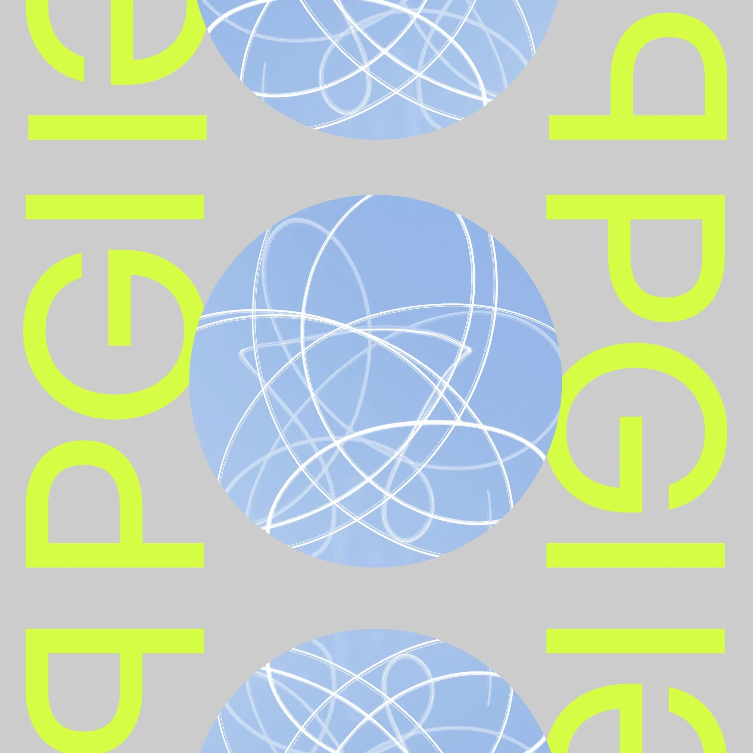
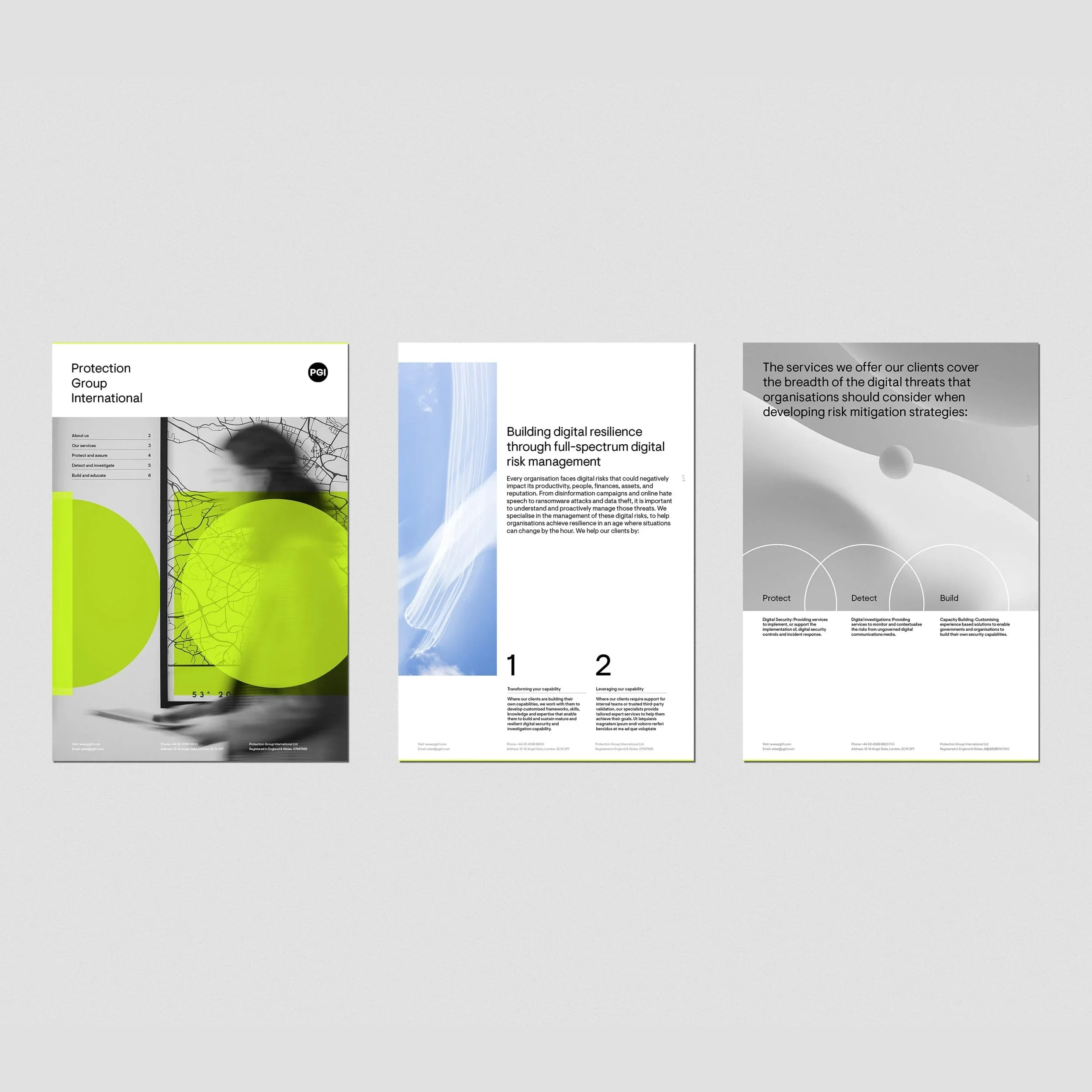
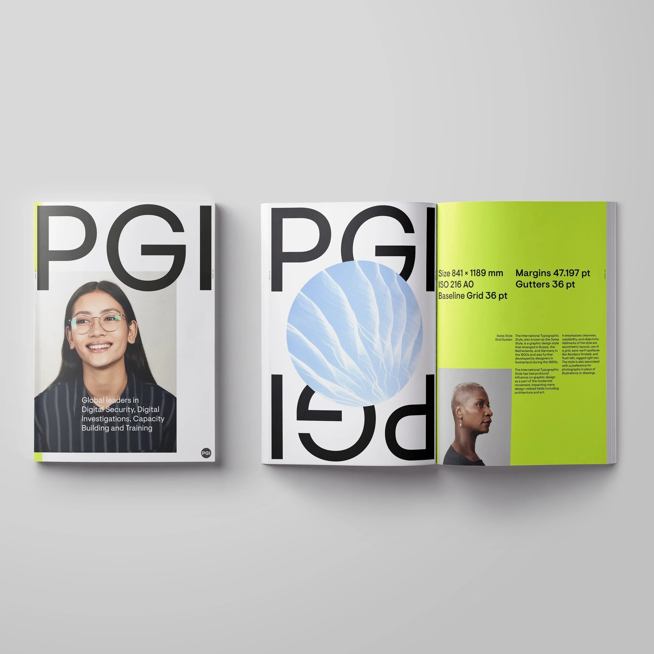
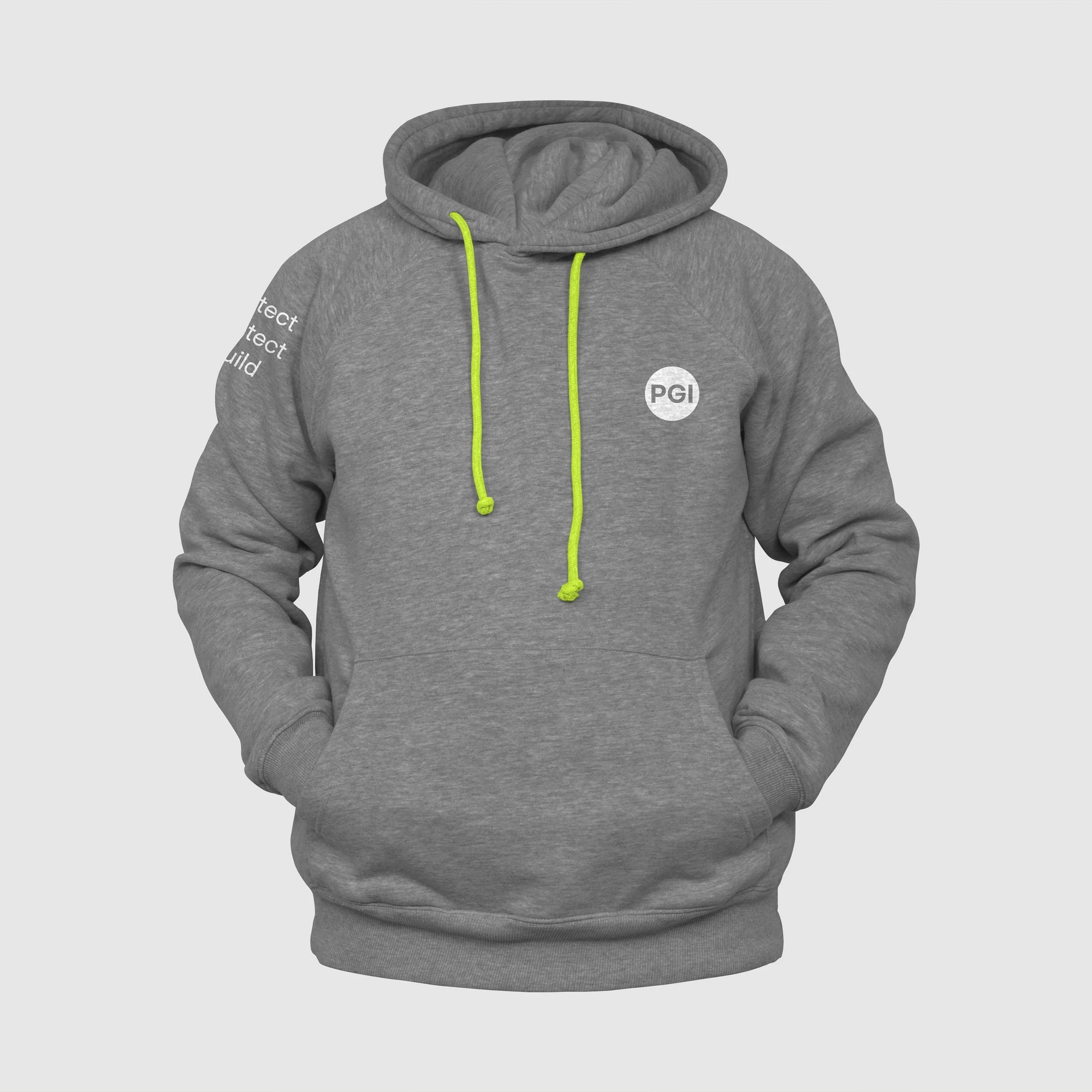
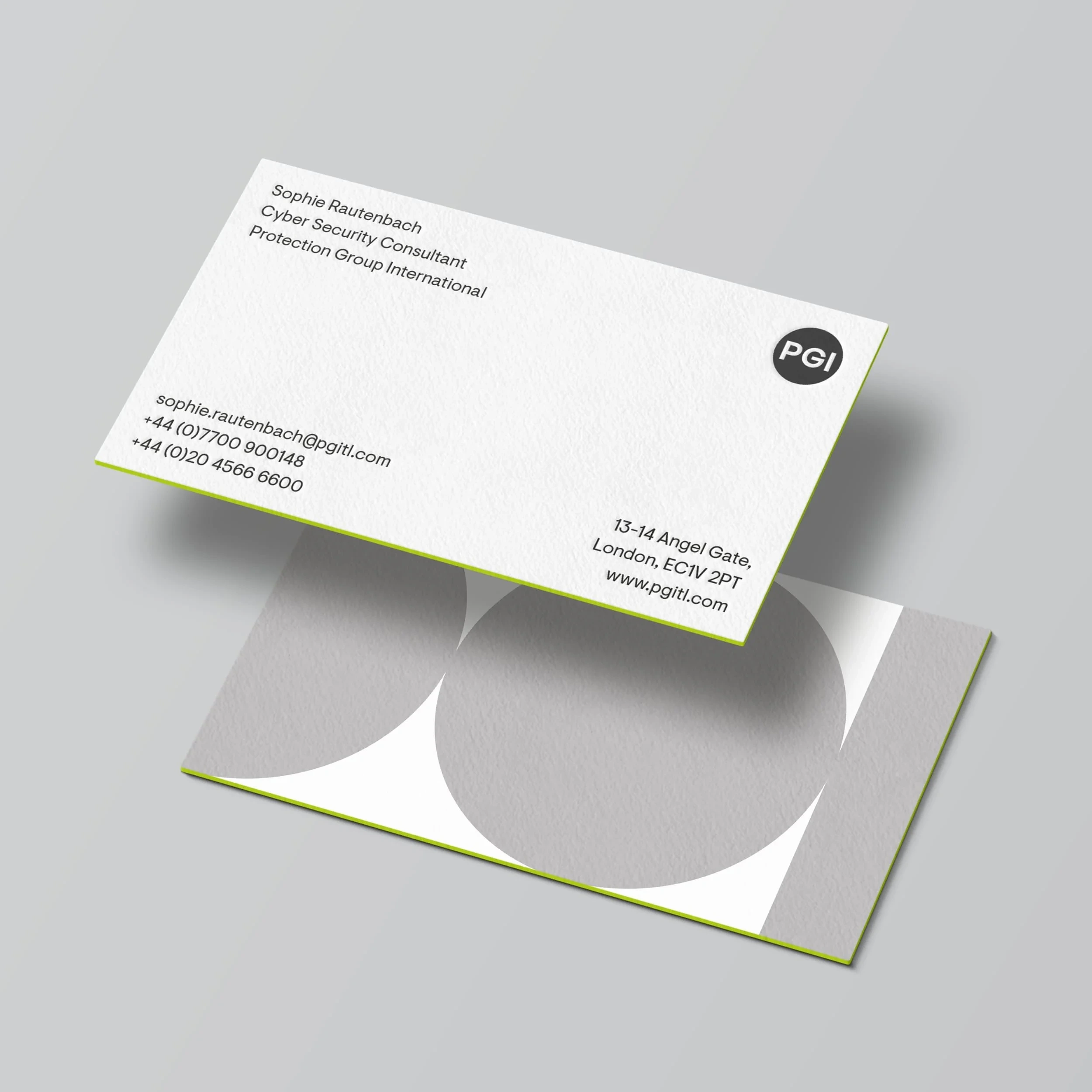
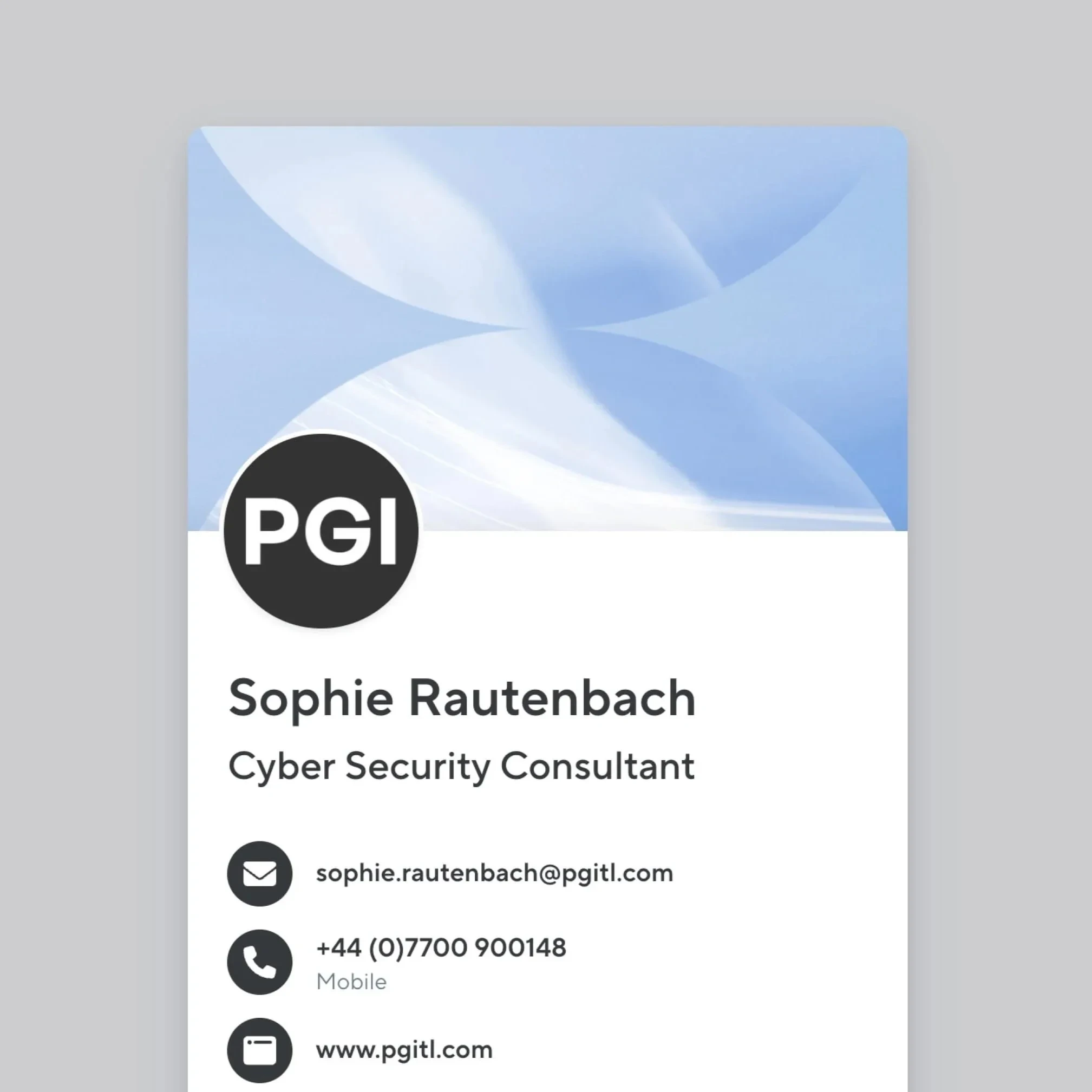
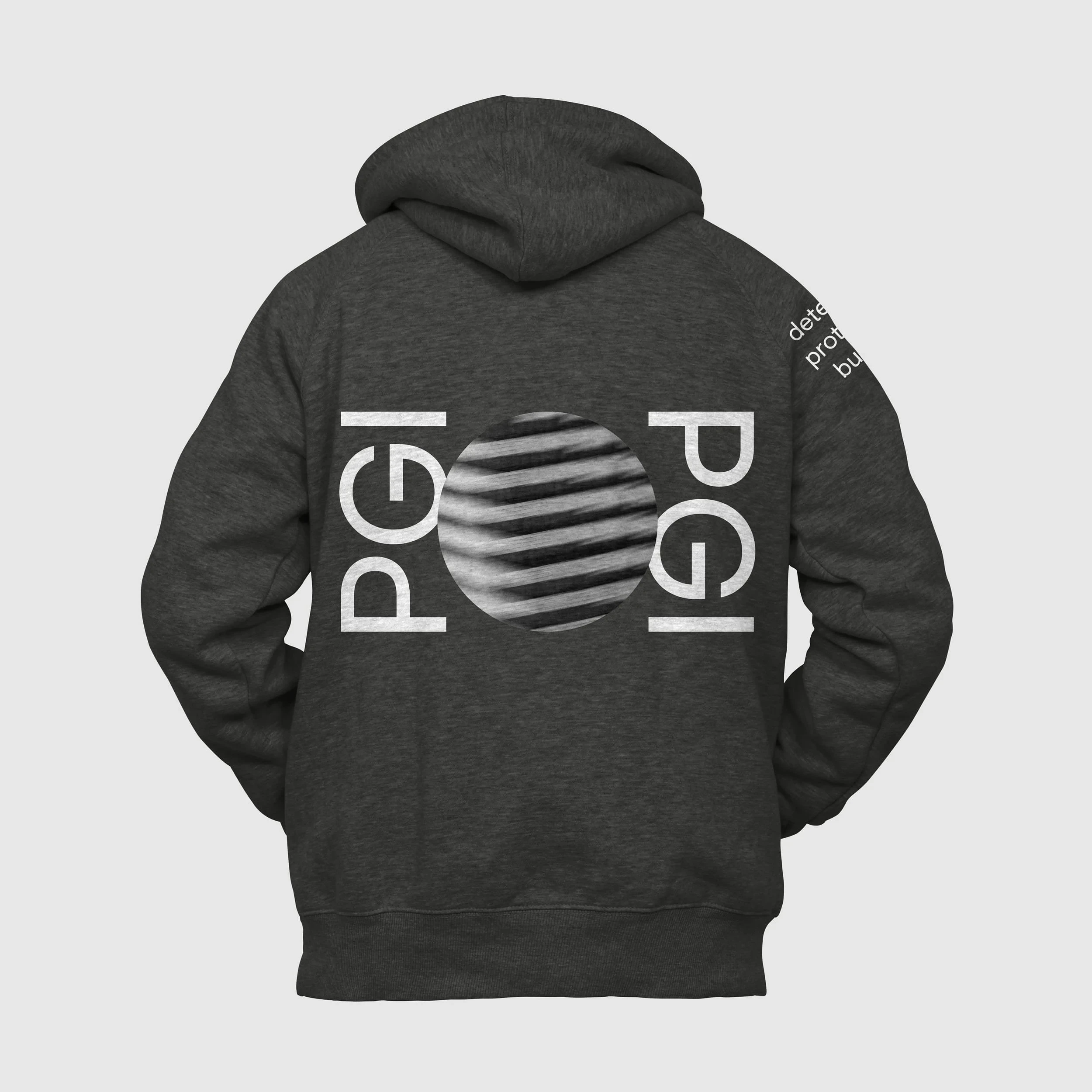
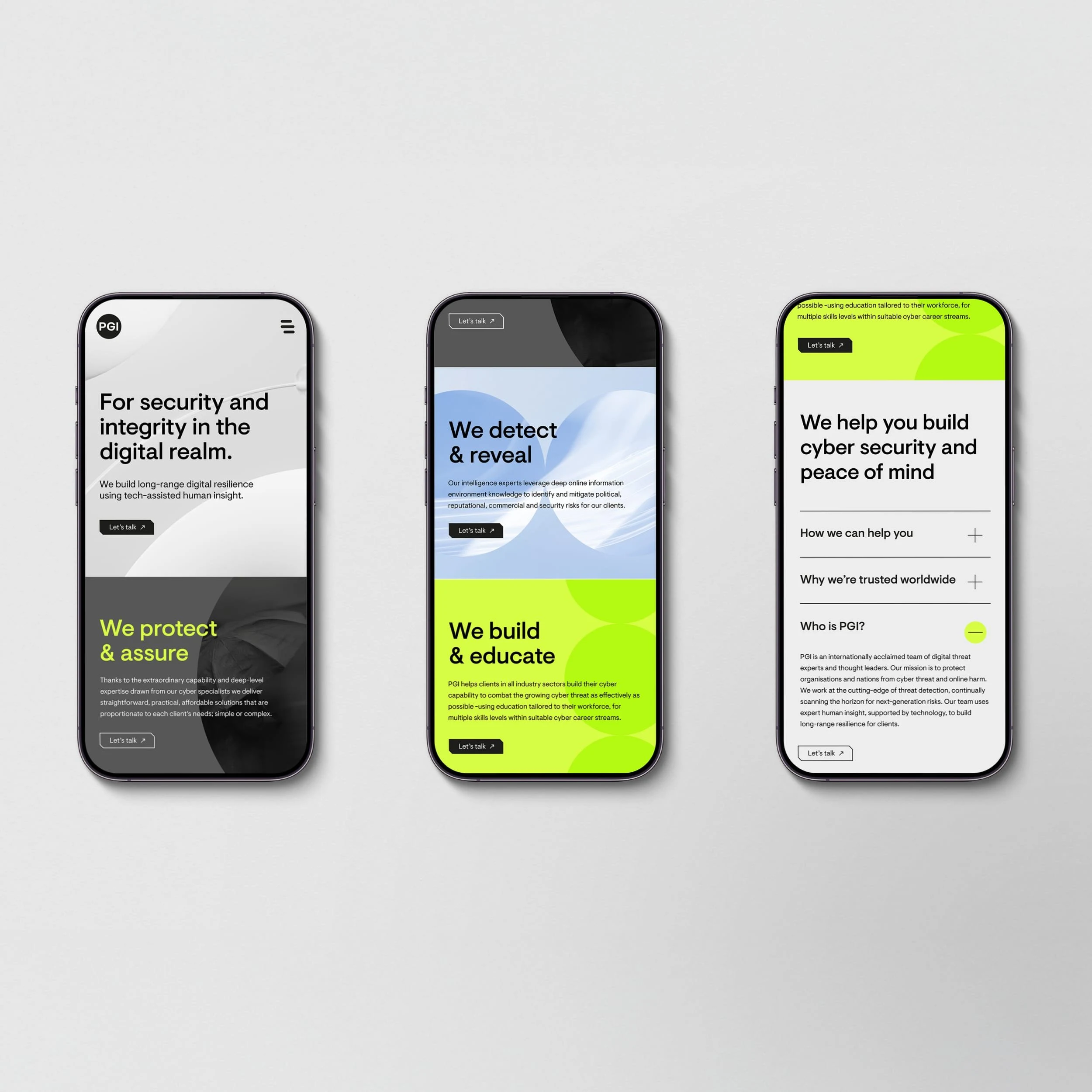
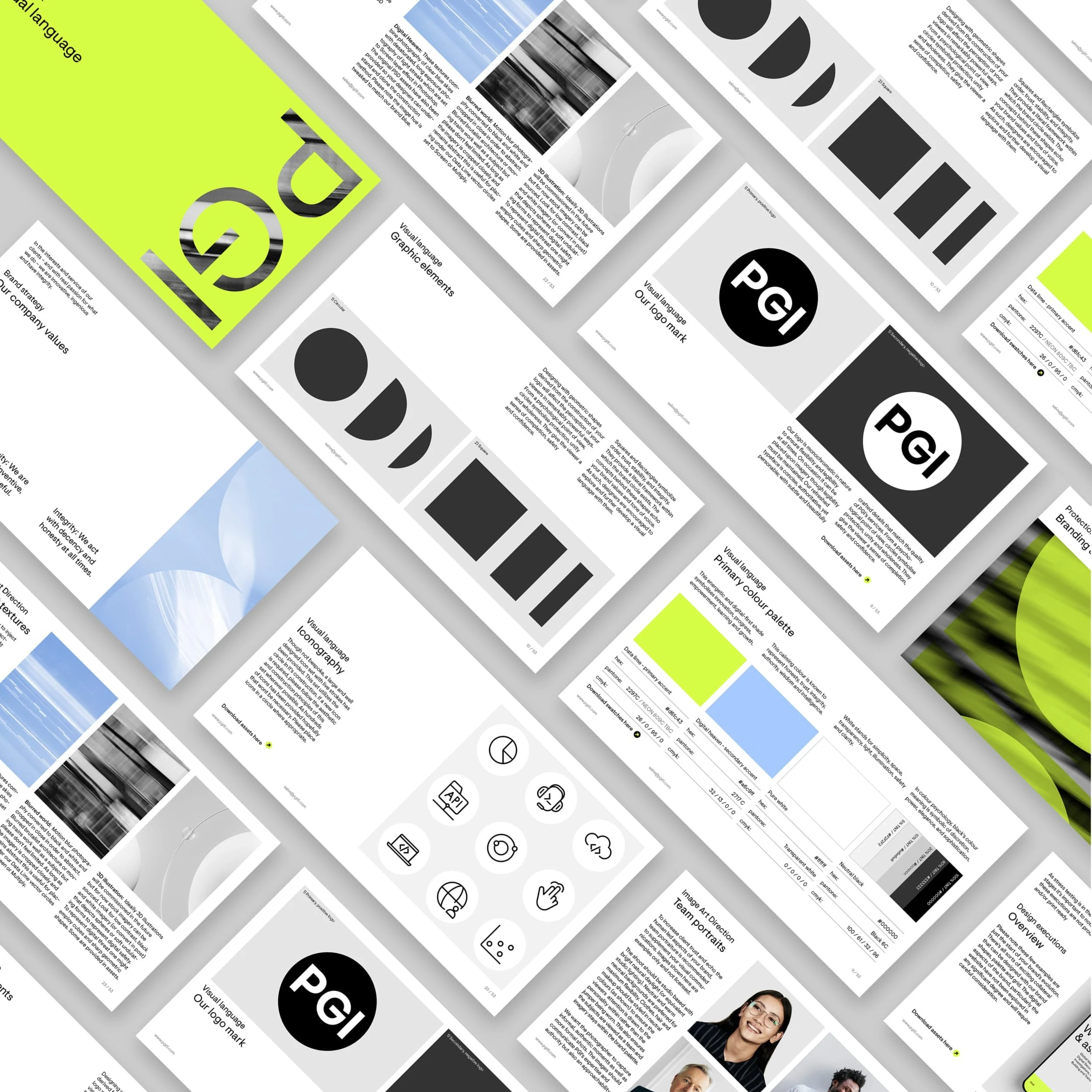
The circle anchors PGI’s logomark, but also works as layout device, symbol and spatial counterpoint. In monochrome contexts, the palette recedes to focus on clarity and tactility. Elsewhere, colour can be dialled up to signal energy and intent. A system built for contrast, not consistency for its own sake.
The primary typeface was chosen for its geometric clarity and subtle warmth, clean and modern, but never sterile. It’s confident without trying too hard, balancing technical precision with just enough softness to feel approachable. Used consistently across applications, it creates structure, pace and rhythm without demanding attention. Set with generous spacing and deliberate restraint, it reflects PGI’s core values: intelligent, composed, and never overstated.
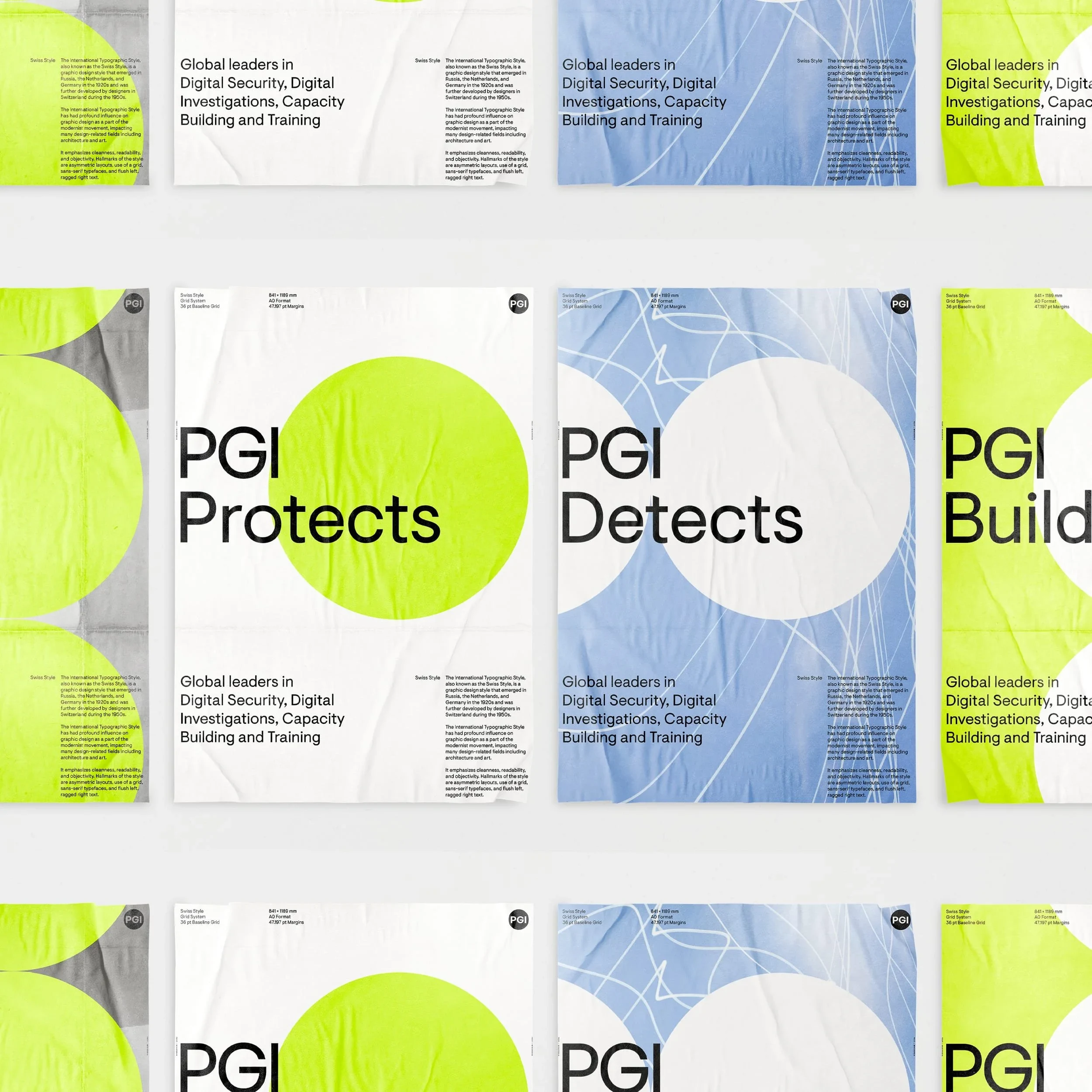
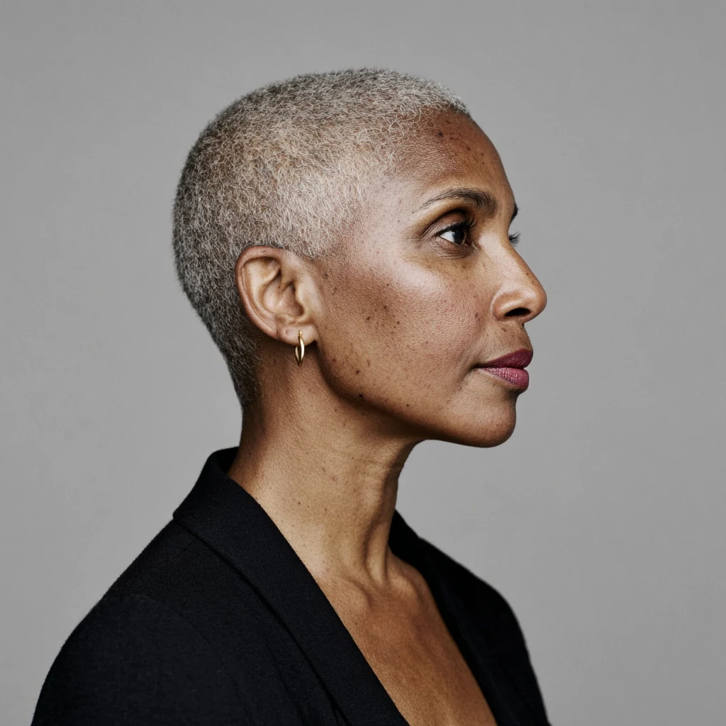
Photography plays with contrast - literal and abstract, direct and atmospheric. I recommended that portraits be honest and unembellished, expressing clarity, professionalism and quiet confidence. In contrast, blurred motion and light textures nod to the unseen complexity of PGI’s work. Together, they create a layered visual tone that reflects the brand’s dual character: human and discreet, grounded and analytical.


If your company is at a pivotal moment, I help bring clarity, direction, and design leadership to the decisions ahead.
Like this project
Posted Feb 24, 2026
Created a new cohesive brand identity for PGI, enhancing clarity and confidence.
Likes
0
Views
2
Clients
Protection Group International