Ocean Bottle Brand Evolution
Sophie Rautenbach
Ocean Bottle is tackling the ocean plastic crisis through beautifully engineered, refillable bottles, funding the collection of ocean-bound plastic via a global network of collectors. With strong DTC traction, a growing B2B arm, and an engaged community, the brand had momentum. I was brought in to evolve the visual language for scale, adding structure and discipline without losing its activist energy or soul.
What came before: The brand had purpose, a strong logo and product, plus an engaged community, but visually, things were starting to fray. The condensed protest-style typography no longer felt right for a more premium, lifestyle-led audience. Paired with the geometric sans serif of the logotype, it felt forced and unresolved. Colour was often used clumsily, and the lack of a clear system meant designers were improvising wildly.
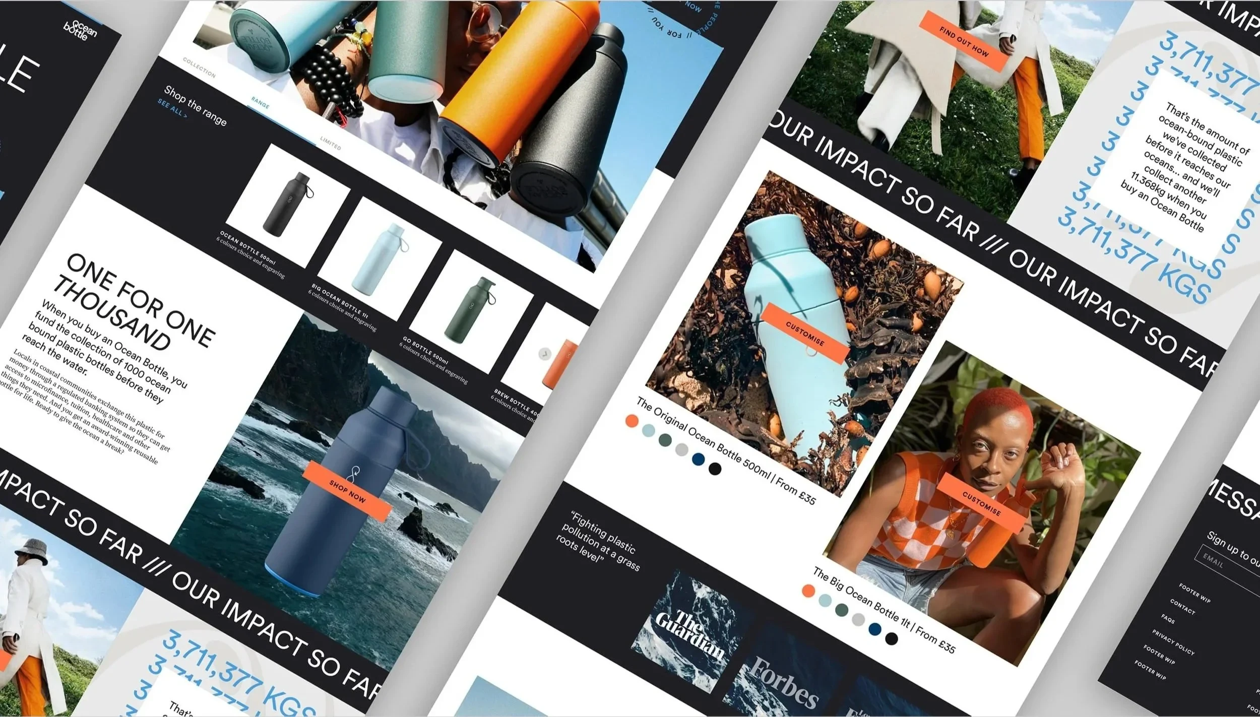
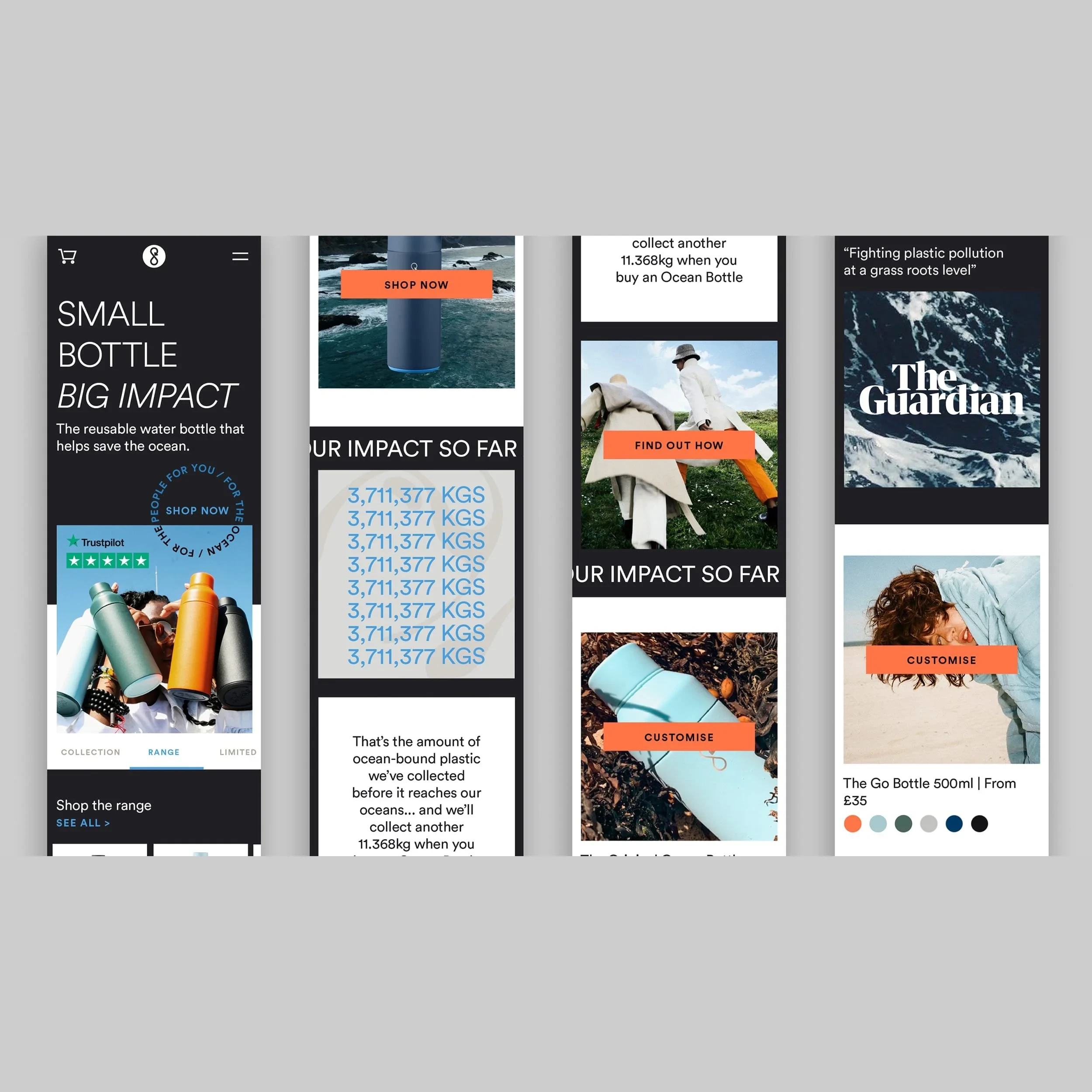
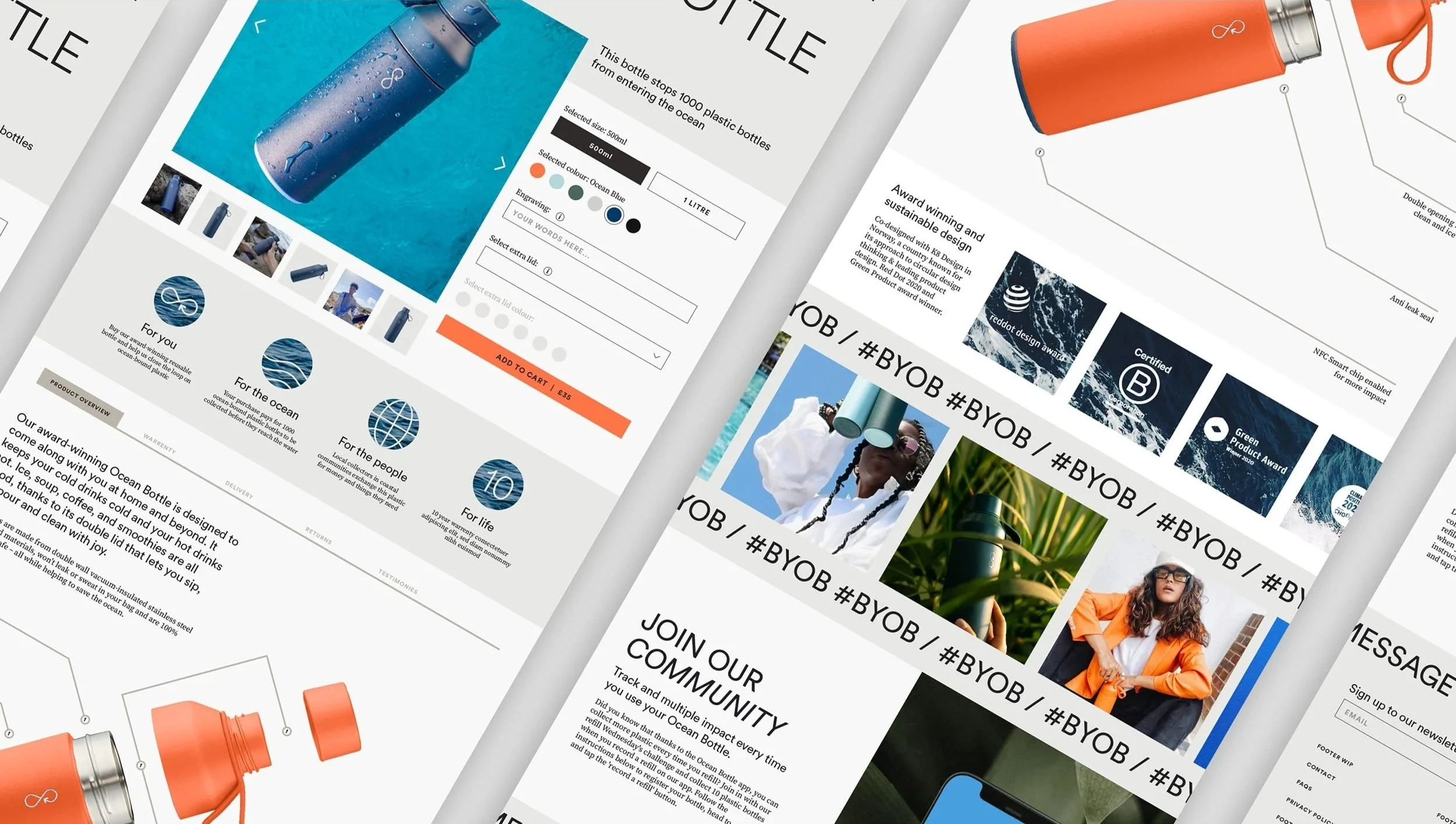
Working closely with a UX Designer, product pages were restructured to improve clarity, hierarchy and conversion. A flexible colour system supported both light and dark modes, while highlighting the full product range with consistency and warmth. Each visual choice helped connect the practical with the purposeful, keeping the experience premium, clear and easy to navigate.
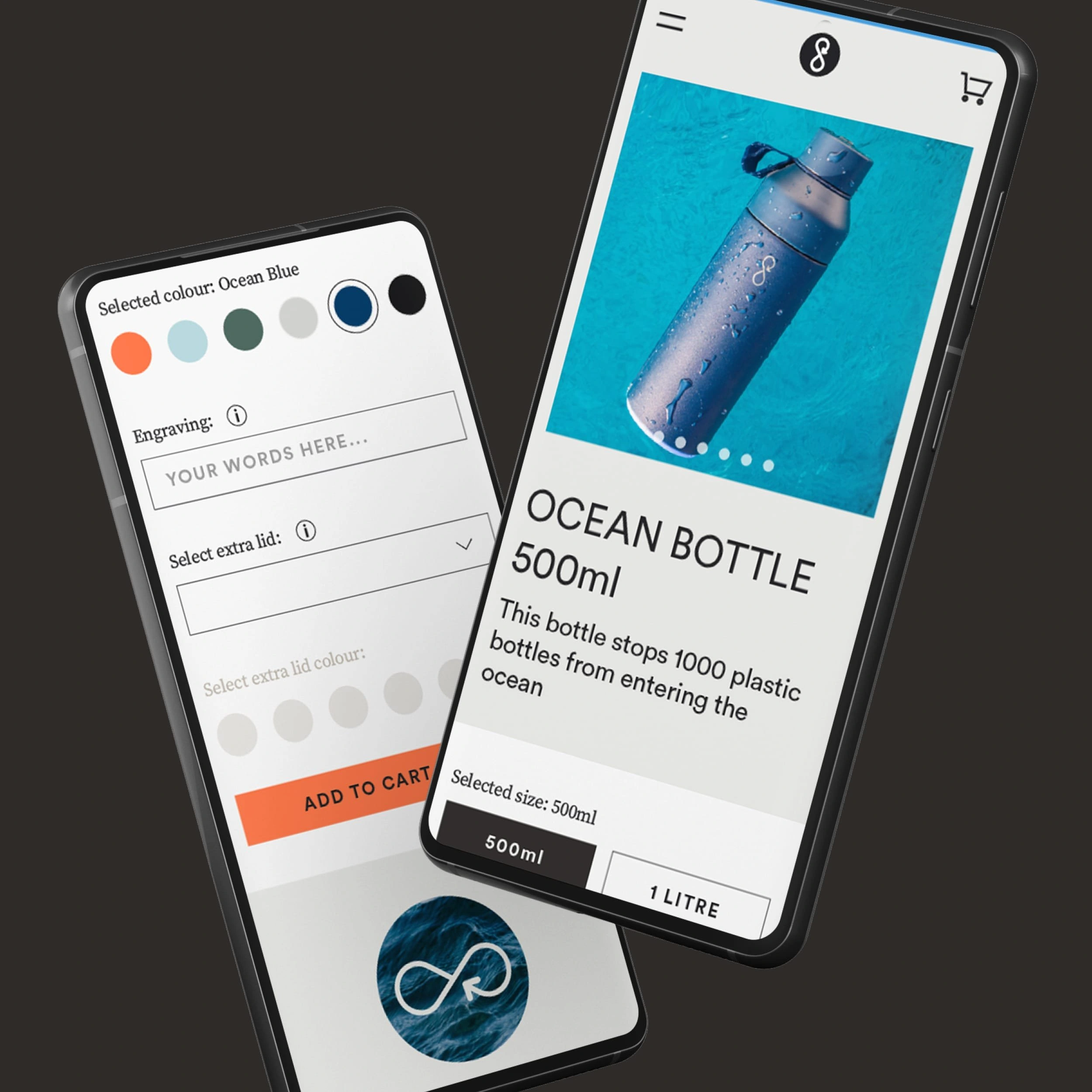
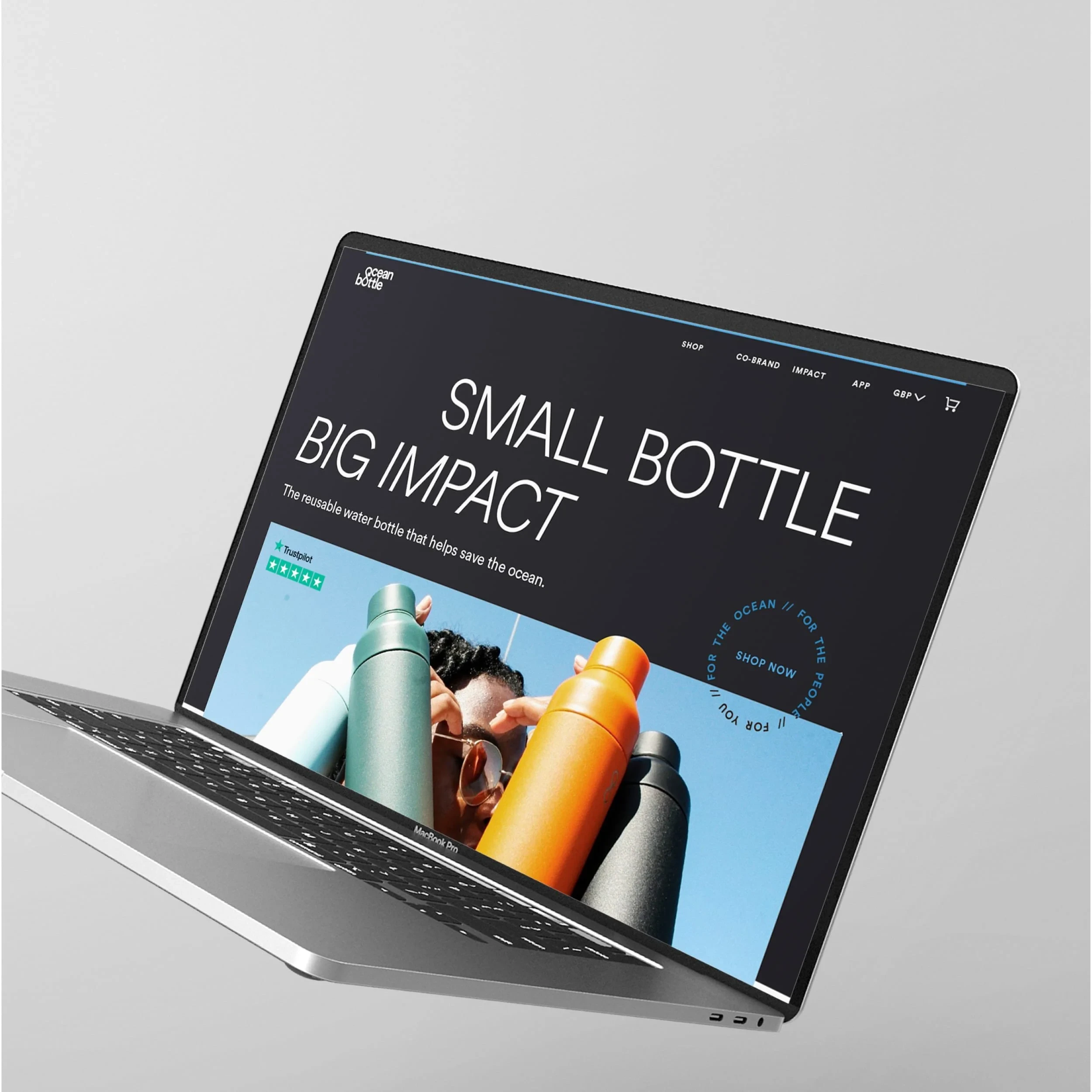
The new site brought clarity and structure to Ocean Bottle’s expanding product line, while elevating the lifestyle feel of the brand. A refined typographic system, bold photographic art direction, and cohesive colour use helped balance purpose with polish, building a premium user experience without losing the energy of the original identity. From product pages to social proof, every element was designed to support both storytelling and conversion.
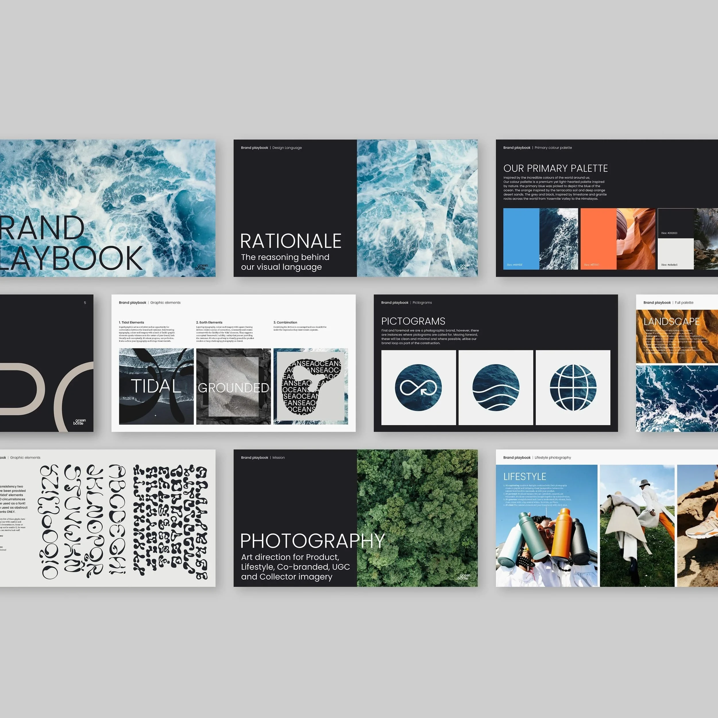
To support long-term consistency, I created a comprehensive brand playbook. Designed for the in-house team, it codified the system and helped steer day-to-day execution without dampening creativity.
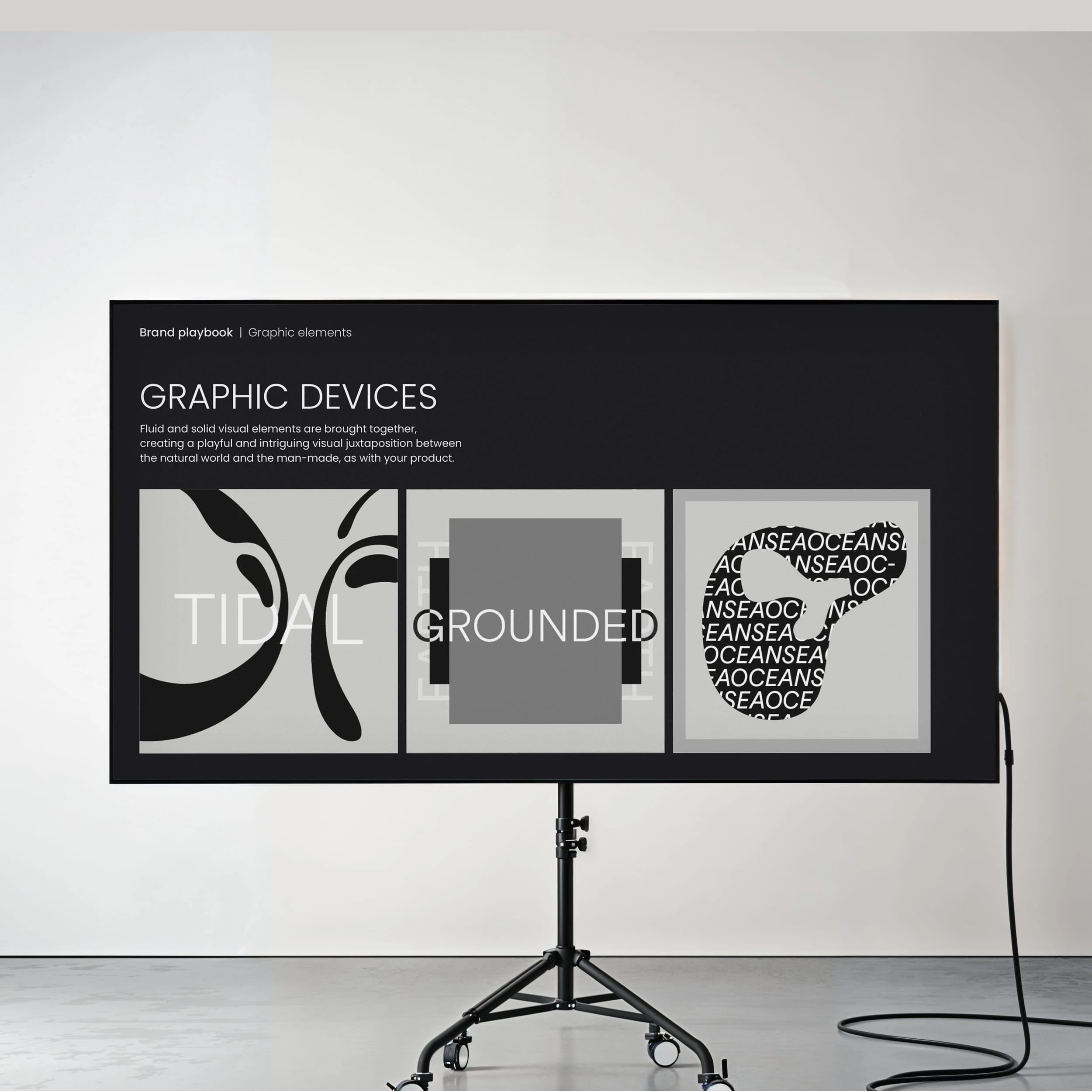
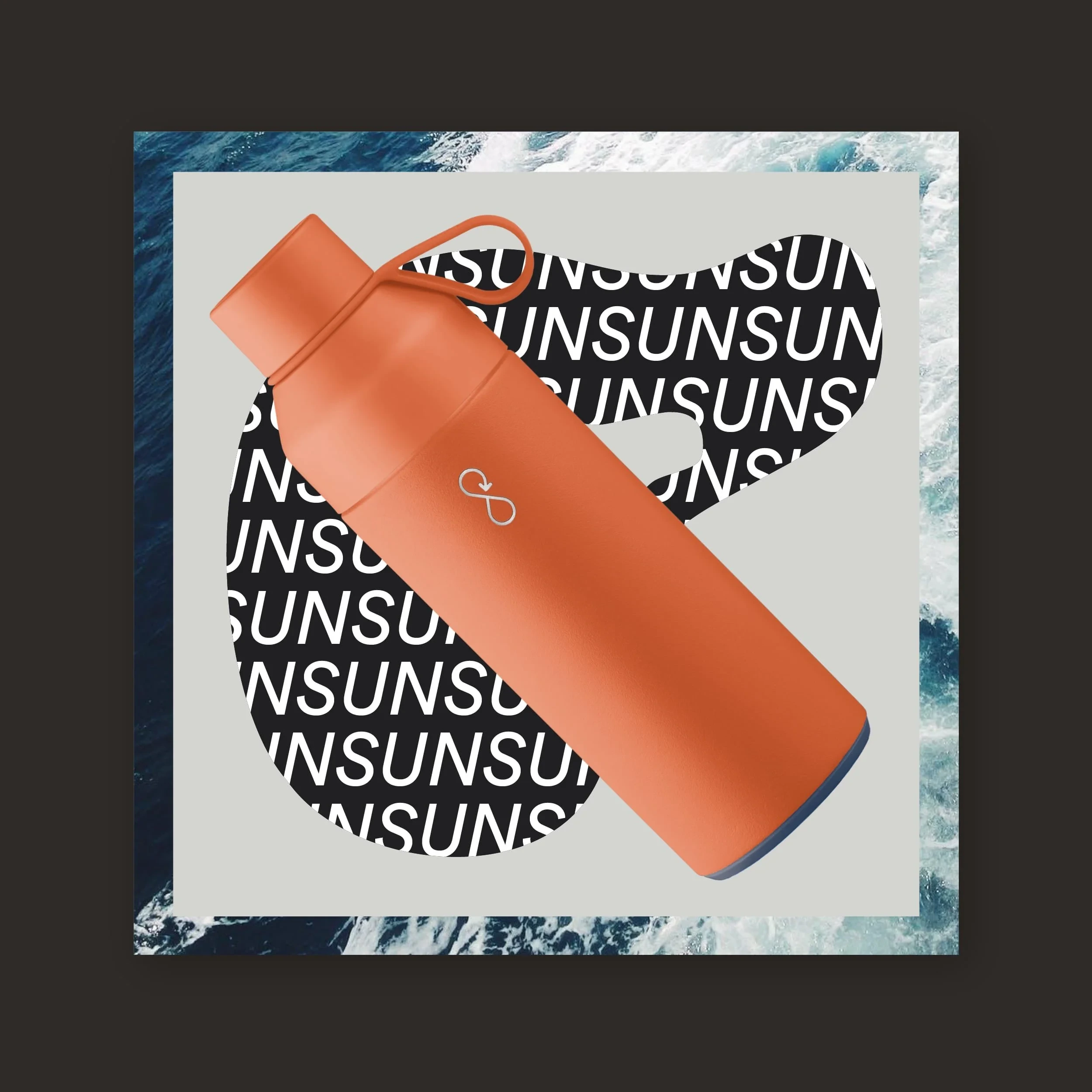
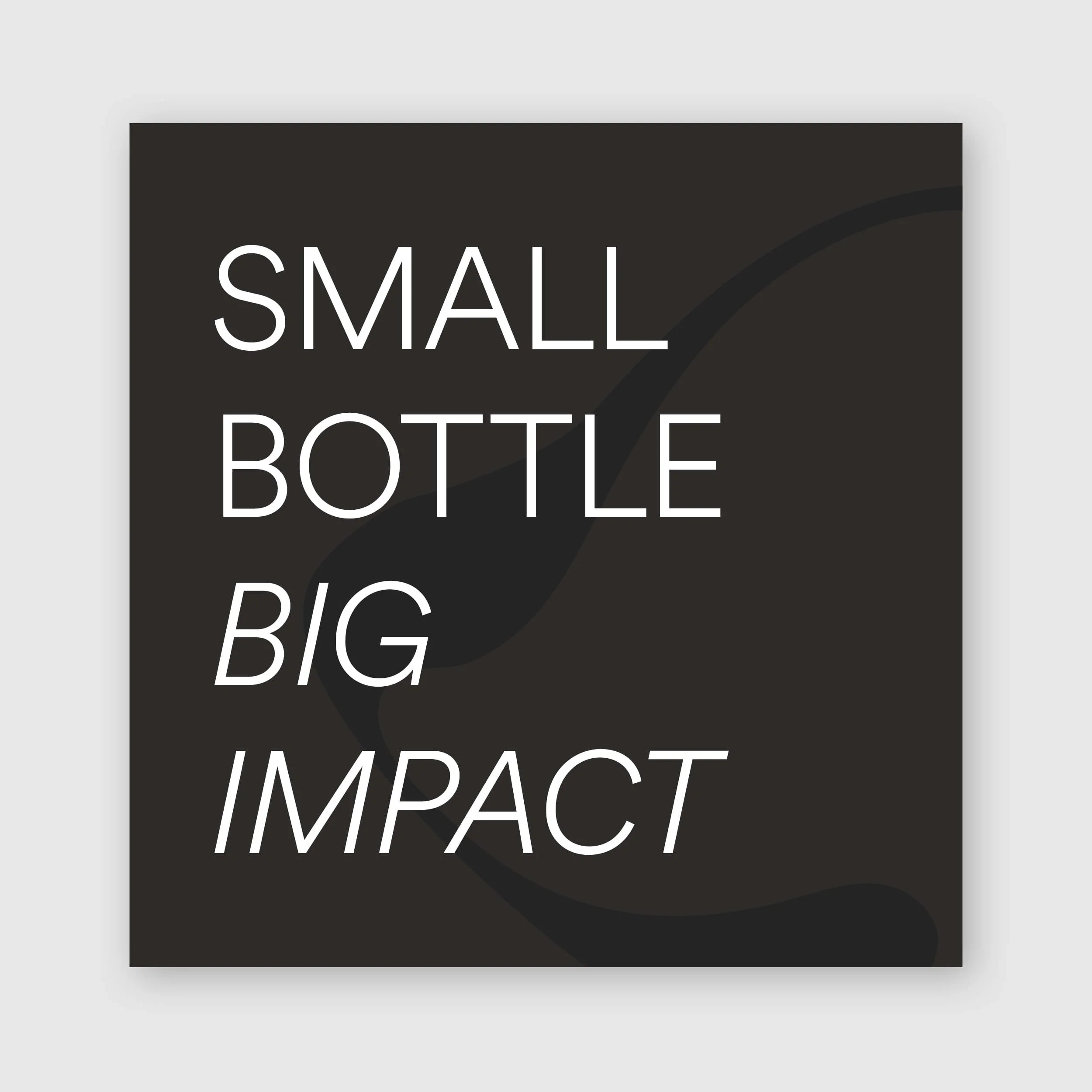
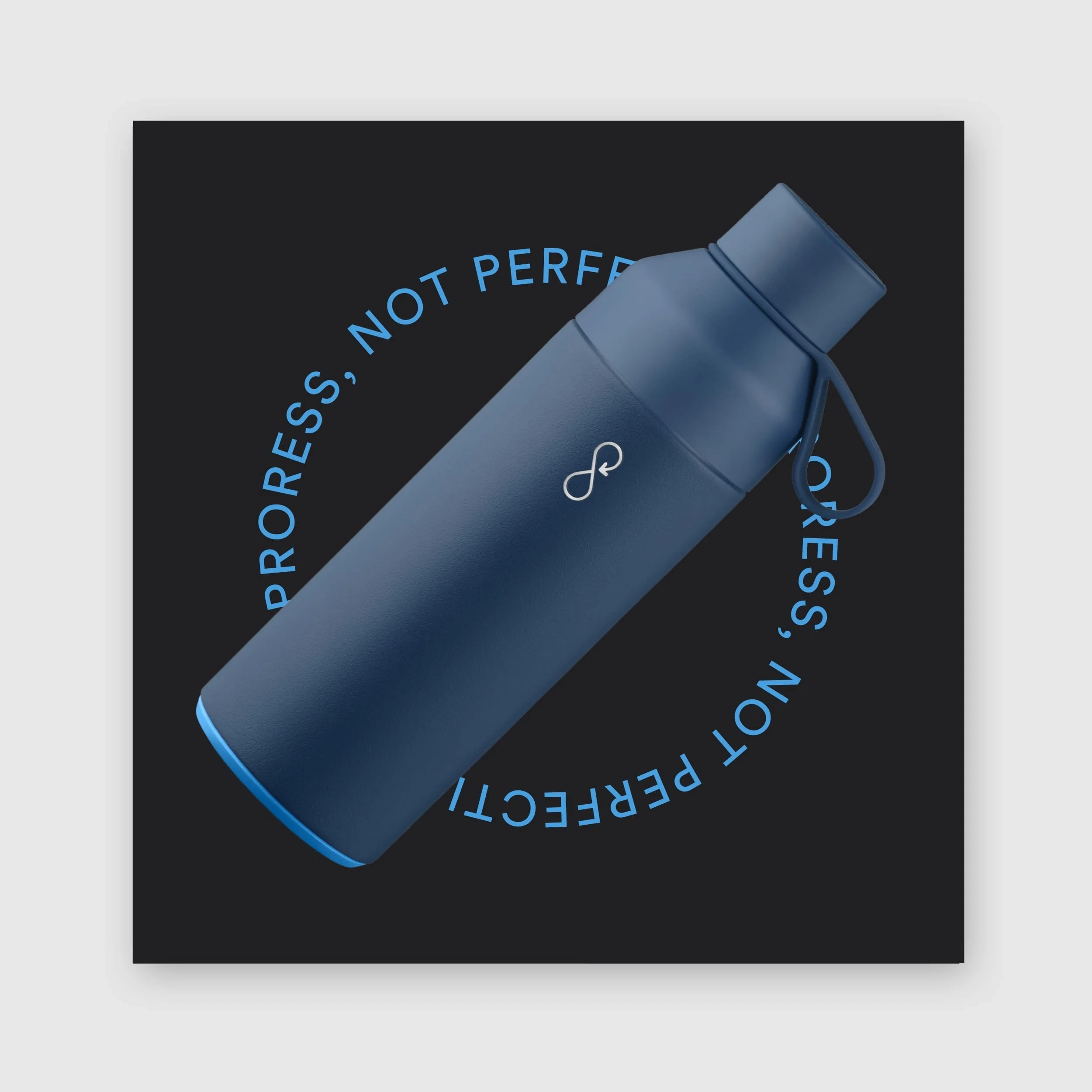
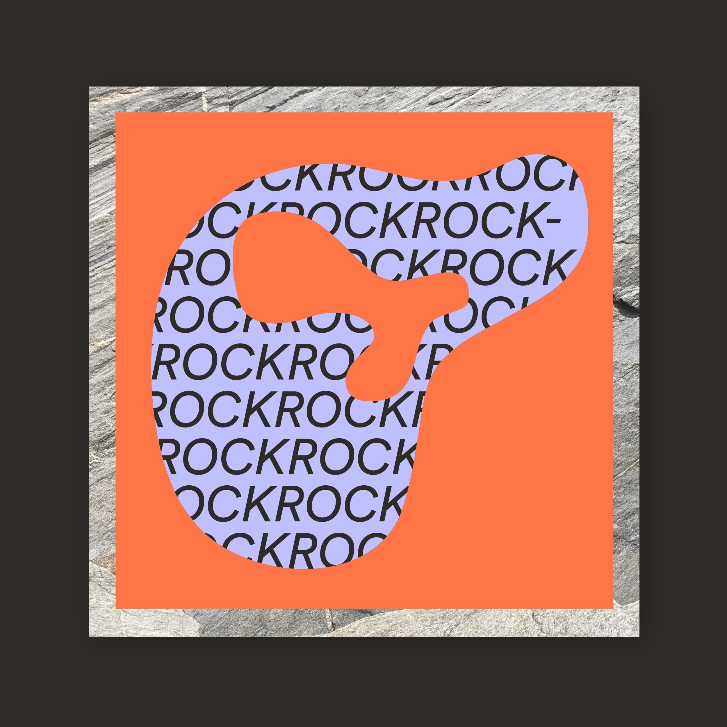
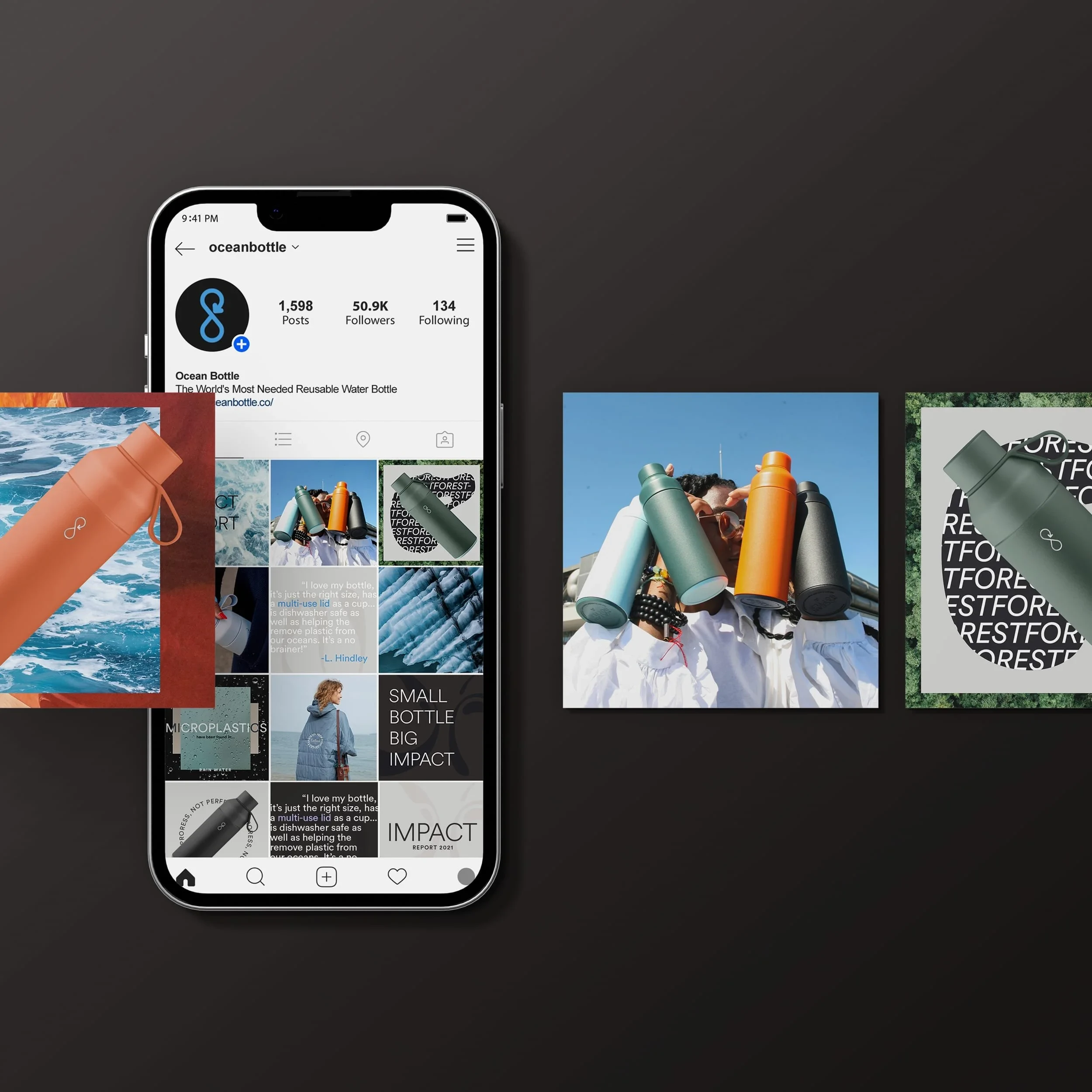
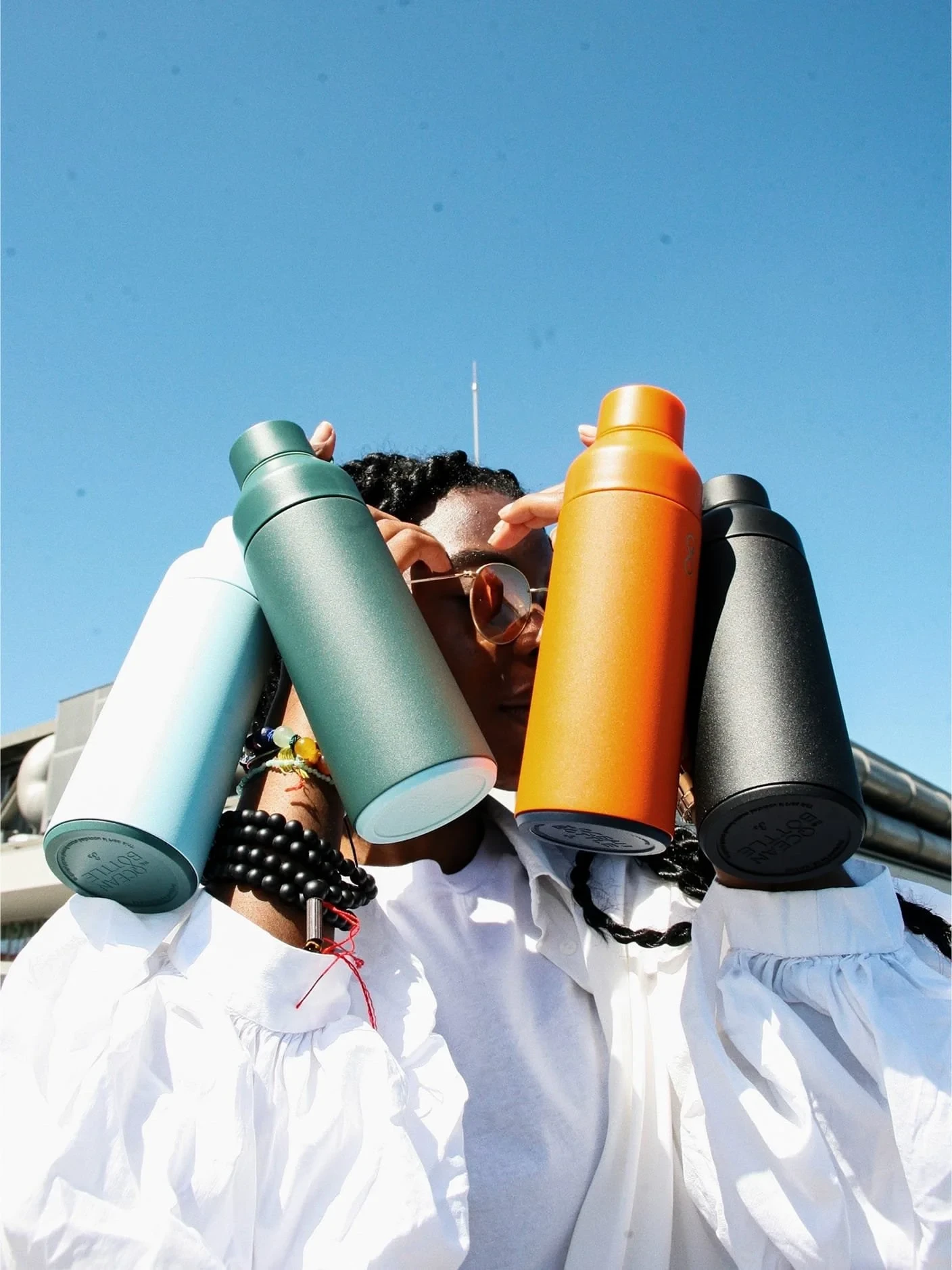
Social was a key space to build community and energy around the brand. It offered more creative elasticity than other channels, a place to flex the identity, dial up emotion, and layer storytelling through type, colour and imagery. The grid system balanced cohesion with character, giving the brand room to speak with confidence, humour and heart.
If your company is at a pivotal moment, I help bring clarity, direction, and design leadership to the decisions ahead.
Like this project
Posted Feb 24, 2026
Evolved Ocean Bottle's brand identity for premium appeal and consistency.