Good2Go Travel App - Basic Branding
Safvan Madhupurwala
About the Brand
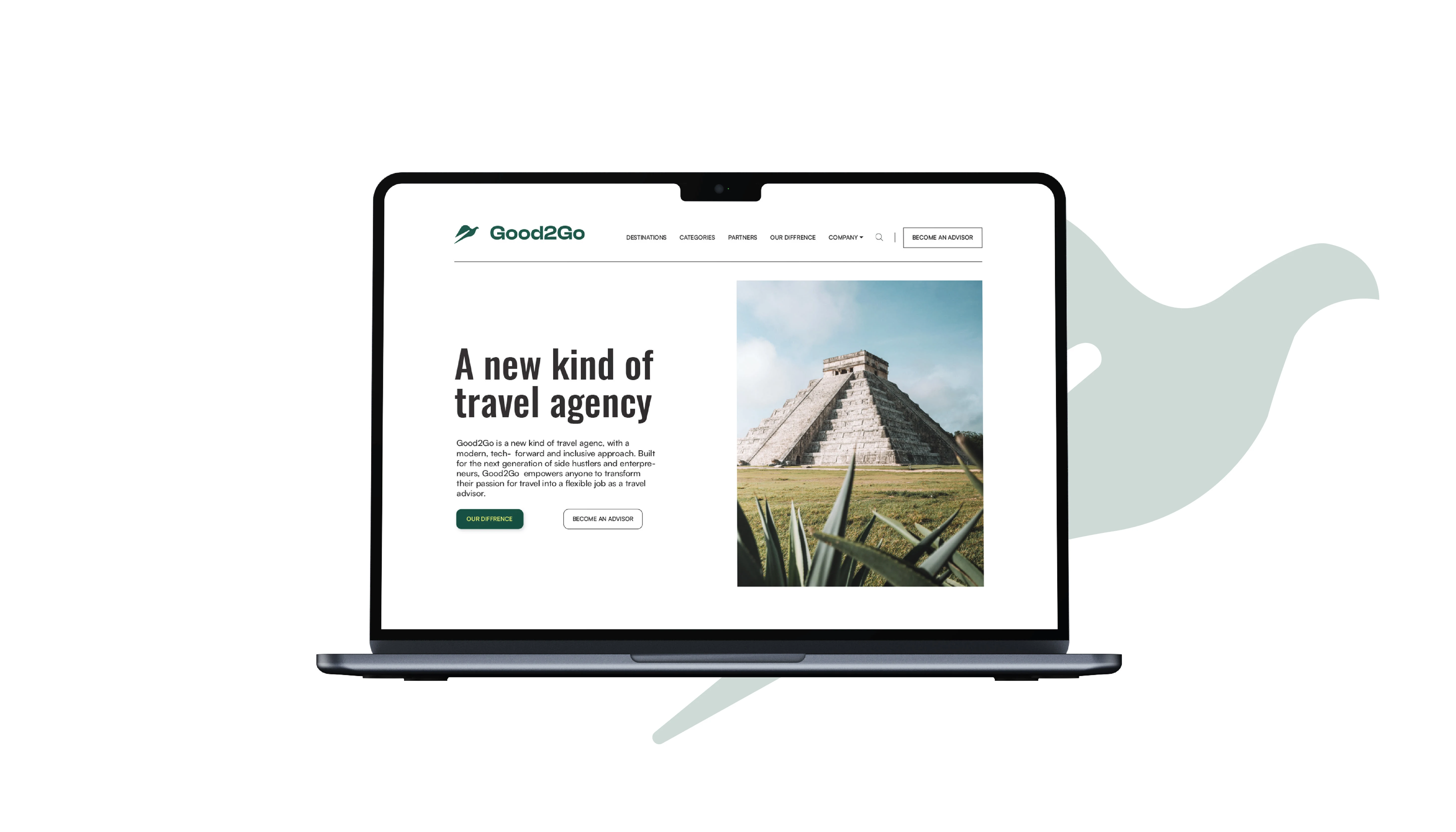
Good2Go is the brand which help to enhance the travelling experience of the consumer through their app and website by connecting them with the local guide of the country and also by providing the best solutions for the travel.
The Challenge
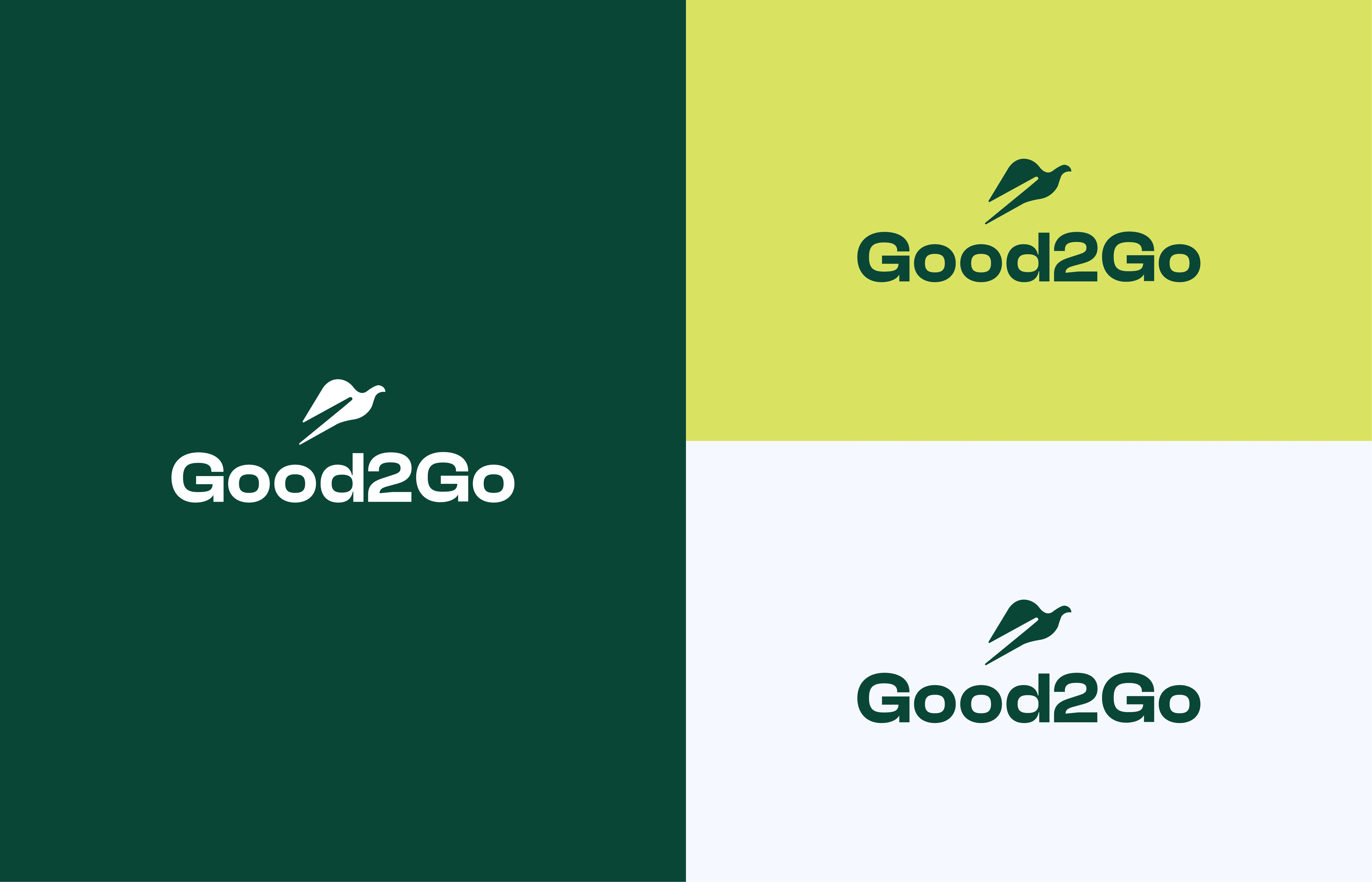
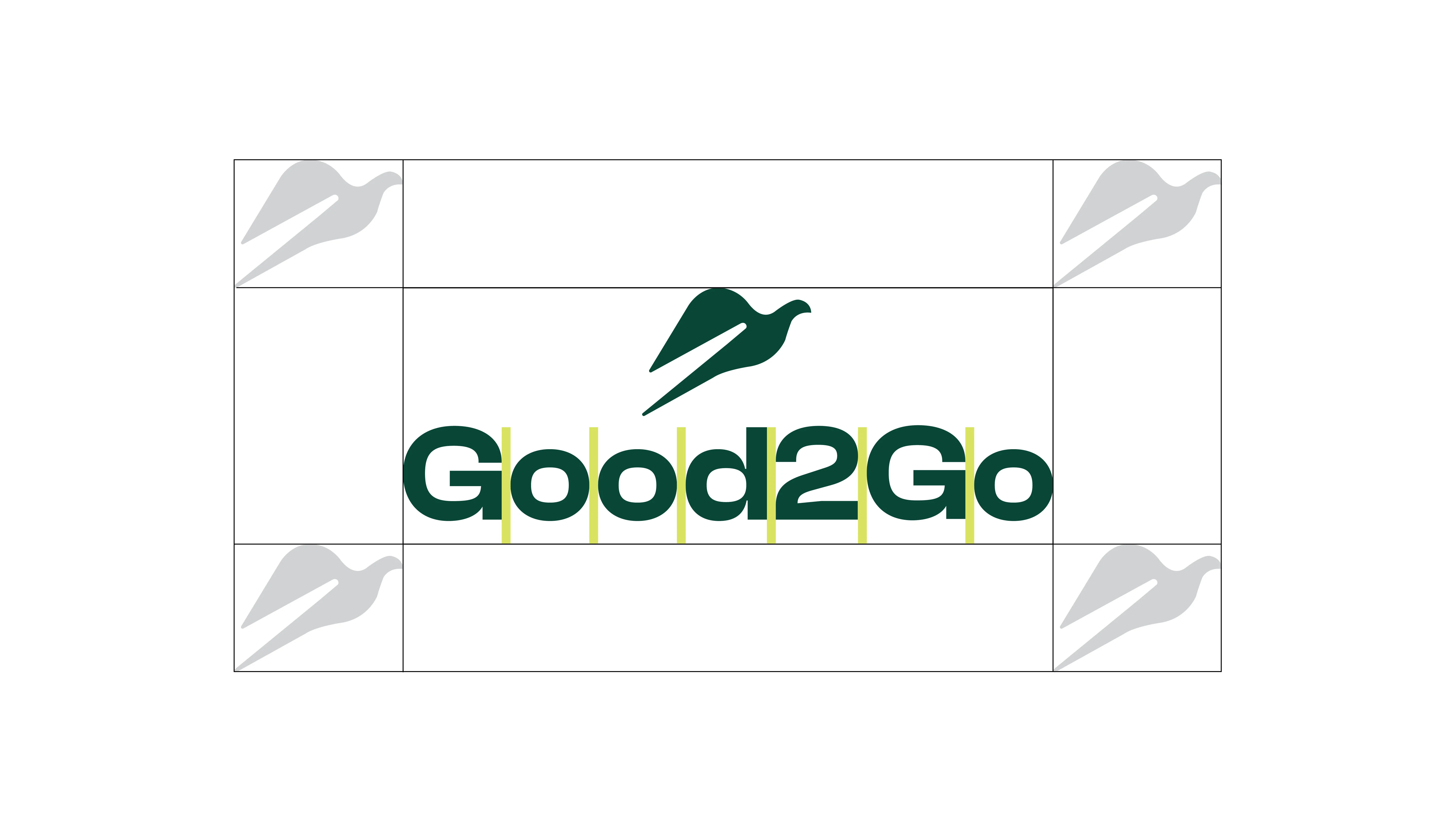
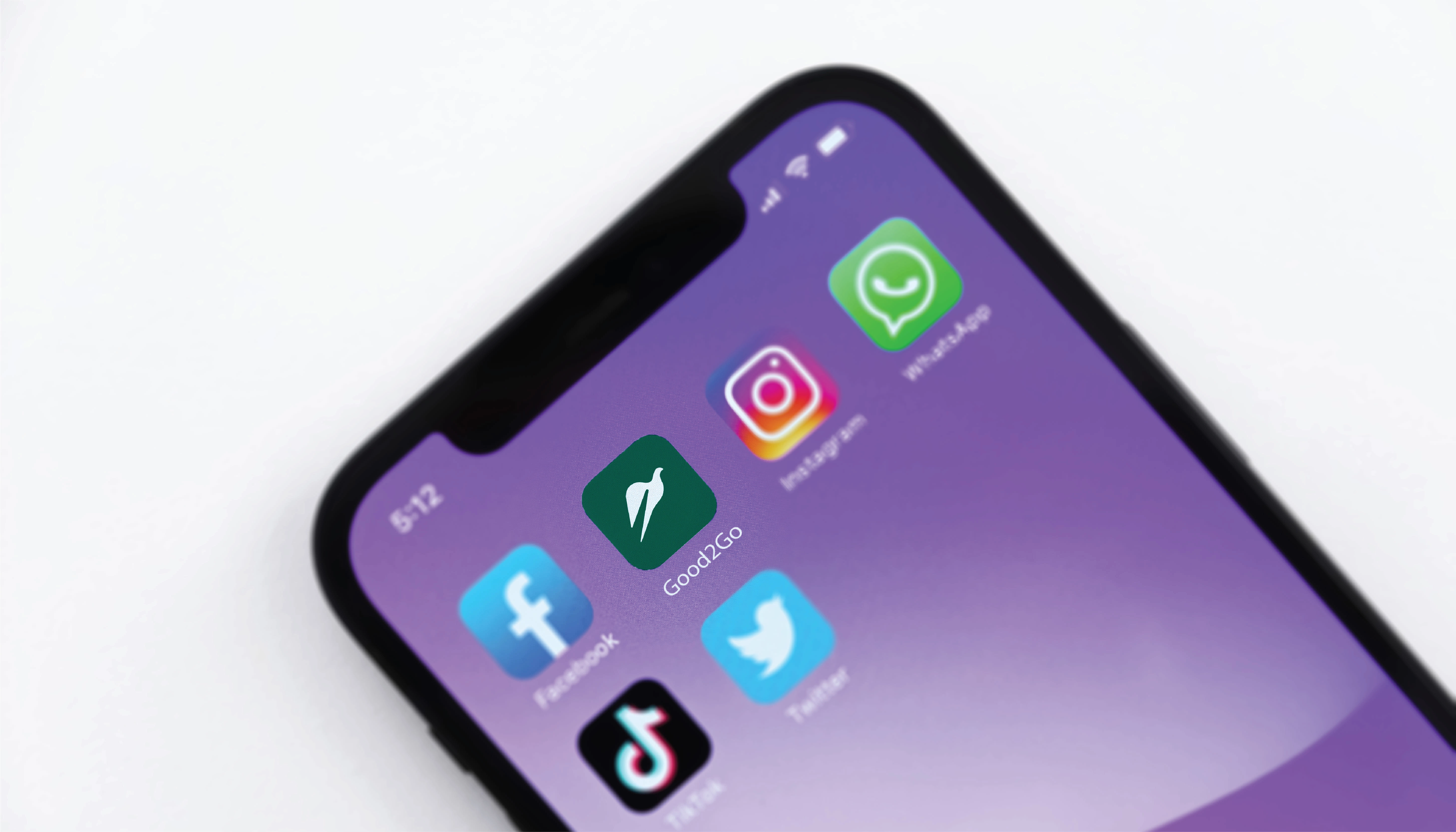
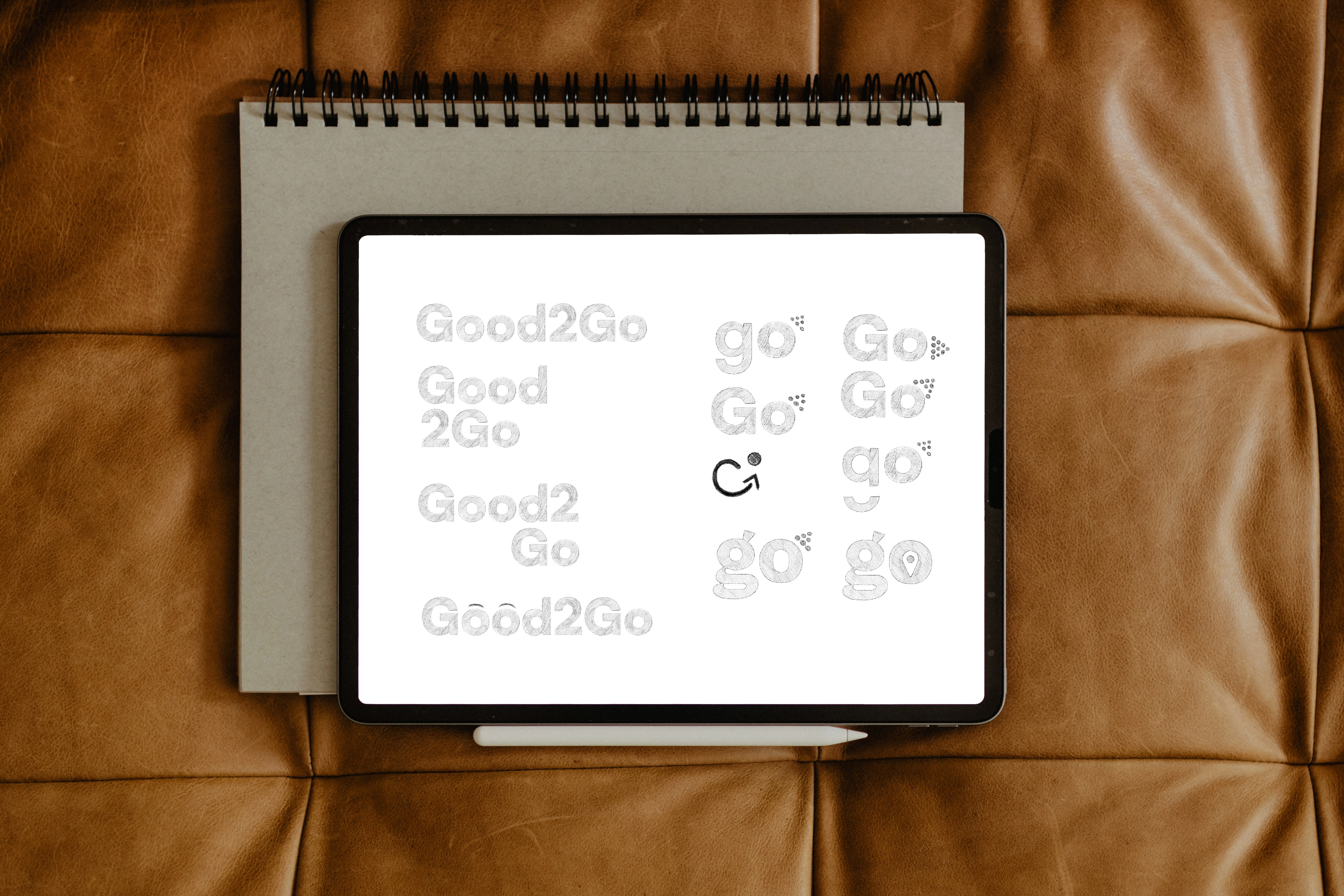
When the client approached me for their startup's branding, they were unsure whether to opt for an icon or a simple wordmark logo. After multiple meetings and brainstorming sessions, we collectively decided to go with an icon-based logo. This choice would serve as the brand's prominent representation and be utilized consistently across their entire branding.
The challenge was to create an icon that not only reflected the essence of the brand's offerings but also resonated with their values and appealed to their target audience. The logo needed to convey a clear message about the brand's services while exuding a sense of premium elegance, as their target audience primarily consisted of high-end customers.
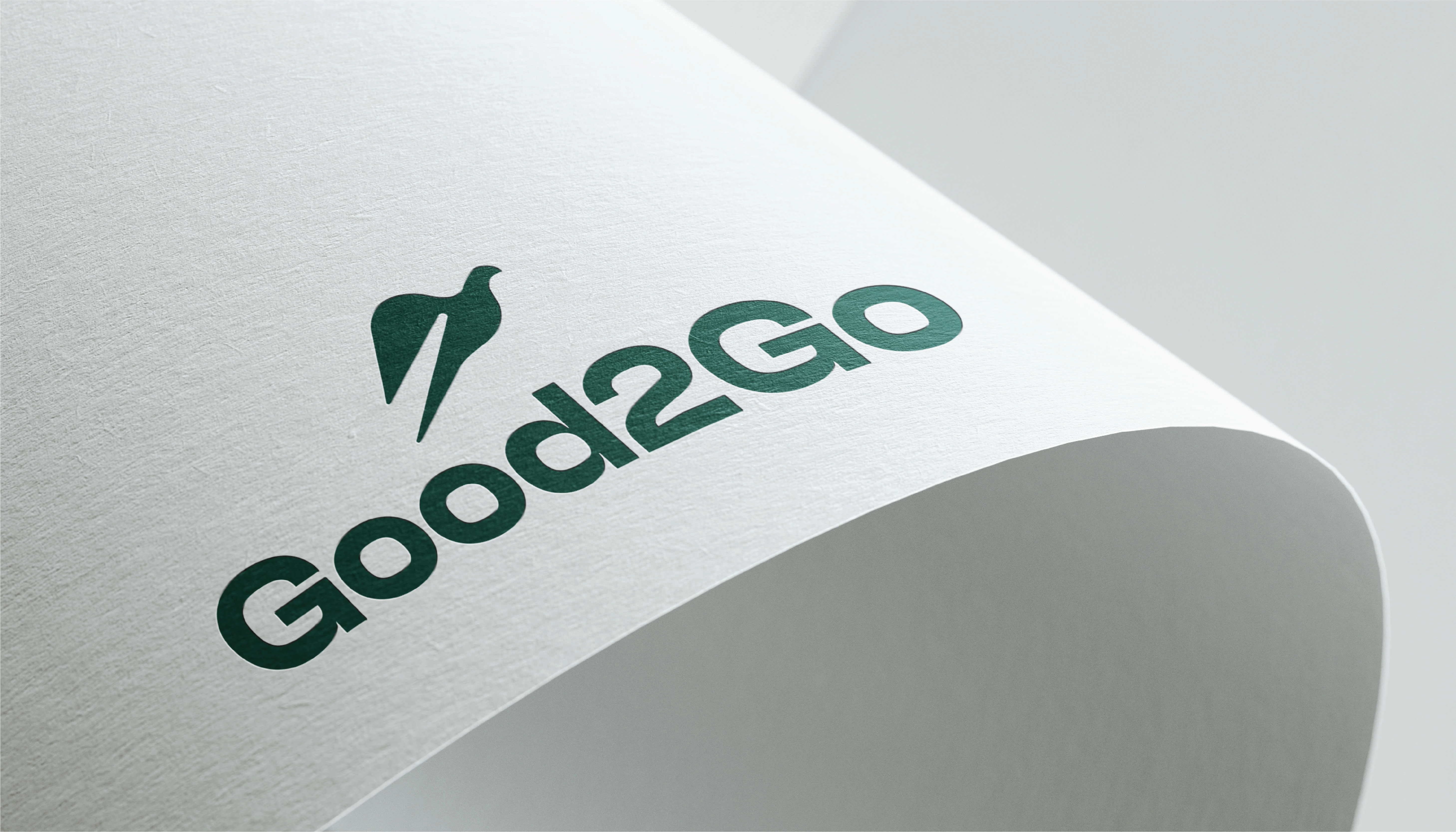
With careful consideration and creativity, we crafted an iconic logo that perfectly encapsulated the brand's identity and conveyed its purpose. This new logo serves as the face of the brand, presenting a sophisticated and captivating visual identity to connect with their esteemed clientele.
TYPOGRAPHY
Typography plays a pivotal role in shaping the brand's visual identity and effectively communicating with the target audience. Thus, the careful selection of fonts that align with the brand's values and effectively connect with the intended audience is of utmost importance.
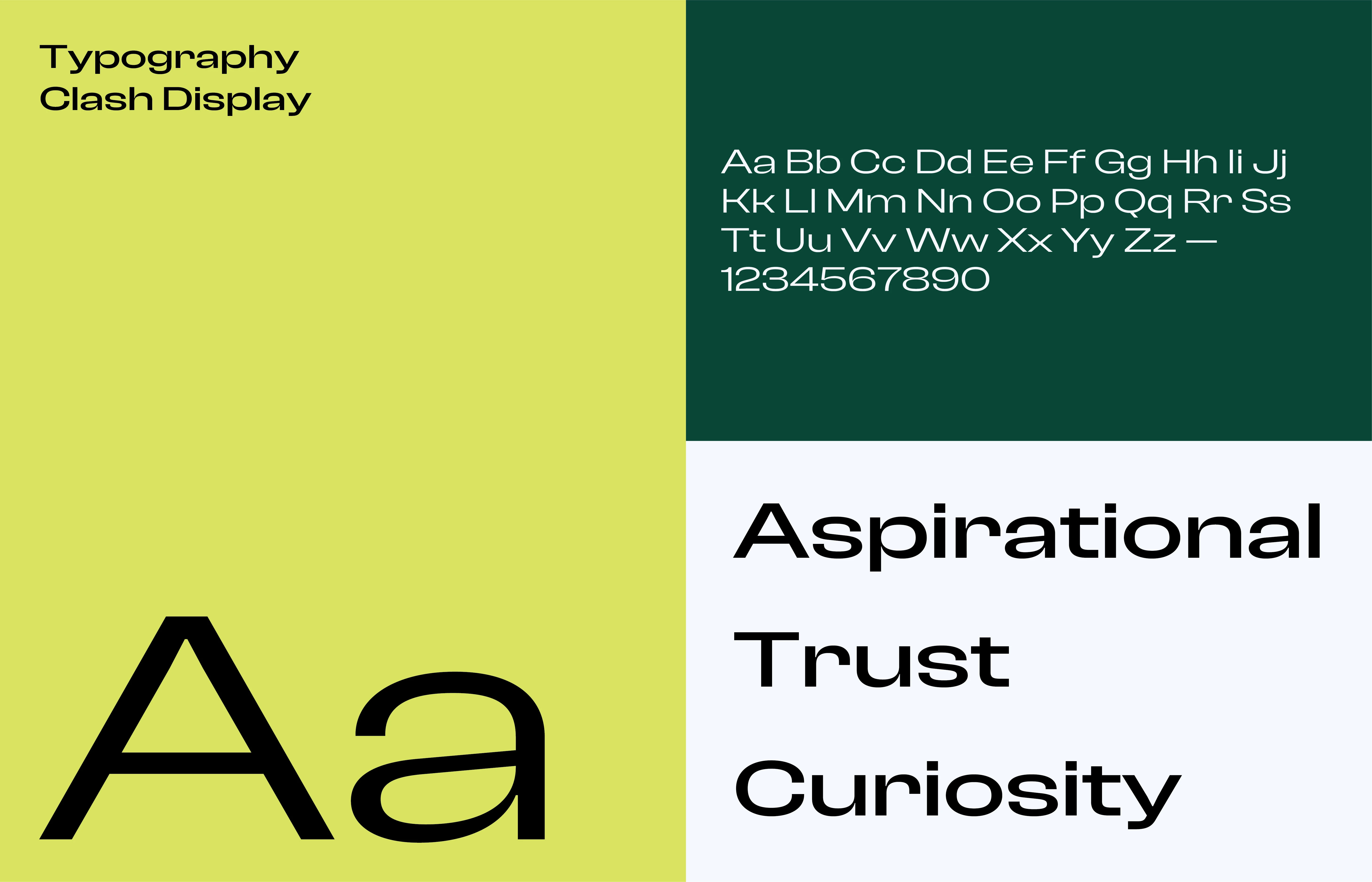
The selection of typography was undertaken with utmost consideration for the brand's core values. As the main typography, "Clash Display" from Fontshare was chosen, exhibiting a compelling visual representation that resonates perfectly with the brand's identity.
In addition, "Satoshi," a complementary sans-serif font, was incorporated to create a harmonious pairing that enhances the overall aesthetic of the brand.
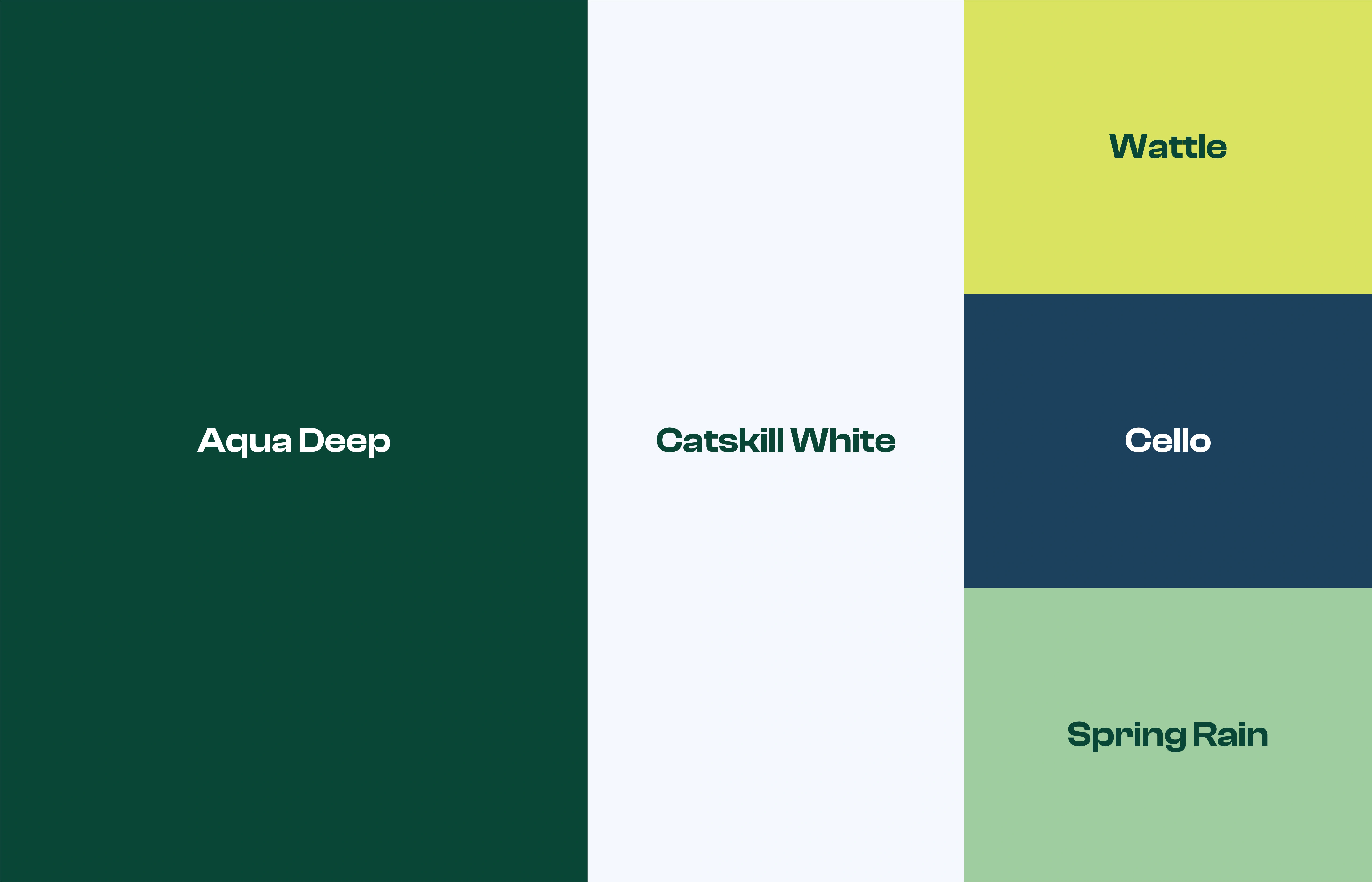
Color Palette
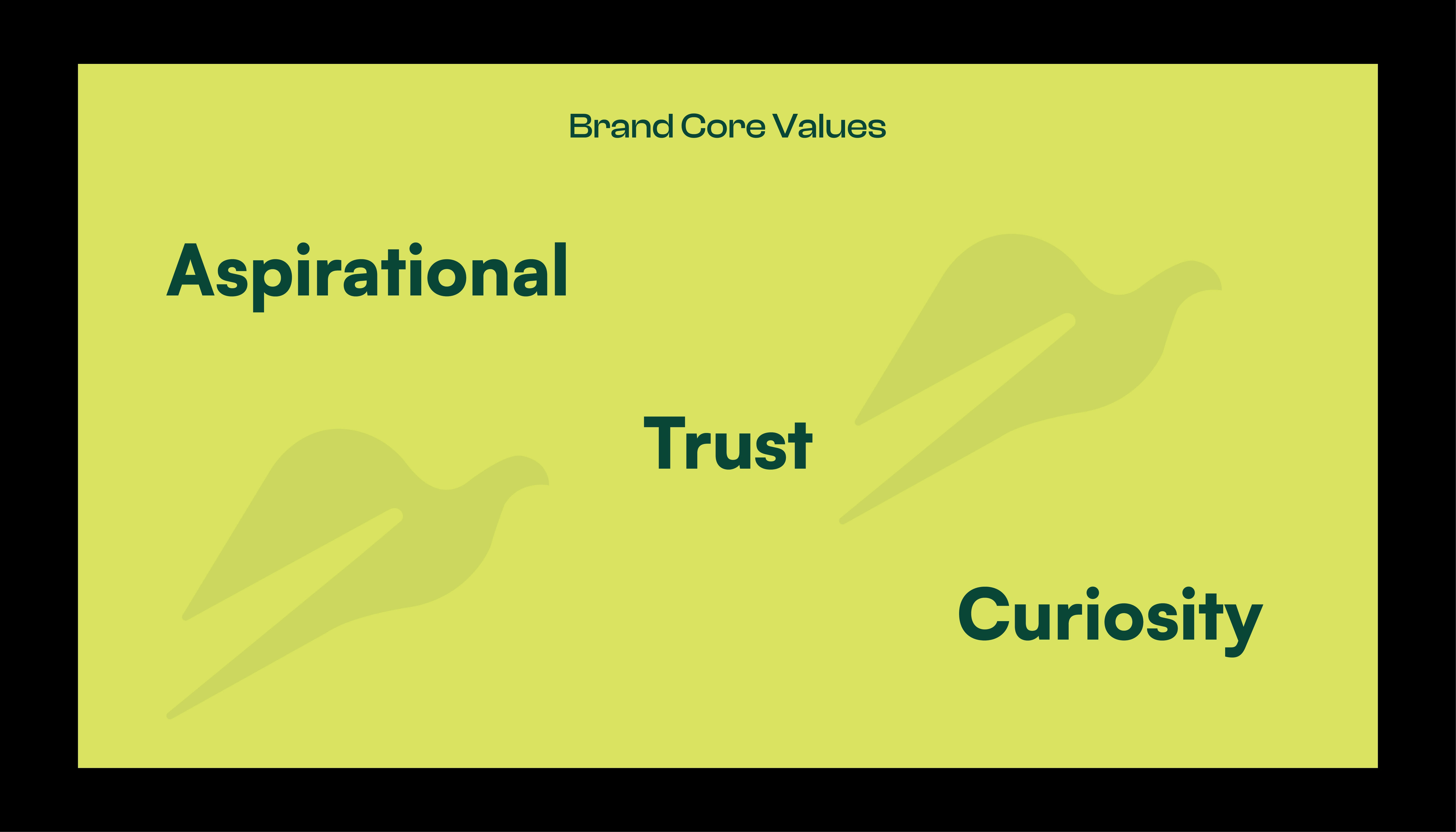
After thorough discussions with the client and carefully examining the overall moodboard and brand direction, I recommended a nature-inspired color palette. The primary colors chosen are Aqua deep green, complemented by Catskill white, creating a visually striking contrast for the brand's visuals.
In addition to the primary colors, we also selected secondary colors to provide support. When the brand needs to draw attention or attract the target audience, we'll use Wattle in combination with either Cello or Spring Rain.
The chosen color palette aims to enhance the brand's visual appeal while staying true to its nature-inspired essence. It ensures a cohesive and captivating visual representation that aligns perfectly with the brand's goals and resonates with its audience.
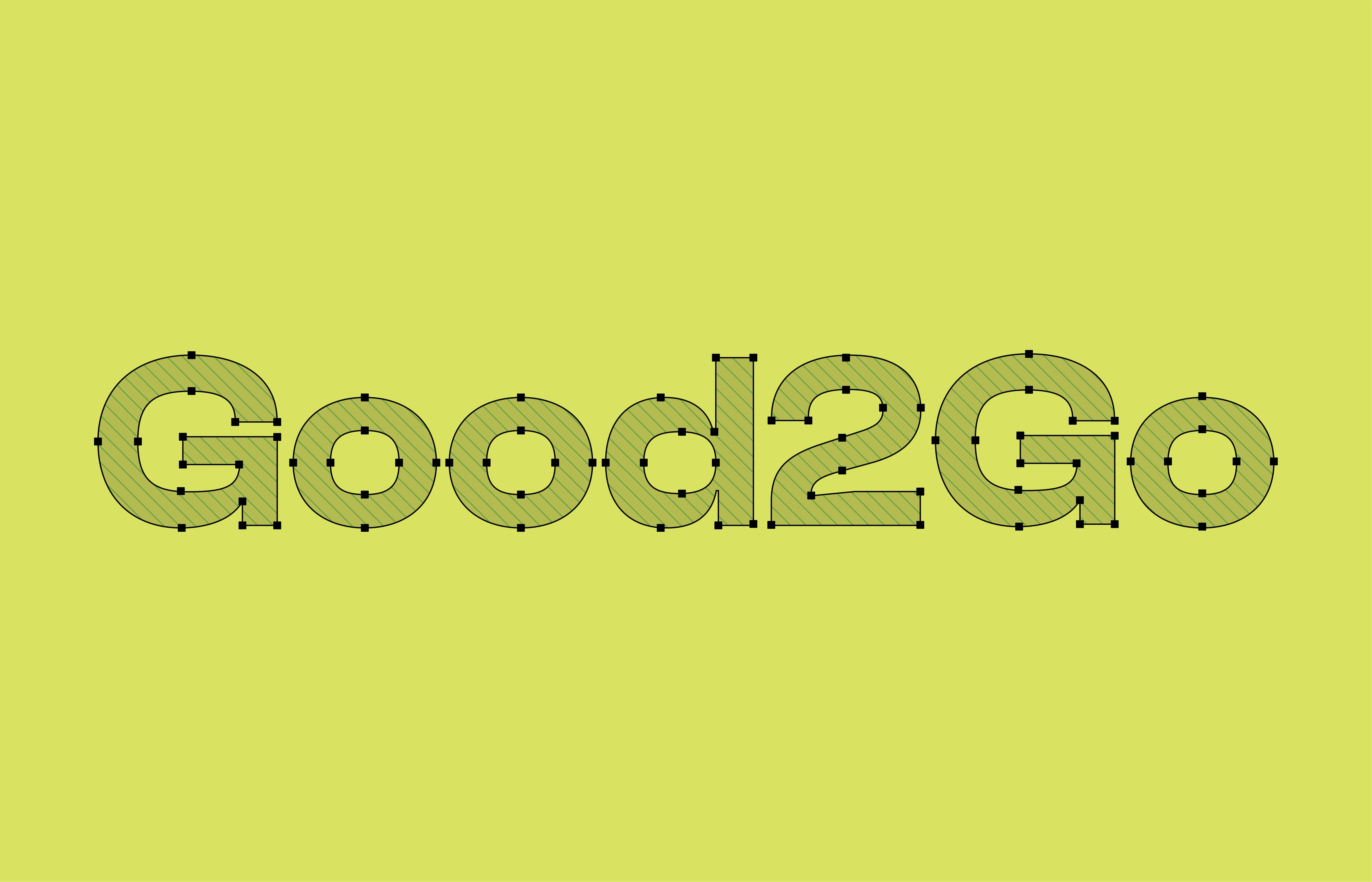
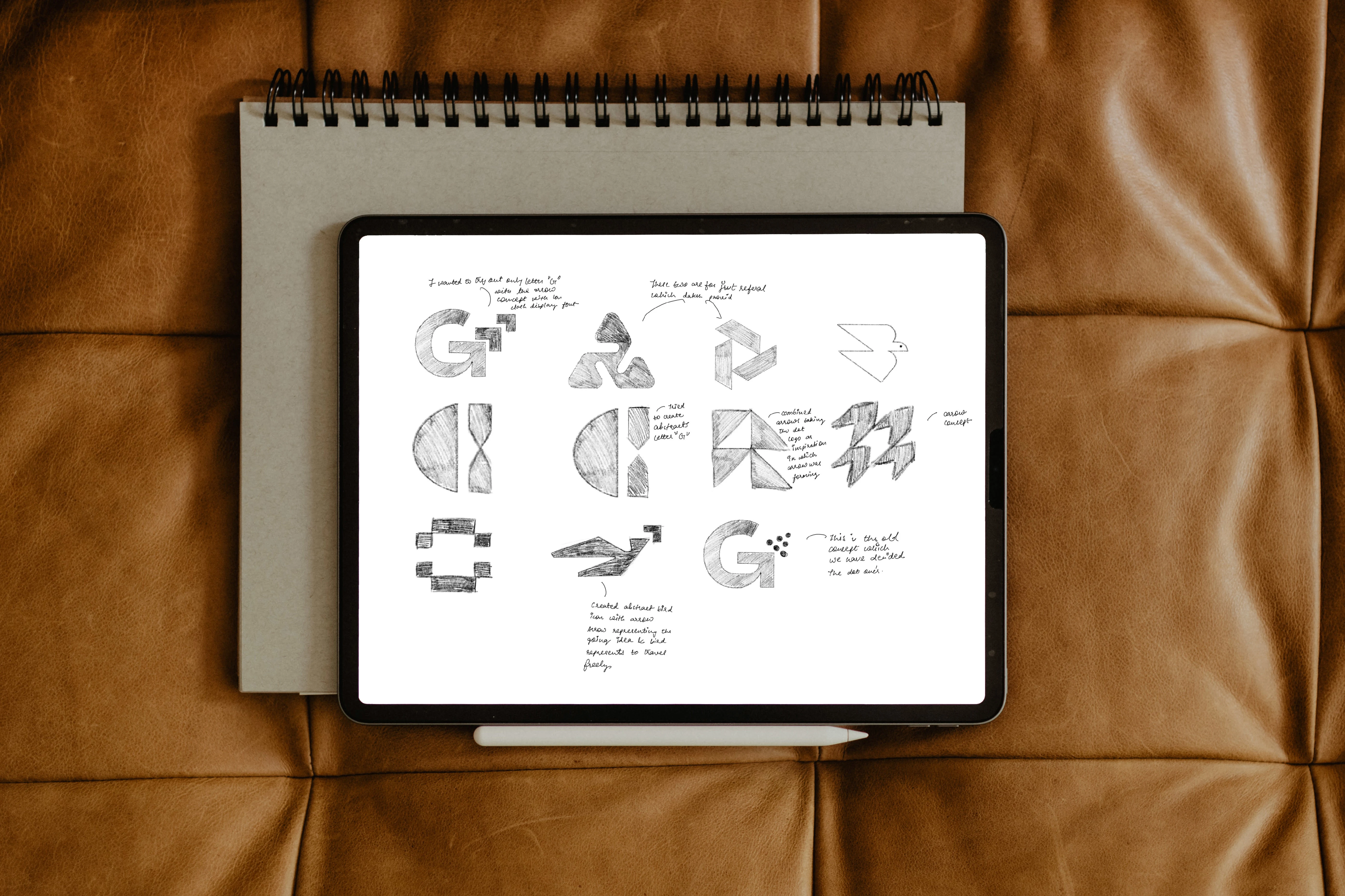
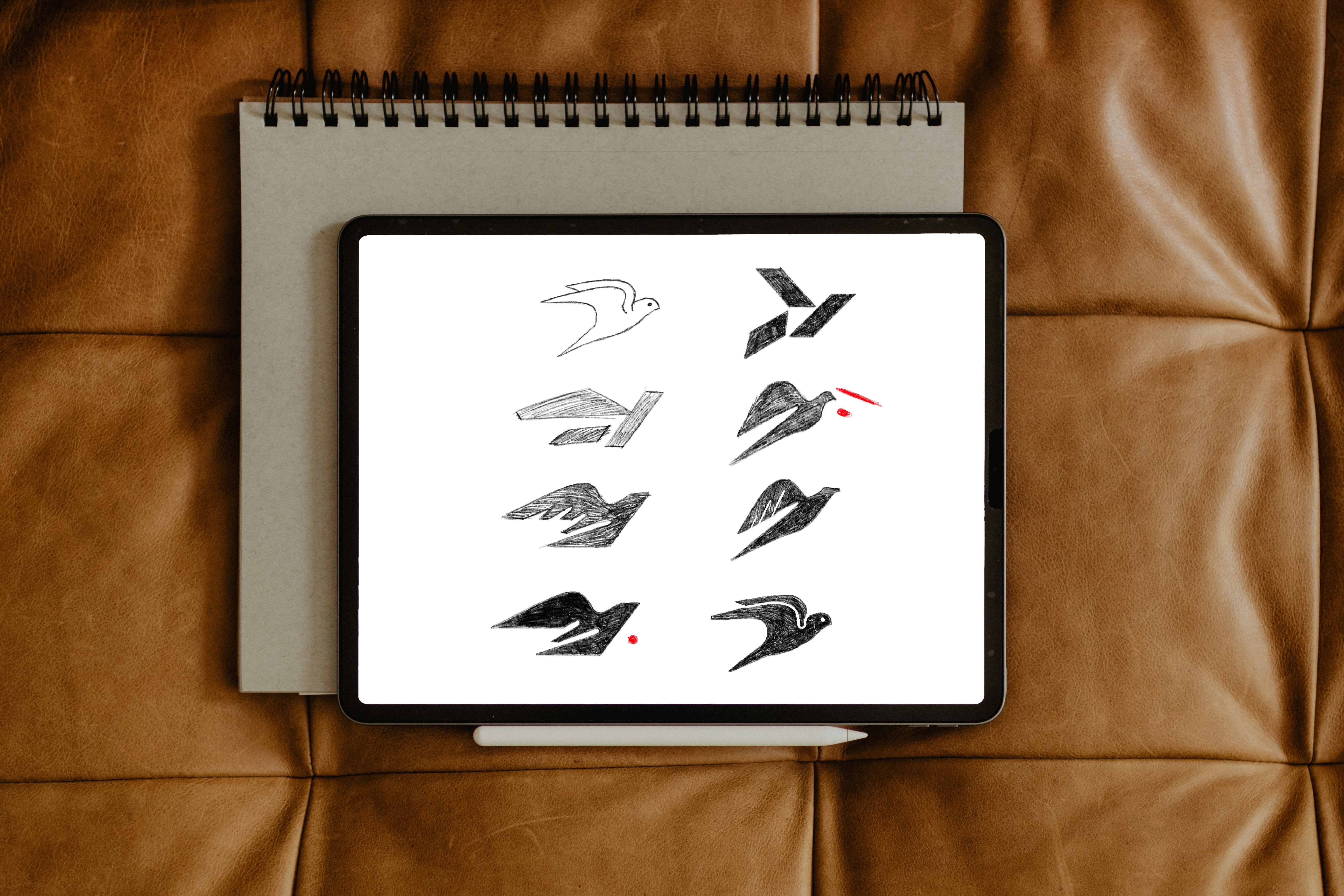
SKECTHES MADE DURING THE PROCESS
Like this project
Posted Jul 21, 2023
The Goal of the project was to come with the Logo design and Color palette for the Travel App startup named Good2Go.