Operations Reports: Performance Dashboard

Juhan Lee


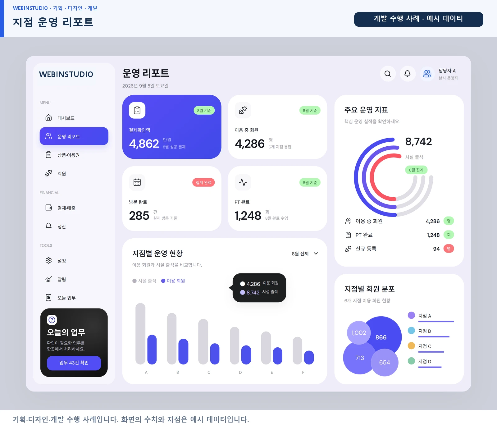
Operations Reports: Performance Dashboard
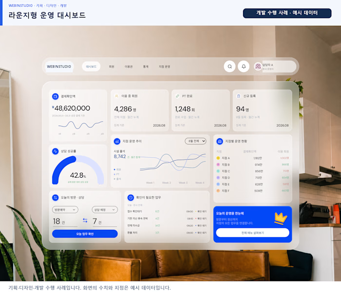
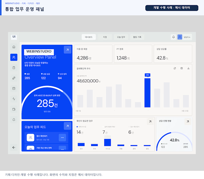
A reporting dashboard for comparing member-service operating indicators. Summary cards, bar charts, circular charts and bubble visualizations organize trends, composition and distribution into separate panels.
Scope: planning, UI/UX design and development. I completed the full scope with 100% participation.
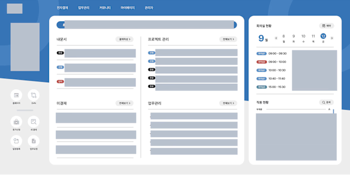
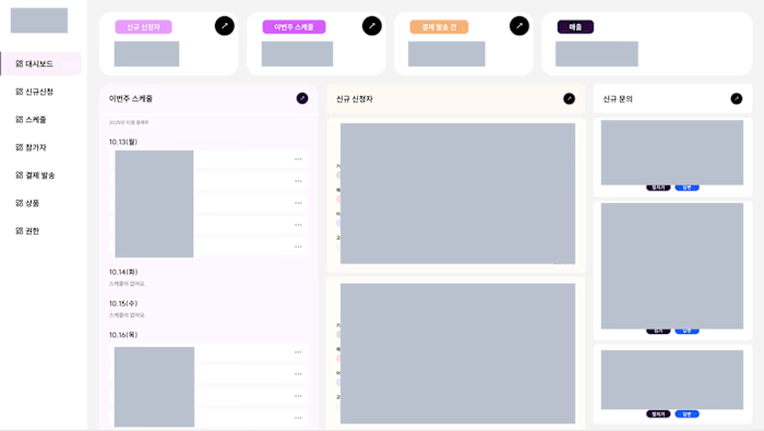
Screens contain sample data; displayed figures are not claimed business results. The attached images document the project interface and workflow.
Period: 2024-07 to 2024-09 (approximate months recorded in the existing portfolio).
Technology: React, TypeScript, GSAP.
Like this project
Posted Sep 16, 2026
Created a reporting dashboard for operating indicators.
Likes
0
Views
1
Timeline
Jul 1, 2024 - Sep 30, 2024