Elevating User Experience through UI/UX Design
Miguel Martinez-Abreu
🎯 UX Case Study ⎯ Payment Checkout Flow Redesign, Driving 90% Upfront Payments
Overview:
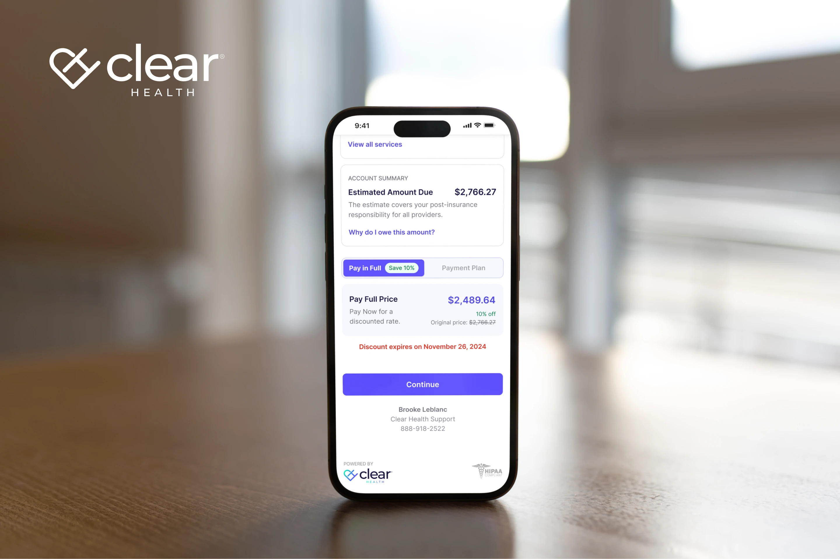
Clear Health™ provides medical billing software for hospitals and ASCs. I redesigned the checkout flow to reduce friction, improve trust, and increase upfront payments.
My role:
Lead UX Designer — UX research, responsive design, flow redesign, and prototyping.
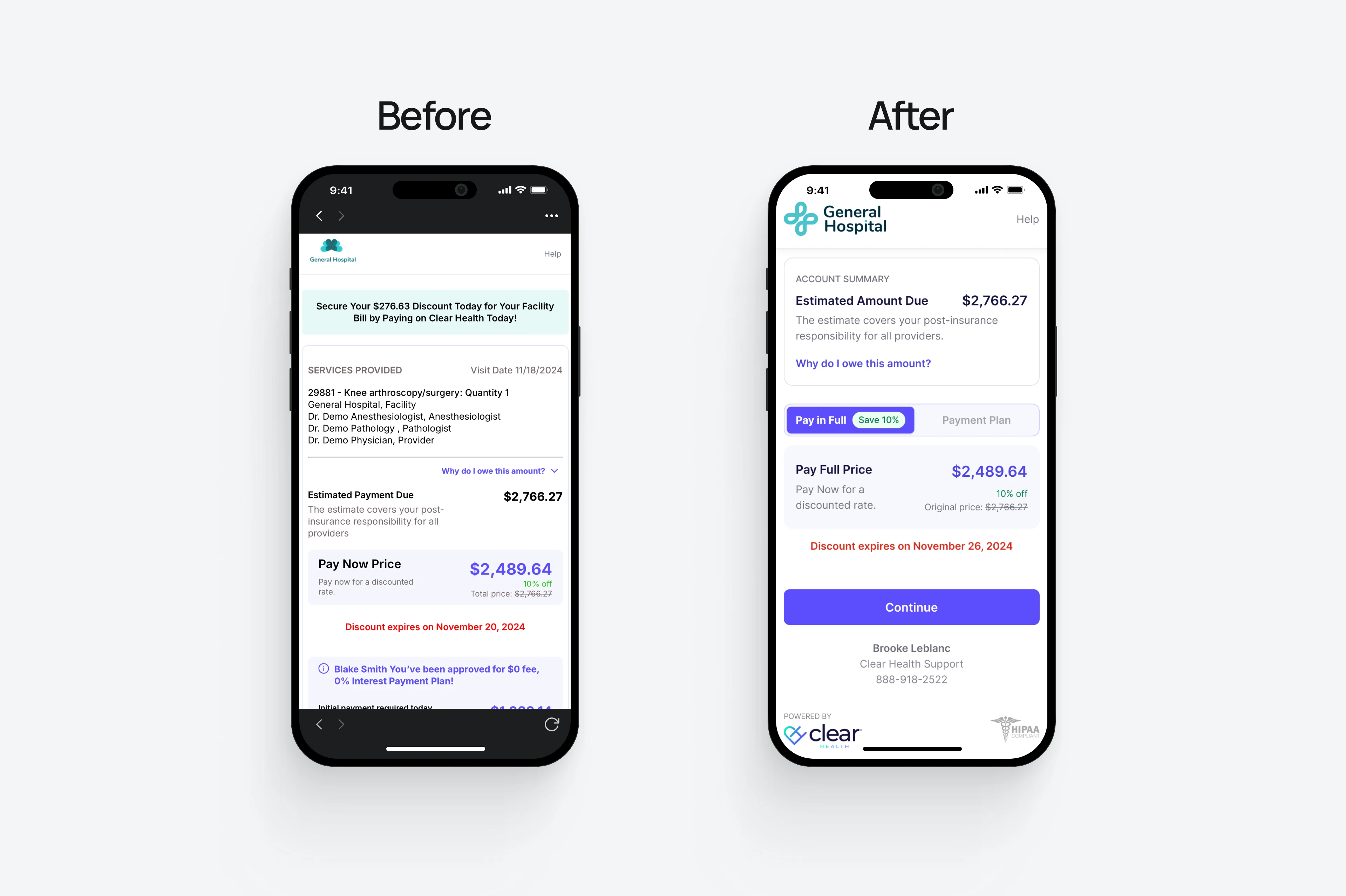
Problem:
Patients saw multiple prices at once and couldn’t tell what they owed or what insurance covered.
Goals:
Simplify the billing flow.
Clarify total cost of care.
Increase upfront payments.
Challenges:
Complex provider breakdowns risked overwhelming patients, and dozens of cost details had to fit within mobile screens.
Solutions:
Consolidated pricing data into one clear breakdown.
Removed distracting notifications to keep patients focused on completing a payment.
Created a collapsible list of services so patients could expand or hide details.
Introduced a toggle to compare payment plans side by side.
Added a “Save 10%” badge to encourage full payments upfront.
Results:
✅ 90% of patients paid upfront (↑30%)
✅ Higher patient satisfaction scores
✅ Secured early funding
🎯 Key takeaway :
Small design decisions can drastically impact trust, sales, & retention.
Like this project
Posted Sep 21, 2025
Payment checkout flow redesign for Clear Health™, a medical billing software company that increased patient satisfaction and upfront payments.
Likes
0
Views
10
Timeline
Nov 23, 2024 - Sep 29, 2025
Clients
Clear Health