Designing Systems 0 -> 1 for Darter
Caesar Rizky Kurniawan
Darter's UI Components
Context
Darter is a specialized route optimization platform built to radically improve fleet efficiency, particularly for medical transport. Having already optimized 1 Million trips over two years, the business has proven its model and is now on track to aggressively expand its services and establish new partnerships.
Problem
Organizational Issues
Absence of Governance: The company lacked an in-house design function, leading to a disconnected product development process without centralized design strategy or standards.
Inefficient: The absence of a single source of truth resulted in an inefficient and time-consuming workflow, forcing teams to enter endless, repetitive debates over basic design attributes (e.g., specific color values, typography sizing).
Platform & UX Issues
Lack of Design Foundation: The platform was built on a weak foundational layer, teams were unintentionally rebuilding the same components repeatedly, slowing down velocity and increasing maintenance cost.
Fragmented User Experience: This lack of foundation caused a scattered visual hierarchy and conflicting component behaviors across the product, resulting in a confusing and inconsistent experience for the end-user.
Strategic Alignment
Business Enablement
The core mandate was to create a scalable web and mobile platform foundation to support the company's expansion to more cities and services.
Product Design Goal
Established a clear, measurable strategic objective for the design team. Framed the design project as critical business enablement, not just a cosmetic refresh.
What we Did:
Audit the process
Roadmap
Design Principle as a guide
A strategic principle drafted to help prioritize decisions, focus efforts, and ensure long-term product quality for aligned team outcomes.
Clarity: Interfaces should communicate purpose instantly. Clear hierarchy, recognizable patterns, and accessible language guide users to the right action without confusion or extra thinking.
Scalability: Designs should scale efficiently across features, platforms, and teams. Consistent patterns reduce decision-making friction and speed up delivery.
Efficiency: Every screen should behave and feel like part of the same system. Predictable components reduce cognitive load and make the experience feel trustworthy.
Cohessivity: Every screen should behave and feel like part of the same system—consistent, predictable, and faster to understand. Cohesion reduces cognitive load and improves overall experience.
Next Step:
Designing Foundation
Typography
The current use of Montserrat presents two critical typographic deficiencies: its characters are excessively wide, leading to poor spatial efficiency and unnecessary layout constraints, and the typeface exhibits suboptimal number rendering, hindering the quick readability and clarity of numerical data and metrics across the product.
Did 3 steps to design a new typography library:
Testing & Validation
Typeface Selection
Designing Typography Library
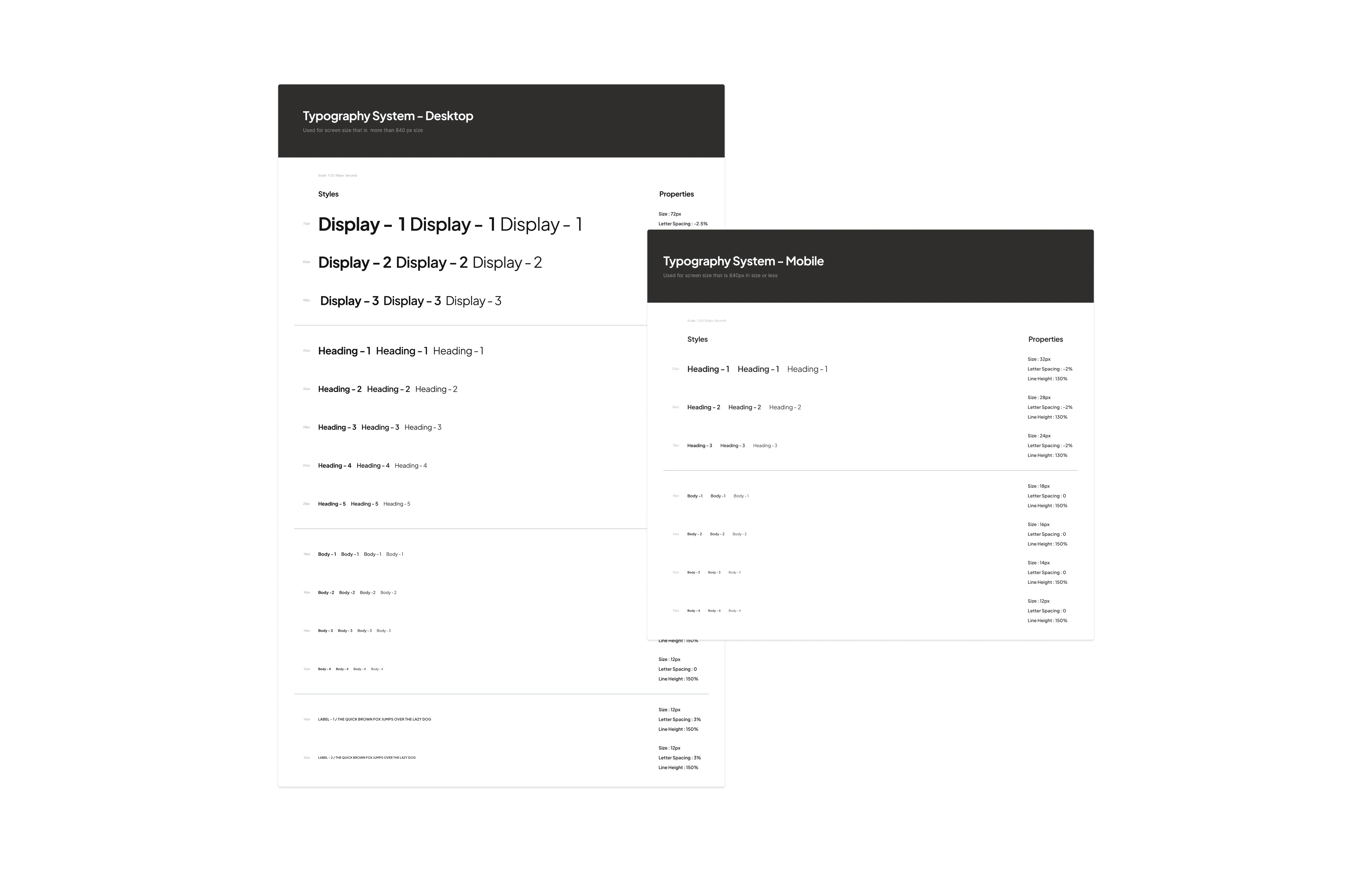
New Typography Library
Color
The current design employs non-intentional color usage, resulting in a complete lack of a defined visual hierarchy. This scattered application of color prevents the system from clearly communicating what information is important versus secondary, directly leading to a broken user interface (UI) structure and a compromised user experience.
Did 3 steps to design a new color library:
Defining core semantic hues
Exploring shades spectrum
Designing Library & Placing by use case
A new color library
Result
A New Scalable Tokens Library
Successful implementation of a complete design token library, centralizing typography and color as foundational elements, and establishing a cohesive numeric scale based on multiples of four (4px, 8px, 12 px, etc) for defining consistent spacing and border radius across all product components.
As a result: estabilished tokens library
Growing a design library
Components Audit
With the foundational design token library now complete, the next crucial step was an intensive audit of existing components. Start with surveyed the entire product UI to identify areas of highest inconsistency and impact. This process allowed us to intelligently prioritize which components would be built first, ensuring our initial efforts delivered maximum cohesion and addressed the most critical user experience pain points.
Auditing current product components
Prioritized Item:
High-Impact Components
With the foundational design token library now complete, the next crucial step was an intensive audit of existing components. We meticulously surveyed the entire product UI to identify areas of highest inconsistency and impact. This process allowed us to intelligently prioritize which components would be built first, ensuring our initial efforts delivered maximum cohesion and addressed the most critical user experience pain points.
Straightly use on Product & Growing
Applying our initial components to live products delivered immediate real-world validation, maximizing our Efficiency. We committed to treating the library as a living system, constantly refining it and filling gaps as new needs emerged during development. This iterative process is key to maintaining Scalability, guaranteeing the library remains the foundational source of truth for future growth.
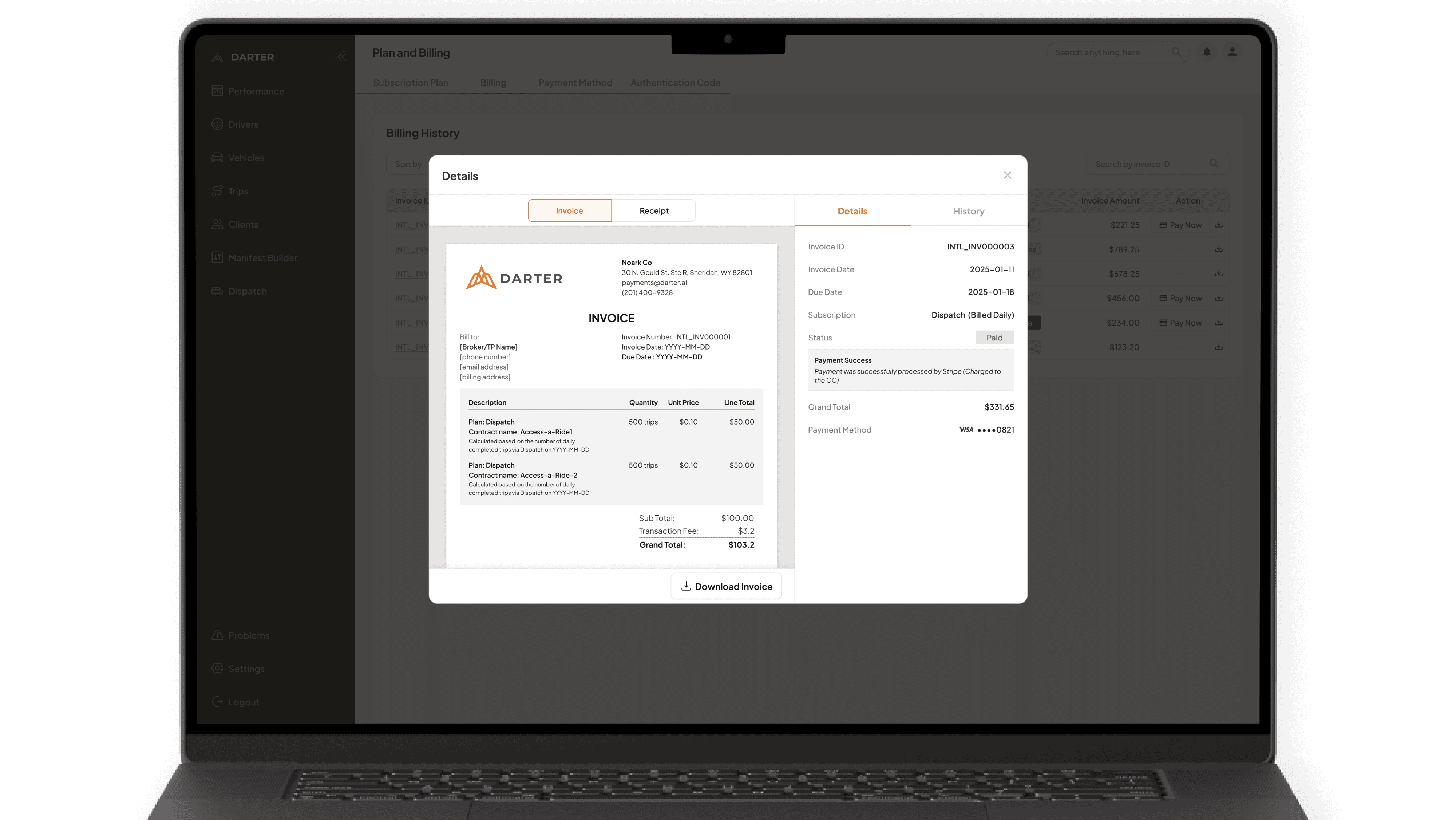
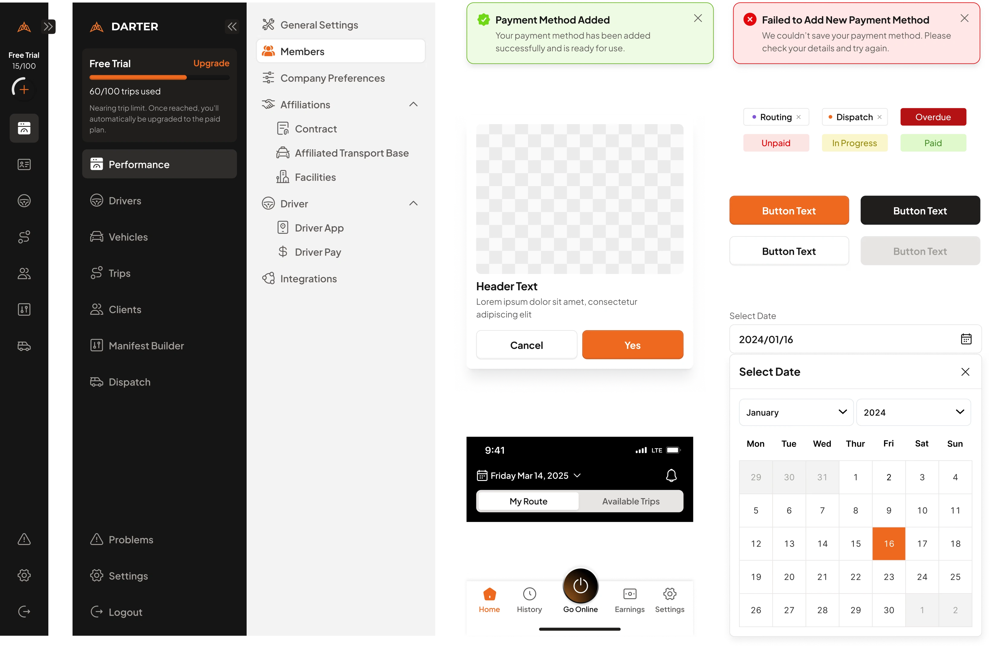
New Invoice Management
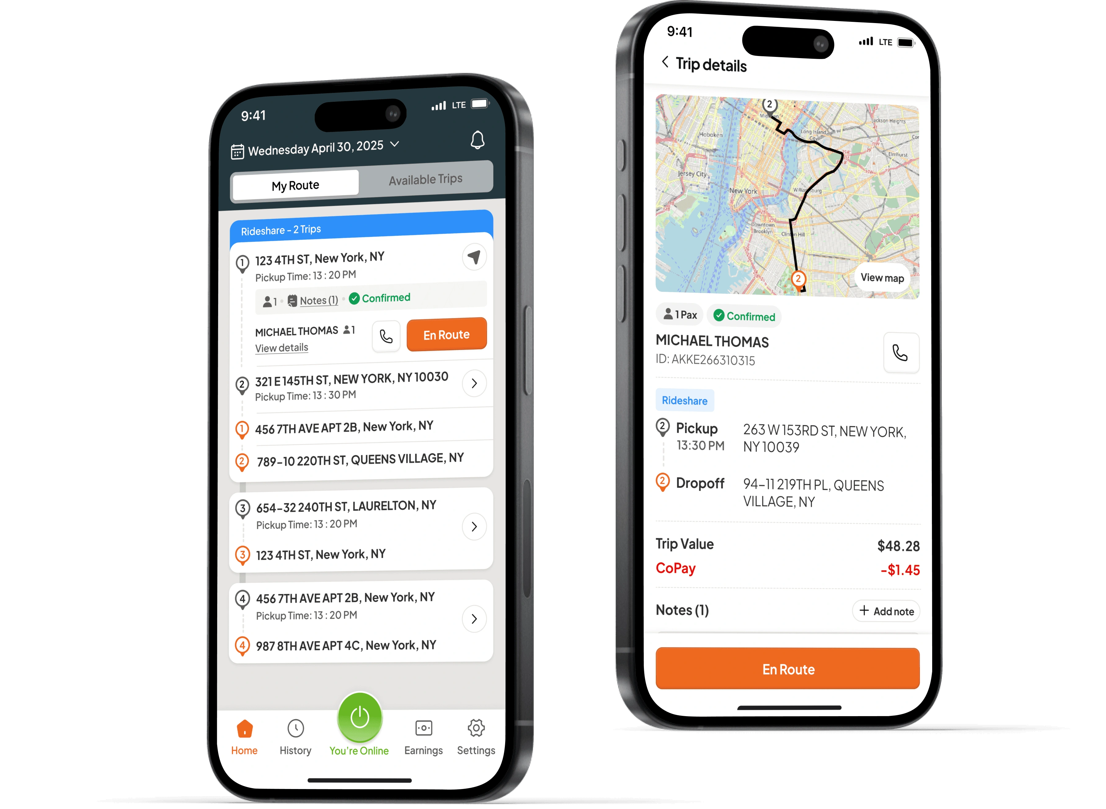
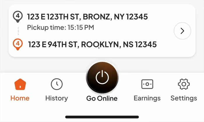
New Driver App Mobile Experience
Result
Design Principle
We defined core principles that served as the organizational and design decision framework. This shift eliminated subjective debates, aligning all teams (Design, Engineering, Product) toward a unified strategic goal and ensuring the design system solves organizational and user friction, not just visual problems.
Clarity, Efficiency, Cohessivity, Scalability
Design Library 1.0
The successful launch of the foundational component library, built on a robust Design Token system (Color, Typography, Spacing), immediately established the single source of truth. This centralized asset model maximized workflow Efficiency, evidenced by a $75\%$ reduction in design handoff time and a rapid decrease in front-end code redundancy.
Better Experience
By rigorously applying the principles of Clarity and Cohesion across the new foundation and components (e.g., semantic color usage, tested typography), we directly solved the fragmented user experience problem. This resulted in a measured improvement in visual consistency, Ensuring a more intuitive and predictable experience for all users.
Conclusions:
This project was a critical intervention that transitioned the company from a fragmented, inefficient design process to a scalable, cohesive, and high-velocity product organization. The success of this initiative was built on a foundation of strategic research, principle-driven design, and rigorous execution.
Maximizing Efficiency and Scalability
We drafted a Strategic Roadmap prioritizing core foundations to quickly unlock engineering velocity. By establishing the Design Tokens Library, we eliminated guesswork, reducing design handoff time by 75%. This focus on efficiency is the engine of Scalability.
Defining Clarity and Cohessivity
I defined and rigorously applied the principles of Clarity (easy user comprehension) and Cohesion (visual consistency). This involved the Testing and Validation of new typefaces (Plus Jakarta Sans) and the creation of a semantic Color Library, directly solving critical user pain points and elevating overall product quality.
Strategic Alignment and Business Vision
By mapping organizational friction to platform weaknesses, I ensured the resulting design foundation was not just a visual fix, but a targeted solution for accelerating business goals and guaranteeing long-term system adoption.
Like this project
Posted Dec 9, 2025
Turning UX chaos into clarity through a strong design foundation that drives consistent, scalable growth.
Likes
0
Views
6
Timeline
Jan 9, 2025 - May 31, 2025