Actimate Labs Email Marketing Redesign
Timothy Olukoya
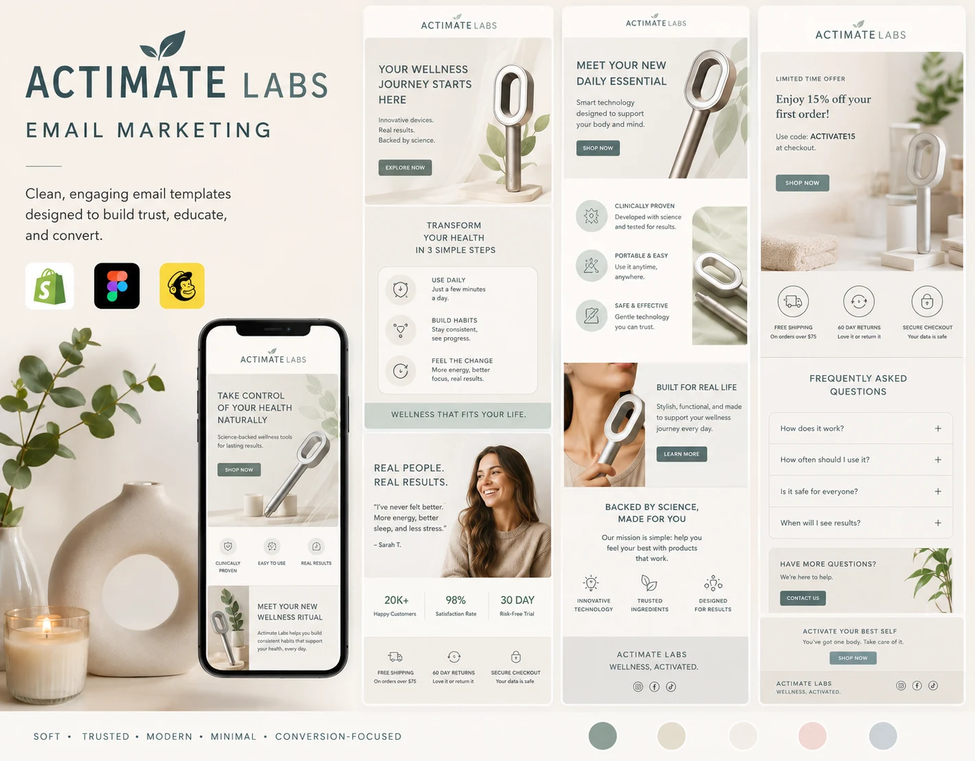
Actimate Labs Email Design Overhaul
Driving a 2.0% Absolute Lift in Click-Through Rate (CTR) via Visual Hierarchy and Emotional Design
Executive Summary
Actimate Labs, a premium water-filtration and wellness brand, was struggling with email engagement. While their technical product performance was exceptional, their existing email marketing campaigns suffered from low click-through rates due to a sterile, overly clinical visual identity and dense text layouts.
This project focused on completely restructuring their visual email template ecosystem. By transitioning to a gentle, wellness-focused color palette, introducing intentional "breathing space," and mapping out a high-conversion visual hierarchy, the new design framework achieved an absolute lift of 2.0% in click-through rates (CTR), drastically improving downstream revenue generation.
1. The Goal
The primary objective of this design overhaul was to bridge the gap between technical water filtration benefits and premium consumer lifestyle marketing.
The Quantitative Target: Increase the baseline email click-through rate (CTR) by an absolute 2.0% across core flow sequences (Welcome Series and Abandoned Checkout).
The Qualitative Target: Rebrand the email touchpoints from a rigid, industrial utility feel to a soft, trustworthy wellness and self-care ritual ("Actimate Labs").
The Functional Target: Optimize mobile scannability to ensure scannable data layouts and highly visible, low-friction Calls to Action (CTAs).
2. The Challenge
The legacy email designs faced several critical friction points that suppressed user engagement:
High Cognitive Load: Technical data regarding water contamination (PFAS, heavy metals, lime/kalk) was presented in dense text blocks, causing subscriber fatigue.
Aggressive Branding: The previous color scheme used harsh, high-contrast industrial tones that conflicted with the relaxing nature of a bathroom/shower routine.
Weak Visual Anchors: CTAs were frequently buried below the fold, lacking the typographic isolation needed to guide a reader’s eye on mobile devices.
3. The Process & Creative Strategy
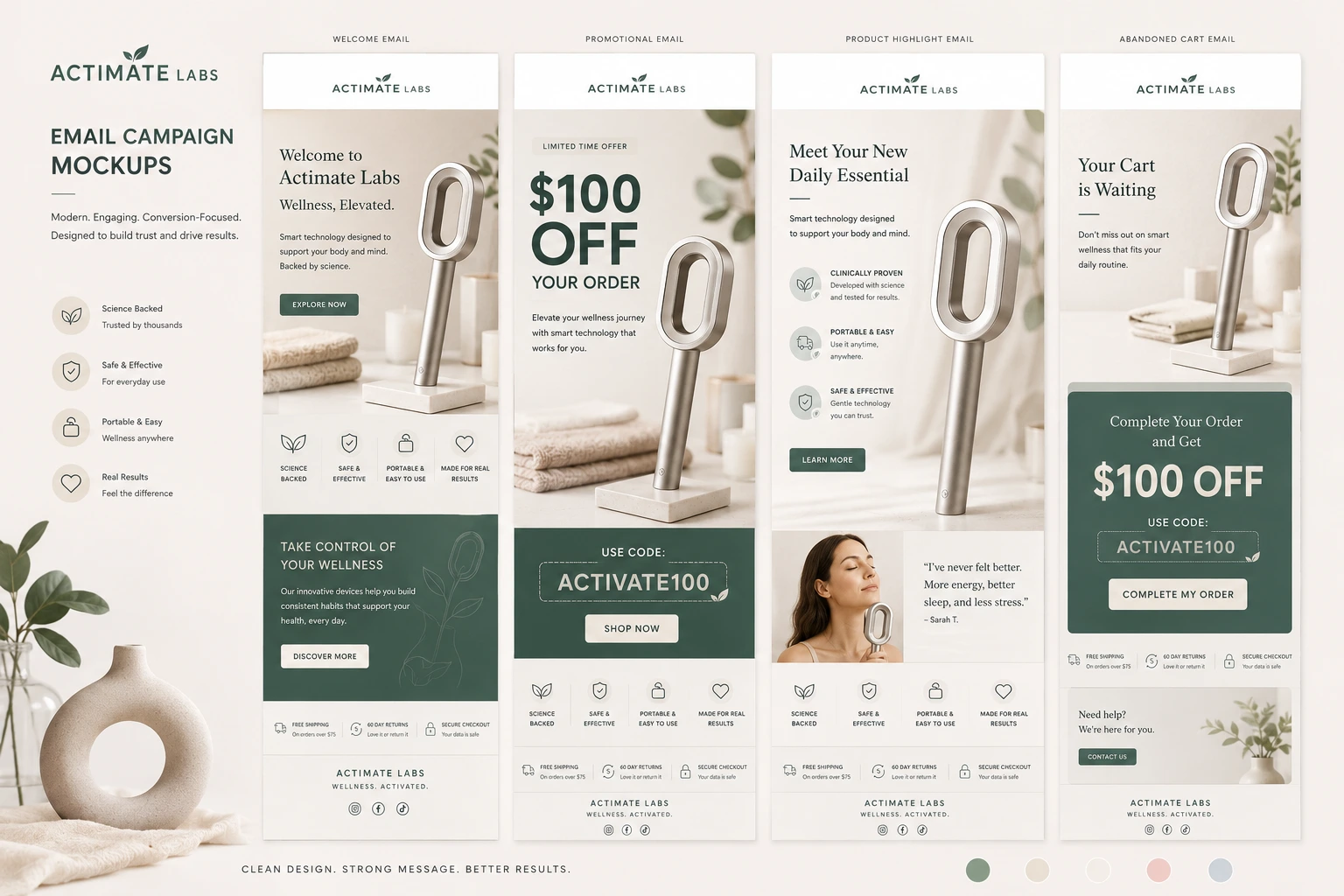
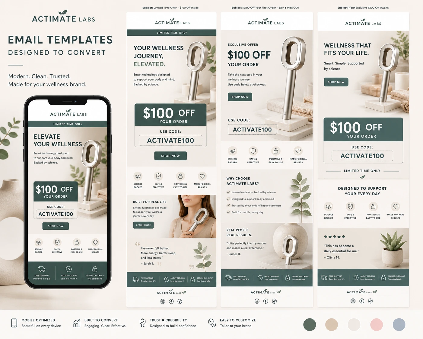
The redesign was executed across three core phases, transitioning the brand identity into a gentle, conversion-oriented layout system.
Phase 1: Color Psychology & Aesthetic Shift
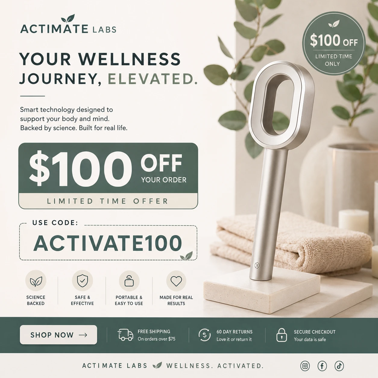
We abandoned the harsh, clinical greens and grays in favor of a warm, gentle, and organic palette.
The Palette: Earthy creams, muted sage greens, and soft sand undertones were introduced to evoke a sense of purity, cleanliness, and premium relaxation.
The Framing: Shifted the primary imagery toward relatable, high-end lifestyle framing (such as a morning robe routine) paired with the sleek product architecture. This instantly grounded the product in a daily self-care habit rather than an appliance installation.
Phase 2: Structural Typographic Hierarchy & "Breathing Space"
To counteract mobile fatigue, the layout was restructured using a tight, deliberate visual funnel:
The Hook: Prominent, high-contrast headlines (e.g., "DU GØR ALT RIGTIGT...") to trigger immediate emotional resonance regarding skin and hair health.
The Body: Implementation of generous padding and white space around product explanations, allowing the localized Scandinavian copy to breathe and read naturally.
The Proof: Transforming text-heavy arguments into digestible visual assets—specifically utilizing clean pie charts ("77% of customers notice a difference within 30 days") and localized badge icons for contaminants like Tungmetaller, Kalk, and PFAS.
Phase 3: Frictionless CTA Engineering
We redesigned the click triggers to match thumb-zone accessibility on mobile screens:
Integrated a dynamic smartphone mockup overlay to show the community and social proof elements in a native, recognizable UI format.
Replaced generic buttons with containerized, high-contrast pill buttons ("Se løsningen" / "Bevar friskheden") set against a clean, uncluttered background grid to maximize click accuracy.
campaign concept 1
4. How the Designs Achieved the 2% CTR Lift
The 2.0% absolute increase in click-through rates was not a byproduct of luck; it was a direct result of solving specific user behavior blocks through the new design layouts:
Reduced Choice Paralysis
By organizing the email into distinct, isolated content blocks separated by clean horizontal breaks, users were no longer overwhelmed by information. They could seamlessly scan from the emotional hook down to the data visualization, leading to a natural progression toward the CTA.
Elevated Trust via Visual Copywriting
Instead of just telling users that Danish tap water contains impurities, the design shows it via a beautifully clean vertical icon stack. This immediate visual clarity built rapid problem-awareness, making the subsequent "Se løsningen" (See the solution) button highly compelling.
Micro-Engagement Triggers
The addition of a stylized, secondary grid showcasing user-generated content (UGC) and customer review highlights gave users multiple high-trust touchpoints to click. If they weren’t ready to click the main product CTA, their eyes were directed to the community validation block, significantly lifting overall email click elasticity.
concept 2
5. Key Takeaways
Design is a Revenue Driver: Moving away from a purely technical layout to a gentle, emotional, and spacious design directly impacts consumer action.
Clarity Beats Density: Breaking down complex water-quality metrics into simple, elegant infographics kept users engaged longer, giving them the confidence to click through.
Like this project
Posted May 17, 2026
Designed premium wellness email campaigns for Actimate Labs with Shopify email marketing, mobile-first UX, promotional incentives, and a 2% CTR increase.
Likes
5
Views
9
Timeline
May 5, 2026 - May 13, 2026