Brand Identity Design for The Grazing Feather
LaVar Taylor

Robyn and Austin were starting a pop-up charcuterie truck and needed a brand that felt:
Elevated but not stuffy
Unique but approachable
Flexible enough to work on everything from a truck to takeout packaging
They didn’t want it to feel overly rustic or overly trendy—just something that felt special, like a little moment of escape when you saw it.
The Approach
We built the brand around one strong visual idea: a golden feather in motion. The name “The Grazing Feather” already had lightness to it, so we leaned all the way in.
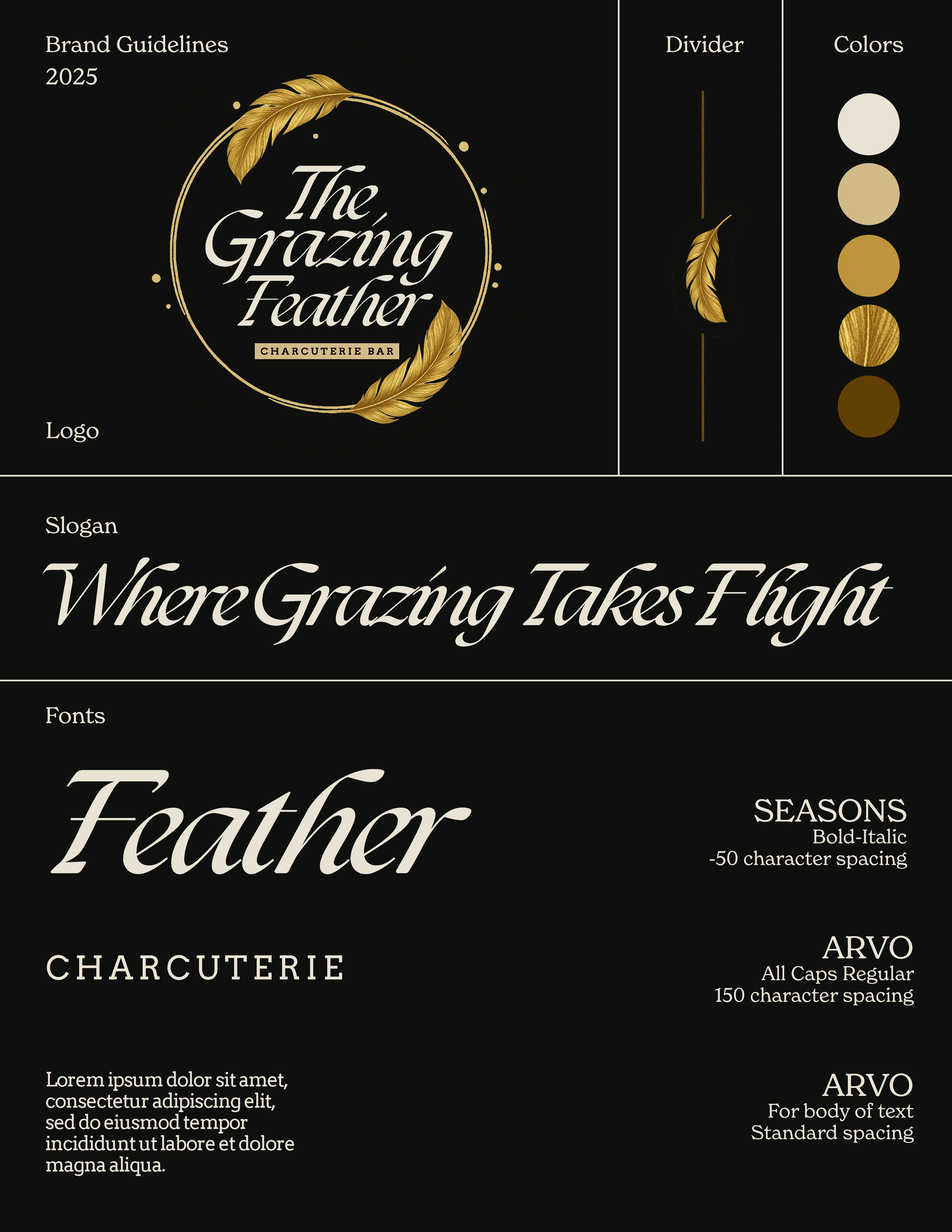
The Logo
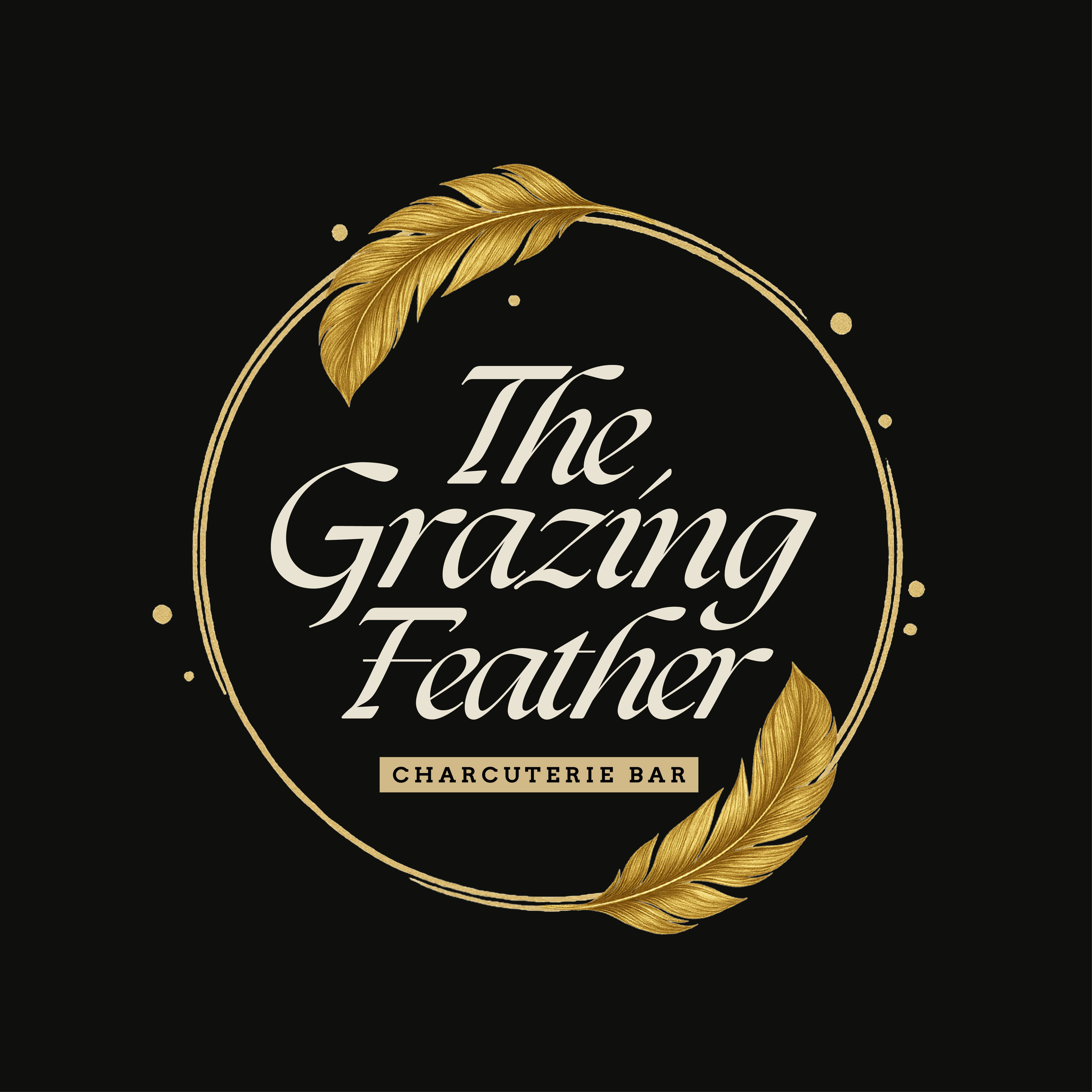
Logo
Visual Solution:
A hand-drawn circle with two golden feathers wrapping the name gives a feeling of motion, elegance, and care.
Font choice:
We used a high-contrast serif for personality and elegance, paired with a clean, modern serif (Arvo) for the supporting type. The contrast creates that push-pull of elevated vs. approachable.
Color system:
Black, white, and gold—simple, flexible, and instantly signals premium without shouting.
The Business Card
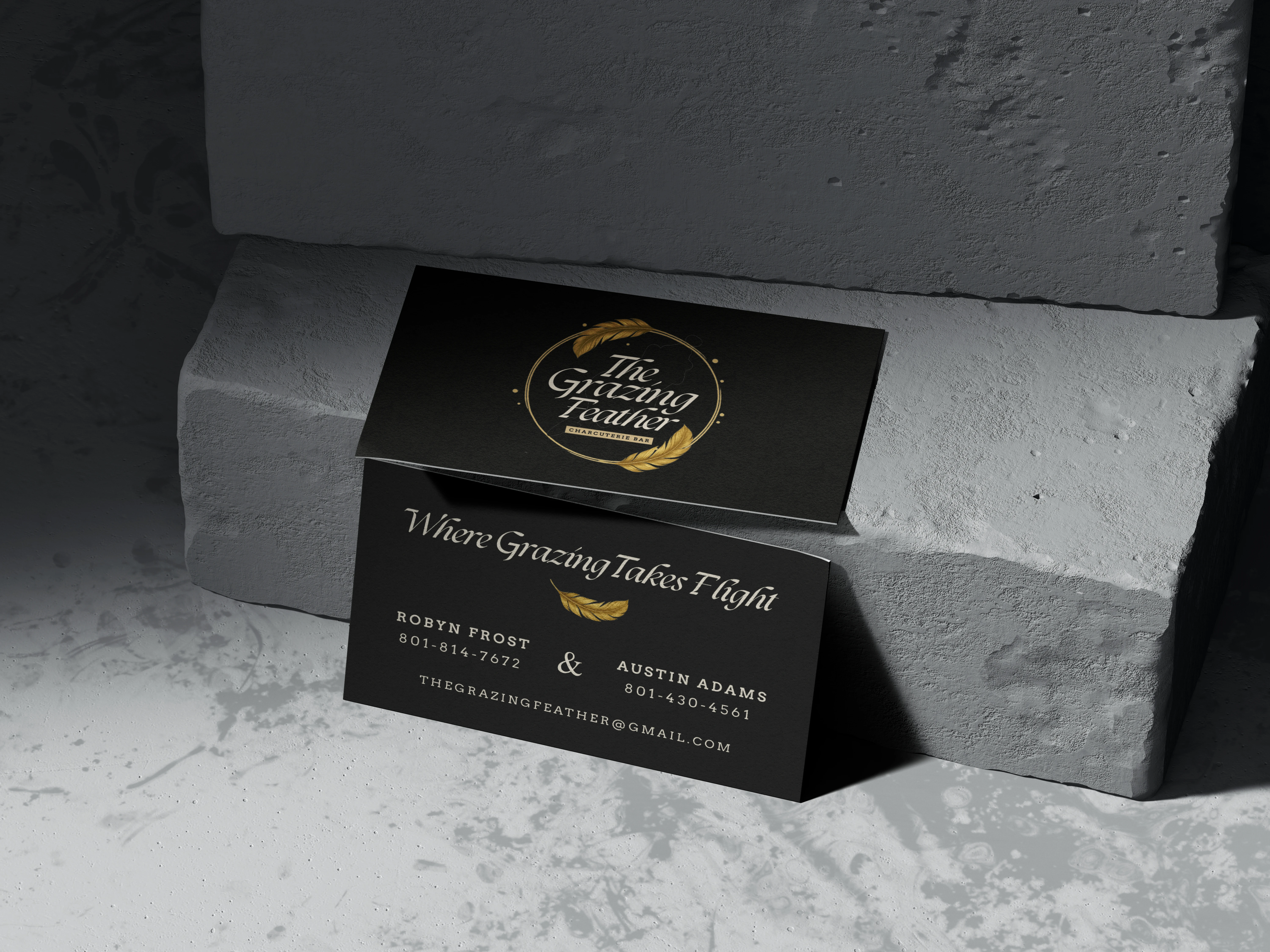
Business Card Mock-up
We kept it bold, black, and gold on the front with the logo dead center. The back holds a soft, feather-inspired tagline (“Where Grazing Takes Flight”) with clear contact info split between the co-owners. The gold feather icon repeats to reinforce the brand.
The Result
The final identity feels polished but warm. It works for:
A wrapped truck or signage
Small packaging like stickers and tags
Instagram and social presence
Printed collateral like menus, order slips, and cards
It’s a brand people remember—and more importantly, one that feels true to the founders.
Like this project
Posted Oct 9, 2025
Created a unique brand identity for The Grazing Feather pop-up charcuterie truck.
Likes
0
Views
5