Opulent Fashion Designing Landing Page
Sulaiman Agara
Intro
Welcome to Opulent's online platform, designed to offer an easy shopping experience. Their website serves as a virtual showroom, showcasing their latest collections and providing detailed product information. Ultimately, their platform drives brand awareness and growth. Welcome to Opulent's website!
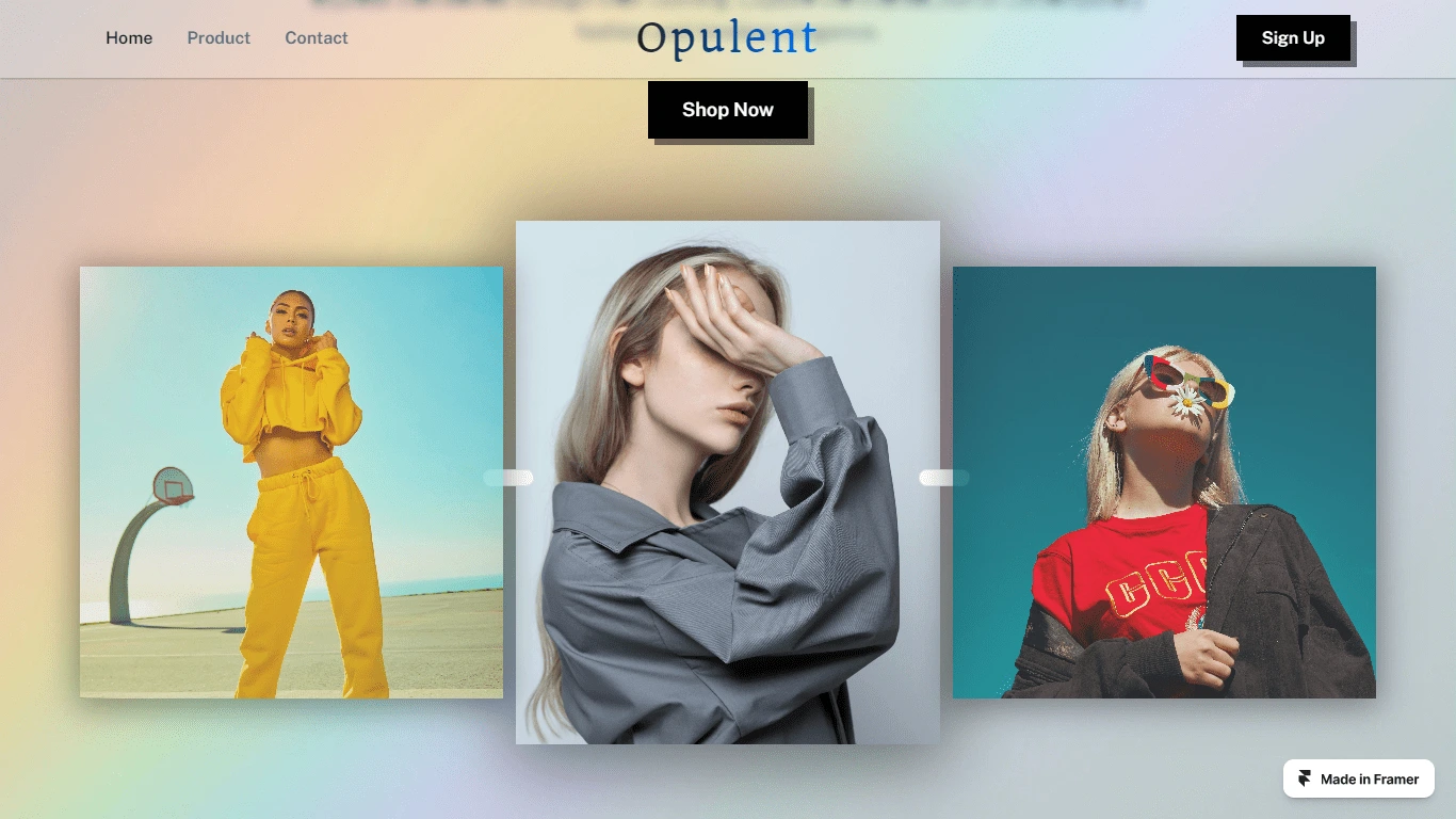
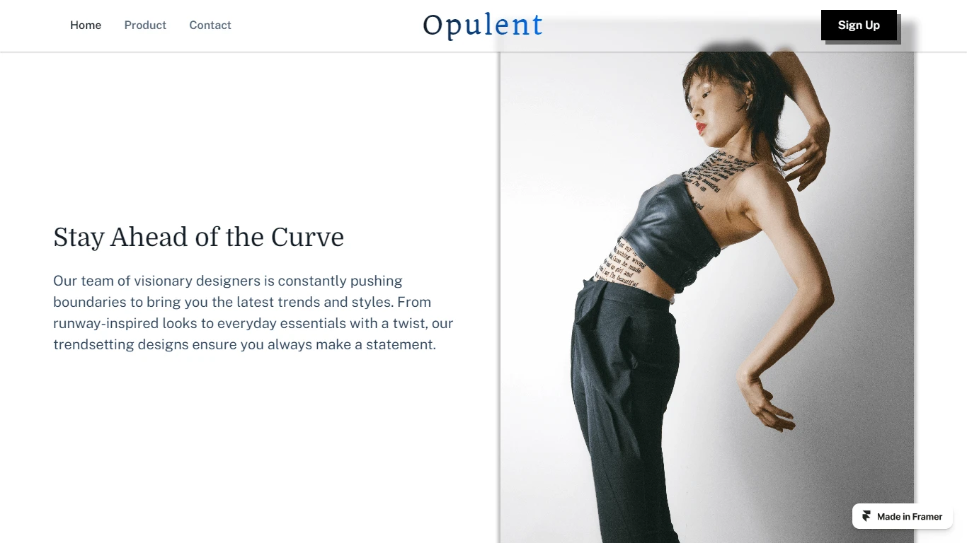
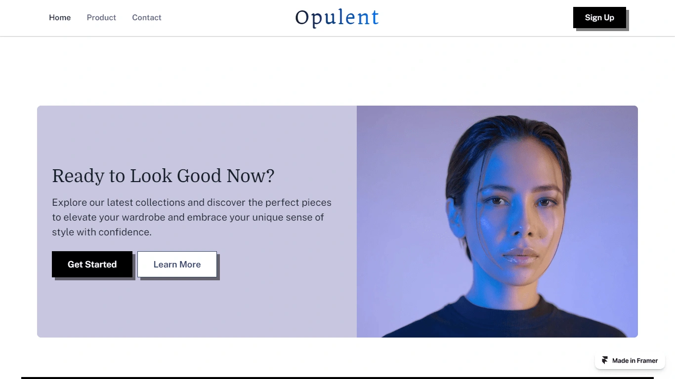
Hero Section:
The hero section is the first thing visitors see when they land on the website, so I've strategically placed it at the top of the page to grab attention. I featured visually captivating images that align with the brand's aesthetic and products.
Accompanying the images is compelling hook text that I added to succinctly communicates the brand's value proposition or unique selling points, enticing visitors to explore further.
I positioned the call-to-action (CTA) button within the hero section to encourage immediate action, which in this case is "Shop Now."
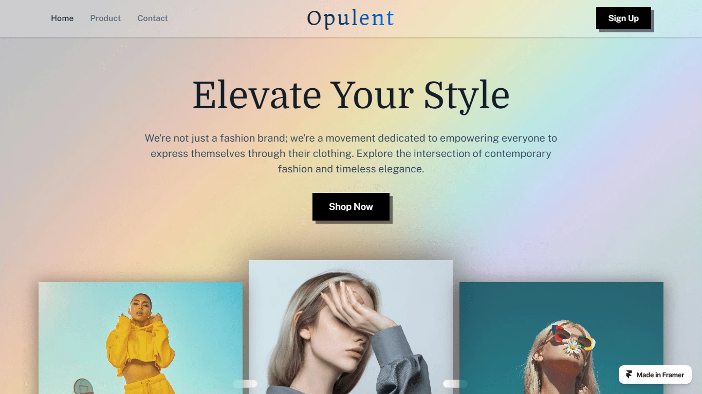
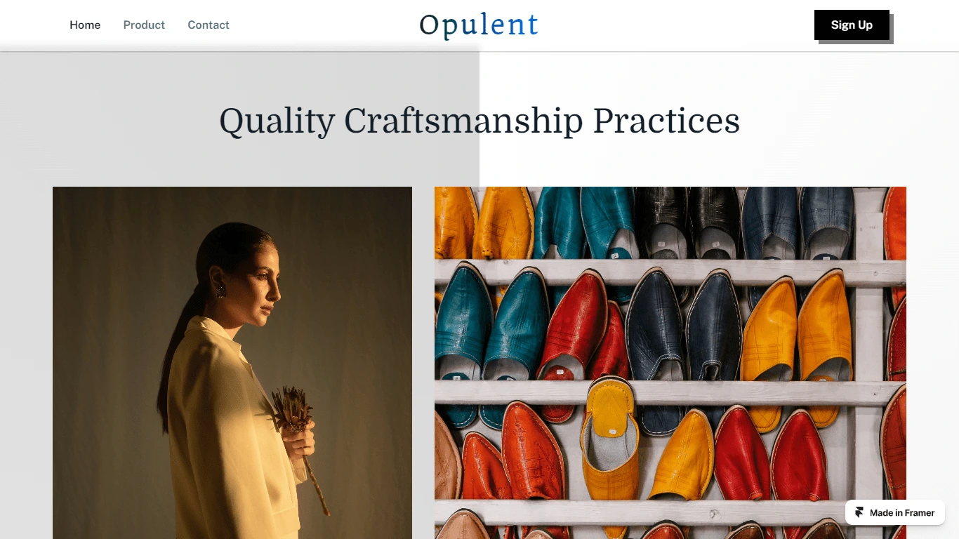
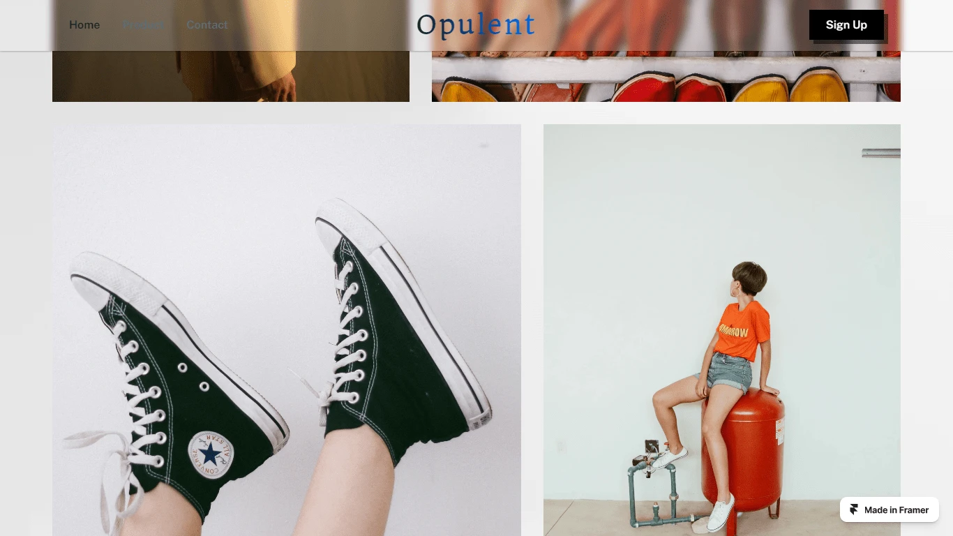
Collections Showcase:
The collections section, which comes after the hero section, showcases where visitors can browse through the various product offerings available on the website.
This section features images or previews of the different product categories or collections, arranged in an aesthetically pleasing grid, two-column layout or carousel format. In this case, I went with a two-column layout, and then a staggered-grid to showcase more images.
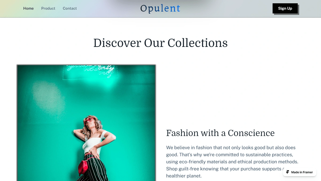
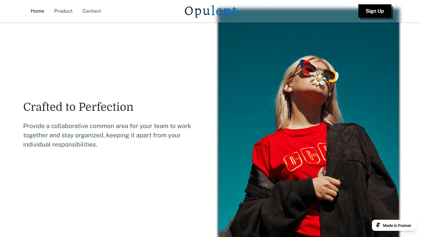
More Images
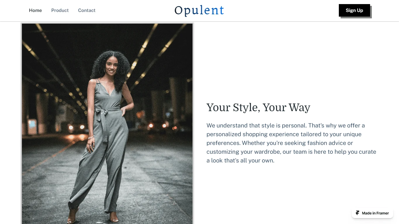
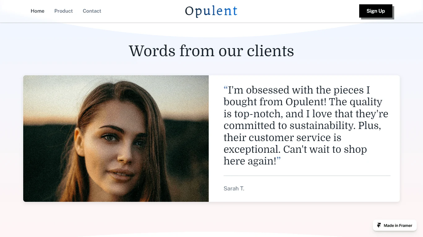
Client Testimonial or Quote:
The client testimonial or quote section adds credibility and authenticity to the website by showcasing positive feedback from satisfied a customers. (You can always add more)
I added compelling quote from a customer which is prominently displayed, along sides by their name, role (if applicable), and possibly a photo.
I use this section to build trust with potential customers and reinforces the brand's reputation for delivering quality products or services.
Call-to-Action (CTA) Section:
The CTA section serves as the final push to encourage visitors to take a desired action, such as making a purchase, signing up for a newsletter, or contacting the brand.
It typically includes a clear and persuasive call-to-action button with text that reinforces the desired action. So here, I used 'Get Started' because I don't want to repeat 'Shop Now.'
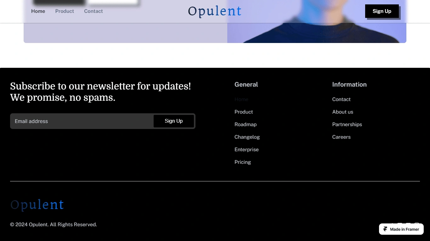
Footer:
And finally, the footer section. It is located at the bottom of the website and serves as a navigational aid, providing links to important pages such as the about us, contact, FAQ, and terms of service.
Conclusion
Overall, the website is designed for easy navigation, highlighting products and encouraging visitors to take action. It starts with a striking hero section and continues with a clear display of product collections. Client testimonials add credibility, while strategic calls-to-action prompt visitors to engage. The footer provides essential navigation links and contact information.
Like this project
Posted Apr 11, 2024
The project involved designing a website aimed at showcasing products and driving engagement. I focused on creating an intuitive layout with clear navigation.
Likes
0
Views
28