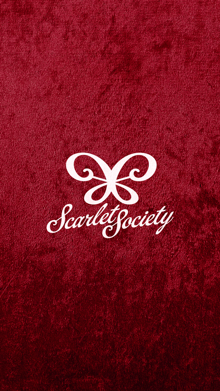
Brand Identity Design for Scarlet Society
Mariyam Afzal

About the Project
Reimagining Chocolate-Covered Strawberries as a Premium Experience
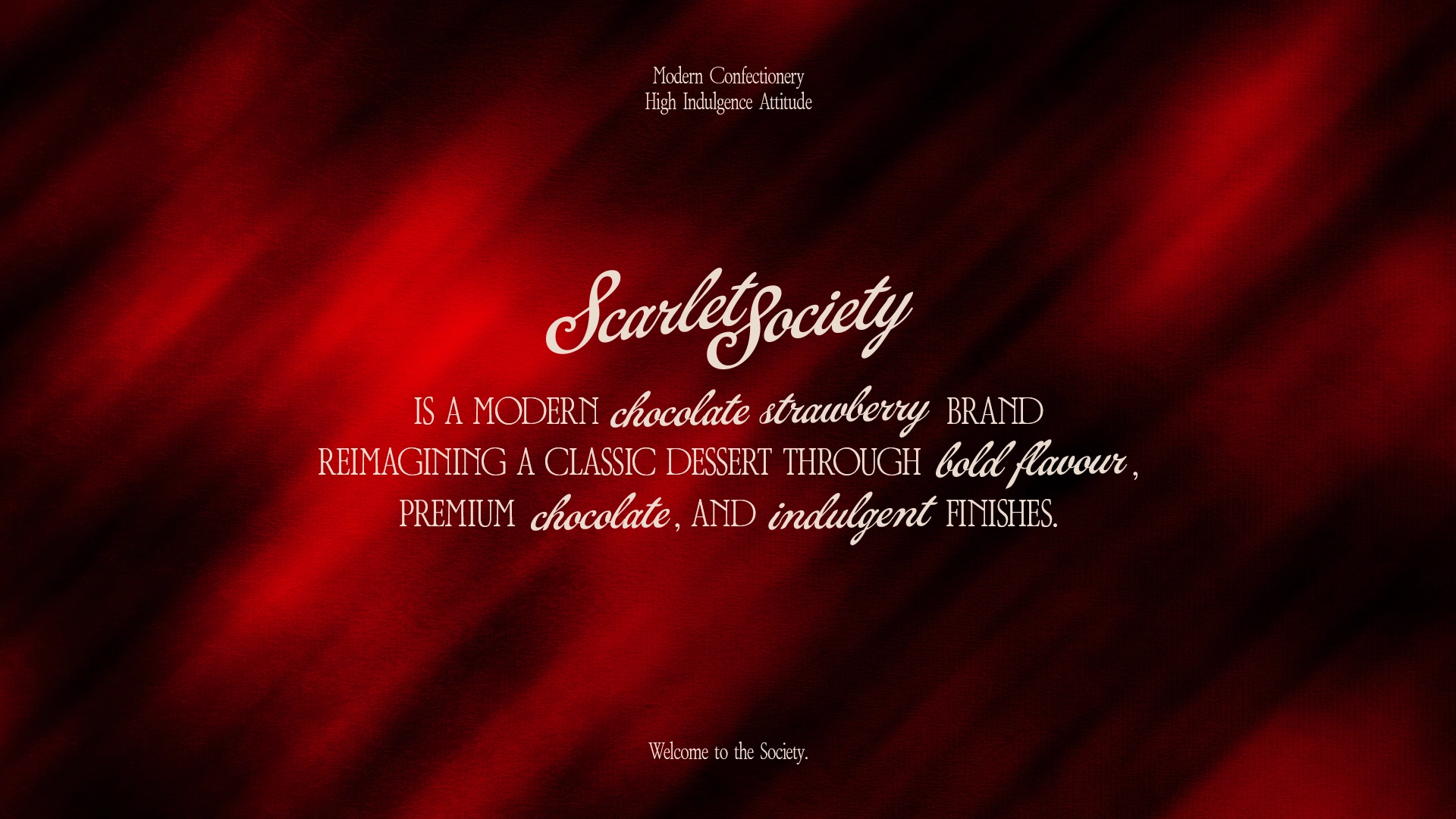
Scarlet Society is a modern dessert brand centered around chocolate-covered strawberries, reimagined as a refined and indulgent experience.
Traditionally associated with gifting or overly playful presentation, chocolate strawberries often lack a strong, contemporary identity. Scarlet Society challenges this by positioning them as a bold, elevated product, combining premium chocolate, curated finishes, and a distinct visual language.
The brand is built around the idea of indulgence as a ritual, where even a simple dessert becomes something worth savoring, sharing, and celebrating.
The Challenge
Moving Beyond Generic Dessert Branding
The dessert space is saturated with brands that lean heavily into pastel palettes, playful visuals, and overly sweet aesthetics. While appealing, this approach often lacks distinction and depth.
The challenge was to create a brand that feels premium, modern, and visually striking, without falling into traditional luxury clichés or generic dessert branding.
Scarlet Society needed to stand apart by:
Elevating perception without becoming inaccessible
Balancing indulgence with refinement
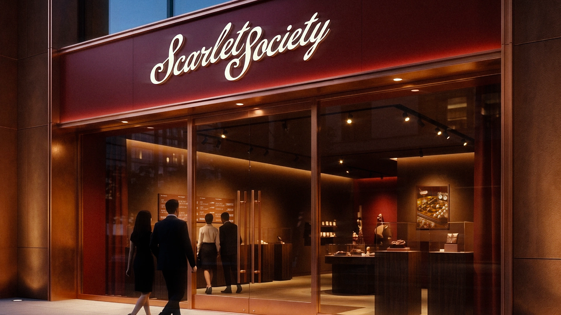
Creating a strong identity that works across packaging, menus, and social content

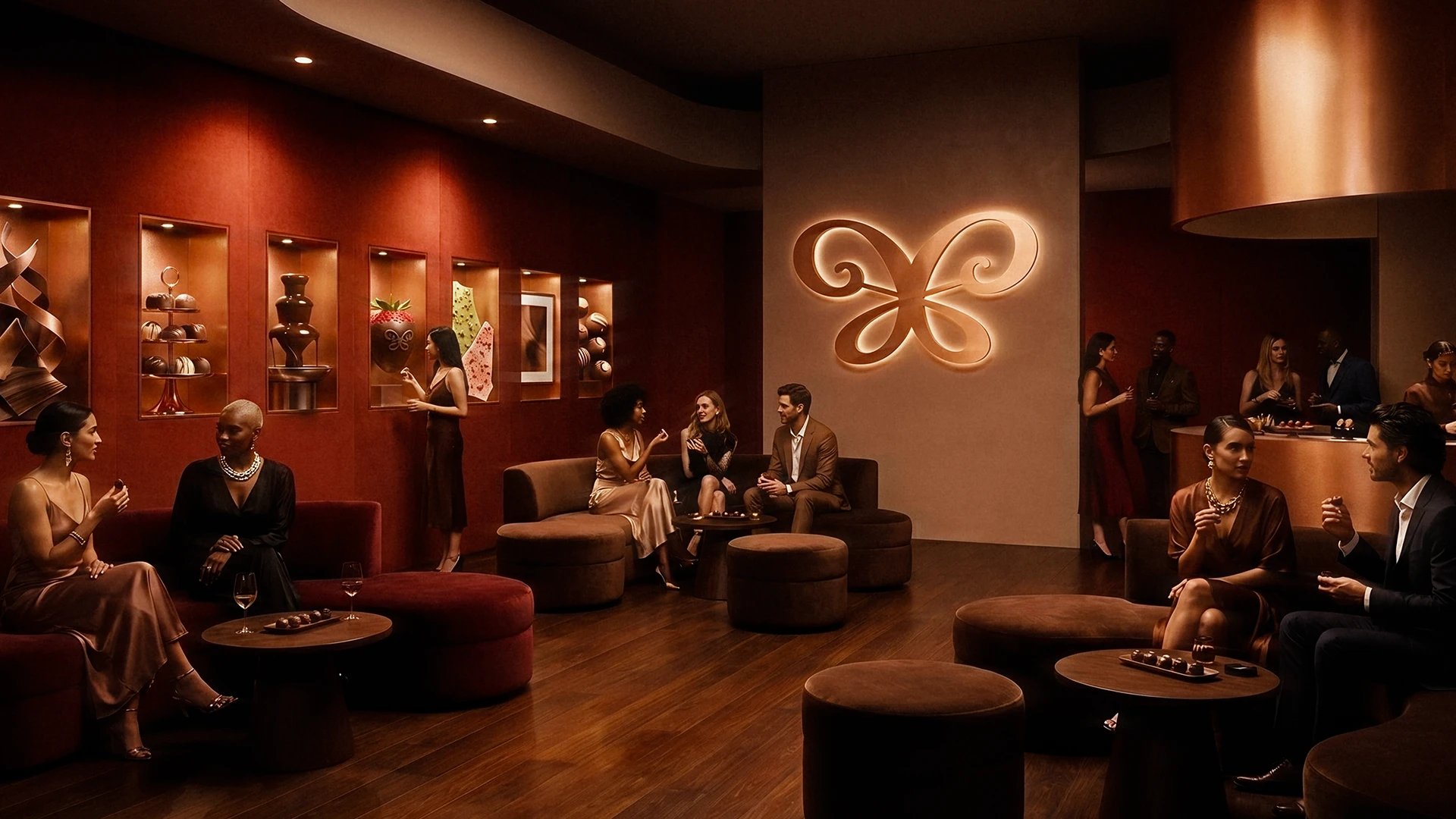
The Approach
Indulgence as a Visual and Sensory System
The starting point was redefining how chocolate-covered strawberries are perceived. Instead of treating them as a novelty or gift item, the brand positions them as a ritual of indulgence.
Visually, the system draws from:
Deep scarlet tones to reflect richness and boldness
Chocolate-inspired textures to emphasize sensory appeal
Editorial-style layouts influenced by fashion and luxury branding
Typography and composition were kept structured and intentional, allowing the product to remain the focal point while reinforcing a refined aesthetic.
The goal was to create a brand that feels confident, indulgent, and modern, without relying on clichés.
The Solution
A Cohesive Brand Built Around Indulgence
The final identity translates this direction into a cohesive and scalable system.
At its core is a bold visual language defined by:
A rich scarlet color palette paired with chocolate and neutral tones
Elegant typography that balances modernity with refinement
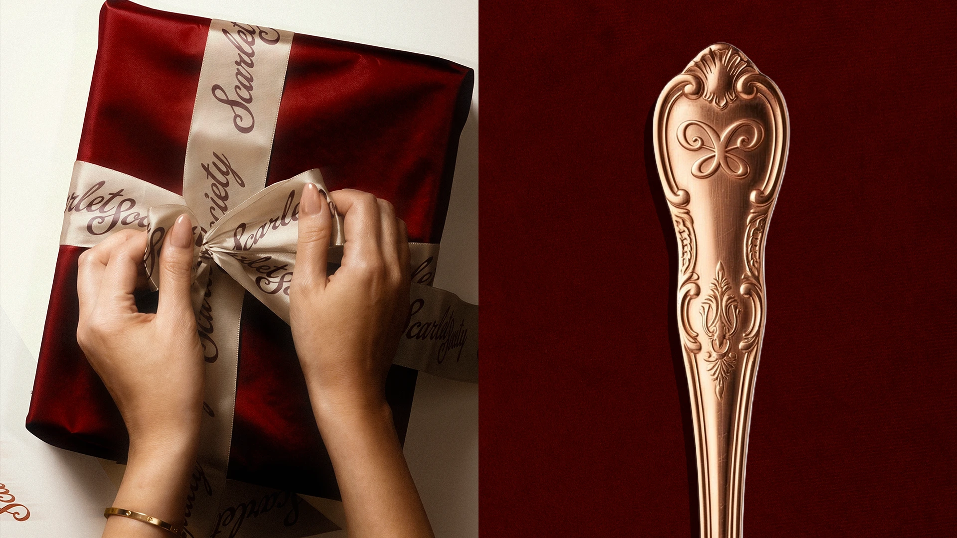
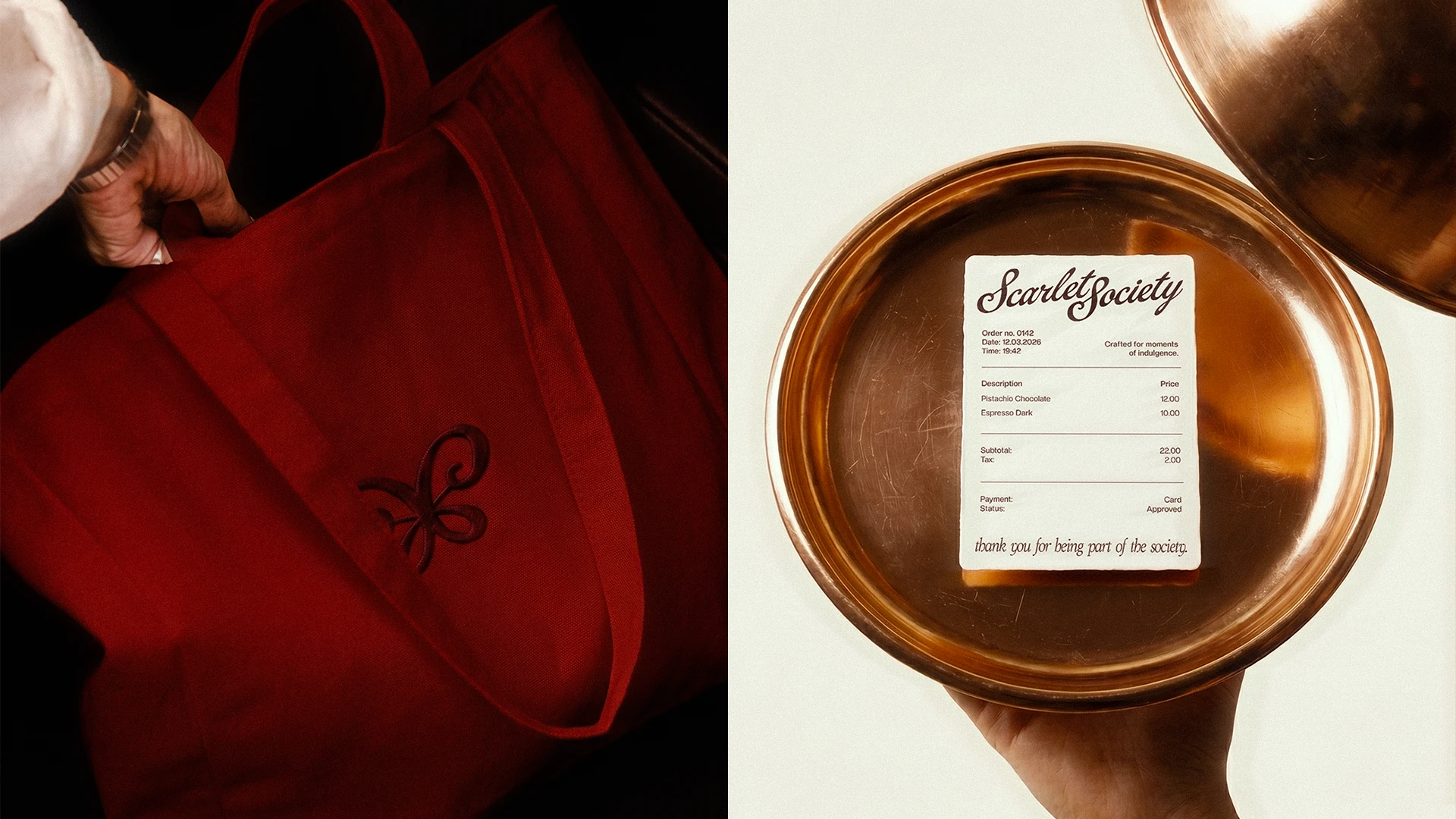
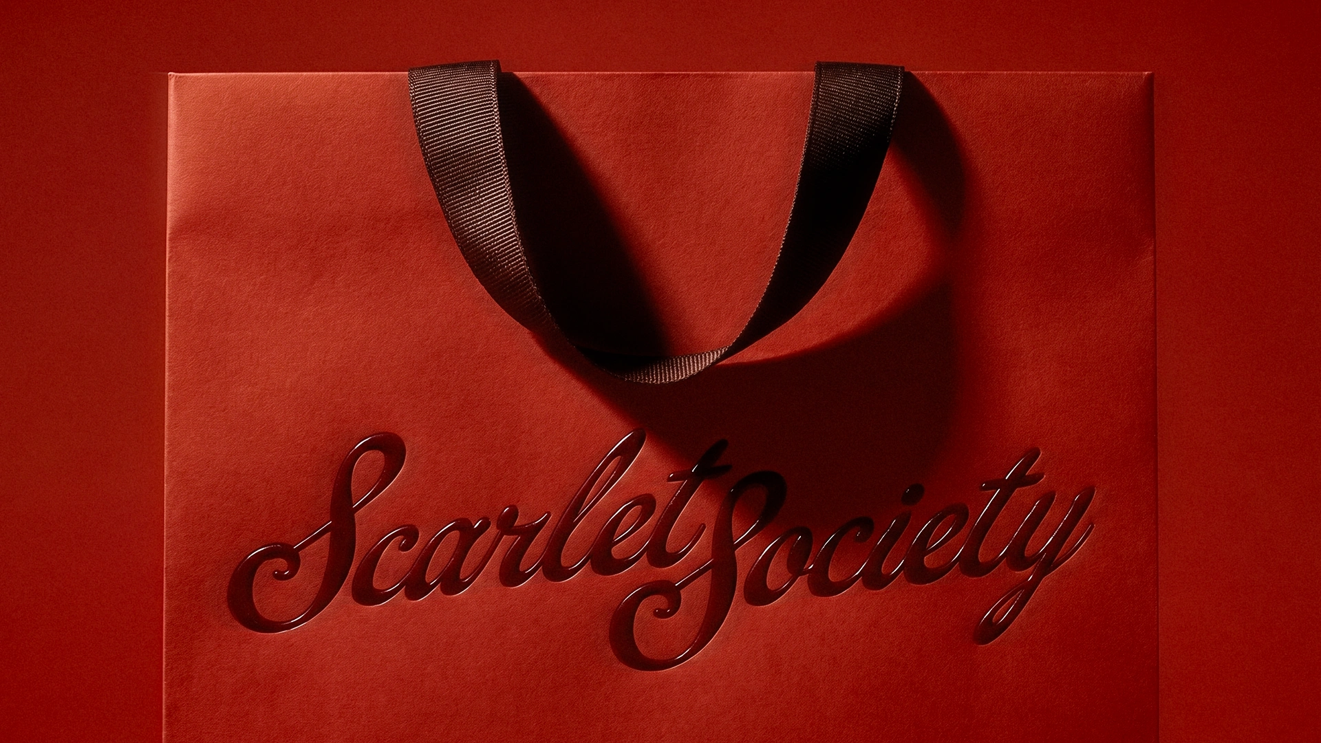
A packaging system designed to feel like an experience, not just a container
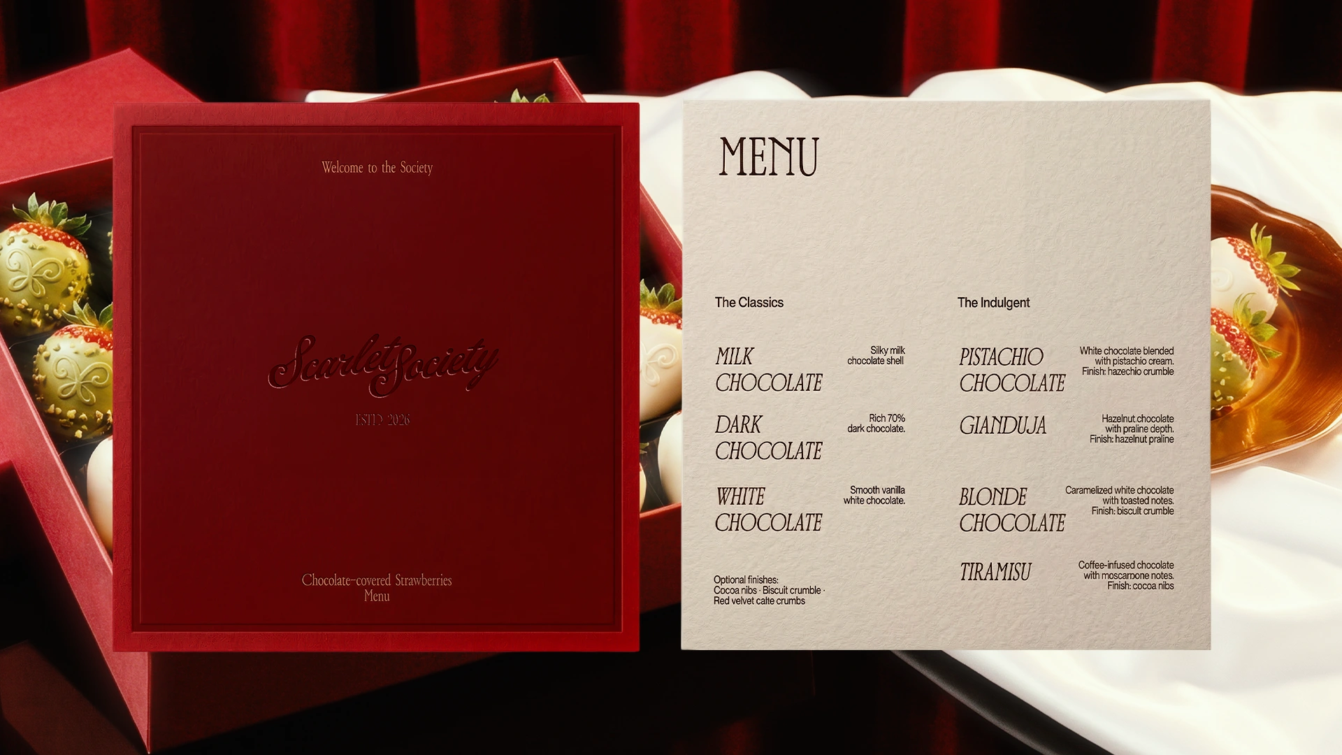
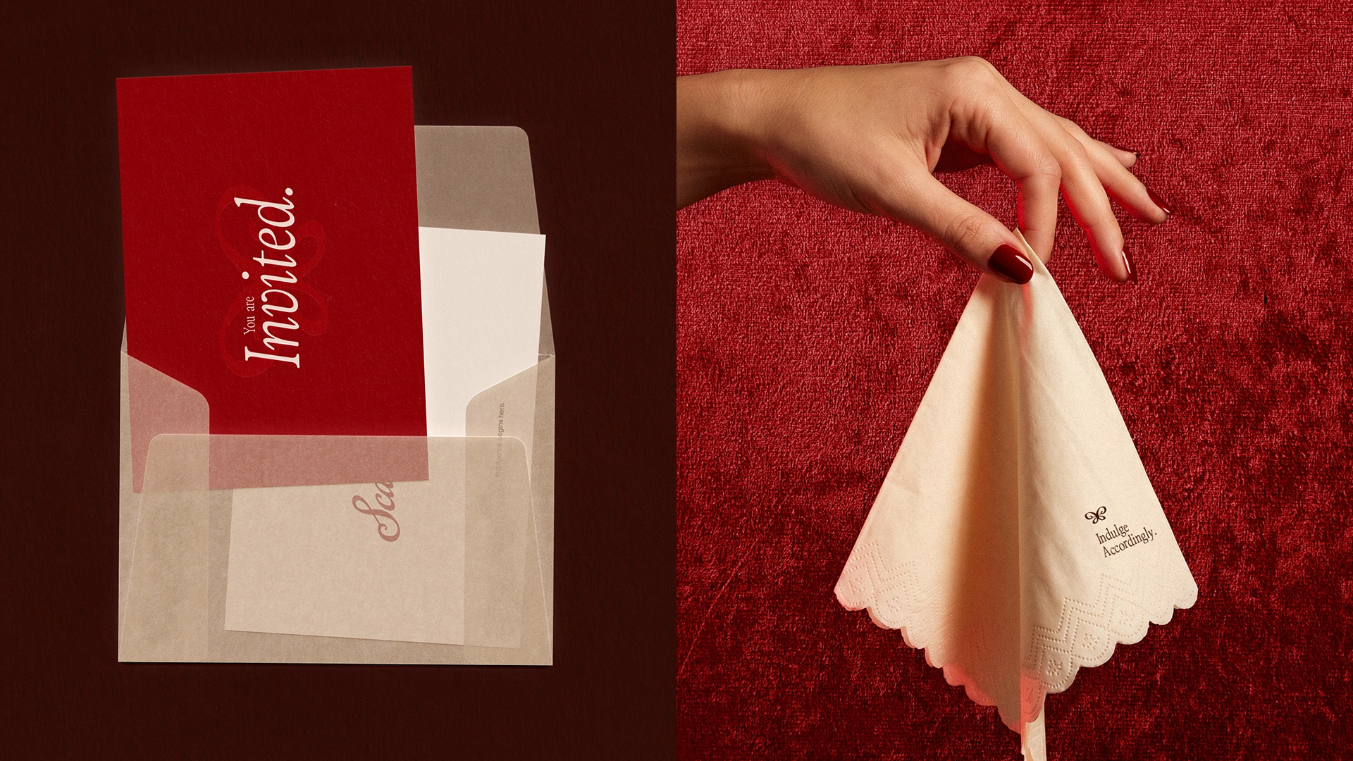
The brand extends across multiple touchpoints, including menu design, invitation cards, thank-you cards, and product packaging, all working together to reinforce a consistent and immersive identity.
Through this system, Scarlet Society transforms chocolate-covered strawberries into a product that feels premium, intentional, and worth indulging in.
About me
I’m Mariyam, a brand designer working across brand identity, packaging, and art direction.
I focus on building brands that feel intentional and distinctive.
Scarlet Society explores how a simple product like chocolate-covered strawberries can be elevated into a refined and indulgent brand experience through thoughtful design and storytelling.
Like this project
Posted Apr 14, 2026
A modern dessert brand reimagining chocolate-covered strawberries as a premium and indulgent experience.