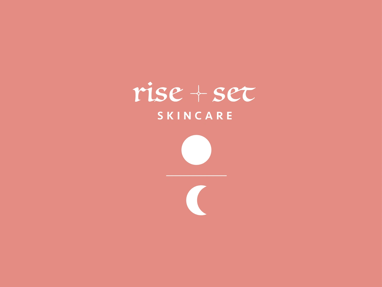
Brand Identity for Rise + Set Skincare
Alison Chan
About
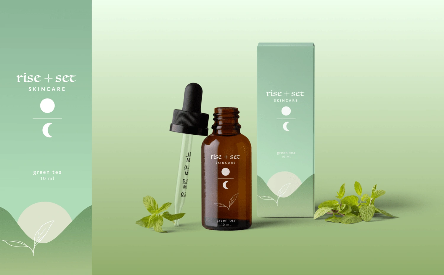
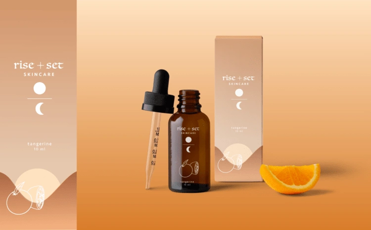
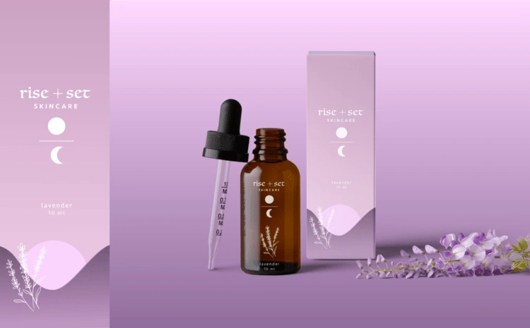
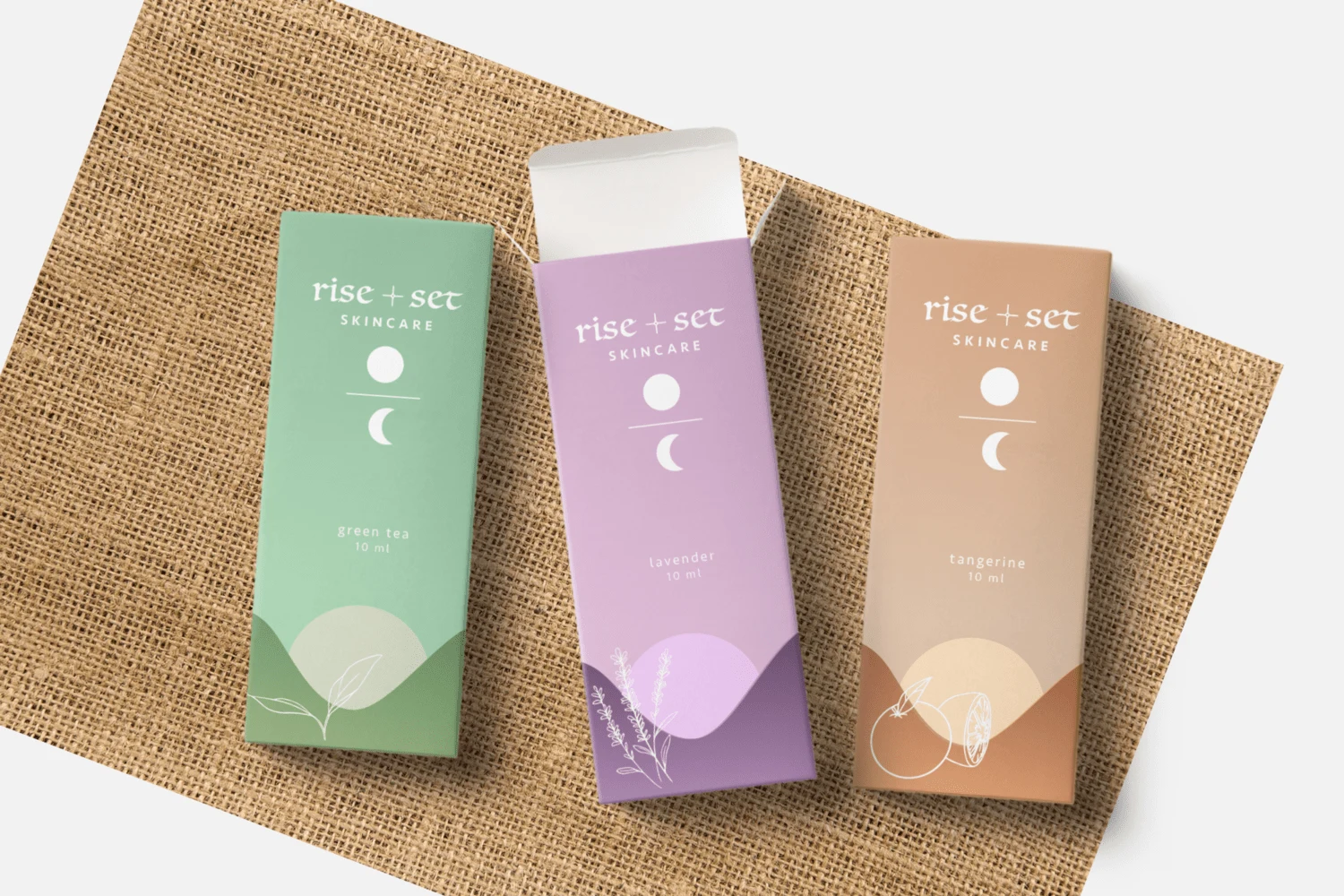
Is a holistic approach to skincare that prioritizes clean, fresh ingredients to help you reset and prepare for the day ahead. Grounded in the belief that skincare should be simple, effective and uplifting, Rise + Sun skincare offers a range of products meticulously crafted to rejuvenate your skin while invigorating your senses.
Project Overview
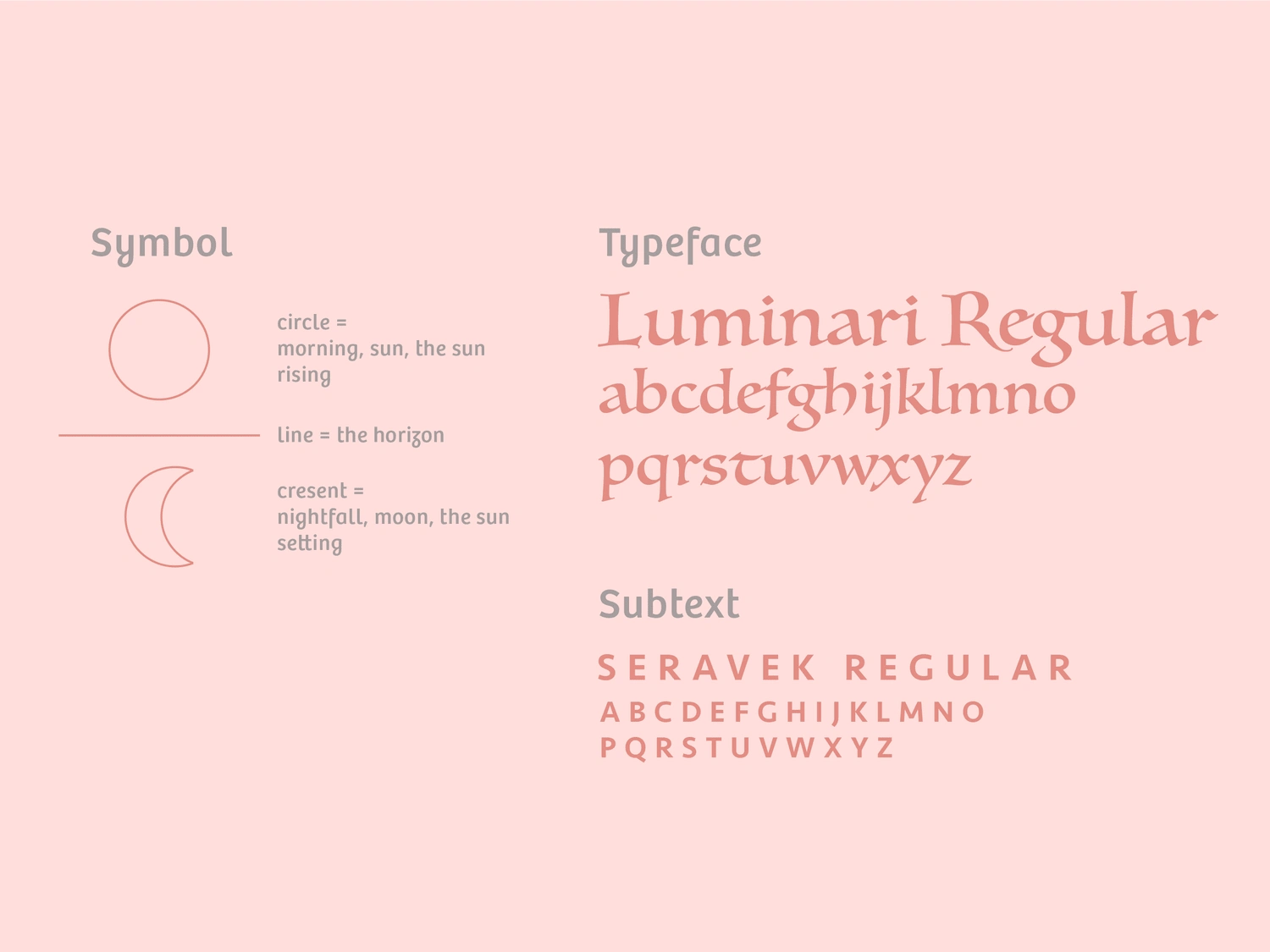
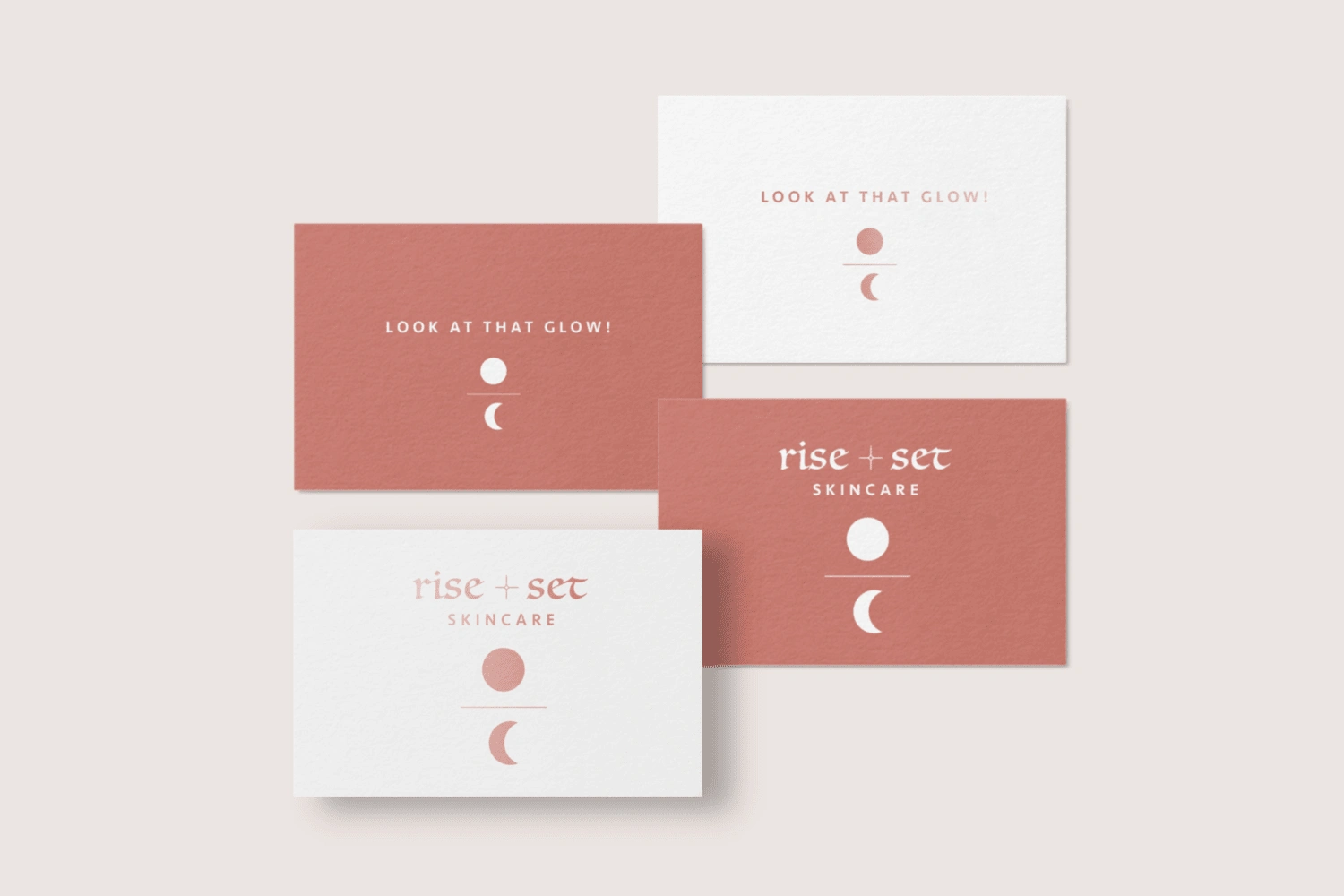
For this skincare brand, I wanted to shape the visual identity around its name, therefore Rise + Sun skincare is inspired by the purity and vitality of nature. The logo features a clean, minimalist design with organic shapes based on the sunrise and sunsets, with the line in the middle representing the horizon line. The color palette is dominant by a warm shade of pink representative of sun’s warmth. The secondary colors are reflective of the commitment to natural ingredients and purity. Clean, uncluttered packaging designs further strengthen the brand’s ethos of simplicity and transparency.
Like this project
Posted May 8, 2024
Developed a brand identity for a skincare brand focused on clean and simple products.
Likes
0
Views
16