Pushpin Studios - Identity Design
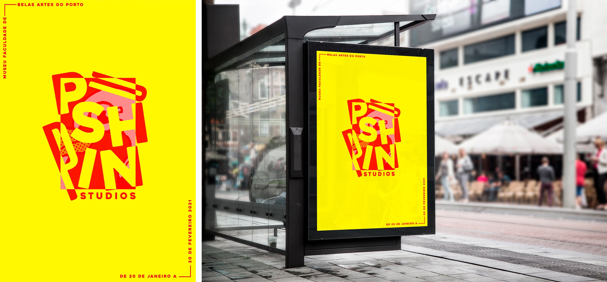
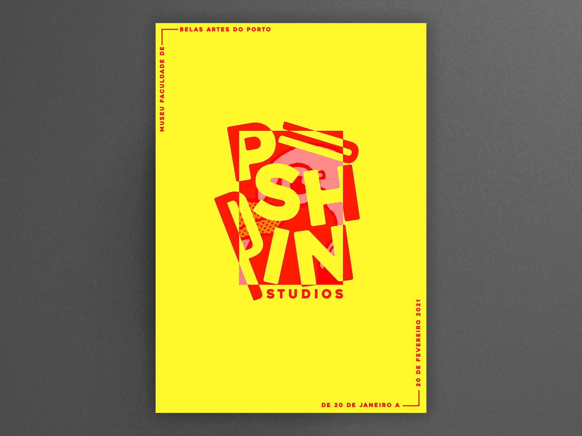
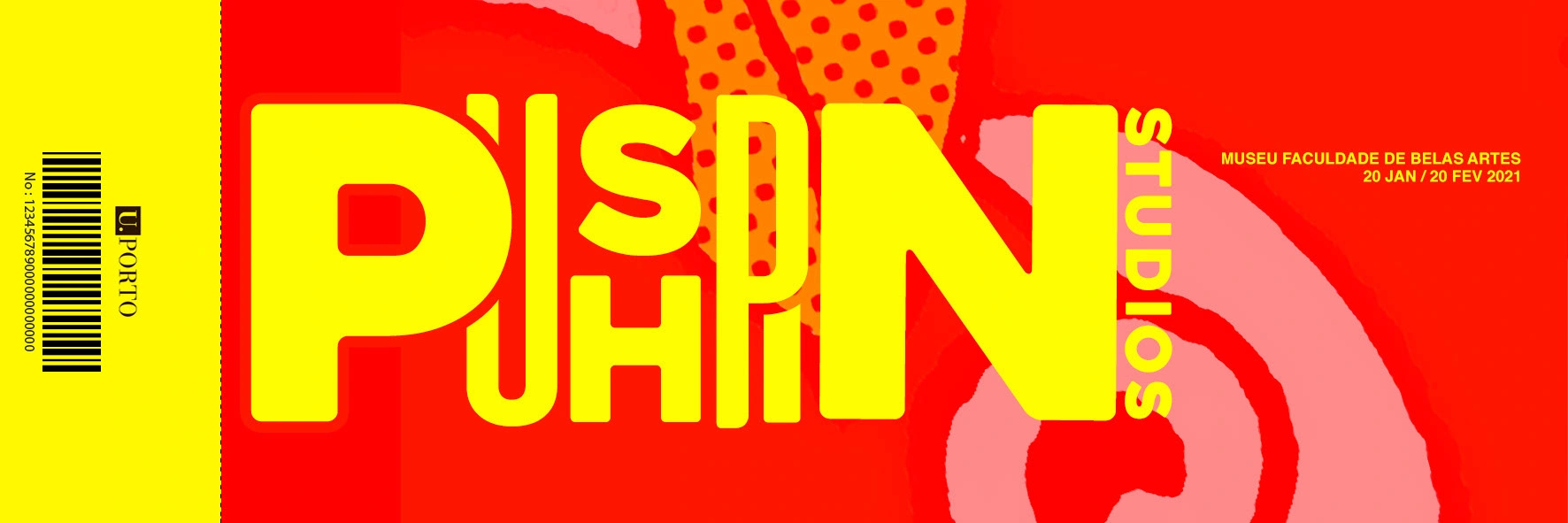
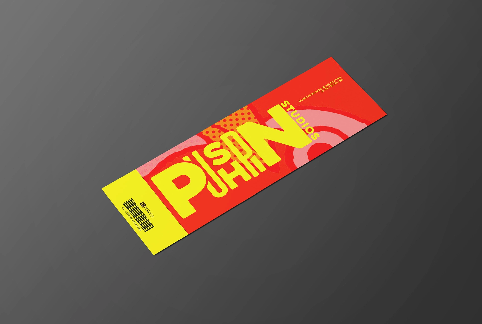
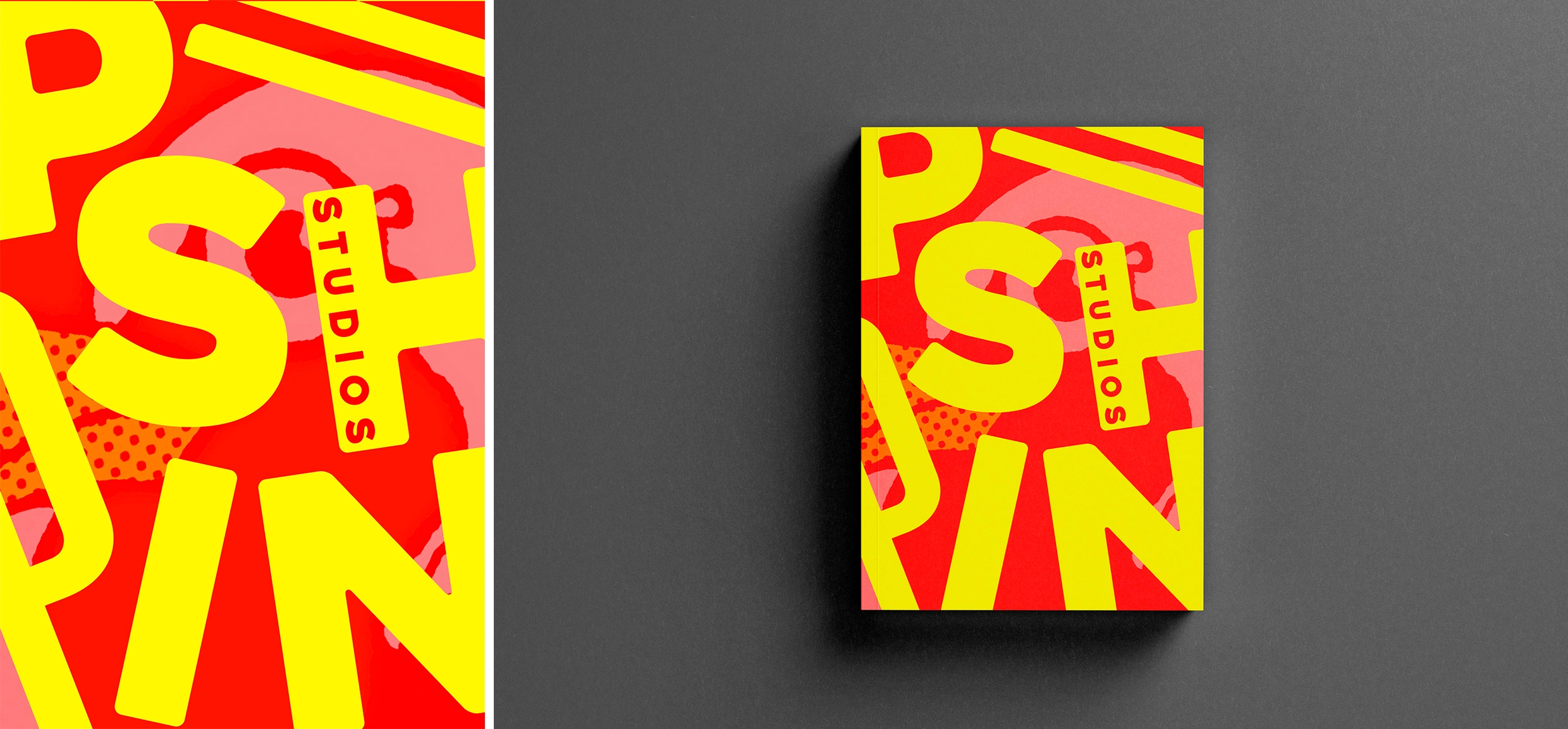
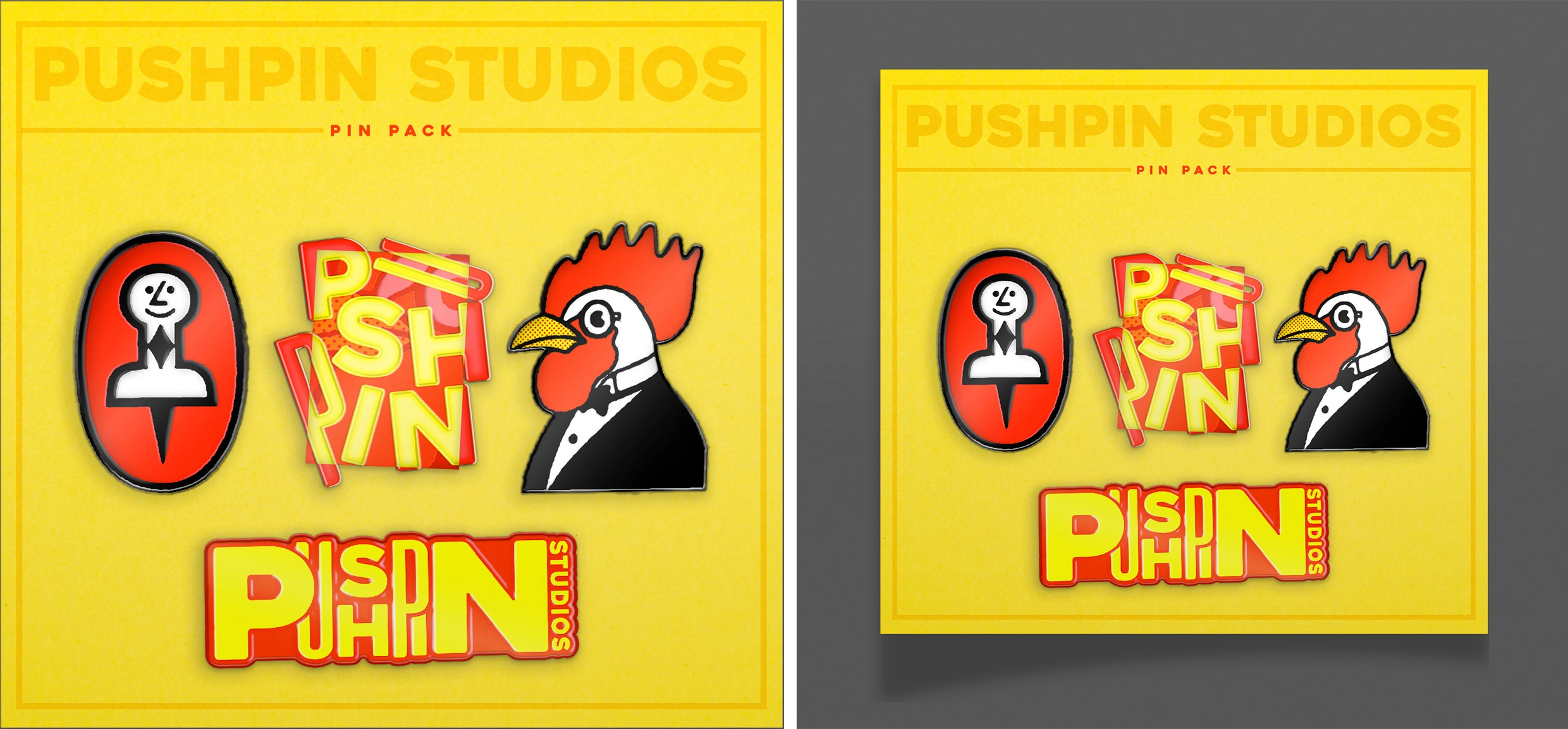
This project aims to promote an art exhibit of the Pushpin Studios artist collective, creating the design of a poster, an exhibit catalog, the ticket, and a promotional object.
To create these elements, I was inspired by the audacity and irreverence of the group's creations, using vibrant colors and the concept of "thinking outside the box". Since the artists in the collective were known for breaking the rules of design, I decided to create a graphic composition of the group's name that represented this resistance to conforming to a style, a technique, a category. The result is a title that literally spills out of an enforced box. The ticket and catalog follow the style of the poster, creating a cohesive branding aesthetic. For the promotional object, I created pins that reference the exhibition design and Pushpin Studios in general, and end up being in themselves a reference to the name of the collective.
This project was created as part of the Design II class of the 3rd year of the Communication Design degree of the Faculty of Fine Arts of Porto.
Like this project
Posted Aug 1, 2023
This project aims to promote an art exhibit of the Pushpin Studios artist collective, designing a poster, the catalog, the ticket, and a promotional poster.
Likes
0
Views
8

