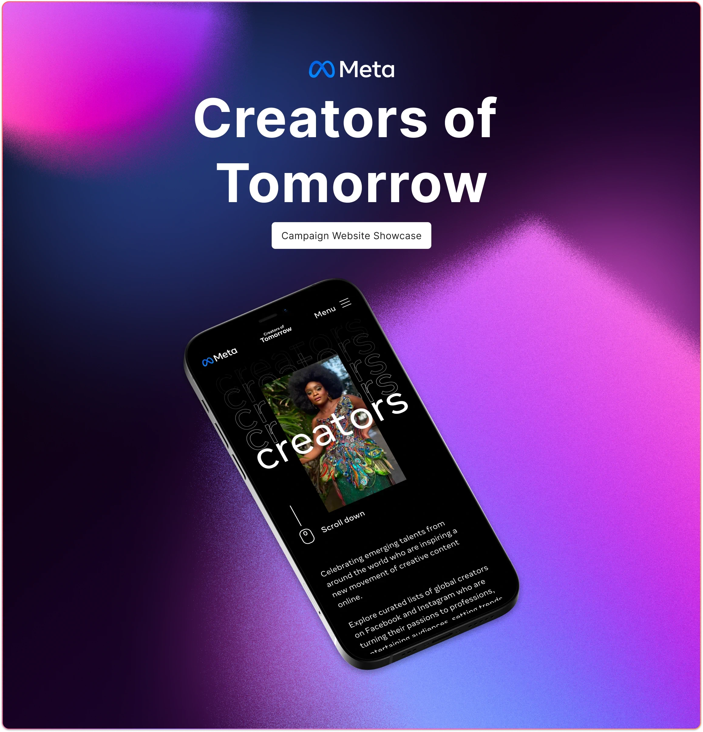
Meta: Creators of Tomorrow
Richard Nash
Introduction
Understanding problems
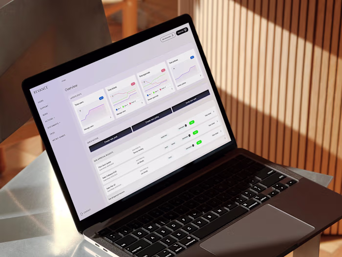
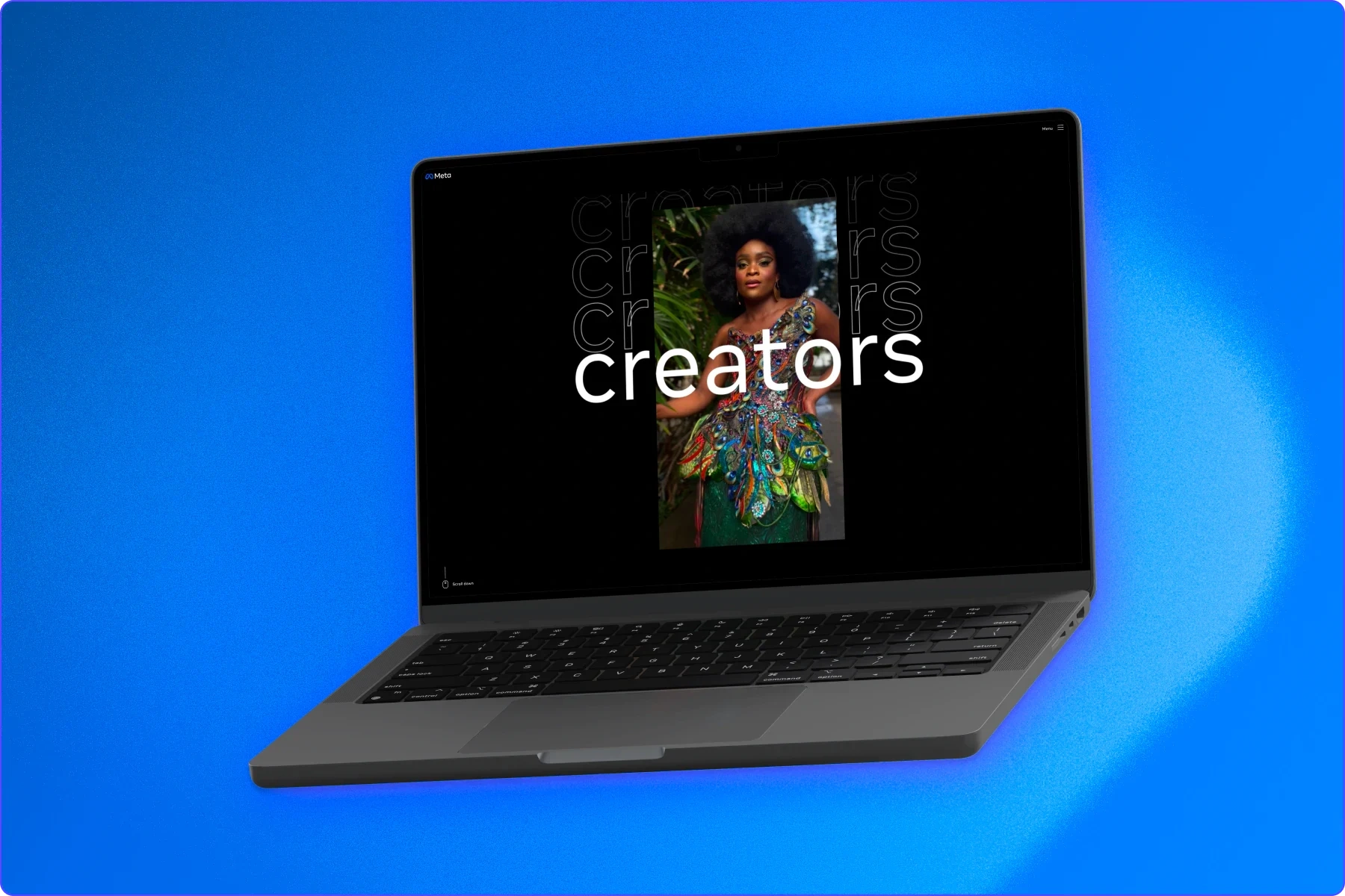
For Meta's 'Creators of Tomorrow' campaign, I helped design a mobile-first, multilingual platform spotlighting emerging social media talent across a variety of market regions, while artfully integrating partner agencies' visions and prioritising 'Reels' content.
Objectives
Functional usability
Language inclusivity
Content championing
Mobile-first design, that brings Meta's 'Reels' into focus
Design scalability for future languages and multiple geographical regions
Consistent brand messaging that allows the creators content to shine
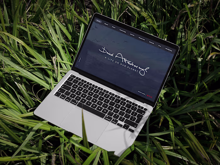
Meta's 'Creators of Tomorrow' campaign aimed to empower and highlight the emerging content creators on social media platforms. Focusing initially on the EMEA and APAC regions, the campaign showcased how these young creators are leveraging Meta's short-form video offering. The project had an international scope, requiring the campaign site to support multiple languages while maintaining a mobile-first approach. This allowed a diverse range of creators to share their stories and engage with audiences across different regions.
Design Process
A design thinking approach
By combining design thinking and agile methodologies, I empathise with users, define problems, ideate creative solutions, prototype, validate, and implement the best ideas. This iterative process ensures a deep understanding of user needs and efficient project execution, fostering collaboration and delivering exceptional user experiences.
1. Empathise
Gain a profound understanding of users' perspectives, needs, and challenges through research and observation, fostering empathy and generating valuable insights to inform the design process.
2. Define
Clearly articulate the problem or opportunity based on insights and analysis, synthesising the information to form a focused and actionable problem statement that guides the design process.
3. Ideate
Generate diverse ideas and concepts through brainstorming and creative thinking. Explore innovative solutions to address the problem or opportunity identified during the design thinking process.
4. Prototype
Transform ideas into tangible representations, using various tools and techniques, such as wire-framing and prototyping, to validate and iterate on design solutions through user testing.
5. Validate
Test and gather feedback on the prototypes to evaluate their effectiveness and alignment with user needs. Iterate based on insights gained to refine and improve the design solution.
6. Implement
Translate the refined design solution into a functional product or service, utilising the necessary tools, technologies, and resources. Ensure seamless integration and bring the design vision to life.
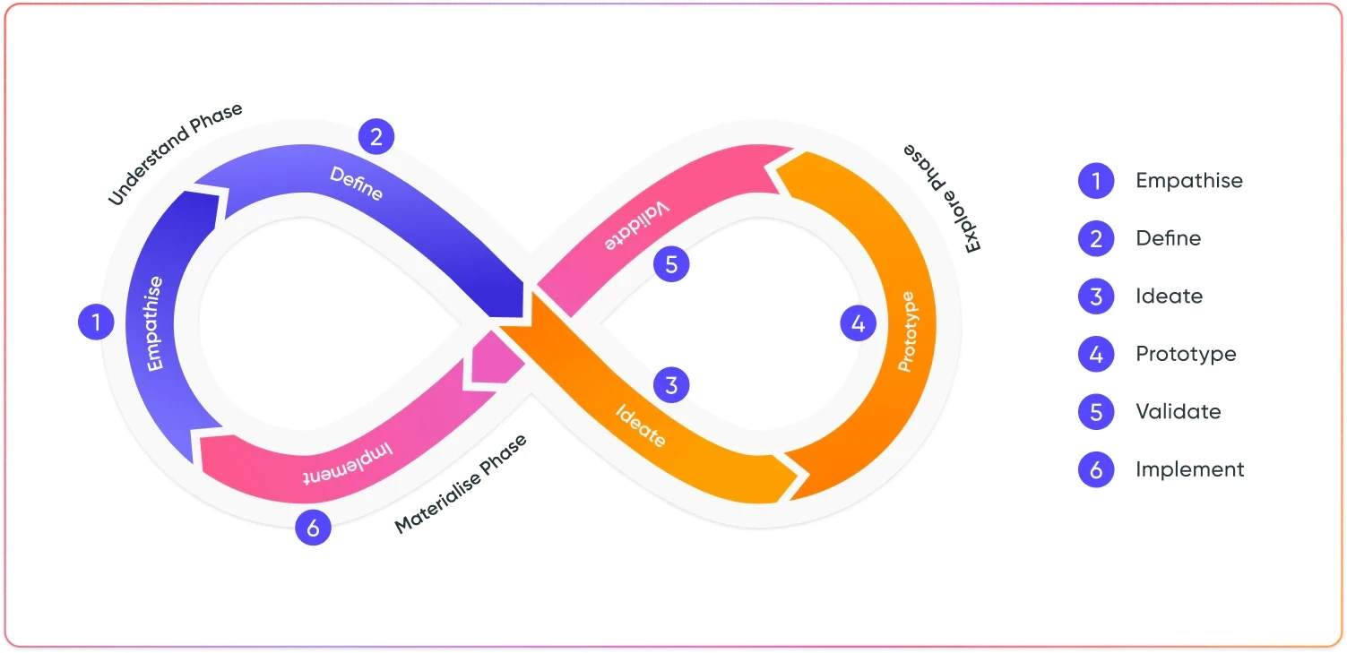
Diagram of the 'Design Thinking' approach to my agile design process
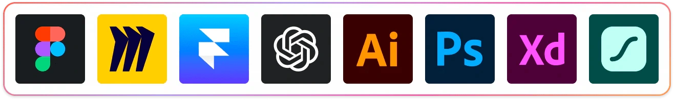
Tool stack
Using key tools like Figma, Miro, and Framer, I streamline workflows, enhance ideation, and create intuitive prototypes. Coupled with Typeform and ChatGPT for insightful user research, I deliver top-tier, user-aligned digital solutions, fostering innovation and impactful experiences.
Understanding Phase
Empathise with users and define the problems
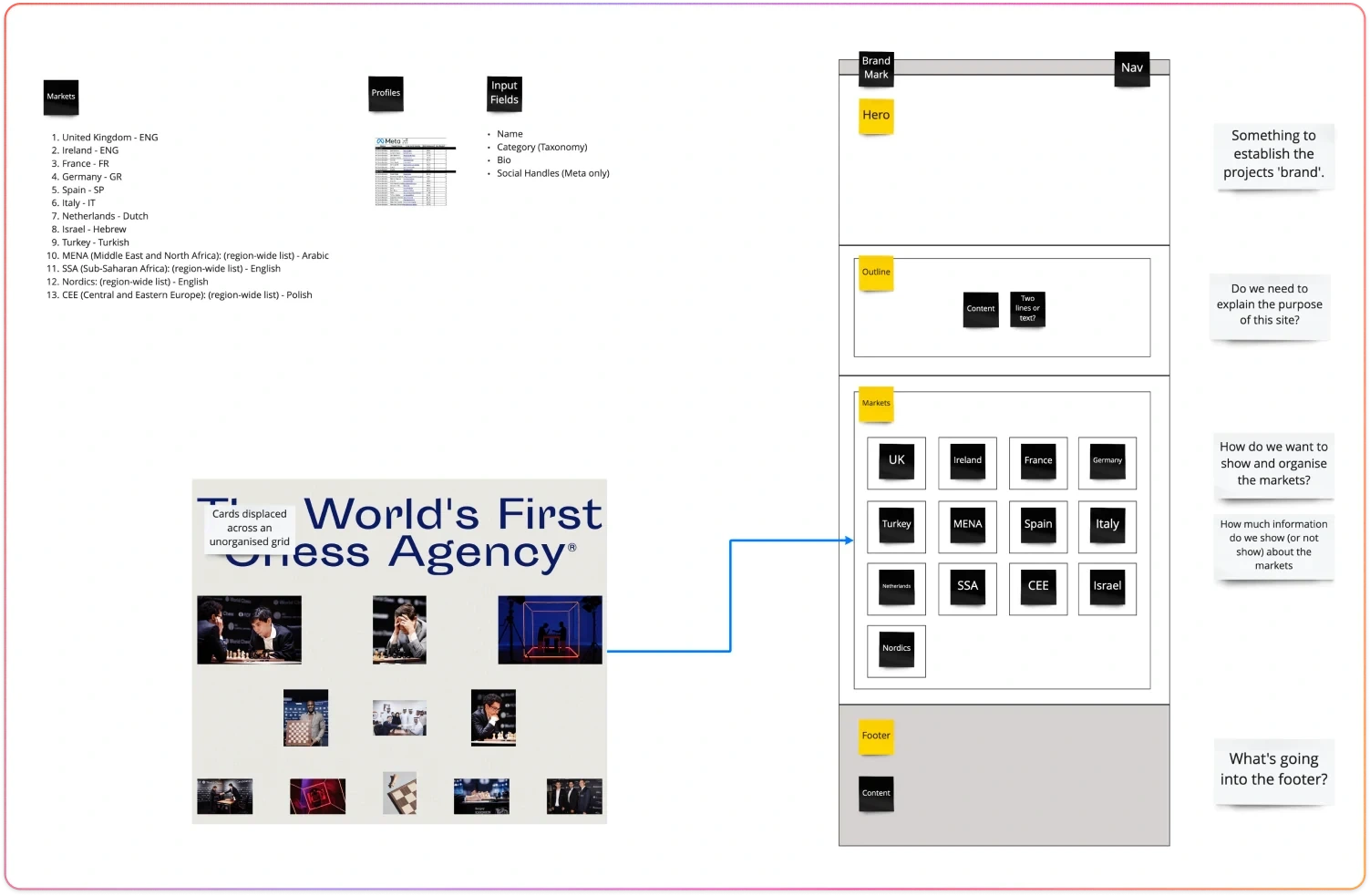
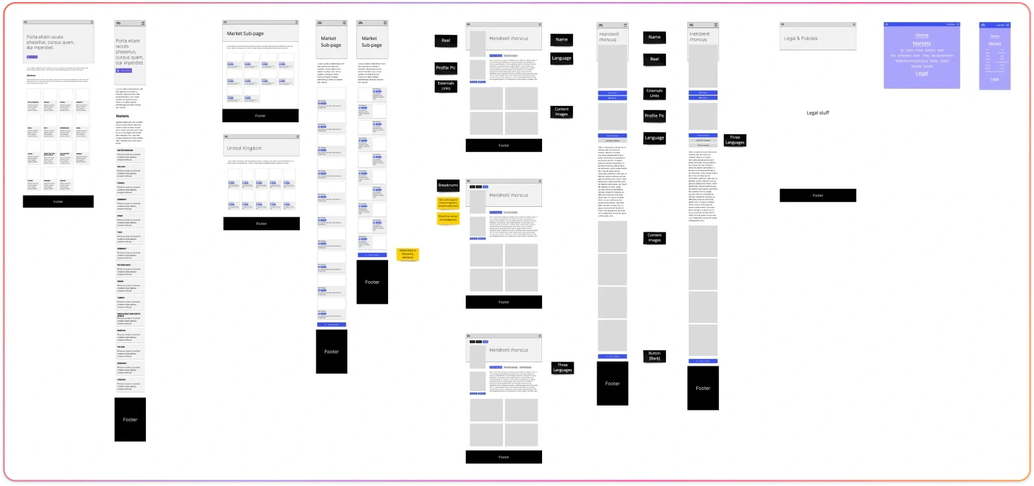
Our journey commenced with an immersive phase of workshops, interviews, and comprehensive discussions involving all stakeholders. The primary objective was to gain a deep understanding of the project's intricacies, including language considerations and specific elements that would shape the website's architecture and design.
To foster seamless collaboration among teams and partners, we harnessed the power of Miro, an innovative and intuitive collaborative platform. Through Miro, we engaged in rapid ideation, refining the information architecture and user flow. This visual collaboration tool facilitated cross-functional communication and enabled us to iterate on the design concepts effectively.
The rough flows and visual representations were then shared with Meta, allowing for valuable input, insights, and discussions. This collaborative process ensured that the design approach was refined, validated, and aligned with Meta's vision and requirements. By incorporating feedback from all stakeholders, we were able to create a design framework that addressed key challenges and provided a solid foundation for the subsequent stages of development.
This iterative and collaborative approach allowed us to leverage the collective expertise and insights of the stakeholders involved. It fostered a sense of shared ownership and alignment throughout the design process, resulting in a more refined and well-informed design solution for the project.
Explore
Ideate solutions and prototype
John Doe's creative team collaborated closely with Meta's team to develop the overall campaign brand. During this phase, our team actively participated in the process, offering valuable insights and guidance on how to translate the brand into the digital experience. We facilitated discussions around the opportunities and constraints that needed to be considered, ensuring that the branding elements could be effectively translated into the interactive experience.
One key aspect of our contribution was assisting in the translation of visual elements from the brand into the digital space. We explored different methods and approaches to ensure that the essence of the brand was captured and effectively conveyed. This involved experimenting with visual effects, motion design, and alternative techniques to bring the brand to life in the digital environment.
By collaborating closely with John Doe's team, we helped them navigate the challenges and possibilities of translating the brand into a compelling digital experience. Our expertise and understanding of the digital landscape allowed us to provide valuable insights and support in aligning the visual elements with the overall campaign objectives. The result was a cohesive and engaging digital experience that stayed true to the essence of the brand and resonated with the target audience.
While it was important to establish a definite brand for the 'Creators of Tomorrow' campaign, we also worked within the scope of Meta's defined style guides.
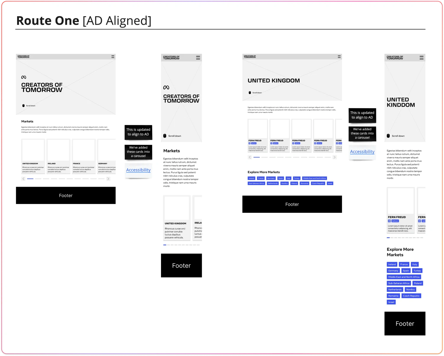
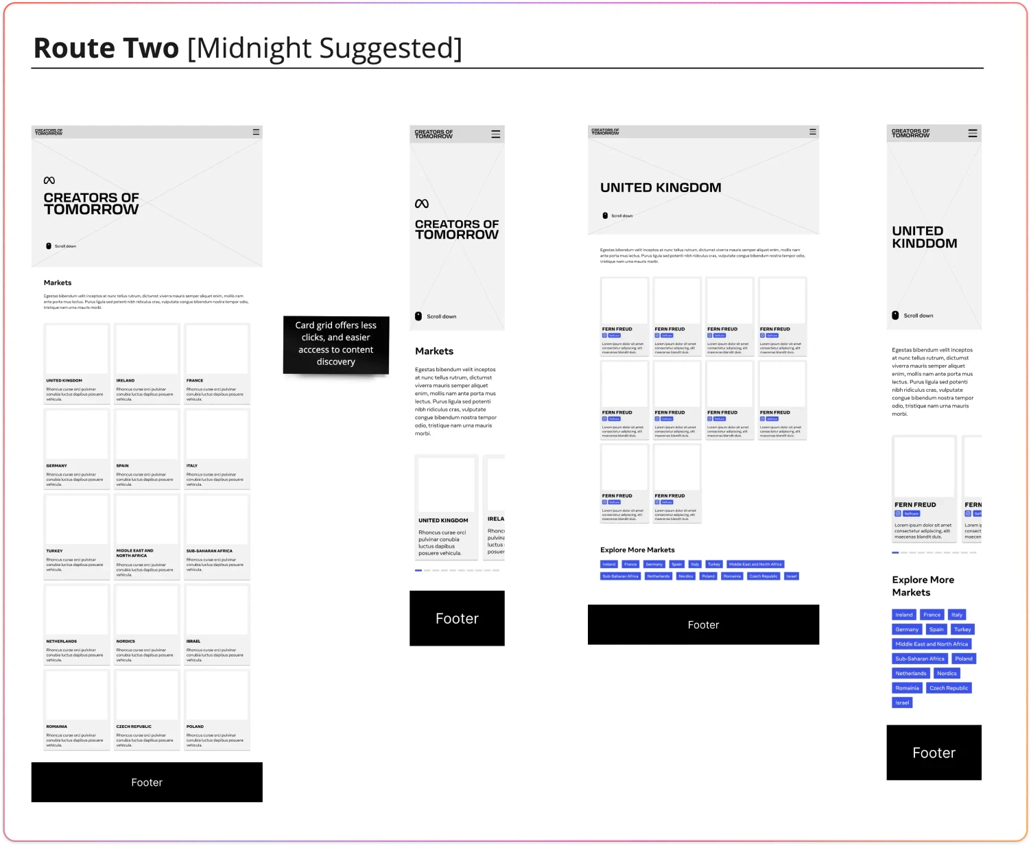
Iterating on the Experience
During the finalisation phase, we dedicated our efforts to refining the visual direction while simultaneously iterating on the user journey and overall flow of the website. It was essential for us to strike a balance between aesthetic appeal and functional usability.
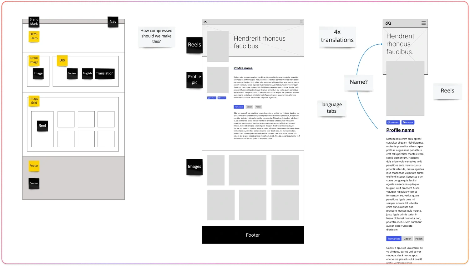
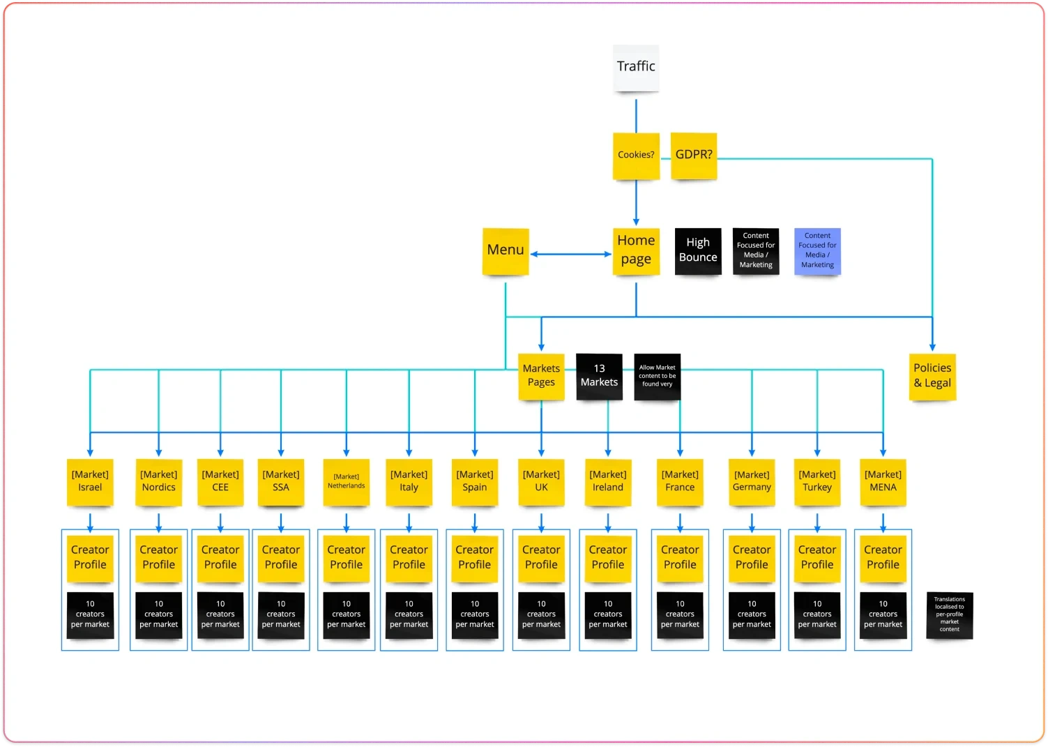
One of the key challenges we encountered was the need to accommodate multiple languages within a single, mobile-first campaign site. To address this, we delved into discussions with our partners to explore innovative solutions that would enhance the user experience across different languages. We recognised the importance of allowing users to seamlessly navigate and discover content regardless of their native language.
To achieve this, we proposed the inclusion of new interaction methods and intuitive features that would enable users to easily select and switch between languages. Our aim was to provide a simple and intuitive interface that would accommodate the addition of future regions and languages, ensuring the website's scalability.
Moreover, we wanted to go beyond mere language segmentation and create a more inclusive experience. We advocated for the implementation of discovery mechanisms that would allow users to explore creators across languages, bridging the gap between different language communities. By promoting cross-language interactions, we aimed to foster a sense of global connection and encourage diverse content discovery.
Throughout this process, we remained mindful of the mobile-first approach, ensuring that all design decisions were optimised for mobile devices. Our goal was to create a seamless and engaging experience for users, regardless of their preferred language or device.
By continuously refining our design concepts, engaging in fruitful discussions with our partners, and prioritising simplicity and accessibility, we were able to develop a solution that met the unique requirements of the multi-language campaign site. The end result was a visually stunning, user-friendly platform that allowed users to navigate effortlessly across languages and discover creators from various regions, fostering a sense of inclusivity and connection in Meta's 'Creators of Tomorrow' campaign.
Visual Experience
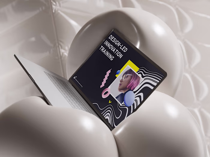
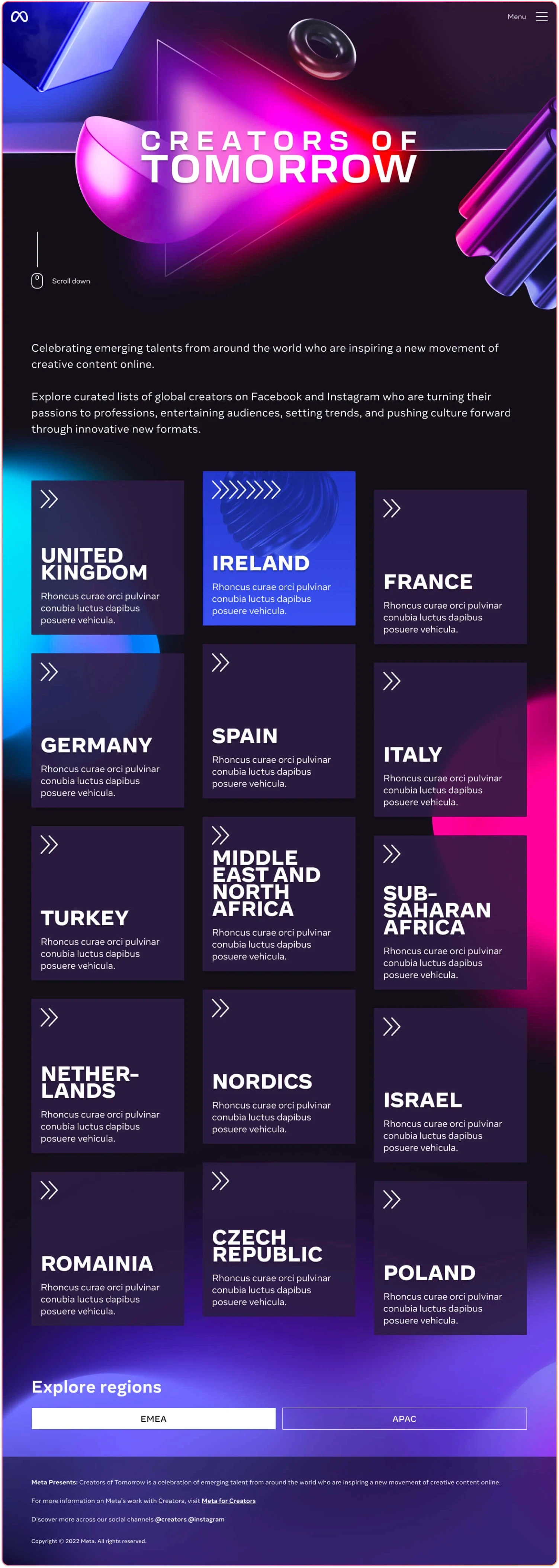
The campaign's visual direction was deeply influenced by concepts of futurism, manifesting as a palette of bold, contrasting colours, gradients, and shapes that intertwined to form captivating patterns. The intentional use of "play button" motifs was a nod to Meta's Reel's branding, emphasising a consistent visual story across multiple platforms. To further elevate this aesthetic, 'glass' elements, echoing contemporary UI trends, were incorporated into various card designs.
John Doe's design team, wielding Adobe Illustrator, embarked on crafting this visual journey, taking cues from the themes of 'forward motion' and 'momentum'. Their designs, abundant in gradients and shapes, incorporated patterns designed to emulate movement. The aim was clear: to captivate the user and drive the brand's message home. However, some elements, such as the intricate 'Creators of Tomorrow' logo, while visually striking, posed technical challenges. Its intricate design indicated potential limitations in usability and versatility.
Transitioning from these Illustrator mock-ups to a tangible, functional user interface was not without its hurdles. The captivating visuals of the initial designs didn't always translate seamlessly into operational layouts. Collaborating with John Doe's designers, we delved into the task of reimagining these designs in Figma. Occasionally, this meant that we had to recalibrate the original concept, ensuring a balanced marriage of visual charm and functional utility.
Acknowledging that Meta was not fully satisfied with the initial branding and visual design work, we found ourselves at a crossroads that prompted an essential recalibration. This feedback acted as a catalyst for multiple in-depth discussions between our teams and John Doe's design crew. Arriving at a consensus, we pivoted our focus towards creating a design that was both clear and user-accessible, aligning more closely with Meta's expectations.
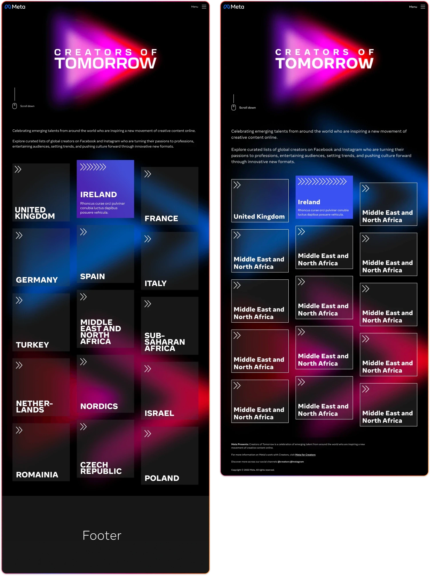
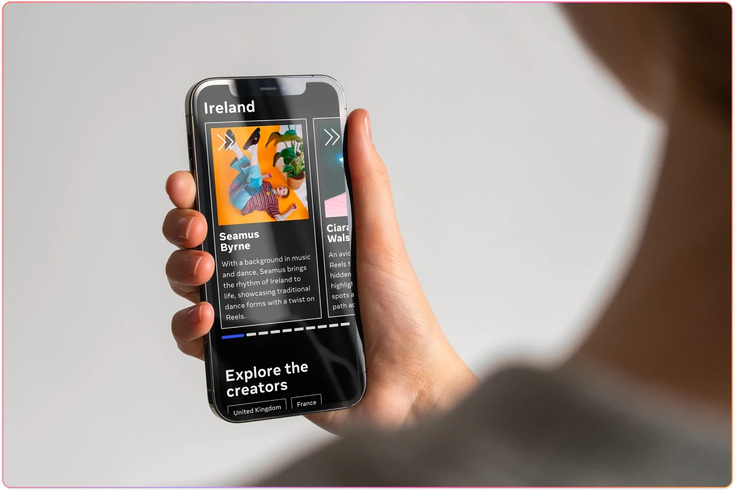
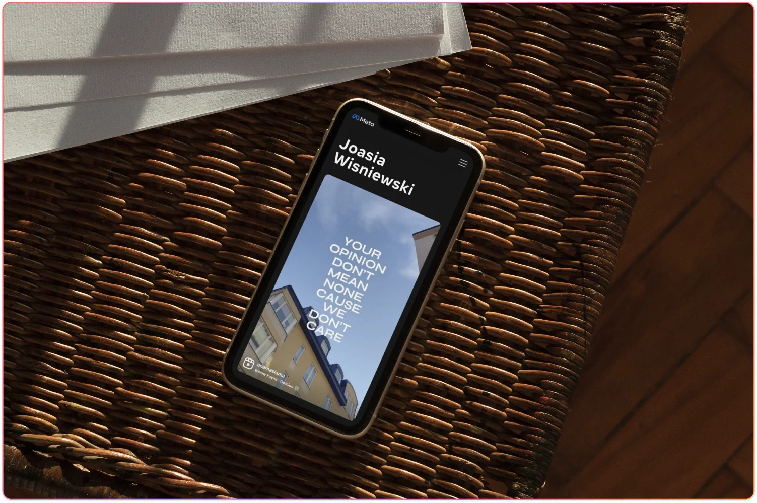
This crucial turning point led us to champion content over complexity—emphasising the creators' work as the campaign's true hero. While the title hero cards were simplified, they still retained a layer of engagement through carefully considered motion designs. These subtleties offered a depth that enriched the user experience without overshadowing the primary content. As users transitioned to individual creator pages, our branding elements took a step back, making way for the creators' own work to be prominently featured. This marked transformation from an intricate, visual-heavy approach to a content-centric, streamlined design underscores our unwavering commitment to enhancing the user experience.
Navigating Design Roadblocks
The journey to establishing a cohesive visual direction was not without its challenges. While John Doe's initial design direction was comprehensive, it unfortunately didn't resonate with Meta's vision. This posed a significant setback given the time and resources already invested in that direction. The implications of this disagreement were felt deeply within the Midnight team, responsible for engineering the experience, as progress began to stall.
Recognising the urgency of the situation and aiming to break this deadlock, I took an initiative under Midnight's guidance. We set out to craft an unsanctioned art direction, intending not to reinvent but to facilitate constructive dialogue and alleviate the existing bottleneck.
While this unsolicited design direction wasn't ultimately chosen by Meta, its introduction served a pivotal role. It catalysed crucial conversations among all involved parties, enabling us to revisit and refine the visual direction. Through collaboration and revisitation, we arrived at the final visual narrative that embodied both the spirit of the campaign and the expectations of all stakeholders.
Advocating for User-Centric Design
During the formation of the campaign's visual identity, we encountered suggestions for modifications to the user experience. Originating from our partners, these suggestions raised valid concerns about the potential effects on user accessibility and the ease of discovering creators. The proposed changes threatened to diminish visibility for creators, especially for display sizes larger than mobile. This stood in contrast to our campaign objectives and primary performance indicators. Moreover, the risk of increasing user interactions, leading to potential friction, was a significant concern, as it could adversely influence both user experience and accessibility.
In response to these challenges, we initiated comprehensive discussions with Meta and John Doe. Armed with data and well-structured arguments, we advocated for a different approach. Our focus remained steadfast: ensuring a fluid user experience, boosting the visibility of creators, upholding accessibility standards, and reducing any unnecessary user steps. Our approach, backed by its merits, was eventually endorsed. This consensus not only validated our perspective but also aligned with the overarching project aims and our commitment to the user. As a result, the campaign resonated with its audience by effectively meeting its goals and fostering an inclusive experience for all users.
Materialise
Validate and implement
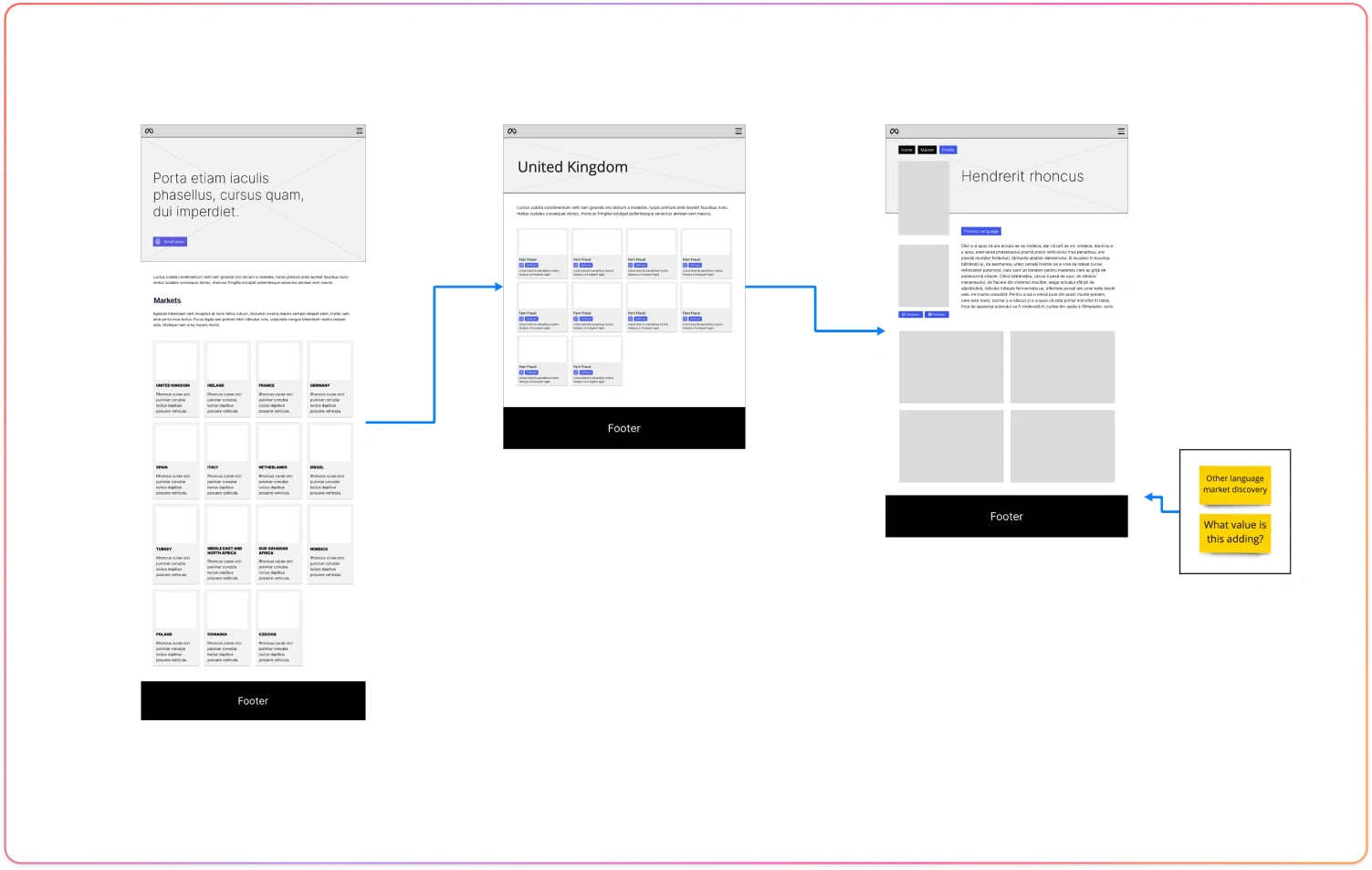
After extensive discussions with partners, Meta approved a final visual vision for the campaign. The decision was made to adopt a minimalist approach, removing excessive elements, colours, blurs, and logos. The primary objective was to create a clean aesthetic that would allow the content to take centre stage. To enhance the user experience, John Doe's motion designs were implemented to bring the pages to life. These subtle animations added a touch of dynamism and further enriched the overall experience, creating a sense of movement and engagement without overwhelming the content. The result was a visually compelling and balanced design that showcased the campaign's content in a captivating and user-friendly manner.
Conclusions
Outcomes and learnings
Combining the efforts of Midnight Studio, John Doe's team, and insights from Meta, we surmounted tight schedules and challenges, elevating our campaign to unparalleled heights. This collaboration highlighted the potency of combined expertise and open communication. Our journey showcased the resilience of our design process, emphasising the value of open dialogue and collaboration among designers, engineers, and content specialists.
Balancing brand aesthetics and user requirements amid the complexities of a multilingual approach was challenging. It wasn't merely about translating content but also embracing cultural nuances, ensuring relevance across various regions. This integration of brand vision, user-centred design, and regional sensitivity manifested our dedication to comprehensive, globally-attuned solutions. Feedback within Meta was overwhelmingly positive, with Adam Mosseri notably championing our project's success.
Retrospective
Reflecting on the campaign, several moments stand out, offering profound insights into our design methodology and approach. Initially, there was an eagerness to weave in various design elements. However, as the journey progressed, we realised that minimalism could be more impactful. This evolution in thought underscored the importance of adaptability in design. It's not merely about embracing trends but discerning when and where they align with the project's ethos.
One of the most significant insights came from standing up for the user journey. Confronted with requests to alter the user experience, we were put in a position where our principles were tested. The challenges posed by these suggestions were multifaceted, from potentially diminishing creator visibility on larger platforms to introducing navigational friction. Our response to these challenges was rooted in a rigorous evidence-backed dialogue with our partners at Meta and John Doe. The outcome of this dialogue wasn’t just an approved design but a reaffirmation of our dedication to user-centric principles. The lesson was clear: true design integrity sometimes requires advocacy, and evidence is a powerful tool when negotiating for the user's best interests.
Further, our discussions surrounding potential modifications to the user journey brought to light the essential balance between stakeholder requests and user needs. Advocating for the user became a testament to our commitment to design integrity. It's a delicate dance, ensuring alignment with the broader vision while safeguarding the user's experience, and this campaign only reinforced its significance.
The utilisation of tools like Miro and Figma, and the seamless transition between them, spotlighted the integral role technology plays in modern design. It's more than just a facilitator; it's an enabler that enhances collaboration and streamlines conceptualisation. The 'Creators of Tomorrow' campaign, in essence, was not just a testament to design prowess but a reflection of growth, adaptability, and the undying spirit of collaboration.
Learnings
The 'Creators of Tomorrow' campaign was a rich tapestry of experiences, underlined by key takeaways that continue to shape my design journey. Central to this was always placing the user at the heart of our decisions. While it's natural to be drawn towards the allure of visuals, true design essence lies in marrying aesthetics with the user's needs. This ethos was reinforced during discussions about potential changes to the user journey, reminding me of the paramount importance of the end-user.
Collaboration emerged as a crucial facet. The synergy between John Doe's team and mine exemplified how shared visions and combined expertise can elevate a project. It wasn't just about translating branding into the digital realm; it was about creating a shared narrative that resonated with the audience.
Adaptability was another cornerstone. As the project evolved, so did our approach. The transition to a minimalistic design highlighted our capacity to pivot and align with the project's evolving demands. Every phase, from ideation to execution, was underscored by empathy, serving as a constant reminder that understanding the user's journey is as essential as any design element.
Effective utilisation of tools, such as Miro and Figma, showcased how the right resources can enhance workflows, drive collaboration, and capture the intricacies of design. Above all, the campaign was a testament to the dynamic nature of design. It's a realm of endless horizons, constantly evolving user behaviours, and technological advancements. Every feedback, every iteration, and every challenge encountered is a stepping stone, propelling me forward in my ever-evolving design journey.
Thanks for reviewing this case-study. Checkout my other projects on Contra. User Experience can help business deepen their connection with users, helping to convert business goals. This drives engagement, develops retention, and improve revenues.
Like this project
Posted Sep 1, 2023
For Meta's 'Creators of Tomorrow' campaign, I helped design a mobile-first, multilingual platform spotlighting emerging creators from around the world.
Likes
2
Views
186