Basement Bar Logo
The Brief ✍️
A family member designed and installed a beautiful bar in their basement. For the finishing touch, they wanted to put up a sign, but couldn't quite find something that fit everyone's style. My job was to create a logo that could be turned into a sign that fit the style of the bar: simple and elevated.
The Process 💡
I had to design this logo to fit in a very specific place, so of course I had to visit the basement bar and learn more about the style they were going for. The bar incorporates a lot of black, white, and gold. It is a simple, elevated, and classic design. I knew typography could play a large role in getting that same feel into the logo.
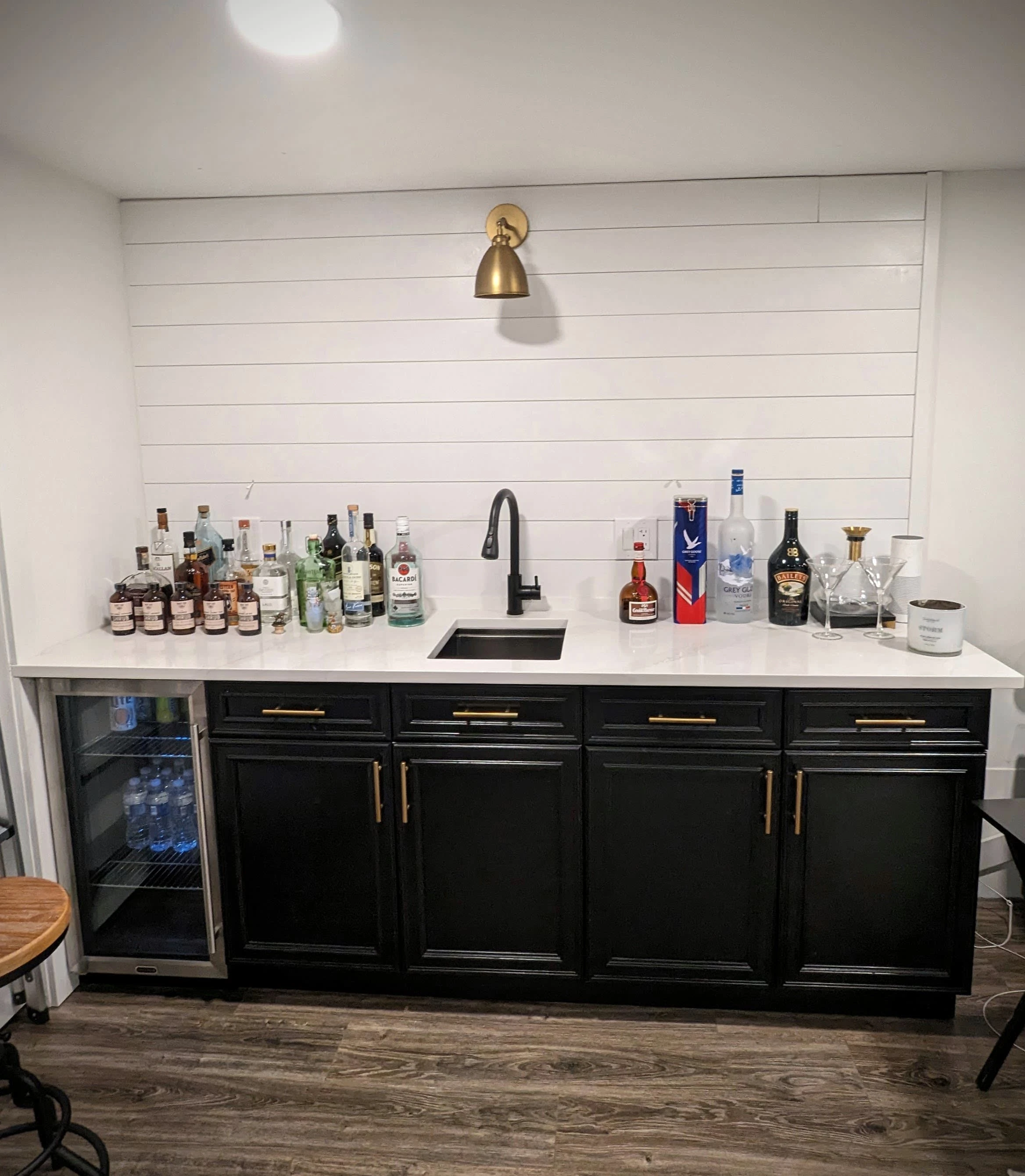
The basement bar, pictured above, while undergoing construction. Still to be added are floating shelves for the liquor.
After seeing the vision for the bar, I began brainstorming some possibilities for logos. I really liked the idea of using an existing typeface and manipulating it to make it have a bit more personality, after all, it is for a bar. I brought some of my logo ideas to the owners and got their feedback.
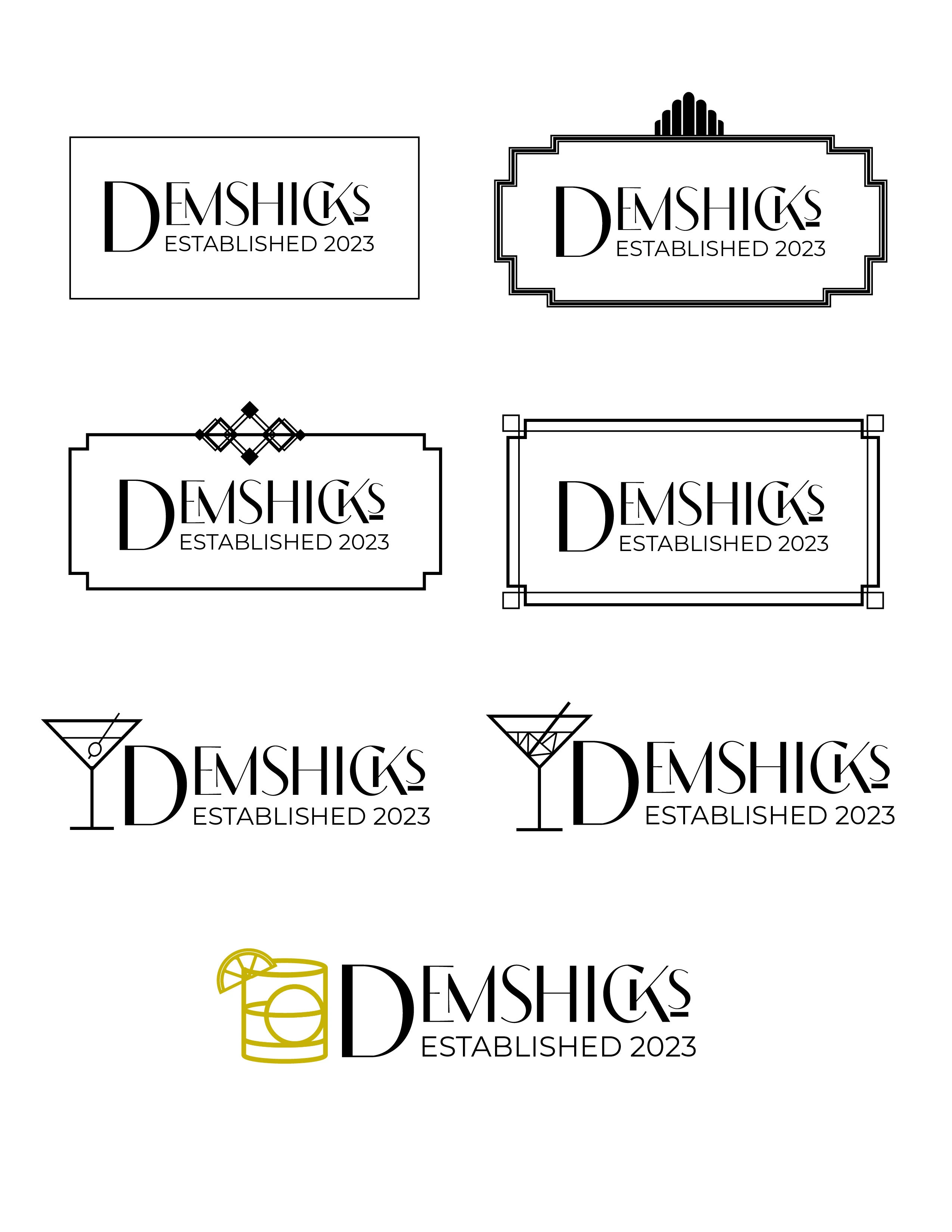
Here are some of the logos I came up with during the brainstorming process. A variation of the bottom logo ended up being chosen.
The Design ✨
I knew I wanted to incorporate some sort of cocktail into the logo. Starting with a martini, I quickly pivoted to an old-fashioned, the new bar owner's favorite.
Inspired by the black, gold, and white color scheme of the bar, I immediately thought of The Great Gatsby and Art Deco design. I chose a typeface that had some remnants of this style but also brought the logo into the modern day.
Below you'll see the final logo we landed on and of course, some alternate logos because why not?!
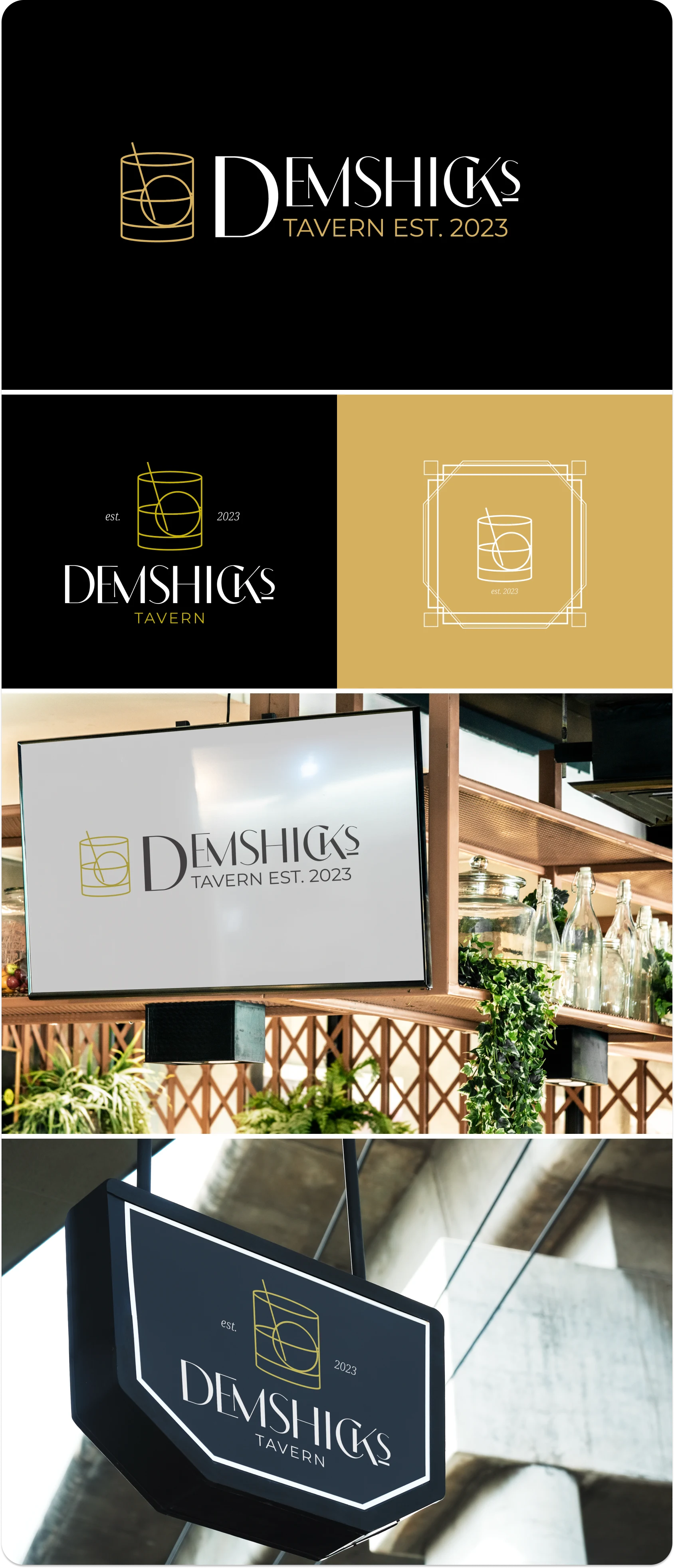
The logo suite I designed for the basement bar and some mockups. Mockups: Images by rawpixel.com on freepik.
🎥 And of course, a basement bar needs a promo video too! (see below)
Thanks for checking out my project. Have any questions, feedback, or a project you'd like to work with me on? Please feel free to reach out on Contra! Thank you 😊
Like this project
Posted Oct 13, 2023
Logo Design | Branding | When someone you know puts a bar in their basement and you decide they need a whole logo suite... and a promo video 🤷🏻
