CVS App Welcome Message Redesign
Ian Richards
CVS App Redesign
Overview
As part of the CVS app redesign, I led a comprehensive user test focused on optimizing the welcome message. The goal was to strike the right balance between personalization and user comfort, while ensuring the message aligned with our brand’s tone and business objectives. This case study outlines the process of narrowing down message options, running user tests, and providing both quantitative and subjective feedback to inform the final decision.
This case set the tone for future content personalization initiatives across the CVS app. It became a framework for balancing emotional impact, technical feasibility, and brand identity—and continues to shape how we think about meaningful microcopy in healthcare.
The Challenge
The welcome message is the user’s first interaction with the app, making it a critical touchpoint for creating a personalized experience. However, leadership had ongoing concerns about addressing users by their name, as this could potentially trigger privacy concerns or negative emotional reactions.
Balancing a friendly, personalized approach with user comfort and brand consistency became a major challenge.
Additionally, leadership often changed their opinions on how the message should be framed, adding to the complexity.
How to deliver a personalized greeting that feels welcoming without breaching user comfort zones.
How to test user sentiment around personalization while ensuring alignment with business objectives.
My Role
As the lead content designer on the project, I:
Developed and curated a series of four potential welcome messages from a broader set, each tailored to strike different tones (from highly personal to more neutral).
Designed and conducted a user test involving 60 participants, aimed at understanding their preferences and emotional reactions to each message.
Analyzed both quantitative data and subjective feedback to ensure the final message aligned with user sentiment, our brand, and business goals.
Navigated multiple leadership shifts and kept the project on track despite changing opinions on the direction.
The Process
We initially created a broad range of welcome messages, but after several iterations, I narrowed them down to four options. These ranged from a highly personal message using the user’s first name to more neutral messages, which relied on pronouns like “you” and “your.” Each option was carefully crafted to test different levels of personalization.
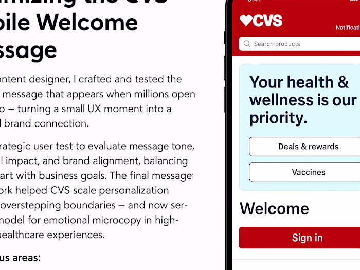
“Your health & wellness is our priority” – professional, steady
“Here to help you feel your best” – warm, slightly softer
“We’re in this together” – communal, inclusive
“Health & wellness is a team sport” – informal, motivational
I designed a study involving 67 participants, asking them to select their preferred welcome message. Beyond preference, participants were asked to reflect on how each message made them feel. The emotional component was critical, as we aimed to understand whether using first names fostered a positive connection or introduced discomfort. We also explored whether more neutral greetings felt personal enough to engage users meaningfully.
Specific questions included:
How did each message make you feel?
Which one made you feel most welcomed?
Did any message feel off or uncomfortable?
How does this message affect how you view CVS as a brand?
This gave us both hard data and emotional context — exactly what we needed to guide decision-making in a high-stakes tone debate.
Participants provided both quantifiable data (which message they chose) and qualitative feedback on why they made that choice. The goal was to understand how personalized greetings impacted emotional response, whether terms like “you” and “your” felt impersonal, and how each option aligned with users’ perception of the CVS brand.
Did it align with their expectations from the CVS brand?
Did it make them feel acknowledged or cared for?
We tracked both the numeric results (which message was selected most) and the emotional drivers behind those choices.
One challenge was the app’s ability to load personalized messages promptly. Backend delays meant that highly personalized greetings, especially those using first names, could result in a noticeable lag, disrupting the user experience. To address this, we tested whether more neutral messages, which didn’t require as much backend processing, could still deliver a warm, engaging greeting.
Throughout the process, leadership frequently changed their position on the ideal level of personalization. I navigated these shifts by presenting user feedback and technical insights, allowing leadership to make informed decisions that balanced user comfort, technical feasibility, and brand alignment.
After a VP raised concerns about the name-based greeting, I showed that 62% of nonbinary participants preferred the neutral message, which ultimately solidified the direction we would go in.
Results
To evaluate which message best resonated with users, I ran a preference test with 67 participants. Each participant reviewed five potential welcome messages and selected the one they connected with most.
The results were clear — users gravitated toward tone that was steady, supportive, and professionally warm. Here’s how the five message options performed:
Your health & wellness is our priority” received the most votes by far (38%), while the team-sport metaphor scored the lowest. Supportive and empathetic tones performed better than playful or overly broad messaging.
Emotional Impact of Welcome Message
We also asked participants to rate how much of an emotional impact their selected message had on them.
Their responses revealed the deeper power of language — and how something as small as a welcome message can shape perception.
How Much Did This Message Impact You?
A full 70% of participants said their choice had a very large or substantial impact — proving that language, tone, and emotion are tightly connected even in the smallest UX moments.
But impact didn’t stop at individual feelings. We also wanted to know if the welcome message could shape how users saw CVS as a brand.
The answer? A resounding yes.
Does the Welcome Message Affect Brand Perception?
76% of participants said yes — proving that small content choices can have outsized influence on trust, connection, and loyalty.
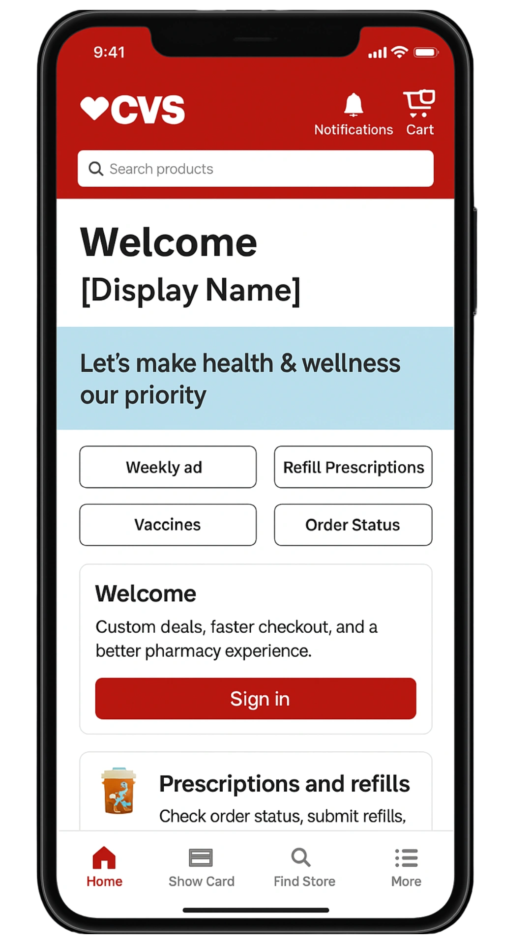
One of the four message options was chosen by 80% of participants, a clear indication of user preference. This message avoided first names, instead opting for a warm, welcoming tone that used neutral language without feeling impersonal.
The qualitative feedback revealed that many users felt uncomfortable being addressed by their first name, particularly when they didn’t go by that name in daily life. However, users appreciated the effort to make the message feel welcoming and personalized without overstepping personal boundaries.
By choosing a message that didn’t require heavy backend processing, we eliminated delays in loading times, ensuring a smooth user experience.
The results helped leadership make a confident, data-backed decision, ultimately aligning the message with both user sentiment and CVS’s brand strategy.
Key Takeaways
In a world obsessed with hyper-personalization, this project reminded us that true connection isn’t always about using someone’s name — it’s about how you make them feel.
I helped CVS choose a message that respected user identity, avoided technical delays, and made millions of people feel cared for the moment they opened the app.
It’s a powerful example of content design at its best: emotionally aware, data-informed, and deeply human.
Personalization is not always about using names; it’s about creating a connection that respects user identity while maintaining emotional comfort.
Managing backend limitations is crucial to delivering a seamless experience, especially when real-time personalization is involved.
User testing that combines quantitative data with subjective emotional insights provides a deeper understanding of how content choices affect the user experience.
This same framework—emotional testing, technical reality, and thoughtful content strategy—can be applied to onboarding flows, alerts, or even error messages. Wherever content shows up, users feel something. That’s the opportunity.
Like this project
Posted May 6, 2025
Led user testing for CVS app welcome message, balancing personalization with user comfort and brand alignment.