Rila | Branding & Visual System | 2025
Denis Constant
Rila | Branding & Visual System | 2025
Rila Studio is a solo creative studio specializing in the production of unique pieces that blend craft and digital. As the result of ongoing experimentation, Rila Studio masterfully sculpts a form of creative versatility that transcends boundaries—inviting us into new worlds, bridging manual techniques and cutting-edge technologies.
Being a solopreneur comes with its fair share of challenges: juggling multiple roles, becoming a true Swiss army knife, managing the studio and its communication… For the visual identity, the focus was on optimizing and systematizing the visual production process. In short, how do you keep a bold, consistent art direction across all your posts—without spending hours on each one?
Project Goals :
✨ A branding that reflects her creative process — blending craft and digital
🎛️ A flexible, modular visual identity that evolves with the studio
🔥 Full independence over her communication — optimized and automated
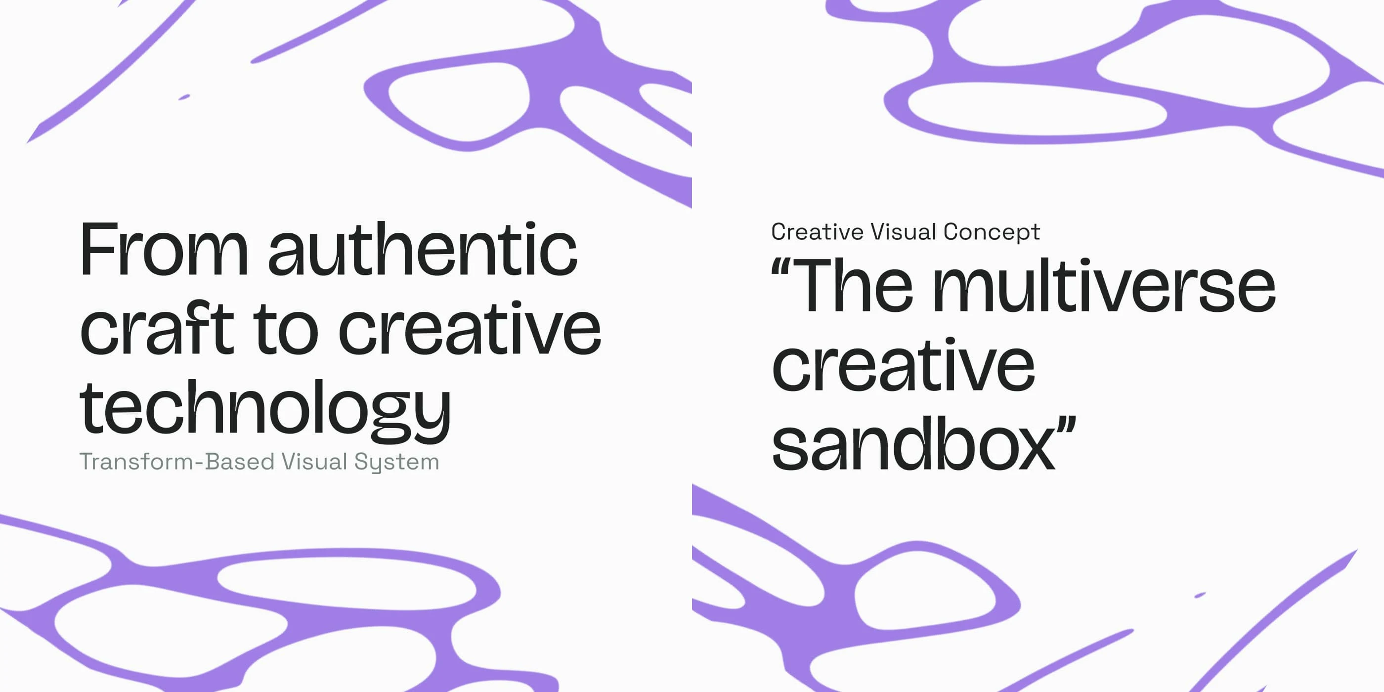
Creative Concept
Rilæ : The multiverse creative canvas
Constraints fuel creativity. For creatives, it’s essential to set a framework — especially when exploring and experimenting across a jungle of techniques and mediums. Rila is that starting point: a space to rethink and apply new ways of creating. Through her experiments, Rila precisely sculpts a creative versatility that fuses the best of both worlds: craft & digital.
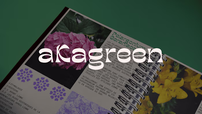
Starting from her own handwritten script as the cornerstone of her art direction, the result is a unique visual expression that embodies her personality and creative vision. This handwriting bridges craft and digital by becoming a custom typeface — a component ready to morph into a logo, pattern, icon, or illustration. These elements then come to life across every application: LinkedIn posts, Instagram visuals, product labels, packaging, stitch patterns… every touchpoint reflects the values of Rila.
Writing is, for me, the most enjoyable way to express myself. Every project starts with a blank page and a pencil… Putting my ideas into words, jotting down resources, exploring both the form and meaning of words to shape captivating creative concepts. – Rila
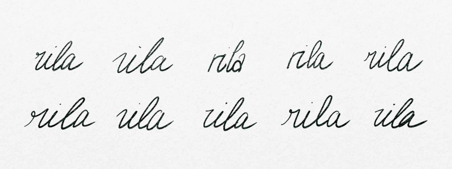
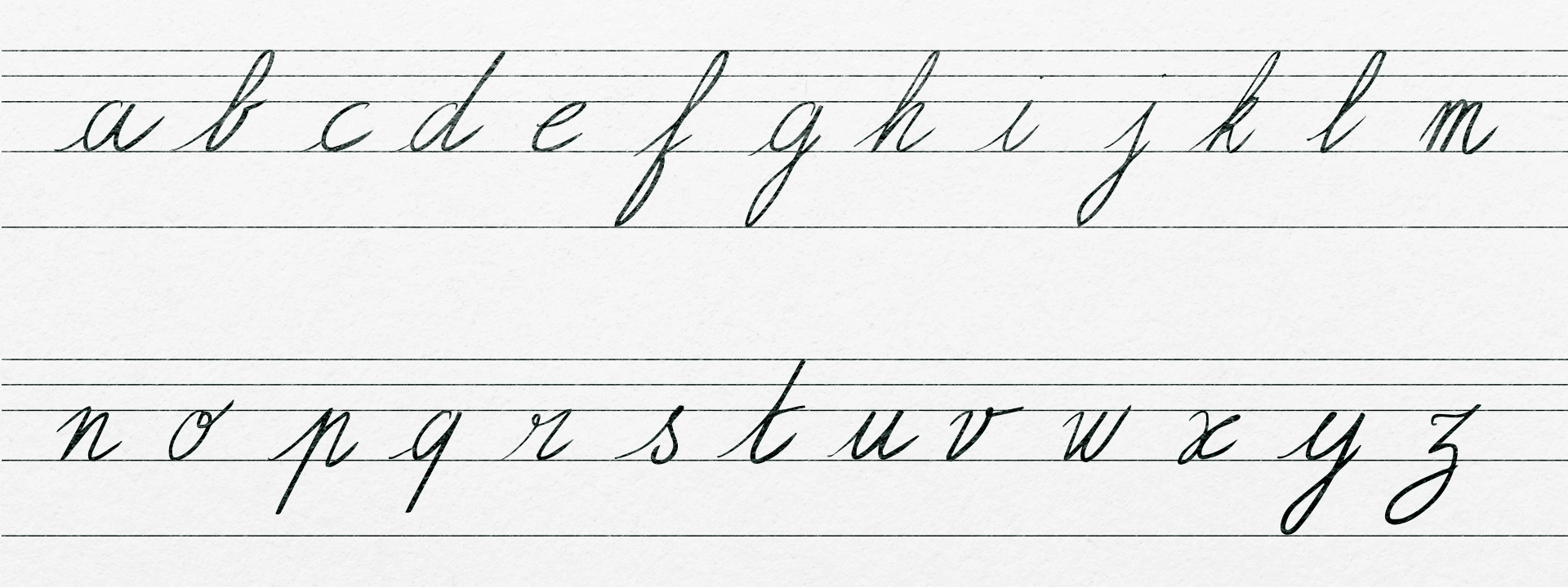
For a solo creative studio, the founder’s personality should shine through every single brand asset. By using her handwriting as a foundation, each visual output becomes a unique and deeply personal artifact.
We started with a hands-on creative workshop that felt like a return to childhood — writing out rows of each letter by hand. Then, each letter was scanned and cleaned up in Illustrator. With the Fontself tool, her handwriting was transformed into a fully functional typeface, ready to use in Blender.
Once the custom font was created, we imported it into Blender as the core visual element to build the entire visual ecosystem — patterns, icons, logos... Every 3D render was then brought into Figma to be applied across all brand touchpoints.
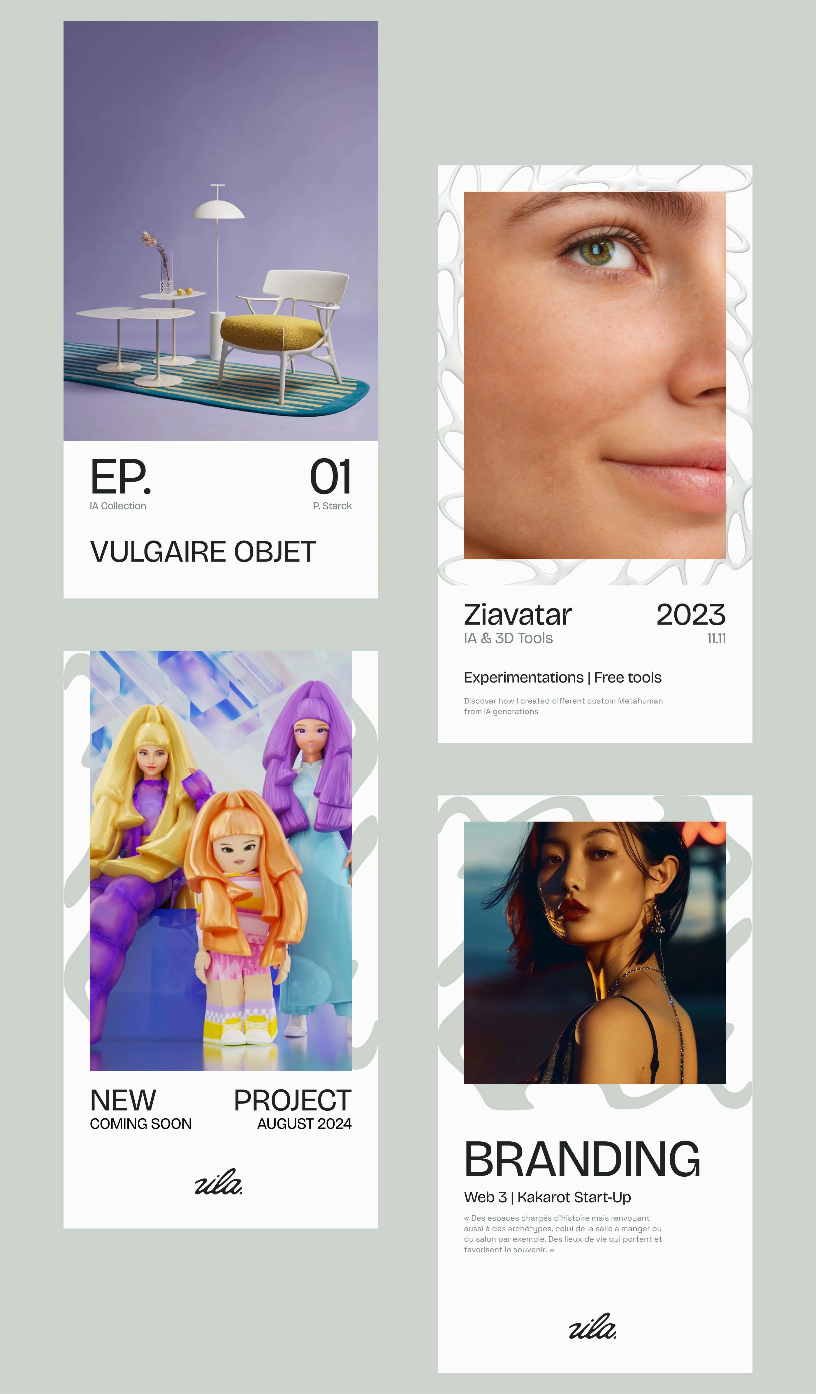
For her LinkedIn and Instagram visuals, we built a modular template kit that lets her generate content on the fly — while maintaining consistency and coherence throughout her brand.
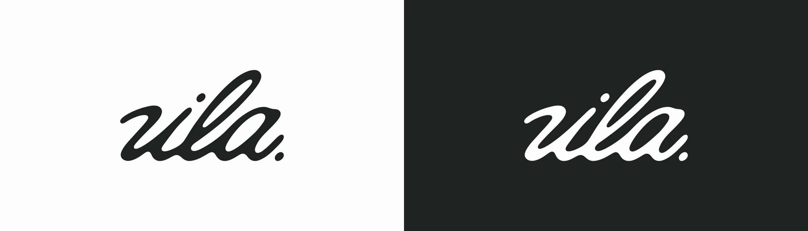
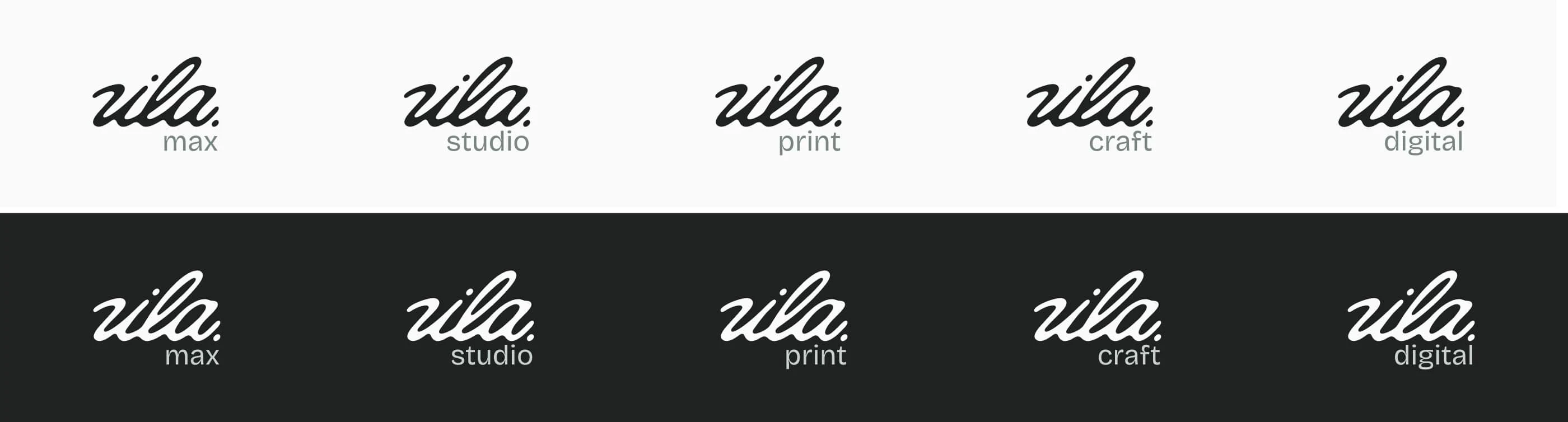
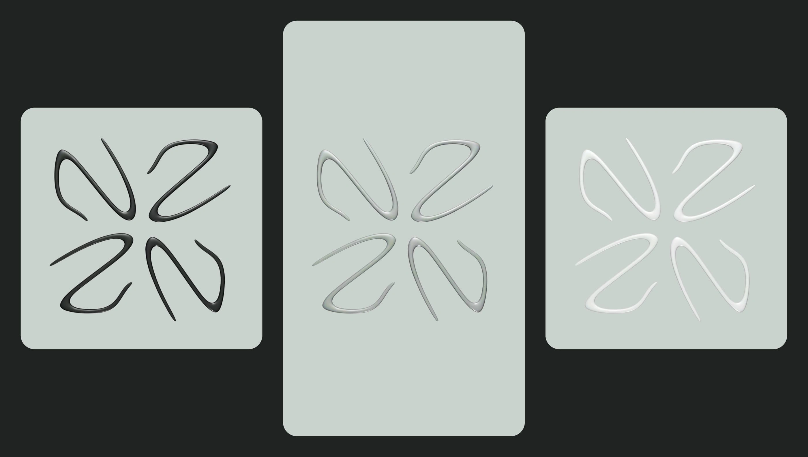
The logotype in this branding is not like the others. It’s not the core of the identity, nor the most important element — it’s the synthesis of all the visual components from the art direction. And for good reason… it was the very last thing we designed!
Born from the visual system and the pattern generator built around her handwriting, the logo is fully modular and responsive. It can include a sub-brand, shift in appearance, or change typographic style… In short, it’s a true all-terrain logo — equally at home in print and digital.
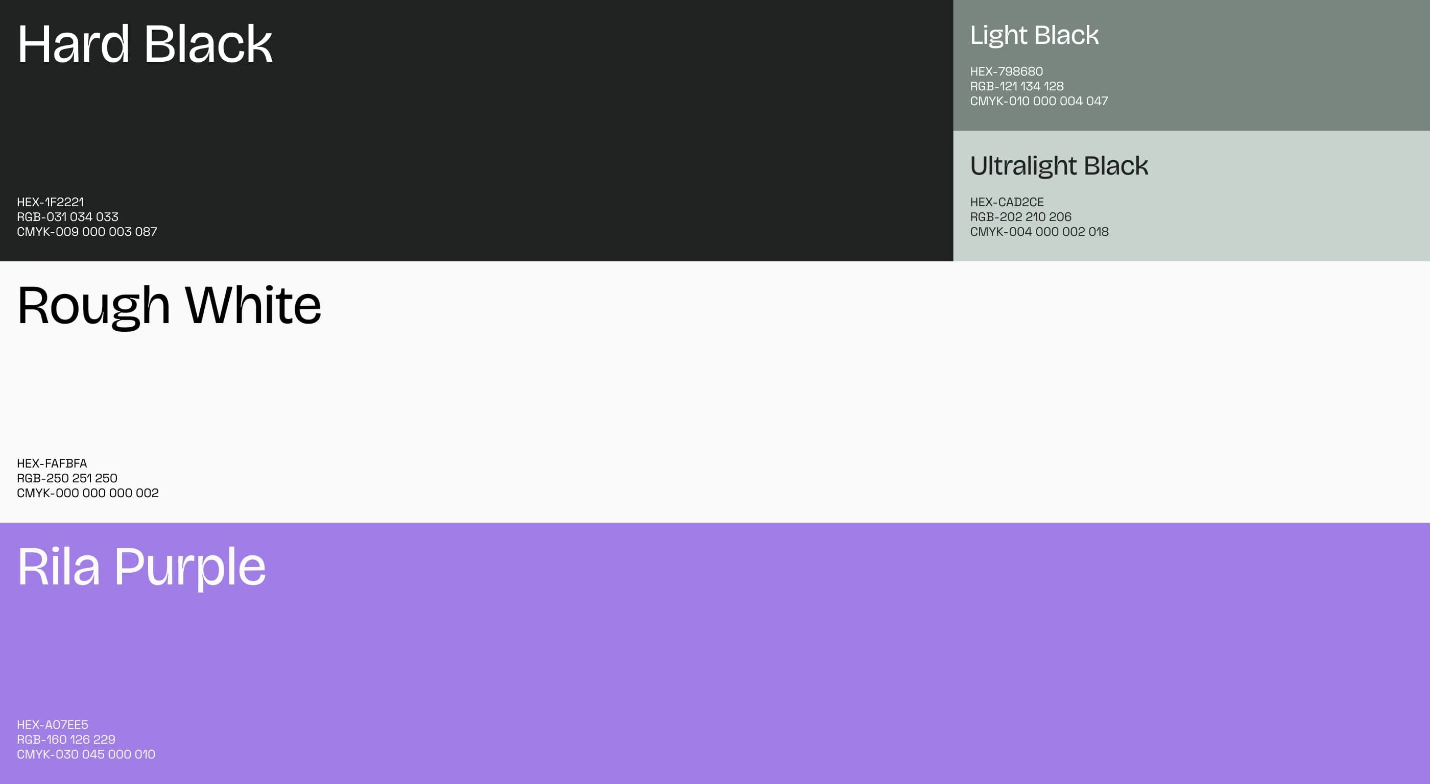
For the color system, we chose to keep things understated — for one simple reason: not to overshadow the art direction of her projects, but to let them shine. This monochromatic palette is inspired by ink and graphite ranges, mimicking the softness and hardness of pencil leads. Finally, a subtle violet accent signs off the studio’s personality — blending poetry and technology.
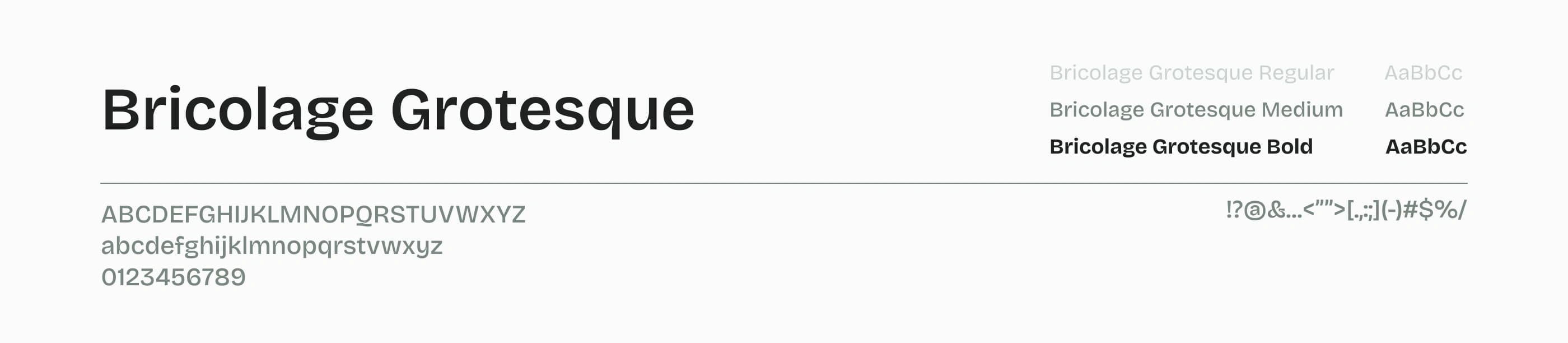
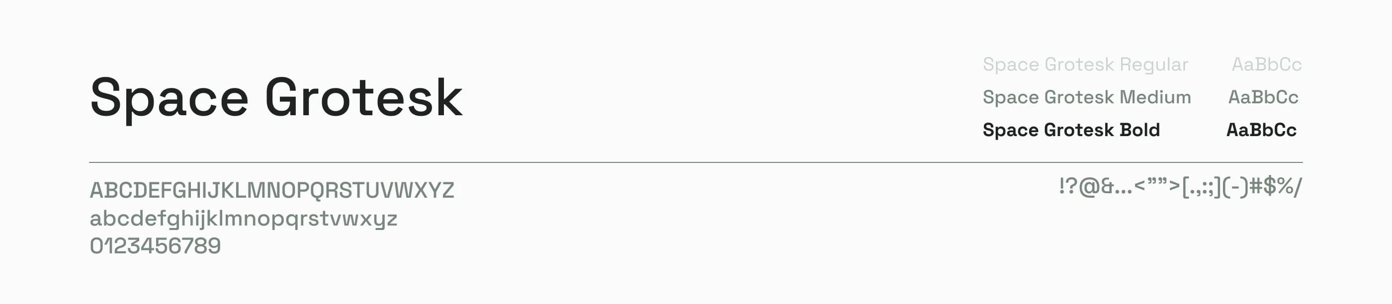
For the primary typeface, we chose Bricolage Grotesque by Mathieu Triay — an open-source font built from a bold mix of typographic influences: Mayenne Sans by Studio Triple, Antique Olive by Linotype, and Grotesque Series by Stephenson Blake. In short, it’s a variable, open-source typeface made from a patchwork of styles — perfectly reflecting the essence of Rila Studio, blending both digital and print inspirations. Its rounded forms nod to handwriting, while its sharp inktraps bring a modern twist. Being open-source also means it can evolve over time, with new glyphs added as the branding grows.
The secondary typeface is Space Grotesk, designed by Florian Karsten — a contemporary variant of Space Mono by Colophon Foundry. With its tech-inspired, angular look, it creates a striking contrast with Bricolage Grotesque, reinforcing Rila’s hybrid universe at the intersection of handmade and digital.
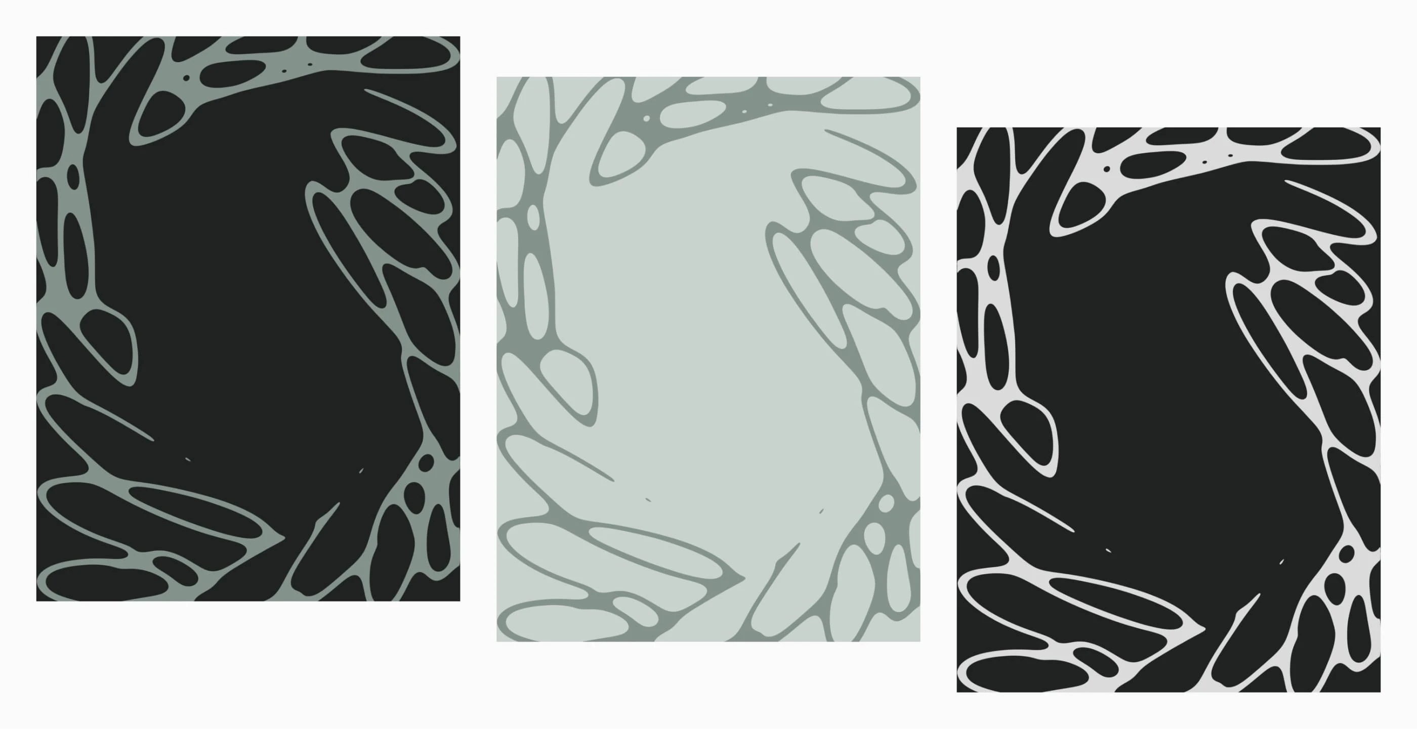
If we had to sum it up, the pattern system developed for Rila is a bit like graffiti: a sequence of words generates the pattern, making each canvas unique. From there, it can be used however you like — as a single line, a frame, a stamp, mirrored, or assembled like Lego bricks.
You can choose to make the text more legible, turning it into a third typeface, or push it further into something abstract and organic. Once again, flexibility and modularity were the guiding principles behind this system.
To wrap things up, here’s an expression I love: “A tool is useless if it can’t be used.” And in our case, that becomes: “A branding is useless if it can’t be used.”
Sure, bold art direction is great — but if the client can’t use it the way they need to, what’s the point?
So we developed a Figma kit that allows for dozens of variations of LinkedIn and Instagram posts, while keeping production as simple as possible.
Picture a Canva template on steroids — with beautiful visual assets and total freedom to tweak and adapt. Not bad, right?
To make it work, we co-built the system to ensure design and content work hand in hand — keeping everything aligned and avoiding unnecessary design fluff or off-brand messaging.
Like this project
Posted Apr 9, 2025
A flexible visual system for Rila, resulting in consistent and relevant visual identity across all platforms & easy to create stunning visuals !
Likes
0
Views
147
Timeline
Nov 1, 2024 - Dec 1, 2024