Before people truly connect with
Greatness O. | Brand Designer
Before people truly connect with a brand, they often feel it first through its colours. People might forget what a brand says, but they always remember how its colours made them feel, and all of that happens in the subconscious mind.
When you see green paired with gold, your subconscious mind instantly picks up premium and luxury. See purple, red, or navy blue with gold, and it immediately signals royalty. It’s not something you have to think about or analyse, it speaks to you right away.
We all know red can mean danger, but also love. Black can represent death or evil, yet it can also communicate power and elegance. That’s why colour is such an important piece of the big puzzle.
And that puzzle is called branding — the game we play here.
And just having colours that evoke emotions and perceptions subconsciously isn’t enough. How they’re branded matters too. That’s what helps a new customer subconsciously understand whether your red means love… or danger.
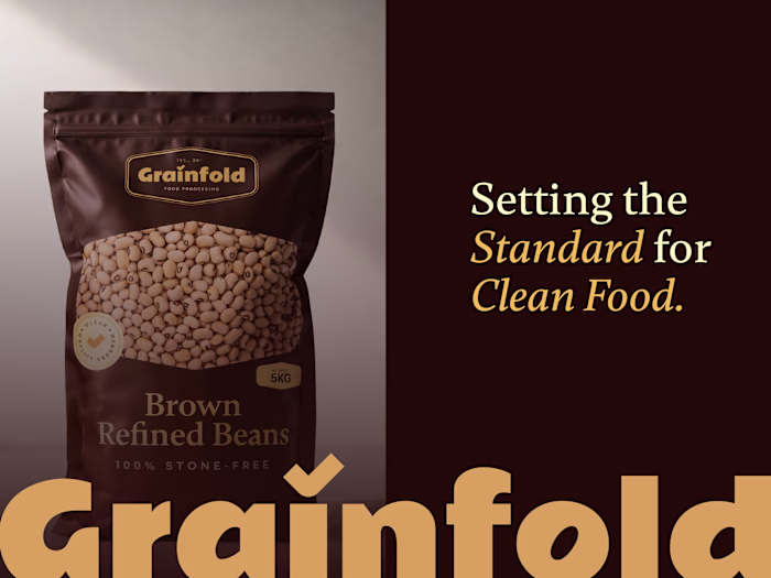
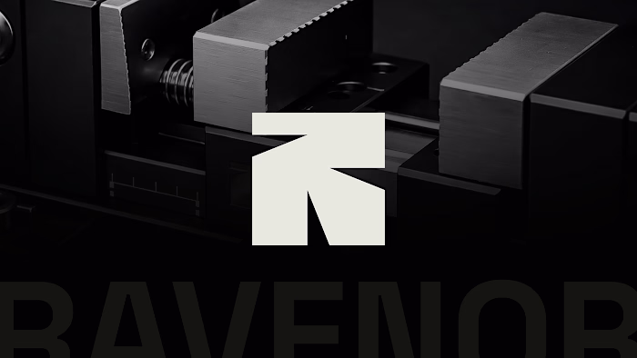
Here are a few colour selections from our previous projects.
Need a logo or branding identity?
Send a DM or mail to 💌 info@donatus.agency
Like this project
Posted May 27, 2026
Before people truly connect with a brand, they often feel it first through its colours. People might forget what a brand says, but they always remember how i...