KÁRO — Coffee Brand Identity
Obioha -Brand designer
KÁRO — Coffee Brand Identity
Modern. Cultural. Premium.
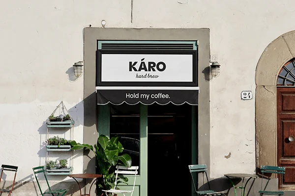
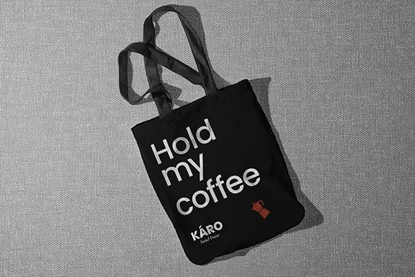
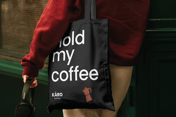
KÁRO is a contemporary African coffee brand inspired by the warmth and cultural depth of Nigerian mornings. Rooted in the Yoruba phrase “Káro,” meaning “Good Morning,” the brand embodies a ritual of grounding, energy, and connection. Its visual identity blends African heritage with a modern, minimalist, premium aesthetic, built on black and white with an accent tone inspired by African earth and sunrise hues to communicate origin and quality. Designed for global appeal, the identity system is clean, scalable, and adaptable across packaging, merchandise, cafés, and digital platforms.
The name KÁRO was chosen because it reflects the first light of day, the aroma of freshly brewed African coffee, and the pride of cultural simplicity. Created for modern African professionals, creatives, and coffee lovers, the name was chosen for its meaning, clarity, and emotional strength—short, memorable, culturally rooted, and internationally resonant.
Logo Concept Direction
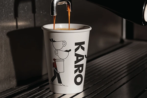
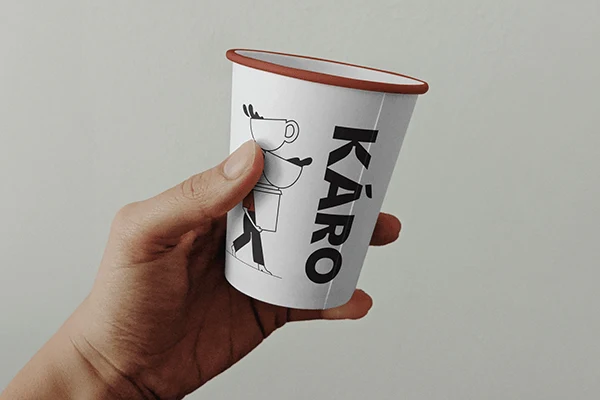
The KÁRO identity merges human touch with modern minimalism, creating a visual language that feels both locally rich and globally refined. The design draws from earth tones and the natural warmth of African culture, expressed through simple illustration and clean, linear minimalism. Modern elements add depth without overwhelming the composition, ensuring the brand remains premium and uncluttered.
In the logo design, geometric modern letterforms create a bold, confident mark, while the negative space remains crisp for versatility across packaging, signage, and merchandise. A supporting brand symbol includes a minimalist coffee-bean shape. The result is a premium brand that balances identity and innovation, tradition and modernity, culture (Local) and simplicity.
Typography
The typography is clean and modern, with slightly rounded terminals that soften the geometric structure and introduce warmth. The layout system is sharp, structured, and intentionally designed to maintain a high-end feel across all applications.
Color concept
A strong black-and-white foundation establishes contrast and clarity, supported by an accent hue inspired by African coffee bean and earth.
THANK YOU FOR VIEWING.
Follow me on x @obiohadesigns
contact me: obiohadesigns@gmail.com
Like this project
Posted Mar 27, 2026
KÁRO brings the warmth of Nigerian mornings to life in a premium, minimalist coffee brand, with clean typography, bold black-and-white contrast, and consistency