Klar: Rebranding an Alcoholic Sparkling Water

Mehmet Turan
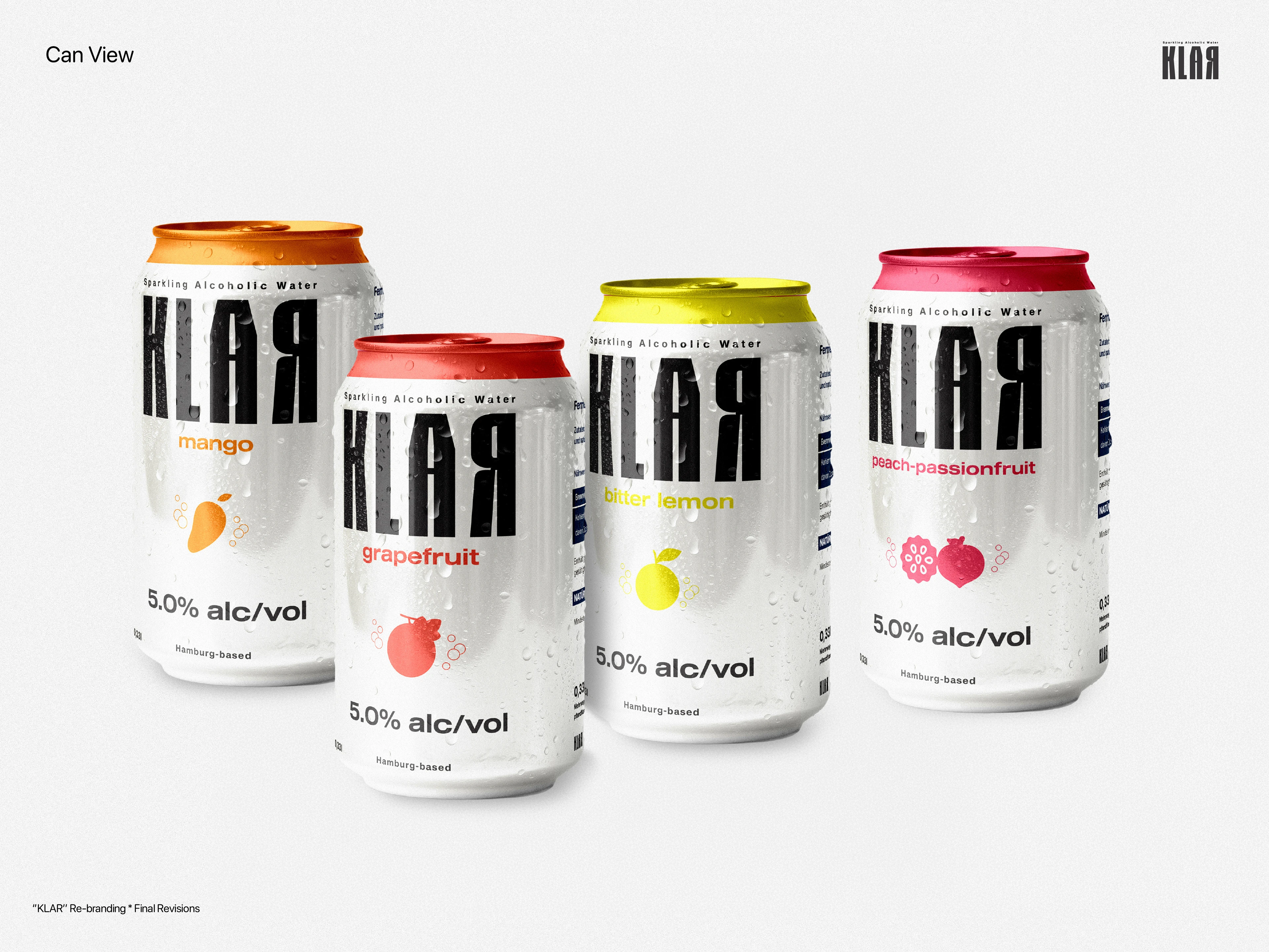
Hamburg-based startup Klar set out to bring alcoholic sparkling water to the German market, a concept that barely existed on local shelves. The brief wasn't about making something pretty. It was about making something make sense at a glance.
Design by Doğukan Özpınar. Art direction by Mehmet Turan.
Starting from zero
The founding team, three friends who turned a homebrew idea into a real product, had one clear rule: nothing from the old branding could carry over. The identity had to be built from scratch, from the logotype down to every label.
They wanted something modern and a little loud, closer to the energy of American soda packaging. Hamburg mattered, but it couldn't dominate. No skylines and no postcard imagery, just a quiet nod in small type.
The real problem: this isn't just water
The hardest part was communication. A shopper might glance at the bottle, assume it was flavored mineral water and walk past it. Someone had to be able to pick it up next to a Corona or a Desperados and instantly understand it belonged in that aisle.
That one problem shaped almost every decision.
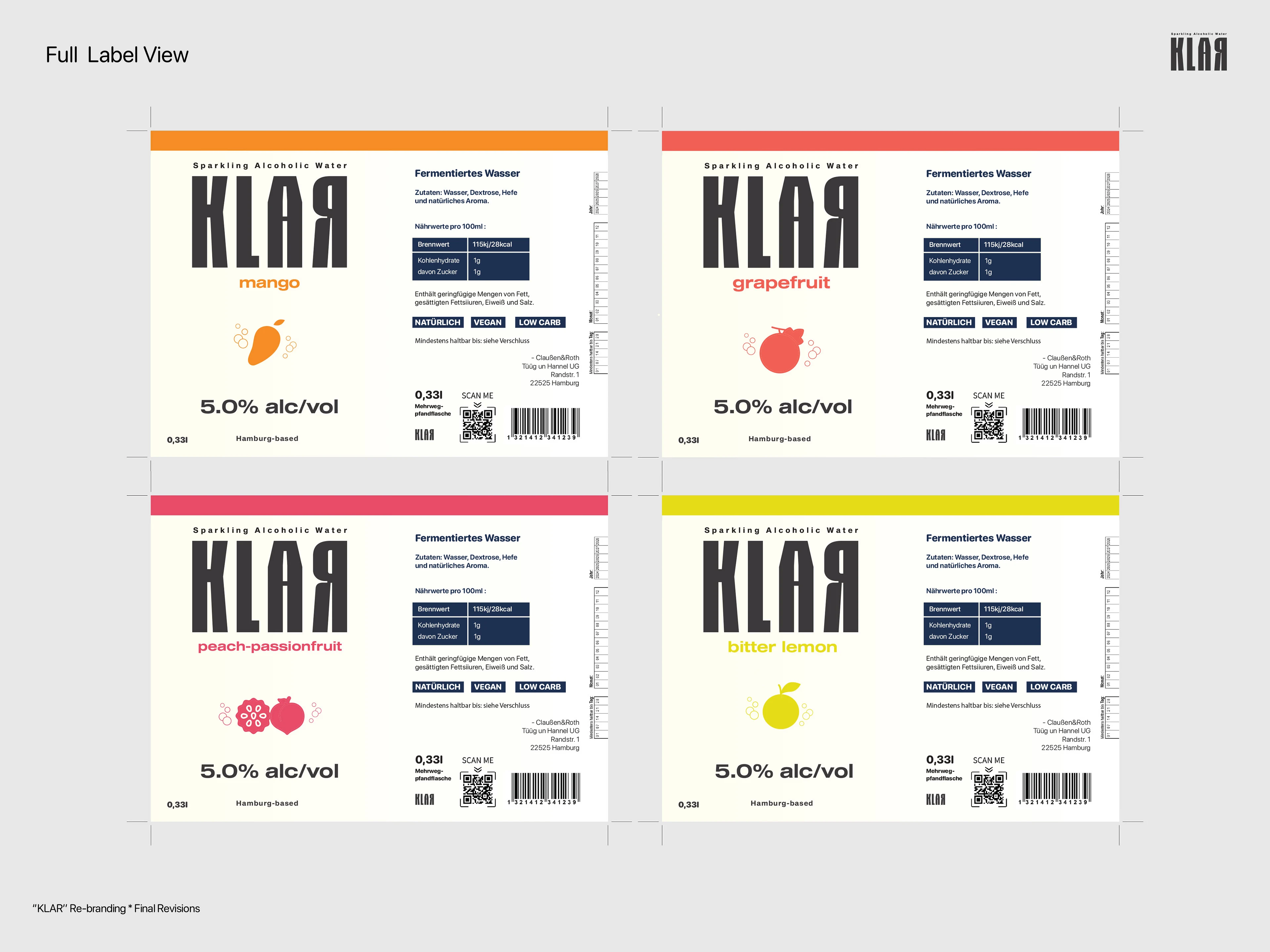
Klar label designs
Round by round
Pulling back the fruit. The first concept landed well, but the fruit illustrations were too dominant. They said fruit drink, not alcohol. We let color carry more of the story, with each flavor in its own palette. The brand also chose premium over party, while the can became the more casual, social sibling to the bottle.
Refining the palette. Decorative stars were cut for feeling busy, and colors became more saturated for shelf presence. Typography got simpler, with a small, understated "Hamburg-based" at the base of the label.
Final details. Orange was retired in favor of Bitter Lemon. Small rising bubbles replaced the stars, evoking carbonation. One choice survived every round: a deliberately misaligned "A" in the wordmark, kept as a piece of shelf disruption.
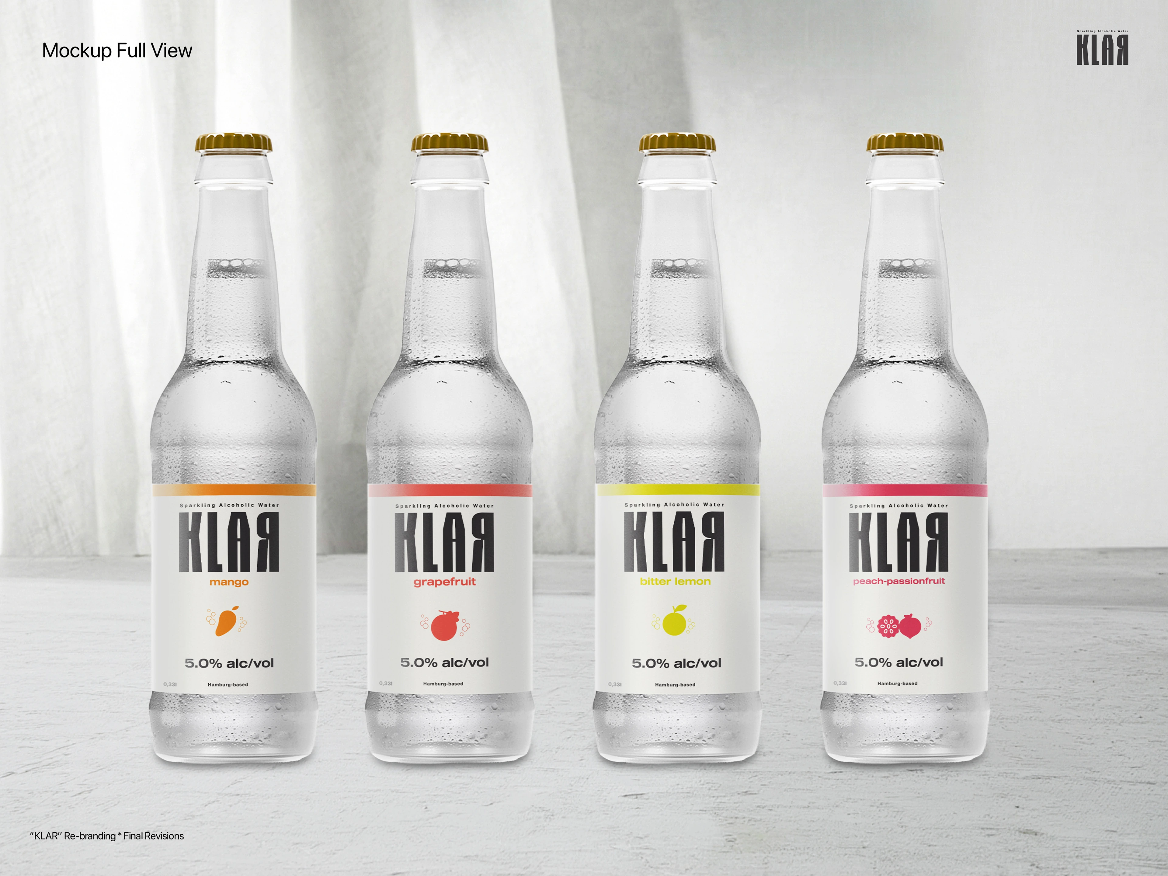
Klar bottles
A brand that reads before it's read
Every round came back to one question: does this say alcoholic drink before anyone reads a word? Fruit took a back seat to color, illustration gave way to typography, and decoration had to earn its place.
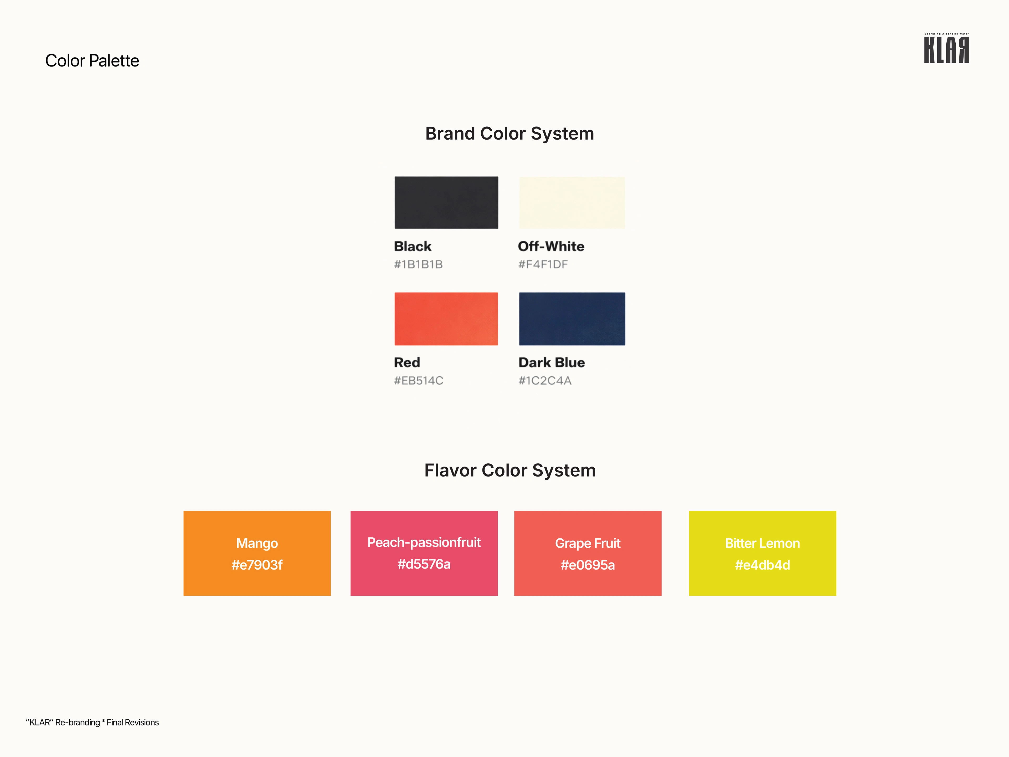
Klar brand and flavor color system
What was delivered
A new logotype, a color system by flavor, and label designs for bottles and cans.
Like this project
Posted Nov 4, 2026
A from-scratch rebrand and label system for a Hamburg startup, built to say alcoholic drink, not flavored water, before anyone reads a word.