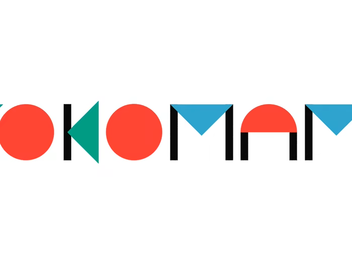
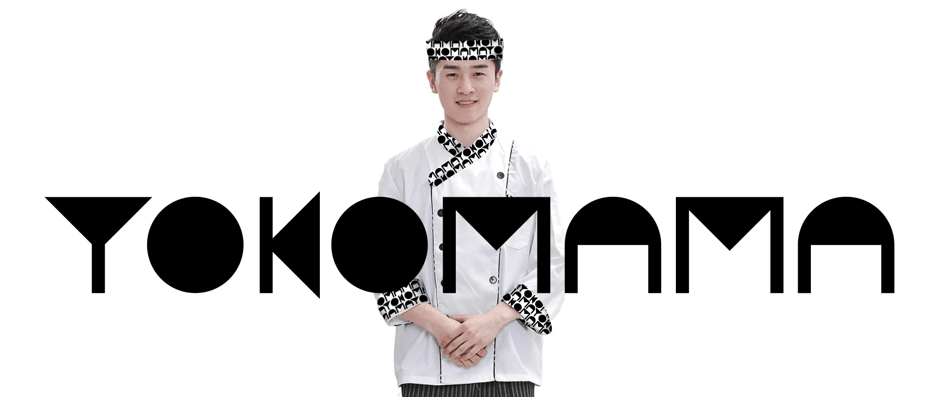
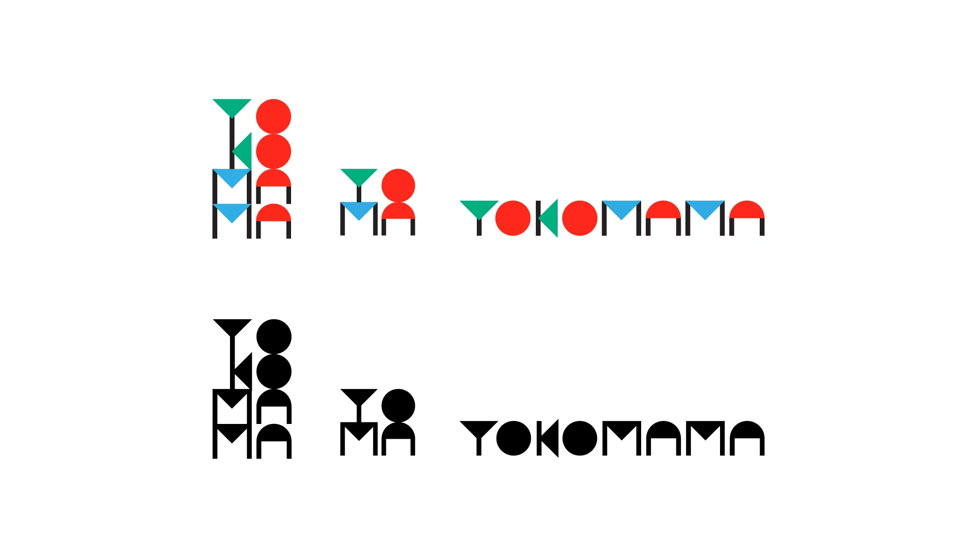
Yokomama identity
Vladimir Khablov
Sounds UWU and YUMMY!
The visual concept of a family restaurant serving pan-Asian cuisine.
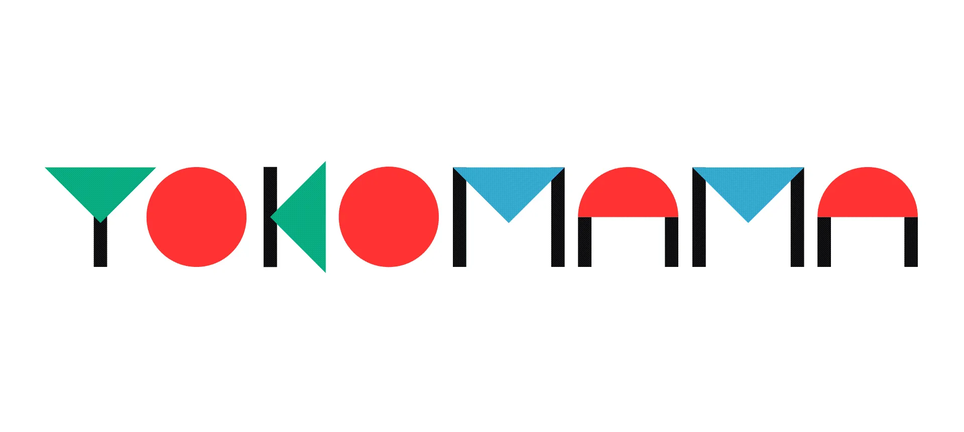
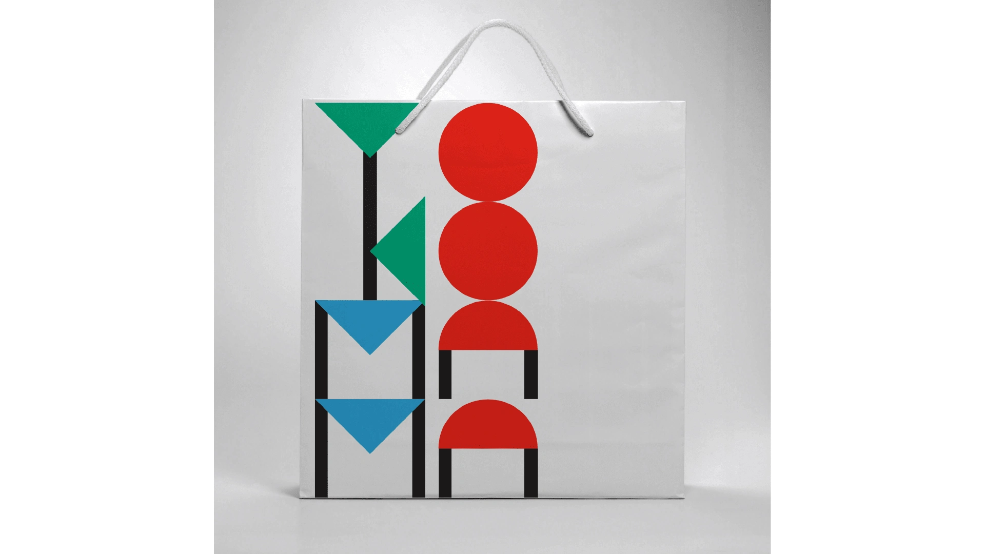
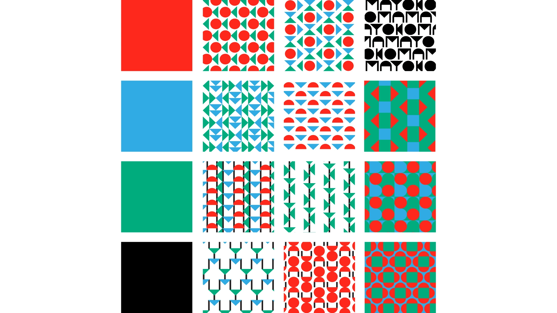
Although the brand was not released, it was fun to design. The name was given by the client. No brand platform, no concept, just pure visual research. From 3 basic shapes came a simple but striking logotype. It gave birth to a series of patterns that garnish the takeout dishes. It also gave life to a couple of mascots, Yo and Ma.


If you're unsure of where you are in the branding journey, please refer to my service
An ongoing brand development
Like this project
Posted Aug 18, 2021
Cute and simple style of Pan-Asian food delivery
Likes
0
Views
24