AirPortal Mobile App Case Study

Angel Iwanowski
Mobile Designer
UX Designer
UI Designer
Figma
Miro
AirPortal
Airports Made Easy
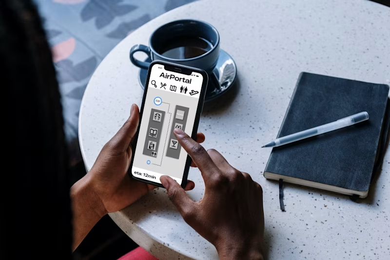
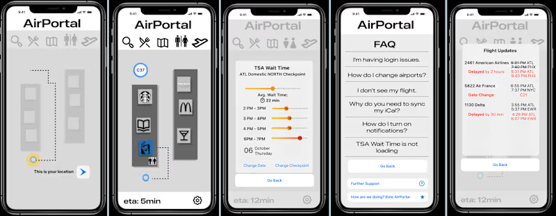
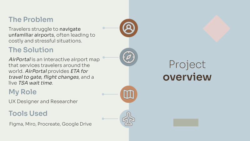
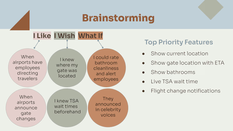
AirPortal is an interactive airport map that services travelers around the world. AirPortal provides ETA for travel to gate, flight changes, and a live TSA wait time.
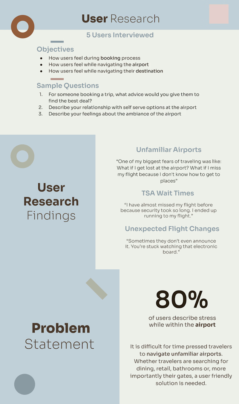
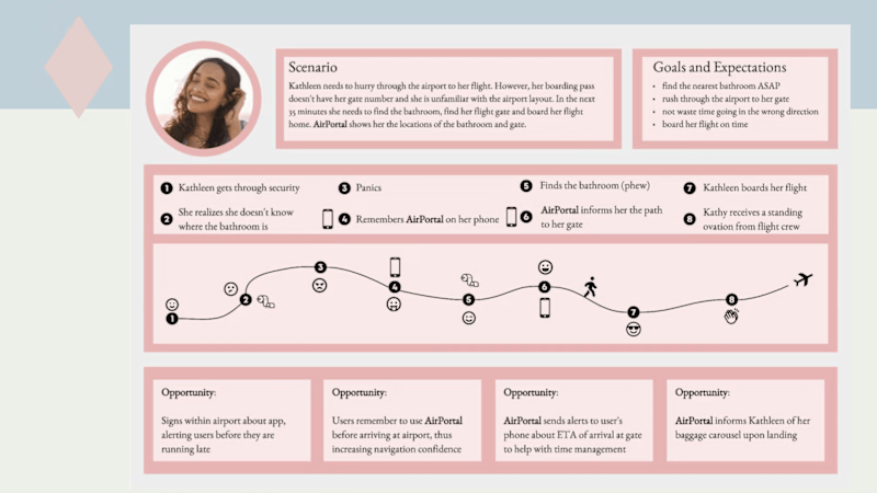
During user research, I found a majority of travelers experienced anxiety regarding the airport. When juggling the time restraint of an upcoming flight and unfamiliar surroundings, they feared a missed flight or struggled to find a bathroom before boarding. With this information, I built my user persona: Kathleen Fernandez.
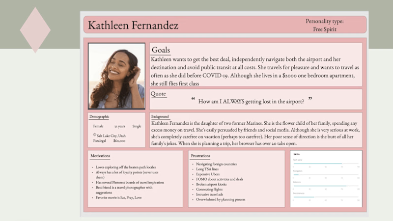
Kathleen Fernandez was imagined as an individual that struggles to navigate even her hometown airport. She considers herself in vacation mode prematurely and often misses flights as a result. She needs a solution that eases her concerns while allowing peace of mind when navigating unfamiliar airports.
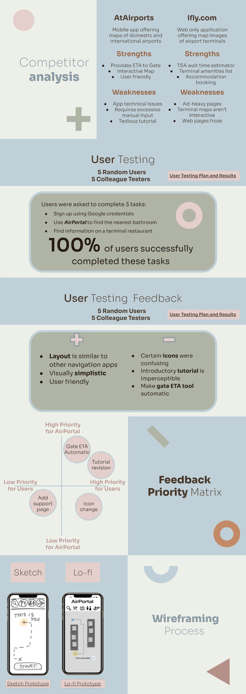
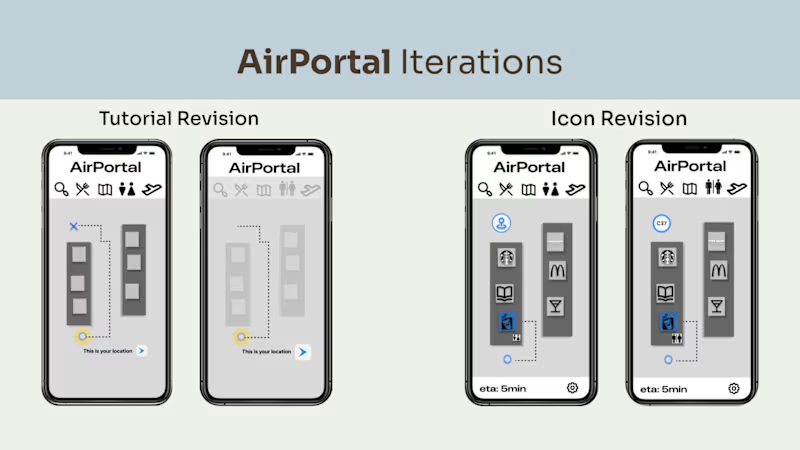
Following user testing, several iterations were made to improve usability of AirPortal. The tutorial was restructured to convey information more efficiently. Users also mentioned the symbol for the bathroom resembled an elevator icon; a more universally recognized bathroom icon was substituted.
