KERV: The Rebrand
One of the major projects I worked on in my time with adtech company KERV Interactive was an entire overhaul of the company’s branding. This was a months-long collaborative process in which the team decided on the color scheme, typefaces, voice, logo, and feel for the new rebrand.
When I first joined KERV, the logo and brand colors were simple and effective, but a bit dated and reflective of the small startup that the company was at the time. We wanted to establish a new aesthetic that would represent the next phase in which the business was growing.
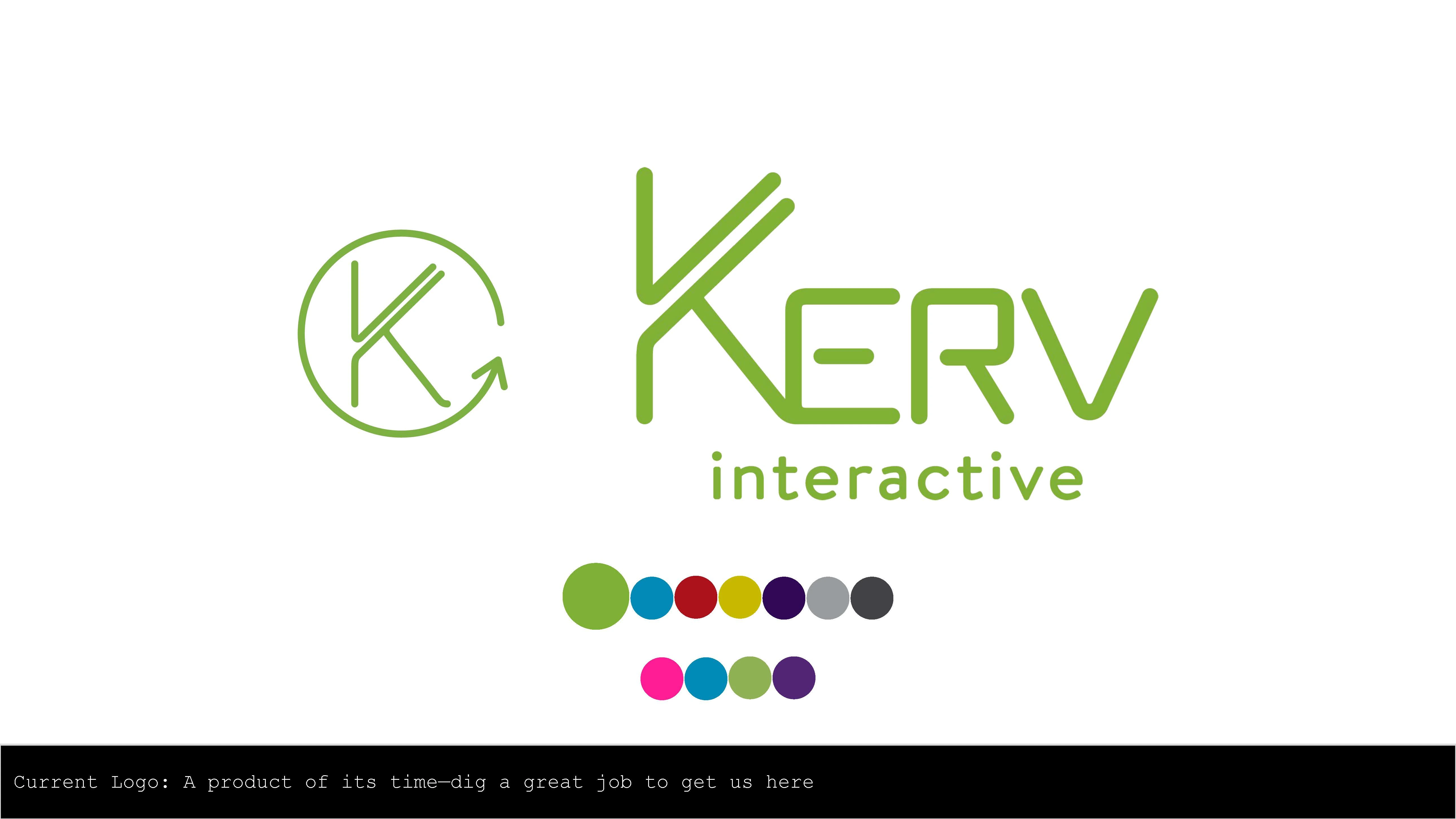
We began the process by gathering inspiration and discussing three things: what we didn’t want our brand to look like, what our competitors were doing and what was working for them, and inspiration from other companies. Our brainstorming efforts resulted in three distinct branding directions, presented to marketing:
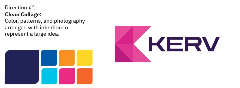
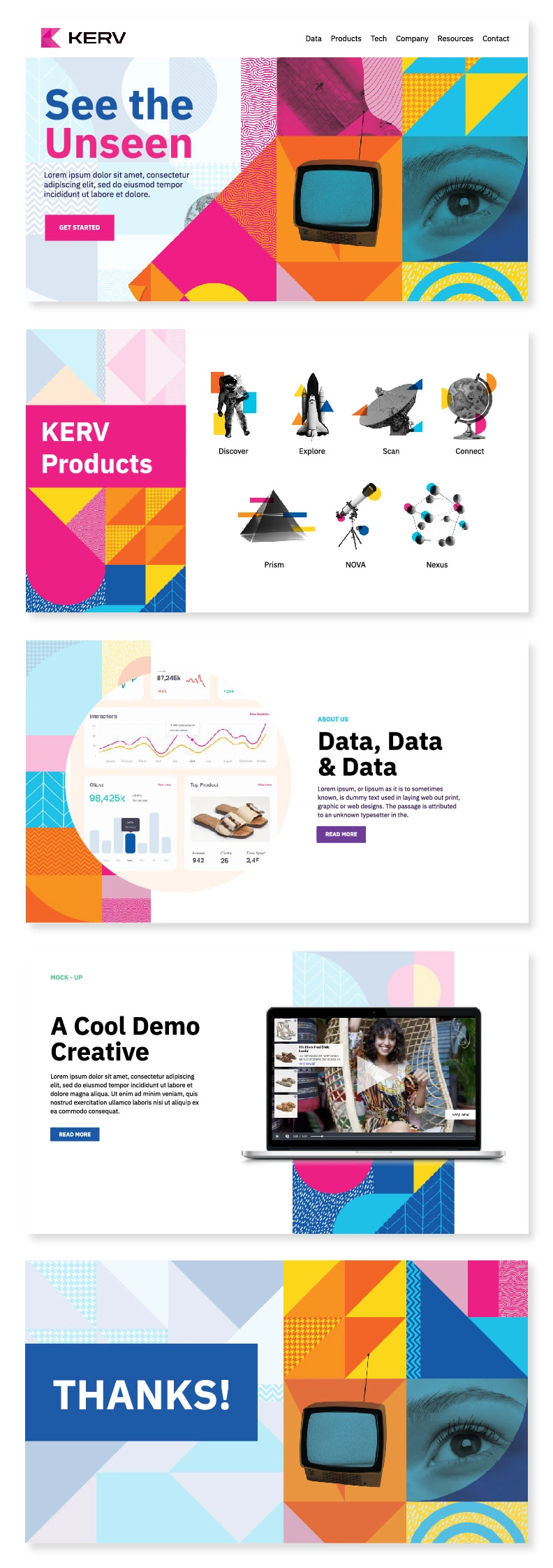
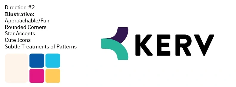
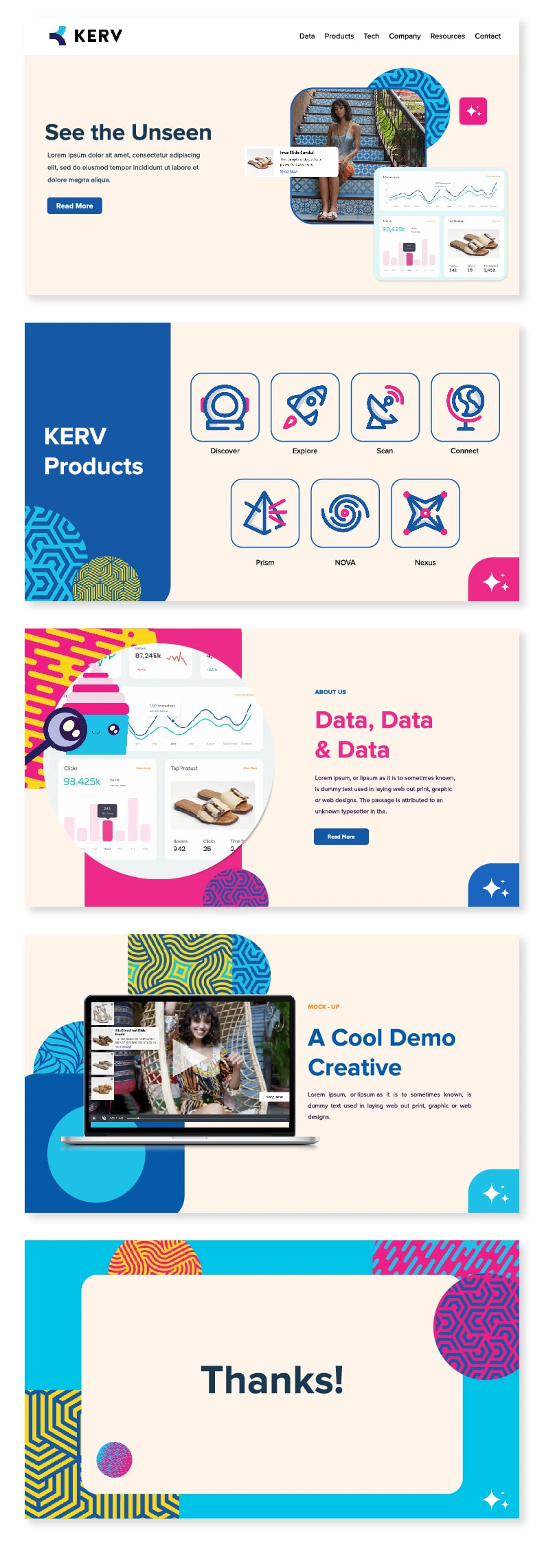
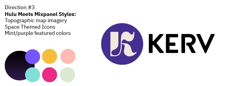

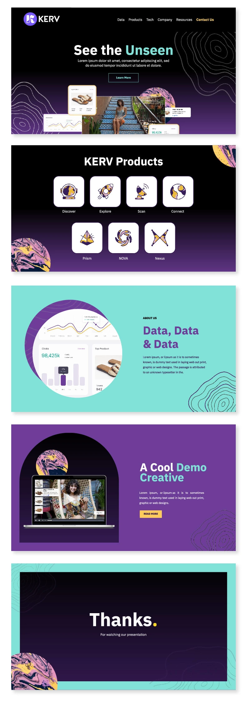
After reaching consensus on the creative direction, the entire team, which included representatives from marketing, the C-suite, design, and development, began engaging in some lengthy brainstorming sessions. We discussed which elements from each of the three approaches worked best for the new direction the company was headed in.
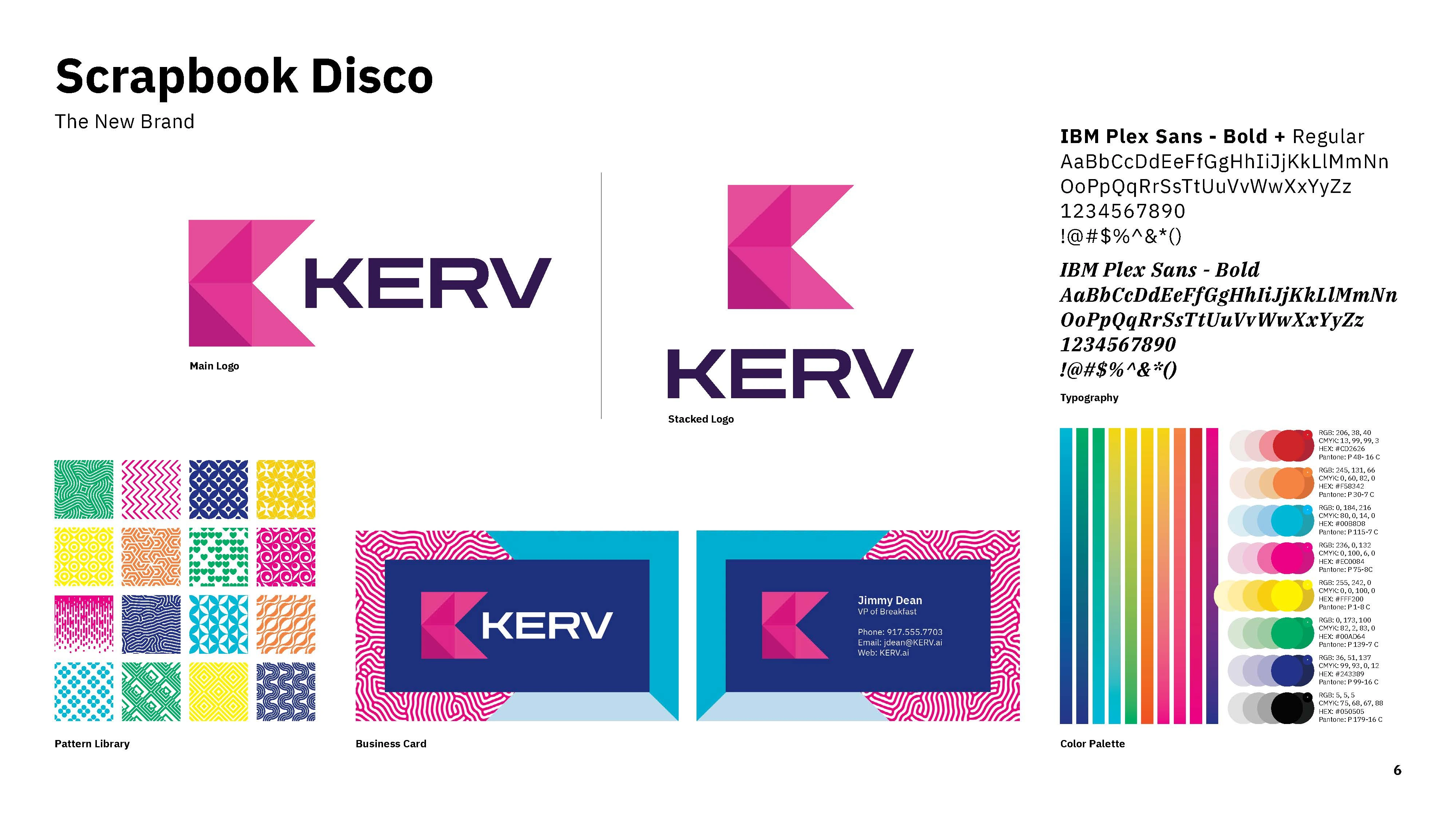
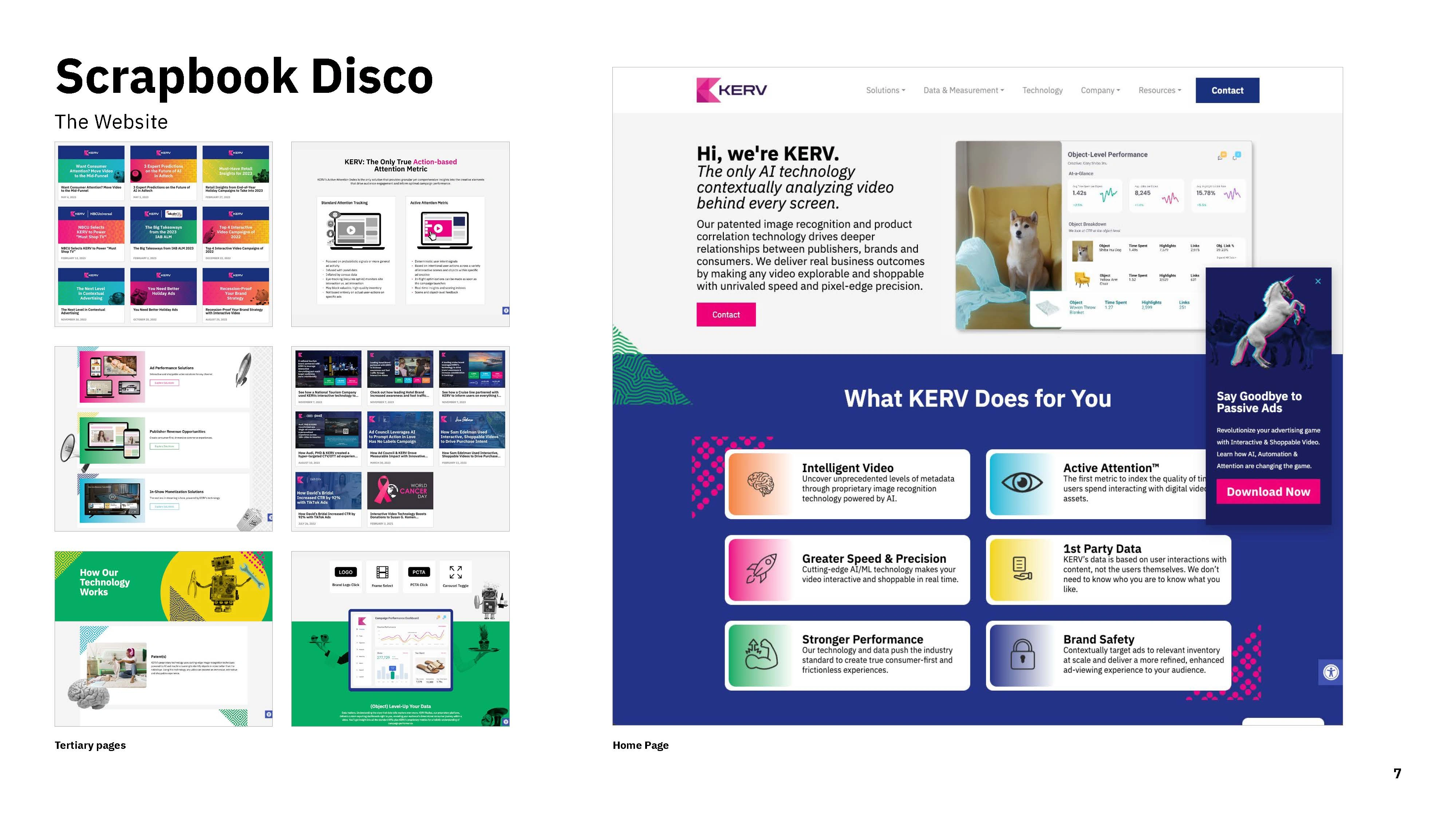
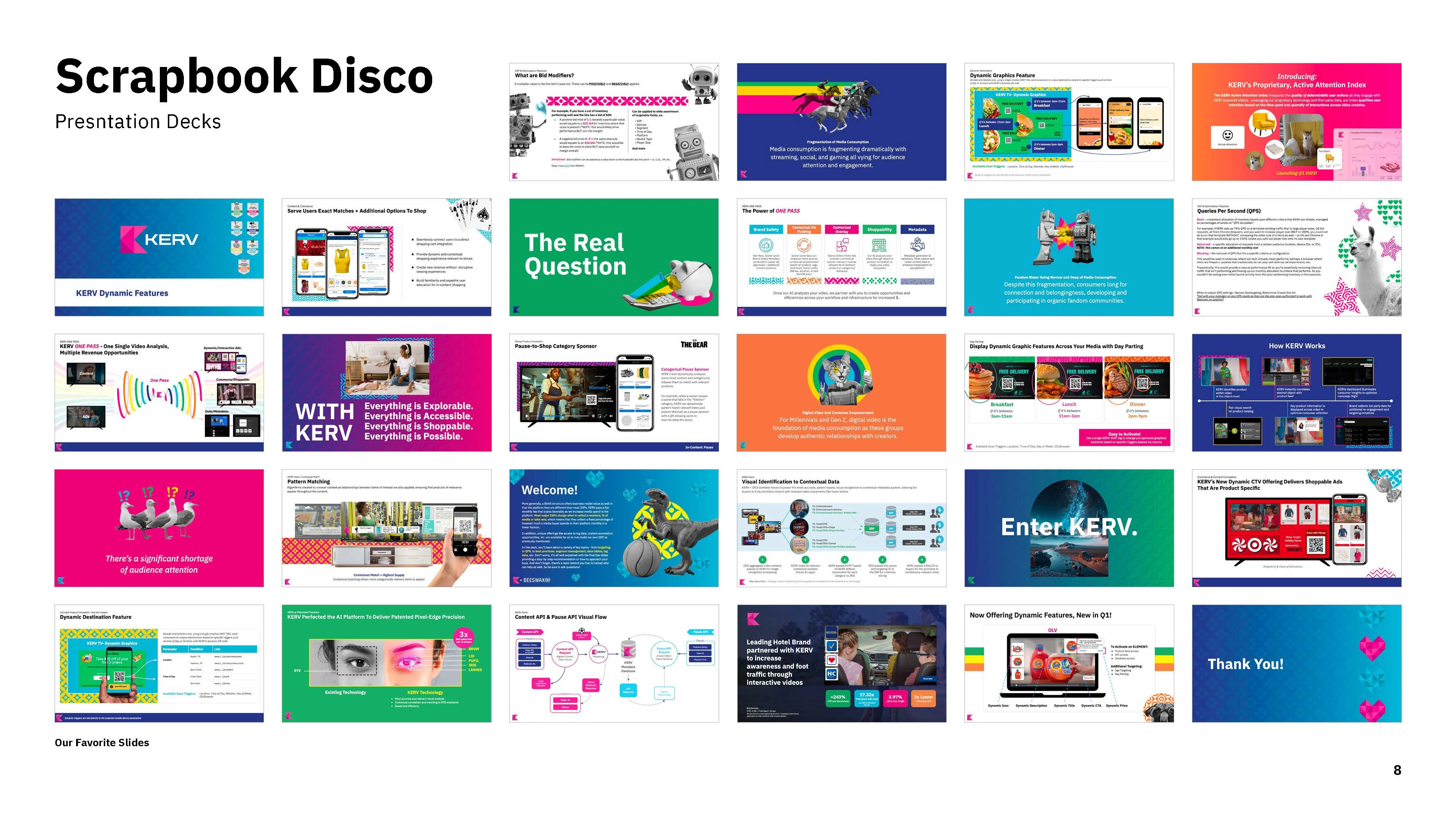
We incorporated photorealistic imagery and a library of vector patterns, as well as a bright, optimistic color palette. The result was a colorful, whimsical, and effective style that design team fondly refers to as “Scrapbook Disco.”
Like this project
Posted Jan 20, 2024
An entire overhaul of the company's branding including logo, color palette, fonts, and pattern library.
Likes
0
Views
12
Clients
KERV Interactive

